
Introduction
Resy is a restaurant reservation platform used all around the world from New York City to Hong Kong. The platform provides users with endless options from up and coming restaurants to top rated restaurants. Acting as a bridge between customers and restaurants, the platform allows users to search different restaurants, book a table, change/cancel reservations, leave reviews, as well as create a personalized favorites list all in one place.
For the purpose of this article, I will only focus on the Resy mobile app with location set to New York. Using Norman’s concepts of design, I will critique the app and propose re-designed solutions for certain functions.
1. Search
When I first opened the app to make a reservation, I was welcomed by a map of my current location. The app automatically assumed I was looking for available restaurants around my location for a party of two, today, at any time of the day. I wanted to search for a specific restaurant, but I wasn’t sure where or how to do that as the search bar at the top of the app said ‘Search Current Location’. There were no indicators that directed me to search for the restaurant I wanted for my date and time of choice. Another point I wasn’t sure of how to use was the buttons right below the search bar. I wasn’t sure if those were filters or actions. I needed signifiers for the filters to know what each button did.
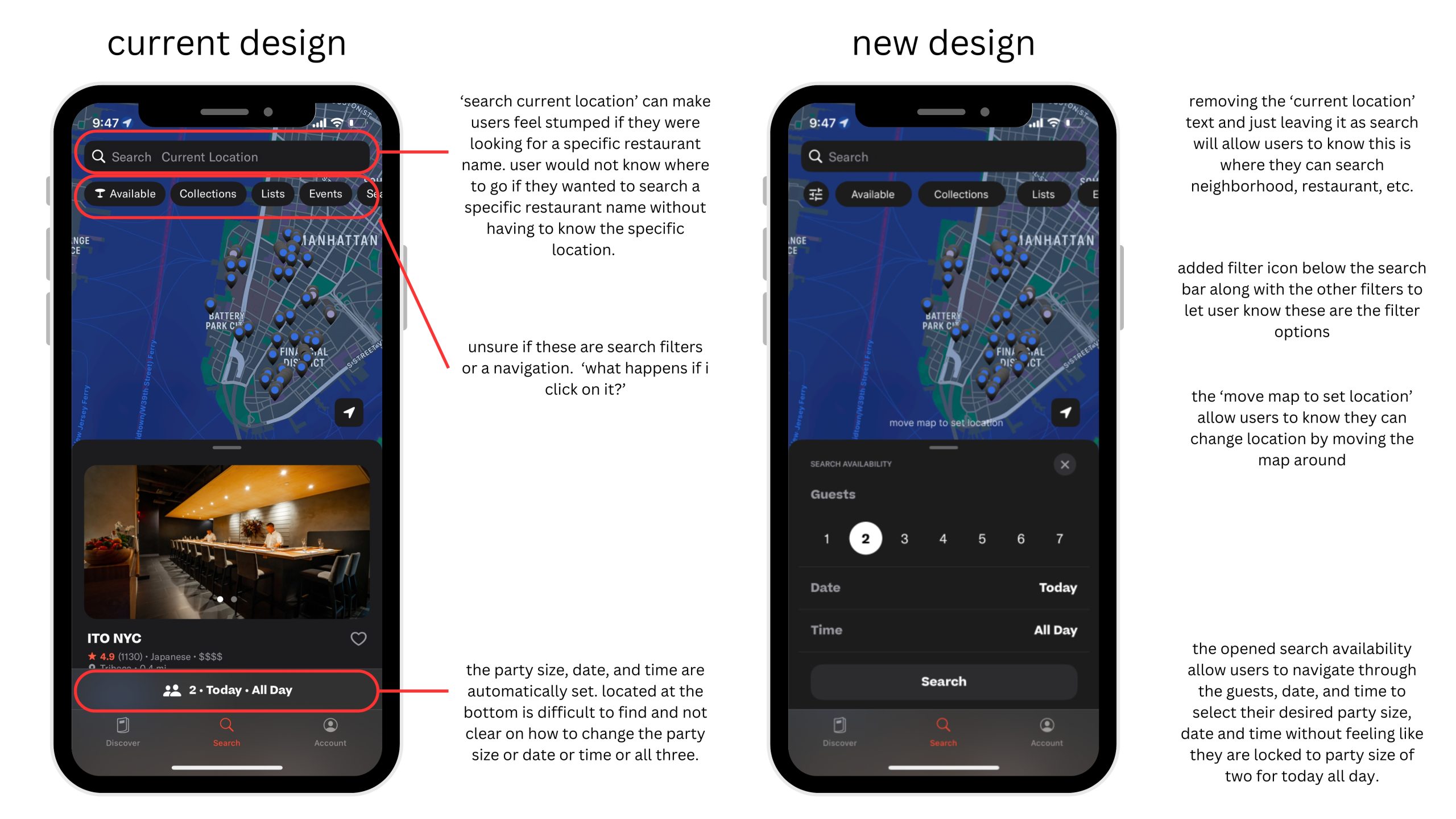
A solution I designed for the current design can be seen in the above image. Removing the ‘current location’ text removes that uncertainty for users who hope to search a specific restaurant. Adding a filter icon below the search bar with other popular filters allows users to see there are filter options for their search. This allows users to feel in control of what they are searching without being thrown random words and buttons at. The last re-design I did was adding the party size, time and date selection to the start of the page so users know to select their party size, time and date before beginning their search. It gives directions on how to use the search engine by providing steps.
2. List vs. Map
Upon opening the Resy app, the search engine is designed to support the map view option. Though this can be helpful, when it came to looking through a list, I wasn’t sure where to find a list of restaurants or how to scroll through the list without feeling uneasy. I wasn’t sure if I had to pick my party size, date and time before scrolling. I wasn’t sure if the results I was getting were tables available for today or for a specific date and time I wanted. The general design of inability to find the list search option needed signifiers.
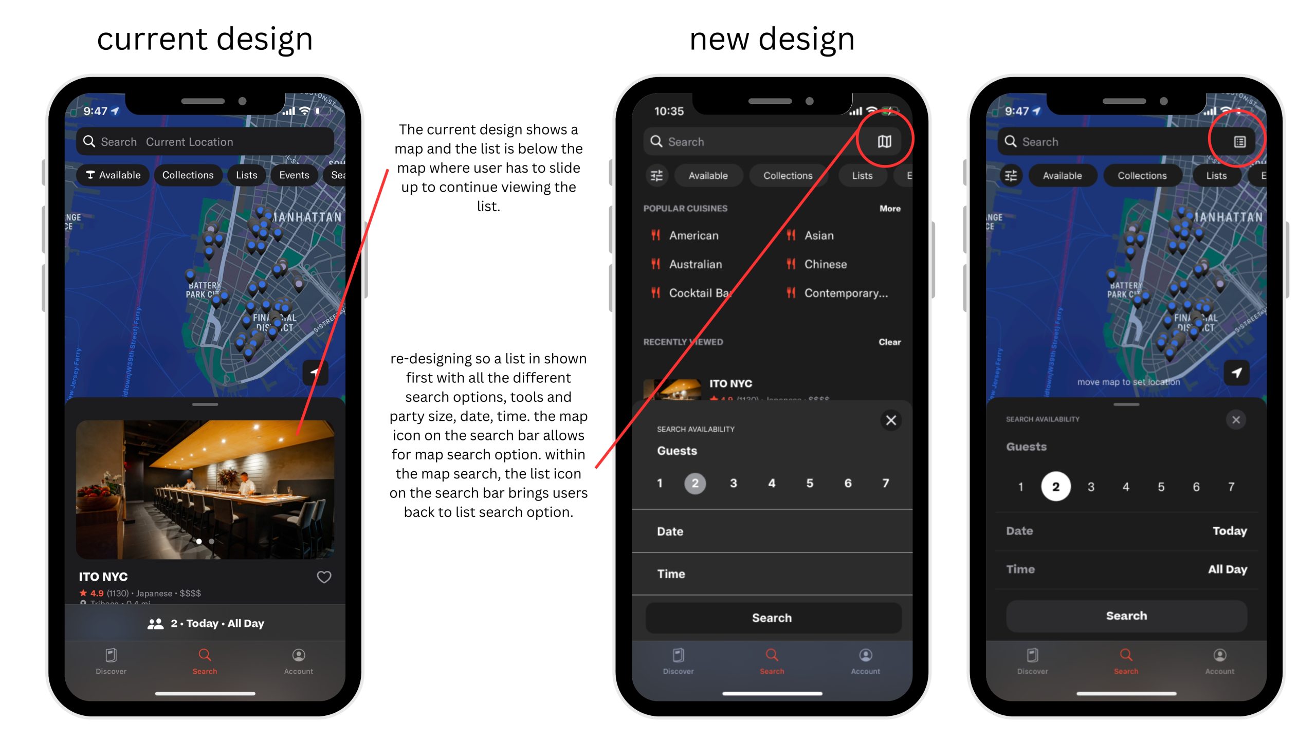
The re-design of this pain point is to change the landing page entirely. As seen in the image above, having the landing page be the search bar, map icon, filters, list of different cuisines allow users to have many different options and directions. Having the party size, date, and time selection open and ready helps with visibility as users will know they have to select their reservation options for best search results. Users will know their search results are for their selected party size, date and time, and not random results of a pre-set search. On the search bar, a map icon would be helpful to allow users to know there is also a map search function if they would like. The re-design allows maximum usage of the app by providing users with curated cuisine, filters and reservation detail selection at the very beginning.
3. Collections
While browsing through the app, I found the filter options below the search bar all served the same purpose except one option. When I pressed seating, I was given options outdoor or indoor, when I selected events, I was given restaurants that were hosting public events, etc. When I clicked on the collection, I was given a big list of different curated collections. While feeling a little overwhelmed I wanted to explore the collections without feeling like I was setting a filter for my search. For this reason, I re-designed the menu bar at the bottom of the app to have a separate collection page so users are able to explore the curated list of collections without feeling overwhelmed or like they are locking in a decision.
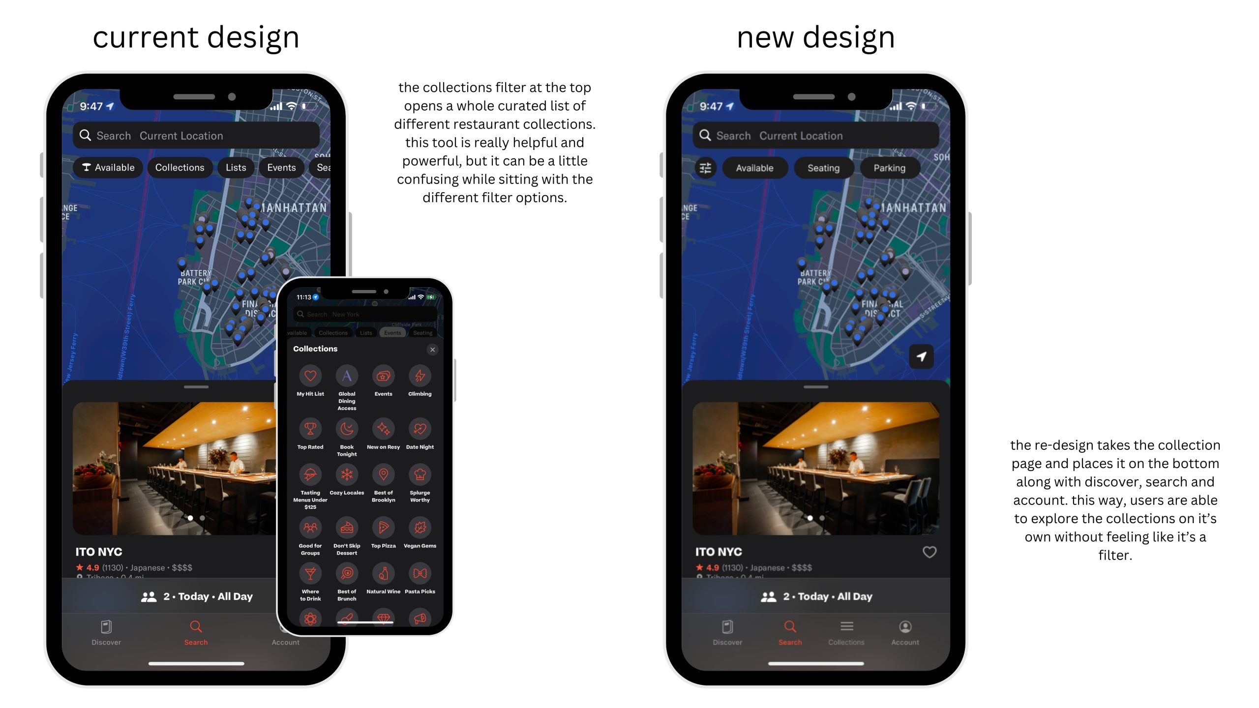
This re-design considered Norman’s principle of constraints. The initial mapping where the collection was with the filters, confused me as a user. I wasn’t sure where I would be led to if I pressed one of the collections as I thought I was setting a filter. Changing the design so that the collection list is at the bottom along with discover, search and account, users will be able to know that if they press collection, they will be guided to a list of curated collections, not a filter option for their search. The initial filter option provided too many options for it to be just a filter. Putting the collection lists below with the menu bar limits the range of interaction and serves only one purpose: a curated list of restaurants. With the filters, it was serving too many purposes.
Conclusion
Overall, the app definitely serves the main purpose of connecting foodies with restaurants through reservations. Though the app could use small tweaks here and there for smoother user flow, the app is well designed to search new restaurants and make reservations without having to call and check for availability. Using Norman’s design concepts, the Resy app would benefit from new signifiers and mapping re-design for some features.