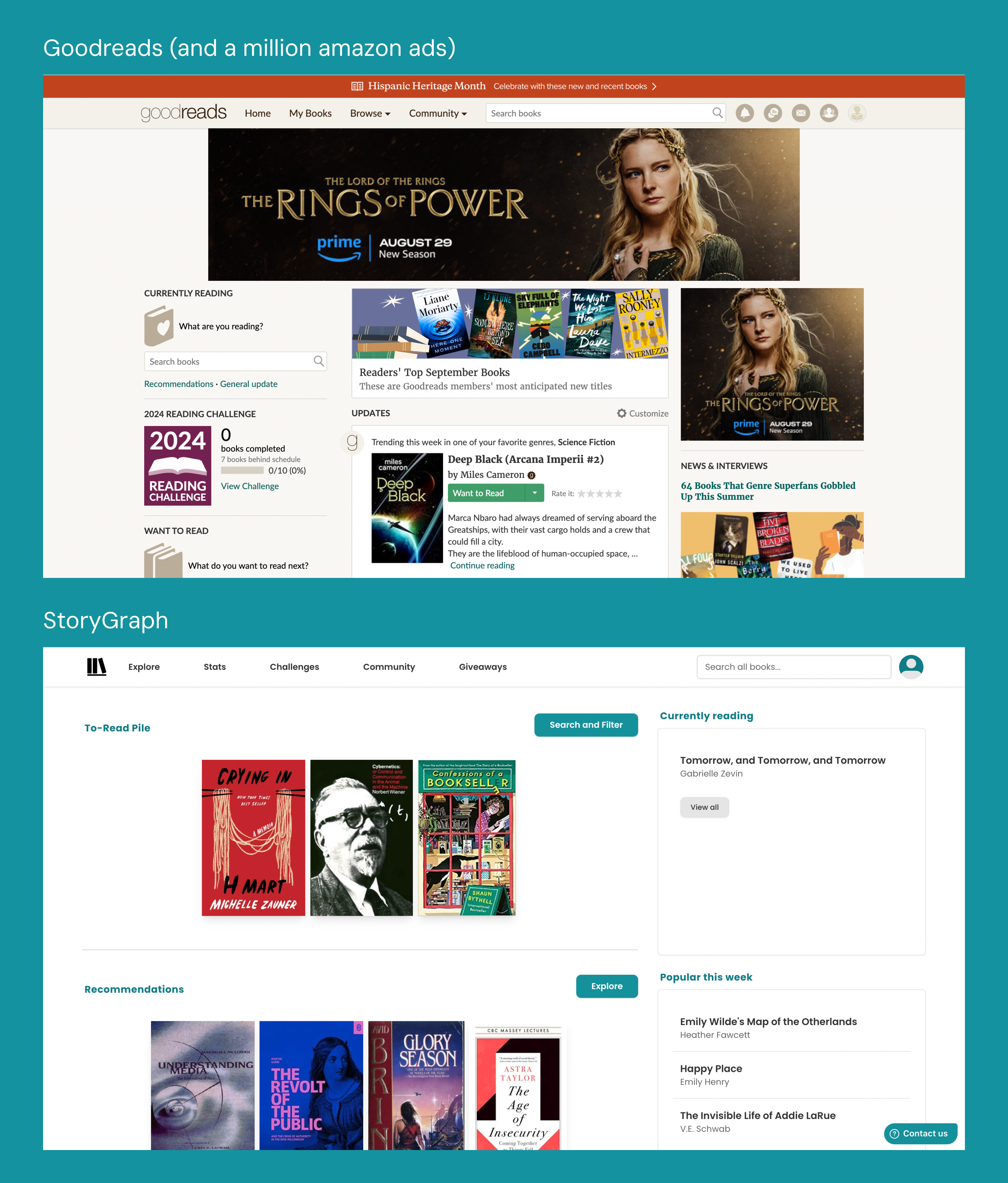
“It is, in fact, possible to have a decent time on Goodreads. You just have to ignore everything about the way the site is designed and how you’re supposed to use it.”
https://thewalrus.ca/goodreads-is-terrible/
Or, you could switch to StoryGraph, an independent, black woman-owned reading platform (website and app).

Introduction
Say goodbye to Goodreads’ old time-y interface and popups that ALWAYS take you to amazon! StoryGraph offers a modern and minimalistic visual design that highlights all but two things: Books and YOU. Hesitant to make the switch? StoryGraph also allows for easy import from Goodreads, so you don’t have to painstakingly add every book you’ve ever logged!
Convinced by my friend (who basically gave me the pitch above), I started using StoryGraph last year. In addition to the features highlighted on the website, I personally also really enjoy the analytical data generated based on my past reads. As an absolute nerd about (psycho)linguistics, data science (not in a tech bro kind of way I swear), and of course books, something tickles my brain when I get to see how my reads are interpreted and represented through data. Why yes, I have been a sucker for emotional and reflective books this year!

As interesting and wonderful as it is, I can also recall several moments of frustration in my user experience. This blog post serves to systematically evaluate and analyze StoryGraph’s design with concepts discussed in The Design of Everyday Things by Don Norman.
The real stuff
The affordances of StoryGraph are perfectly stated on its website.
“We’ll help you track your reading and choose your next book based on your mood and your favorite topics and themes.”
The two primary functions: to track what you read, and to give you new books to read.
Makes perfect sense, right? Except–
1. Wait, what did I read?
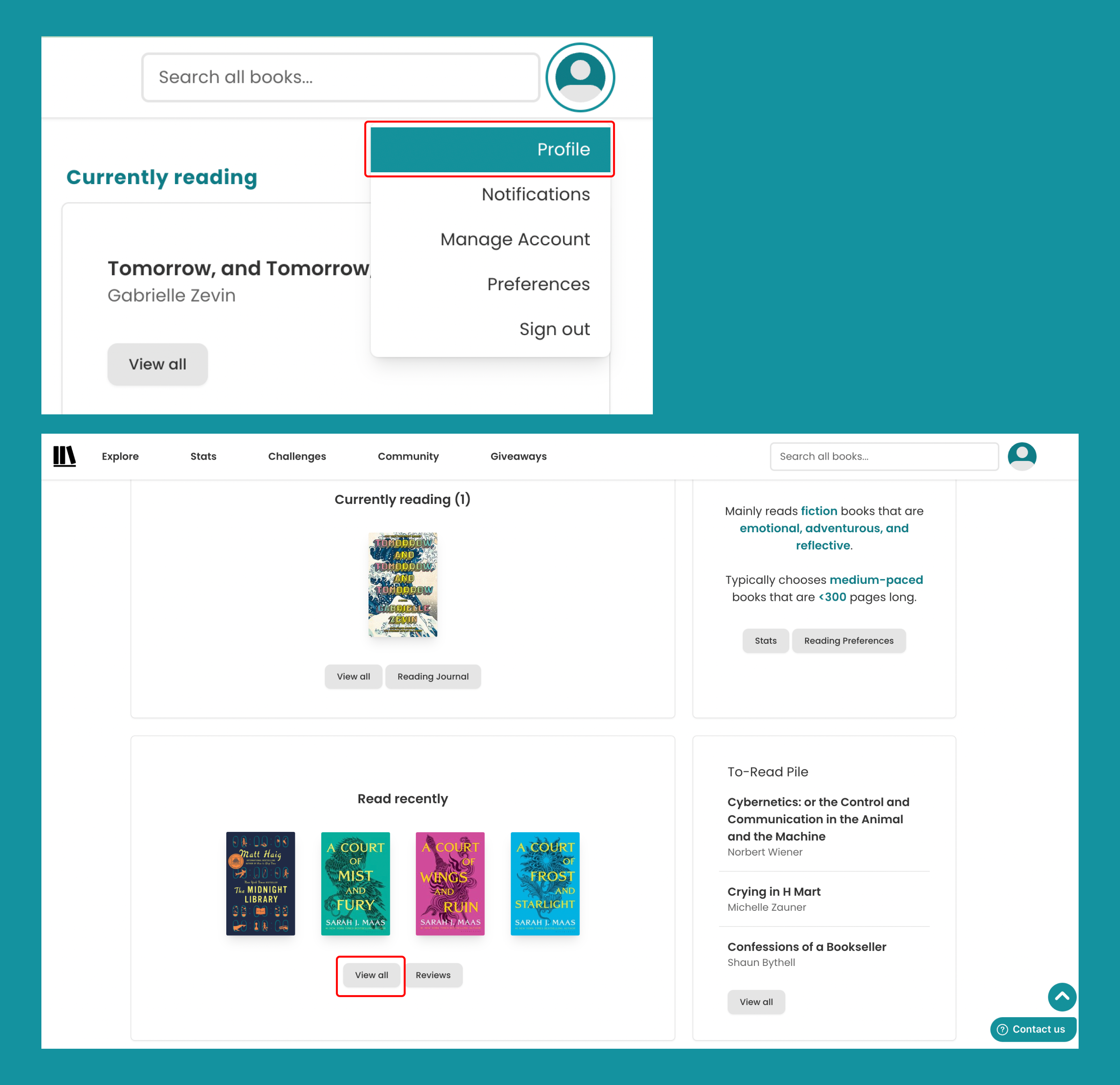
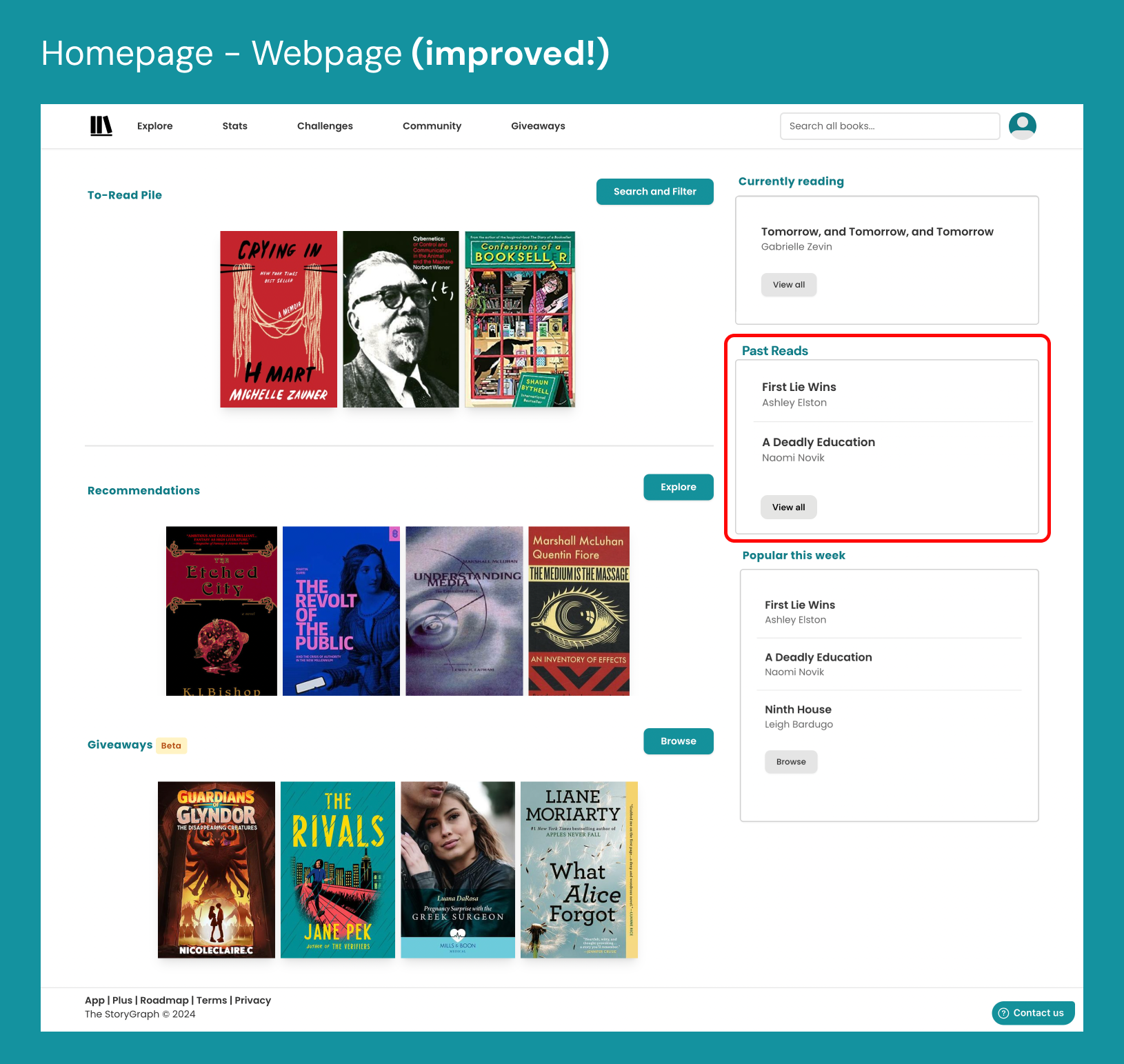
Though laid out slightly differently, both the mobile app and desktop view of the home page contain the following blocks: “To-Read Pile”, “Currently Reading”, Recommendations”, “Popular This Week”, and “Giveaways”.
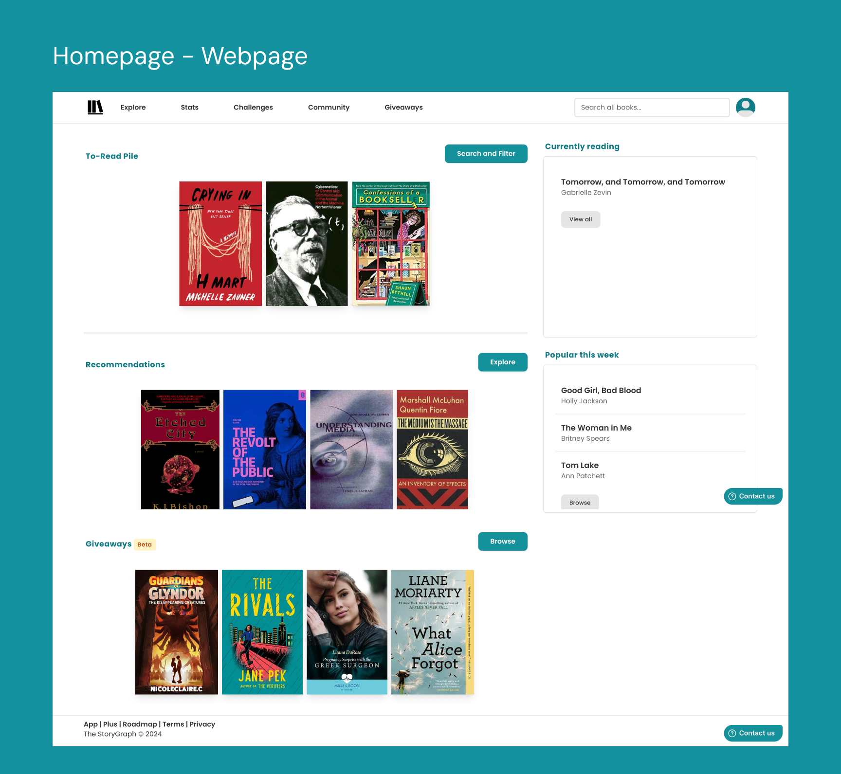
However, If I want to see a comprehensive list of the books I have marked as “read,” I would either have to:
- go to my own profile, find “Read Recently” with a scroll-down, hit “View all,”
or,
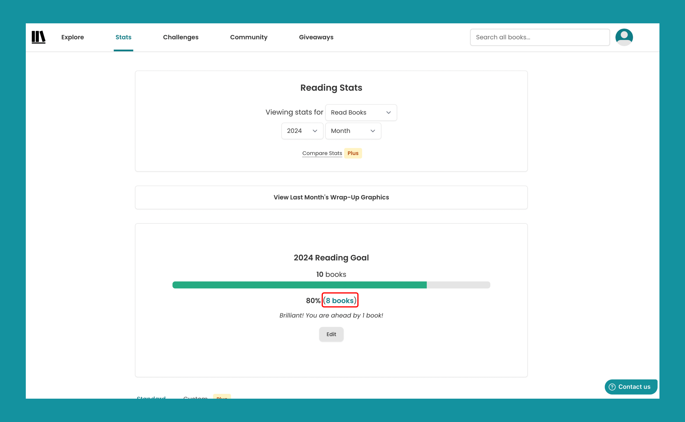
- go to “Stats” and click the teal-colored text indicating the number of books I have read, which I did not know is clickable until today, after a whole year of using the platform.
As I understand that StoryGraph affords me to track the books I have read, my mental model is that I should be able to directly view my past reads with ease. In reality, it is rather difficult to discover this function. In addition to the lack of discoverability, in both user journeys I find the signifiers to be less than satisfactory.
PROPOSED SOLUTION
As the problem primarily lies in discoverability, the simplest way to resolve this is to add the corresponding signifier! An example could be adding a “Past Reads” section to the homepage. In conjunction, the clickable portion within the “Stats” page shown previously could also be rendered more in the style of a button than text. This way, there would be multiple signifiers pointing to the library of books already read.
2. What does it do and why does it matter?
I borrowed On Earth We’re Briefly Gorgeous from a friend, miraculously finished the book and gave it back to them in a week. Time to log it on StoryGraph. Once I hit “read”, the teal block turned white, and a couple lines of gray texts appeared. Ok. Guess I’m done.
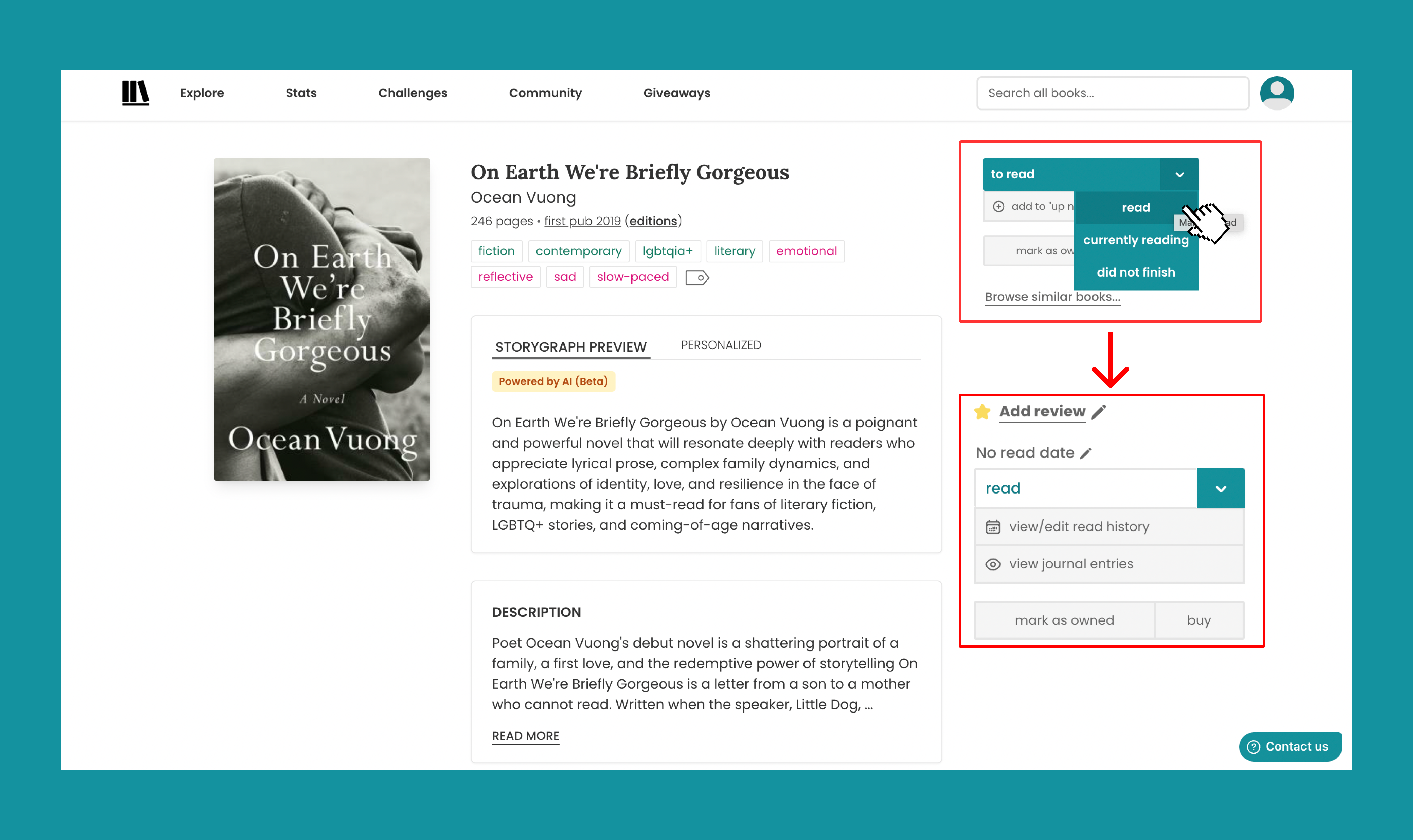
I expected the data related to this book to show up in my “Stats” of the month. It was also the only book I read this month. Lo and behold, it’s not there!

My mental model was that the action of changing the status to “read,” would be automatically dated. As in, StoryGraph would assume that I completed reading it on the day I hit the button. Realistically, I was not made aware that my mental model did not match the concept model of StoryGraph and that I must manually input the completion date. Nor did I know that without the date, the book would just be in a liminal space and not incorporated into my history of books read.
The gray pencil icon and text “No read date” that subtly appeared were not enough for me to discover that the reading entry requires further actions from me. I was not motivated to add the dates, as they do not appear to be necessary.
In this sense, this particular design lacks potent signifiers and feedback. As a user, I had no idea what actions were expected from me, what the status of that reading entry was, and how my actions would affect the ultimate purpose of retrieving insights about my reading habits. Much like Norman described in the book, even though I identified this issue in my early months of using StoryGraph, I had attributed it to my “human mistake” rather than the massive, unbridged gulf of evaluation the design creates.
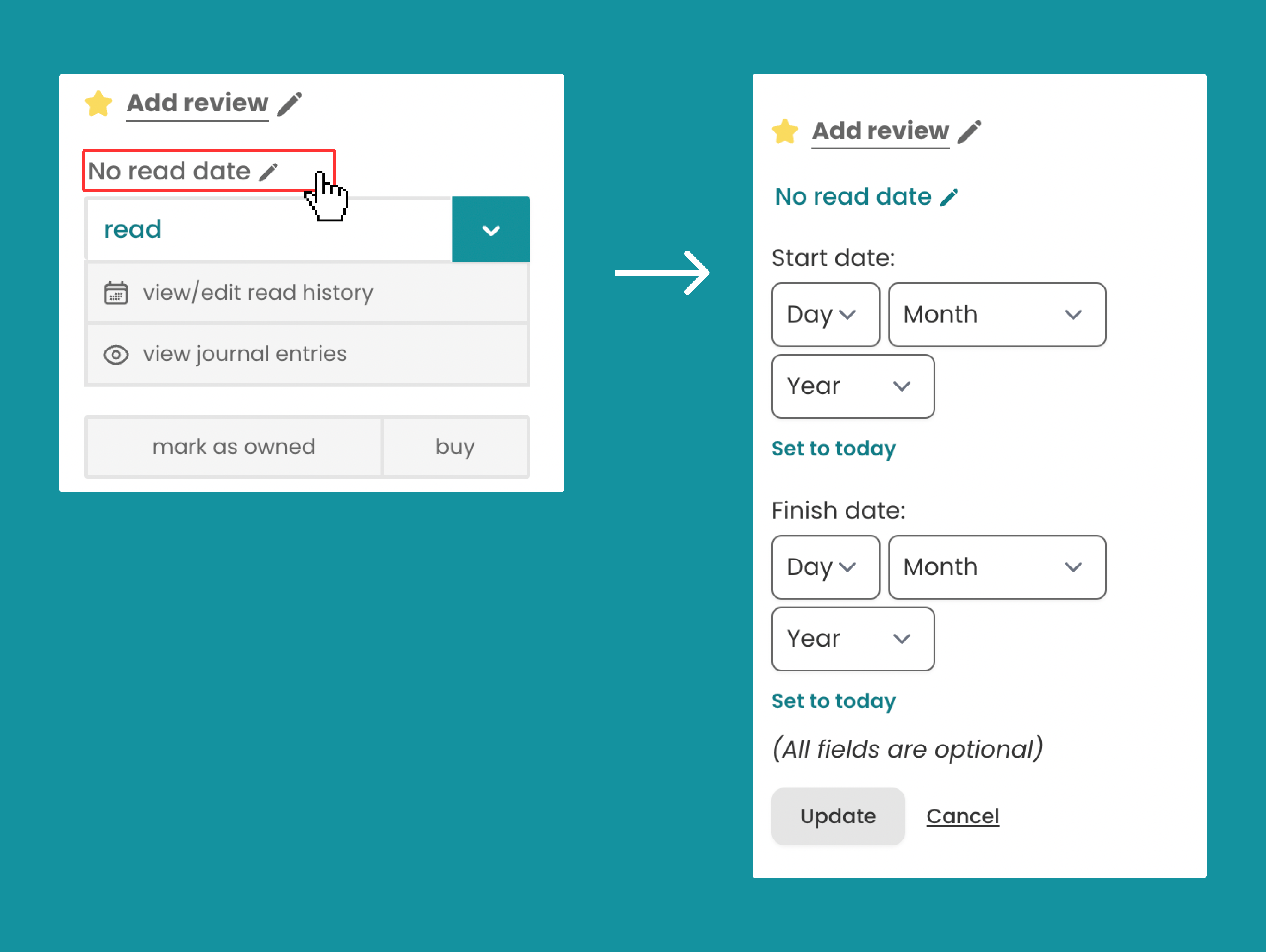
PROPOSED SOLUTION
To ensure the users are sufficiently prompted to perform all of the expected actions, signifiers should strongly suggest that the goal of “marking the book as read” is incomplete until an end date is provided. Here is my step-by-step solution:
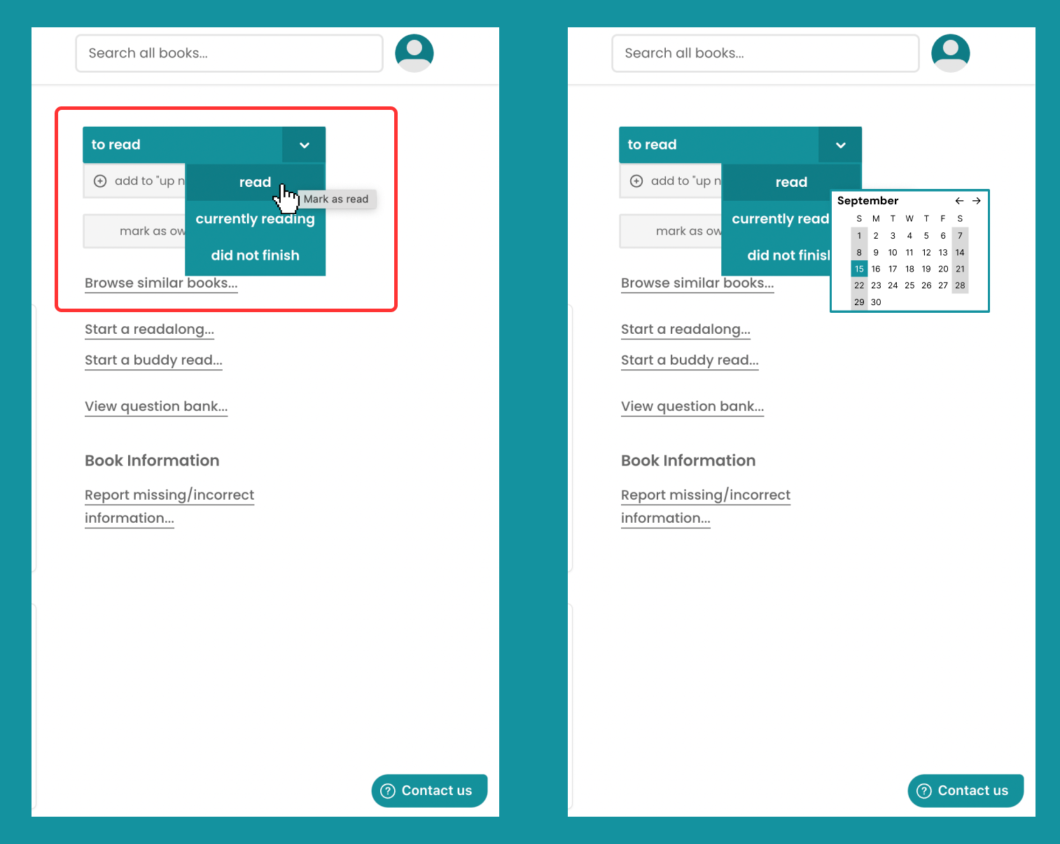
- The teal color button should not turn white upon the initial click.
- Instead, a pop-up calendar should appear, allowing for the users to select a date, preferable with accompanying texts indicating that they are inputting the date of which they finished reading the book (not shown in the mock-up below).
- After the date is selected, the button is then turned white.
3. Unclickable tags?
Let’s say I am in the mood of finding new books to read. To the “Explore” tab I go.
I see a list of books, but none particularly catches my eye.
That said, staring at the tags under All the Lovers in the Night, I wonder if I might be more interested in other books under the “literary” tag. I hover over the tag, only to find the text cursor appearing —- the tags are not clickable???
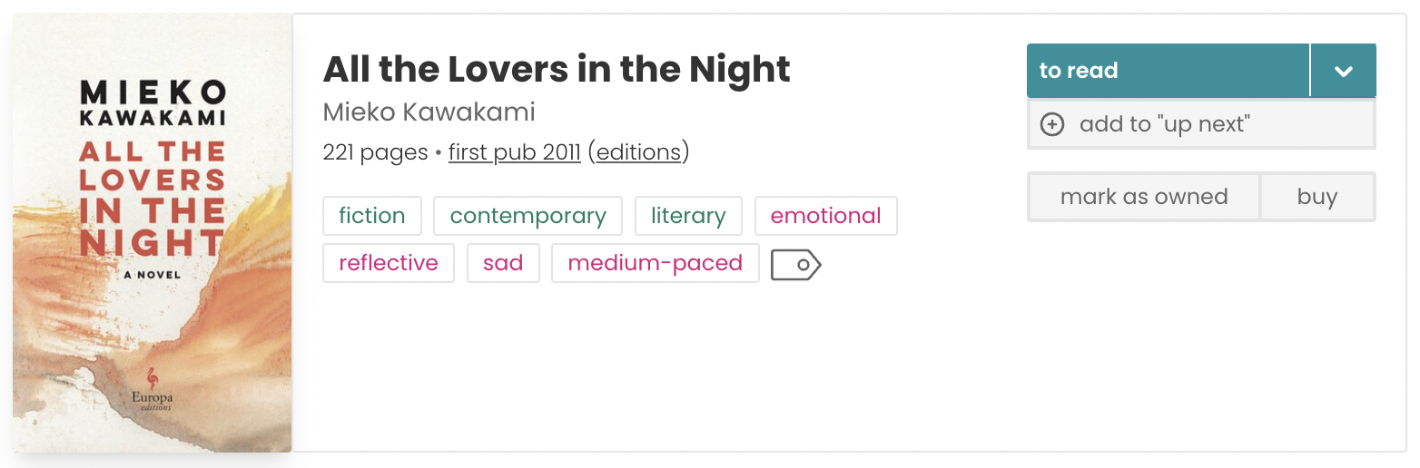
One of the main affordances highlighted by StoryGraph itself is that users can choose books based on the preferred moods, topics and themes. Directly relevant to this, the platform does allow users to “Filter all books” by a rather intricate system of descriptors.
In addition to the fact that these tags are already used to filter for books (only on a different part of the “Explore” page), it has also become somewhat of a convention/cultural constraint that these boxed tags are interact-able. Thus, it is entirely unexpected that users cannot use the tags under specific books to find other similar ones, potentially resulting in some level of frustration and disappointment.
PROPOSED SOLUTION
Make the tags clickable! Each click on the tag should take you to the individual page housing the books that contain this tag.
Conclusion
It should be noted that starting off as a one-woman-effort and currently managed by only three people, StoryGraph did not and probably still does not have the budget to carry out extensive evaluation processes with myriad inspection methods and rounds of user testing. Perhaps consequently, many of its obstacles concern the mismatch between the conceptual models of the developer and the actual users. Some signifiers fall short in pointing to the actions expected from the user, thereby weakening the discoverability and resulting in gulfs of evaluation.
Nonetheless, insofar as its general function, StoryGraph is indeed able to outperform many existing reading platforms. I definitely will continue using StoryGraph as it meets my needs. I also appreciate that the entire development process is extremely transparent (documented in its Instagram account), and that there is a designated page for feedback, bugs and requests!
Keep it up, StoryGraph!