Introduction
Threads, launched in 2023, is a social media service developed by Meta. Similar to Twitter, it allows users to post text, images, and videos. The home page displays popular posts based on users’ locations and content from followed accounts. This article focuses on the critiques of the Android Version of Threads, addressing three user tasks: following users, adding users to the feed, and reading comments.
Problems
Problem 1: Following users on Threads
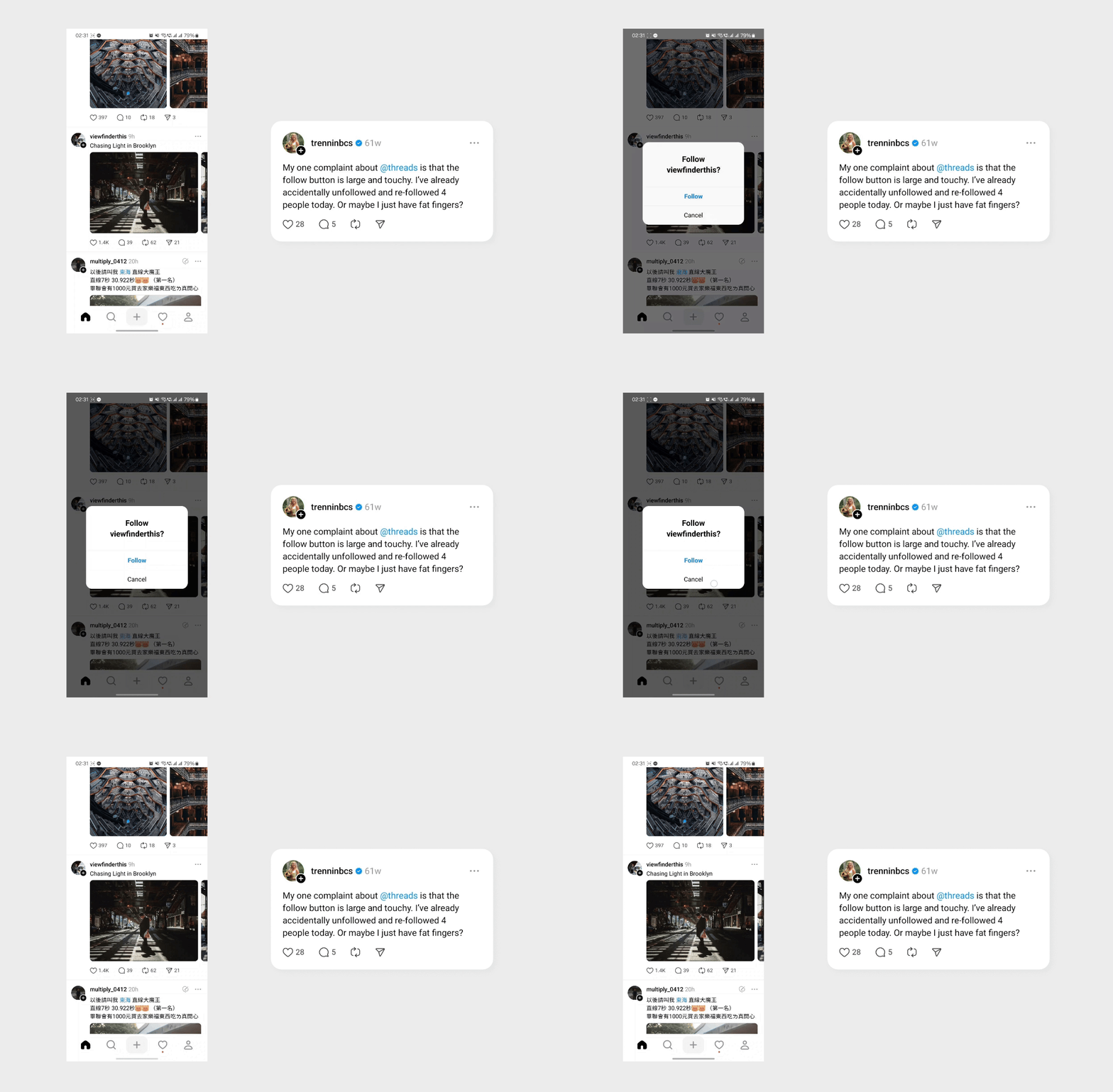
In Threads, users can directly follow others on the home page by clicking avatars. However, this mechanism is against the conceptual models users have established from other social media like Facebook, Instagram, and Twitter, where clicking an avatar means going to the user’s profile. Moreover, people usually check profiles before deciding to follow others. Threads’ following function results in users misclicking avatars and taking unnecessary steps.
Problem 2: Customizing feeds
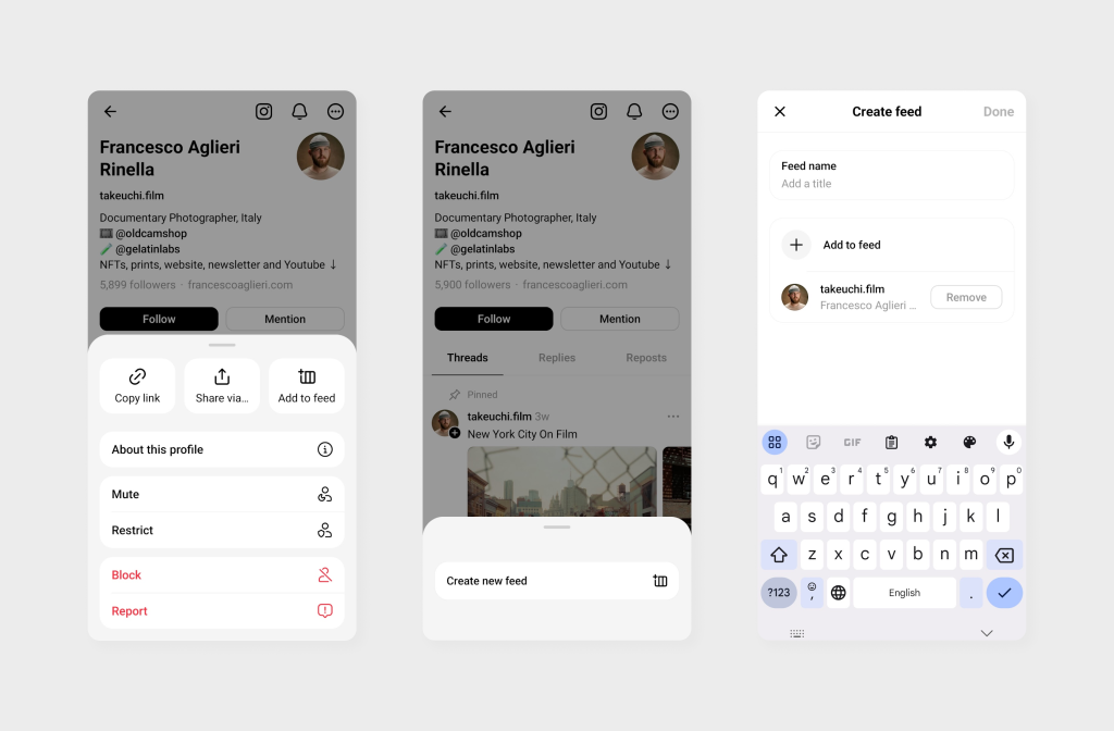
When clicking the more button on the profile page, the option “Add to feed” will appear. Since the term “feed” is not often shown on Threads and the icon served as the signifier is not clear, this option confuses users. Does feed mean the home page? What is the difference between “add to feed” and “follow”? Also, there is no feedback to inform users of the results after finishing the “add to feed” flow.
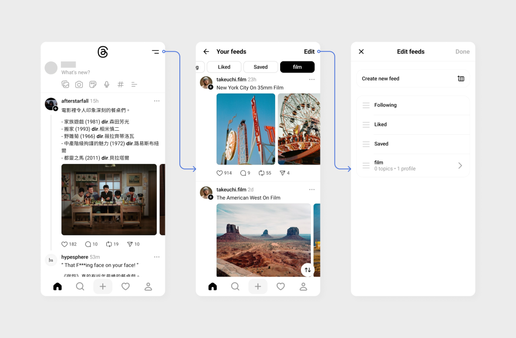
In fact, the feed function is hidden in the top corner of the home page. This function can help users create their own feeds based on chosen accounts. However, the poor discoverability of this feature and the oversimplified signifier lead to confusion for users.
Problem 3: Reading comments
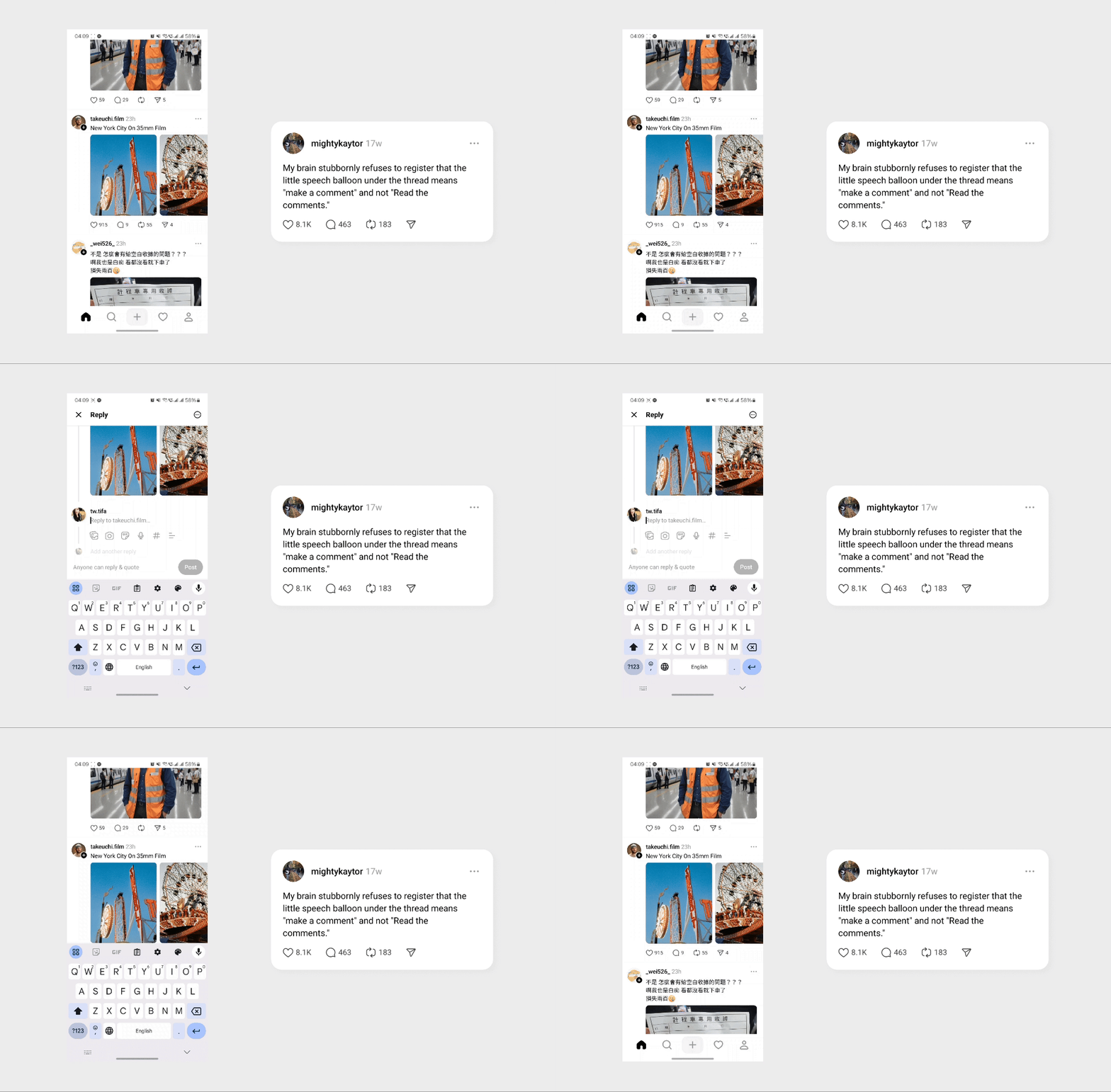
On Facebook and Instagram, users click the comment icon to read comments. However, on Threads, clicking comments means writing comments rather than reading comments, which is against users’ previous conceptual model. As a result, Users would misclick the comment icon for reading and need to close the writing section to go back to the post page.
Validation
To validate the identified problems, I interviewed 6 Threads users via phone calls. The participants consisted of 3 males and 3 females, aged 18 to 29. I asked them:
- Have you ever followed someone on Threads? How did you do that?
- Have you ever used the “add to feeds” function on Threads? If not, what will you expect after clicking this?
- How do you read comments? Have you ever had trouble with it?
83% of interviewees would check user profiles before deciding to follow (the other 17% don’t follow users on Threads), and half of them have misclicked the avatar when they just wanted to check the profile.
All interviewees never used the “feed” or “add to feed” function. 83% of them viewed the feed icon as a menu icon related to system settings. Participants have different guesses about the “add to feed” feature, such as sharing profiles, a function similar to follow, or making an account show up more on the home page.
66% of interviewees have clicked the comment icon when intending to read comments. Half of them have adapted to the design, and half of them still misclick the comment icon despite knowing the icon is for writing comments.
Solutions
Solution 1: Following users on Threads
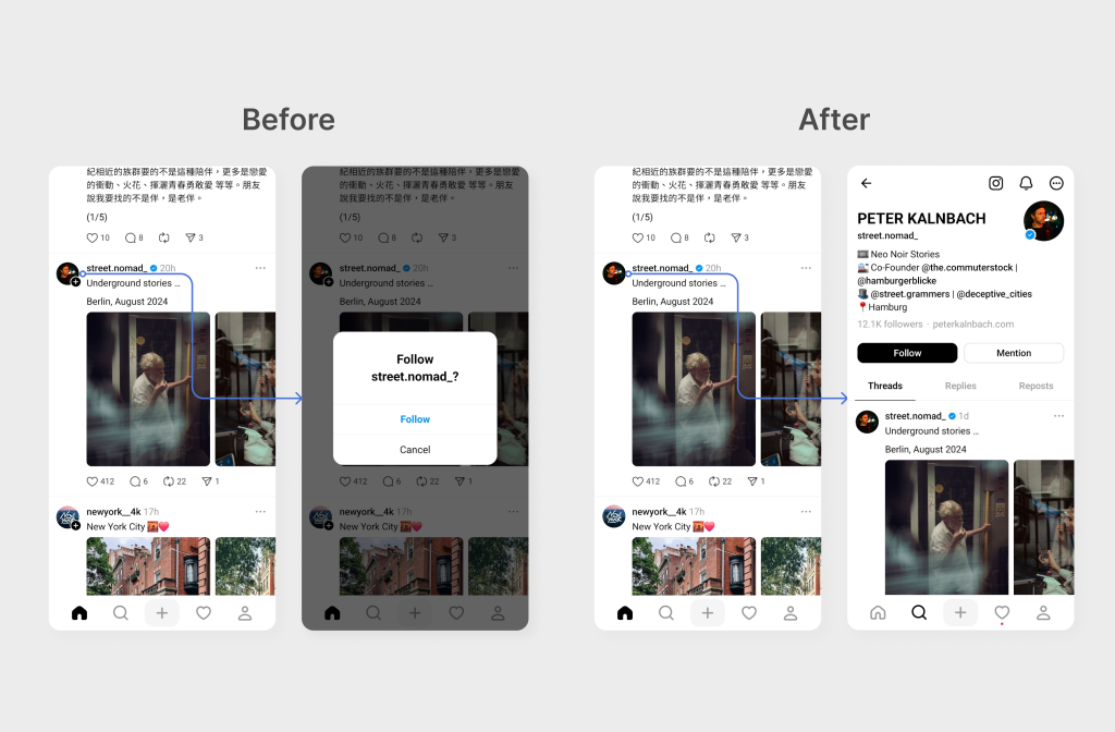
The avatar would link to the account’s profiles, aligning with users’ mental models established by most other social media.
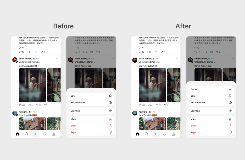
Based on the interview, most users prefer to check profiles before following someone, rather than directly following people on the home page. Therefore, on the home page, I move the following function to the more menu.
Solution 2: Customizing feeds
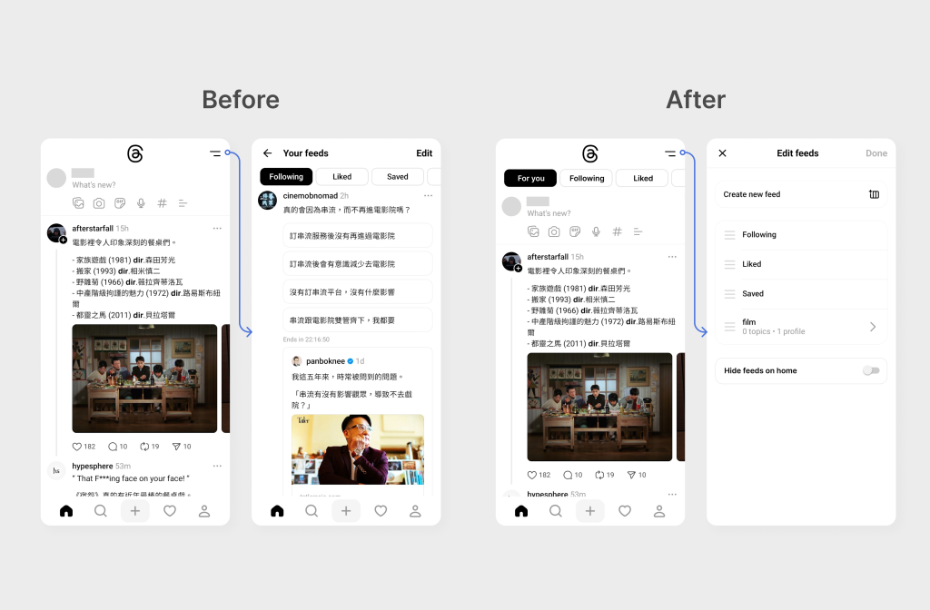
To improve the discoverability of the feed feature, I put feed tabs on the home page. The original feed icon would link to the feed settings page, aligning with people’s expectations about the icon based on the interview. I also add a new function, “Hide feeds on home,” to provide an option for users to hide the tabs on the home page, ensuring the minimalist style of Threads.
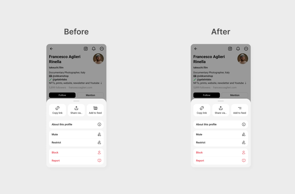
I change the ‘Add to feed’ icon to match the icon shown on the home page, which represents the feed settings. This change would create a stronger association between the ‘Add to feed’ function and the feed tabs on the home page, improving users’ understanding.
Solution 3: Reading comments
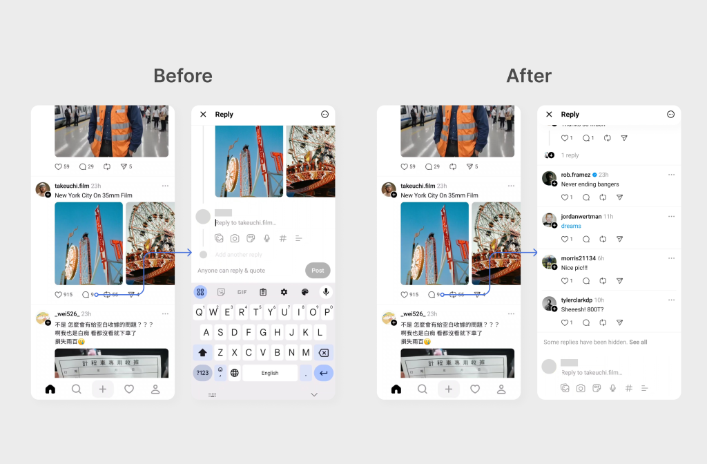
Understanding that users have a conceptual model of the comment icon as a reading signifier, and considering the importance of maintaining the original concept of quick interaction in Threads, I combine the reading and writing functions in the comment page. This design, similar to Instagram, would better correspond to users’ mental models while preserving Threads’ focus on user interaction.
Takeaways
Vague signifier leads to various conceptual model
During the interview, I found that when a vague icon, like “Add to feed”, shows, users would have different guesses about its function. The varying interpretations would lead to different conceptual models of how the app works. As a result, users would experience disappointment when they found that the app doesn’t function as they expect.
People blame themselves rather than design
During interviews and research, I found that many people would think themselves “too old for this new app” when they have difficulties using Threads. This aligns with Don Norman’s notion in “The Design of Everyday Things” that people tend to blame themselves when encountering problems with technology. However, it is our designers’ job to ensure a smooth user experience and make people’s lives better.
