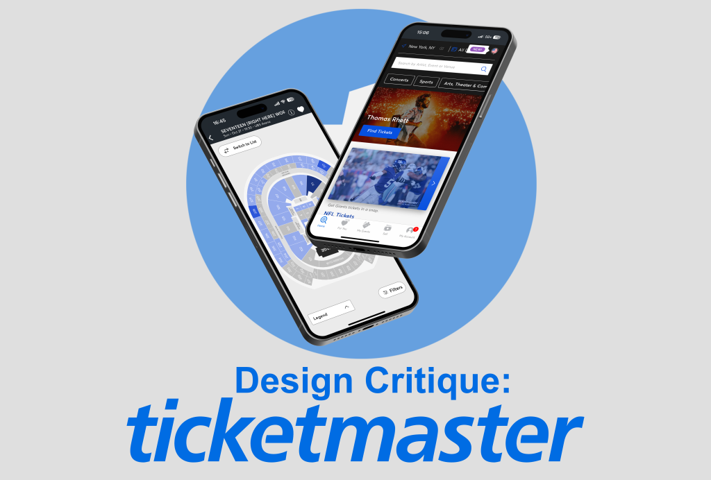
The Ticketmaster App aims to make ticketing for events and shows easy by allowing users to find events near them, select their seats, purchase or resell tickets, and store tickets all within the same app. Because the tickets are on the app, it’s convenient for attendees to show up and get in by just scanning their phones.
Seating Map
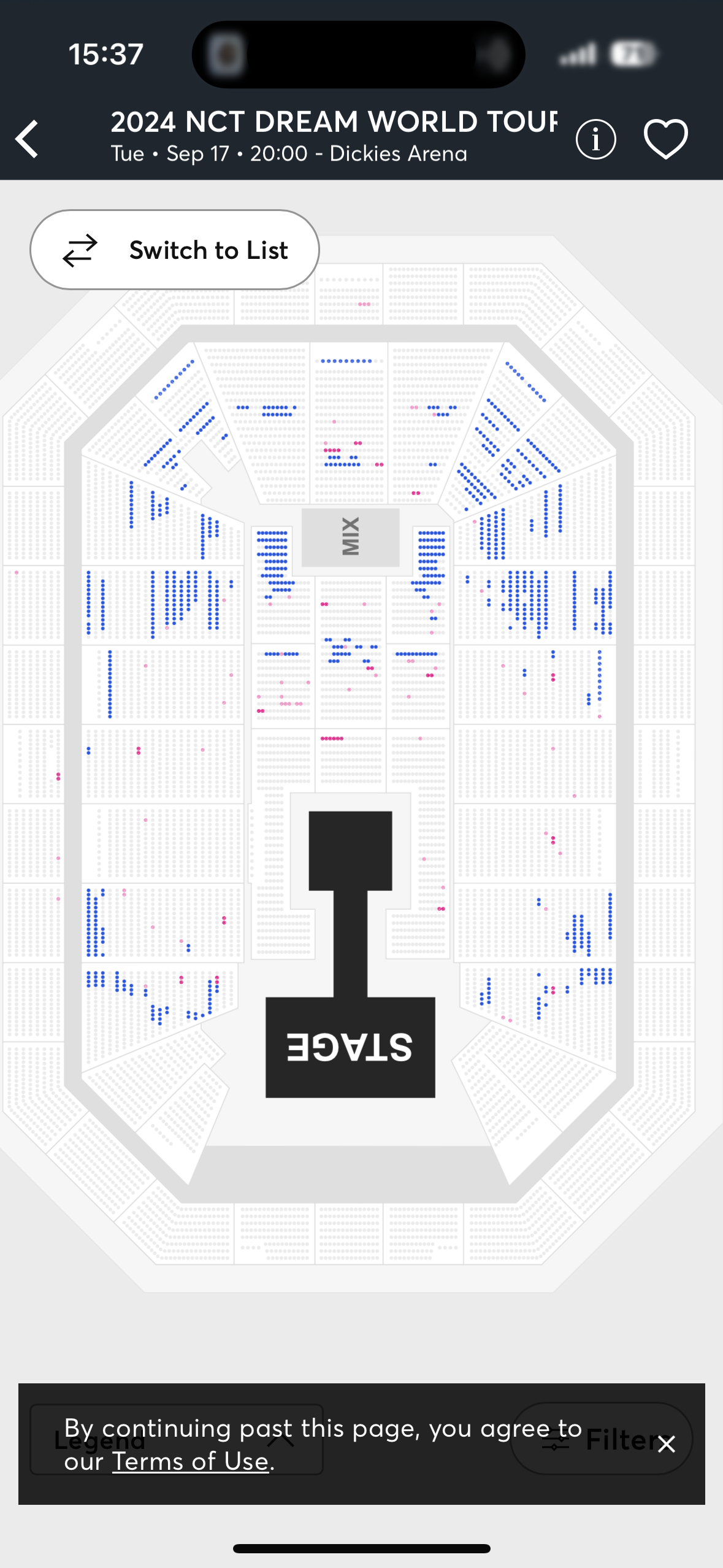
Ticketmaster allows users to see available seats and their prices on the seating map, but users can also utilize filter features to get more specific information, such as number of seats together or a price range. When viewing a specific event, users can choose to switch between list view and map view of the available seats.
The seating map is in accordance with the concept of principle of mapping since it provides users with a visual representation of what the layout of the arena looks like in real life so that they don’t have to blindly purchase tickets that may be in a different section of the arena than expected. The relationship between the map and the arena is a natural association as they mirror each other, seat for seat. Although the relationship between the seat map and the actual arena is not a perfect representation of what the user’s viewing experience will be, it gives the user an expectation of where exactly they can sit and how the price may change based on how close or far it is from the main stage. The only recommendation I would offer to enhance this future is to incorporate pictures of the stage from the seat. Typically when buying tickets, I use Ticketmaster and A View From My Seat, an open source resource that allows users to post and see what a stage view would look like from a particular seat or section of the arena. Adding a similar feature to Ticketmaster would help strengthen the natural mapping a user has with the seat map as they will be able to see what the actual seat would look like in a show and how much of the stage they would be able to see if they were to purchase it. It would also make it easier and more convenient for users so that they don’t have to look for another resource to see what the viewing experience actually looks like.
The seating map also utilizes signifiers to show which seats can be selected by the user and what the status of the seats are. The unavailable seats are “greyed out” to show that they are taken and cannot be interacted with by the user, but the available seats are shown in color– either blue or pink. If the user is curious about what the difference is between the colors, they can check the legend in the bottom right corner where it informs them that there are icons to show accessibility and, that grey indicates unavailable seats, blue indicates available seats, and pink indicates a verified resale ticket. Without these signifiers, users would need to manually check each seat to see which were available or check the list view of available seats and then crosscheck with the seating map to find where the available seats are. They can also utilize the seating map to quickly see whether the seats near them are taken or not too. Once the user clicks on a seat, additional information is given in the pop-up, so they know the exact location of that seat and the price.
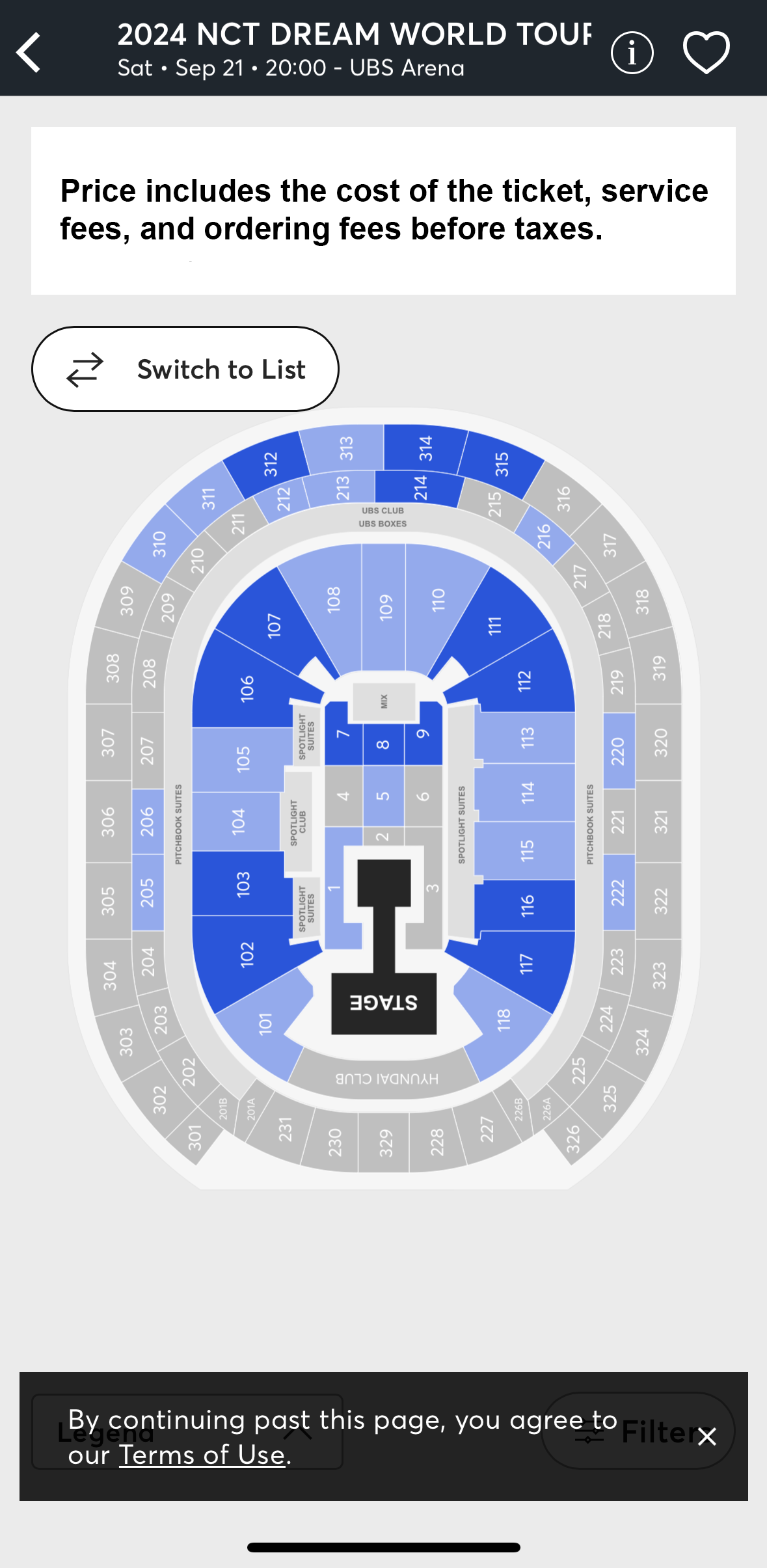
All-In Pricing & Fees
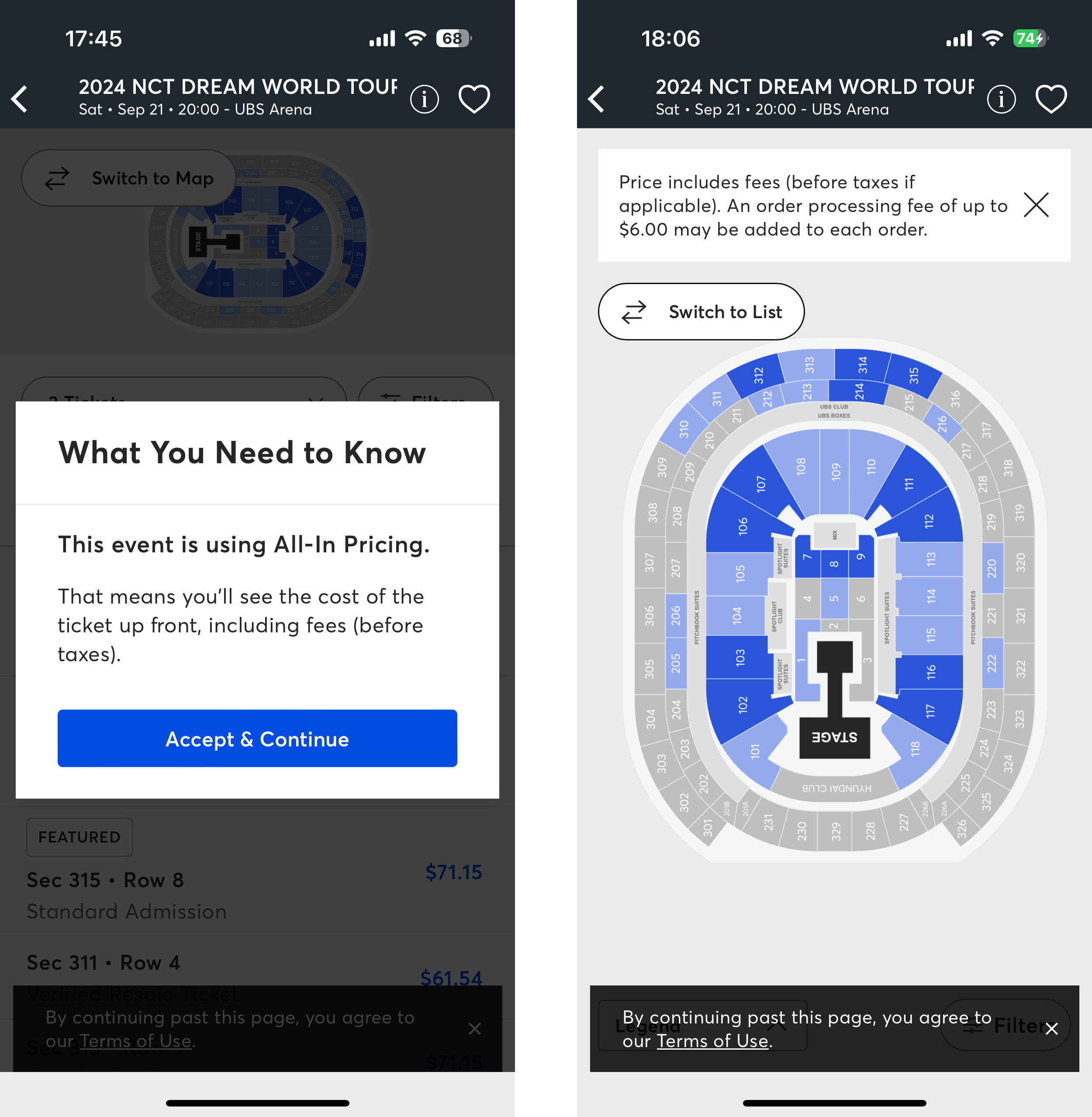
One aspect of Ticketmaster that could be improved is the consistency and visibility of informing the user of the added fees. Ticketmaster does charge a service fee when a user purchases tickets, but when a user first looks at an event, the cost on the screen doesn’t always reflect the actual price people have to pay. Sometimes Ticketmaster informs users through a pop-up that the event is All-In Pricing (left screenshot), meaning the cost of the ticket on the screen includes all of the fees. However, on the other hand, there is another pop-up (right screenshot) that occurs even in an All-In Pricing event that informs the user that there could be added ordering fees up to a certain amount of money. This can be confusing to the user since they’re first told that all included fees are already in the price of the ticket, but then they are also told that more fees may be added to their ticket price. Furthermore, the pop-ups are also able to closed, which decreases the visibility of that information as users can just click it away and forget about it, forcing them to use their working memory. To remedy this issue, I would recommend changing the terminology of All-In Pricing or informing the user to make it more clear that it only includes service fees and the value of the ticket. Another option would be to include the ordering fee in the price and continue to use the current All-In Pricing terminology. I would also put all of this information in a spot that is continuously accessible to the user before they make their purchases to increase the visibility of this valuable information.
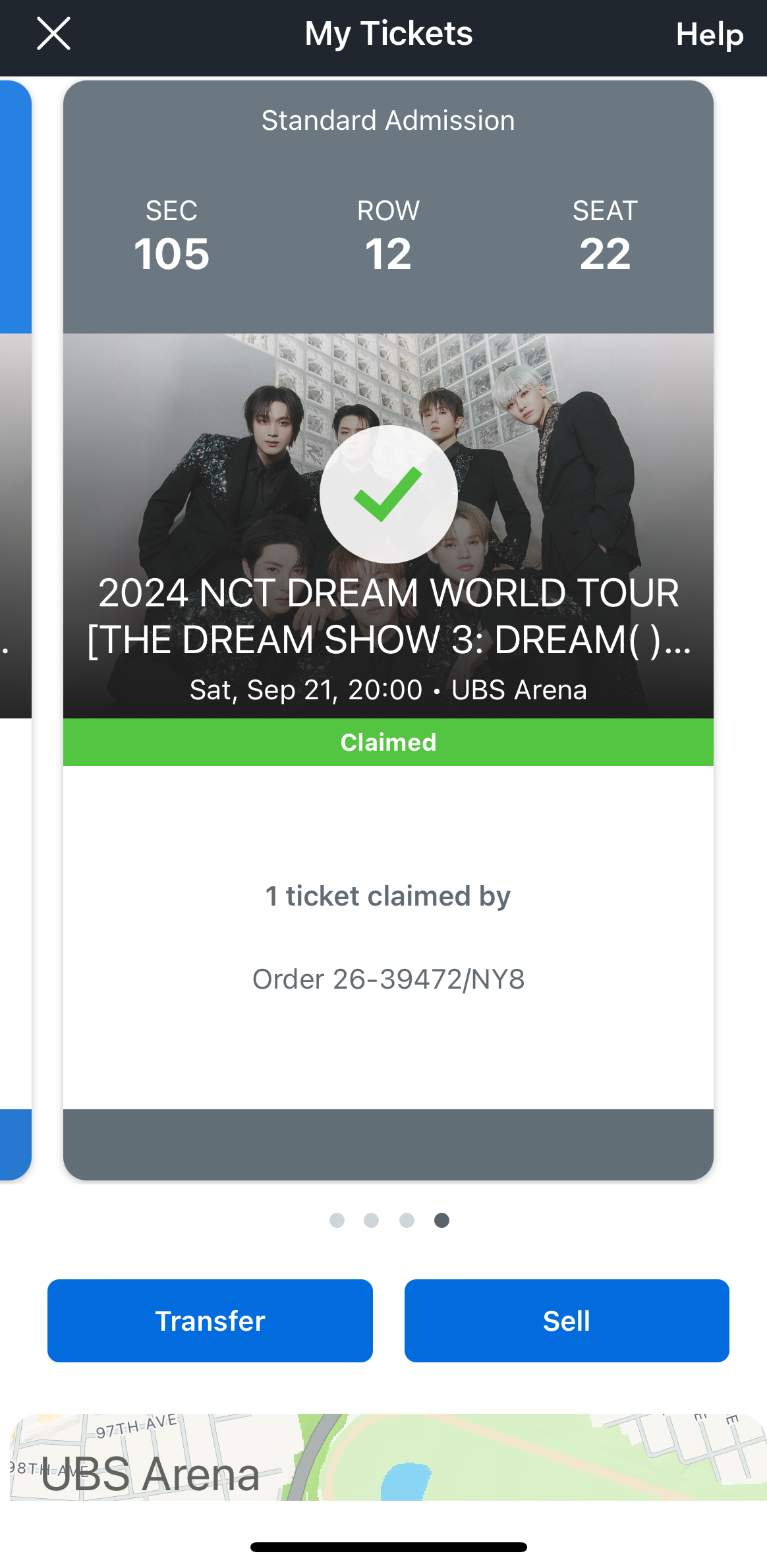
Transferring Tickets
Ticketmaster also allows users to buy tickets and transfer them to other members in their party or sell them. This can be done from the My Events page where the user’s tickets can be found and they can click into individual tickets. Once on the ticket, they can transfer or sell it with the 2 buttons beneath the ticket. Transferring a ticket requires the other party’s contact information for the ticket to be sent to. Once the ticket is sent, the other party must claim the ticket. This process is a good example of feedback, which is especially important in this process if the ticketholder is not in contact with the ticket receiver or doesn’t know them personally. When the ticket buyer transfers the ticket, they are sent an email confirming that the ticket was sent and that it’s pending being claimed. At the top of the email, there’s a bar showing the progress of the transaction. When the receiver claims the ticket and the buyer is sent another email and the bar progresses. These emails and the progression of this bar gives the users confirmation of their actions and the actions of the other party in the transaction.
Once the transaction is complete, the ticket buyer can check their tickets in the app and see another confirmation that their ticket was transferred and claimed successfully. Because of the multiple confirmations Ticketmaster gives as feedback, the user never has to worry about whether their actions were completed or successful– and if they do, they have multiple places they can check for reassurance!
Conclusion
Ticketmaster is a very successful ticket selling platform for a reason– it’s designed to do all of the important functions of attending events all in one place with its capabilities to buy, sell, and store tickets all in one place. However, while there are many ways that all platforms and apps can improve, one of the main principles designers at Ticketmaster should consider is the visibility of their information regarding fees and additional costs. On the other hand, the Ticketmaster app gives a strong showing in the principles of mapping, signifiers, and feedback, which is why it’s such a strong contender in the world of ticketing platforms.