Imagine stepping into a luxury camping tent, where you have a comfortable mattress perfectly made out for you, while listening to the sound of your campfire and the forest, as you drift away into ultimate relaxation. That’s the essence Tide aimed to capture by integrating sleep, meditation, relaxation, and focus for better physical and mental care. This blog will critique the design aspects of the Tide app based off concepts mentioned in The Design of Everyday Things – by Don Norman and How Artifacts Afford – by Jenny Davis.
For the sake of this critique, I’ll only be focusing on the Napping and Sleeping user journeys on the app.
Launching the app
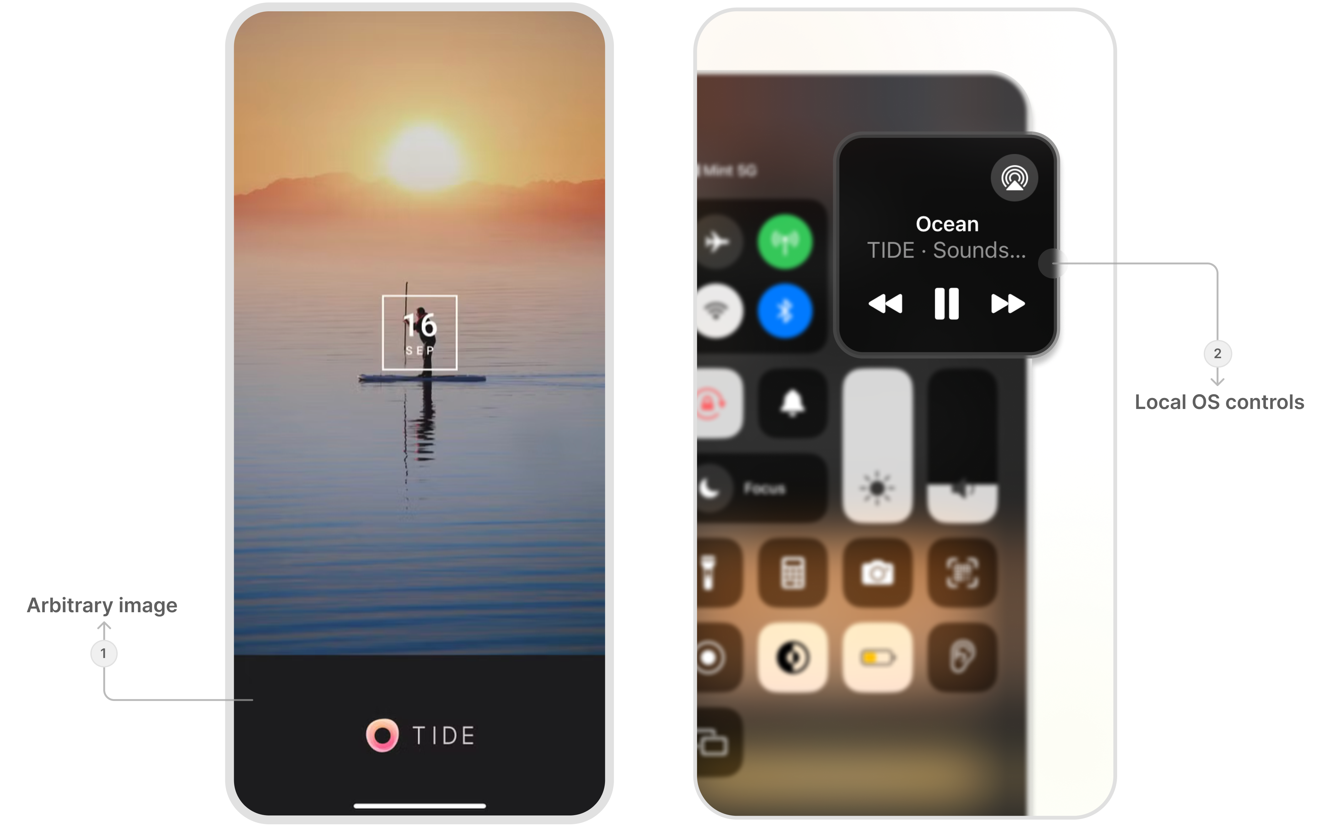
Upon launching the app for the first time, users see a splash screen displaying an arbitrary image (1) along with the date. This experience is seemed even more disorienting when a background music began playing automatically on this screen.
The audio feature is extremely confusing because of the absence of any visible controls or feedback. Inspecting more closely, I discovered that the music is managed through the local OS control center (2) rather than within the app. This deviates from common user expectations and mental models.
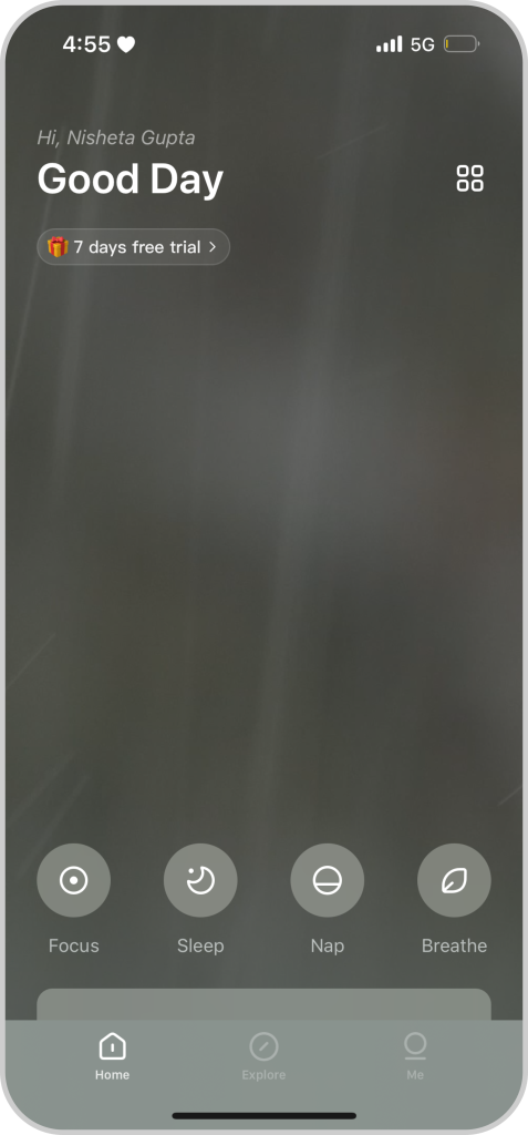
The Home Screen
The Home Screen clearly conveys the four primary affordances of the app—Focus, Sleep, Nap, and Breathe.
The background of the homepage features a dynamic rainfall effect which is accompanied by a rainfall sounds. This integration of visual and auditory elements effectively taps into visceral processing—the instinctive, emotional response that occurs at a subconscious level, giving the user a sense of calm and peace.
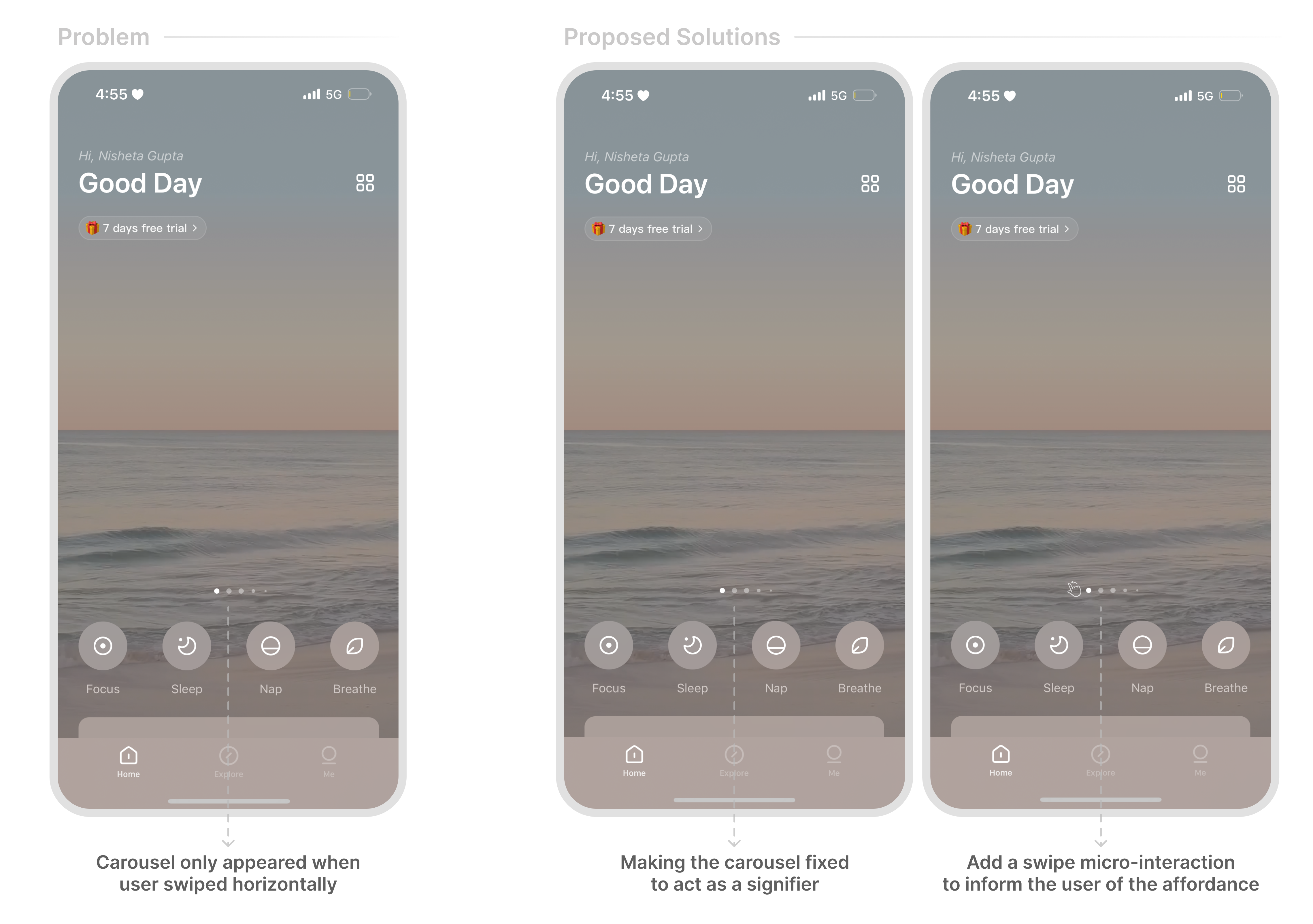
On the homepage, users can also swipe to change the dynamic effect and sound, but this interaction is not very intuitive. The carousal only appeared if a user attempted to scroll horizontally, thus acting as a hidden affordance due to a bad signifier.
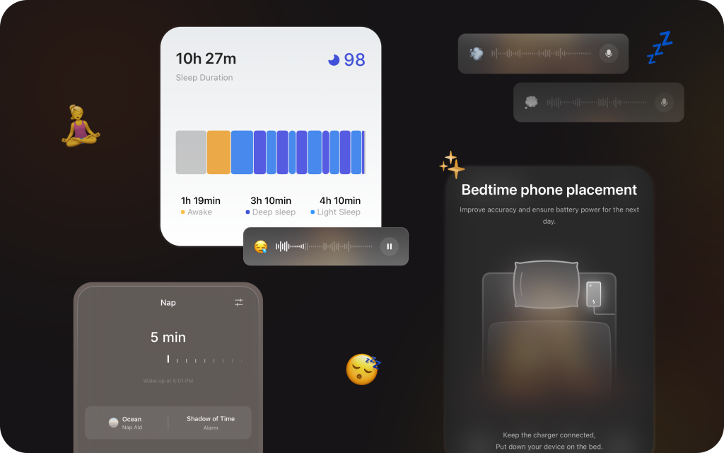
Taking a nap
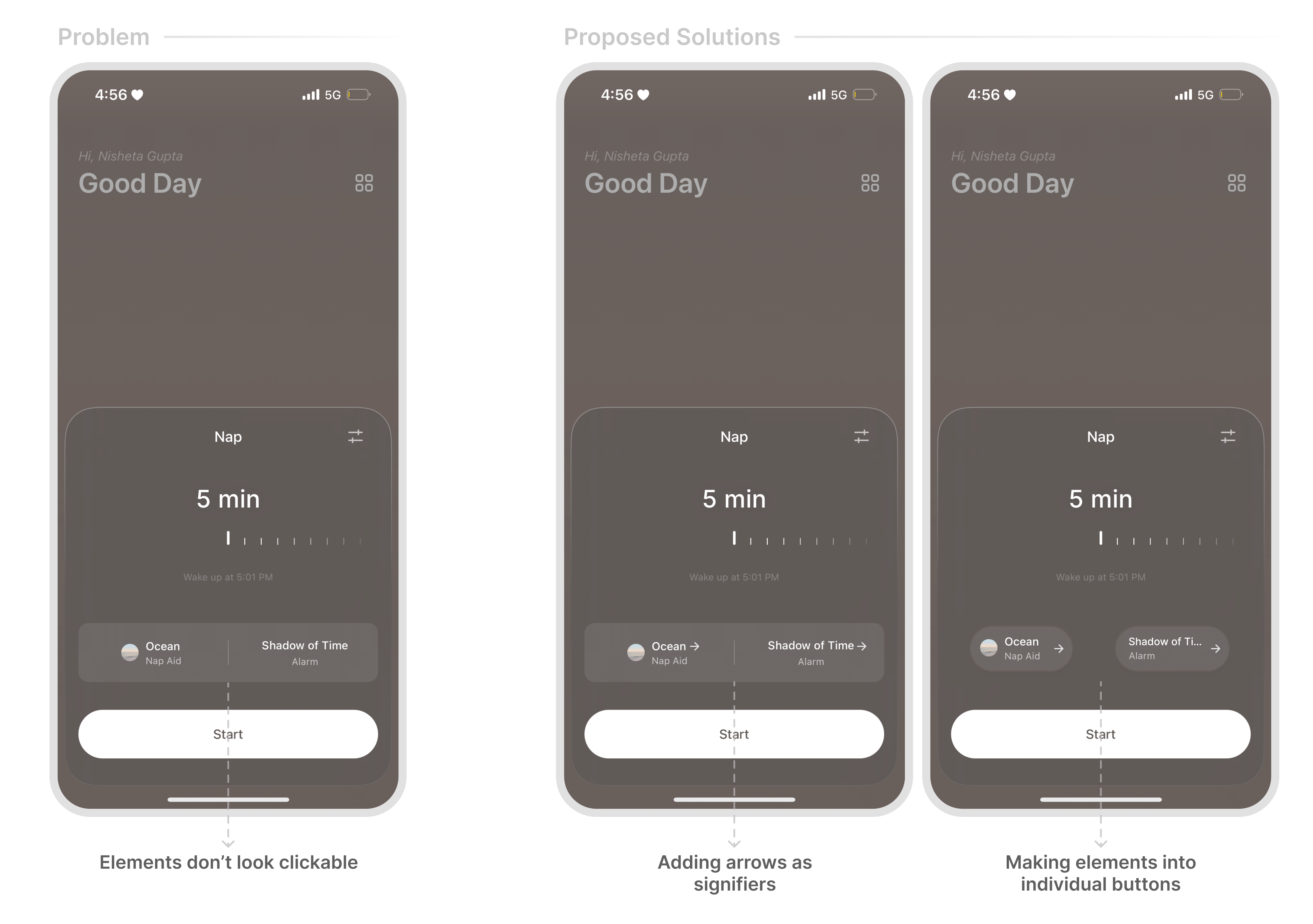
The horizontal time selection makes it very easy to set a nap duration, enhancing user convenience. However, the signifiers for changing the nap and alarm music don’t clearly indicate they are clickable. Users might not intuitively recognize these elements as interactive features, hindering the communication of the designers’ conceptual model.
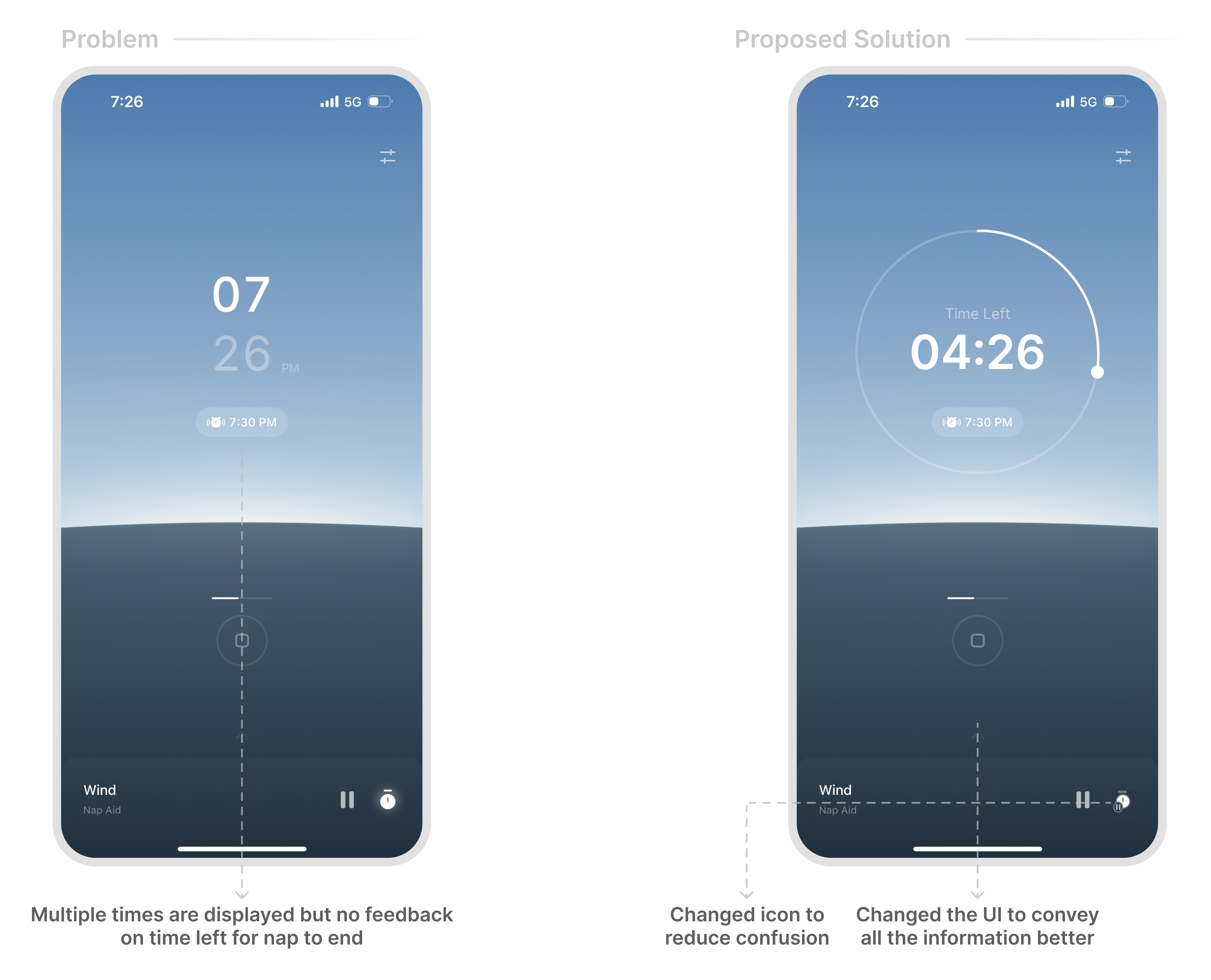
When the user starts a nap, they’re able to see the current time and the time when the nap ends. However, since most timers typically show the amount of time left, this approach may not align with the user’s conceptual model. The app is not able to convey the nap duration, widening The Gulf of Evaluation.
Users can also pause the background sound or set a time for it to stop automatically. However, the timer option is represented by an alarm icon nested within an ongoing alarm, which does not serve as a clear signifier.
This screen discourages users from stopping a nap by requiring them to long hold the stop button, preventing action based slips. If a first time user clicks on the button, a progress bar is shown as a feedback to indicate that they need to long-hold this button, showcasing designs to minimize error.
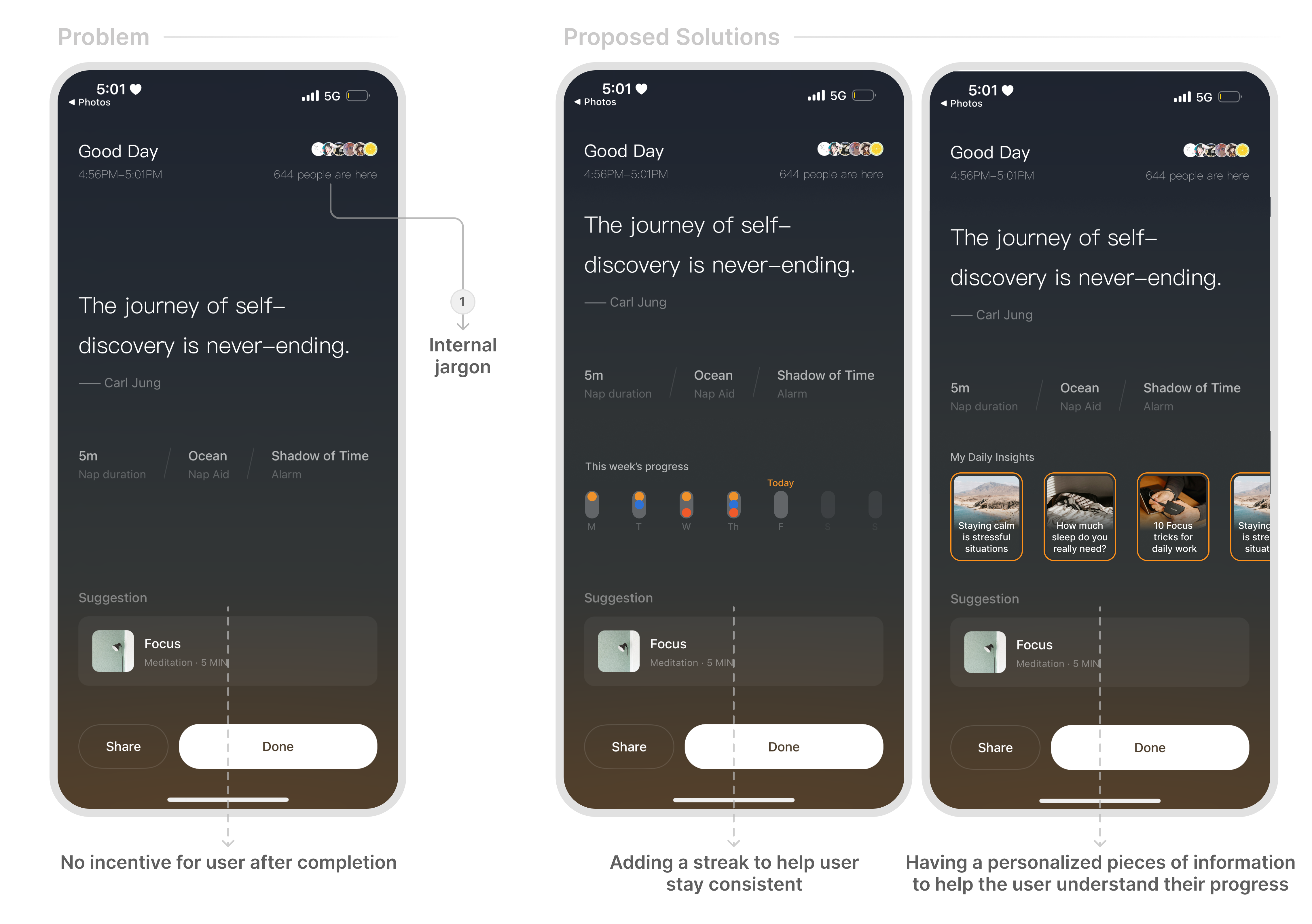
At the end of a nap, the app automatically logs the session and stores it in a tracker within the user’s profile. However, this tracker is not shown at the end of the nap, rather the user is expected to go their profile and analyze their progress. This could be shown in a better way by creating a conceptual model of streaks to help user understand where they stand with respect to an average humans sleep requirements.
Here users also see the number of people with them (1). The lack of clarity in what this number represents fails to provide intuitive feedback. Users are left confused about the relevance and meaning of the information, which diminishes the intended social proof and overall experience.
Starting a sleep cycle
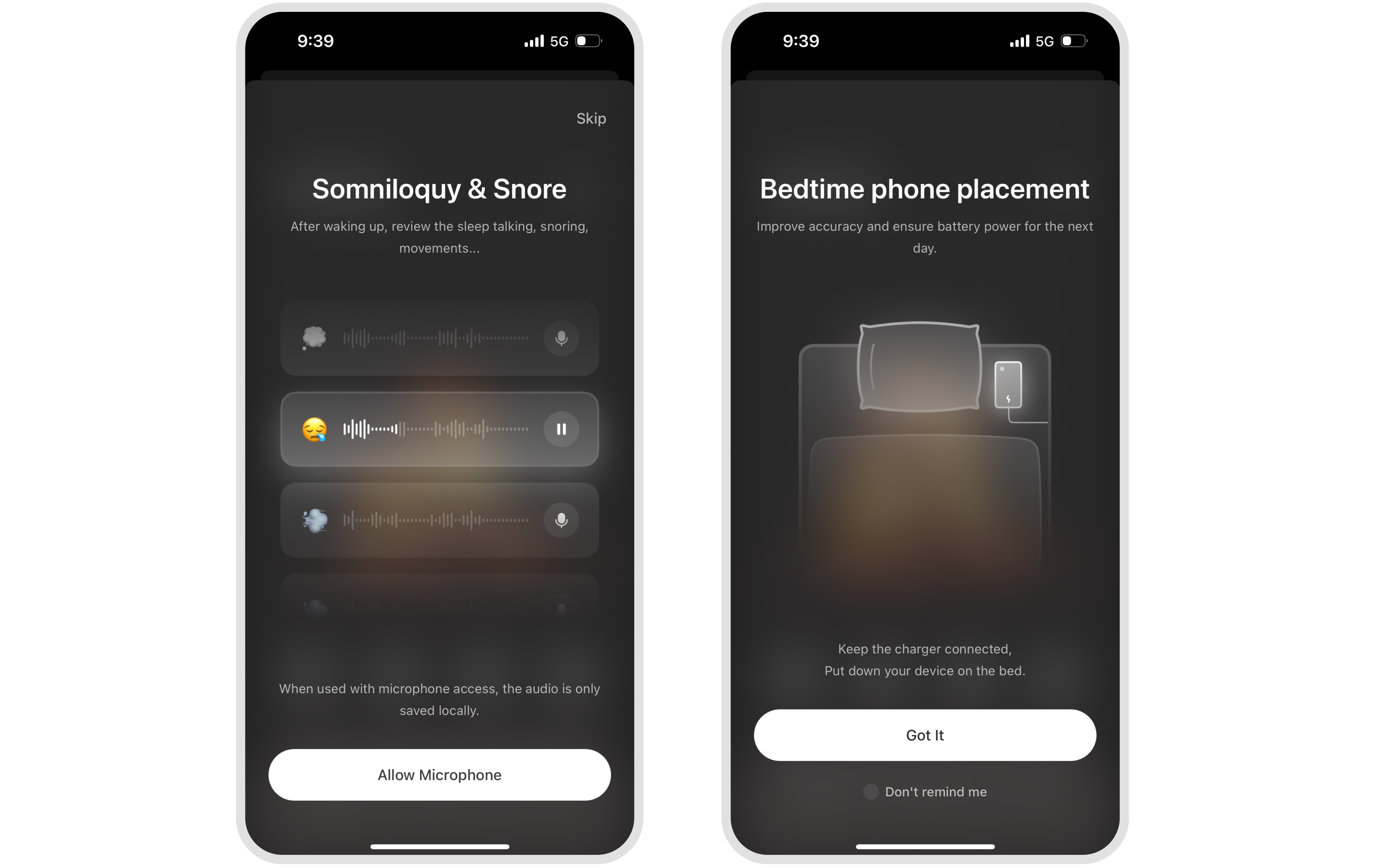
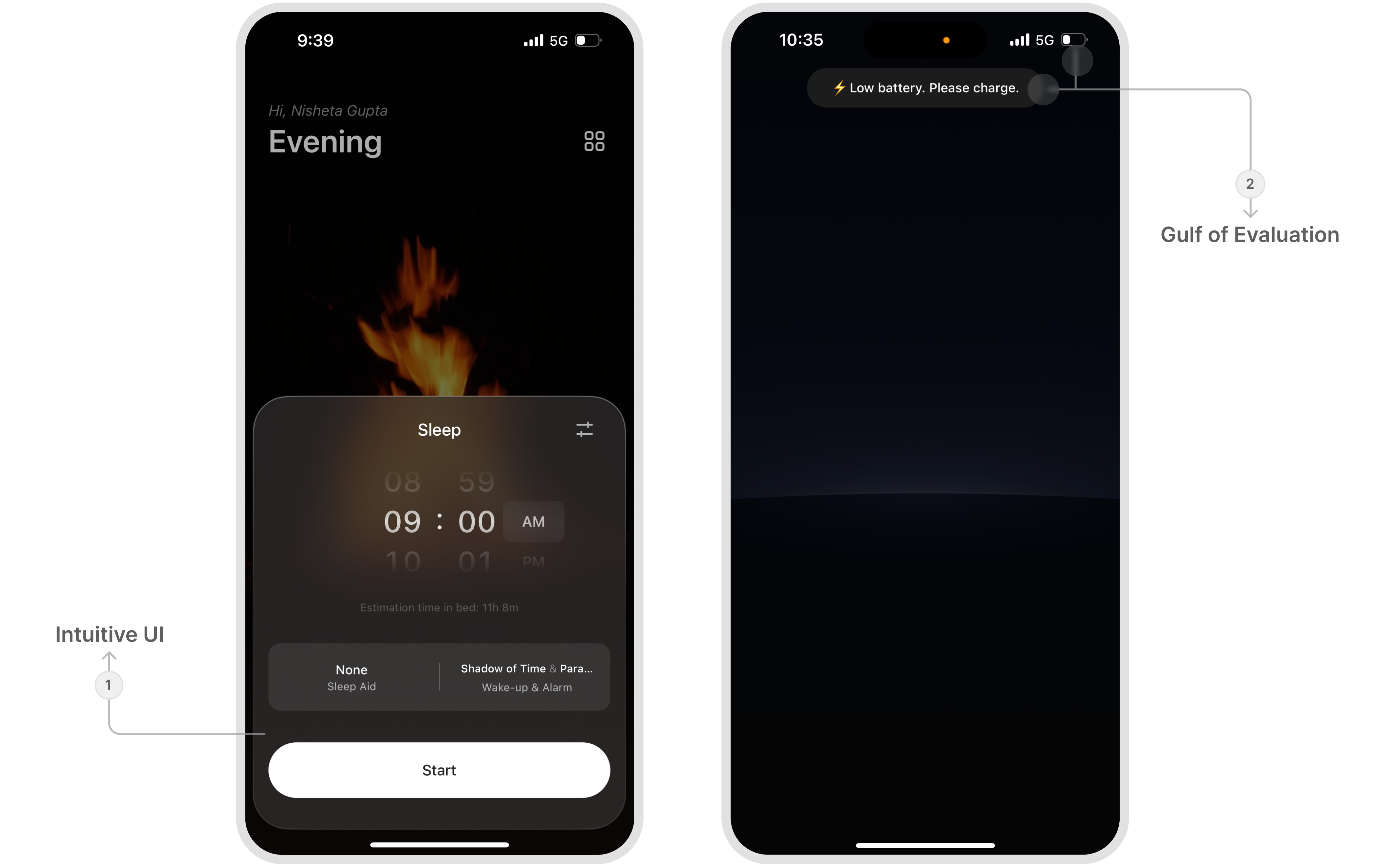
For a first time user experience, the app offers a concise onboarding. The introduction provides feedback on proper use of the feature, ensuring that users are able to bridge the gap between the gulfs of evaluation and execution. Providing guidance on the phone placement prevent errors that could occur from incorrect setup.
The process to set a cycle was fairly intuitive — like any other alarm app, users had to set a time to wake up in the morning (1). The app also has an interesting signifier letting me know that even though my battery was more than 20%, it was not enough for the app to record my sleep for the entire night. This could have been further improved with better copywriting to shorten The Gulf of Evaluation (2) for the user.
The screens presented at the start and end of the sleep cycle were consistent with the napping flow, making it easy for users to navigate.
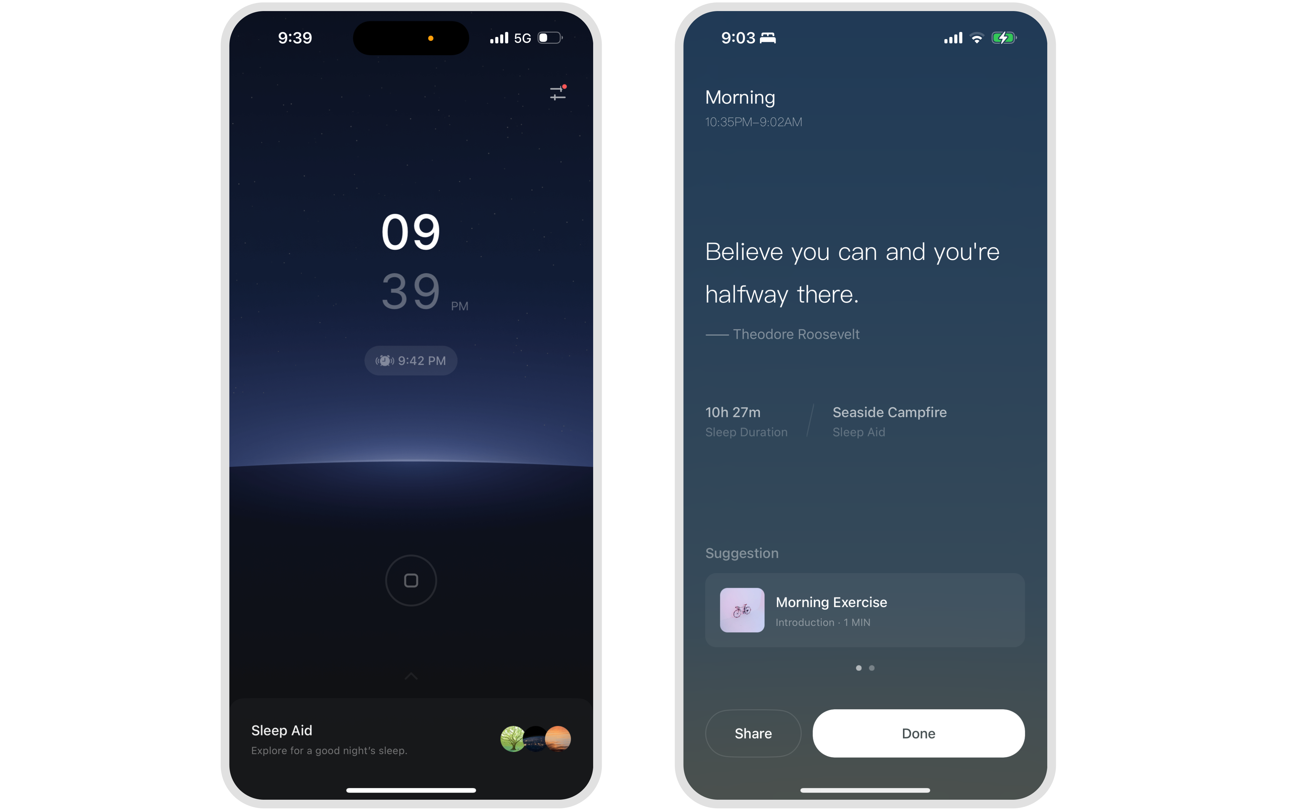
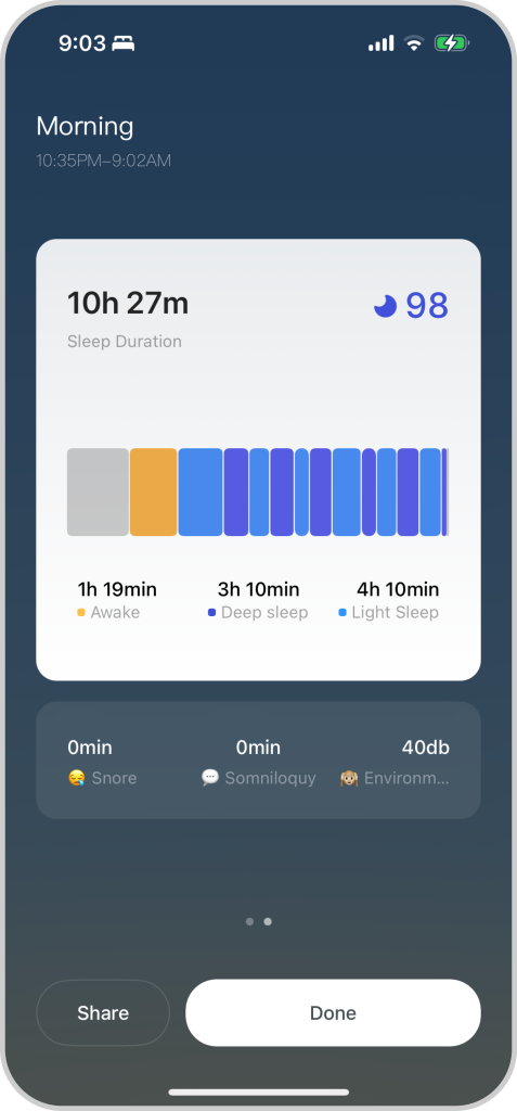
At the end of a sleep cycle, users see clear feedback about their sleep patterns, duration, and quality. The graphical representation affords exploration, encouraging users to get a deeper understanding of their sleep data.
The sleep cycle summary also effectively narrows both the Gulf of Execution and the Gulf of Evaluation by simplifying the interpretation of sleep data and clearly communicating the results.
Conclusion
Tide provides a promising and engaging experience with its thoughtful design features and user-centric approach, which can be further improved through smaller refinements. Improving the clarity of affordances, enhancing feedback mechanisms, and ensuring consistent and intuitive interactions will bridge the gaps in user experience. By addressing these areas, the app can align more closely with users’ conceptual models and enhance their overall engagement, making it a more valuable tool for fostering restful sleep and mindfulness practices. Till then, happy napping!