
Ultimate Guitar is primarily a crowdsourced catalog of chords and tabs. Musicians of all levels use its mobile app to learn how to play popular guitar, bass, and ukulele songs, improve their skills, and join a community of musicians. This is a design critique of the Ultimate Guitar iOS mobile app’s free tier.
Overview
- Let users filter sheet music
- Add feedback for rating sheet music
- User a skeuomorphic design to improve mapping of tuner buttons
Apply Filters to Sheet Music Versions
The user can use filters (difficulty, types of tuning, and if a capo is needed) while searching for a song to learn. Filters are easily discoverable at the top of the Explore page, and the signifiers are clear. Once users select a song, the song page will show a list of different sheet music versions.
Issue
At the individual song page level, all sheet music versions are shown; versions that do not match with the selected filters are displayed. For example, Yellow by Coldplay was filtered as an intermediate song with standard tuning. However, one version is listed as a novice level, and the other has non-standard tuning.
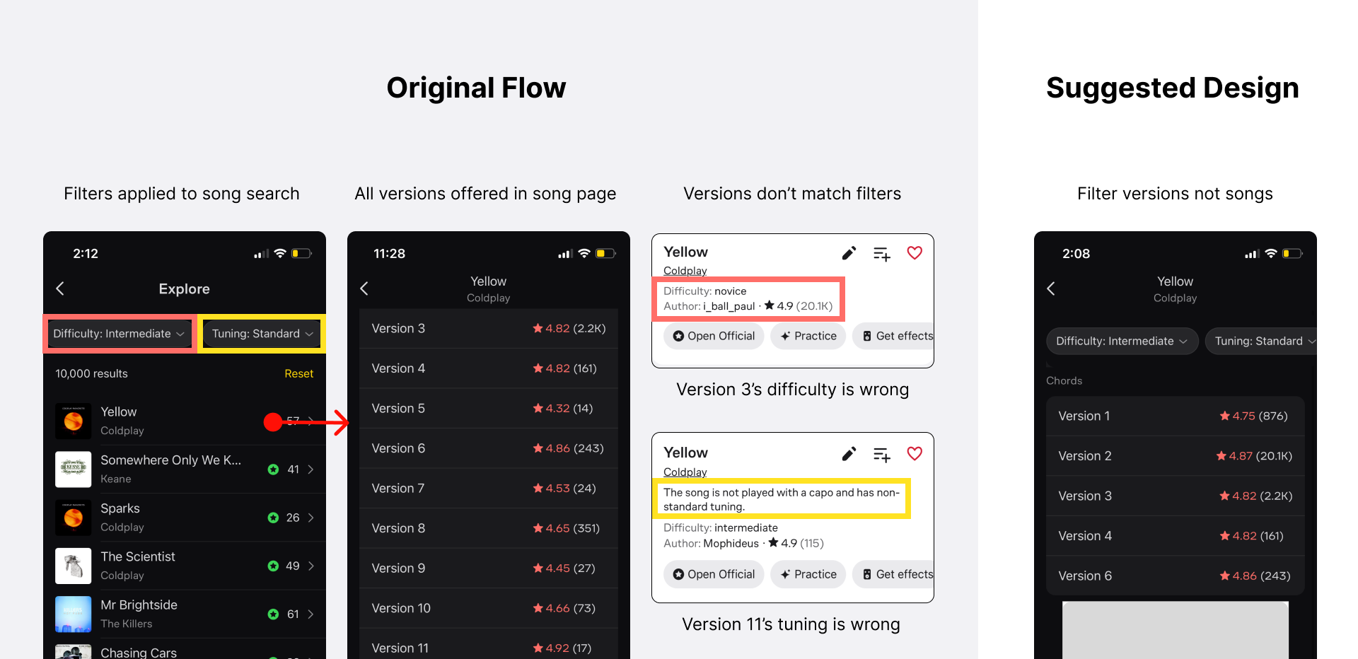
This issue violates the user’s conceptual model of how filters work. Some filters like difficulty, tuning and capo are relevant to how the sheet music is written. Users expect those filters applied to the song search to constrain their access to sheet music that matches the filters.
Solution
The filters should exist at the version level instead of the song level, as different sheet music versions of the same song will vary in difficulty, tuning, and capo needs.
Add Feedback for Rating
Users can rate sheet music at the bottom of the screen by tapping on stars. The five stars are clear signifiers for rating; they leverage Nielsen’s usability heuristic of following industry standards. While a star is pressed, it shows a pressed state, giving the user feedback that they have clicked within a button target. However, after the tap is complete, the star returns to its original state.
Issue
There is a lack of feedback from the system after pressing. This will leave users confused on whether or not the rating was recorded, failing to bridge the Gulf of Evaluation.

Solution
After clicking on one of the stars, the appropriate stars fill in to provide feedback that the app has recorded the rating. Additionally, a message can appear thanking the user for the rating as further feedback that the rating has been received.
Improve Tuner Button Mapping
The button to select which string to tune is at the bottom of the screen in a horizontal row.
Issue
For a beginner guitarist, it can be challenging to remember which note corresponds to which string on the guitar. For example, a beginner can easily mistake the high E button for the low E string when tuning a guitar. The current design requires the user to use short-term memory about which E-string they’ve selected and how it corresponds to the tuning pegs on their guitar.
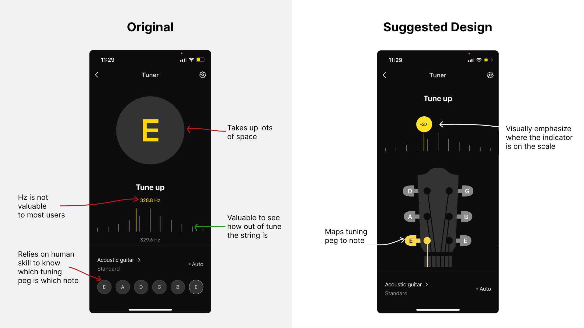
Solution
There is an opportunity to reduce the load on short-term memory by using a skeuomorphic design. Arrange the of six note buttons on the shape of a guitar neck as its tuning pegs to improve the mapping of buttons to the corresponding note detection.
Conclusion
For an app with countless features, Ultimate Guitar balances discoverability for key features well. The app successfully uses strong signifiers to make navigating easy. Tweaking designs to align better with their user’s conceptual models will help reduce errors and improve its usability.