Introduction
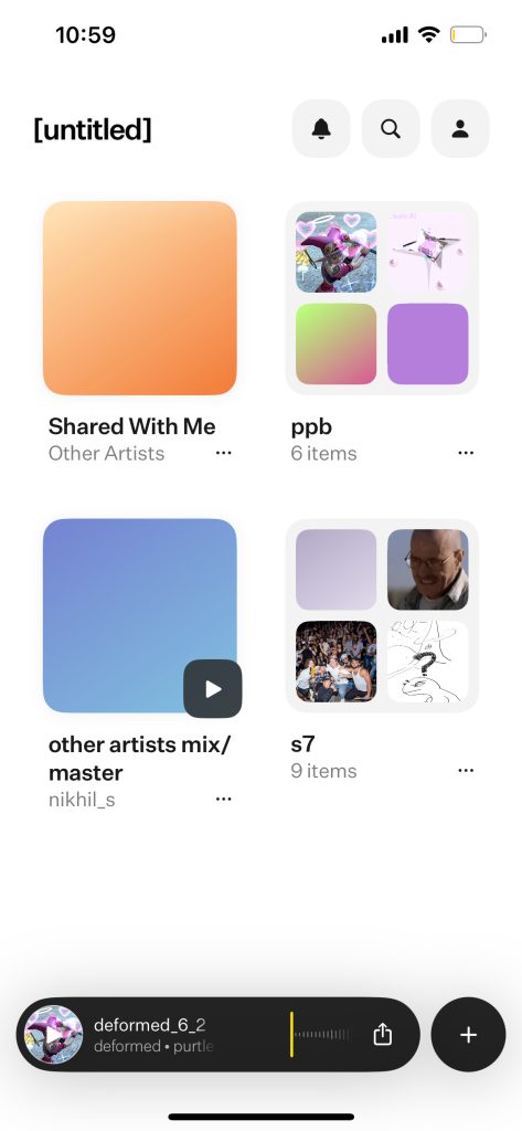
[untitled] is a cloud-based music storage and sharing app. Unlike other cloud sharing apps such as Dropbox and Google Drive, [untitled] specifically markets itself towards musicians and artists who need to store their songs and demos online. [untitled] is an expertly designed app that has revolutionized and simplified the very tedious system of version controlling work-in-progress music, but there are some questionable design decisions that can be improved upon.
Home UI:
Problem 1: Import Button Capabilities and Mapping
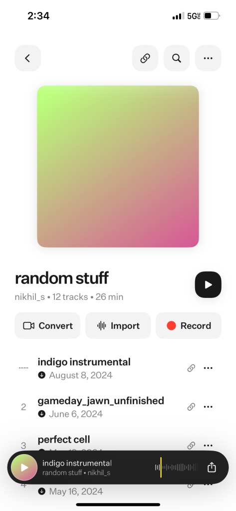
When you decide to add tracks and audio files to a project in the app, you are afforded three options. These are to convert audio from video, import an audio file, or record audio directly from your phone into the project. The import button contains a symbol with a stylized audio spectrum. This symbol is very similar to the logo of the Voice Memos app on iPhone.
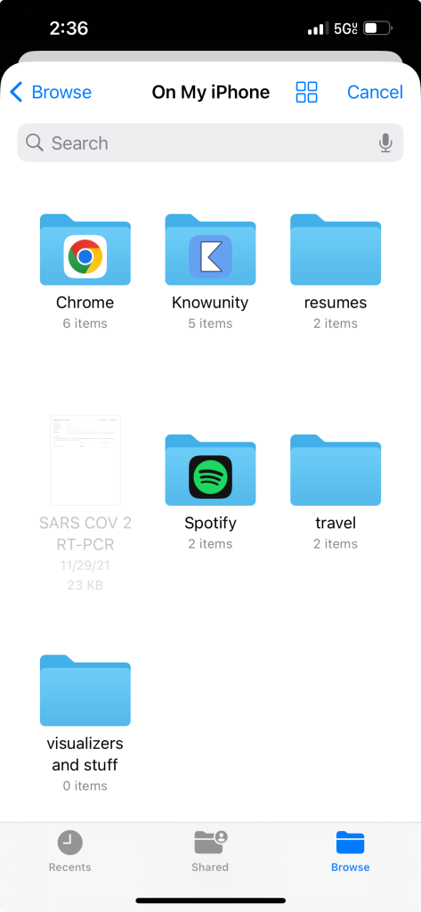
When the Import button is clicked, a user might infer that you can import recorded voice memos into the untitled app. However, clicking on the import buttons simply brings you to the Files app; voice memos are not stored within the Files app. You are not able to upload voice memos recorded using the Voice Memos app onto untitled.
The audio spectrum image used on the Import button is a signifier that could be confusing to some users. This button’s mapping could be better utilized by connecting it to the voice memos on the user’s iPhone.
Solution:
- One way to fix this issue is to have the import function link directly to the voice memos directory
- In general, users are most likely not going to import audio files onto [untitled] from the default iPhone storage system
- They will most likely import files directly from the computer that houses their DAW into the [untitled] web app
- Another way would be to get rid of the Convert or Record feature in order make room for a Voice Memos signifier
- My last suggestion would be to create a Project folder that could house any voice memos that are currently within the iPhone’s ecosystem
Problem 2: Notes function and Visibility
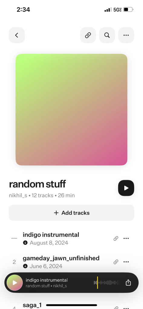
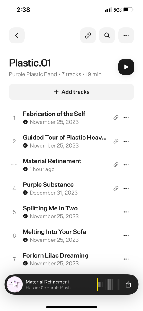
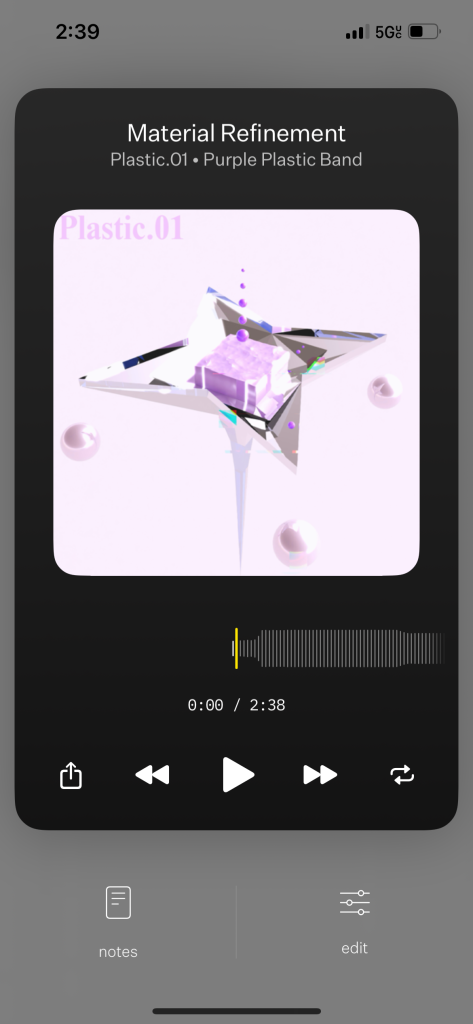
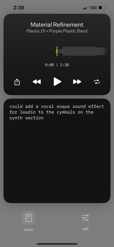
One useful feature of the untitled app is the ability to create notes for any individual track. This feature comes in handy when a user has gripes or potential additions that they would like to keep in mind while further iterating on their tracks. However, it is not possible to see if a track has any notes on it or not unless the user either clicks on the track options button or clicks on the notes button within the track playback window.
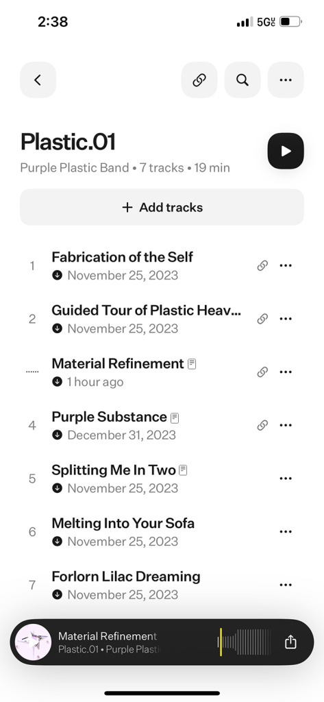
The visibility of notes that have been added to tracks is not as prevalent as it should be. Users should be able to see the prevalence of notes on their tracks from the project screen, rather than the playback screen.
Solution:
- Create a Notes icon that appears next to the track title if the track has notes added to it
- This design will ensure continuity with the link sharing enabled icon and the offline download available icon that already exist
- It affords the user the ability to view the status of their notes on each song they have
- This also increases the discoverability of notes the user may have forgotten making
- The icon I made for this is simply the already existing notes icon, but with its colors inverted
Problem 3: Projects Shared by Others / Affordances
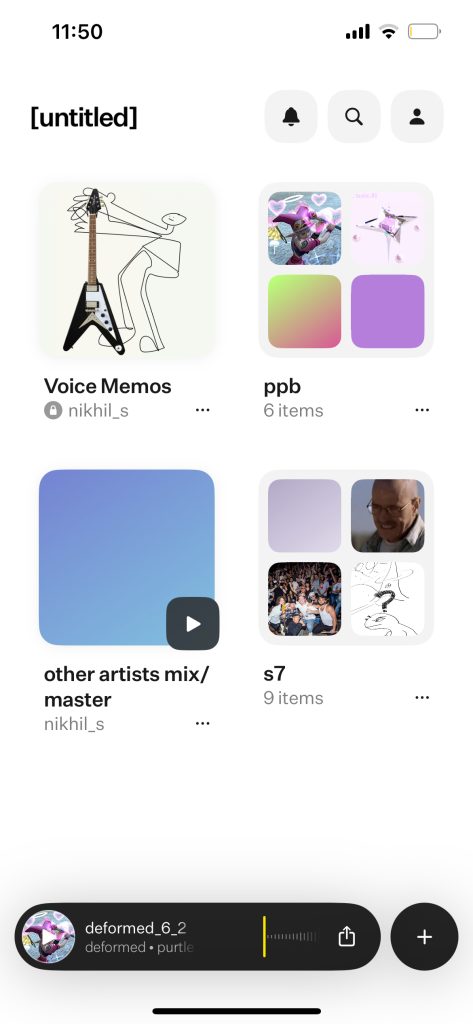
Users are allowed to share projects that they have made among other users of the untitled app. This is an incredibly useful feature as this allows users to create collaborative works together with others, and project creators get to choose how much control other users have over the additions and reductions of songs to a project. Unfortunately, there is not a strong enough differentiation between projects made by other people and ones made by the primary user.
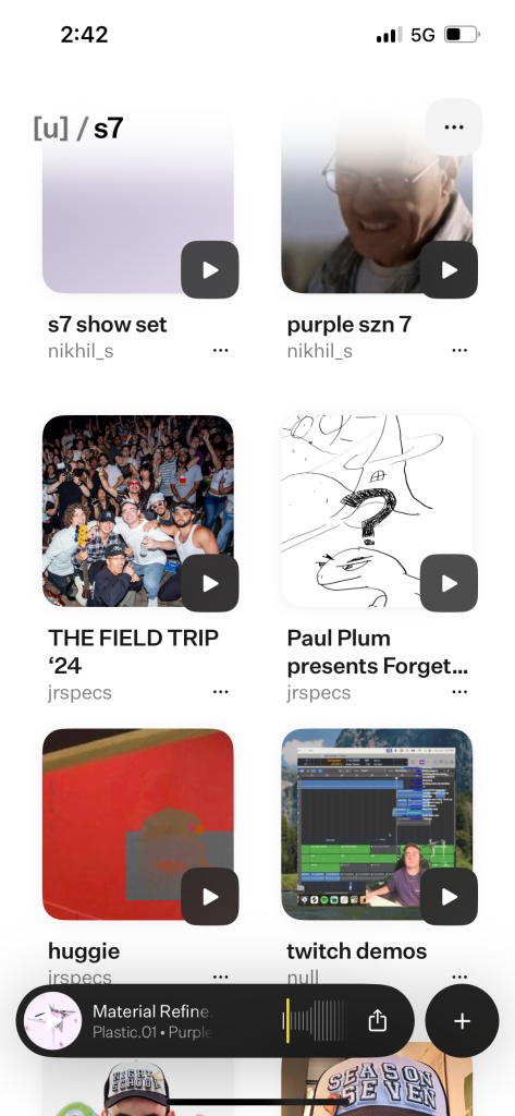
Users are not afforded the ability to clearly distinguish between projects that they have created themselves and ones created by others. While there are small signifiers, such as the name of the creator shown in grey below the project title, this is undone by the fact that these projects are located in the same place as the primary users’.
Solution:
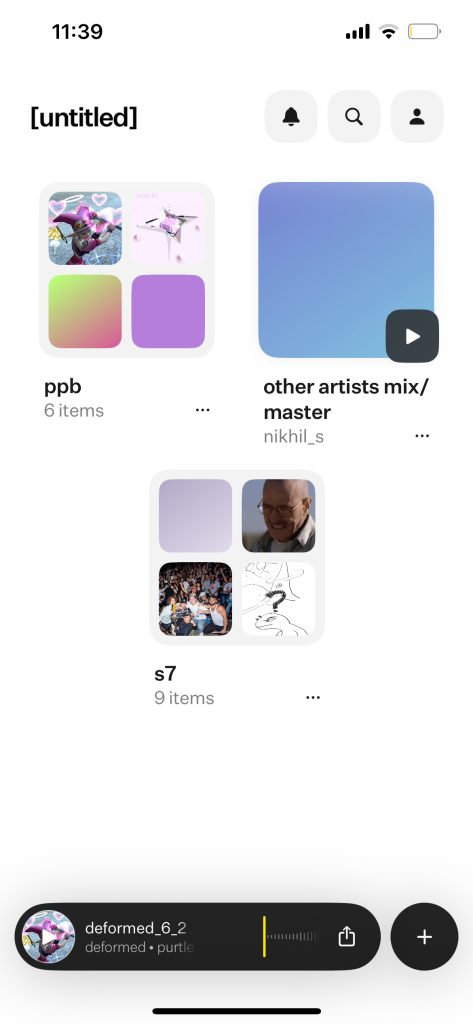
- Create a Folder/Project/Area that stores projects that are shared with you
- For example, I created a Project titled Shared With Me where songs or projects created by other users will go by default
- Inspired by the ‘Shared With Me’ and ‘Shared drives’ sections utilized by Google Drive
- This way, users will be able to use their own preexisting mental models that they have built through the use of other, very popular, cloud storage apps
