Introduction
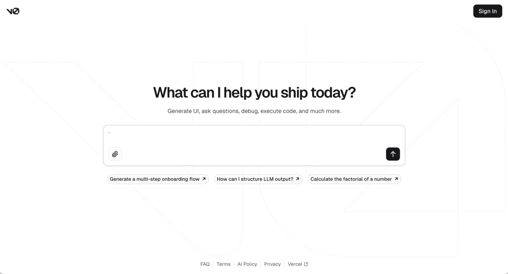
v0 is a chat-based web development companion created by Vercel that is meant to help users program front-end code, offering help such as debugging and executing code. It can even generate UI components from Vercel’s popular component library shadcn/ui.
This article explores and critiques v0 through the lens of Don Norman’s “Design of Everyday Things.” It starts with a general overview of the UI, then looks at issues like discoverability, lack of signifiers, and the need for improved feedback. Finally, it considers how small changes could lead to radical innovation.
UI Overview
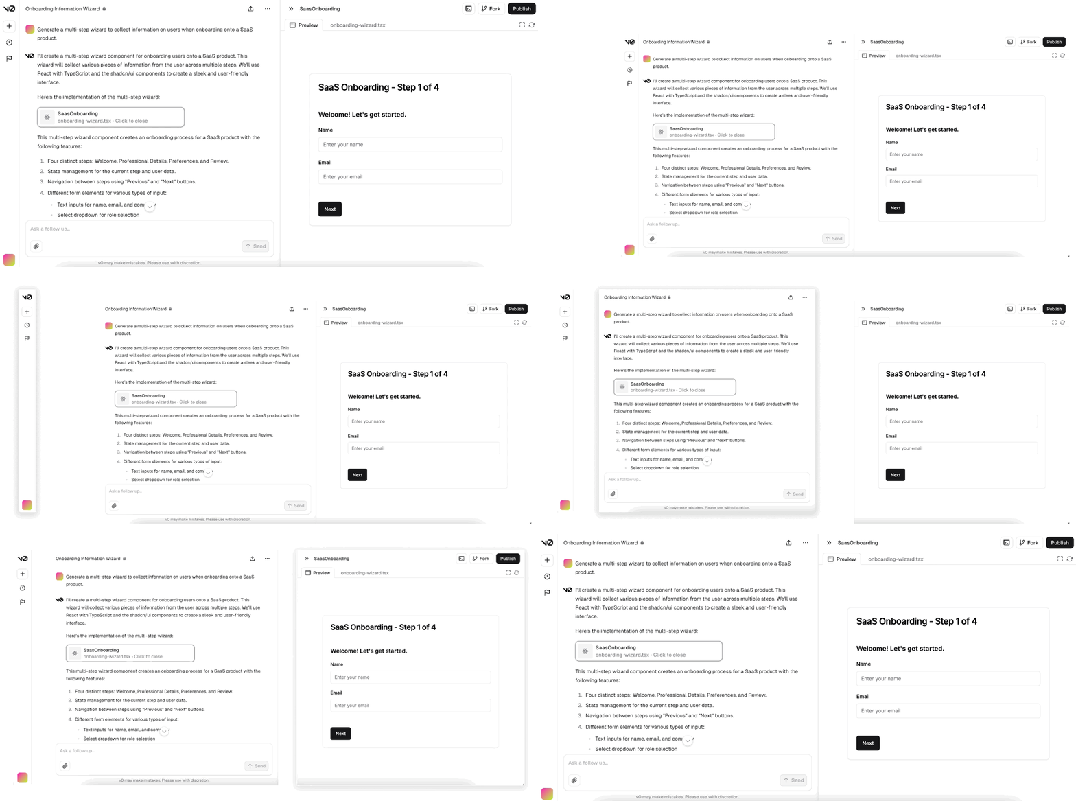
/The current user flow and conceptual model are similar to many chat-based AI products where a user inputs a prompt and is then given the results. The user can continue iterating through more prompting, mimicking a conversation. The buttons and features are mapped well within the UI, with everything being grouped within three categories: site-wide navigation, prompting, and output.
Due to its effective use of icons and a simple user flow, users get a general understanding of the product very quickly. UI components have fantastic feedback through hover states and effective animations. The use of signifiers makes it easy to start using the product and provides a positive user experience.
But there is some room for improvement
Discoverability
When visiting v0’s homepage, users are greeted with an interactable text box. It does a fantastic job drawing you in with its prominence on the page, clear signifiers, and its interactive nature.
Unfortunately, this is not what most users are looking for! They want to try the newest v0 update, but this text box is an outdated version with a different user flow and features. Users who wish to use the current product need to click the call-to-action (CTA) button labeled “Get Started.” The CTA’s styling is not effectively competing for the user’s attention (pictured below).
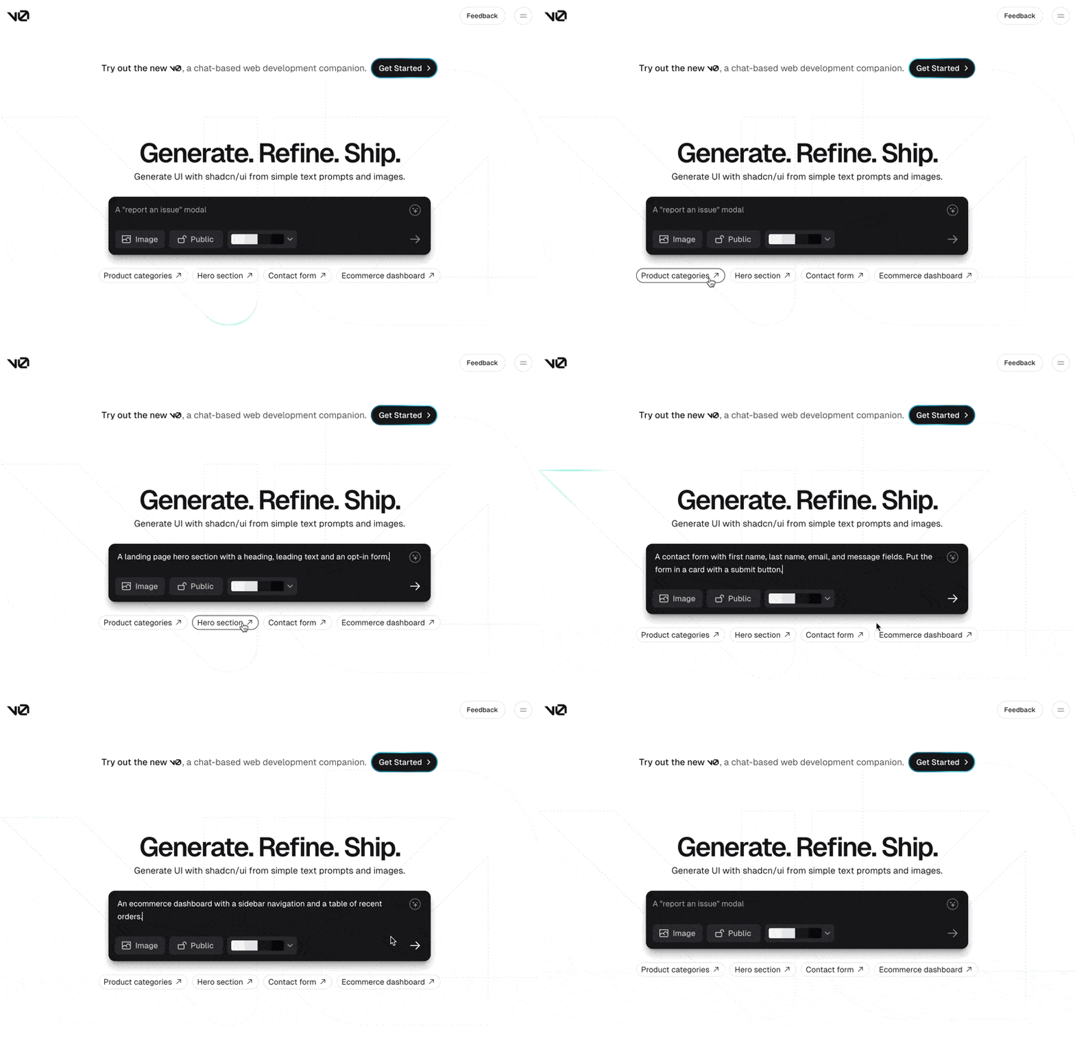
I expect a CTA to make use of color, interaction design, and visual signifiers to grab the users’ attention. The current button uses a subtle hover animation, uses the same dark gray color used for the text box, and is very small in comparison. While many returning users could avoid the homepage entry point by going directly to v0.dev, it sets a bad initial impression for its new users who may not be familiar with the product variations.
the Solution
The solution here is simple, update the homepage to reflect the current version of v0!
Spoilt for Choice
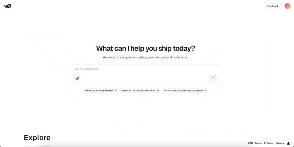
v0 promises a product that can “generate UI, answer questions, debug, execute code, and much more.” There is no conceptual model for such a general statement, and the limited copy on the page does not define v0’s strengths or weaknesses to the user. Algorithms have limited capabilities and users are not let in on what v0’s capabilities are. So while there are good signifiers for inputting a prompt and submitting it, there is a real lack of signifiers guiding the user on how to use v0. The possibilities seem endless, but the users are left on their own to take the first step.
The only way for users to gain an understanding of v0’s capabilities is by investing time in experimentation. Adding constraints and clear messaging would be a huge improvement, helping users avoid getting stuck in the gulf of expectation.
the Solution
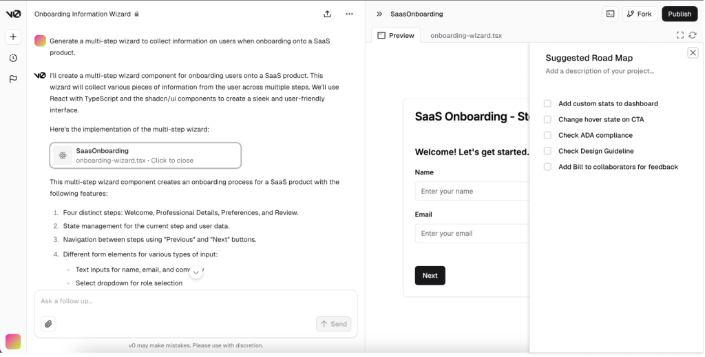
Change the user flow to include the creation of a products requirement document (PRD). A suggested roadmap for completion does not narrow what the user is allowed to prompt, but it can focus the user by suggesting how it can help them. Where a user is generating an e-commerce dashboard or debugging code, a suggested “Next Steps” list could help the user take advantage of v0 and improve their projects. Suggestions like uploading a design guideline, checking The Americans with Disabilities Act (ADA) compliance, or navigating specific business constraints could become a huge part of v0’s value statement.
Feedback During Generation
v0’s processing time from prompt to finish is truly impressive. A user can input a prompt and see v0 build both code and a prototype for them in under a minute. The user experience is pretty exciting as you see the preview window pop out from the right, code starts being typed out in front of you, and then a prototype is generated element by element.
While the process is under a minute, I still find myself wondering if it is done or not. No typical indicators, such as an animated logo or “stop” button, are located in the preview window — they all take place in the prompting section. In addition, you stop seeing the preview change because when the code length exceeds the screen size, it does not scroll along with the content.
the Solution

Creating more obvious feedback at a prompt’s completion would strengthen the user experience. The use of a completion bar would be an effective use of feedback to communicate with the user.
Conclusion
In conclusion, v0 is a promising chat-based web development companion. Its user interface does a lot right through the effective use of signifiers through icons and a simple conceptual model. It could also be greatly improved with some iteration. In its current form, v0 is a fun tool to play around with, but an updated user flow that guides users on a project basis would add a lot of value to the user experience. Updating its homepage would heighten discoverability to all of its users and adding a progress bar to increase feedback during processing would be some big improvements.
