
Introduction
WhatsApp is a messaging app designed to provide a consistent chat experience across different devices and regions. With over 2 billion active users globally, it stands as one of the most popular messaging platforms. In countries like India, it has become an integral part of daily life, used not only for staying connected with individuals but also for building and communicating within communities. WhatsApp also offers features such as status sharing, channels, and more. Recently, WhatsApp completely revamped its UI on Android, but the changes were not well-received as they disrupted users’ muscle memory built over the years. In this critique, I won’t focus on those issues but will instead evaluate WhatsApp from a new user’s perspective, specifically exploring features I have rarely or never used.
The Process
In this study, I focus on exploring features of the app that I have rarely or never used, so as not to let my familiarity with the app influence the findings. This approach helps me better evaluate the experience from a new user’s perspective. Additionally, I conduct the test using only one hand to simulate real-world constraints, pushing the app to its limits in usability.
The test can be summarized as a cognitive walkthrough under the constraint of using the app with one hand. The tasks include:
- Upload a new status on WhatsApp
- Use the Meta AI feature
- Start a new chat by entering a phone number directly without saving the contact first.
1.1 Same screen two cameras?
In the updates tab of WhatsApp, there are two camera icons: one in the parent header and one as a floating icon. The camera in the parent header lets you either send the photo directly to someone or post it as a status, whereas the floating icon only allows you to post the photo to your status. The inconsistency between the resulting screens from both icons creates a gulf of evaluation. For example, if I take a different route to upload a photo to my status, I don’t see the same signifier for the photo being uploaded on that screen. Conversely, when trying to send a photo directly, the option may not even be available.
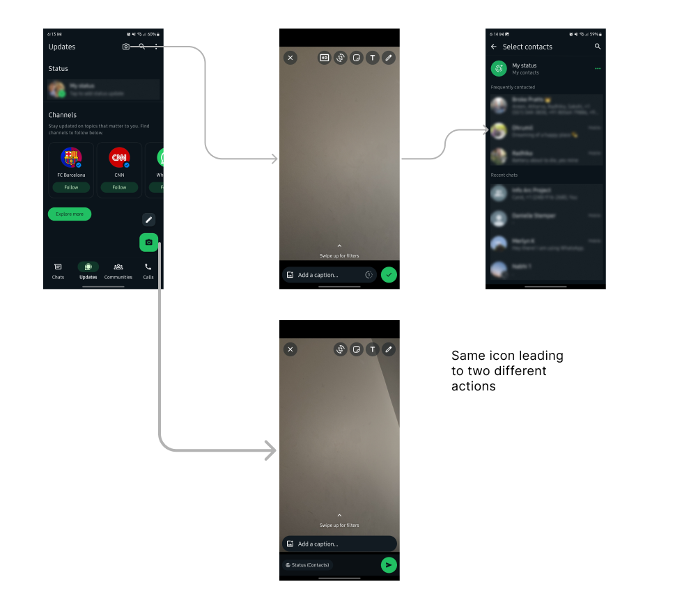
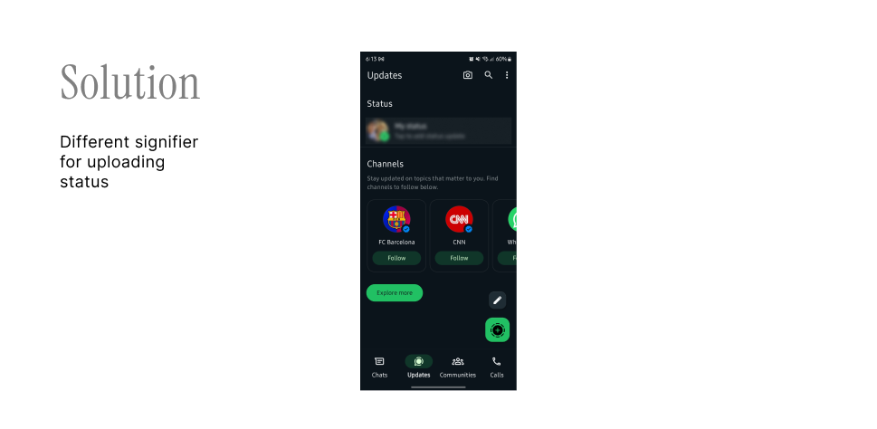
The ideal solution would be to unify both actions into a single flow for sending photos/videos and posting them as a status. Another option is to use a distinct signifier for the status upload icon, indicating that this action is solely for uploading statuses and not for sending photos, leading to better mapping and clarity.
1.2 Meta AI is here
Meta AI is a newly introduced feature, and WhatsApp seems to be doing everything to encourage users to adopt it. However, in pursuit of this goal, they might have compromised one of their best features, i.e. search. As shown in the screenshots below, the search bar also functions as an input box for Meta AI. Given that AI is already highlighted with a floating icon on the same screen, is it necessary to integrate it into the search bar as well?
The confusion arises when, for example, you type something and the keyboard displays a “search” action, while the top shows a “send” icon for AI input. Whether the user’s goal is to use AI or search, mapping both to the same input but triggering different actions can create confusion and hinder their ability to achieve their goal, raising questions about the affordance of the search bar.
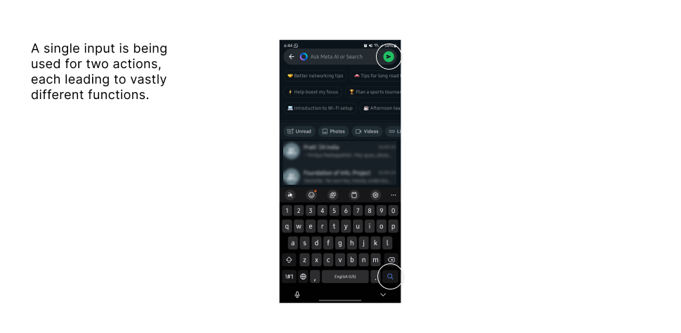
The clear solution is to reserve the search function solely for searching, as the floating button is already effectively promoting the use of Meta AI. Other ways to further promote Meta AI can be explored without compromising the user experience—such as featuring an exclusive AI chat at the top of the list or placing it in the navigation menu.
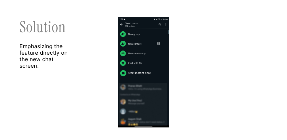
1.3 Great feature, but how can I find it?
WhatsApp recently introduced the ability to start a chat with someone without saving their number, which is a great relief for those who use the app for temporary conversations. However, accessing this feature within the app is challenging. The discoverability of this feature needs to be improved to make it more user-friendly and effective.
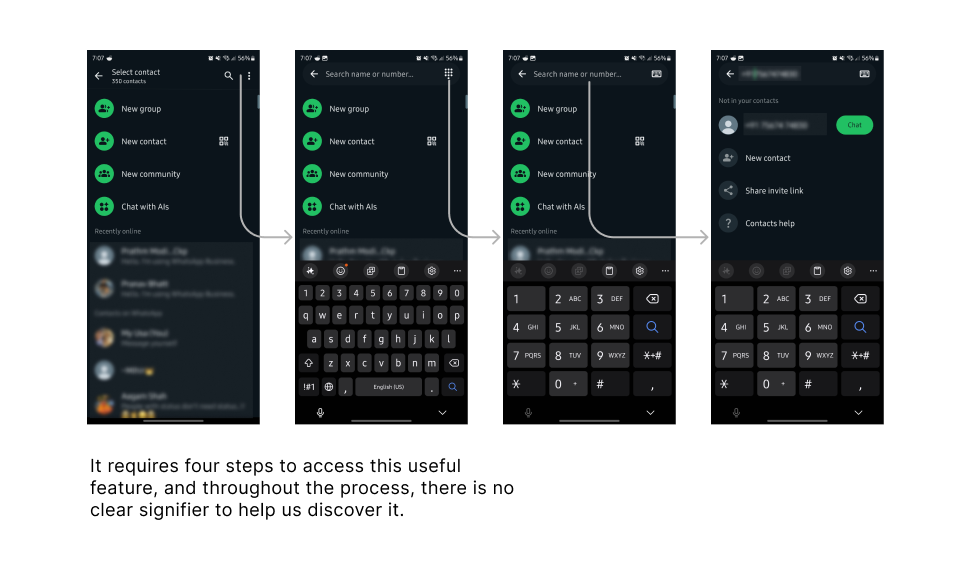
The solution is to directly highlight the feature and group it with similar actions on the first screen of the flow. It’s surprising that useful features remain hidden while others, like Meta AI, which have no direct connection to the app’s primary goal, are heavily promoted.
1.4 Reaching the Top
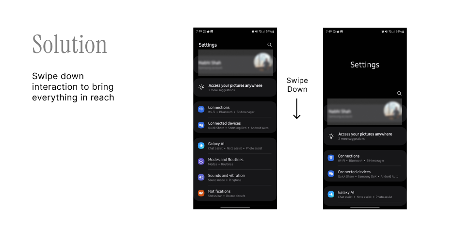
Research shows that not all areas of the screen are equally accessible, with reach varying based on palm size and phone dimensions. However, design should not rely on users opting for smaller phones. Efforts should be made to make the search bar at the top more accessible for one-handed use.
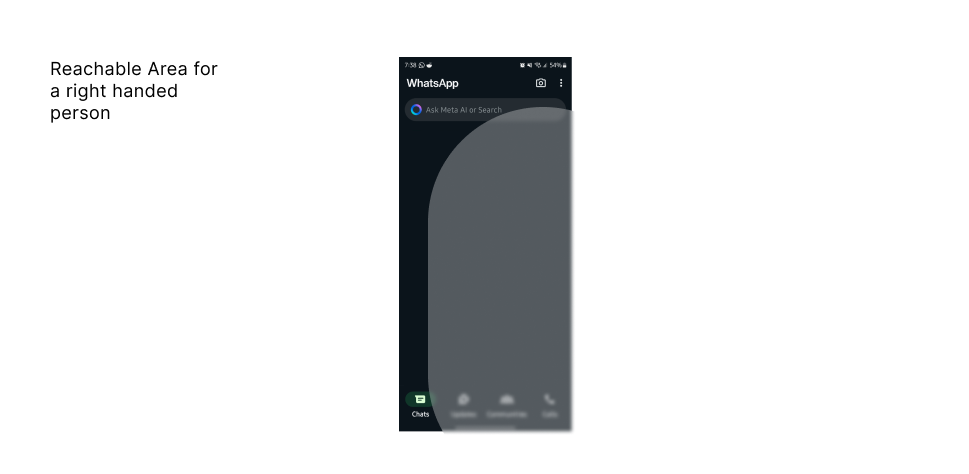
Many companies, including Samsung, have already addressed this issue by introducing a swipe-down gesture to make all elements within reach. A similar approach could be implemented here. Additionally, utilizing the newly available space to display features such as new statuses would be beneficial. One might argue that operating systems like iOS or Android already include features like one-handed mode. However, these solutions may not be as seamless as a custom approach. A tailored solution would avoid disrupting the experience of other apps, focusing solely on improving access to the search bar in this particular app.
Conclusion
Overall, WhatsApp has evolved into a well-designed application and remains one of the most user-friendly platforms available. Recent updates have made positive changes, such as moving the navigation menu to the bottom for easier access. However, there are still areas where signifiers, mapping, and discoverability can be improved. Enhancing these aspects could lead to better app adoption, as demonstrated by the case of starting a new instant chat. Also, while the app’s business goals may have led to the integration of AI to the search bar, it’s worth exploring whether this approach yields effective results and if sacrificing usability is justified.