Learning to Play Guitar is Hard Enough. UG’s Tabs & Chords App Does Nothing to un-Muddy the Waters.
Introduction
Ultimate Guitar is an online guitar community and music archive where people create, share and learn guitar tablature. This critique will inspect their companion iOs app, Tabs & Chords, and evaluate its design based on the principles discussed in The Design of Everyday Things by Don Norman.
STEP 1: Understand the Users & Identify Problems
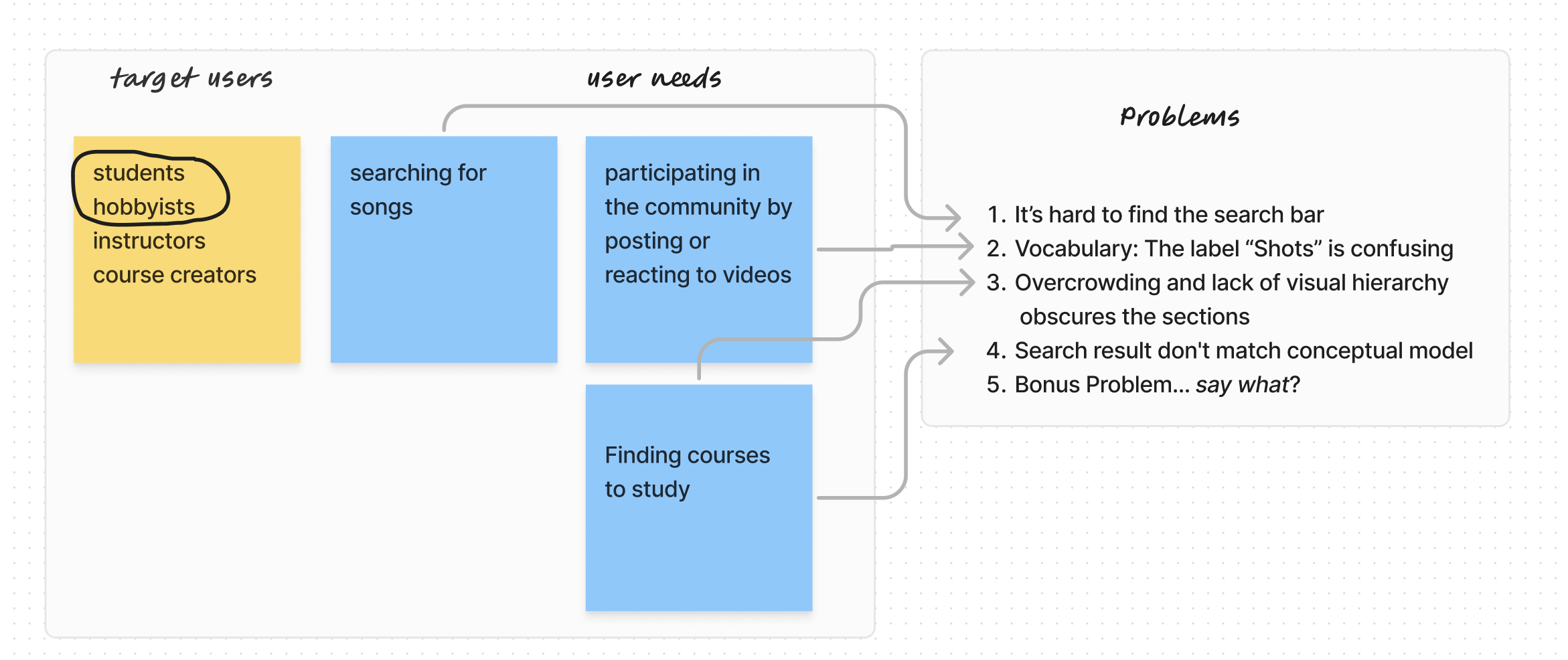
Who uses an app to search an archive of guitar tabs? Since tablature is a basic and more primitive form of music notation, it’s primarily used by students, hobbyists or instructors as a teaching aid. These users typically search for songs, participate in the community by posting or reacting to videos, and find courses and lessons to learn more about guitar playing.
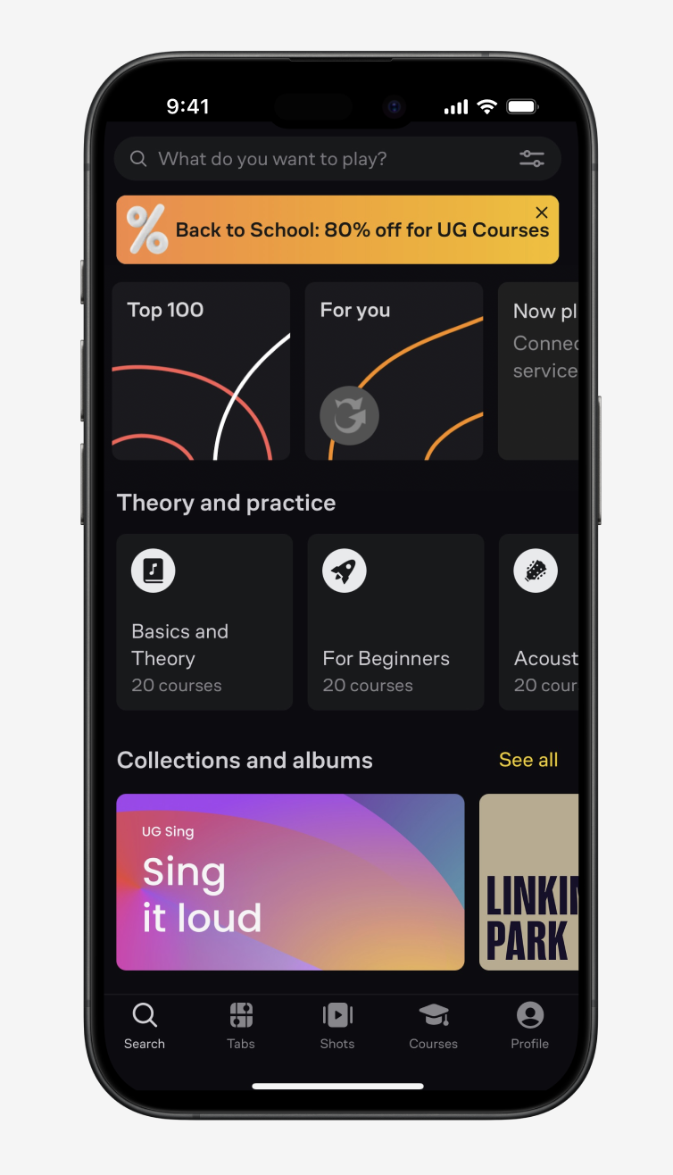
The problems with the current layout and design of the Tabs & Chords app include:
- It’s hard to find the search bar
- Vocabulary: The label “Shots” is confusing
- Overcrowding and lack of visual hierarchy
obscures the sections - Search result are confusing and don’t match a user’s conceptual model
STEP 2: Devise Solutions
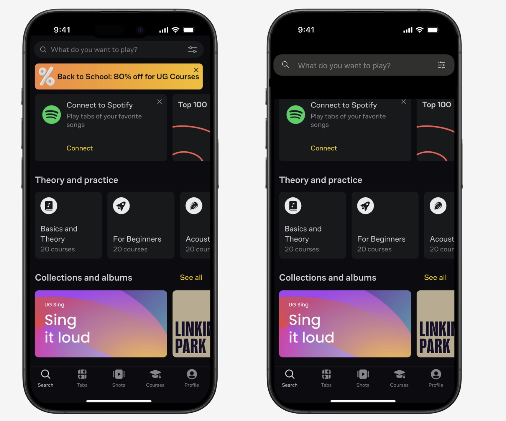
1. It’s hard to find the search bar
The primary use of an online music archive is to search for tabs/songs. Yet this affordance is difficult to find. The search bar (signifier) is too close in color to the background and the overcrowding on this screen adds to the difficulty in finding it. It lacks discoverability.
| PROBLEM | SOLUTION |
|---|---|
| It’s hard to find the search bar. It lacks discoverability. | Make the search bar larger, change the color and remove dead weight near it (the sale banner). |
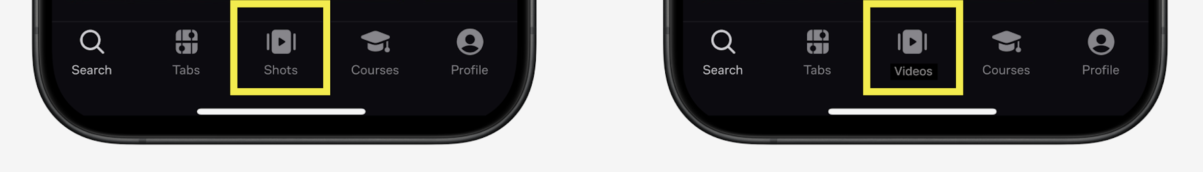
2. Vocabulary: The label “Shots” is confusing
A big draw for members of an online music community is a place to showcase skills and interact with fellow enthusiasts. Tabs & Chords includes a section called “Shots” where users can upload videos of themselves playing songs they’ve learned or comment on other’s performances. While the “Shots” link is easy to find, (good discoverability), the word is confusing and hides the meaning of the page. Using a more recognizable word like “Videos,” which is commonly used on other platforms matches the user’s knowledge in the head.
| Problem | Solution |
|---|---|
| What does “Shots” mean? This is a confusing signifier. The vocabulary conflicts with users’ knowledge in the head. | Change the word “Shots” to “Videos.” |
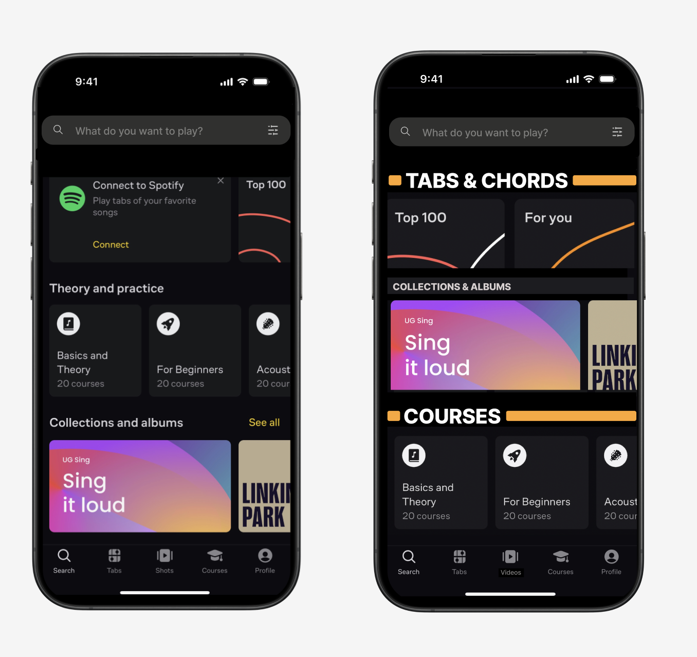
3. Overcrowding and lack of visual hierarchy
obscures the sections
Complexity is Good; It Is Confusion That Is Bad.
Don Norman
The layout of this home screen is an information overload with little semblance of order. It’s difficult to determine what options this screen affords. There is a link to “Theory and practice” and there is also a link to “Collections and albums.” A beginner coming to this site may not have the ability to sort out what these terms mean quickly. The visceral response to this page is unsettling, and the design is jumbled and unclear.
Streamlining the information into two distinct categories, “Tabs & Chords” and “Courses,” will relieve the user by bringing the knowledge (of how to search the site) into the world.
| Problem | Solution |
|---|---|
| The messy layout of the homepage obscures affordances and creates a negative visceral response. | Bridge the gulf of execution and evaluation by streamlining into two sections: “Tabs & Chords” and “Courses.” |
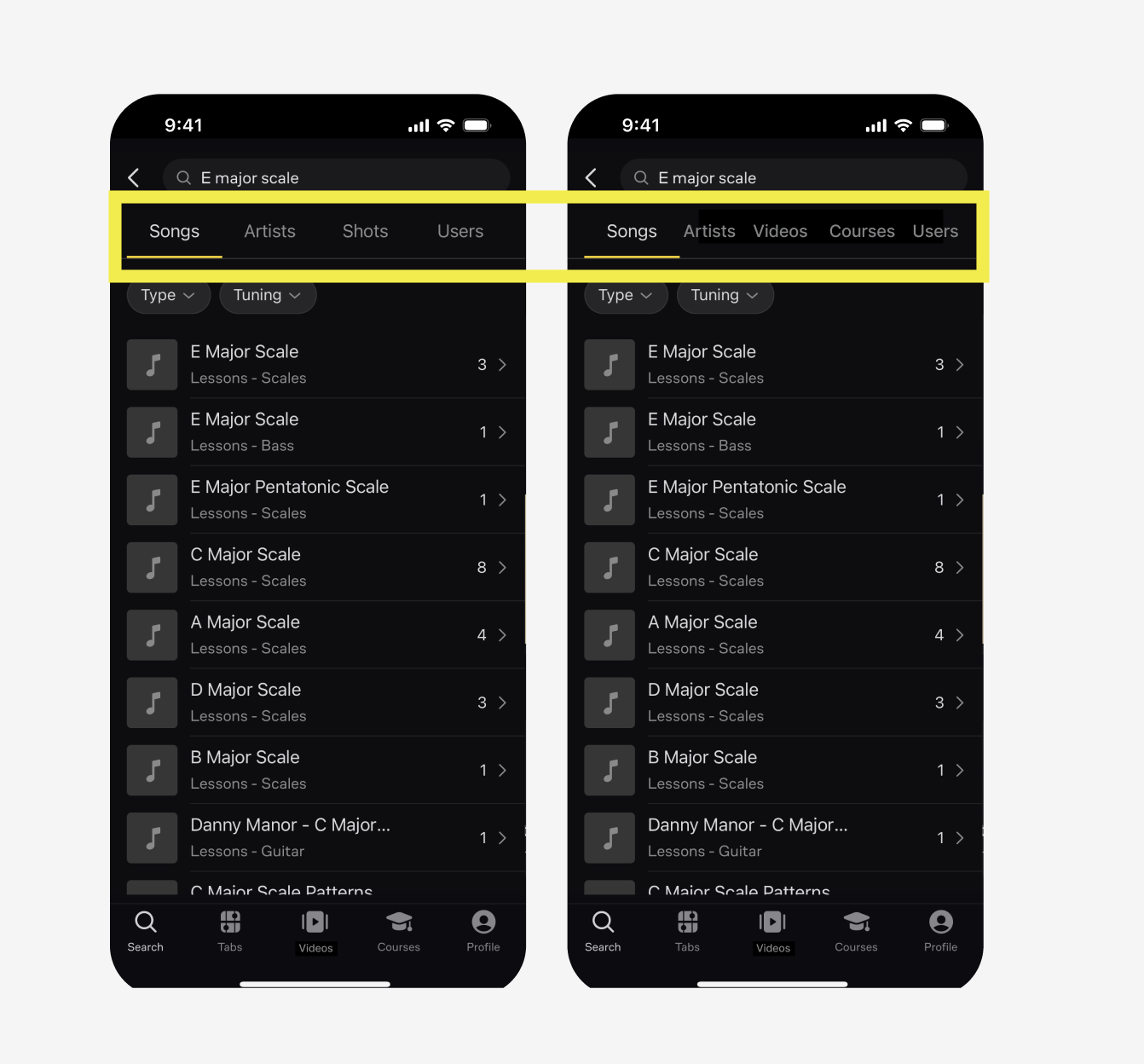
4. Search results don’t match conceptual model
| Problem | Solution |
|---|---|
| The organization of search results for course material doesn’t match the user’s conceptual model. | Add the category “Courses” to the search results page. |
For example, when you search for “E major scale,” you are taken to a screen with results and categories for “Songs,” “Artists,” “Shots,” and “Users.” There is no category for instructional content, where this result should be.
A simple solution is to add the category “Courses” to the search results page, so users can see other results of the same type.
Bonus Problem (has anyone ever said this before?)
| Problem | Solution |
|---|---|
| Offering lessons on a new instrument detracts from the brand messaging. (featuritis). | Stick to offering courses and sheet music for guitarists. |
Conclusion
Ultimate guitar is a valuable resource for beginning musicians seeking easy-to-understand guitar sheet music. With a few key tweaks to its layout and design, and a restructuring of the information architecture, this app could be a happy haven for beginners, hobbyists and instructors alike.