Introduction
Ever since the pandemic, Zoom has become a ubiquitous tool for school and work. It is meant to provide users an easy-to-use tool for all kinds of occasions – class, work meeting, coffee chat, and more.
However, its quick rise to popularity should not stop us from holding it to the highest standards of usability that make an app easy and enjoyable for its users.
In what follows, I take a detailed look at the flow for inviting participants while inside a Zoom room. Despite how straight forward this process ought to be, it is complicated by poor discoverability, confusing signifiers, and weak conceptual model.
–
Usability Problems
- Poor discoverability: sharing a meeting invite is always a 2-3 step process
Let’s first take a look at how I might invite another person to join a zoom meeting.
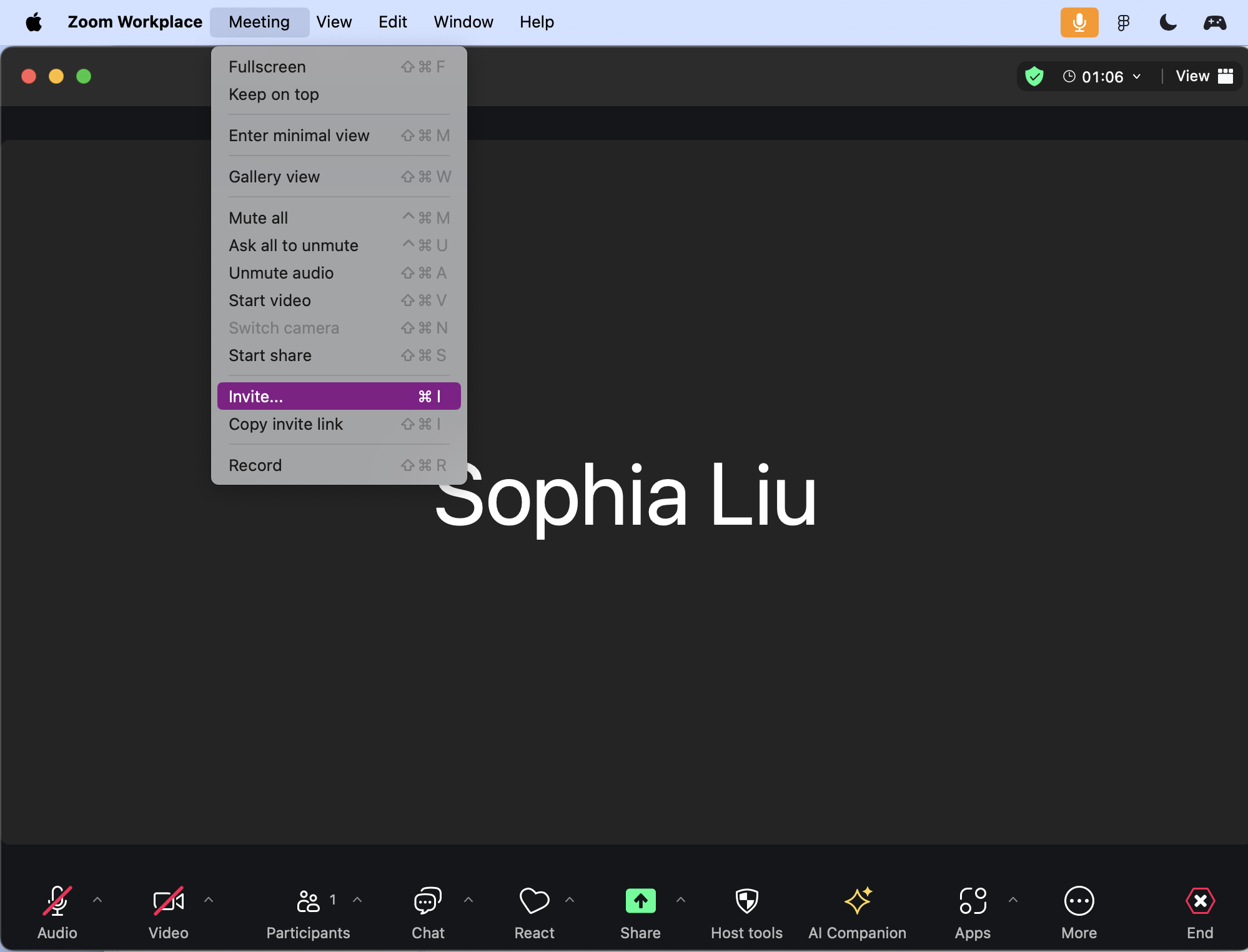
1/ Clicking on the top menu to pull up the options to “invite” and “copy invite link”, then selecting an option
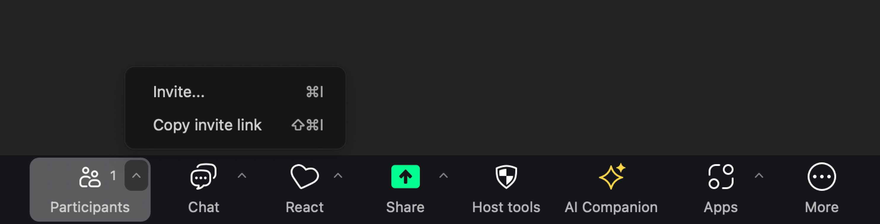
2/ Clicking on a small arrow in Participants to pull up the options to “invite” and “copy invite link”, then selecting an option
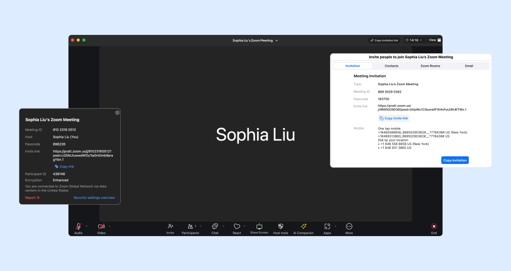
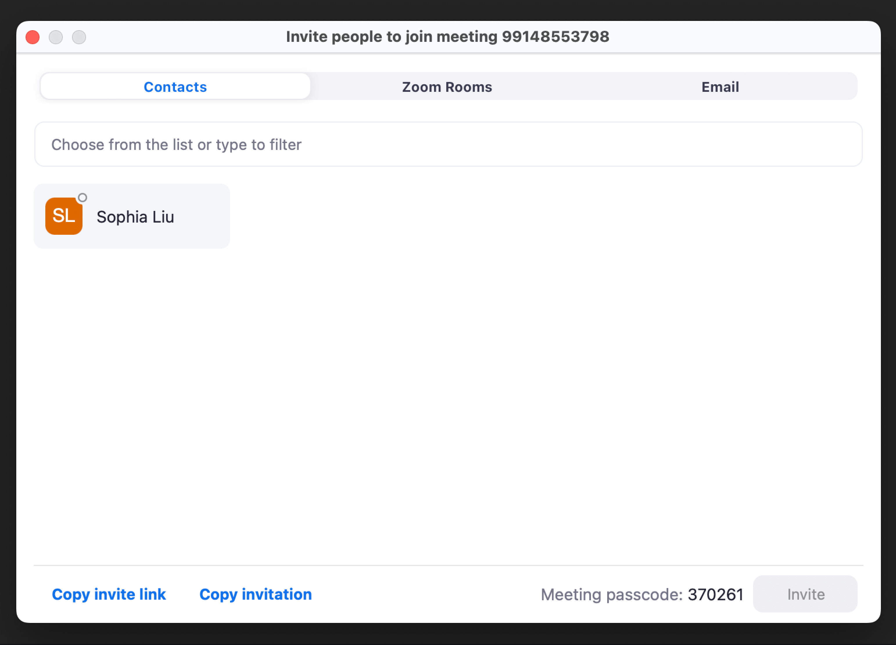
3/ Clicking on Participants to pull a modal, then clicking invite
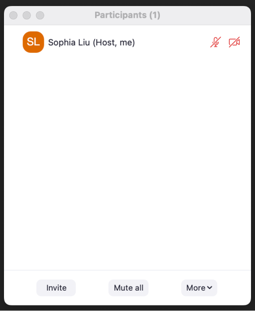
4/ Finally, in the three instances, if you click “Invite…” a proper invite modal shows up where you can select a preferred invitation method
Neither of these provide a clear one-step path to invite participants. The feature to invite is always nested within some other feature, making it difficult for users to quickly discover where the invite feature is.
- Confusing signifiers throughout the interface, leading to even worse discoverability
Looking at Zoom’s interface overall, several confusing signifiers prevent the user from doing what they want – inviting people – with ease.
1/ The word Share is not a clear signifier: people could confuse the copy “Share (screen)” with “Share (this room with someone else)” when they can’t easily find a way otherwise. They are also encouraged to do so because of the green color.
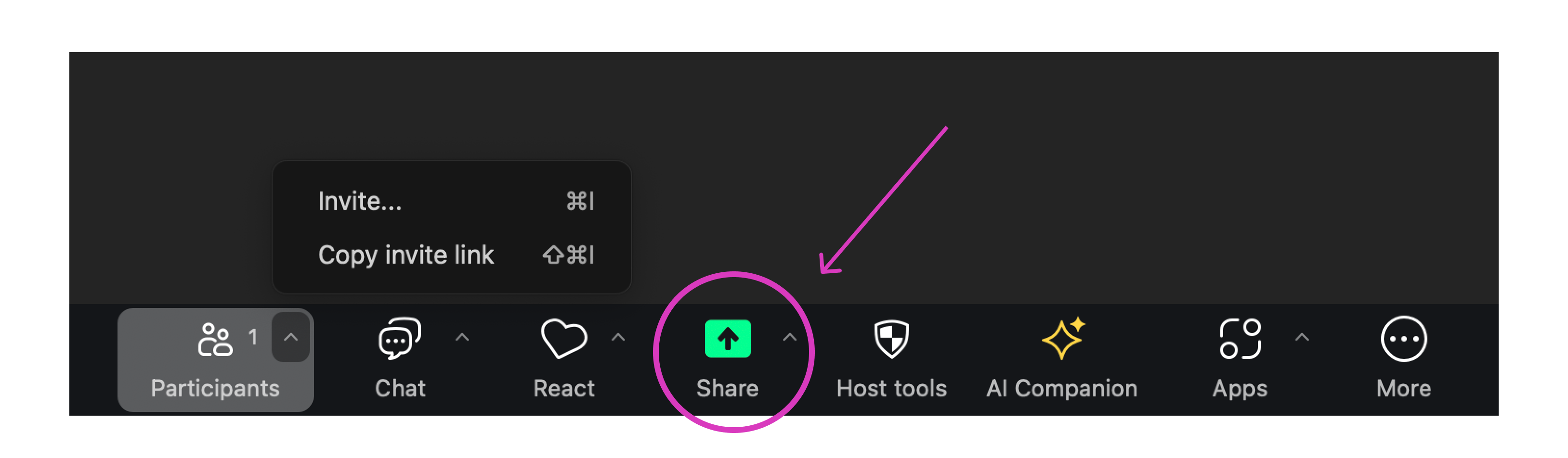
Even though a seasoned user will learn that this is a share screen icon, a confusing signifier increases the chance of slips. For example, the user might want to share an invitation, but the only thing remotely related to sharing is the share screen button, a slip happens when the user is compelled to click on share screen, with a correct intention resulting in a wrong result.
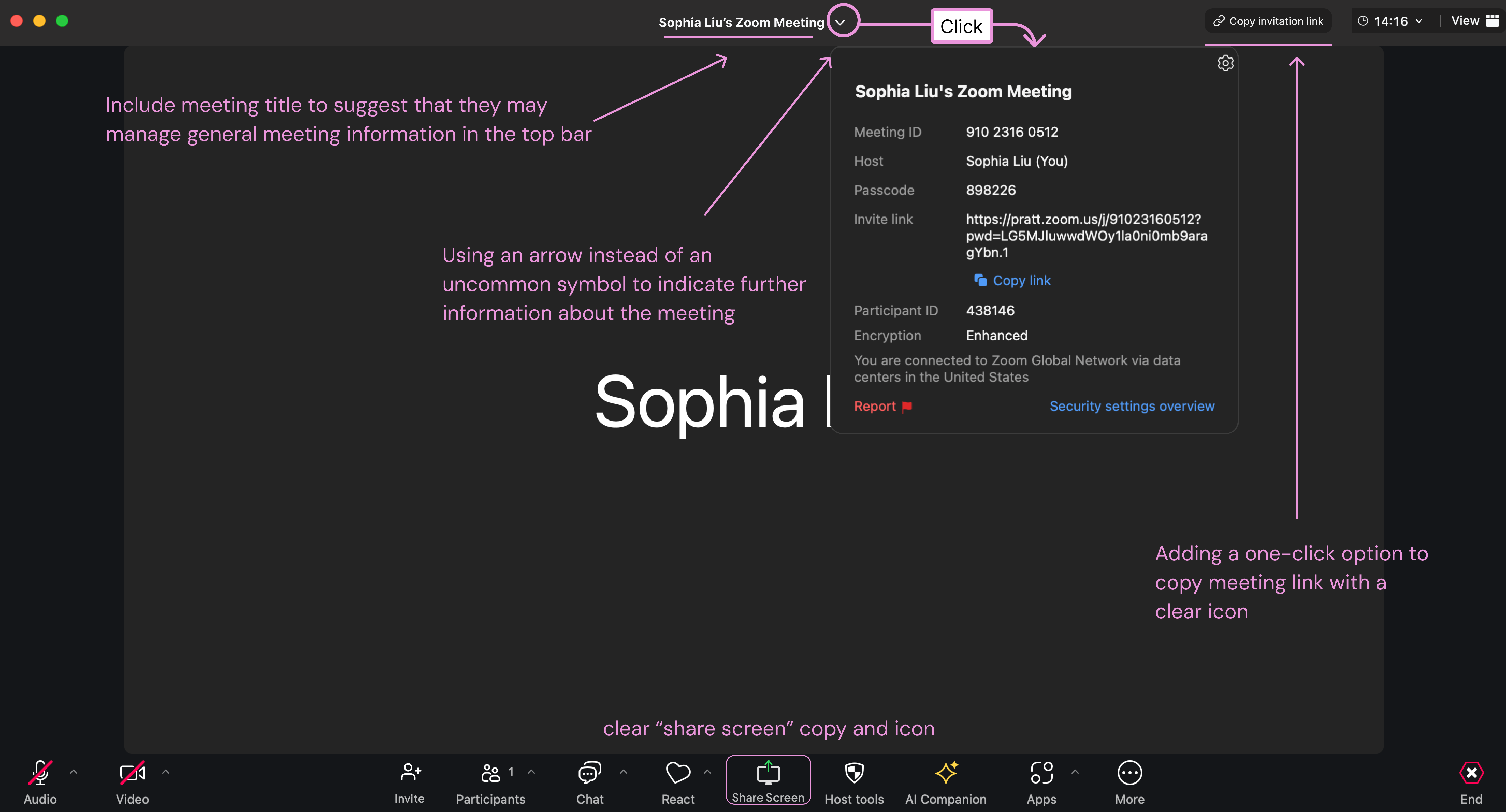
2/ There actually is another clearer way to quickly pull up an invitation link; but there is no way the user will know this because of a confusing signifier – a green shield.
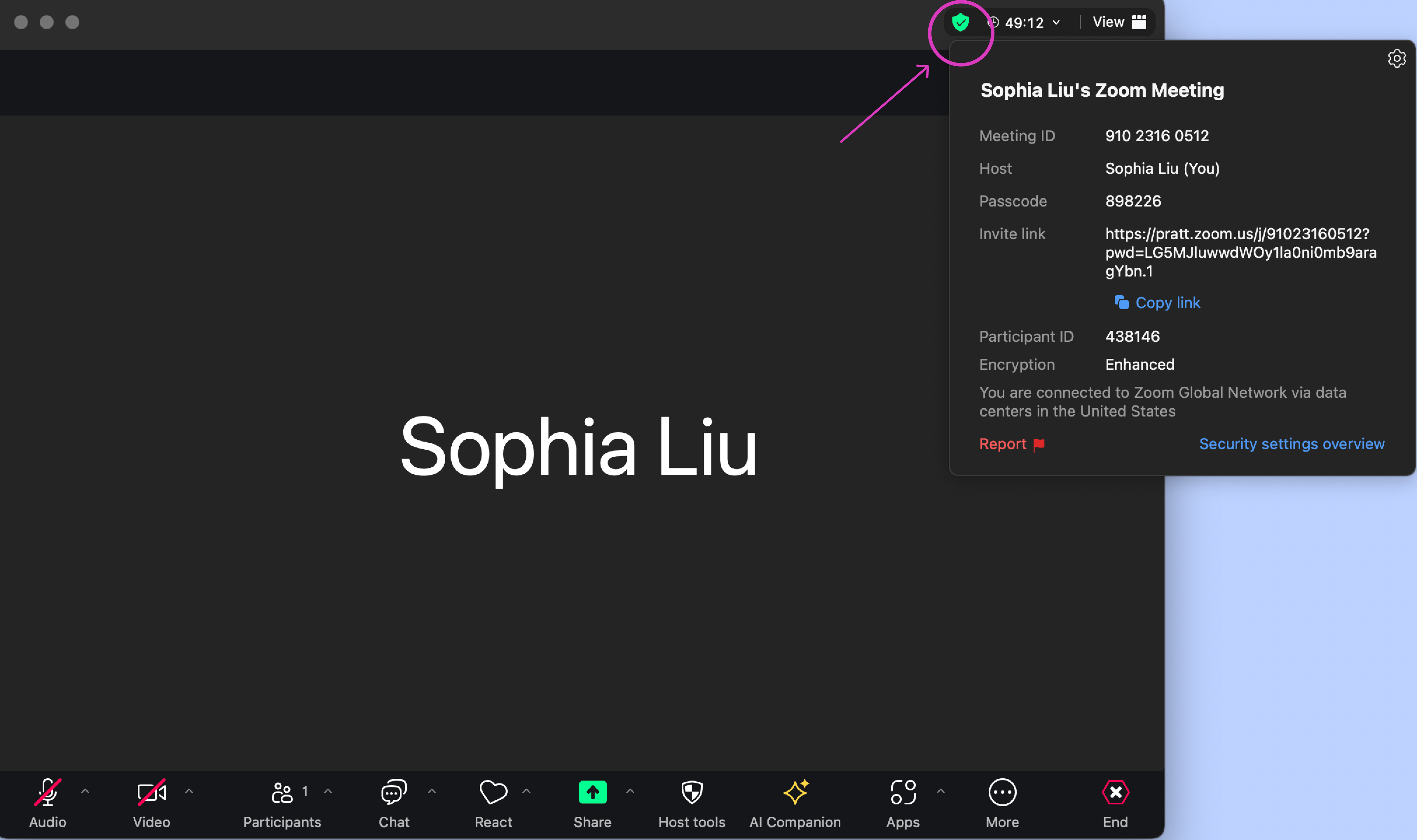
Technically, the icon signifies security information, but within it the user finds general meeting information that does not match the signifier. The signifier should correspond strongly with the action and information it denotes.
- Poor conceptual model: The user does not know the difference between sharing a link vs. sharing an invite
At every step of the invitation flow, the user is faced with this decision: do I copy an invite link, or do I invite them in some other way?
However, Zoom fails to provide a conceptual model of how an invite works to help users with this decision.
For example, the modal below provides no specific, distinct clue on what will happen when the user clicks on the option to “copy invite link” and “copy invitation”.
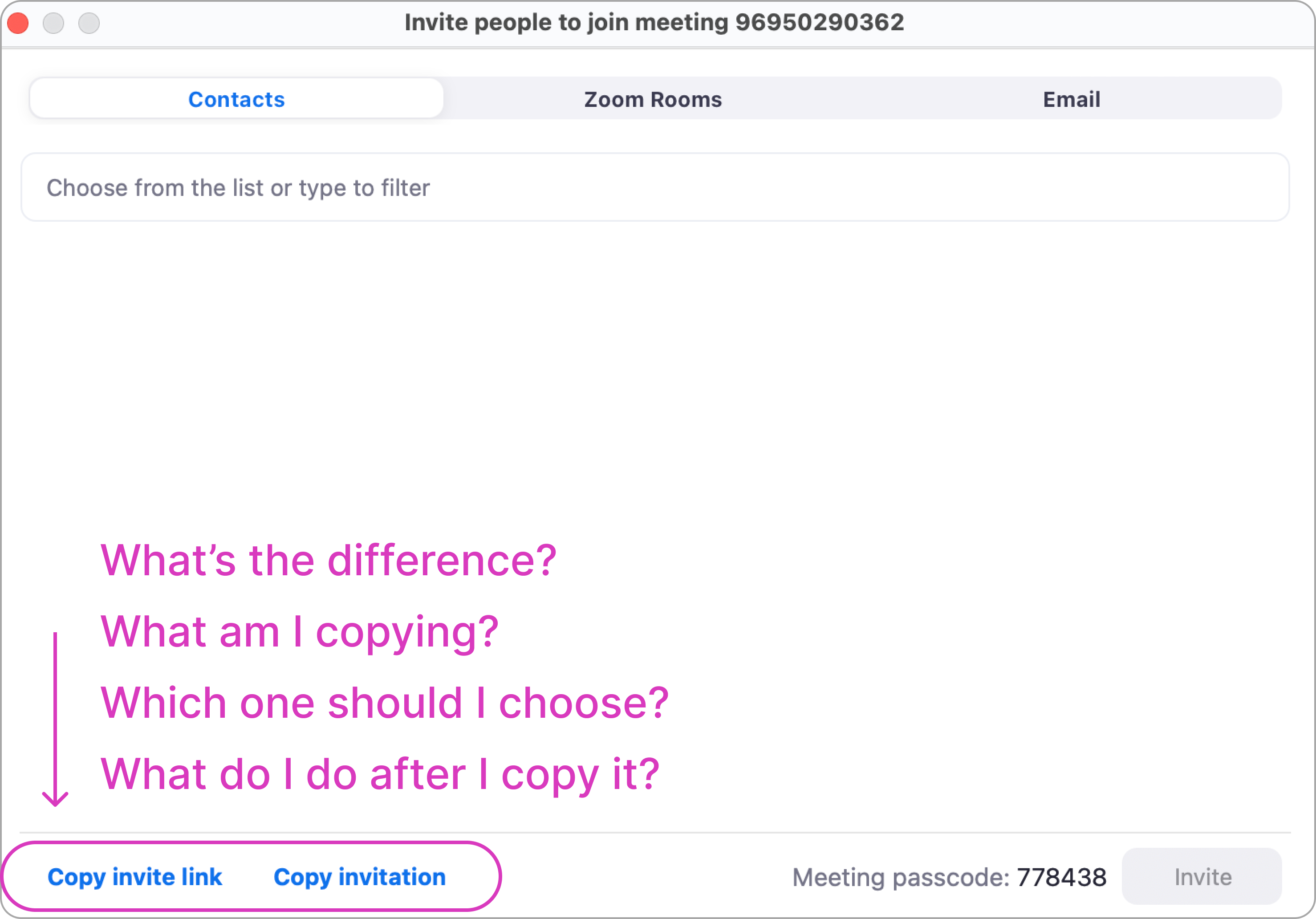
In other words, users operate blindly without being able to predict the effect of their action. The interface simply asks the user to do certain things without providing a coherent conceptual model for them to understand what is happening, and why.
Even after clicking on either options, the user is left clueless as to what they copied. The user needs to paste what they copied somewhere in order to see it
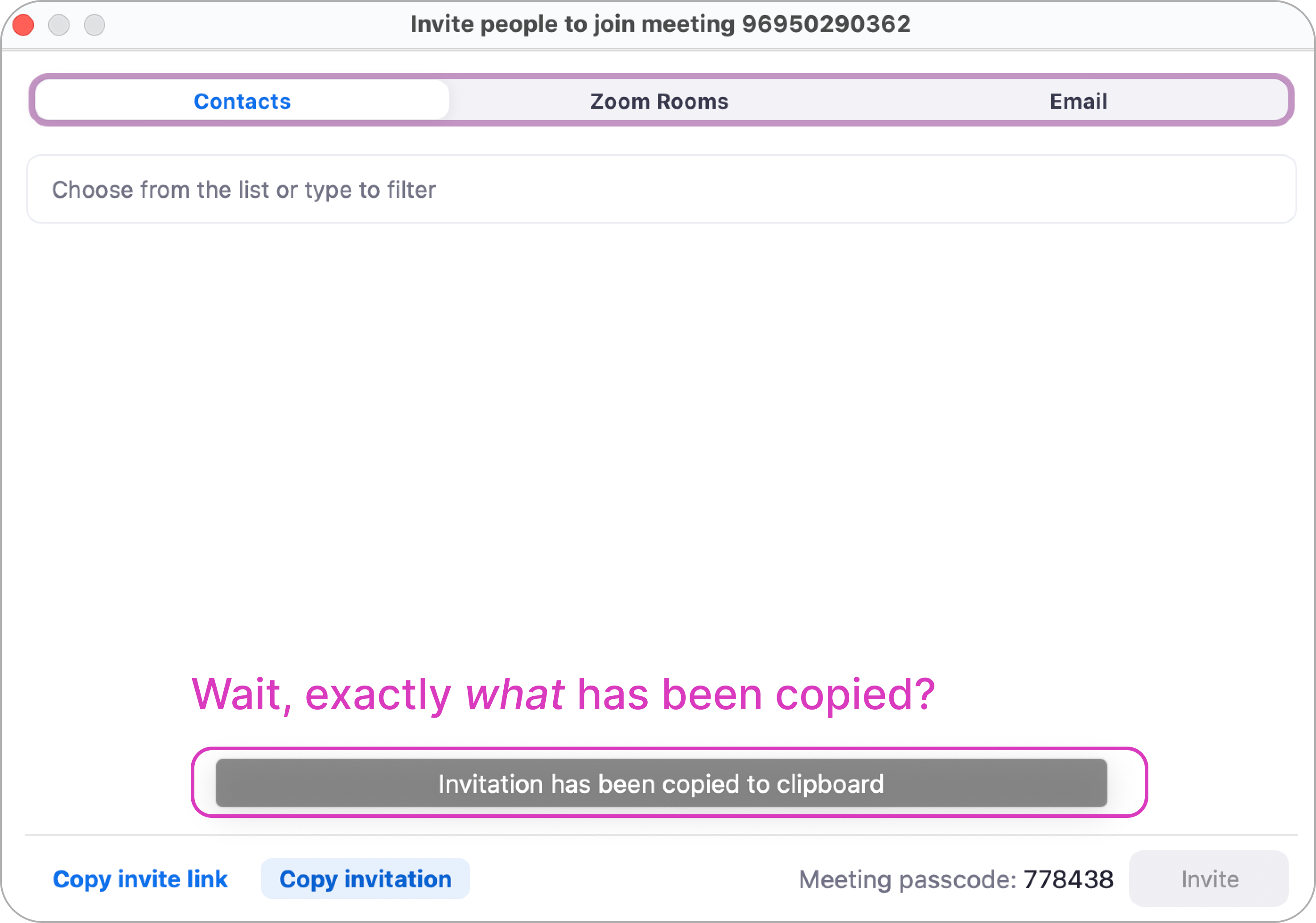
Here feedback is present and immediate, but not informative. The user is left wondering: What happened? What do I do next?
–
Proposed Solutions
- Using clear signifiers to increase visibility for specific affordances
I propose redesigning the top and bottom bars with clear signifiers with specific affordances – user knows exactly what they mean and what to do.
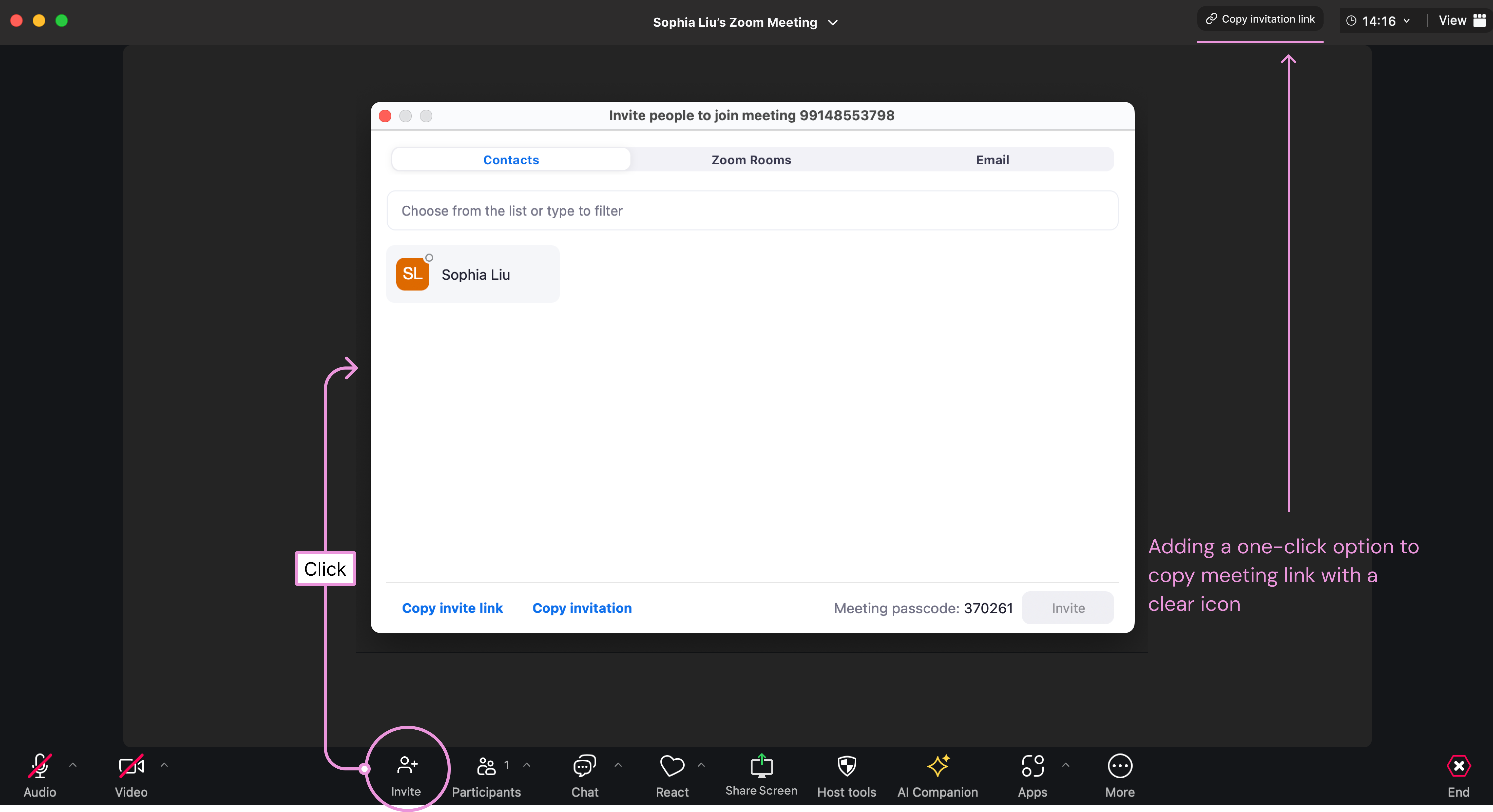
- Increasing discoverability through one-click options to invite people
Rather than nesting invite within other features, I propose housing it in a distinct function in the tool bar, especially when it brings up its own modal. The steps between the main screen and inviting another person are reduced.
- Building conceptual model through more context and clearer information hierarchy
In the invite modal, I propose adding an “invitation” tab that allows the user to see what they will copy.
This makes logical sense because in the other cases (Contact, Zoom Rooms, Email), the user does not need to copy an invite – a conceptual model is formed through the distinction.
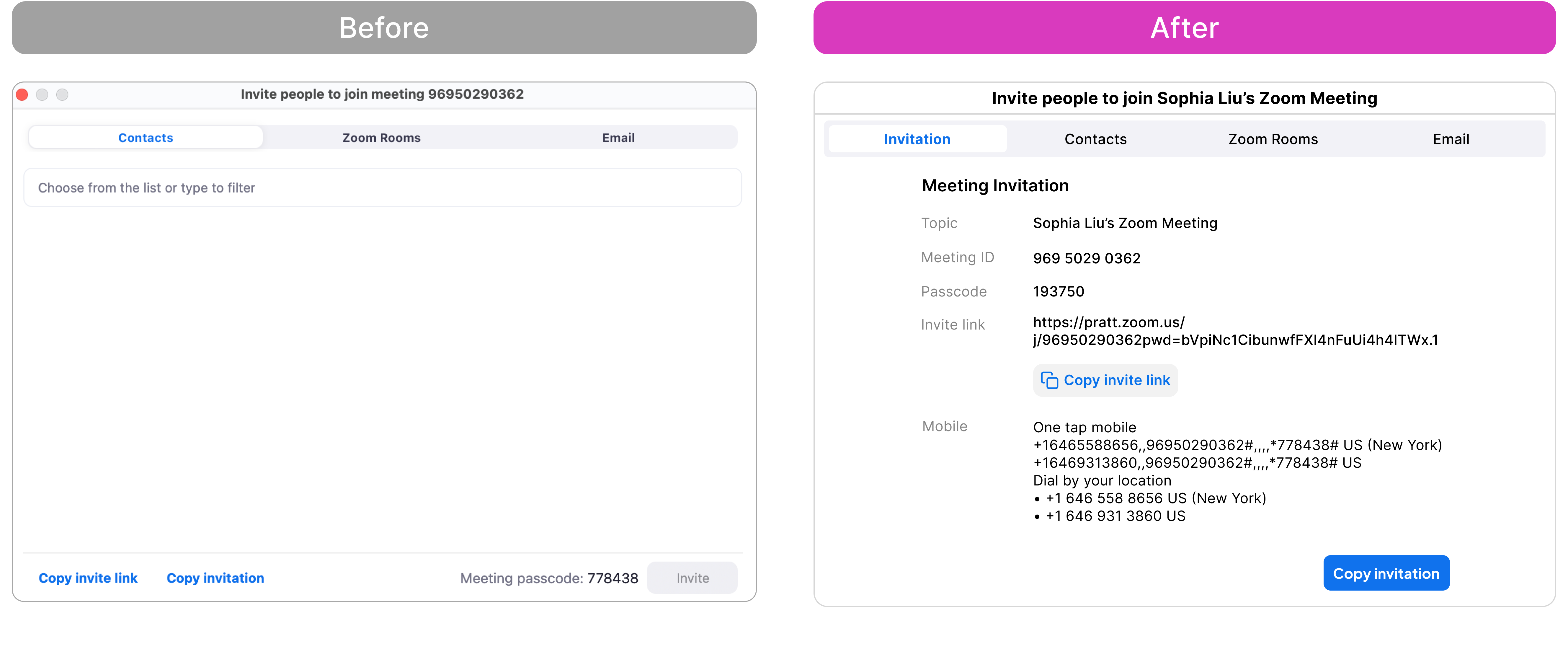
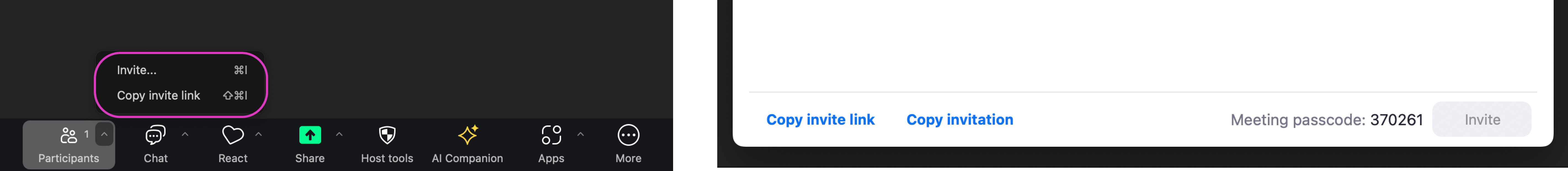
In this modal, rather than putting two very similar buttons together, I put the “copy invite link” button closer to the link, this clearly signifies what is being copied.
Then, I put the “copy invitation” button as a CTA at the end of the invite text to distinguish it from “copy invite link”. This also indicates that it applies to the entirety of the text.
—
Conclusion
In conclusion, although the current invitation flow works, it falls short of being easily usable. Because inviting new participants is such a crucial experience for conversion, a high abandonment rate can be potentially harmful.
This post explored several opportunities for improvement: 1) increasing discoverability, 2) clarifying signifiers, and 3) helping users build a clear conceptual model.