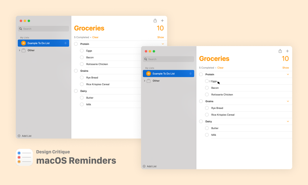
The Reminders app is a core piece of Apple’s ecosystem available on every screen-based Apple product. It gives users the ability to make organized lists, assign due dates for these items and track their completion. Despite its essential function and prevalence across products, the in-app experiences differ drastically across devices. The following is a discussion of some of the most disruptive problems with the desktop interface of the Reminders app and suggestions for its improvement.
Task: Adding an Item to a List
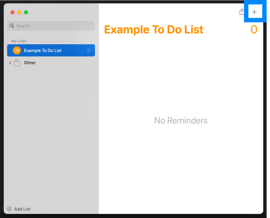
Users can add an item to a list by clicking the plus icon in the top right-hand corner of the app, or by clicking in the white space below the list title.
Problem: Position of plus icon is misleading
Although the plus icon on the top right is discoverable because of its visibility and the overall lack of visual clutter on the Reminders app interface, its position does not match a user’s mental model of list-making. This injects hesitation into a user’s workflow, extending the length of their Gulf of Execution (in this case, figuring out how to add an item to a list).
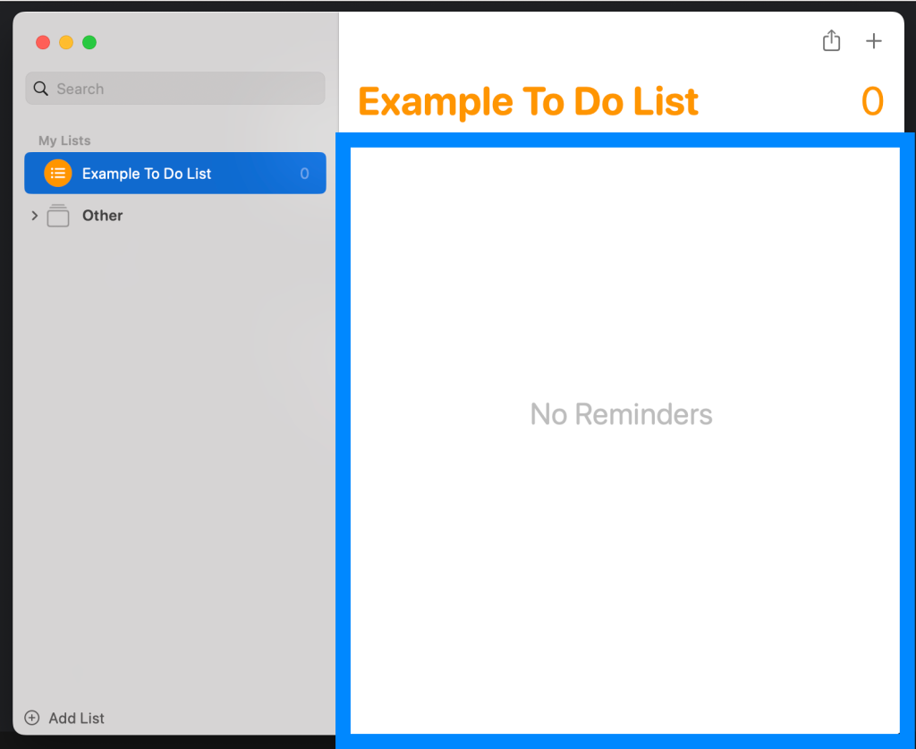
Problem: Lack of signifiers delays user flow
One affordance of the Reminders app is the ability to click on the white space highlighted in blue below to add an item to the active list, however there is no signifier indicating to the user that this action is available. This introduces confusion at the start of the most essential user flow of the Reminders app: adding items to a list.
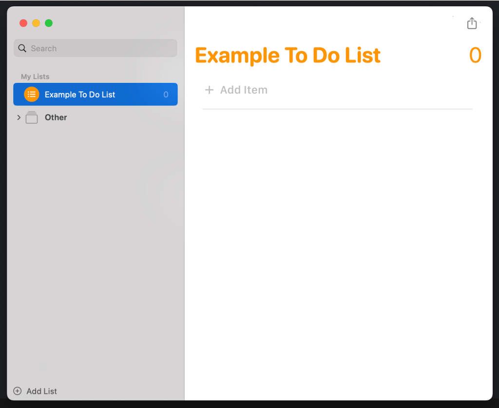
Solution: Match the conceptual model
The plus icon should be removed altogether from the top right of the application window and instead a ‘ghost item’ should be placed immediately below the list title. This is where people are accustomed to adding items to a list and therefore the natural place they would look when beginning to add items to a list. The icon and instruction ‘Add Item’ clearly signals to the user that by clicking that area, they will be adding an item to the list. The position of the ‘ghost item’ within the larger white working space additionally implies to the user they can click the larger white area to add an item, not just immediately below the title, helping users to more easily identify the affordance of clicking on the large white space to add list items.
Task: Rearranging List Elements into Sections
A function of many list-based apps, including the Reminders app, is the ability to create sectioned lists. For example, a grocery list may have a section called Protein containing eggs, bacon and rotisserie chicken, and a different section called Dairy containing butter and milk. In the desktop Reminders app, this is done by dragging one list item on top of another.

Problem: Draggable area of list item is too small
The affordance of dragging items to re-order them or place them within other sections to nest the items has has no signifier, making the feature poorly discoverable. Additionally, the draggable area of the list item excludes the text, making the action more challenging and therefore weakening the affordance: the action is possible, but only if you grab the item in just the right place.
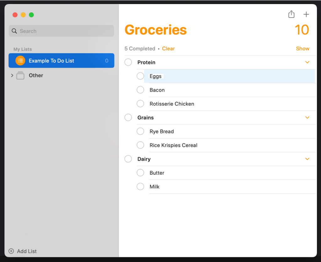
“Eggs” list item with draggable area highlighted
Solution: Add a familiar signifier
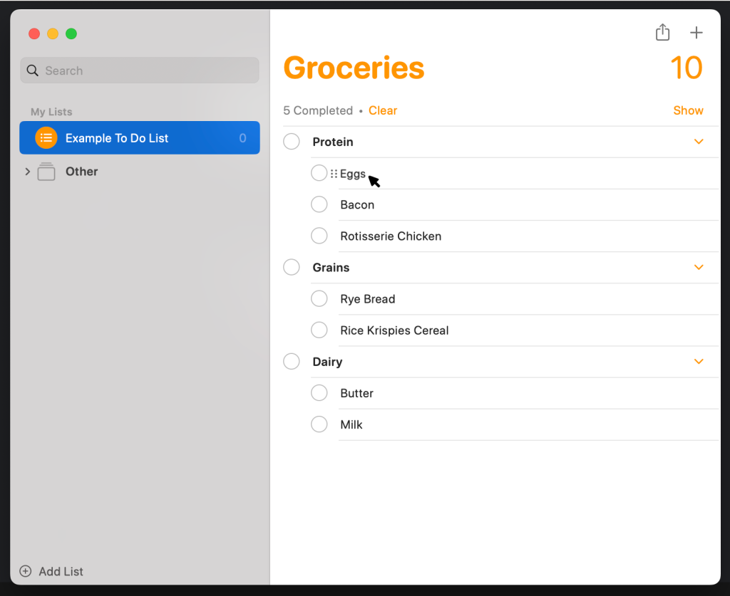
Applications that provide similar list functionality (like Notion) have recognized similar usability issues and addressed them by adding a ‘triple colon’ icon as a signifier. I propose that in the Reminders app, this same icon should appear to the left of the list item on hover. This will improve discoverability of the draggable feature by utilizing a conceptual model established by similar applications like Notion.
Summary
Making lists is an essential organizational tool, and for many, the Reminders app facilitates this process. Because list-making is such a common activity, we often take its simplicity for granted. However, friction in tasks we expect to be effortless, like adding a list item or rearranging list items, can be particularly frustrating. For the Reminders app to remain competitive as a list making tool, it’s essential it modernizes its interactions to keep the simplest activities in our day truly simple.
