About the Project
Client
Hatemap.io
Bjørn Ihler
Duration
14 weeks
Sep 2024 – Dec 2024
Location
Europe – Our client
New York – The UX team
Meet the Team
NOTE: Despite assuming roles, we were a very collaborative team and worked on everything synchronously.
Executive Summary
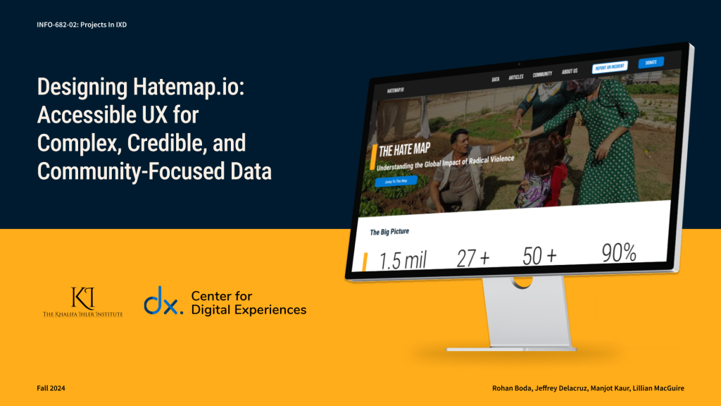
We collaborated with Bjørn Ihler, a counter-terrorism and peace activist and co-founder of the Khalifa Ihler Institute, to enhance Hatemap.io. The website hosts their data visualization project, “The Hate Map,” which tracks and visualizes hate crimes worldwide through interactive maps and dynamic data displays.
His goals with this project were to:
- Make the data accessible and engaging while exploring ways to tell complex stories.
- Improve the user experience of the site and encourage community building.
- Revise the map to keep users actively engaged and interested.
Based on the project brief that Bjørn created, we brainstormed design and scope questions to kickoff the project.
Some of these questions included:
- How might we present substantial and complex information to users in an effective and meaningful manner?
- How might we foster community building at Hatemap.io among affected individuals and research professionals alike?
- How might we make users feel confident that Hatemap.io is a trustworthy source of information?
Design Strategy and Process Overview
Our solution was to design the Hatemap.io website using the following strategy:
Establish Khalifa Ihler/HateMap.io as a welcoming, trusted, and accessible information hub.
We accomplished this by the following:
- Creating a usable website that simplifies data
- Highlighting key insights and statistics
- Fostering inclusivity among users
- Enhancing engagement through clear communication channels
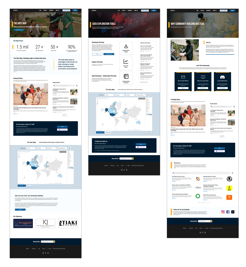
Figure 1: Home page (left), Data page (center), and Community page (right).
In addition to these pages, we created an About Us page and an Articles page.
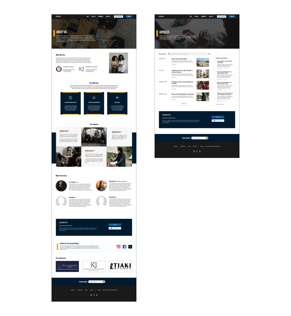
Figure 2: About Us page (left), and Articles page (right).
Understanding Goals, Users, and Existing Solutions
We found that the current Hatemap.io website provides limited information about the organization, and data represented on the map. We also found that the site offers little community support.
To further understand, we evaluated various websites using two techniques – heuristic evaluation and competitive analysis. By doing so, we understood how sites organize and present large datasets, evaluated their usability, and explored how they foster community among their audiences.
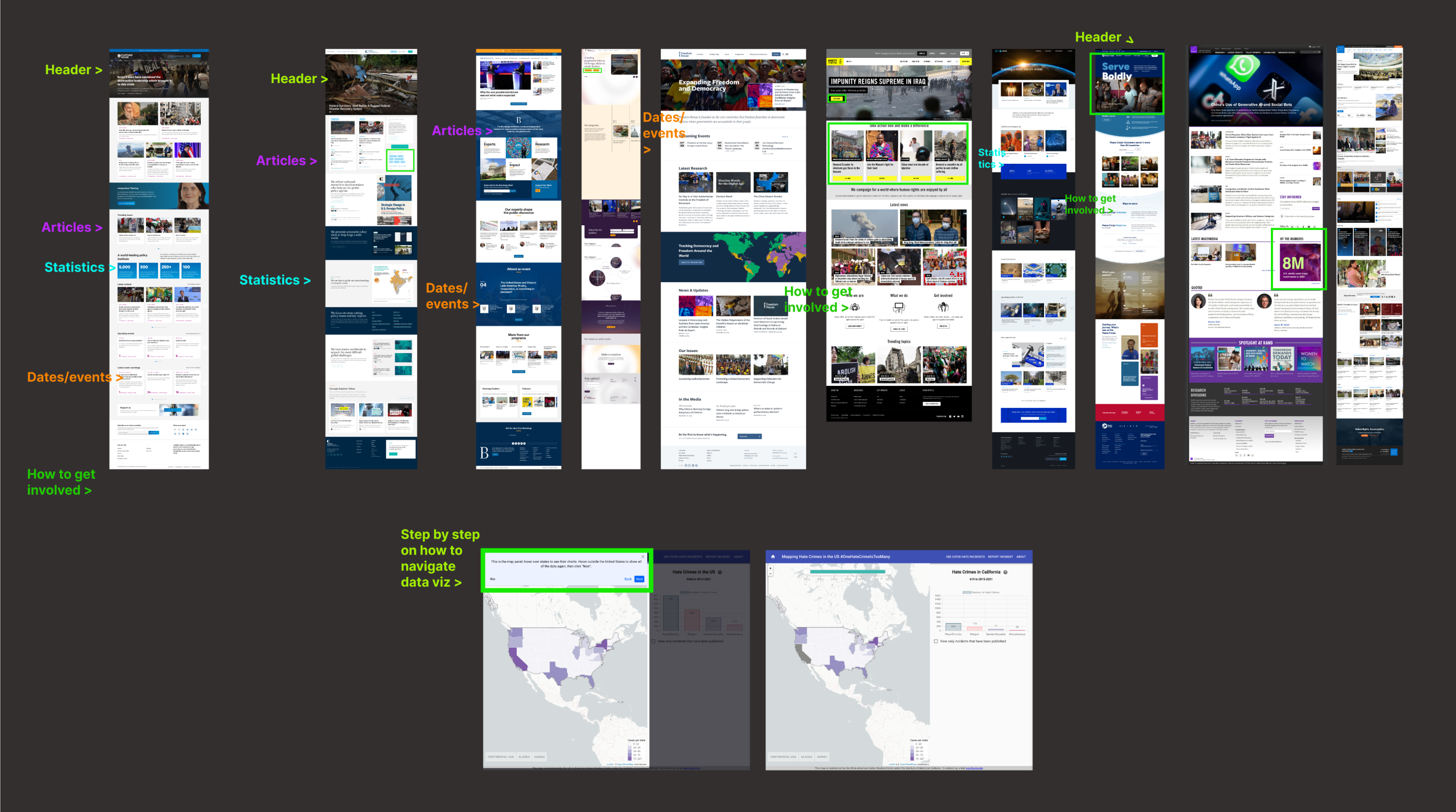
Figure 3: Competitive Analysis
As UX students, we had limited experience working with complex datasets, particularly ones as sensitive as terrorism data. Hence, we have done a literature review to understand how blogs and publishing represent sensitive topics. We also interviewed research professionals and internal stakeholders to understand their research process and expectations when interacting with visualizations and websites.
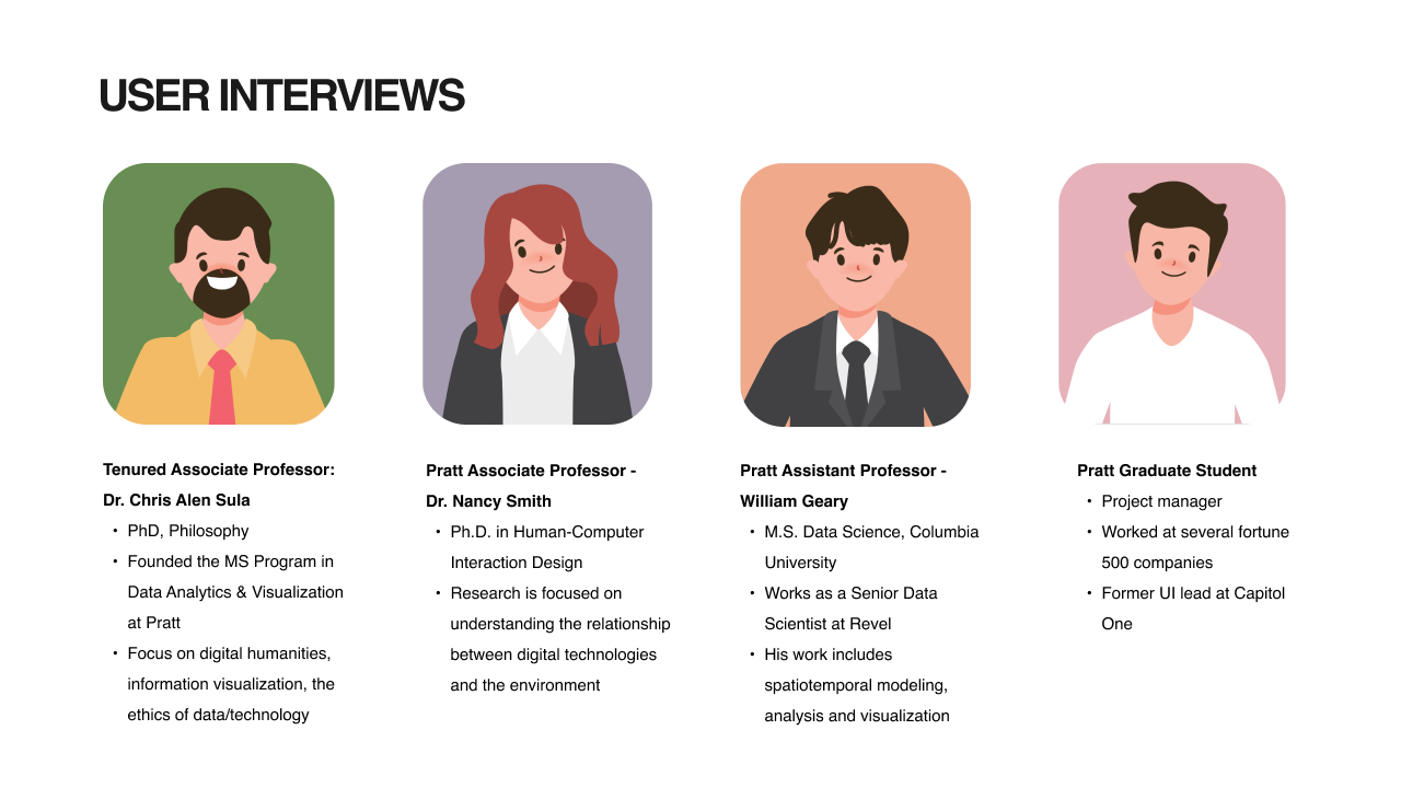
Figure 4: User Interviews
Through this research and our synthesis of findings, we identified three key insights to help drive our designs, they are:
- We can empower users and boost engagement by simplifying data.
- We can foster inclusivity and trust by supporting all user expertise levels.
- We can build a thriving community by enhancing engagement, collaboration, and communication.
These insights lead to the following strategy:
Establish Khalifa Ihler/HateMap.io as a welcoming, trusted, and accessible information hub.
We accomplished this by using the following guiding principles:
- Creating a usable website that simplifies data
- Highlighting key insights and statistics
- Fostering inclusivity among users
- Enhancing engagement through clear communication channels
The Design – Translating Strategy to Screens
Since Hatemap.io was an incomplete site when we embarked on this project, we expanded the site to have more pages. These pages include:
- Home
- Data (Including a Trend Finder)
- About Us
- Community
- Articles
We added these pages based on the findings we uncovered during the research process. Some of the key points we had in mind were:
- Making the dataset more accessible to researchers.
- Making The Hate Map itself more readable and engaging to casual users.
- Establishing Hatemap.io as a credible anti-terrorist information hub.
- Providing a space for community building.
NOTE: Images may be blurry. Click image to view clearly.
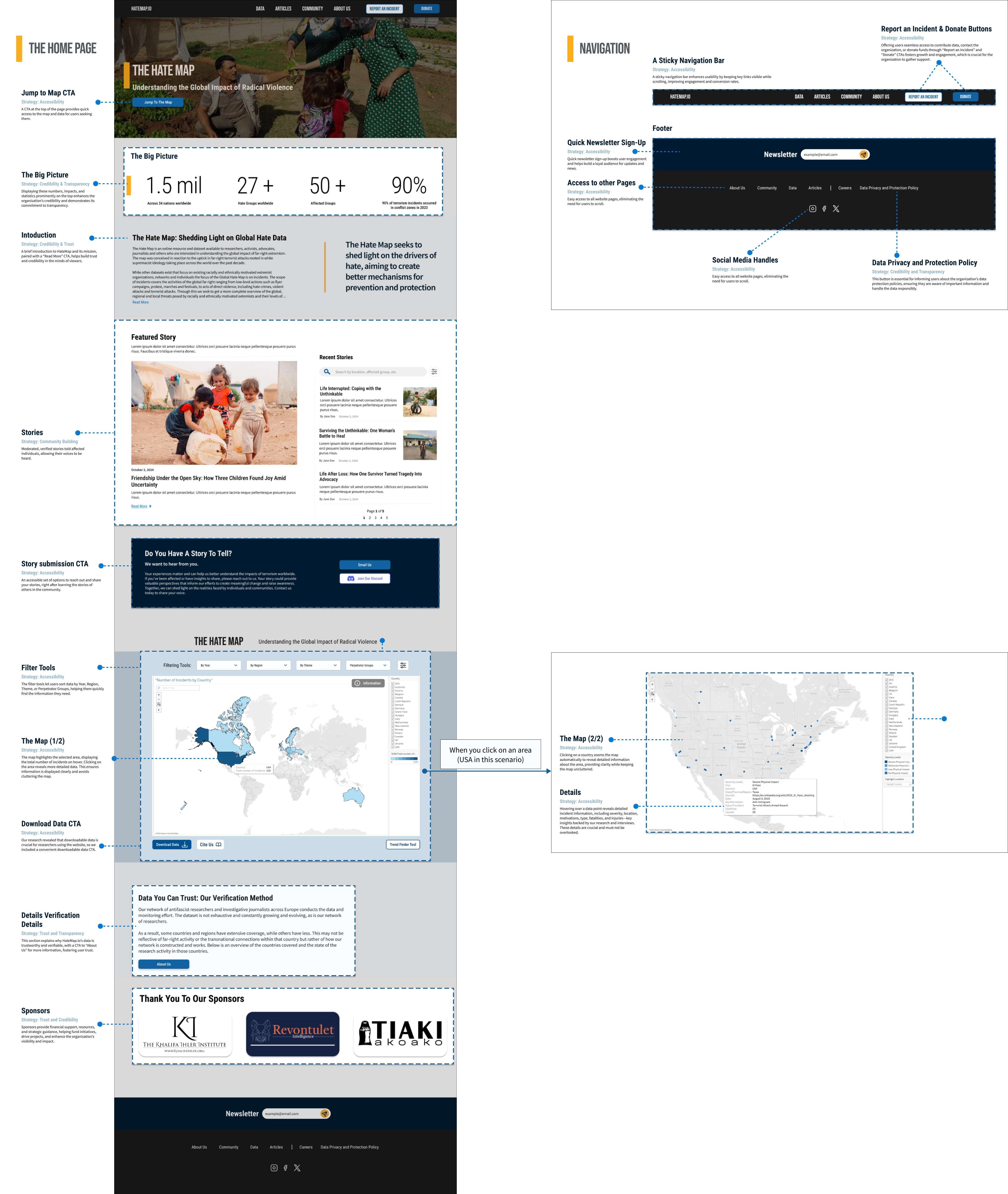
Figure 5: Home page (left), Navigation (top right), Map (right).
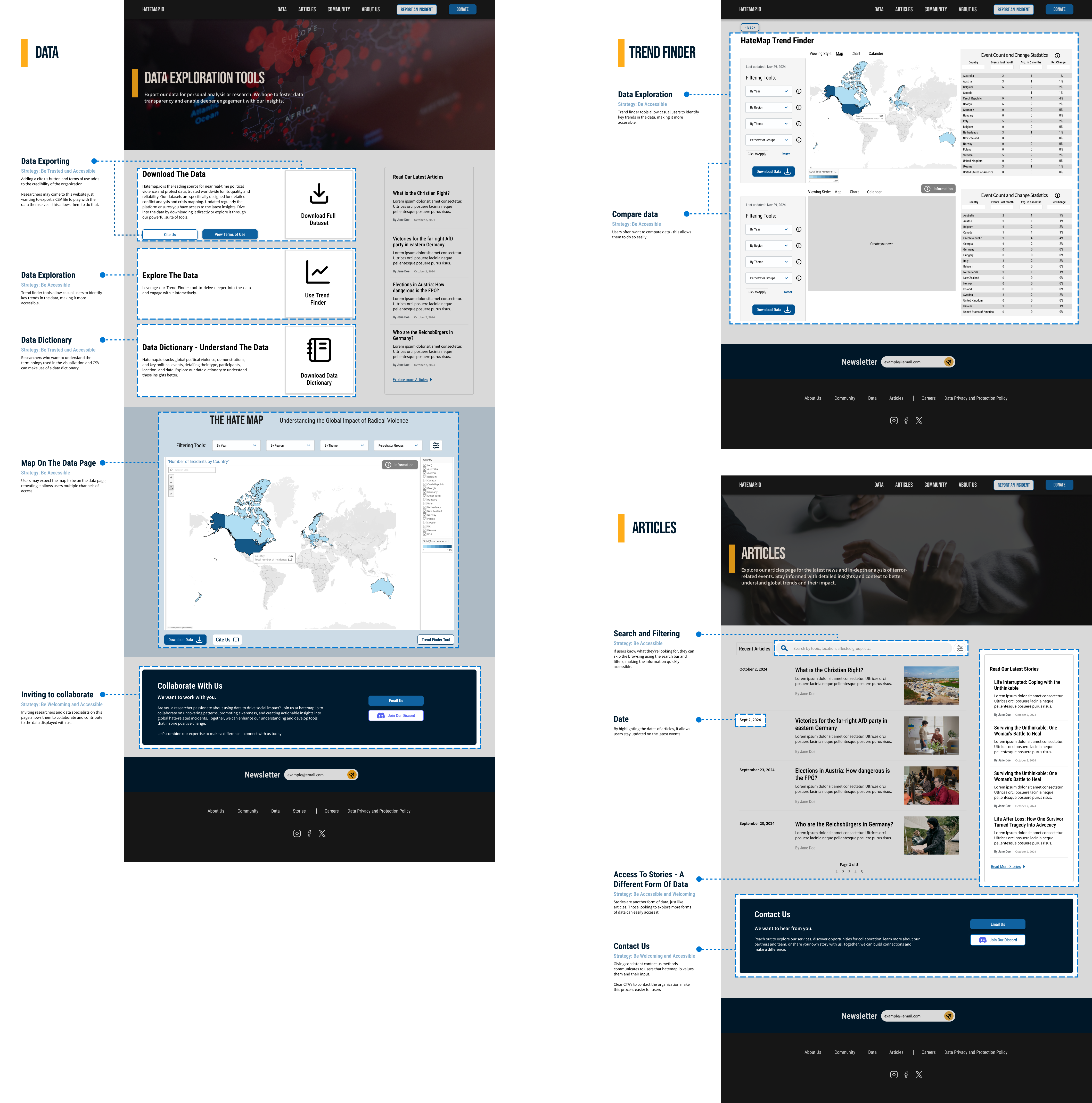
Figure 6: Data page (left), Trend Finder page (top right), Articles (right).
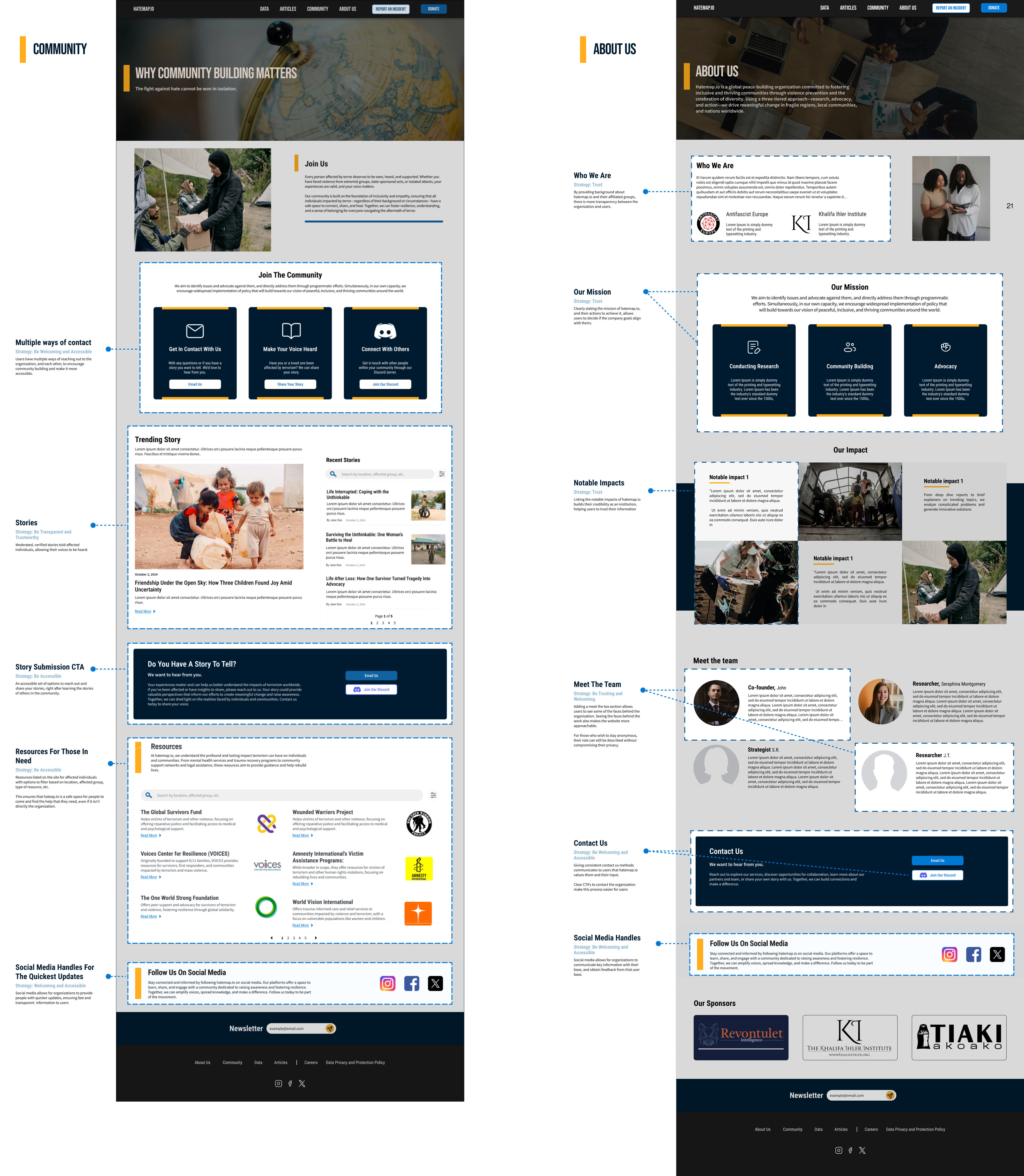
Figure 7: Community page (left), and About Us (right).
Next Steps
We pitched our final designs to our client- Bjørn Ihler, remotely. View the slide deck here.
Bjørn responded positively to the redesigned prototype and expressed that he was excited to begin implementing the designs. This design will aid him in fundraising to bring the website to life.
If we had more time, we would have implemented the following, but instead recommended these as the next steps for the project:
- Mobile Design: Many people, especially those in terror-stricken nations, only have access to phones and do not have computers. Creating a mobile version of the site would ensure accessibility to everyone in need.
- Map tutorial: Step-by-step instructions would aid new or less experienced users explore The Hate Map.
- The Trend Finder: For this project, we created a static mockup of the trend finder. Implementing this feature would grant users greater flexibility when interacting with the dataset.
- The Hate Map: We were given a limited dataset for our mockups, with which we wanted to represent how even large amounts of data could be visualized.
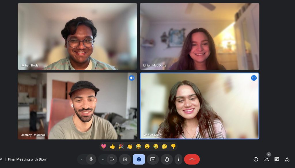
Figure 8: The team after concluding the final client presentation.
