Project Overview
The Financial Empowerment Center (FEC) at New York City’s Department of Consumer and Worker Protection (DCWP) provides free financial counseling and coaching services to NYC residents regardless of their immigration status. These services include counseling for budgeting assistance, debt management, credit improvement, student loans, and more. Clients can book appointments through the FEC’s scheduling website.
Recently, their website saw a 300% increase in traffic, driven by FEC’s growth strategy and marketing efforts. Despite this, the booking completion rate is low.
In this project, our UX team at Pratt Institute identified key usability issues, restructured the user flow, and redesigned the scheduling website. Our project strategy focused on enhancing service awareness, managing client expectations, simplifying interactions, and delivering an intuitive, accessible experience for users of all ages and tech skill levels.
Project Timeline
12 weeks
Our UX team
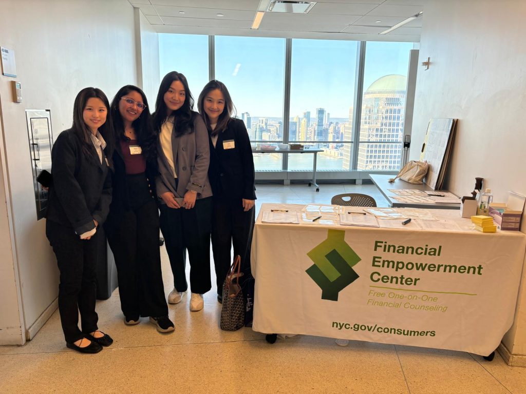
Our team at Pratt consisted of four UX Designers: Emily Chiu, Jimin Hong, Jiyoung Lee, and Richa Shah. They brought expertise in user research, design, and product strategy. Guided by Professor Rachel Ginsberg, we strategically divided roles to enhance efficiency and collaboration with our client.

Problem
Despite the surge in web traffic driven by FEC's marketing efforts, the appointment booking conversion rates remain low on their current website. This suggests that users face significant barriers preventing them from completing online bookings.
Current Website Interface
Their current website requires users to complete three main steps, each with multiple sub-steps and excessive loading time, to book an appointment. It also lacks a clear appointment confirmation screen and relies on email/ text messages for confirmation details.


–
Project Constraints & Considerations
1. Limited Time and Resources
Completed within 12 weeks, this project required prioritizing high-impact, quick-to-implement solutions.
3. Design System Adherence
Solutions were designed to align with the existing Bootstrap framework for quick implementation and developer efficiency.
2. Restricted Access to End Users
Confidentiality constraints prevented direct interaction with FEC clients/ end users, limiting insights into their experience and pain points.
4. Streamlined Scope
The project focuses on specific touch points within the scheduling experience, not the broader end-to-end customer journey.
Project Goals
Our proposed solution focuses on analyzing and addressing the factors that contribute to low engagement and conversion rates. Key objectives include:
- Improving the usability of the portal to streamline the appointment booking process, thereby boosting the appointment booking rate.
- Enhancing service awareness to ensure users understand the value and outcomes of financial counseling with the FEC.
Based on our objectives and goals, we defined the following “How Might We” statements:
How might we improve the navigation intuitiveness and usability of the online portal while streamlining the overall experience to increase conversion rates?
How might we ensure the platform is accessible for all users, including those with varied age range, abilities, and language-related requirements?
How might we enhance clients' understanding of financial counseling services and encourage them to book appointments online?
A Glimpse of Our Final Design Solution

Experience the final design prototype before diving into our process, research findings, and design breakdown.
Our Process in a Nutshell

STAGE 1
Conducting Research & Synthesizing Insights
The core research approach involved gathering insights into client pain points through counselors and stakeholders, as direct access to clients was not possible due to privacy concerns and the sensitive nature of financial counseling. To achieve this, we:
- Conducted 7 in-depth stakeholder interviews, including interviews with former counselors and counseling managers, all within a short time frame of one week to understand their perspectives.

2. Participated in FEC’s quarterly meeting, conducting polls with 60+ counselors to gain insights into their perspectives and common challenges reported by their clients.

3. Distributed anonymous surveys directly with clients and analyzed annual digital performance reports provided by FEC to gather insights into pain points, device usage, and other statistics.

4. Conducted heuristic evaluation and benchmarked against other 8+ financial service providers and 12+ appointment booking platforms.

These engagements provided valuable context on the client journey, pain points, and stakeholder expectations. We used affinity mapping to cluster findings, identify patterns, and extract key insights that shaped our strategy and design decisions.

Key Insights and Findings that helped us Shape our Strategy
- 80% of users access the scheduling website via their mobile devices.
- Misconceptions about financial services often lead to misaligned expectations among users.
- Slow loading times and confusing layouts create an impression of limited availability, resulting in errors and user drop-offs.
- Collecting language preferences and visit reasons beforehand improves session flow and counseling efficiency.
- Low tech-savviness, un-intuitive user flow, and excessive clicks decrease motivation for users, especially older adults.
- High no-show rates stem from unclear appointment confirmations and weak reminders.
Mapping Existing Client Journey

STAGE 2
Shaping Our Guiding Strategy
Spreading awareness, educating clients about available services, and managing expectations, during scheduling and beyond.
This strategy, informed by our research insights, aimed to empower clients to confidently navigate the portal while clearly understanding the scope of services offered. These elements were thoughtfully integrated into the proposed design to deliver a seamless and reassuring user experience.
Guiding Principles:
- Mobile-First Design Approach: With 80% of users accessing the scheduler via mobile devices, we decided to prioritize a mobile-first design approach. This included designing responsive layouts and interactions optimized for smaller screens while ensuring scalability for larger devices.
- Intuitive and Inclusive Design Experience: With a diverse user base spanning various ages and levels of tech-savviness, we prioritized clear navigation, language options, accessibility features, and a simple, user-friendly interface.
- Streamlining the Flow to Reduce Friction: We mapped the ideal client journey, simplified complex processes, and applied progressive disclosure to reduce cognitive load and user frustration.
Mapping Ideal Client Journey

Streamlining Appointment Booking by applying the Principle of Progressive Disclosure
We applied the “Progressive Disclosure” design principle, breaking the appointment process into manageable steps to reduce cognitive load and improve clarity, especially for users across a wide age range. This approach also addressed long load times by distributing data across steps, ensuring a smoother experience. Additionally, we restructured the flow and tasks to make sessions more efficient and intuitive for clients.
Before (Existing user flow):

After (Newly proposed user flow):

STAGE 3
Turning Strategy into Action
The redesign aimed to streamline the appointment booking process by reducing confusion and cognitive load. Leveraging research insights, strategy, and benchmarking against other financial service providers and scheduling platforms, we made informed design decisions, crafting high-fidelity prototypes and utilizing a cohesive design system.
We also conducted moderated usability tests with 8+ users, including 50% aged 55+, to gather valuable insights. These insights informed thoughtful design iterations, ensuring the process was more intuitive, accessible, and user-centered.
Overall Ease of Use Rating: 4/5 (1 being very difficult, 5 being very easy).
User Quotes from Testing the usability of our Newly Proposed Design
“It was pretty straightforward and the questions were very simple to understand.”
“Overall this was easy to follow and the next steps were clear. “
Final Design Breakdown
Link to our final design prototype.
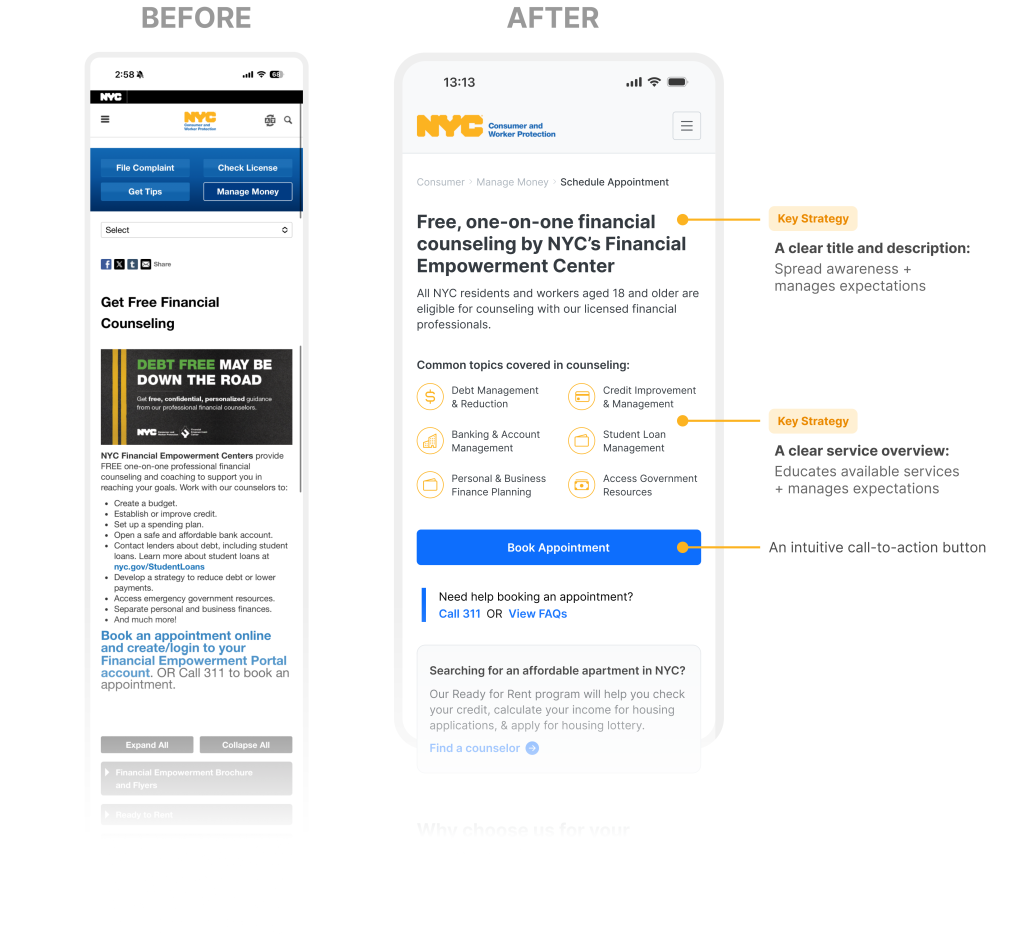
A landing page designed to spread awareness, educate clients about available services, and set clear expectations.
First impressions matter, so we have made our landing page more organized and user-friendly. We tackled the issue of finding the text link for scheduling and simplified the lengthy list of previously hard-to-use services. We added a clear call-to-action button that is easy for users to see and click, removing the need for them to search for how to get started. Furthermore, we arranged the available services in a visually structured format, using eye-catching icons and sorting them by popularity. Lastly, in line with our key strategy, we included a clear title and description to increase awareness of the services and effectively manage user expectations.
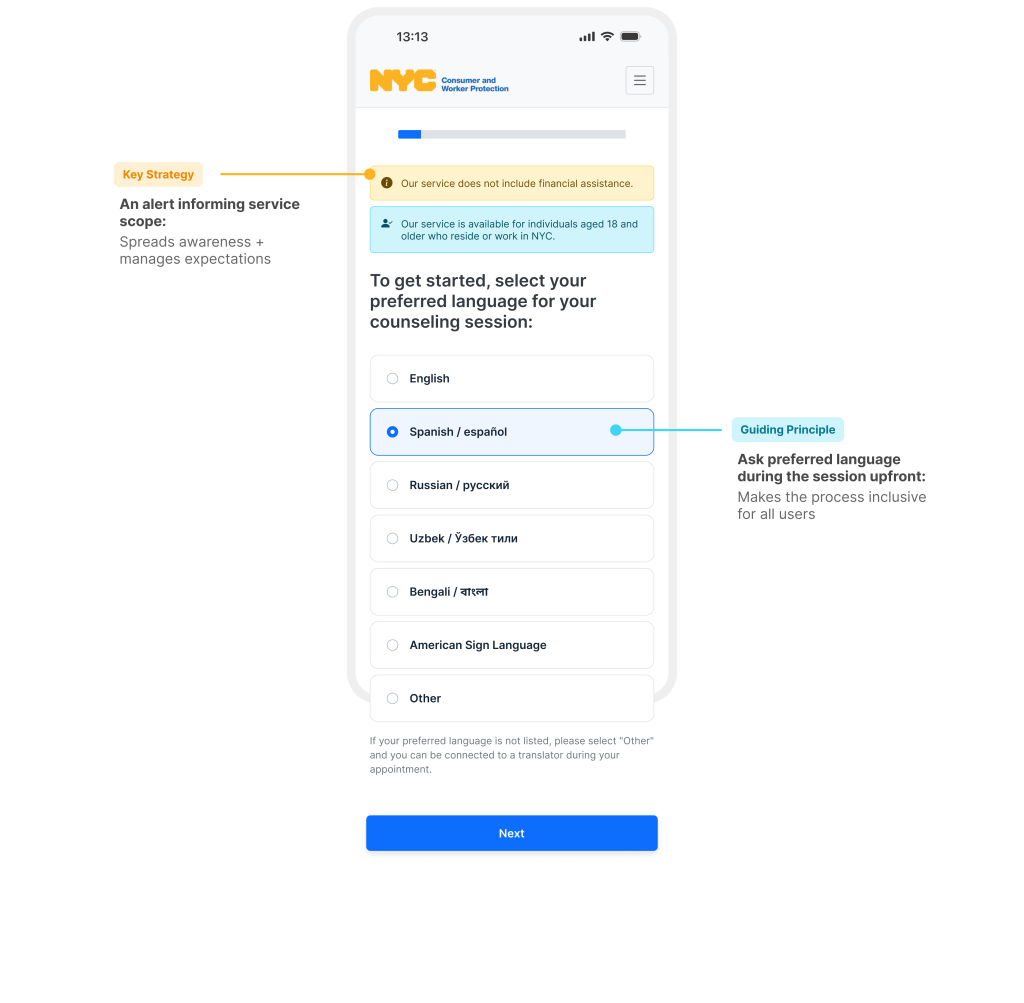
To set the right expectations and align with our strategy, we included a prominent alert that clearly informs clients that this service does not provide financial aid.
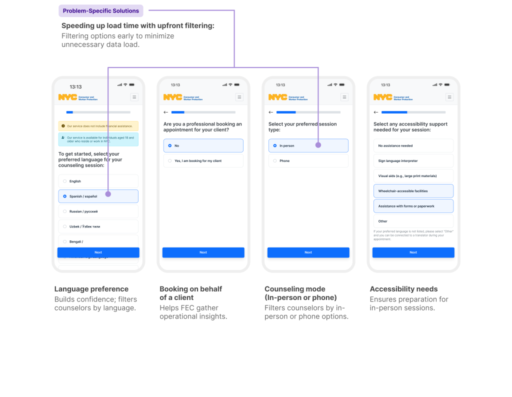
Session preferences upfront that will boost user confidence and enhance the data retrieval process.
We begin by asking about the language preference for the session. This not only helps build confidence in the counseling session they are about to book but also speeds up the data retrieval time by filtering the counselors who speak the selected languages. After this question, we will ask additional questions that can assist with the operational aspects of FEC or help narrow down the available modes of counseling.
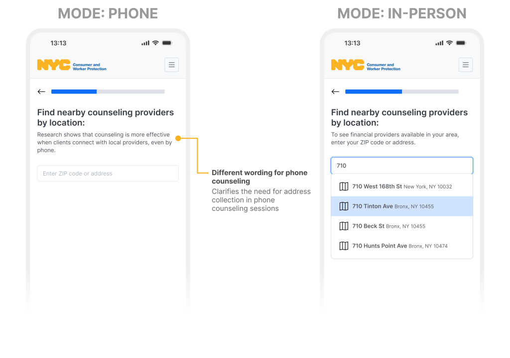
A thoughtful UX writing for location selection for both in-person and phone counseling.
Once clients have set their preferences, it’s time to check for availability, beginning with the selection of a location. You might wonder why a location matters for phone counseling, and the rationale is clear: connecting with a local counselor provides benefits, especially if you decide to shift to in-person sessions later on. This thoughtful approach ensures a continuity of support, creating a seamless transition in their counseling session.
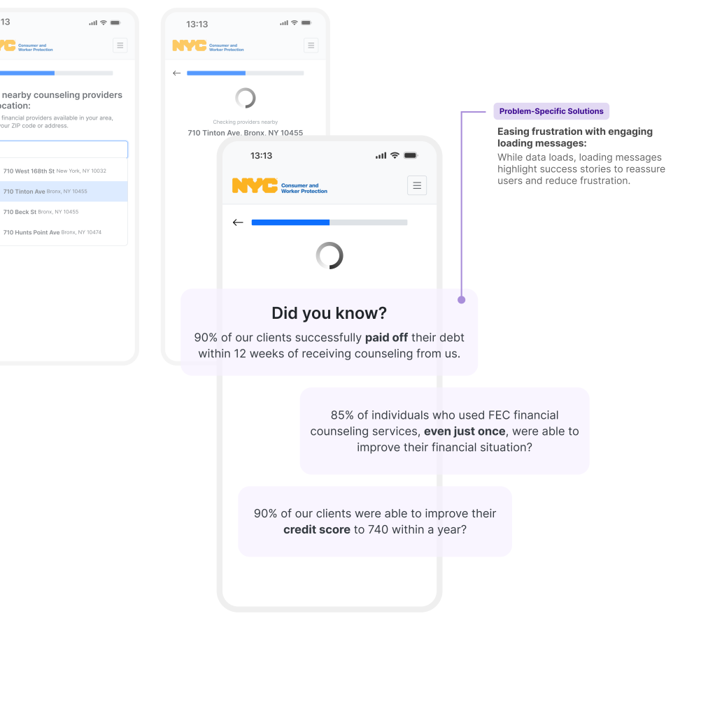
Transforming a Load Message into an Engaging Experience.
We acknowledge that retrieving data can take a long time, and we have received feedback about the portal being slow. While we work on improving its speed, we view this as an opportunity to keep users engaged during the wait. Therefore, we display informative messages to reassure users, such as, “Did you know that 85% of our clients who received counseling paid off their debt within four months?” This approach is designed to engage users while they wait and reinforce their confidence in our services.
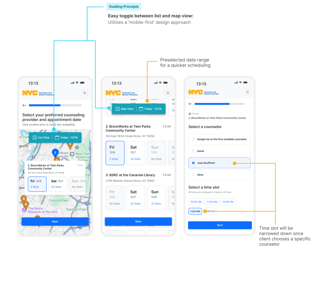
No cognitive overload, just an easy, intuitive choice process with preselected dates along with a toggle for a list or map views.
Next, clients get to choose Provider, date, counselor, and time in two steps instead of one page to reduce cognitive load. Providers and available dates are displayed in a list view with a default preselected two-week range based on research showing most clients prefer scheduling within this timeframe. Clients can toggle effortlessly between list and map views, maintaining consistent interaction patterns. In the next step, clients can select a counselor and time slot, with available times narrowed down when a specific counselor is chosen.
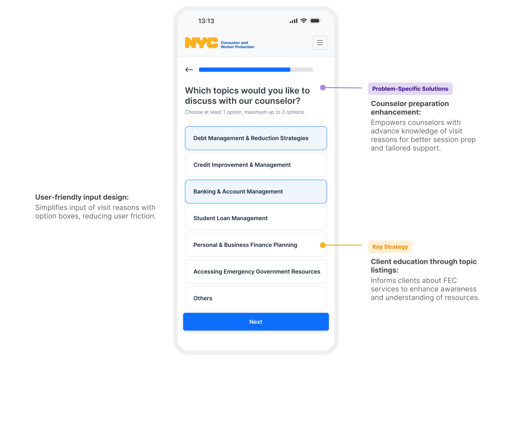
With an easier topic selection process, counselors can prepare better, leading to more effective sessions for clients.
Once clients pick the counselor and availability, they can select the purpose of their visit by choosing from predefined topics, presented in a user-friendly option box format to reduce friction and minimize typing. By allowing clients to select topic(s), the design addresses key challenges such as improving counselor preparation and enhancing client education about the range of services offered by FEC.
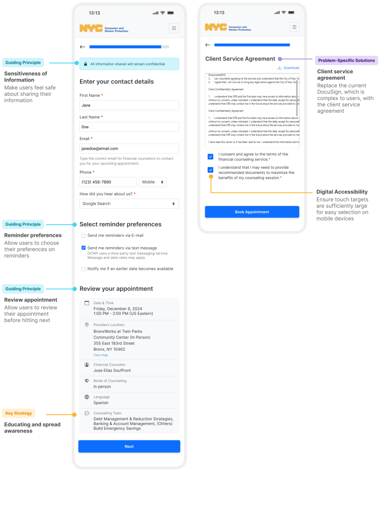
An overview and the agreement form integration enhances client confidence and simplifies their experience.
Lastly, we have included a quick appointment overview to give clients a chance to review their details before submitting them. This overview uses clear language to help clients feel confident about sharing sensitive information. Additionally, we have integrated the Client Service Agreement form directly into the scheduling process, replacing the previous DocuSign method, which required users to sign separately after booking their appointment. This change reduces the chances of missing the agreement and streamlines the entire counseling session.
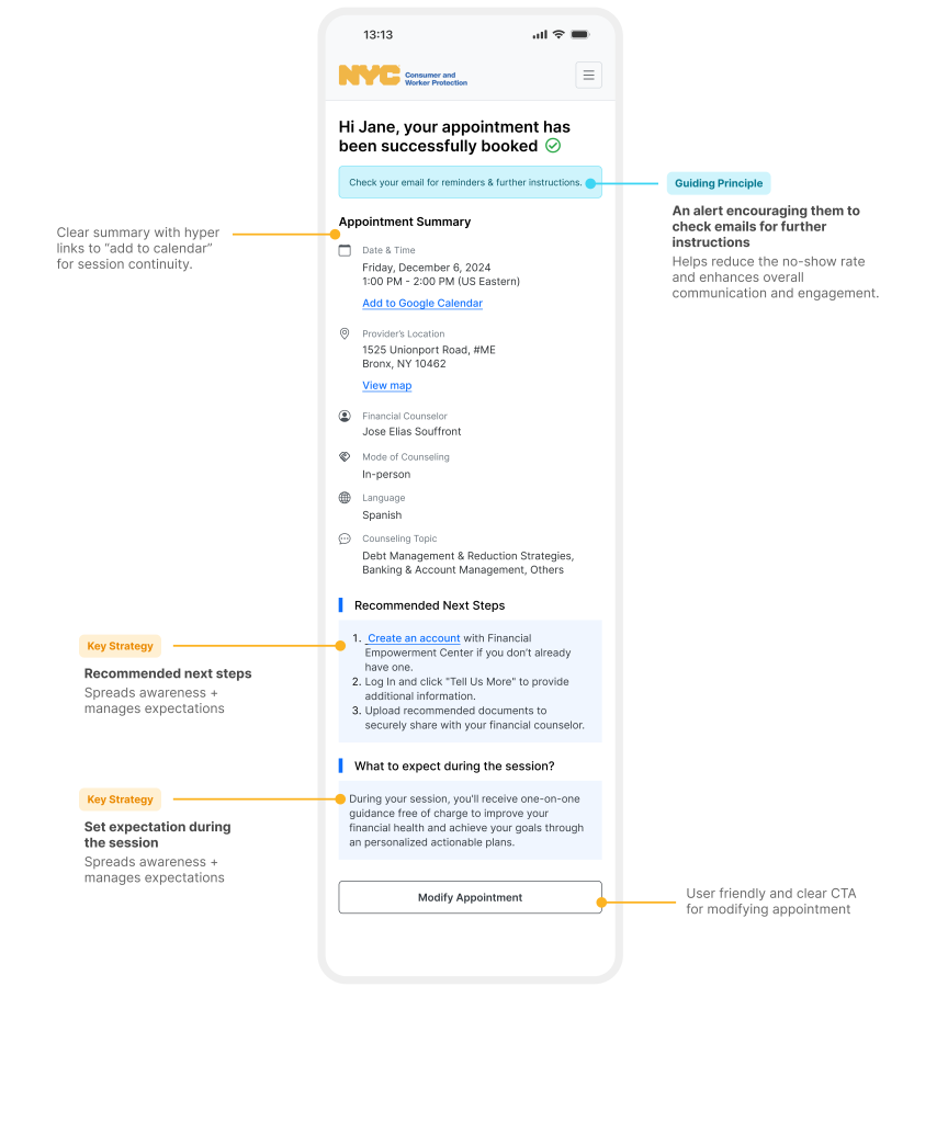
The confirmation page ensures clarity and reassurance, aligning with our goal of managing client expectations.
A prominent alert encourages clients to check their email for appointment details, while the “next steps” section outlines what to expect during their session, minimizing uncertainty. This thoughtful design prepares clients for the process and offers the flexibility to proceed or explore additional information as needed.
Key Takeaways & Project Impact
In conclusion, revamping FEC’s financial counseling scheduler has successfully improved service awareness, usability, and accessibility.
We received enthusiastic and positive feedback during the final presentation, which highlighted the design’s intuitive navigation, simplicity, and effectiveness in addressing previously overlooked challenges. The audience was particularly impressed with our detail-oriented approach and efficient execution, expressing excitement about implementing the design.
Overall, the project not only exceeded their expectations but also provided a valuable solution that saves time and resources, creating a meaningful impact for both the client and their users.

Our clients not only plan to implement our design solutions to the financial counseling scheduler but also intend to apply this approach to other scheduling processes across their entire services.
“Excellent work! Very thoughtful approach to each and every aspect of the portal.”
~Stakeholder 1
“We’re going to use the same design for other appointment tool that we have.”
~Stakeholder 3
“This is how I was hoping it would look. Amazing work in such little time.”
~Stakeholder 2
“Shows services offers really well- works well with comms strategy as well- better than just talking about it during the session.”
~Stakeholder 4
