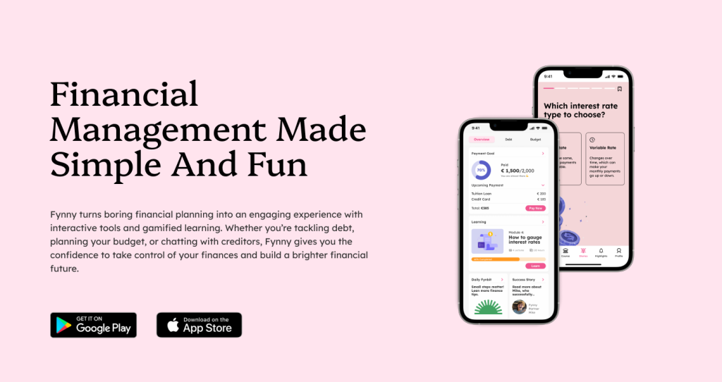
Overview:
Fynny is a financial startup based in Netherlands devoted to educate youngsters on how to plan their debt and their spending management. Fynny focuses on user’s financial health connecting behavioral science, technology and a scalable model.
Hence, for us the project mission was to simplify financial processes, enhance financial literacy, and make debt management engaging and accessible for young people.
The project involves conceptualizing the design of the app from scratch, and developing screens for important task flows related to financial management and literacy for the target audience.
Process:

1. We understood the crux of the brand and its problem
Netherlands faces a serious rising debt challenge for its younger population.
Youngsters in Netherlands face debt from multiple reasons like mandatory health insurance payments, lack of knowledge of late payment repercussions, less access to financial educational resources, not being able to approach the right people for help, all collectively adding to their debt.

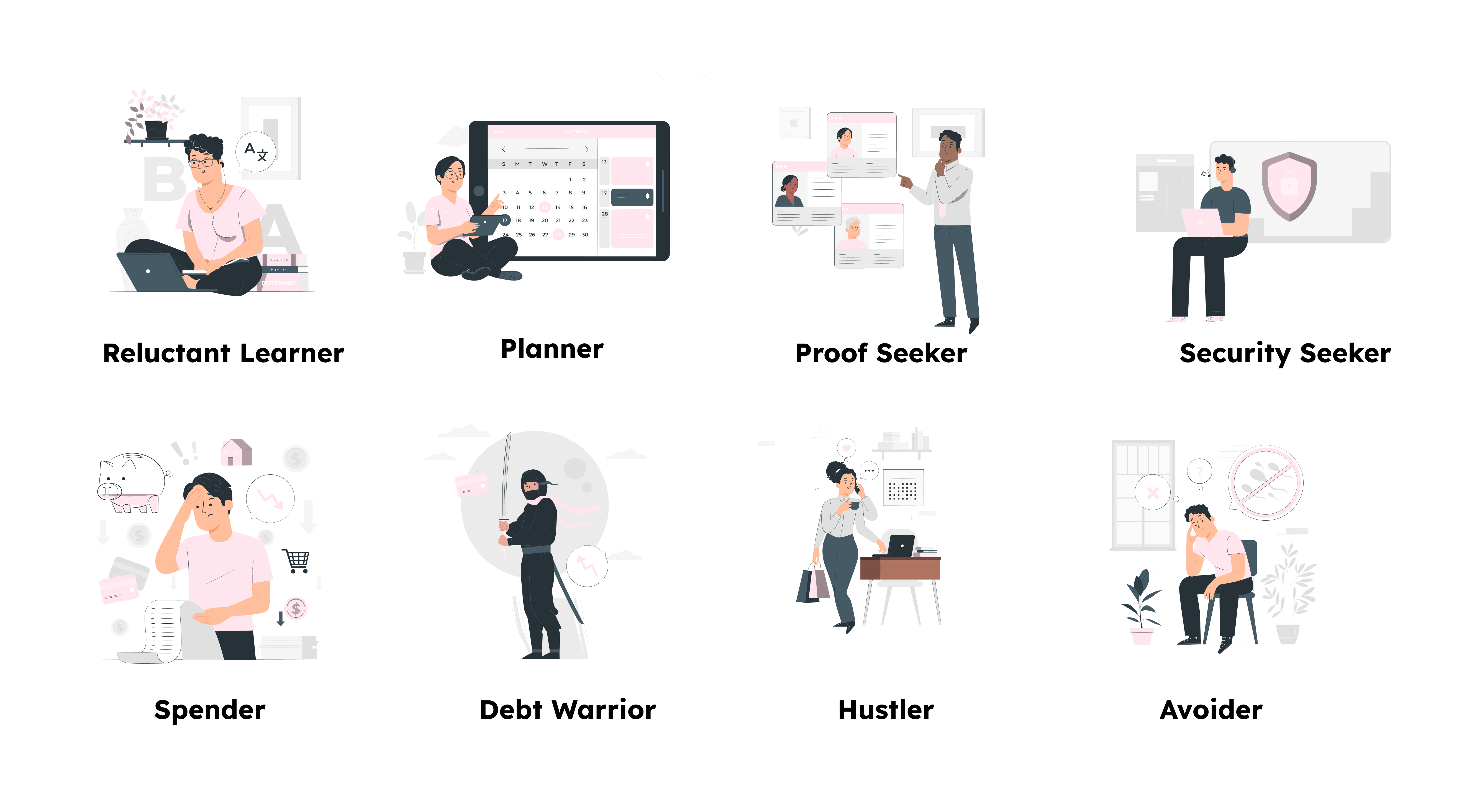
The research gave light to 8 behavioral personas youngsters in the Netherlands embody in the context of financial behaviors.
We understood these persona characteristics concluded by the pilot research in detail so as to design features and UI for the app that caters to all of these behavioral patterns. We prioritized this in our design decision making as we realized the target user group of 18-40 years acts in multiple ways when it comes to dealing with their finances. A Planner would operate very differently in the app than a Spender persona.
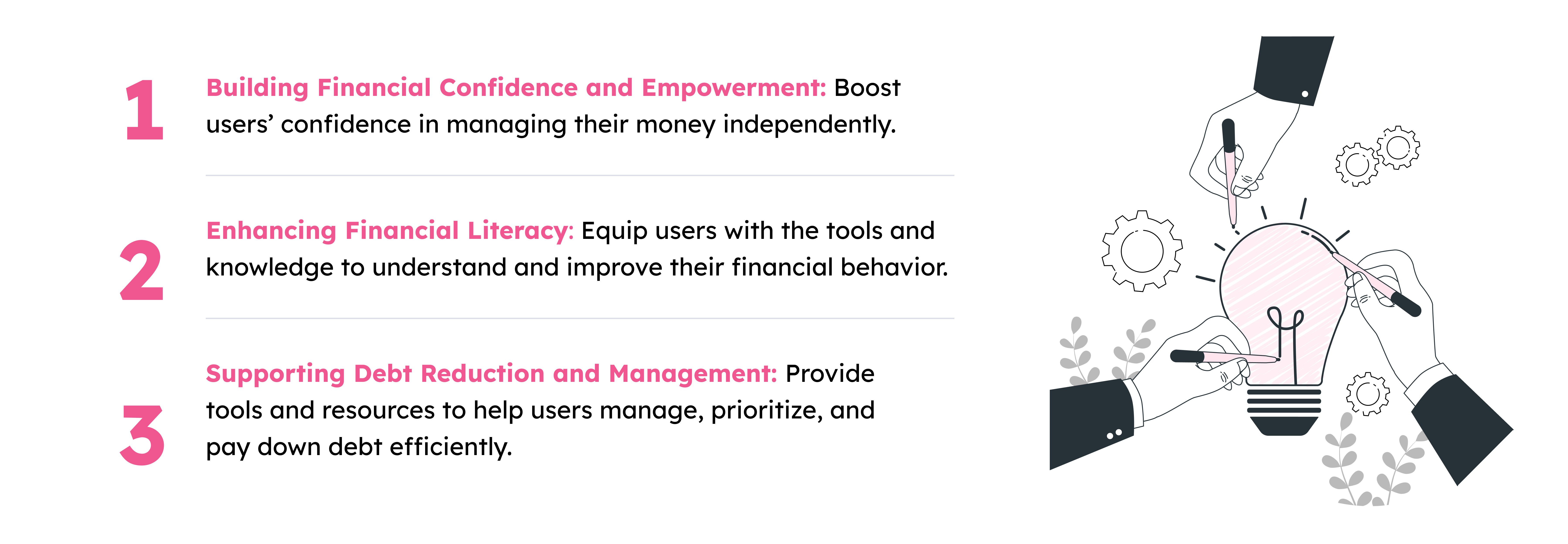
Understanding these issues and consulting with the client, we could strategize and structure Fynny’s organizational goals. This was the base intent of Fynny and the manner it which it will cater to solve these financial issues the target user group is struggling with.
Organisation Principles
2. We started exploratory research to understand how we can design an app to solve the Problem:
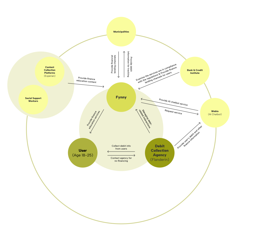
a. Mapping Fynny’s Stakeholder Ecosystem:
An ecosystem map helped us map out the stakeholders, and their precise relationship with Fynny. As Fynny needed to connect users with debt collection agencies and social workers to help them change their payment structures, debt collection agencies become a primary stakeholder and other platforms feed into the system.
b. Case-studies and Competitive Audits
Elaborate case-studies and competitive audits made us realize the important feature base Fynny must have to cater to these problems. We could conclude with some strategies that we could use to design user flows directing users to financial control.

c. Interviews with Government stakeholders
In-depth interviews with officials from the Netherlands Municipality and debt collection agencies made us understand better the seriousness of the issue and the real situation in Netherlands. Based on these insights, we could conceptualize Fynny’s potential features to better cater to the users and also align with the primary stakeholders.
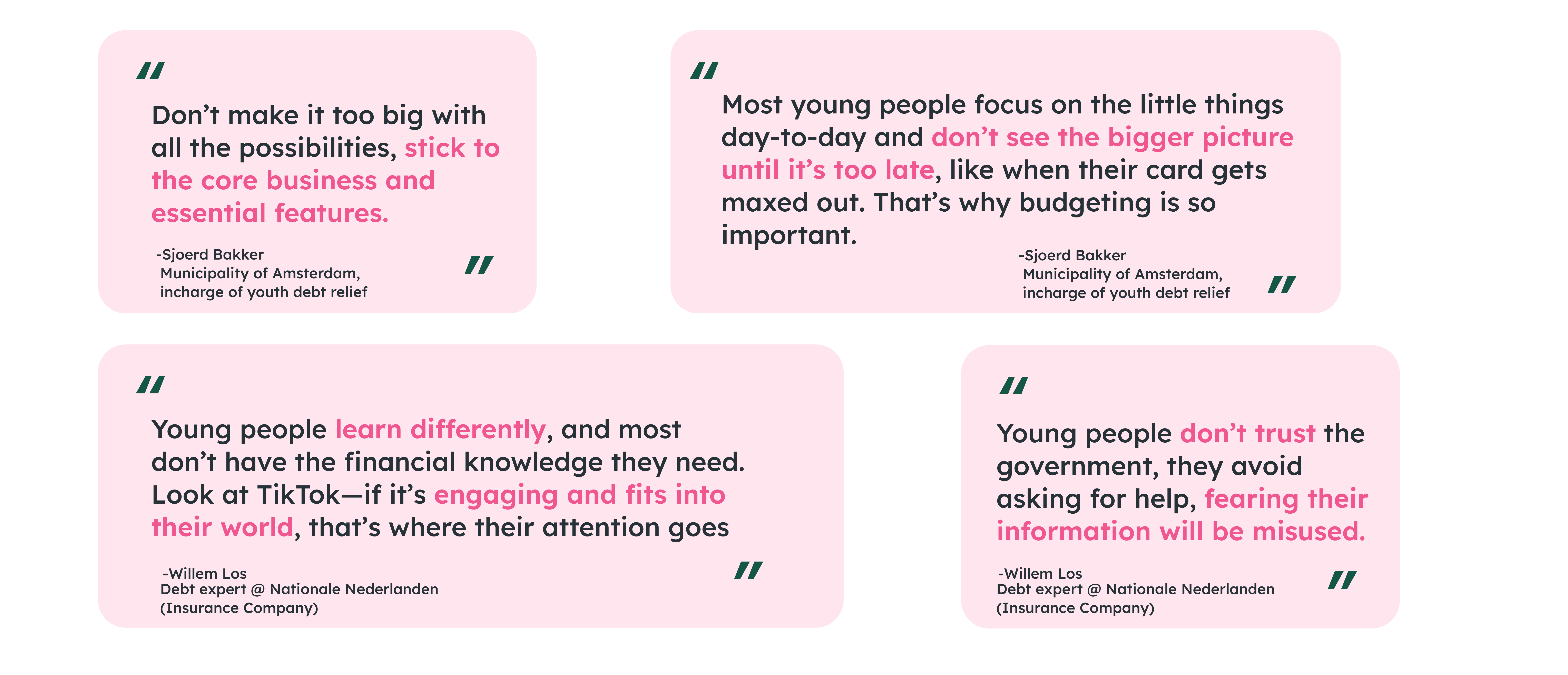
d. Target User group interview to understand the debt struggle
This interview gave us much deeper insights from a user’s point of view about struggles the youngsters are facing. From minor details to major issues we could visualize the features Fynny should have much better after this interview. From a functional, emotional, and technical point of view, we could make some bigger conclusions:
How can we assist our target users in addressing their debt issues through design strategies?
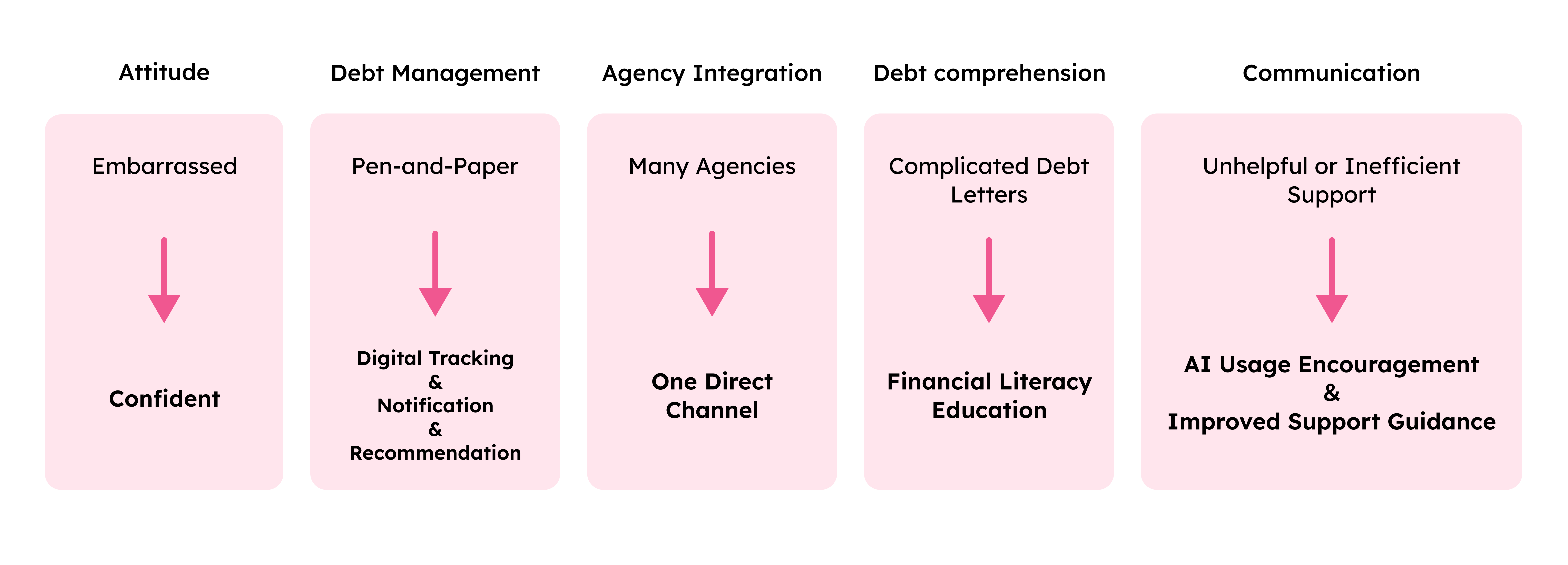
3. We conceptualized Fynny’s potential features for strategic problem-solving.
The main question arose on how to concise the elaborate research insights, Fynny’s goals, our design prioritizations to the user’s benefits to strategize Fynny’s feature library and its MVPs.
We came to a clear conclusion by charting out x leads to y and hence y must lead to z and came up with Fynny’s key features. we also included the client and the primary external stakeholders in this final decision-making, revising core feature intents to align the teams at play.
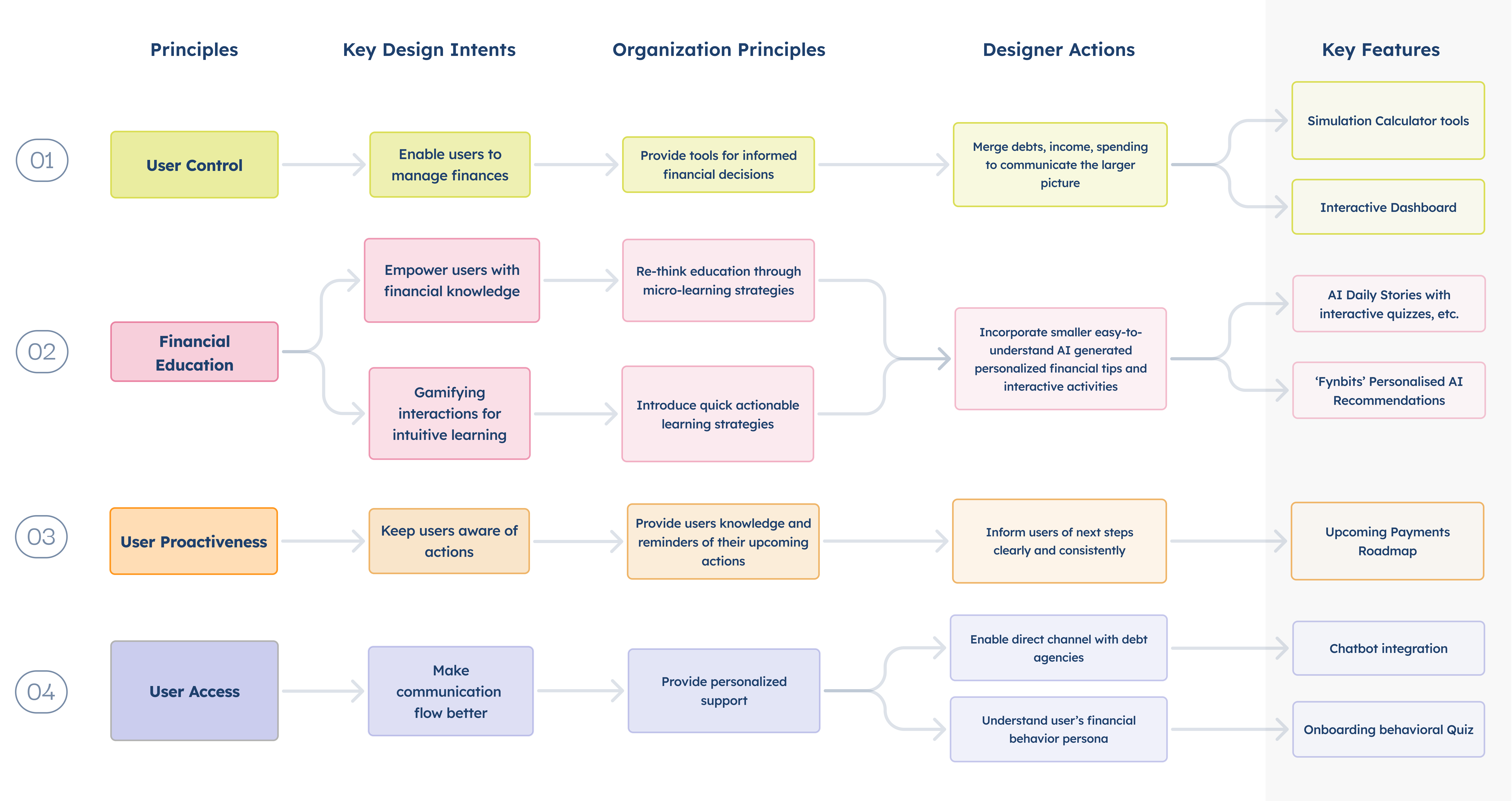
The main app features hence stemmed from a core organizational intent and a core user-focused perspective.
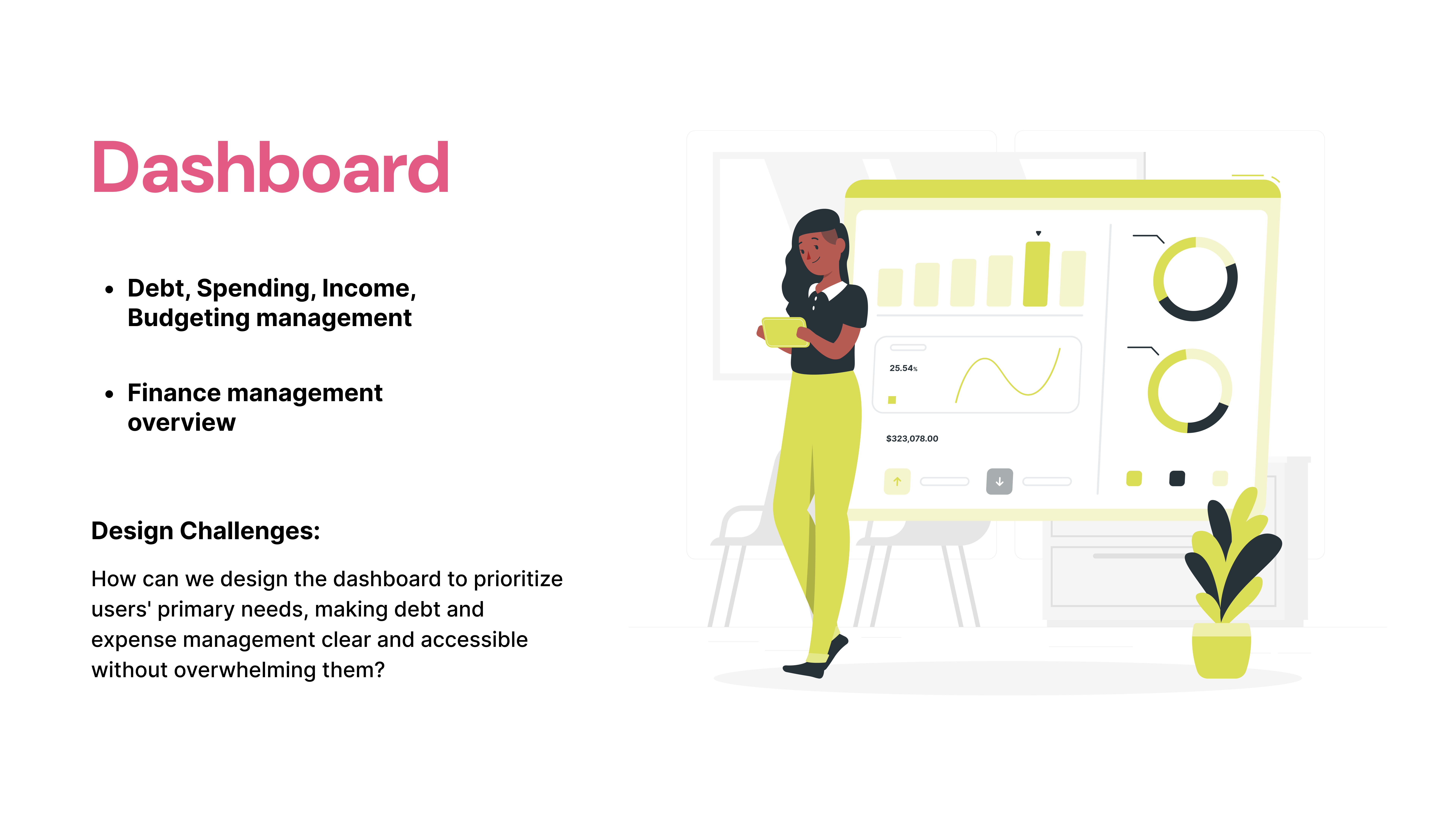
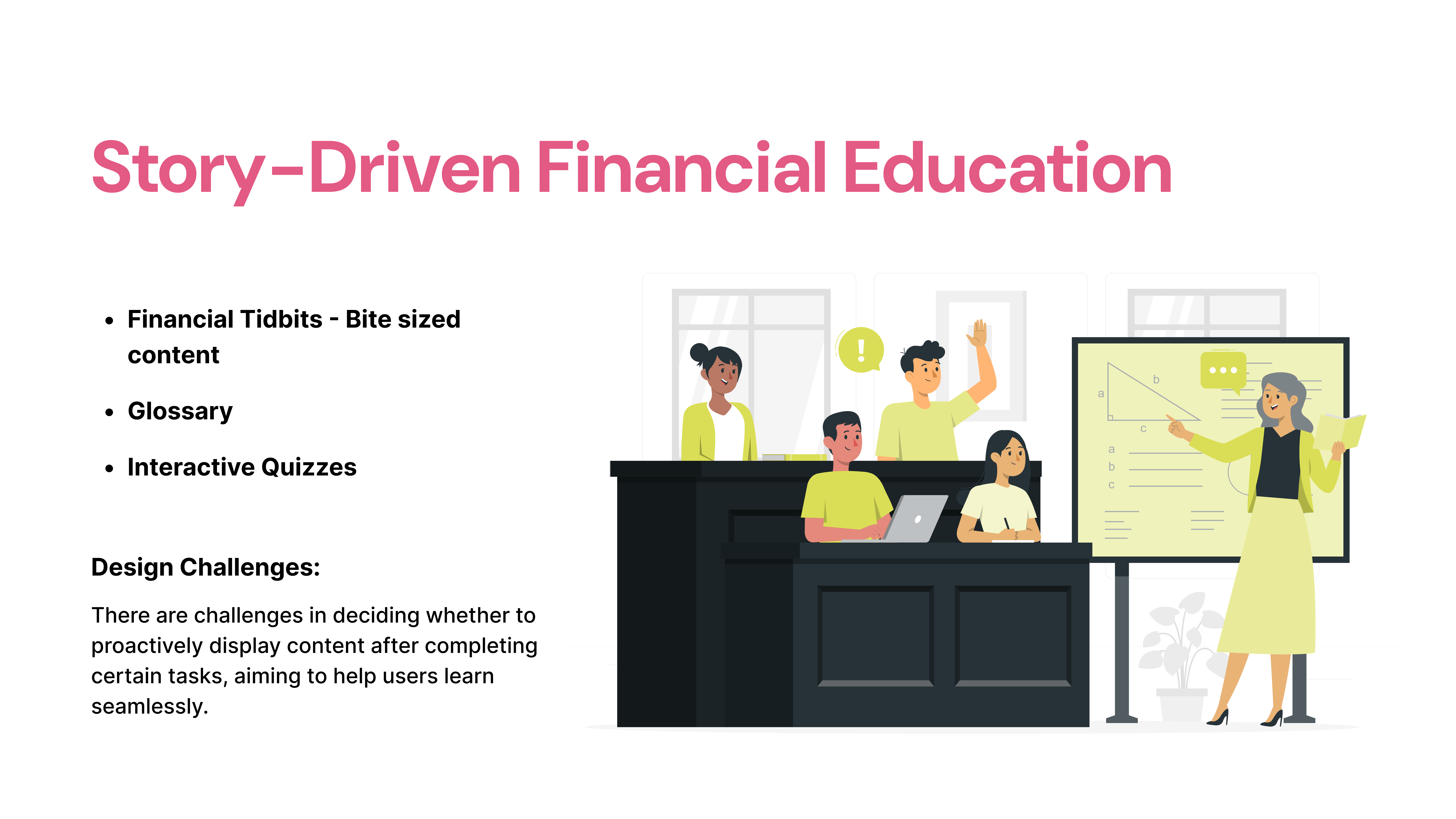
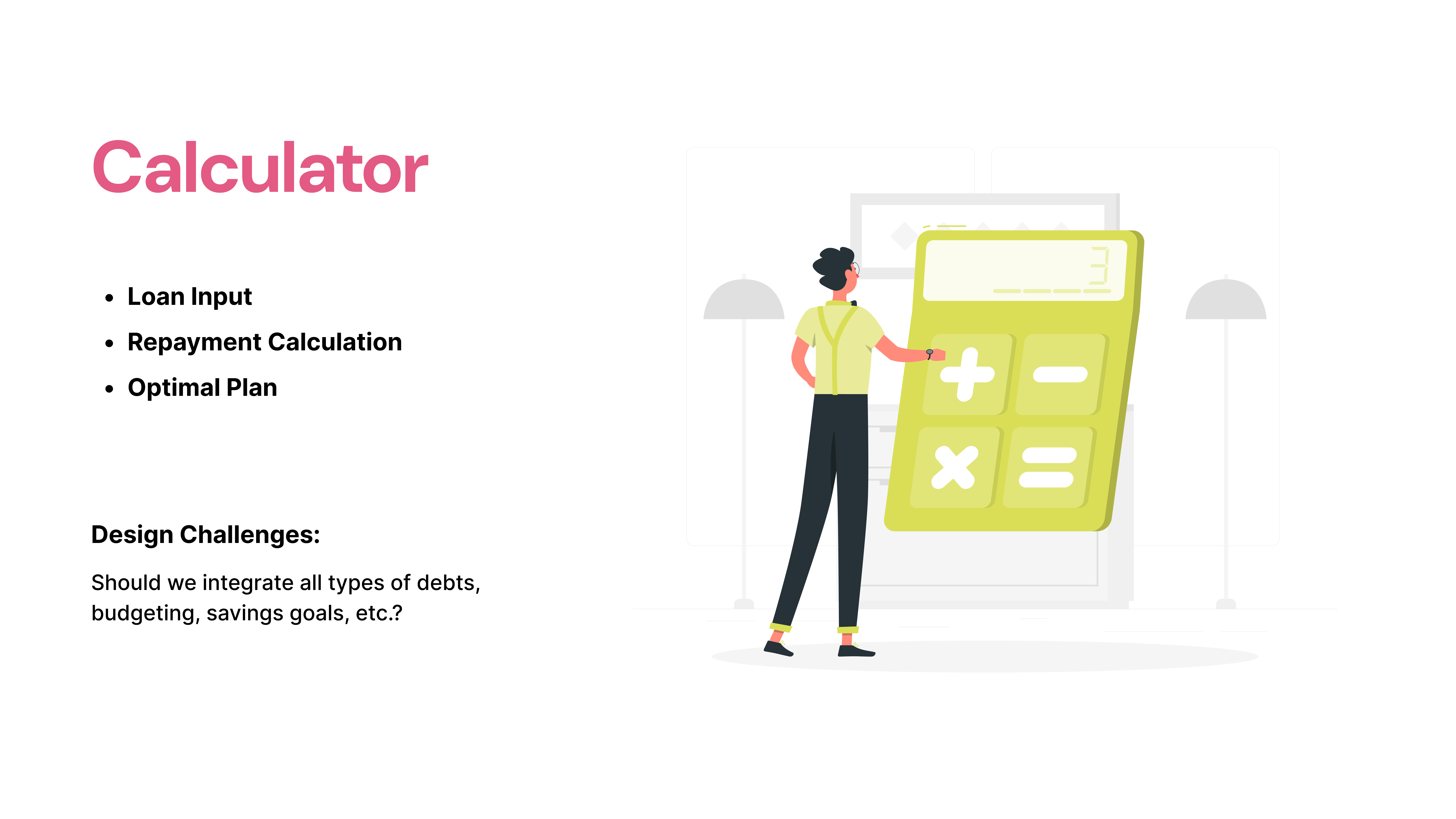
4. Mixed-methods Evaluative Research on the low-fidelity wireframes helped us structure the navigation.
Participant Age group: 16 participants aged 18 to 40 (target audience)
75% were students in various fields, 25% were recent graduates and working professionals.
Research method 1: Card Sorting
We conducted a card sorting exercise with 8 participants, where they were asked to categorize 20 features into sections like Home, Profile, Navigation Bar, and others. This helped us gain insights into user behavior and how they mentally organize the website’s content.
Insights:
Users associate financial tracking data, insights, and behavior together. Educational elements are grouped together, and progress/ planning elements are grouped separately.
Users will hence intuitively try to locate features on the app as per these groupings.
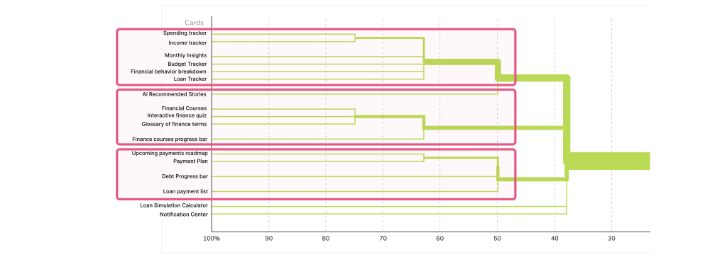
Users feel that the home page should house necessary information on financial data tracking and important progress information for everyday actionable use.
We also adjusted the information architecture based on card sorting results to better align with users’ mental models.
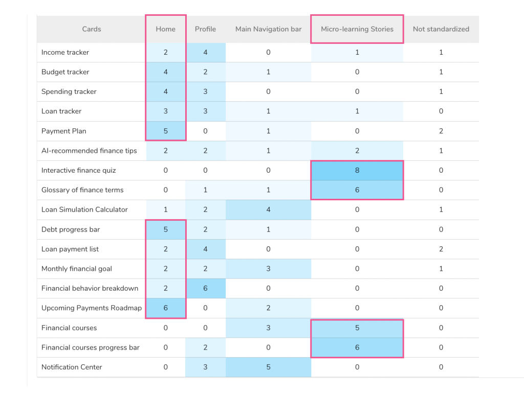
Micro-learning is largely paired with interactive quizzes, and financial knowledge, like we anticipated. This research helped us understand in detail how users thought about these features, associated them as groupings, and how important they felt them to be.
Users feel actionable financial features are most important to them.
- Debt goal and Progress bar – 37% of users
- Upcoming Payments Information – 12.5% of users
- Monthly Financial Goal – 12.5% of users
- Loan Simulation Calculator – 12.5% of users
- Upcoming Payments Information – 12.5% of users
- Income vs spending vs enough saving – 12.5% of users
Research method 2: A/B Testing
We performed A/B testing with 8 participants, assigning two tasks to observe trends, drop-off rates, and task success rates. This allowed us to evaluate the effectiveness of the Information Architecture (IA), navigation, and page contents in enhancing user experience. We made 2 prototypes:
For the first flow (V1) , the homepage was minimal, devoid of much financial data incase users felt overwhelmed by the debt information or actions displayed there. We shifted the data and features within the app pages.
For the second flow (V2), the homepage hosted the financial debt data, progress, interactive financial charts, access to features like calculators, right on the Homepage.
65.3% mis-click rates
37.5% drop-off rates
0% direct* success rates
We observed when features were not clearly displayed on main pages (V1) , causing users to struggle in locating options and ultimately failing to achieve their goals. We observed user frustration when trying to locate some features that the card-sorting also validated should be on the primary visibility areas on the app screen.
- (users did not click on the correct path in their first try)

All main features need to be on the Home page.
50% direct success rates
The result indicates that when all features were clearly displayed on the home page and properly linked to relevant pages, users achieved their goals more quickly and easily. (V2)

However we also received feedback from users needing the information, but to be presented in a more simple clear manner for ease of use.
We hence took learnings from both the flows and structured our navigation and information architecture.
Information Architecture
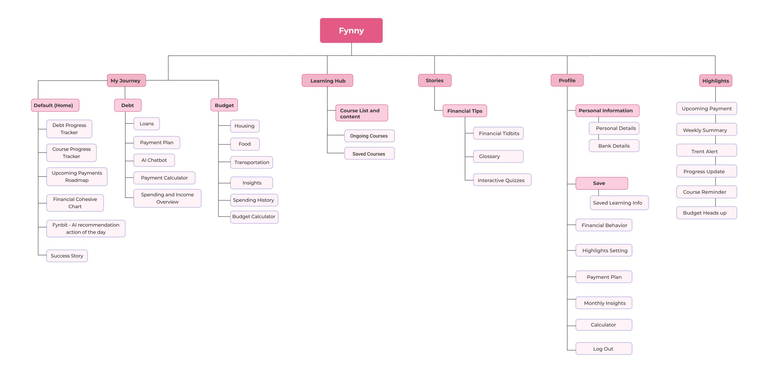
We designed the final flows and designs incorporating all the insights.
Onboarding Flow
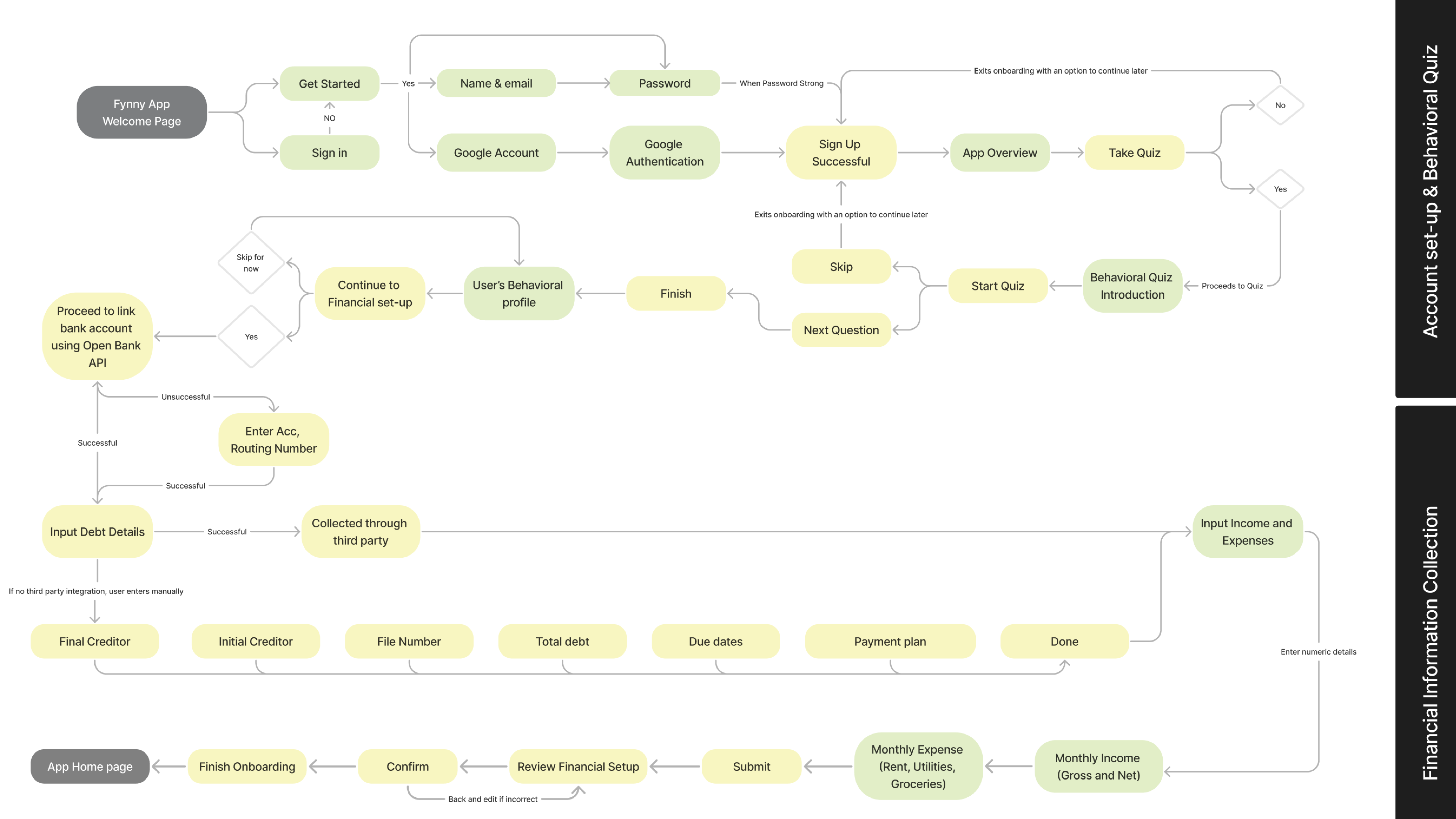
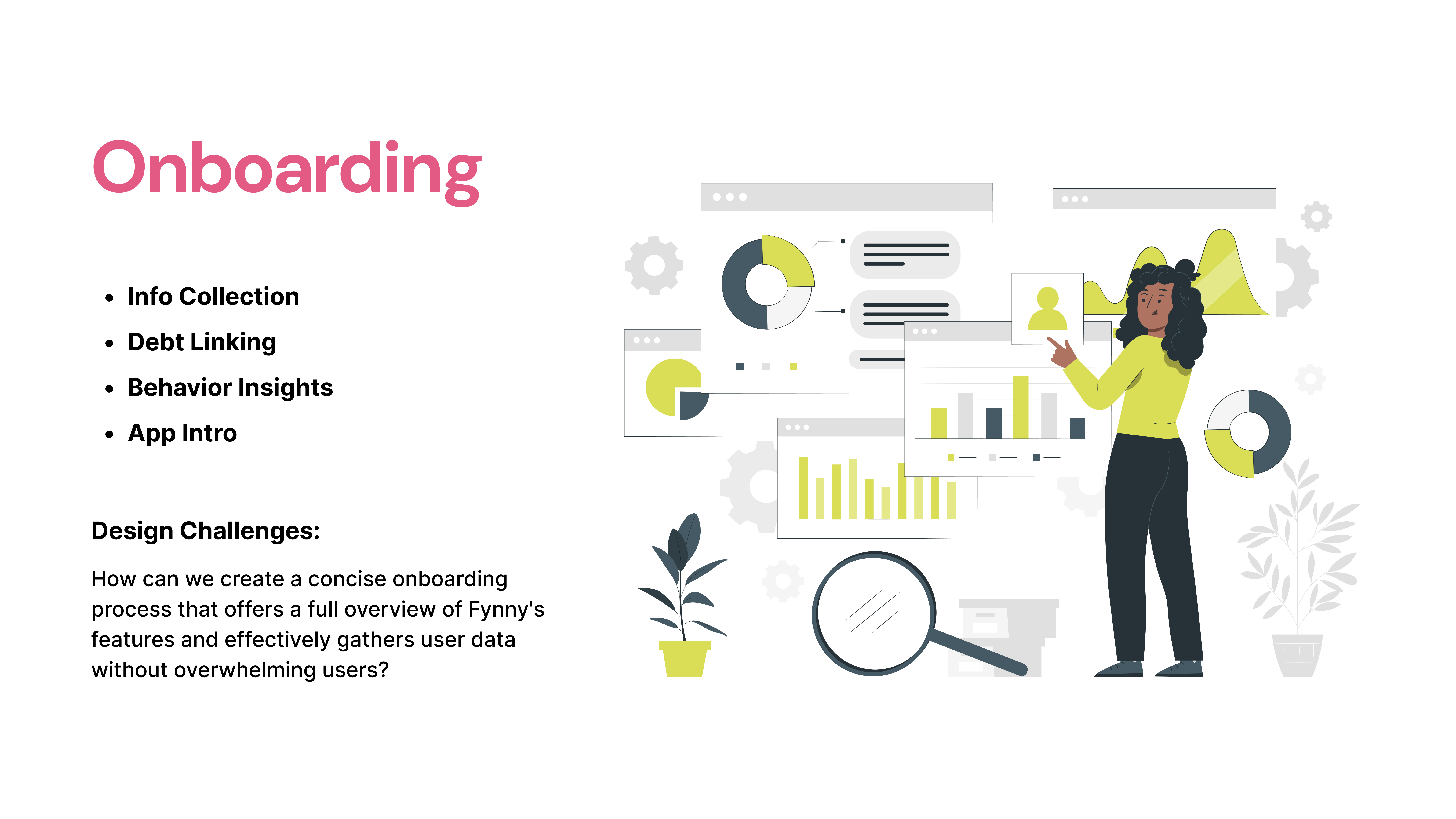
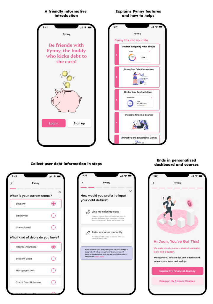
We designed onboarding screens to take users step-by-step through the process of entering their debt details, taking an engaging quiz for Fynny to understand their behavioral persona to provide a customized dashboard and personalized AI-generated insights.
We aim to keep users engaged throughout the process and guide them to the next step. To achieve this, we designed a simple and visually appealing experience, avoiding overly complicated quizzes and lengthy explanations.
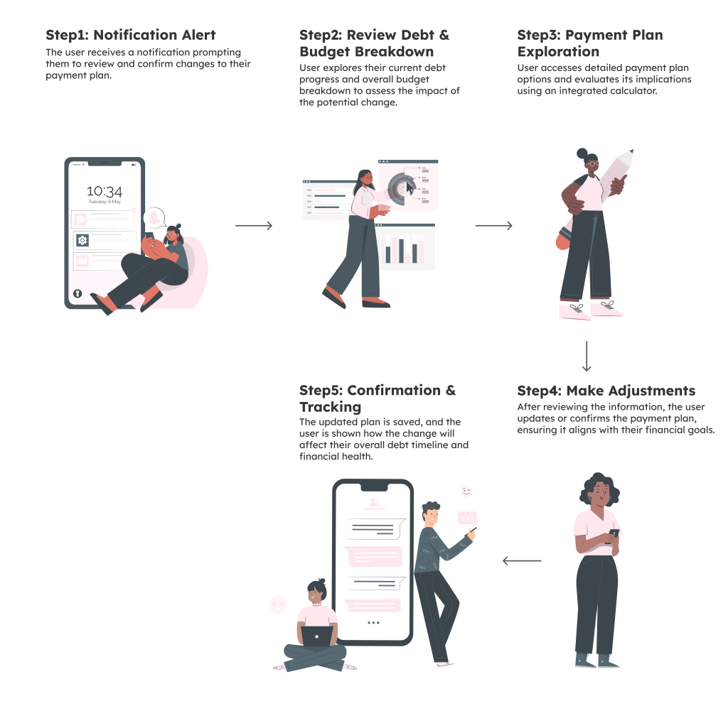
Financial Management Flow
The intent of this flow is to guide users through actionable steps for effectively managing their debt while fostering healthy financial habits. By providing structured assistance and practical tools, the flow aims to empower users with the knowledge and resources needed to navigate their financial challenges. Additionally, it offers tailored financial tips to enhance users’ financial literacy, enabling them to make informed decisions and achieve long-term stability.
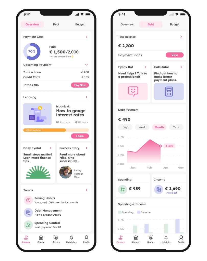
Home page and Debt page showcase quick summaries of your financial journey.
The Journey overview page acts as the Homepage showcasing the users financial journey through payment goals progress, learnings progress, Actionable daily finance tips, and upcoming payments reminders.
The Debt tab showcases the payment plans, quick access to Simulation Calculators and Fynny Bot for contacting debt collection services, and charts for communicating your debt versus spending and income.
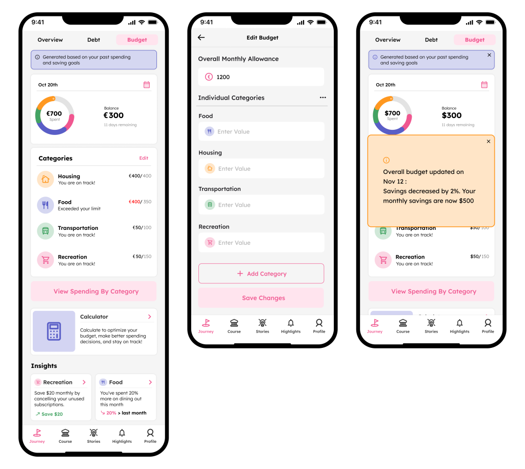
Fynny encourages healthy financial habits by suggesting personalized Budget Categorisation.
The budget page generates a clear budget based on the user’s saving goals. The user can also edit specific categories. It showcases insights based on your spending and how you can practice better financial behaviors to combat debt and higher spending.
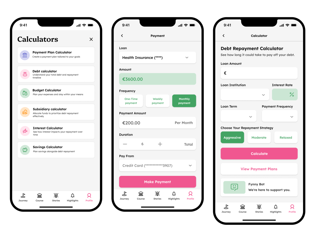
Simulation calculators empower users with confidence and control to make informed decisions.
Simulation calculators help users explore various financial scenarios by providing instant, data-driven insights. They enable users to test different strategies, such as adjusting monthly payments, estimating loan repayment timelines, or evaluating savings goals. These tools empower users to make informed decisions, fostering better financial planning and control.
“I receive so many letters with different debt deadlines from various agencies. I don’t know what I owe, who I owe it to, or when I need to pay them.”
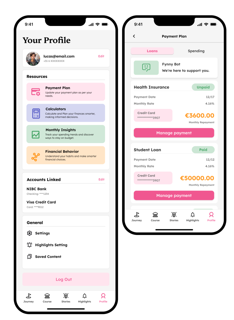
Hence, the payment plan consolidates the user’s debt payment details in one place, ensuring they stay informed and never miss crucial payment deadlines.
Users have shared feedback that receiving letters from multiple debt collection agencies leaves them without a centralized place to track their obligations. This confusion often results in missed payments as they struggle to identify which agency they owe and how much. The payments page addresses this by providing a comprehensive overview of all their debts, payment deadlines, and agency details in one organized location. The payment plan consolidates the user’s debt payment details in one place, ensuring they stay informed and never miss crucial payment deadlines.
The profile page holds access to important features and saved information to refer to again.
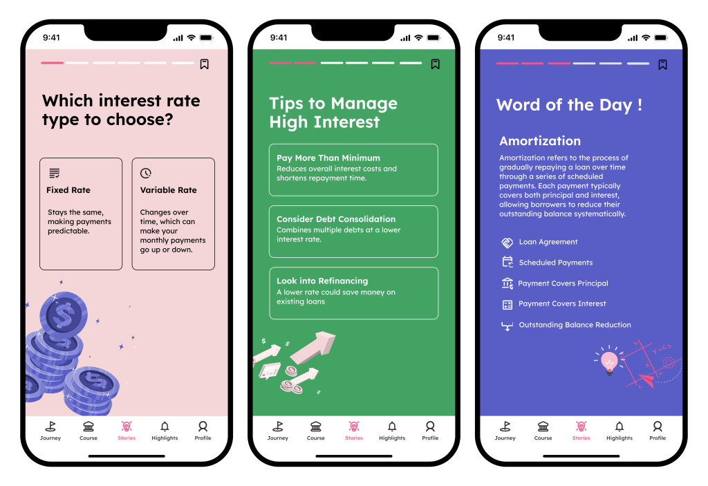
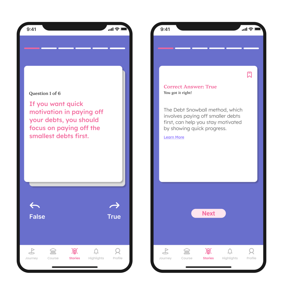
Micro-learning finance in small interactive bites helps users build user confidence.
Offering financial insights in bite-sized formats makes learning manageable and engaging, encouraging users to explore and retain information more effectively. By incorporating gamification into financial education, complex concepts become approachable, breaking down the intimidation often associated with managing finances. This playful, interactive approach not only deepens understanding but also fosters a sense of achievement, making financial literacy both enjoyable and impactful.
Reflection: Learning Through Design
Working on the finance management and learning app has been a fun and rewarding experience. As students ourselves, we know how challenging it can be to learn about finance. Designing the app not only helped us create solutions for others but also deepened our own understanding of key financial concepts along the way.
