Client
Girls Power Fund
Duration
Fall 2024 – 14 Weeks
Team Members
Dominique Dorvil – UX Writer, Researcher & Designer
Rafaela Hojda – UX Writer, Researcher & Designer
Yuexi Hua – UX Writer, Researcher & Designer
Overview
The Girls Power Fund is a non-profit organization dedicated to empowering girls by providing them with the resources and opportunities they need to thrive. The organization sought to improve its website to better align with its mission, effectively communicate its messaging, and enhance its ability to attract donors and beneficiaries. As part of a class project, we served as UX Consultants, taking the lead in redesigning the Girls Power Fund website.
Scope
The existing Girls Power Fund website lacked clarity in its messaging, making it difficult for both donors and beneficiaries to understand the organization’s mission and impact. This lack of clarity negatively impacted fundraising efforts and limited engagement. Additionally, the website was only available in one language, which restricted its accessibility for non-English-speaking users. The CEO of the organization expressed the need for a user-friendly, trilingual website that builds trust with stakeholders and supports monetization efforts.

Process

Foundational & Exploratory Research
Stakeholder Interviews
Conducted regular monthly meetings with the CEO to understand her vision and the organization’s goals.
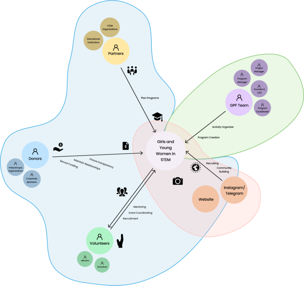
Ecosystem Map
Developed an ecosystem map to visualize all stakeholders, processes, and interactions within the Girls Power Fund’s network. This provided a comprehensive understanding of the relationships between donors, beneficiaries, volunteers, and organizational operations, ensuring the website addressed each group’s unique needs.
Competitive Analysis
Analyzed similar non-profit websites such as Girls Who Code, First Tech Fund and GirlDreamer to identify best practices in messaging, design, and functionality.

Information Architecture
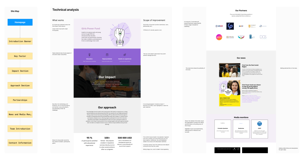
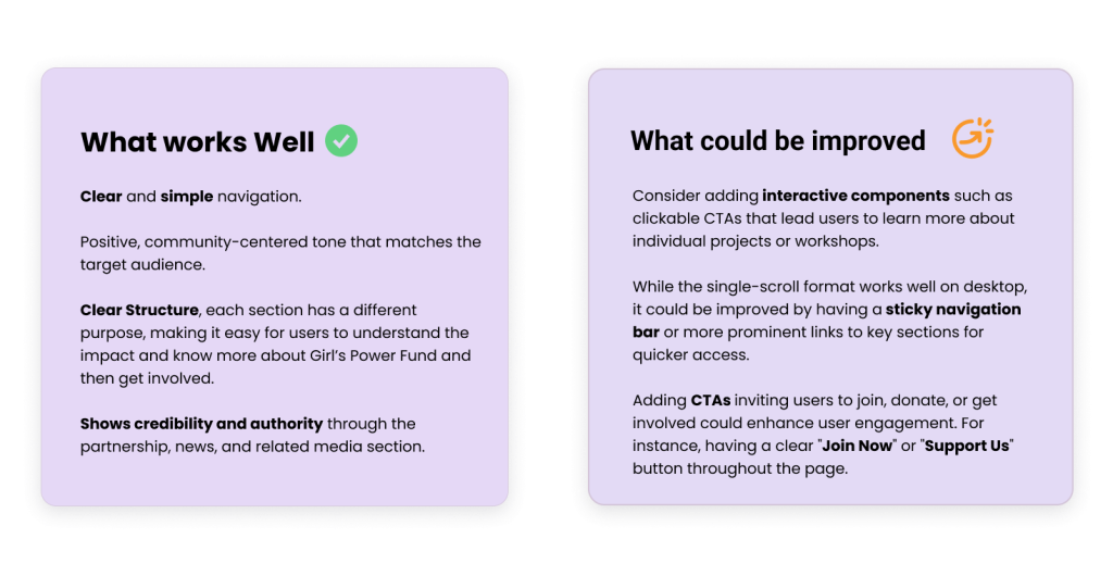
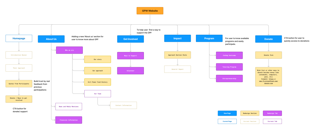
To create a better user experience, we analyzed the current IA model of the Girls Power Fund website to identify its strengths and weaknesses.
Based on these findings, we proposed a revised IA model that enhances clarity, navigation, and user engagement. The structure now includes dedicated pages for critical content like About Us, Get Involved, Impact, Programs, and Donate.
Schematic Design
Our schematic designs outlined the placement of key content elements, navigation systems, and calls-to-action to ensure an intuitive and functional user experience. The design decisions were based on user research insights and stakeholder requirements, ensuring alignment with the organization’s goals.
Design Goals
- Information Accessibility and Economic Mobility
- Monetize to keep the mission going
- Facilitate Global Communication
- Inspire trust & credibility
- Website Redesign
Organizational Goals
- Provide monetization avenues to encourage non donor funds
- GPF Instagram page – focus more attention to website through instagram
- Conveying the Impact of Girls Power Fund to convince donors
- Provide Translations (Russian, English, and Kazakh)
- Provide Programming for Participants to learn
- Prove to potential users GPF is trustworthy
User Flows
We identified and designed key user flows to ensure the website provided an intuitive and seamless experience for different user groups. The primary user flows included:

Evaluative Research
TREE TESTING METHODOLOGY
To validate the effectiveness of the revised IA model, we conducted tree testing with a focus on evaluating the navigation clarity and efficiency. This method helped us understand how easily users could locate key information and complete tasks on the Girls Power Fund website.
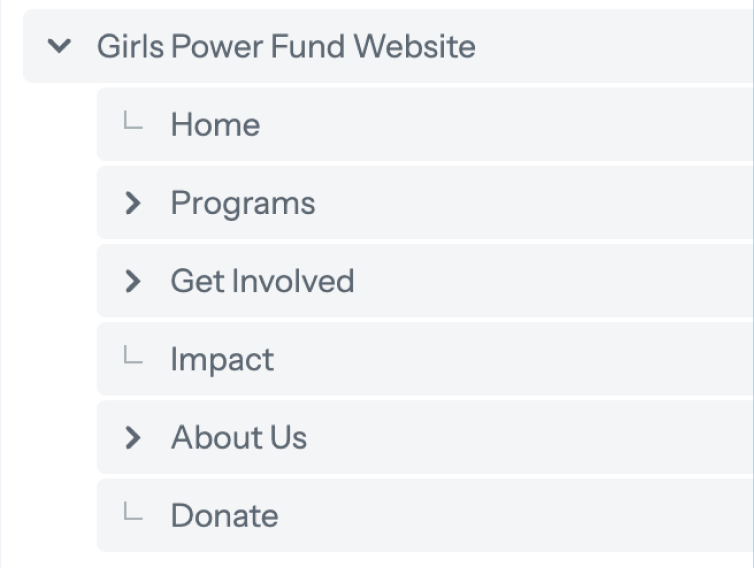
We have a total number of 4 participations joined our tree testing.
- 50% of the them participated in organizations like Girls Power Fund.
- 50% of them supported organizations like Girls Power Fund.
- 100% felt confidents in completing tasks on websites like finding information or filling out forms.
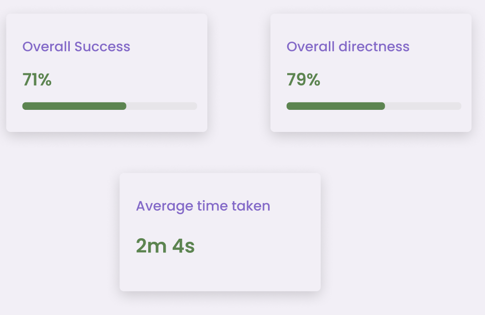
TREE TESTING RESULTS
KEY FINDINGS
- Participants located donation forms quickly, showing that the dedicated Donate section improves clarity and visibility.
- Users could easily find the Volunteer section under “Get Involved,” demonstrating the revised IA effectively supports user actions.
- Users shows the ability to locate information quickly and efficiently, indicating that the IA structure is intuitive and well-organized.
USABILITY TESTING METHODOLOGY
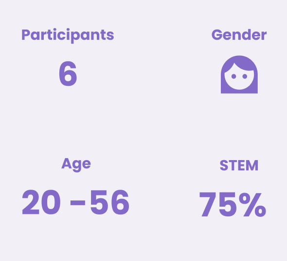
To assess the effectiveness and usability of the revised Girls Power Fund (GPF) website, we conducted usability testing with six participants. This helped evaluate user behavior, task completion success, and areas for improvement.
TASKS
- Go through the website and tell me what stands out to you, what do you think the nonprofit is about?
- Look through the different programs GPF offers and find one that you might be interested in. Then try to apply.
- You want to know more about how other girls like you have succeeded in coding with GPF. Show me what you would look for on the website to find that information.
- You need help with understanding a program or applying. Try to find how you would reach out to someone for support or more information.
- If you wanted to view this website in Russian, what would you try first to make that happen?
RESULTS

QUOTES FROM THE CURRENT DESIGN
QUOTES FROM OUR MID-FI DESIGN
“No where to change the language on the other website.”
– Participant 2“Yes, looking for information was easier.”
– Participant 4
Design Development
Content & Style Guides
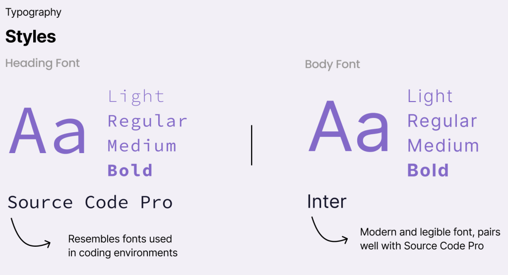
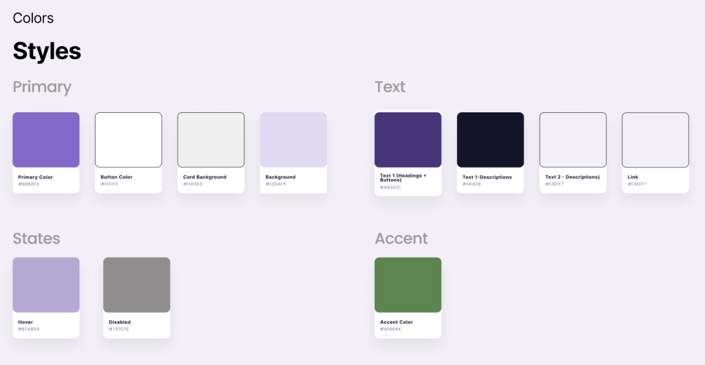
To ensure a cohesive and user-friendly interface, we developed a style guide for the Girls Power Fund website. This kit standardizes design elements, improving consistency across all pages and components.
Tone enforces the voice design principles through attitude, word choice, diction, and writing style.

We created a content guide that included the tone spectrum, FIG_ and our voice principles which are:
1. Confident: Positions Girls Power Fund as an expert in STEM and entrepreneurship and demonstrates expertise without being patronizing .
2. Cross Cultural: Uses simple sentence structures. clear language and avoids jargon and metaphorical language.
3. Community Oriented: Uses inclusive pronouns like “us,” “we” and “our” to create a sense of belonging and emphasize shared goals and uses personal anecdotes to illustrate the impact of Girls Power Fund.
4. Empowering: Uses language that inspires and motivates, but steers clear of cliches and uses positive affirmations and inspiring calls to action.
Impact
We influenced the stakeholders to have an “Impact” page to highlight the financials of the organization. Information describing where the money goes, how much money was donated and revealing/linking annual reports helps create transparency and convince donors that the organization should be chosen to benefit from sponsorships and donations.
Another reason we advocated for this page to be implemented is that many other similar organizations that we conducted our competitive analysis on also had pages on their website dedicated to the financials of their organization.
Reflection
This project showcased our ability to follow the complete UX design process and collaborate effectively with stakeholders to deliver impactful solutions. Working closely with the CEO allowed us to align the redesign with the organization’s vision while addressing the needs of its users. By focusing on clarity, accessibility, and trust, the new website empowers the Girls Power Fund to better achieve its mission and maximize its impact
