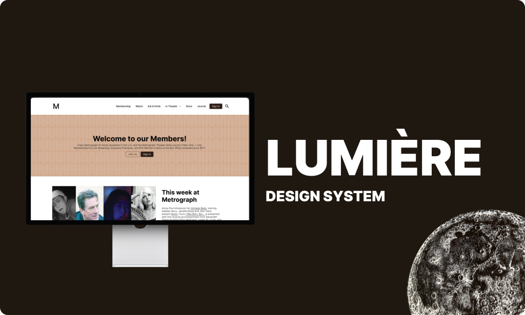
Cohesive experience with streamlined navigation and efficient user journey.
Team Credits:
Cheih, UX Designer
Eloisa, UX Designer
Eleanor, UX Designer
Metrograph is a stylish retro theater website
Metrograph, an independent theater in the Lower East Side, specializes in rare archival screenings and special premieres.
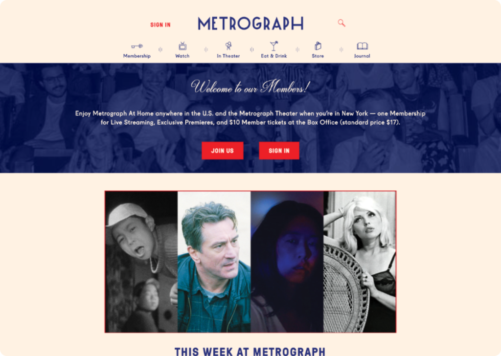
However…A website with a nice design doesn’t necessarily mean it’s well-designed.
Although Metrograph’s website has a careful combination of colors, fonts, pictures and videos, there are still many things that make users confused when using it.
01. An overabundance of styles
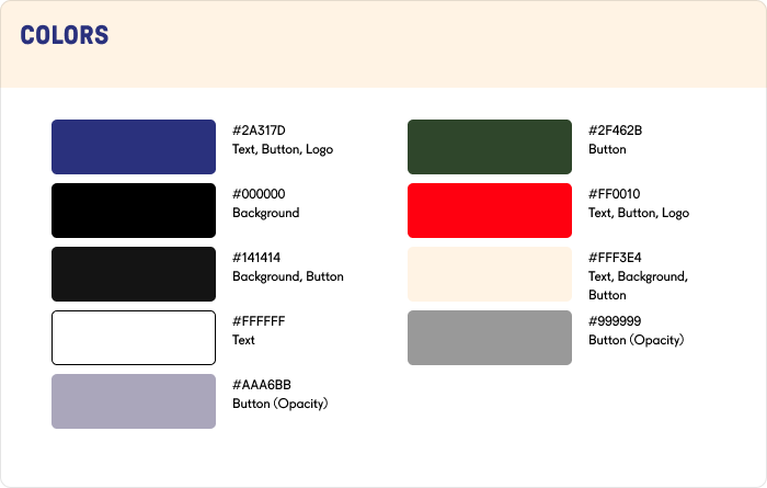
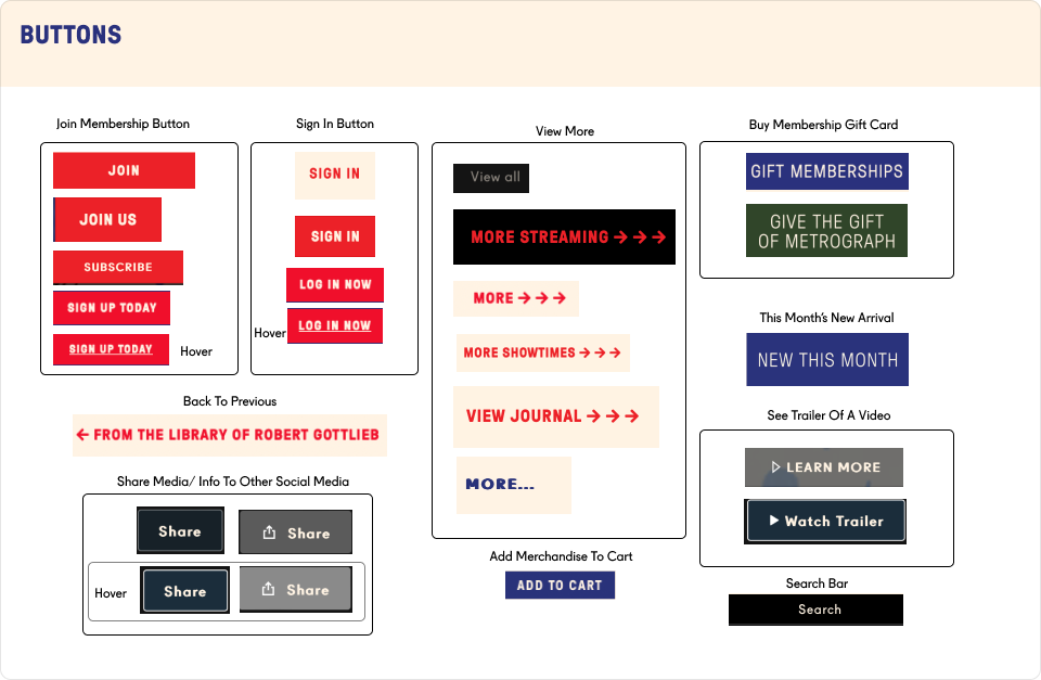
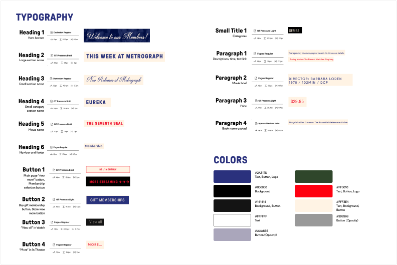
There’re 7 colors and 15 typeface styles used in original design. Some fonts and colors appear quite random, and while there are many styles, the website lacks a cohesive theme.
Then
How might we create a more cohesive experience for Metrograph’s audience, providing streamlined navigation and an efficient browsing journey?
What are Metrograph‘s foundation?
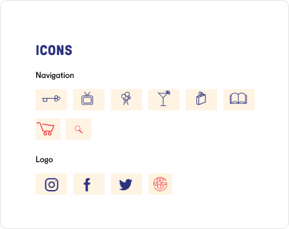
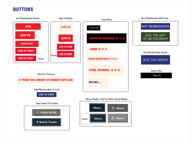
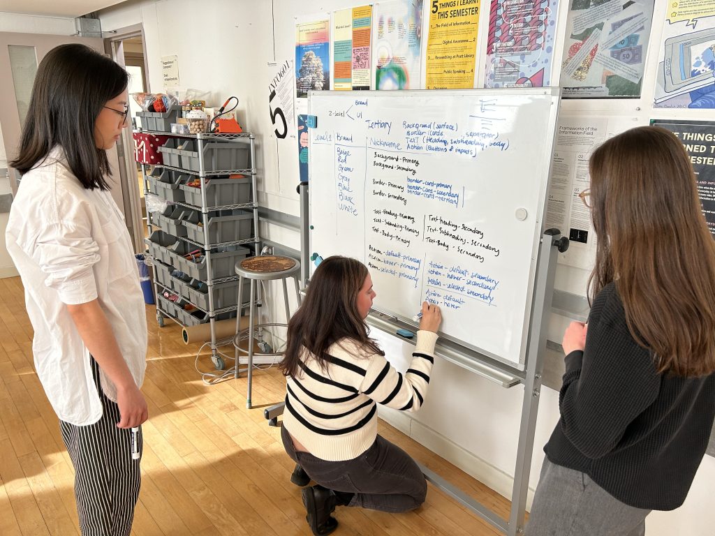
Disassemble the design tokens and components on the metrograph website. Group together elements with the same purpose to clearly see which elements have multiple repeated designs and which elements are missing. Here are the 12 elements that build Metrograph’s website:
Navigation, Footer, Logo, Color, Typography, Icons, Buttons, Forms, Media, Sections, Interactive components, Pop-ups.
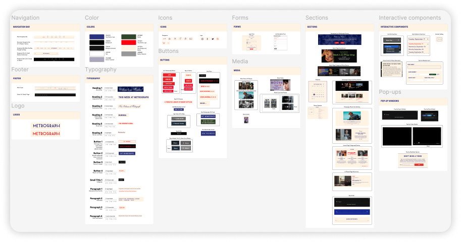
What to Keep, What to Merge, What to Add
How can Metrograph refine its presentation to captivate its audience while staying true to its iconic style?
01. Preserve the Essence
Retain the retro charm, striking visuals, and cinematic atmosphere that define Metrograph’s identity.
Let’s kick things off with the basics—the real MVPs: tokens.
Tokens are the foundation of any design system, but their naming and organization are critical to its success. A well-thought-out naming structure not only clarifies the system’s design principles but also streamlines tasks like switching colors, modes, or finding the right settings for spacing, padding, typography, and more.
Redesign components by rethinking purpose and tackling the most-used ones.
We noticed that Metrograph’s website is packed with information sections featuring media—perfect for crafting card components. Plus, the nav bar is one of the most used elements, and interactive fields like inputs and dropdowns get plenty of action. That’s why we’re focusing on these key components—they’re the heart of the user experience.

We’re also dedicating plenty of time to perfecting dark mode and light mode, since the original website blends the two—time to bring some harmony to the mix!

Documentation makes design system ≠ UI kit.
A UI kit is like a toolbox—it’s got all the nuts and bolts (buttons, icons, colors), but no instructions on how to build the house. A design system, on the other hand, is the blueprint, the rules, and the why behind it all. It’s what transforms those loose pieces into a cohesive, functional masterpiece. That’s why we draft principles and guidelines of how to use Lumiere and documented them on Zeroheight—they turn a simple UI kit into a powerful design system.

Introduce Lumière Design system
01. Utilize gradients to create depth and vibrancy without adding extra colors.
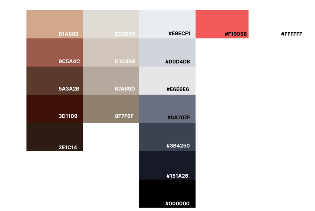
Based on the original retro style of Metrograph, we use 4 levels of beige and 5 levels of brown to distinguish different information levels and different modes. These colors have been tested by WCGA to ensure the contrast and accessibility between them.
02. Making call-to-actions stand out and sharpening priorities.
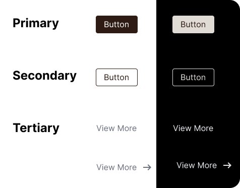
Forget juggling 10+ button styles—you only need 3 levels and 4 styles to get the job done. By slimming down the options, it’s crystal clear to users what each button is here to do!
03. Easy, breezy navigation for a smooth and seamless experience.
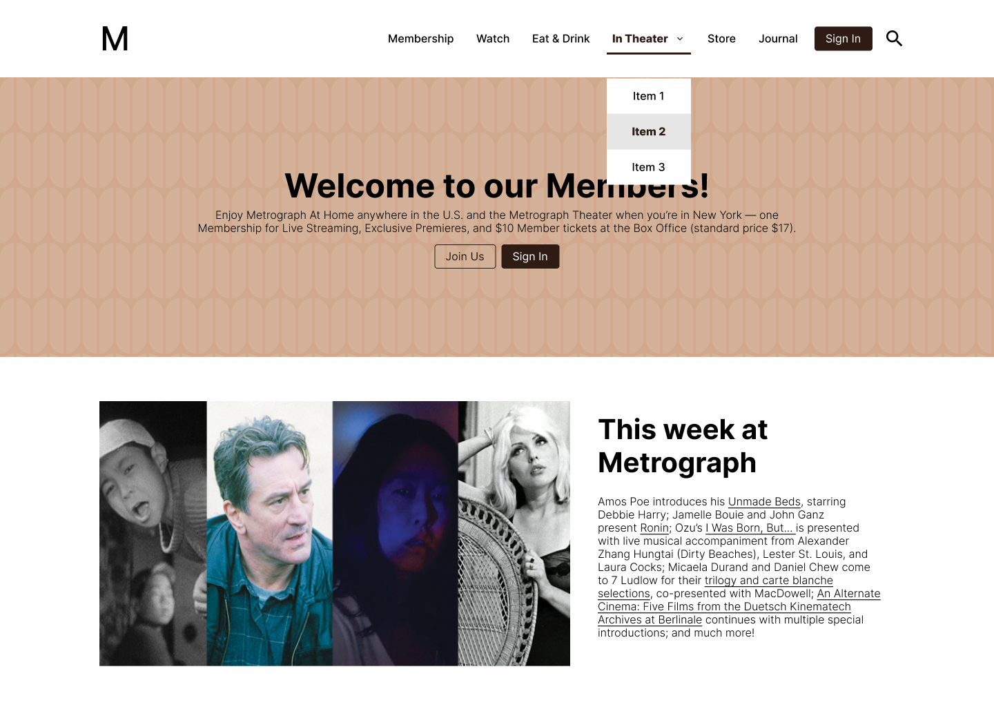
We ditched the confusing icons and focused on the tab content, giving it room to breathe. Now, users don’t have to squint to figure out if the nav bar or dropdown is open. We reimagined how the second-layer menu works, and the navbar now has clear hover and active states. No more guessing games—users instantly know where they are!
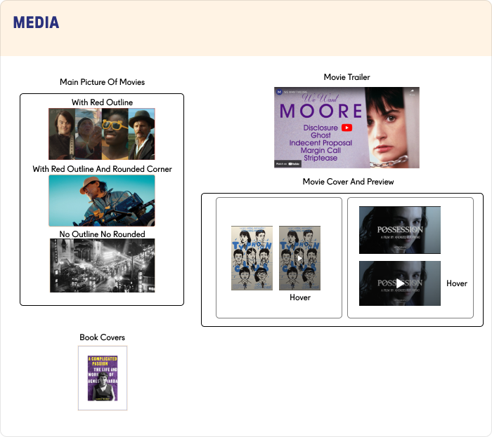
04. A cohesive media style creates a visually harmonious flow.
Metrograph’s got a whole mix of picture and video styles—but do we really need them all? Media is key for delivering information, so instead of throwing in random round corners and red strokes that leave users scratching their heads, we’re sticking to one clean, consistent style for all media. Simple and sleek!
05. Clear-cut rules and organized documentation.
Getting started with Lumière is easy! Start by checking out the principles and guidelines on our website, then add our UI kit to your Figma. Learn the basics by exploring our foundations and component instructions—we’ve got all the resources and tools you need. Need help or want to contribute? We’re here for you! Find our contact info in the Help and Support section. Let’s create something amazing together!
Read the guide but still lost on where to start with Lumière? Don’t sweat it—we’ve got you!
We whipped up a demo showing how to use Lumière to build a Metrograph homepage. Watch it, and anyone will be ready to dive in with confidence!
See how crisp and effortless everything looks with Lumière in action!
Design system is not a one time design, we’ll keep:
01. Gain feedback and improve: Keep the feedback coming from designers, developers, and users to spot what’s working and what needs tweaking.
02. Keep it fresh: Regularly update the documentation so everything stays clear, relevant, and easy to use.
03. Consistant developing: Expand the system by adding new components and adapting existing ones to meet evolving project needs.
