PROJECT OVERVIEW
Sharing Knowledge, Inspiring Growth
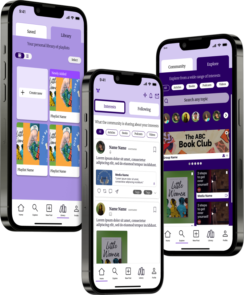
Lumity is an information sharing platform to engage in positive, productive content with your like-minded, growth-oriented learning community.
TEAM
Smridhi Gupta
Nandita Malhotra
Jiten Thakkar
Navya Thakkar
ROLES
UX Design
Usability Testing
User Research
Systems Design
Product Architecture
TOOLS
Figma
FigJam
UXtweak & Useberry (UX Research Platforms)
OVERVIEW
About Lumity
Lumity is an information sharing platform to engage in positive, productive content with your like-minded, growth-oriented learning community. Users can track and share what they are learning, and view other people’s learnings to witness their growth in real time. Our goal is to build a community of curious thinkers committed to lifelong learning.
This project involved the redesign of the Lumity application, with the goal to increase usability, improve consistency in design, and build user engagement through exploration and community features.
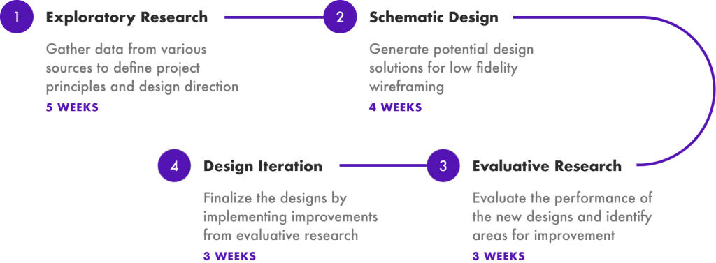
OUR PROCESS
How Did We Get Here?
OUR GOALS
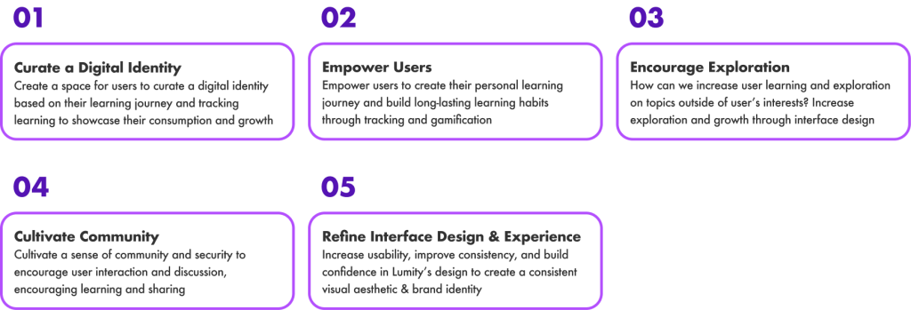
Defining the Scope of the Project
First, we came up with project goals to define the scope of the project, and guide us through the process. These were created and prioritized based on the initial client meeting, and the needs they communicated for their organization and product.
EXPLORATORY RESEARCH
Determining Design Direction Through Research
Our team employed a range of research methods to identify and analyze key focus areas for a learning platform. These methods provided valuable insights that informed our design decisions and ensured that our solutions effectively addressed user needs and pain points. Some of the research methods and their respective insights are outlined below:
Research Methods:
Key Insights:
The following diagram depicts the key insights we gained from all the exploratory research methods outlined above.
A closer look at the Ecosystem Map:
Users exist in progressive levels, starting at the individual level, growing to explore the community, and then to actively contributing to the community. Lumity’s features encourage growth.
Design Principles:
A synthesis of guiding design principles, gained from exploratory research, that propelled the design journey forward.
What we learned:
TECHNICAL ANALYSIS
Avenues for exploration are limited to interests and people. Provide more options to explore different types of content without actually searching for it specifically.
ECOSYSTEM MAP
Users exist in progressive levels, starting at the individual level, growing to explore the community, and then to actively contributing to the community
LITERATURE REVIEW
Design interface to optimize micro-learning & delivery for users, in the form of posting & viewing content.
INTERVIEWS & USABILITY TESTING
Simplifying the main & top navigation by clearer prioritization of key features & intuitive labeling.
DESIGN STRATEGY
Conceptualizing and Structuring the Redesign
Product Architecture
The Product Architecture diagram helps us better understand and communicate the relationship between the app’s core functions and the various types of users on the platform.
The nested visual of the diagram also aims to reflect a users growing role on the platform as they continue to actively engage with the app features.
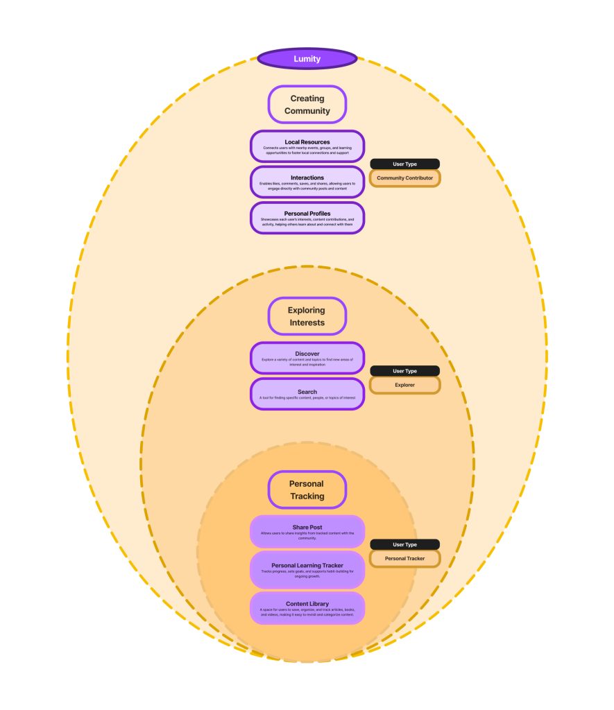
As you see in the diagram above, Lumity has three key app functions:
- Personal Tracking
This app function supports novice users with tools for tracking progress and effectively organizing content in their Library.
- Exploring Interests
As users grow more engaged, they explore and discover new topics and search for specific content they may be interested in.
- Creating Community
And as they become regular users, they seek to actively engage with others and contribute to community discussions, thereby fostering deeper connections through the Lumity platform.
Information Architecture
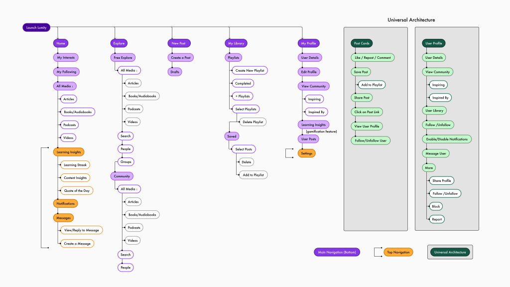
The updated Information Architecture for Lumity depicts some key changes in the way users interact with the app features:
- Navigation Bar
The core functions of Lumity are now grouped together on the main navigation at the bottom, giving users faster access to the different sections of the app.
- Messages and Notifications
Moving ‘Messages’ to the top navigation now makes them directly accessible from the home page.
- Post Interactions
We also refined the interactions on a post card to ensure users can now seamlessly add a post to their desired playlists.
These changes ensure users can easily interact with the app and also explore more freely as they become increasingly invested in learning and building a community through the platform.
Key Workflows
Based on our research & analysis of the Lumity app, it’s users and it’s key features, following are the key workflows that users go about as they engage with the app.


LOW FIDELITY PROTOTYPE
Wireframing to Visualize Our Designs
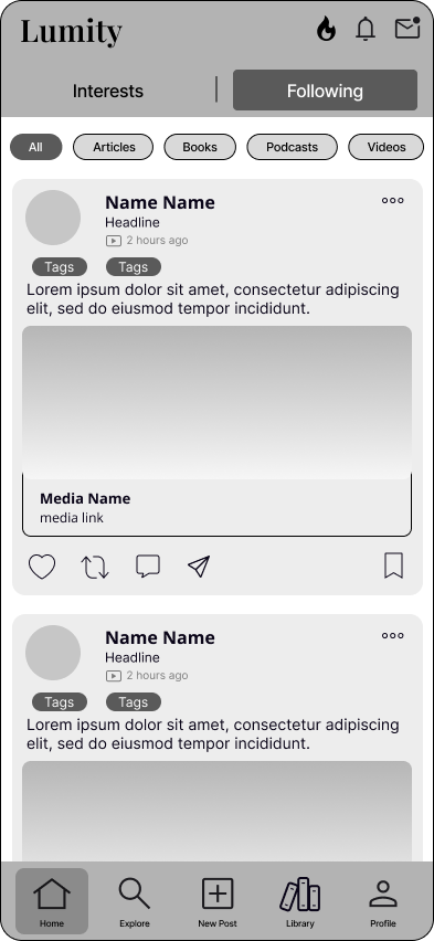
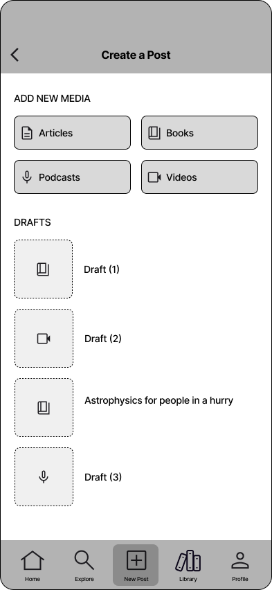
Next, we started the wireframing phase, which was essential for establishing the structure and layout of the new design for Lumity. Wireframing allowed us to focus on user flow, content placement, and functionality without distractions from visual details.
Initial Lumity Wireframes:
We presented these designs to the client for further feedback, as well as conducted evaluative research to understand user experience with the new design. This step ensured alignment among stakeholders early on and provided a clear foundation for the next stages of the design process.
USER RESEARCH
What Do Our Users Think?
What we did:
- Test navigation and key workflows of the application
- Understand how users interact with Lumity’s new design elements
- Implement insights and improvements into final designs
Participants:
Conducted interviews with four new participants to get fresh eyes on the new and improved designs.
What users think:
Key Insights:
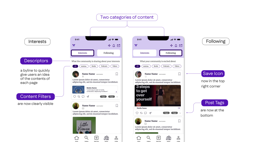
CLEARER NAVIGATION TABS
Users struggled to understand the distinction between the tabs on Home and Explore pages.
REDESIGN THE POST CARD
Users were overwhelmed by all the information and interactions on a post which led to cognitive fatigue.
VISUALLY DISTINGUISH MEDIA TYPES
Need for different thumbnail sizes and icons to visually distinguish the different media types that content can be explored in.
UNIFIED LEARNING AND TRACKING EXPERIENCE
Users struggle with fragmented learning and note-taking across multiple apps. A unified platform that integrates both would create a seamless experience.
FINAL DESIGN DEVELOPMENT
The Culmination of Our Research and Design Process
It was important to us to create a foundational design system with an emphasis on:
- Adaptability across pages
- Visual Consistency
- Clarity of actions – labels
This design system is easily buildable for future iterations.
Navigation Components
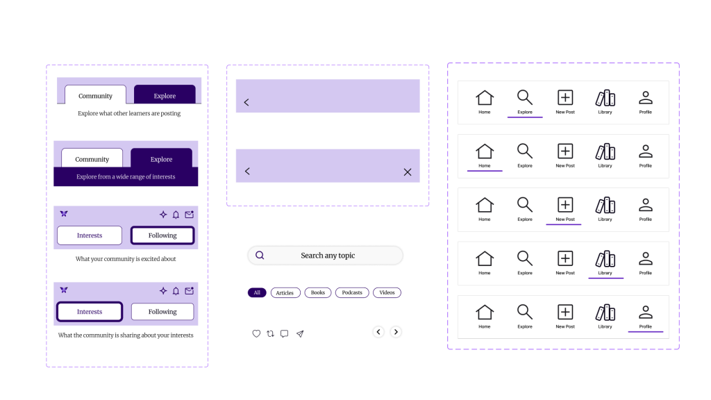
Homepage:
Switch easily between your interests and people you follow.
The homepage is a personalized aggregation of content based on the user’s selected preferences, comprising two primary sections.
- the people they follow and
- their specific interests.
Each section dynamically displays posts relevant to its respective category, offering a tailored and engaging user experience.
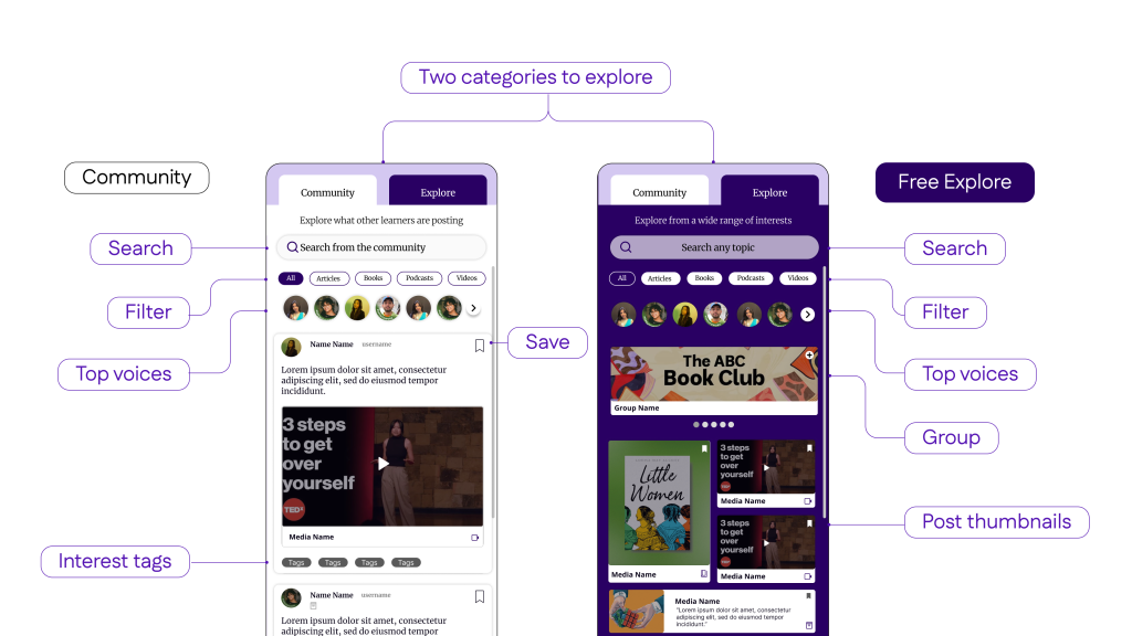
Explore:
Giving users multiple ways of expanding their learning experience.
The Explore page offers users two distinct sections to discover new content:
- Free Explore, which allows users to browse through various topics and interests at their own pace, and
- Random Exploration, where users can stumble upon random posts from other users.
Both sections provide users with alternative ways to explore content while maintaining a consistent design and layout with the homepage, ensuring ease of use and familiarity for a seamless user experience.
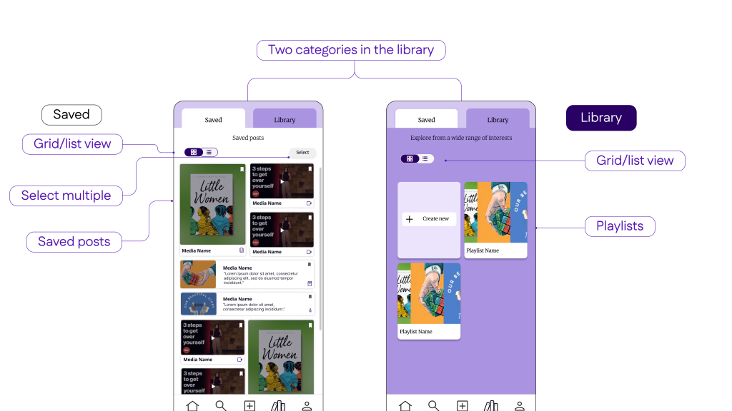
Library:
Personal tracking
- The Library feature provides users with a centralized location to access their saved posts for convenient navigation.
- Additionally, it includes a consolidated playlist page that offers a selection of pre-existing playlists, as well as the ability to customize their learning experience by creating personalized playlists tailored to their specific interests and preferences.
User Profile
A refreshed Profile Page with some delightful new updates

- ‘My Profile’ Page
The Bio section has been redesigned to create clear visual distinction between the various parts of the user’s Bio.
- Overview
The new Overview feature gives users a sneak peak at their and recent activity on the Lumity App.
- Playlists
A featured ‘Playlists’ section when viewing another user’s profile.
This section features a user’s curated public playlist on their profile page. It is designed to give them a chance to better express themselves and curate a playlist of content for visitors on their profile.
- Grid View/ List View Toggle for User Posts
The Inclusion of a Toggle here gives users two ways to explore recent posts:- A Free Explore Grid View layout which give users another way to explore their recent posts.
- A List View displays posts by the order in which they were posted (recent posts first)
Lumity Insights
We created an updated Insights page designed to engage users while also motivating them to use the app regularly.
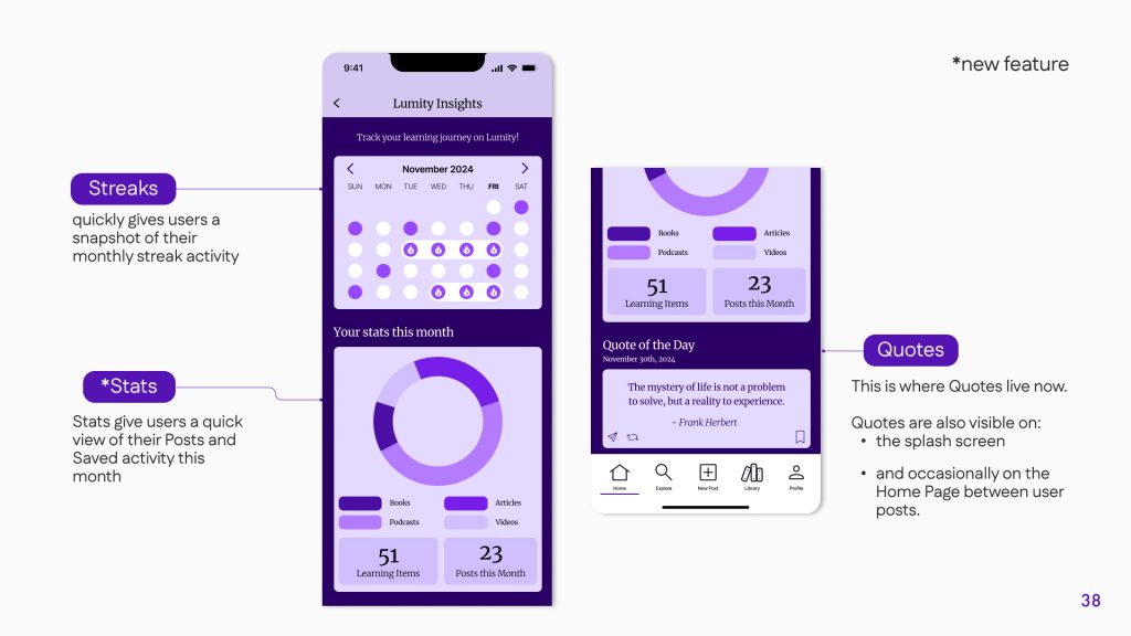
Here are some notable changes we made on this page:
- Streaks
A new Streaks section gives users a visualisation of their monthly Lumity app activity. Through motivating users to build streaks, we hope to motivate users to come back and engage with the app regularly. - Stats
The Stats feature gives users a way to visualise and track their activity and interactions on the Lumity app. - Quotes
The Quotes now have a new home at the bottom of the Insights page.
Also, the Quotes are now interactive. Users now have the ability to save, repost and share them with their community.
CONCLUSIONS & REFLECTIONS
Looking Back, Moving Forward
Client Reaction

When we presented our final project, the client expressed a high level of satisfaction with our work, particularly with the grid view and filter functionalities that facilitated a more content-centric experience. They appreciated the layout, citing its smooth flow and design as factors that contributed to an enjoyable user experience.
The client also highlighted their appreciation for the thoughtful addition of a highlighted “about me” section in the user profile, which successfully maintained the integrity of the user’s information while providing a more organized hierarchical structure. The display of playlists on the profile was another aspect that the client found particularly appealing.
In conclusion, the client expressed their gratitude for our team’s dedication and hard work throughout the semester. They praised the overall quality of our design proposals and research and looked forward to delving deeper into the final designs and prototypes during the following week.
Notably, the client did not request any changes or provide additional comments, indicating that our project met their expectations.
Looking ahead on Lumity
Looking Ahead: Future Considerations
As Lumity continues to evolve as a platform, it is essential to remain committed to the principles that have guided its development thus far. With a focus on meeting the needs of its users, there are several potential features and collaborations worth exploring to maintain growth and enhance the user experience. Besides testing, if we had more time, these would be the main needs we would address:
- Personal Notes Feature: Many users have expressed interest in a feature that allows them to record their thoughts and reflections. Integrating this functionality would enable users to engage more deeply with the platform and foster a sense of personal growth and self-discovery.
- Customizable Learning Journeys: By offering users the ability to personalize their learning paths, Lumity can continue to be a valuable resource for growth and development. Tailored experiences will not only help users stay engaged but also contribute to the platform’s overall appeal.
- Collaboration with Local Community Organizations: Partnering with local organizations would allow users to connect with one another and engage in shared learning experiences. This collaboration could foster a sense of community and belonging among Lumity users while expanding the platform’s reach and impact.
By considering these potential additions and partnerships, Lumity can continue to serve as a dynamic and user-centric platform that empowers individuals in their personal growth and learning journeys.
Team Reflections
Upon completing this project, our team is proud of the work we have accomplished in designing a platform that prioritizes user needs and aligns with Lumity’s core principles. The positive feedback received from the client has validated our efforts and affirmed that we successfully met their expectations.
Throughout this process, we have learned the importance of adaptability and collaboration. Navigating various challenges has helped us grow as designers and problem-solvers. If given more time, we would have liked to incorporate some of our future recommendations and test our design with a diverse range of users to identify and address any potential usability issues.
Moving forward, we are confident that Lumity will continue to evolve and improve as a platform that empowers users in their personal growth journeys. The opportunity to contribute to this project has been invaluable, and we are grateful for the experience gained in working together to create a meaningful and impactful design solution.
