Client: Electronic Arts Intermix (EAI)
Team: Mia Greenberg, Allison Chen, Conor Mack, Hridya Nadappattel, Iris Sun
My Role: User Researcher, User Experience Design
Design Tools: Figma, Notion, Google Forms
Methods: Baseline Testing, Iterative Testing
Project Duration: 6 weeks
Overview
The Electronic Arts Intermix (EAI) is dedicated to preserving and distributing Video Works and Media Art. Founded in 1971, EAI is a nonprofit that preserves and distributes over 5,000 video works by experimental artists from the 1960s to the present. They make these works accessible to museums, institutions, educators, and students worldwide through exhibitions, screenings, and their Educational Streaming Site.
What’s the Problem?
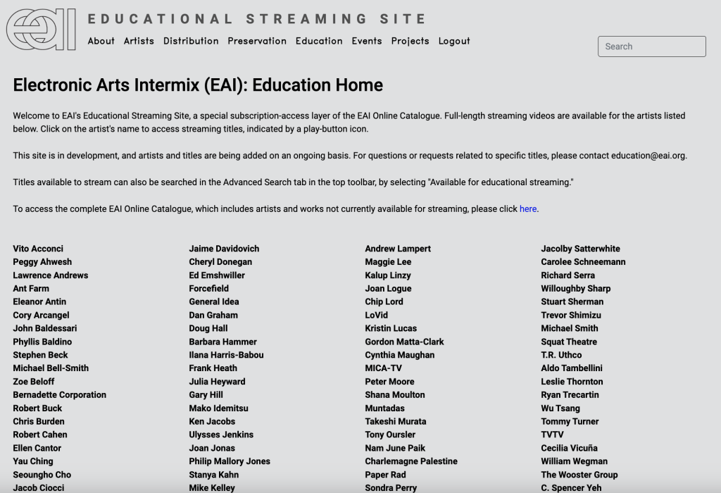
During our client kick-off meeting, EAI expressed concerns about the functionality of their Educational Streaming Site particularly regarding user flow. Their main concerns were increasing accessibility and discoverability, both of which contribute to the preservation and relevance of their extensive collection.
Our Solution?
Make EAI more usable by reducing user confusion and introducing new educational tools to increase engagement between users and EAI’s content.
User Profile
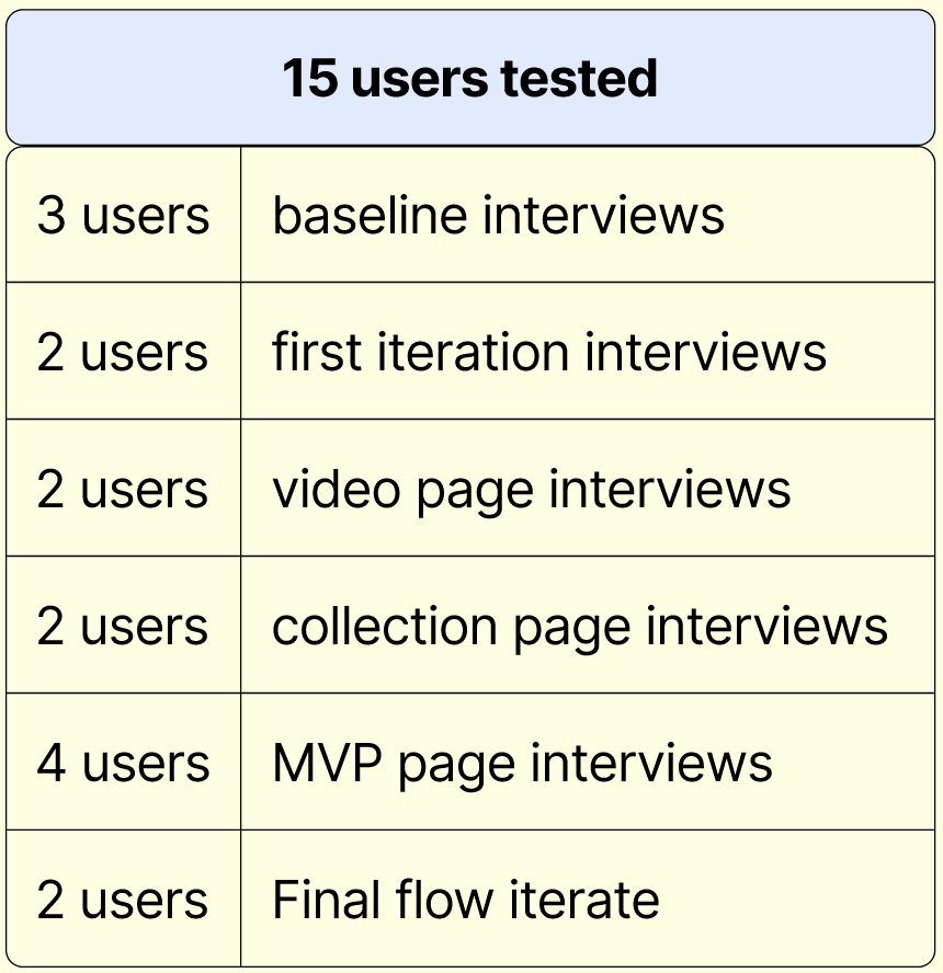
We did this by conducting 15 user tests with Pratt Institute students and alumni:
Process & Methodology
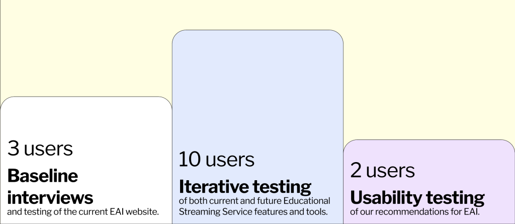
We conducted 3 baseline interviews to test the current EAI website, 10 iterative interviews to test both current and future Educational Streaming Service features and tools, and 2 usability tests of our recommendations for EAI.
Of the interviewees: 5 were MLIS students, 8 were UX students, and 2 were either film students or worked in film.
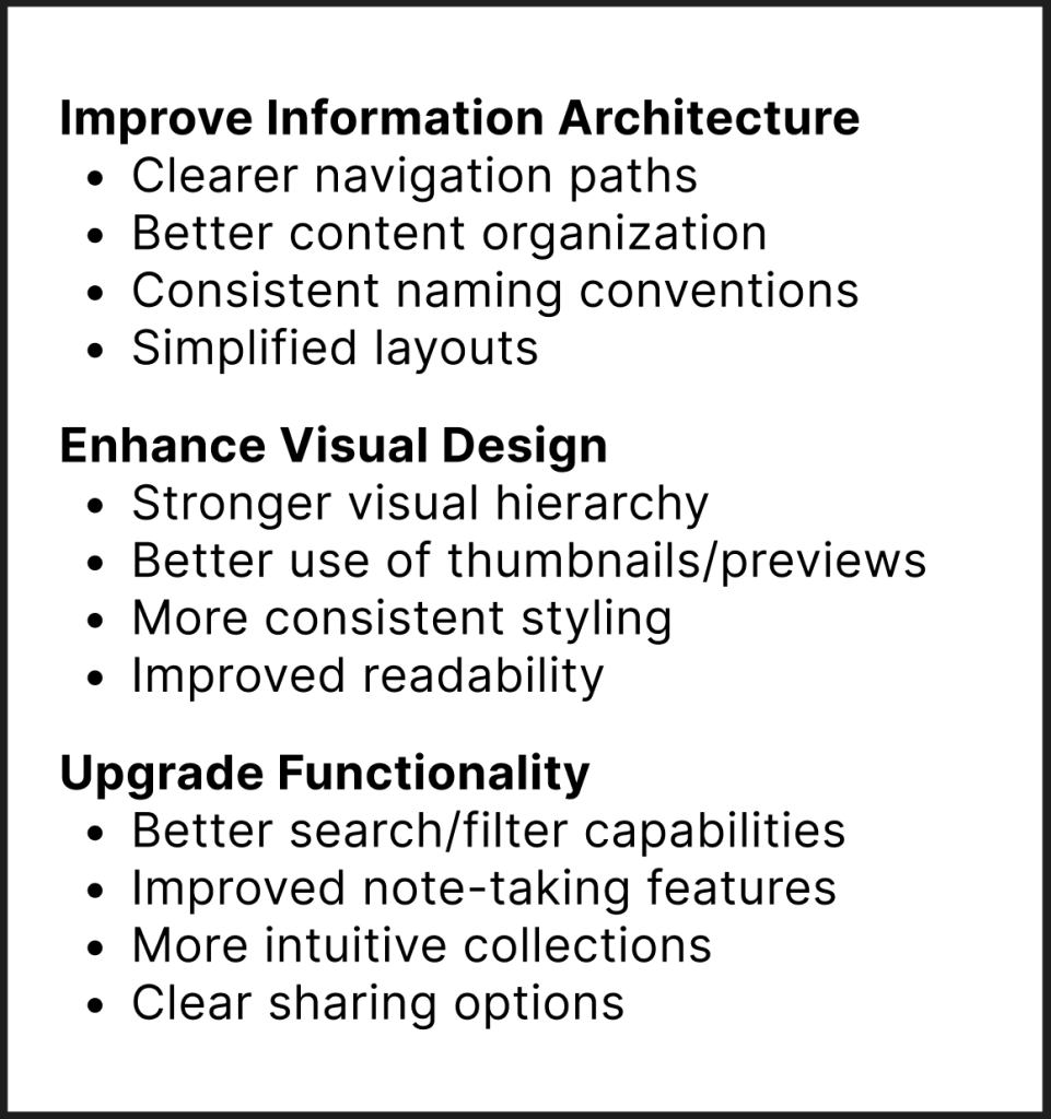
From our baseline interviews, our group decided on the 3 main issues on the EAI Educational Streaming Service site and recommendations for each:
We then used the 10 iterative tests to refine our recommendations and mockups, transforming our feedback into a hi-fi prototype that we showed to our final 2 interviewees.
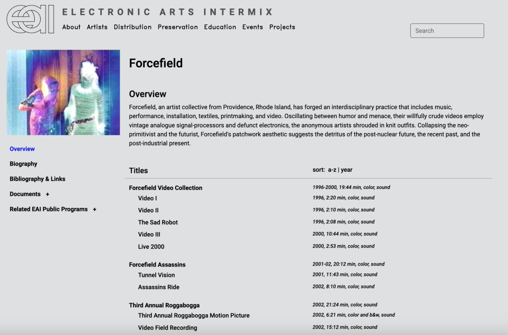
Although our iterative test interviews were really great, we found that the first two we conducted were too long with both being longer than 30 minutes. Due to project’s timeline , we knew we had to adjust our interview script. Originally, we asked each user to test three different pages – the home page, artist page, and video player – but quickly adjusted our remaining eight interviews so that each interviewee was only testing one. This greatly improved our ability to focus our findings and obtain better data.
What Were the Results?
Using the three primary problem areas we discovered during our baseline interviews, our group started working on mockups for various improvements using Figma.

Clarify EAI’s Goals and Mission
The most jarring feedback we received in our baseline interviews and the first round of iterative testing was that no one knew what EAI was or the purpose the Educational Streaming Site served. Even after allowing users to explore the site, many still stated they could not tell us what EAI does or what the site is used for. The issue is that the statement on EAI’s home page was so long that not a single user read it all the way through.
Originally, we wanted to test a complete rebrand of the company, but due to time restraints, we decided instead to just alter their mission statement. We knew this was a very basic starting point, but believed it would communicate to EAI that their branding needs major improvement.
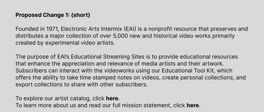
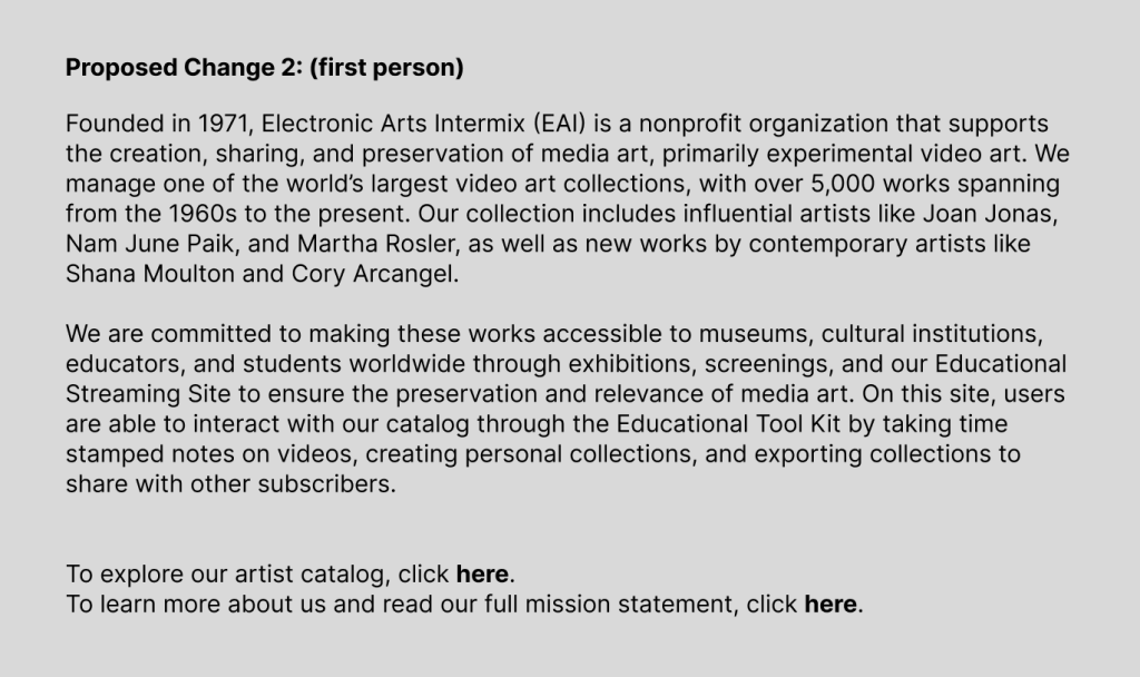
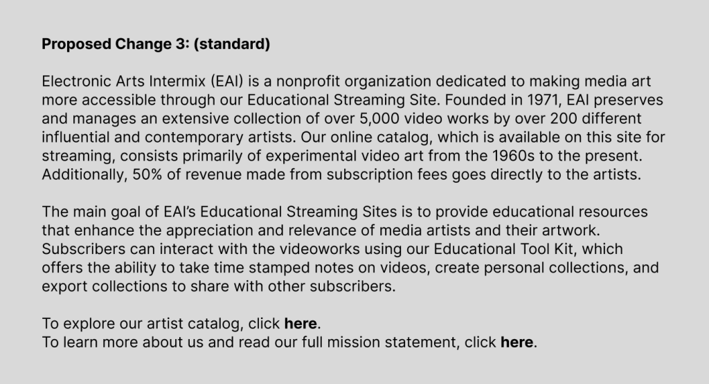
I wrote three different mission statements that we tested in our iterative interviews:
Through more iterative tests, we quickly found that the shortest statement performed best, meaning users not only read it, but got enough information that they felt more comfortable navigating the rest of the site.
Not only did we shorten the mission statement, but we separated EAI’s goals from the Streaming Site’s goals so that users can clearly understand the purpose of both. Our design would allow users to read about the educational resources and access the streaming site from the home page.
Make Navigation and Information Clear
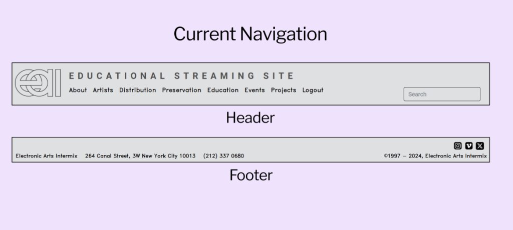
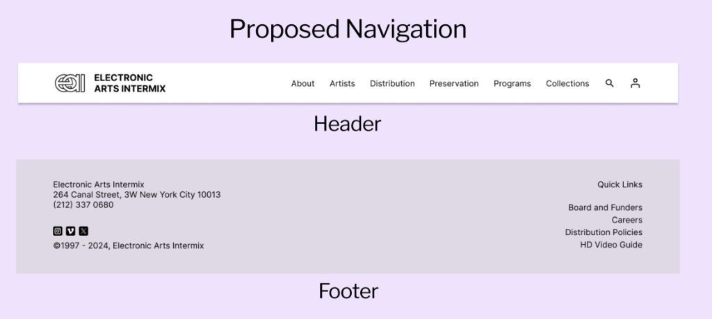
Many users struggled with the navigation on the site and were confused about which pages performed which functions. Users wanted to have a clear path through the site, but with no information hierarchy and little explanation as to what the site does, they felt lost.
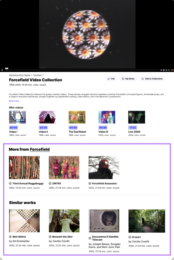
Our solution was to add simple visual cues and touches that would guide users to different pages on the site while keeping EAI’s minimalist aesthetic, a request they made clear from our kick-off meeting. We did this by implementing consistent navigation throughout the site, hover previews and auto-play for video files, and video minimization so users can explore the site and watch videos simultaneously.
Introduce Educational Tools
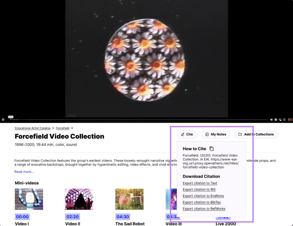
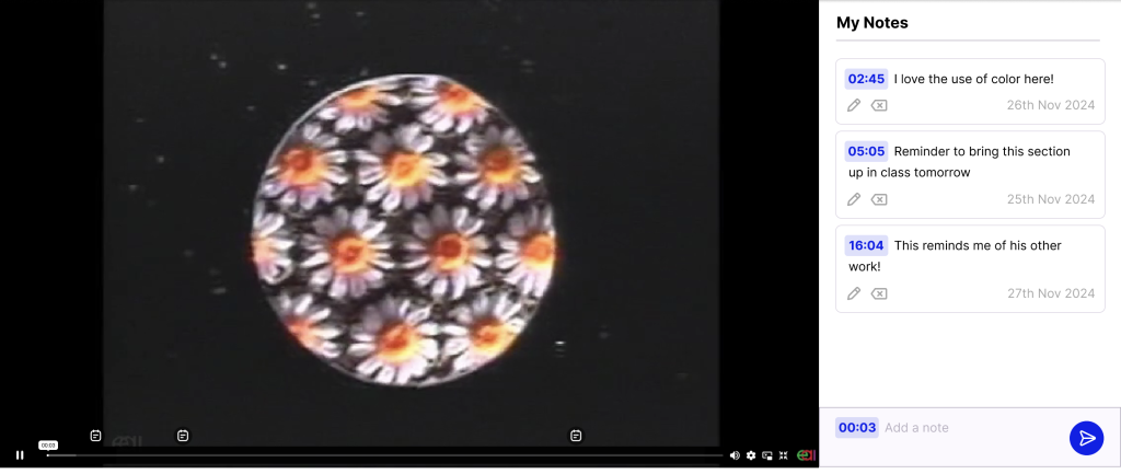
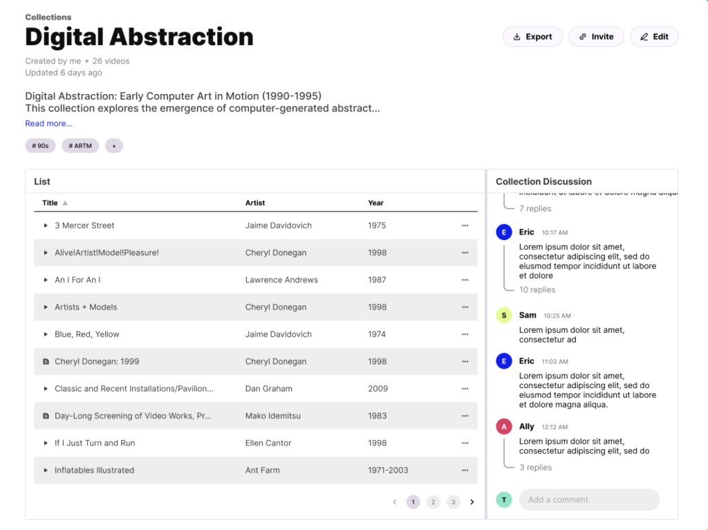
To make the streaming platform more education-centric, we focused on the tools and features that users typically rely on for research. Drawing inspiration from both the physical world (archives) and other online research platforms (Zotero), we created the Educational Toolkit:
Citation Tool: a button underneath every video and item on the EAI site that solves the problem of citing films and documents.
Timestamped Note-Taking: notes with timestamps on videos so users can track their thoughts and the thoughts of other students.
Similar Video Section: videos with similar themes and by the same artist laid out on the same page to aid with topical research.
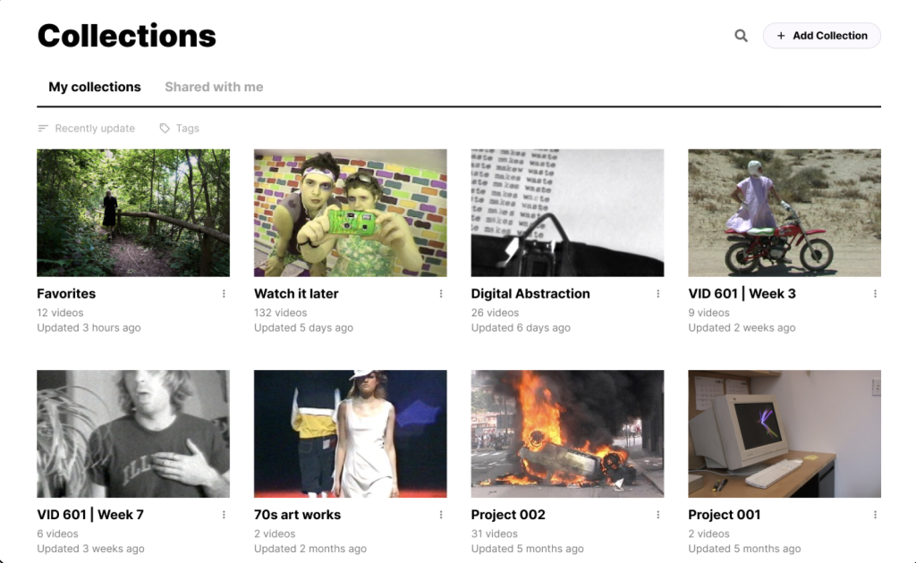
Discussion Board: on the collection and item level for collaboration to further foster user interaction and engagement.
What Did I Learn?
We concluded this project by presenting our slide deck to 4 members of EAI at their office in Chinatown. They seemed incredibly engaged, asking questions during the presentation and giving us positive feedback as we went. They were vocal that the results of our baseline testing were worrisome, especially our observation that users were not reading their mission statement or understanding the site’s function. As we went through our recommendations, they seemed incredibly excited and interested.
This was my first UX project and I felt very supported by my team members. As someone who was unfamiliar with Figma before this assignment, I worried I was moving too slowly and that my ideas weren’t holding up as well as those more familiar with UX/UI. However, everyone in my group was very helpful in teaching me how to use the application. I learned a lot on my own, but I learned just as much from them.
On week 5, our clients asked to move our presentation up to the following week (other groups presented on week 7). As a team, we were able to get the work done because we communicated well and were consistently helping each other out. We handled the pressure by correcting our timeline quickly and, as a result, ended up presenting a great deck with thoughtful recommendations to our clients.
