AllTrails is a widely used app for discovering, tracking, and reviewing hiking trails. It provides an interactive way for users to find trails based on location, attributes, and user-generated reviews. For this critique, we will be evaluating how AllTrails accomplishes the main use cases of the app: finding and filtering trails and tracking a live trail. Evaluating the app through principles from The Design of Everyday Things by Donald Norman and How Artifacts Afford, this critique identifies both strengths and areas for improvement.
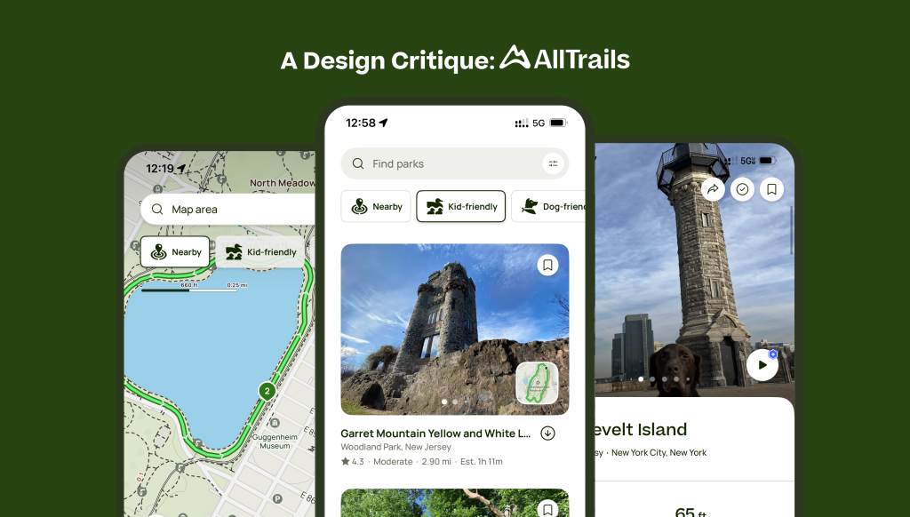
Home Explore Page
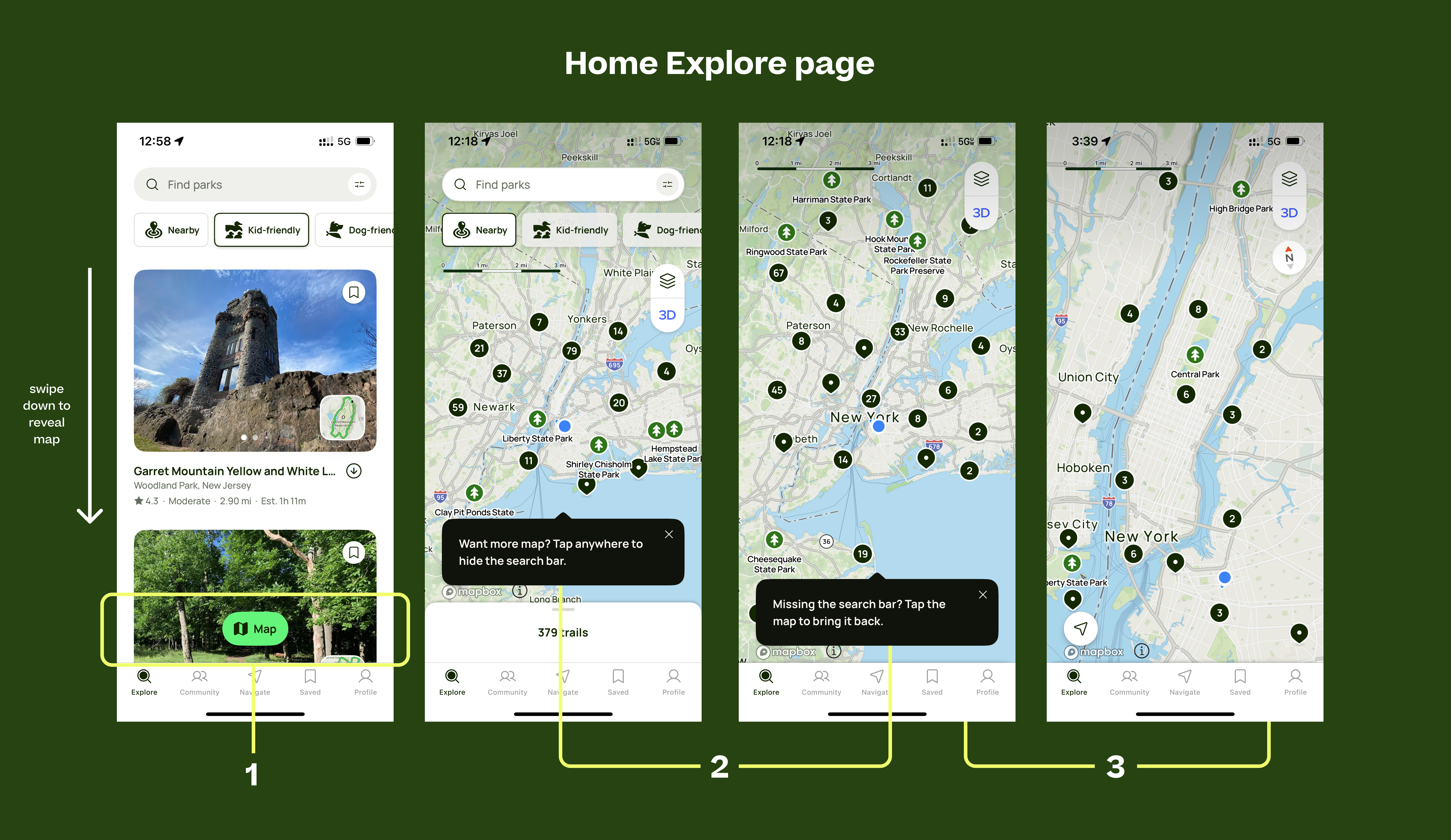
The users are taken to the main explore page as the first screen on the app, which effectively combines a search interface with trail cards and an interactive map. Users can swipe down to reveal the map or press a floating map button (1), which displays trails visually based on their locations. Providing multiple ways to afford the map—via the floating button and a swipe gesture—caters to both novice and experienced users. The floating button is an explicit affordance, requesting interaction from novice users by offering a visible signifier that clearly suggests the action. On the other hand, the swipe gesture is a more subtle encouragement for experienced users, affording a quicker and more efficient interaction once the user is familiar with the interface. Moreover, by dynamically updating trail availability as users zoom in or out (3), the app gives immediate feedback, reducing the Gulf of Evaluation by making the relationship between filters and results immediately clear.
Additionally, the first time a user opens the map, a pop-up information message (2) guides them on how to interact with it. The first pop-up informs users that they can swipe down to expand the map fully, while a second pop-up clarifies that swiping up will return to the search bar. This well-designed onboarding feature acts as an explicit signifier, ensuring that new users understand the navigation gestures without overwhelming them, increasing the Discoverability and Understandability of the features.
Filtering Feature + Advanced Filtering
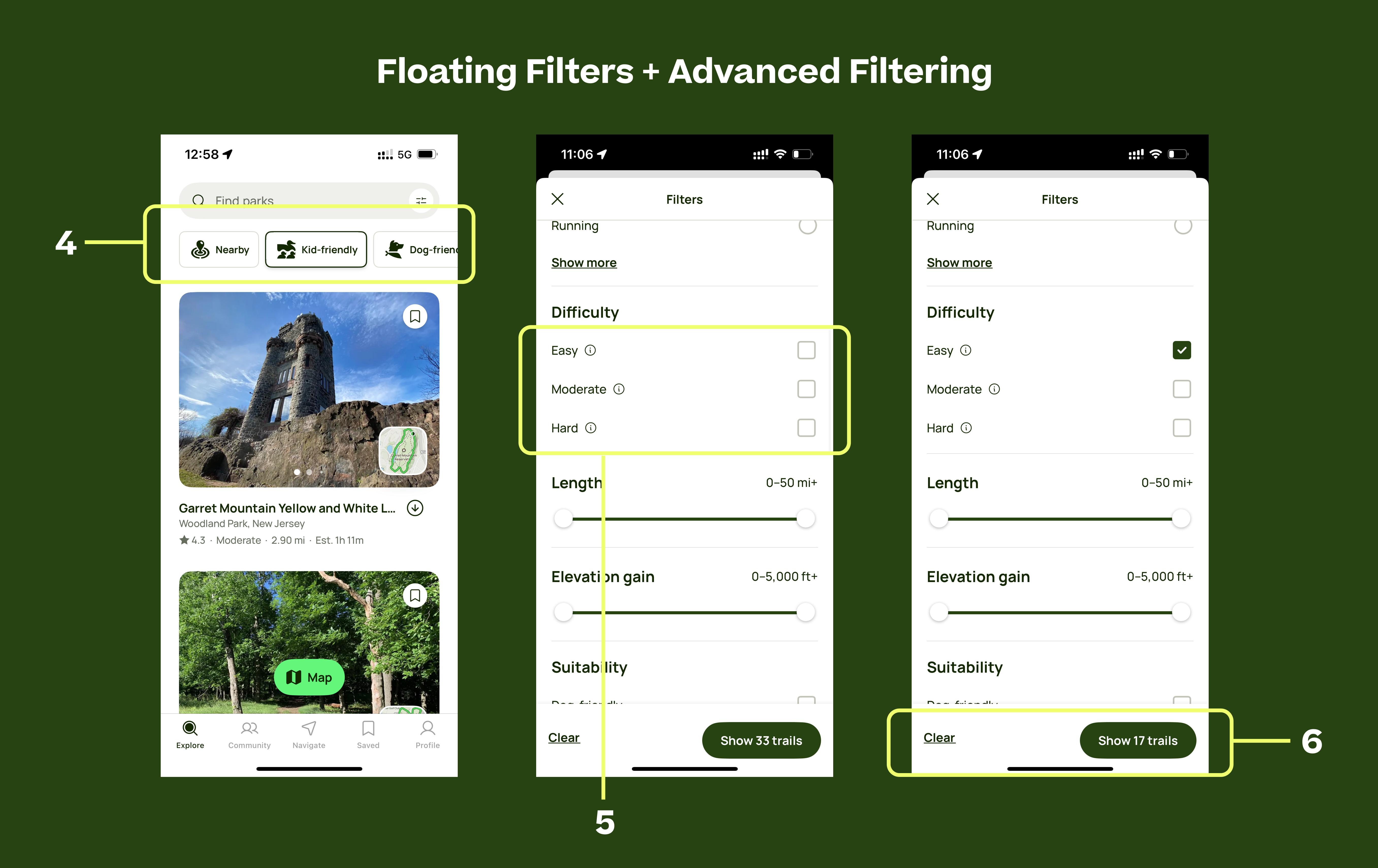
Filtering on AllTrails is inconsistent. On the homepage, floating filters (4) allow users to select only one filter at a time, automatically deselecting the previous choice. However, in the advanced filtering menu, multiple selections are allowed. This inconsistency confuses users, as it violates the users conceptual model of how the app functions—users expect the same function to work the same way across different parts of the app, leading to a disconnect in the Gulf of Execution where users struggle to predict how filters behave.
Additionally, the floating filters perceive to afford multiple selection due to their bubble-like appearance, which users often associate with checkboxes. This mismatch in mapping of this feature further increases confusion. A technical solution would be to allow multiple selections in floating filters to match the advanced menu. In addition to that, adding a small “+” icon to each filter bubble could signal that multiple selections are possible within the advanced menu.
One of AllTrails’ strongest usability features is its Advanced filtering. AllTrails rates trails as “Easy, Moderate, or Hard”(5), and each label includes an info icon that provides additional details when tapped. This offers a strong affordance, as it allows users to quickly access explanations for difficulty levels without cluttering the interface. This approach successfully reduces the Gulf of Evaluation by helping users understand whether difficulty is based on elevation gain, terrain, or distance. Additionally, The “Show XX Trails” button (6) dynamically updates as users select different filters, providing instant clear feedback on how their choices impact the results. Users see real-time changes, avoiding unnecessary search failures and thus preventing errors and reducing frustration.
Live Trail Tracking Page
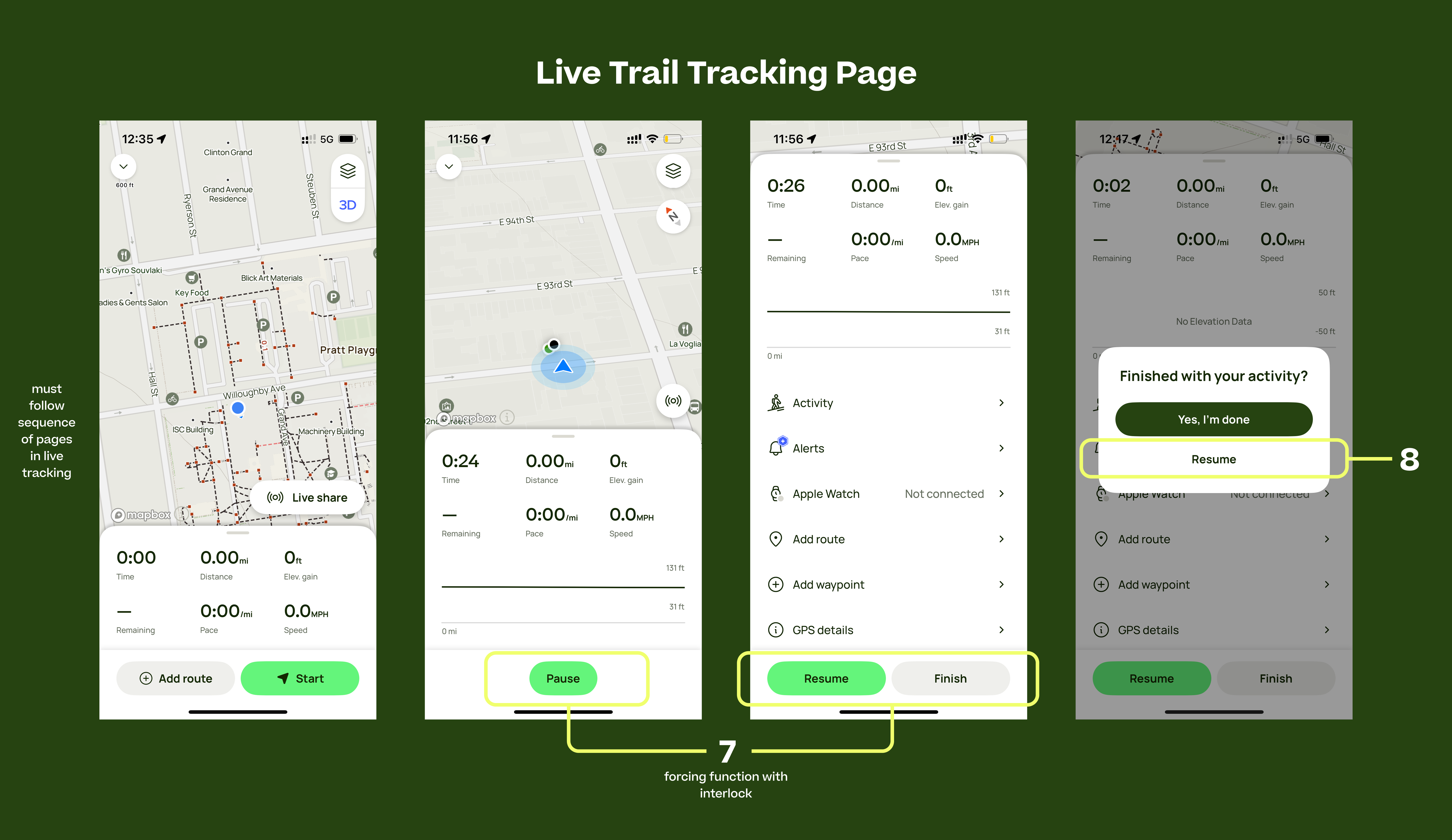
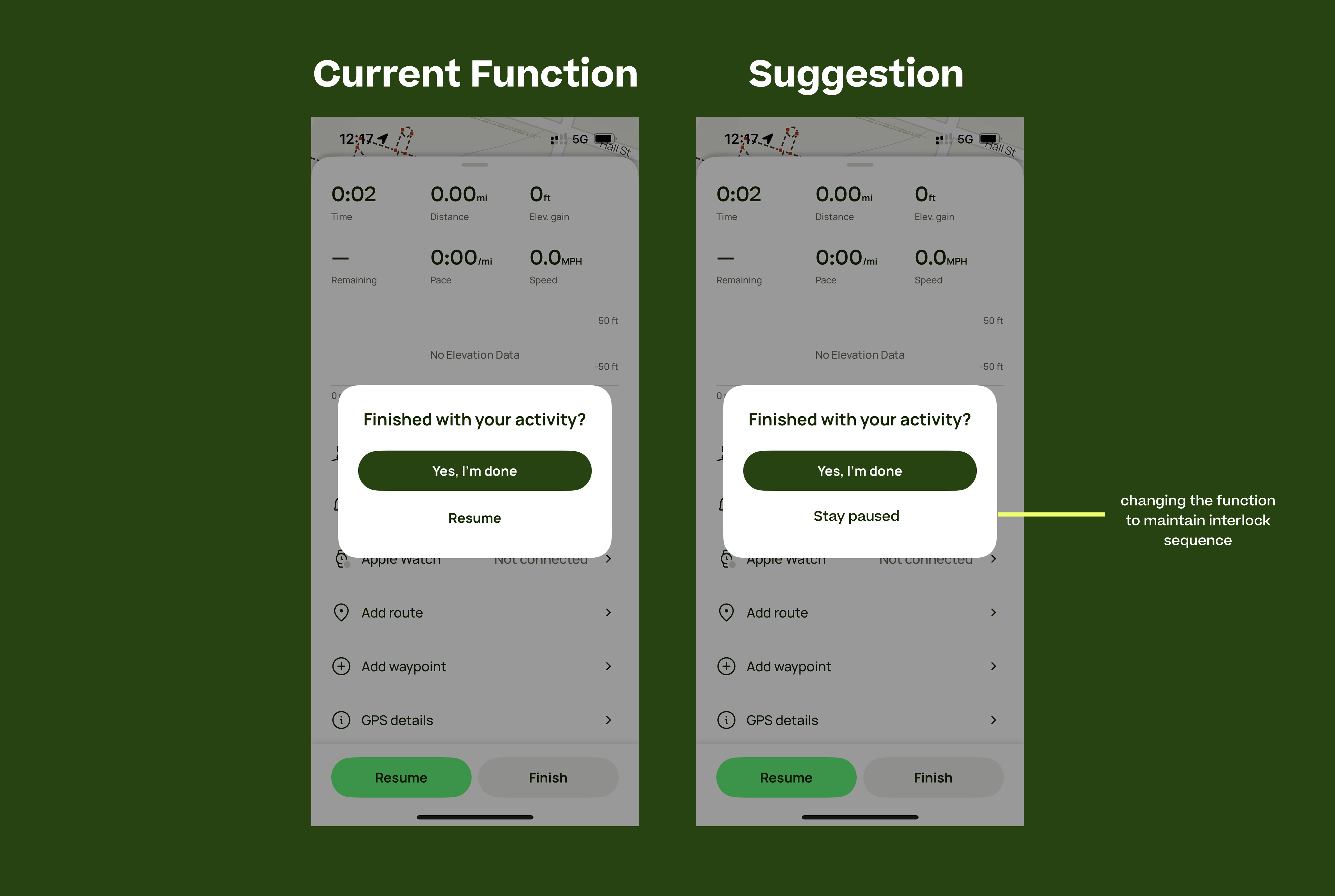
After selecting a particular trail, you can navigate it live by starting the same. AllTrails incorporates a forcing function (7) in its hike-tracking feature: when the user wants to stop their trail, They must first press the “Pause” button, which then leads to two choices, “Resume” or “Finish”. Thus, you can only finish/stop a trail by pausing it first. This follows the concept of interlocks, which ensure critical actions cannot be performed accidentally, aligning with Norman’s emphasis on designing for error prevention. In this context, the feature prevents accidental termination of a hike, ensuring that users don’t mistakenly end their session while still moving. This also aligns with the conceptual model of real life workout tracking, as most gym machines also incorporate this fail-safe of pause-first to avoid any abrupt accidents.
However, the implementation of this feature weakens this constraint. After pressing “Finish,” a pop-up offers the option to “Resume”(8) instead of returning the user to a paused state. The initial pause acted as a deliberate constraint to prevent accidental finishes. However, the confirmation pop-up introduces a loophole where users can skip back to active tracking instead of being required to stay in pause mode first, disrupting the intended sequence. From the perspective of “How Artifacts Afford”, the flow originally affords safety but is undermined by refusing the option to go back to the safe space created. Norman’s argument that affordances should be consistent applies here. If the system enforces a sequence, it should maintain that sequence throughout.
A solution to fix this sequence would be Renaming the “Resume” button to “Stay Paused” or “Go Back” to maintain the interlock without removing user control. The functionality would have to switch to going back to the paused page rather than automatically starting the live tracking again.
Conclusion
AllTrails demonstrates a well-designed user experience in many areas for its main use cases, particularly in dynamic feedback, its explicit affordances and signifiers, and effective interlocks. However, inconsistencies in filtering behavior and weak signifiers in some areas introduce friction. These refinements would create a more intuitive and seamless experience for hikers navigating the app.