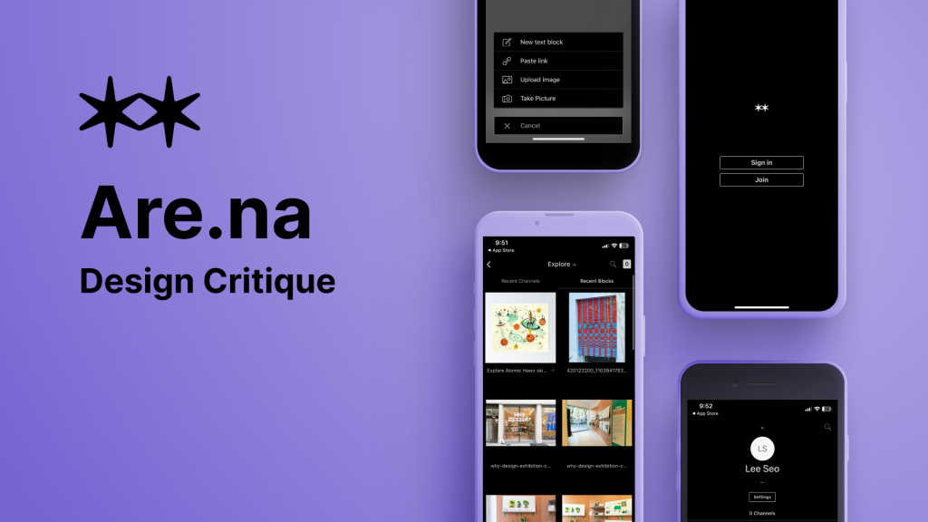
What is Are.na?
Are.na is a platform for creative thinking and collaborative research. It lets you collect, organize, and develop ideas over time—kind of like Pinterest, but with a different approach.
Confusing? I found it confusing too. While Are.na allows users to upload and share content, it doesn’t function like a typical social media platform. There are no likes, shares, or favorites, and it’s not as visually driven as Pinterest or Tumblr. What truly sets Are.na apart is its lack of algorithms, recommendations, or ads. Everything you collect and connect with is entirely your own choice, without outside influence.
Still unsure? You’re not alone. Even the Are.na team continues to explore how to define the platform. In fact, there’s a channel where hundreds of users have shared their own explanations in response to the question: How do you describe Are.na at a party?
How does Are.na work?
When you sign up for Are.na, the first thing you’ll do is create a Channel. Think of Channels as folders for specific ideas, similar to Pinterest Boards. Inside these Channels, you’ll store Blocks, which can be images, links, PDFs, videos, or text. Channels can be public or private, and you can invite collaborators if you want. Plus, Blocks can exist in multiple Channels, and related Channels can be linked together.
While you do need an account to use Are.na, signing up is simple. A free “Guest” account gives you up to 200 Blocks, while a paid plan ($7/month or $17/year) offers unlimited Blocks and extra features.
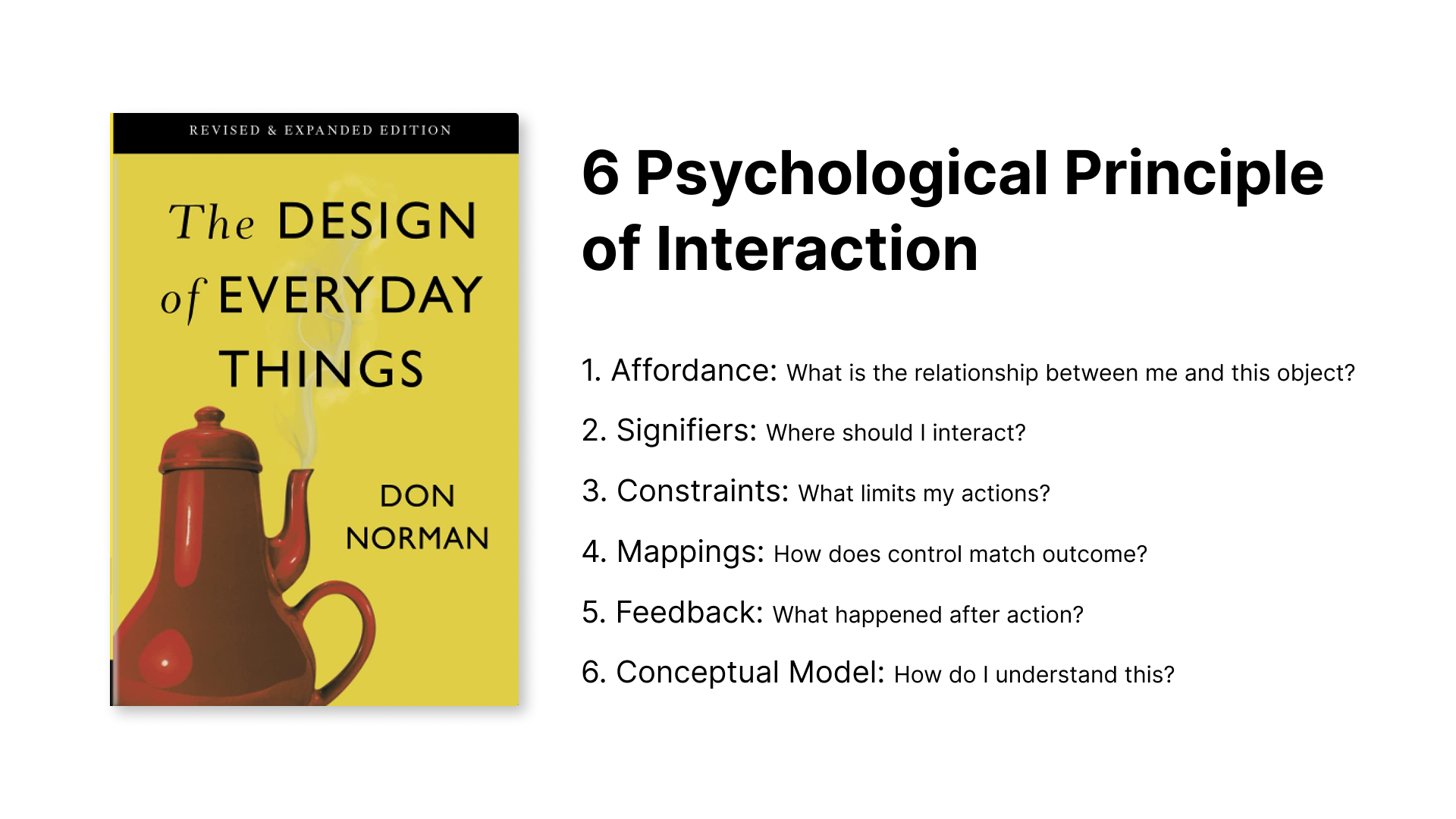
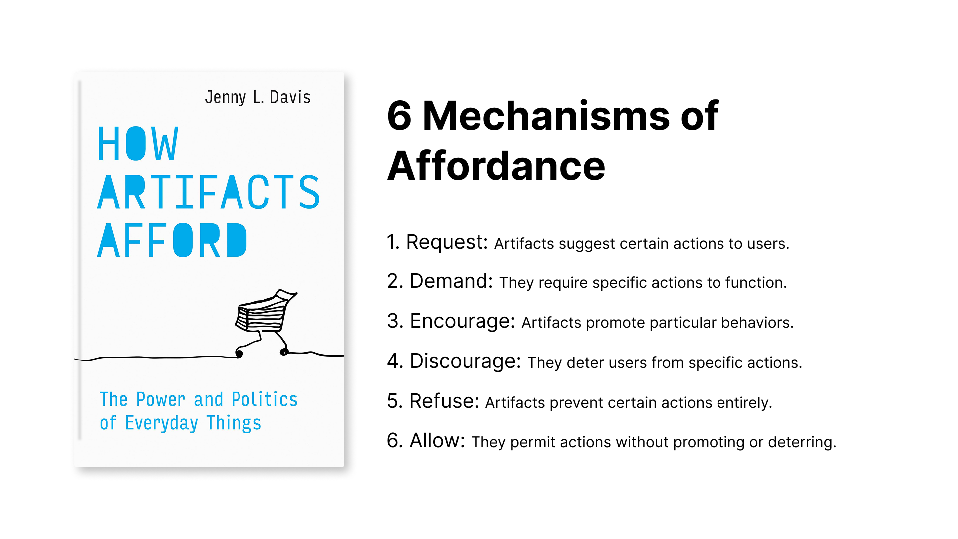
Insights from Two Design Theory Books
“Good design fits our needs so well that the design is invisible, serving us without drawing attention to itself. Bad design, on the other hand, screams out its inadequacies, making itself very noticeable.” – Don Norman
Drawing from two influential books—The Design of Everyday Things by Don Norman and How Artifacts Afford by Jenny L. Davis—I learned a psychological perspective on how humans interact with objects. While both books explore a wide range of design principles, I’ve chosen two key concepts to guide my review of the Are.na mobile app.
The next section will focus on analyzing the user experience design of Are.na.
Design Critiquing Are.na
A. Sign-up Process
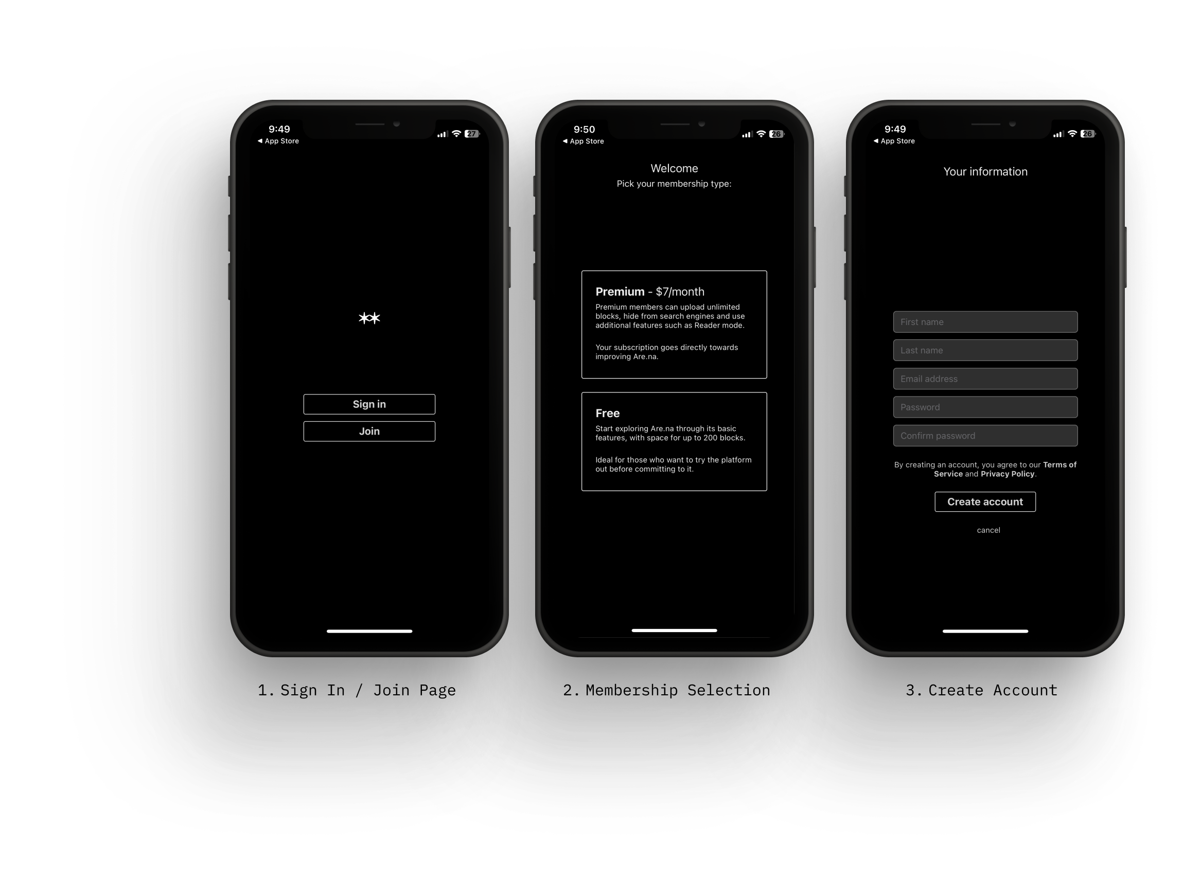
What’s Good?
The sign-up process is simple and streamlined, consisting of just three pages with a clean UI and clear signifiers. Each page requires only two or three clicks, making navigation easy. This well-designed flow helps reduce mental overload, especially for first-time users during onboarding.
What’s Not Good?
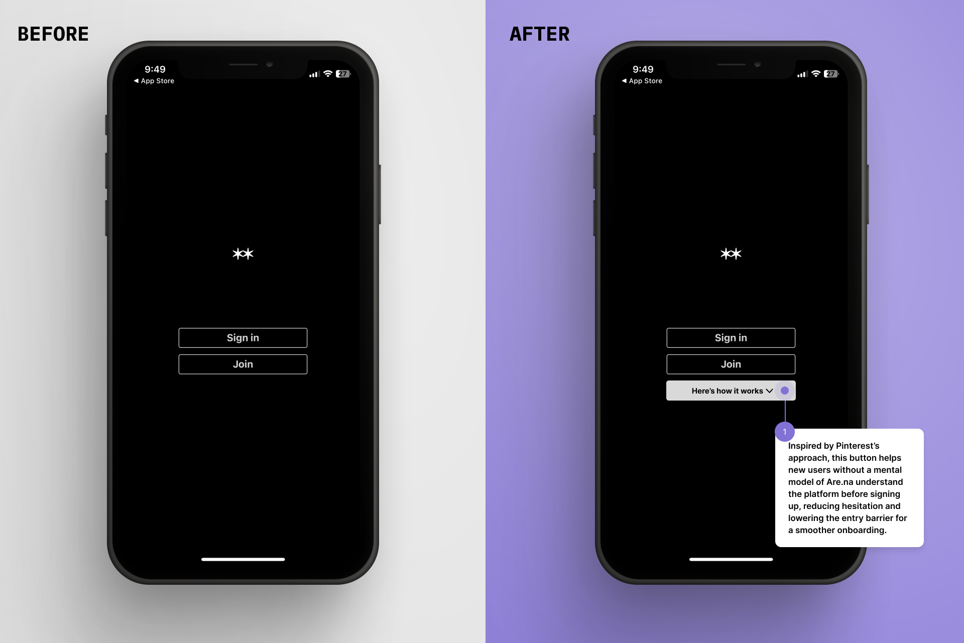
1. Demanding Sign-up: The sign-up process demands users to create an account before accessing the app. However, for users with no mental models, which means for those unfamiliar with how it works, this step might feel like a hurdle. Pinterest takes an interesting approach to this issue. While it also demands users to sign in, it includes a “Here’s how it works” tab below the sign-up form. This leads to a separate page explaining how Pinterest functions, making it easier for first-time users to understand the platform before committing. This is a smart way to lower the entry barrier and ease hesitation
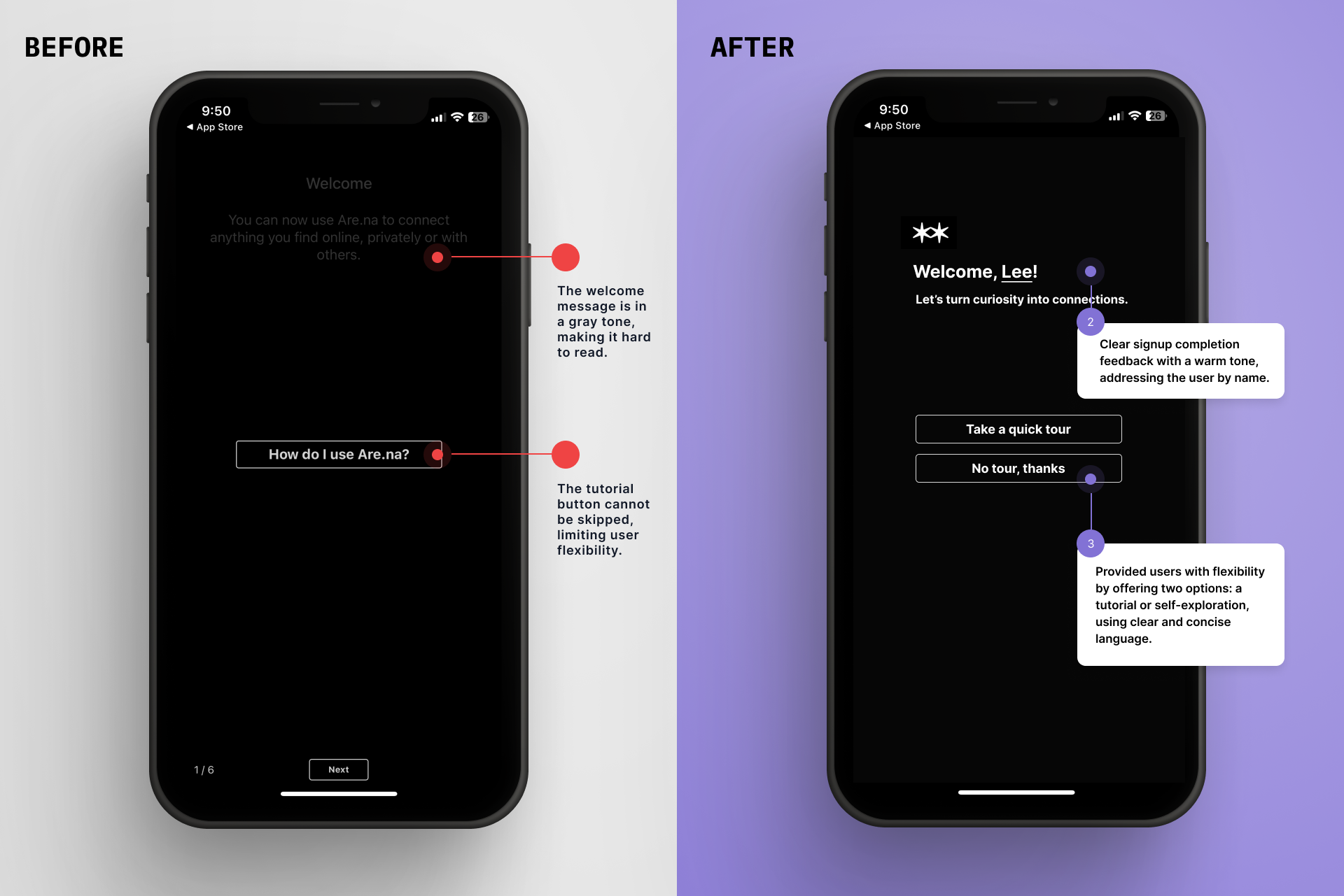
2. No Progress Bar as a Signifier: Even though the sign-up process is only three pages long, users still benefit from a visual cue indicating how far along they are. In this case, there is no progress bar or signifier showing how many steps remain, which can leave users uncertain about how long the process will take. Adding a simple progress indicator could improve the experience by setting clear expectations.
3. No Completion Feedback: Even though the sign-up process is just three pages long, users still appreciate clear confirmation when they’ve completed it. In this case, instead of a confirmation message, users are automatically redirected to a tutorial page. While the tutorial is helpful, adding a simple success message or confirmation screen could provide a better sense of completion and clarity.
B. Explore
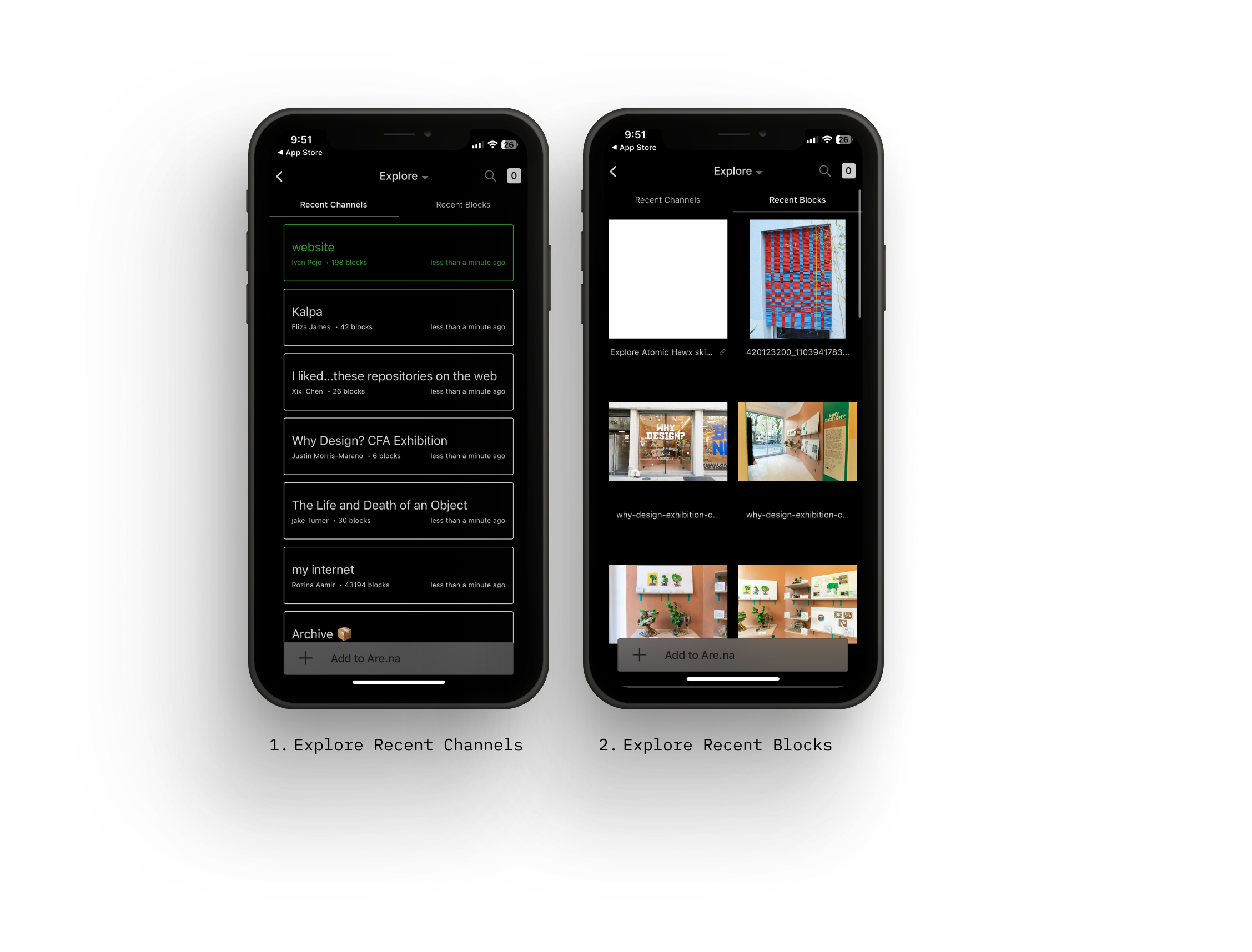
What’s Good?
The simple two-tab design of Are.na clearly supports the idea of “exploring” what others have collected. This straightforward layout effectively guides users toward the app’s core purpose, making it easy to navigate and stay focused on discovering content.
What’s Not Good?
Need of Balancing Simplicity with Engagement: While Are.na’s simple design aligns with its no algorithm, no ads philosophy, it can also feel plain—even dull. Personally, it reminds me of older HTML-designed websites, evoking a sense of nostalgia but also a lack of engagement.
In The Design of Everyday Things (DOET), Don Norman highlights the importance of the visceral level in human cognition and emotion—often called the “lizard brain.” This level influences our immediate reactions to design, shaping how pleasant, harmonious, or visually appealing something feels. As Norman states, “Great designers use their aesthetic sensibilities to drive these visceral responses.”
Are.na could enhance user experience by refining its visual design, creating a more engaging and emotionally resonant interface while staying true to its minimalist identity. (which, as any designer knows, is no easy feat!).
C. Add a Block to My Channel
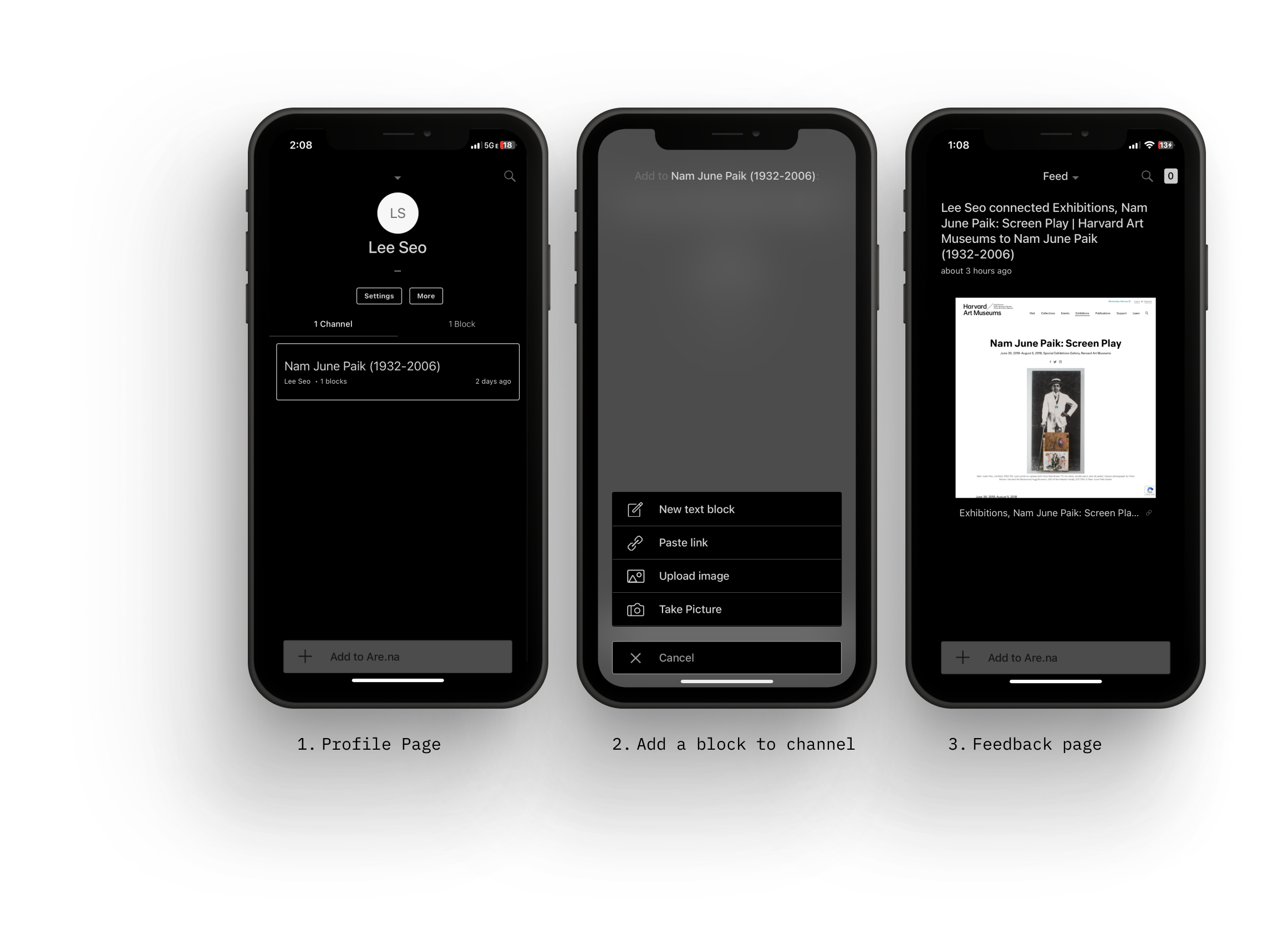
What’s Good?
Encouraging Proactive Engagement Through Constraints: Are.na’s lack of like, share, and comment buttons limits typical social interactions, but this design choice has a clear purpose. Without these features, users aren’t influenced by external validation or trends, keeping their actions focused on their own decisions. As a result, users are encouraged to be more intentional and proactive—actively curating and adding their own content (blocks) to their channels rather than passively engaging with others’ posts.
What’s Not Good?
Minimal Feedback When Adding Blocks: When a new block is added to a channel, the confirmation appears as plain text: (User ID) connected (Title of Block) to (Title of Channel). While this provides basic feedback, it feels minimal and lacks visual reinforcement. Incorporating additional elements—such as icons, subtle animations, or color changes—could enhance the user experience by making the action feel more satisfying and clearly indicating success.
DESIGN SUGGESTIONS
Design suggestion: Based on the observations, I created two mock-ups to improve the design using psychological concepts. Click the image below for details.
Take Aways..
Good design isn’t just about how something works—it’s also about how it makes users feel. Are.na’s simple approach keeps things distraction-free, but adding small details like progress indicators or visual feedback could make the experience clearer and more satisfying. A design that feels both easy to use and enjoyable helps users stay engaged.