
Bloomberg Connects is a free platform offering digital guides to cultural institutions like galleries, museums, and parks, featuring audio tours, videos, and interactive maps. As a new explorer of New York City’s cultural landscape, I’ll evaluate how this app shapes the museum experience through Norman’s “The Design of Everyday Things” and Davis’s “How Artifacts Afford.”
Explore Arts and Culture Page
Review
When users open Bloomberg Connects, they’ll land on the “Explore Arts & Culture” screen, which is where they can discover different cultural venues. I’ll be looking at four main parts of the interface: how users search, how they filter, how they save favorites, and how they see distances to places.
(1) The search feature doesn’t clearly show users how it works, creating a gulf of execution between what they want to do and how to actually do it. Users have to figure out on their own that searches only work within whatever filter they’ve selected – for instance, if they’re in the “Biography” filter, they can only search for biography-related places, but this isn’t obvious at first. This breaks the principle of clear signifiers since users shouldn’t have to guess how to use a feature.
(2) Below the search bar, users find filter pills that help sort through different categories. While these pills turn black when selected (with “All” being the default), only the “Favorites” has an icon, which breaks consistent system feedback. The side-scrolling design also creates issues with request affordances (users can’t tell if they can select multiple filters) and refuse affordances (users can’t see that more options are hidden off-screen), making it hard to explore and filter effectively.
(3) The heart icon demonstrates positive affordances by letting users save and curate their own collection of cultural institutions. Combined with the dedicated “Favorites” filter, this feature transforms the app into a personalized guide for cultural exploration.
(4) The distance indicators (like “0.2 mi” for MoMA) show request affordances by transparently communicating location proximity after receiving geolocation permission. This feature enables users to quickly assess institutional accessibility through clear signifiers that turn spatial information into easy-to-use navigation help.
While the app shows each institution’s name and distance, it could also showcase labels to identify venue types (museum, gallery, garden, etc.). Adding these signifiers would help browsing – knowing that MoMA is an art museum and Public Art Fund features an art funding organization would help users quickly understand each institution’s nature before selecting them.
Suggestions
MoMA | The Museum of Modern Art Page
Review
When users select an institution on the Explore Arts and Culture Page (in this case, MoMA), they land on a detailed overview page that shows good information architecture and natural mapping. The information flows in a logical way that matches how people typically plan their visits – starting with a description of what they’ll see, offering language choices, and ending with practical details like how to get tickets, where to go, and when to visit.
(5) The heart and bell icons in the top navigation show both negative request affordances and unclear signifiers – the heart duplicates the existing ‘Favorites’ feature, while the bell’s notification purpose is ambiguous, which creates an unnecessary cognitive load.
(6) The language selection feature shows strong encourage affordances by inviting users to customize their experience through 40 language options, making cultural content more welcoming and accessible to all visitors.
(7) Another encourage affordance is the displayed address with a “Directions” link, making it simple for users to locate and navigate to the institution, reducing barriers to physical visits.
Suggestions
MoMA Page
Review
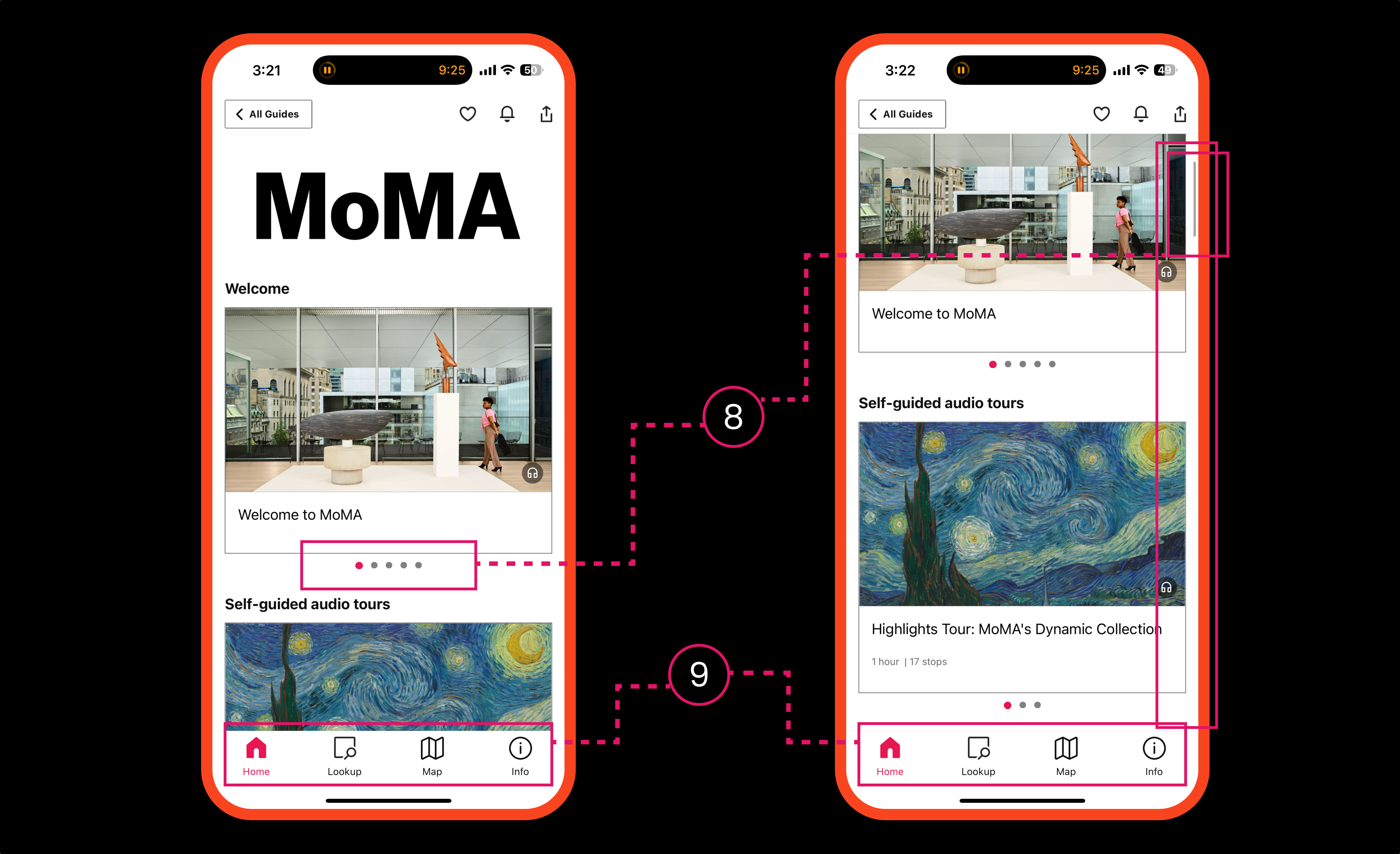
After selecting “Start Guide” on the MoMA | The Museum of Modern Art page, users are directed to a hub featuring diverse audio guides. The design holds signifiers through intuitive visual cues, while affordances guide users to explore tours organized by museum floors and curated collections – this enables visitors to easily select the specific experience matching their artistic interests.
(8) The app’s scrolling design shows cognitive load through redundant imagery, creating constraints that obstruct content exploration. These dense layers violate the visibility of system status, impacting user navigation.
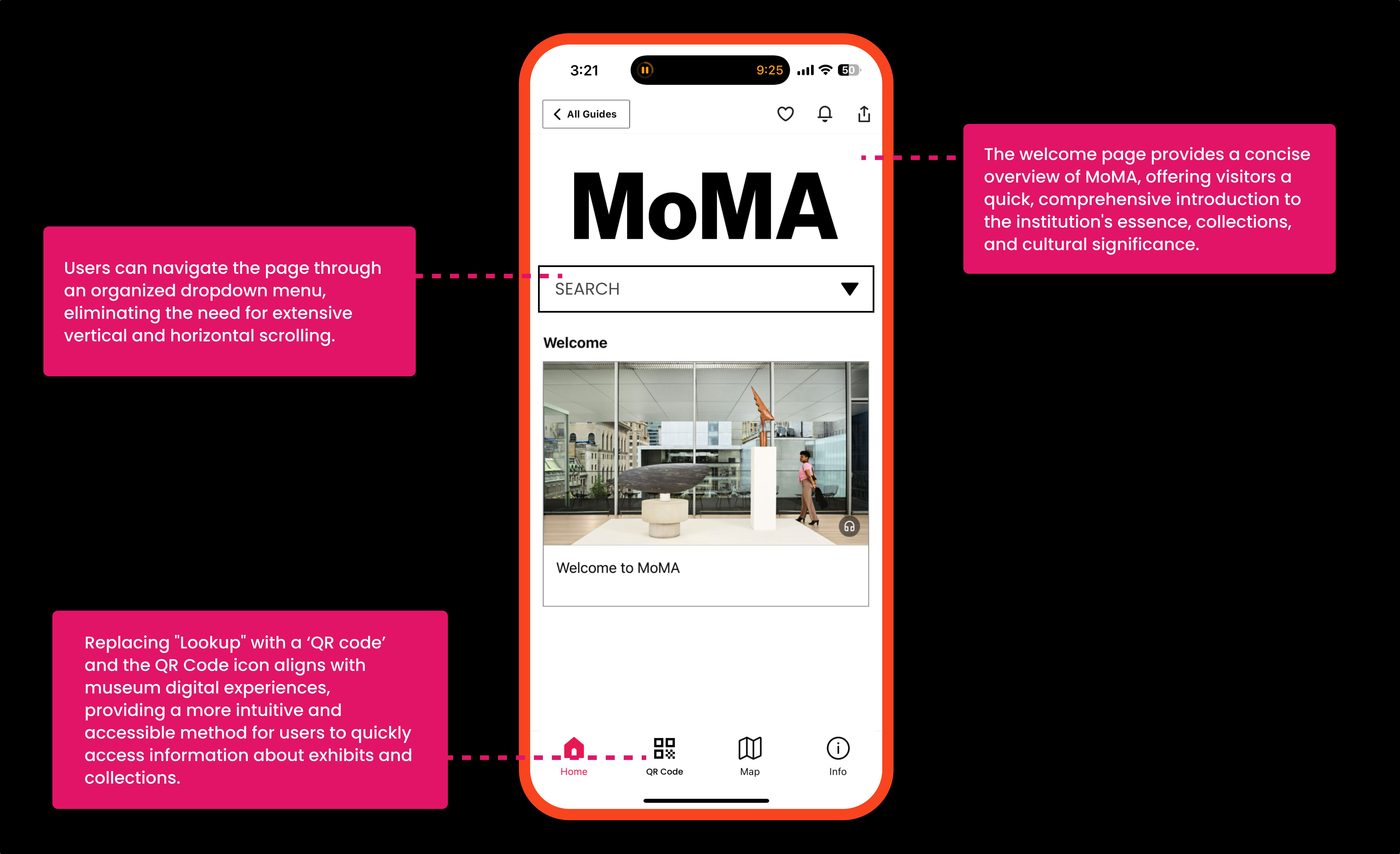
(9) The bottom navigation demonstrates mapping by aligning icons to reflect functional relationships, creating an intuitive digital landscape. However, the “Lookup” icon undermines this clarity by lacking descriptive discoverability despite the logical navigation.
Suggestions
Conclusion
The Bloomberg Connects app provides initial affordances for cultural venue discovery but falls short in creating an intuitive user experience. By finding the critical design gaps in discoverability and interaction, the suggested recommendations can help transform the app from a basic navigation tool to a more engaging cultural exploration platform.