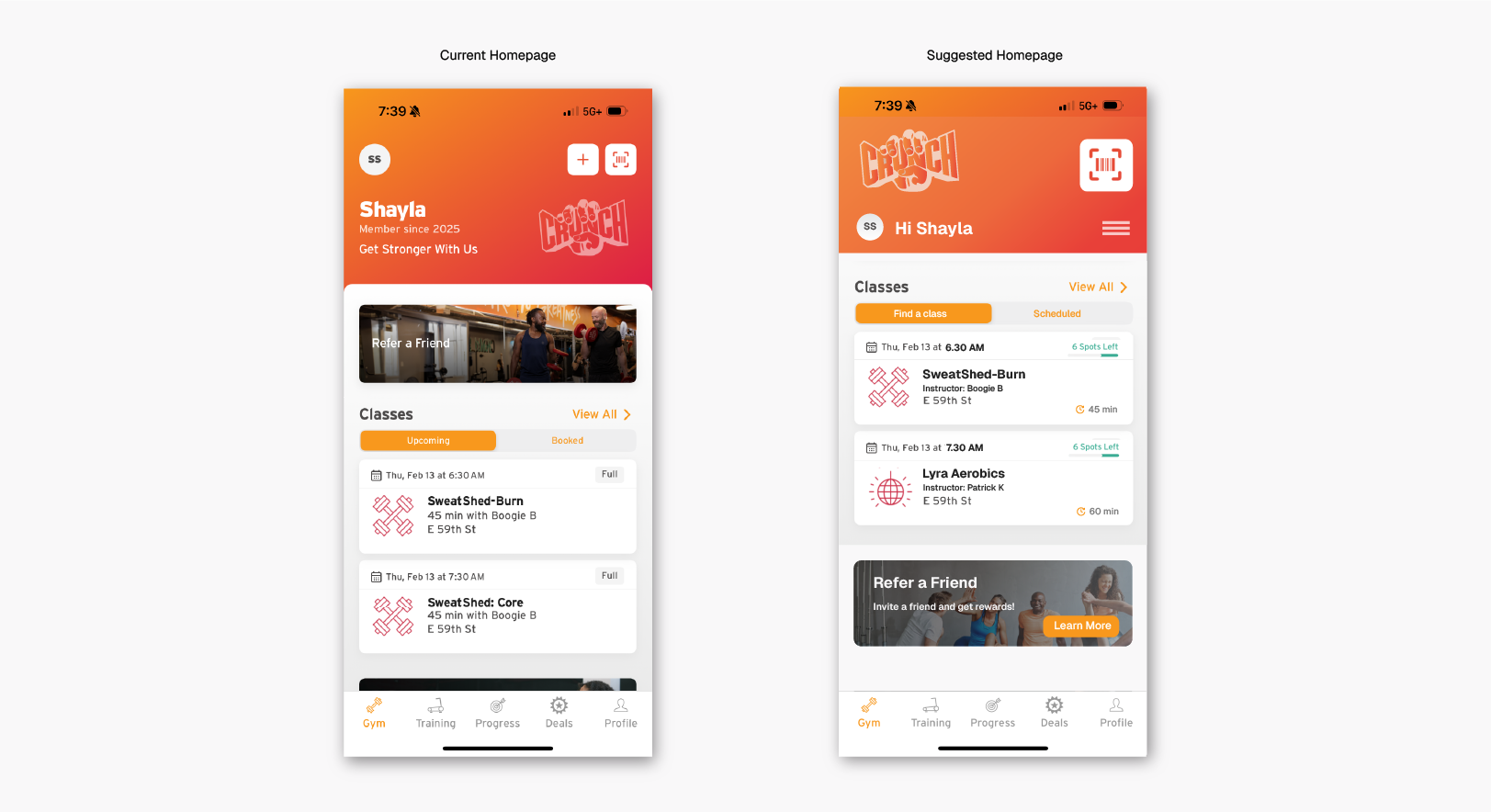
Crunch, a popular NYC fitness chain, attracts thousands daily. Their app allows users to book classes, locate gyms, and manage memberships. This critique analyzes the app’s homepage using principles from Don Norman’s book, The Design of Everyday Things.
I recently enrolled in a Crunch membership to improve my physical and mental well-being. They offer a wide variety of classes, which was the selling point for me to join Crunch in the first place. Booking classes requires using their mobile app. This post explores some of my observations on the app’s design, focusing on the homepage of the iOS app.
Clear QR Code Icon, Ambiguous ‘+’ Signifier
The homepage features ‘+‘ and ‘QR code‘ icons in the top right corner, marked (1) and (2) respectively.
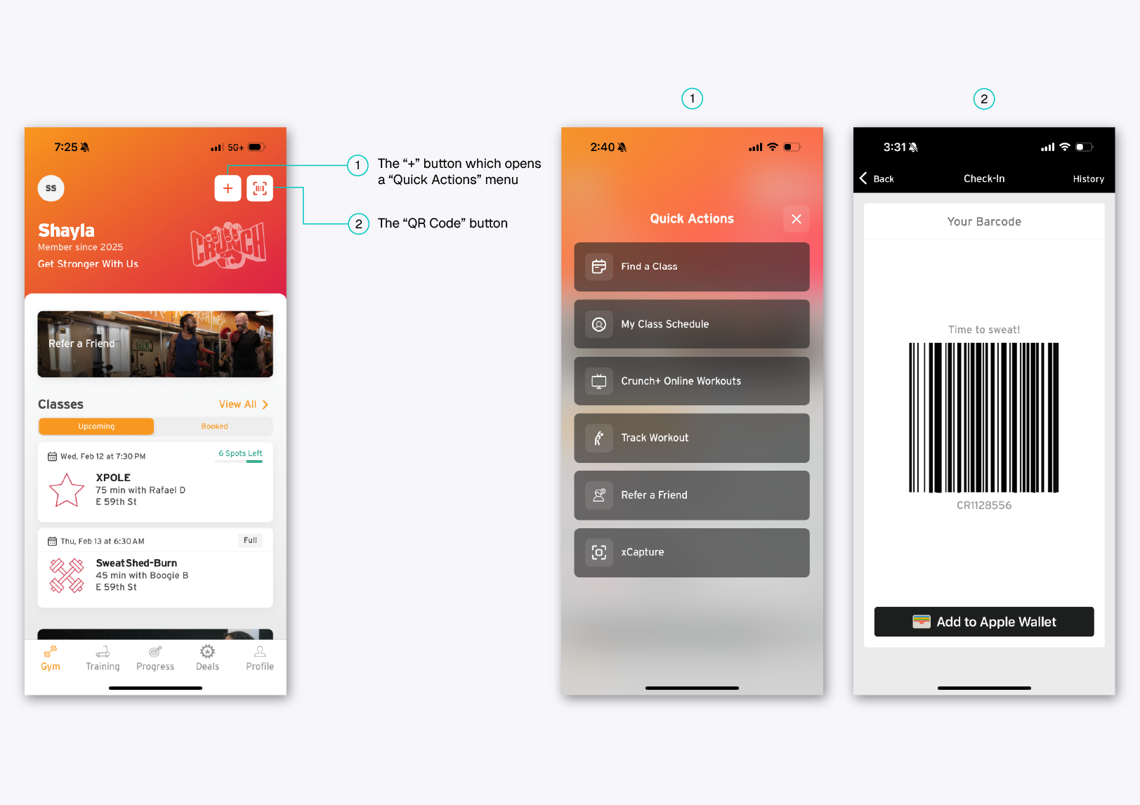
The ‘+’ icon lacks clarity of function and does not afford a menu. Without any text labels, it serves as a poor signifier, leaving users unsure of its purpose. The ‘+’ symbol is not a universally recognized indicator for navigation menus—users might assume it adds a class instead. Additionally, its placement away from the screen’s edges conflicts with common mental models of menu locations, which are typically found at the far left or right.
However, the QR code icon effectively represents its function, demonstrating good discoverability as a distinct white button against an orange background. It provides clear feedback by instantly opening the QR code screen, ready for scanning, making it easy to use at Crunch gym entrances.
Recommendations
To improve affordance, the ‘+’ icon could be replaced with a more conventional menu symbol (like a hamburger icon) and positioned at a more expected location, ensuring better alignment with users’ conceptual models. Since the QR code button is frequently used at the gym, increasing its size could further enhance its discoverability.
Addressing the Space Crunch
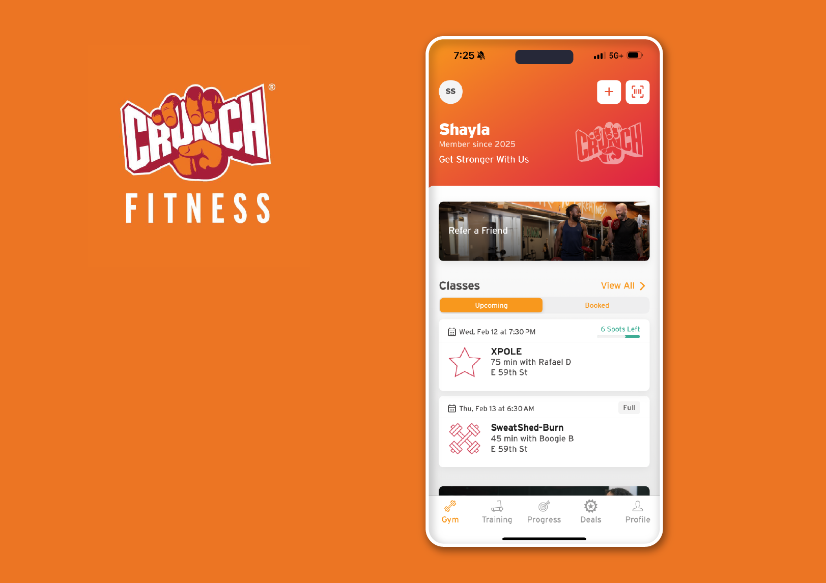
The Crunch homepage features two prominent content blocks: the personalized details section that show the user’s name, start date, and a tagline and the “Refer a Friend” block, marked (3) and (4) respectively. They stand out as they occupy excessive screen space without offering actionable affordances, potentially hindering primary tasks like booking a class. The user can only click on the small “SS” icon to access “My Profile,” while the “Refer a Friend” button leads to a page for sharing an invitation link.
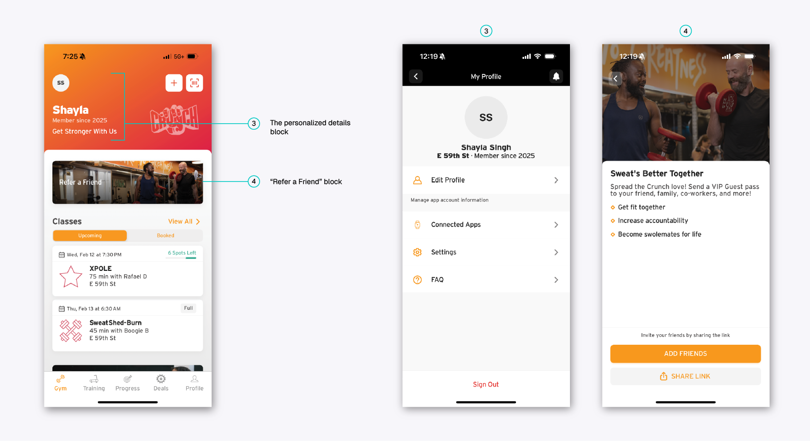
The personalization elements, such as displaying the user’s name, start date, and a motivational tagline, aim to create a sense of connection and enhance engagement. However, the start date and tagline feel redundant and do not provide any actionable affordances, contrary to Norman’s principle of affordance, which suggests elements should clearly indicate their function.
The “Refer a Friend” button effectively signifies its purpose, encouraging user engagement and growth. However, its functionality is unclear as users may hesitate, uncertain if it leads to switching apps, a referral form, social sharing, or another action, creating a gulf of execution.
Recommendations
To improve this, the personalization elements could use more effective and relevant copy. The “Refer a Friend” button could utilize space better by including a clearer call to action, such as “Invite a friend and get rewards!” or buttons like “Learn More” or “Invite Now.” Since this feature is rarely used, repositioning it lower on the homepage or redesigning it as a more compelling offer (e.g., “Deal of the Day” or “Exclusive Monthly Offer”) could enhance visibility and engagement that the app is looking for.
Class-ic Confusion
The “Classes” section on the homepage showcases the main offerings, including a “View All” (5) button, two tabs labeled “Upcoming” and “Booked” (6), and a list of classes with details on the class name, duration, instructor, and location (7).
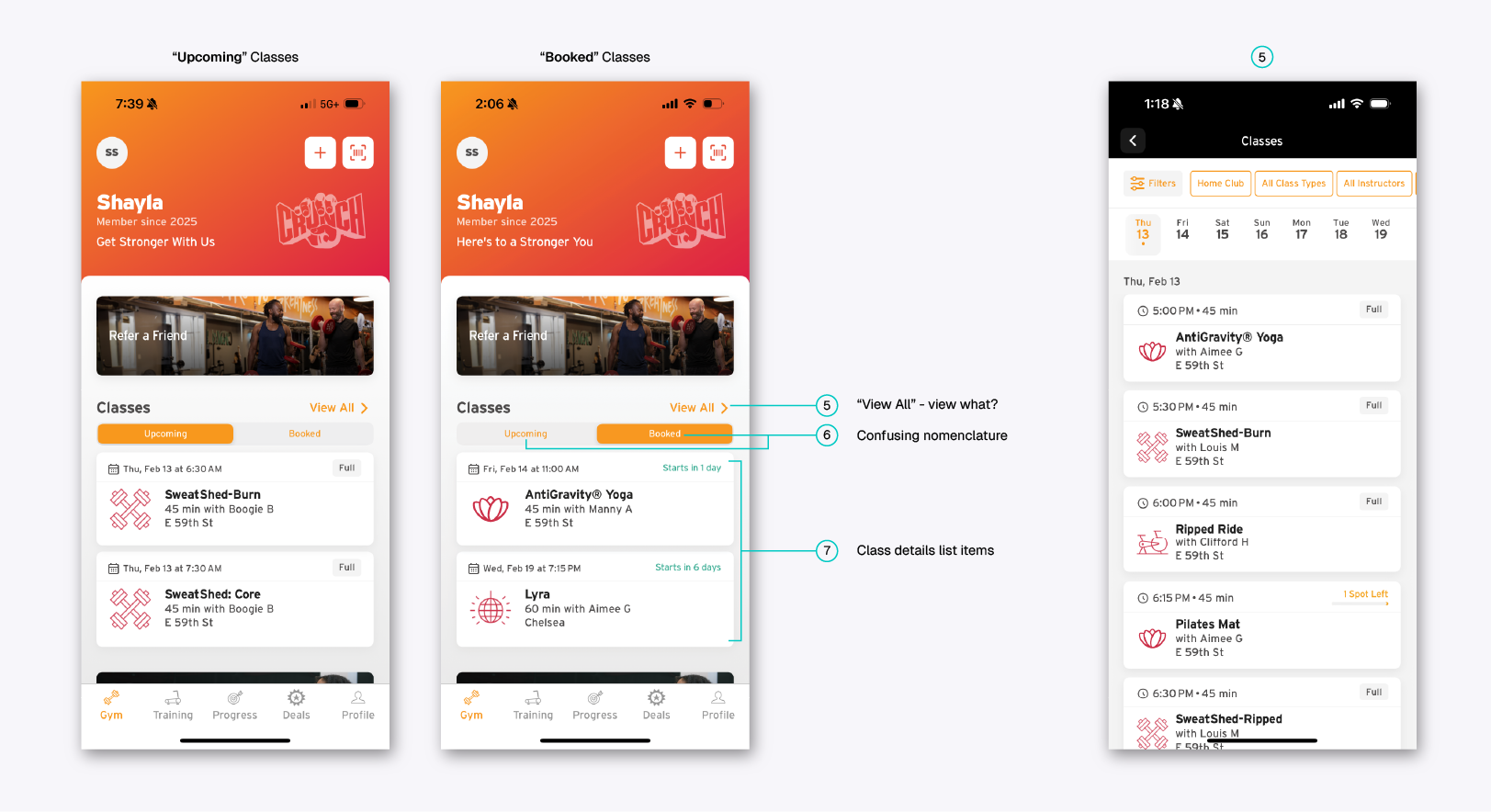
As a first-time user, I found the toggle between “Upcoming” and “Booked” confusing due to ambiguous nomenclature. “Upcoming” could imply classes you have already scheduled, while “Booked” in past tense could suggest classes you’ve attended. This confusion comes from poor mapping, as the labels do not align with users’ mental models.
For example, I actually clicked “Booked” expecting to find details about a past yoga class I attended, only to realize it shows only my future bookings. Clearer labels, such as “Scheduled” and “Past Classes,” would better indicate their functions.
The “View All” button effectively indicates its function to display all classes, showing good discoverability. However, when switching to the “Booked” section, it misleadingly presents the same list of all classes rather than only those that are booked. This creates a gulf of execution, as the interface does not match the user’s conceptual model of viewing only their scheduled classes. Renaming the button to “All Classes” or separating booked classes into a dedicated tab would provide better mapping.
The class detail buttons display essential information, including the date, time, class name, instructor, location, and duration—demonstrating good signifiers of what users expect to find. However, the lack of visual hierarchy makes it difficult to quickly scan relevant details, increasing cognitive load. Organizing the information with clear headings or bolding key details would improve visibility.
Additionally, displaying “Full” classes that users cannot book negatively impacts discoverability. Showing unavailable classes first forces users to look at options they cannot select.
Recommendations
The “View All” button should be specific to each section—“Upcoming” or “Booked” to clearly indicate what users will “view” when clicked, improving mapping.
Clearer labels, such as “Find a Class,” “Scheduled,” or “Past Classes,” would more accurately indicate their functions compared to the current “Upcoming” and “Booked,” enhancing signifiers.
In the class list view, organizing details with clear headings or bolding key information would improve visibility and help users quickly decide on booking.
On the homepage, only classes with available seats should be displayed first, enhancing discoverability. Fully booked classes can be shown in the complete list view for a comprehensive
Final Design Recommendations