DICE is an event discovery and ticketing app that helps users find and attend the best shows, festivals, and club nights near them. With personalized recommendations, upfront pricing, quick ticket purchases, and easy sharing with friends, DICE offers a seamless experience for discovering and enjoying live events.
In this design critique, I will take the perspective of a new user and walk through the event discovery process to evaluate the app’s usability through the lens of design theories from The Design of Everyday Thing and How Artifacts Afford. This evaluation will be limited to the discovery phase only and will not extend to further actions after purchasing a ticket.
Homepage
Promising First Impressions
Upon opening the app, the strong visual design creates a positive visceral response. At first glance, the app appears clean and easy to understand, providing various recommendations with visually appealing posters, giving users a sense that they can really find something they want.
A Closer Look Reveals Problems
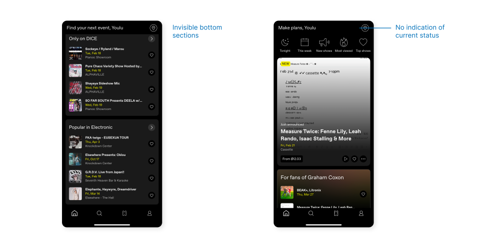
- Bottom sections become less visible
However, the extensive recommendations create visibility issues, as the endless scrolling makes later sections hidden and less noticeable. Introducing tabs or a hamburger menu could facilitate in-page navigation and prevent the list from becoming too long.
- Lack of feedback to confirm location setting
The top-right location icon allows users to set their location manually or automatically. However, after selecting a location, there is no feedback to confirm the selection or indicate the current status. Users may wonder: Has my location been set up correctly? Has it been updated?
A success message and current location indication can be added to reduce such confusion.
Various Ways to Discover
Music Library-Based Discovery: Personalized Recommendations
Connecting to a music streaming platform’s library enables personalized recommendations. The sense of familiarity feels crucial amid an overwhelming display of information.
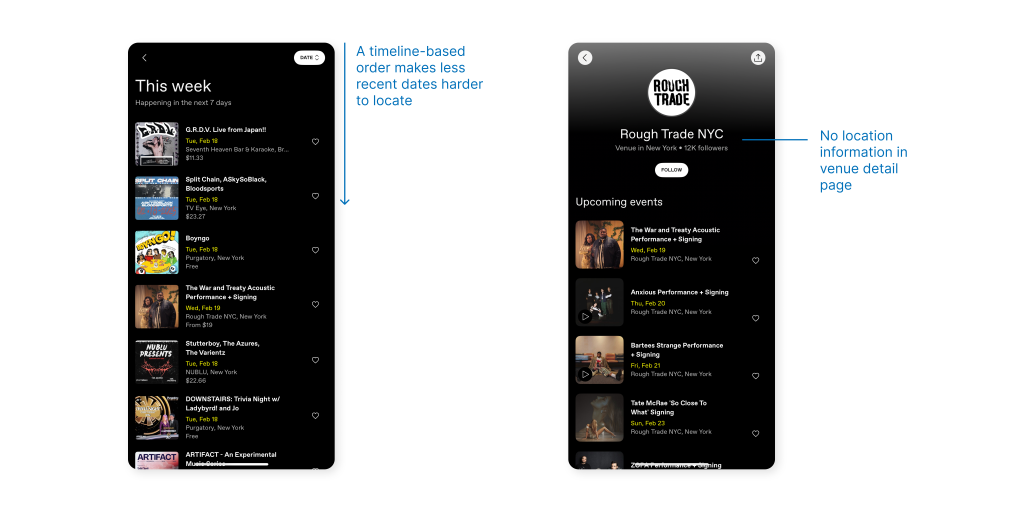
Discover by Lists: Low visibility amid a long scroll
Low visibility also presents further event discovery. Users must scroll through the extensive list to locate a desired event. In many cases, users might not even have the patience to browse through everything. Instead, adding a filtering system or cut the list into sections could help reduce the cognitive load of scrolling.
Discover by Venues: Hidden Locations
For a location-based discovery method, venue information is deeply hidden. It take several steps to find a venue link that is actually tappable. Worse yet, the link isn’t even part of the venue flow – instead, users must open a specific event to access location information.
Placing a clear and accessible venue location link on the venue detail page would better meet users’ expectations.
Discover by Search
- Inconsistent mapping and discouragement of change
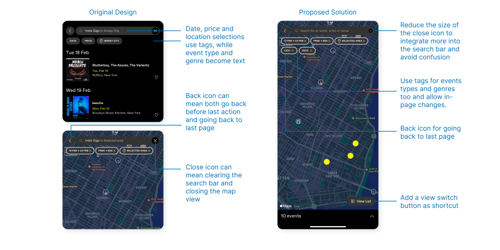
Filters are useful, but the selection process for event types and genres is inconsistent with other filtering factors. When setting the date or price, they transform into interactive tags that allow in-page adjustments. However, after selecting event types and genres, they collapse into filled text within the search bar, discouraging further changes, as typing requires more effort than simply selecting options.
A potential solution would be to align all filtering factors with the tag-based format for consistency and ease of use.
- Convention violation leads to action-based slip error
Additionally, the close button does not align with standard conventions. A cross can mean either clearing text or closing a page. Likewise, a back icon can mean going back to the last page or the reverse of an action. In this case, some might mistakenly assume the cross icon closes only the map view but instead dismisses all filtering settings or taps the back icon multiple times only to remain on the same page, leading to confusion and unintended action-based slip error.
The proposed solution reduces the size of the close icon, integrating it more into the search bar to avoid confusion. The back icon now exclusively indicates returning to the previous page, as users no longer need to reverse the settings process and can instead change tags directly in-page. A view switch button has been added to the bottom-right, providing an easier shortcut to the list view.
Event Detail
Top Track Preview Meets User Needs
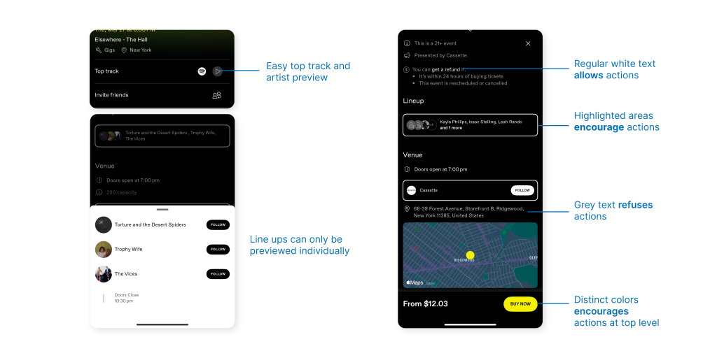
As an event app primarily for non-mainstream artists, users may often be unfamiliar with the lineup or hosts. A track preview, along with easy integration with third-party music streaming services, helps users decide whether to attend an event.
However, for gigs with multiple lineups, users must navigate back and forth to check each preview individually. A more convenient approach would be consolidating all previews into a single, concise list.
What Can Be Tapped? Hierarchical signifiers for different levels of affordance
The event detail page contains dense information, much of which links to other pages or additional details. DICE effectively uses different signifiers to indicate varying levels of affordance. For example:
- The most encouraged actions, purchasing the ticket and checking the time and location, are painted bright yellow.
- The second level of encouraged action, following artists and venues, is designed with thick white outlines.
- Interactive text elements that allow further actions appear in white
- while purely informational text is displayed in grey, signaling refusal of actions.
Conclusion
Overall, DICE is a well-designed app. Its high review scores (4.9 on the Apple Store, 4.8 on Google Play) definitely say so. It is visually appealing, with information displayed cleanly and understandably, without major usability blockers. Actions are clear, and features align well with user needs.
One key improvement could be reducing the cognitive load of browsing through large amounts of information while maintaining a clear visibility. Another area for enhancement is the search view switching experience.
That said, I’ll definitely keep using this app.
