The Formula 1 application is the main app of the sport to track races in real-time and stay up to date with events. These updates include news, videos, and highlights of past, current and upcoming races during the season. Users can track teams, drivers and use the data from races to follow the sport closely.
“Latest” page
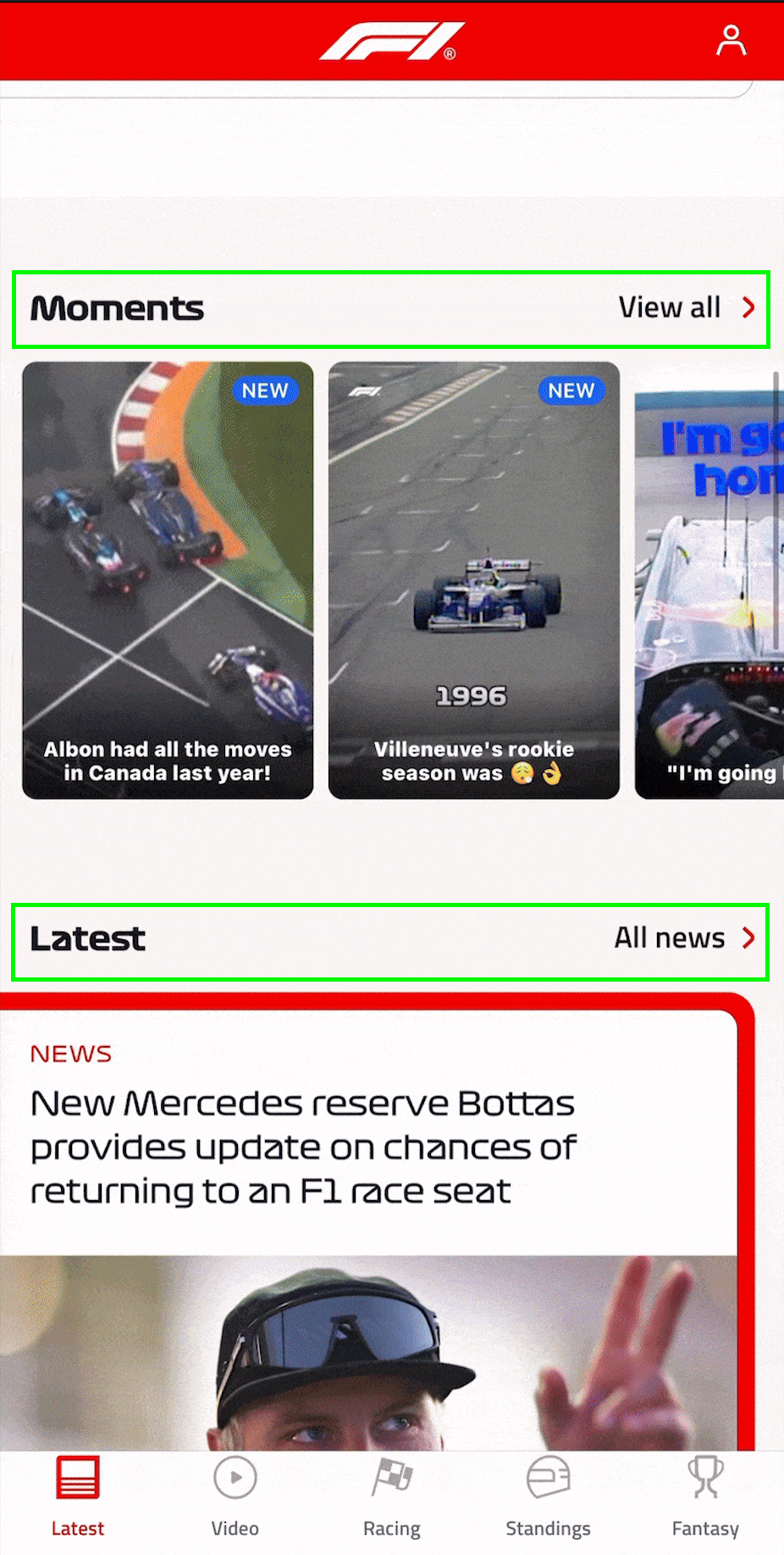
The landing page of the application is the “Latest” page which shows lots of content categories to the user that include: “Latest”, “All News”, “Top Stories” and others.
The distinct categories allow for easy discoverability for users to navigate through the latest content quickly. The Latest button in the navigation bar also works well with the mental model that users have when interacting with the button. The mapping leading to the immediate feedback of the new content on the page does not require users to have knowledge in their mind of what specific button to push for latest content.
However, the amount of information on each category can easily become an overload of information. Not constraining the amount of information shown for each section can cause a cognitive load which can leave the user in need of a more intuitive way of navigating.
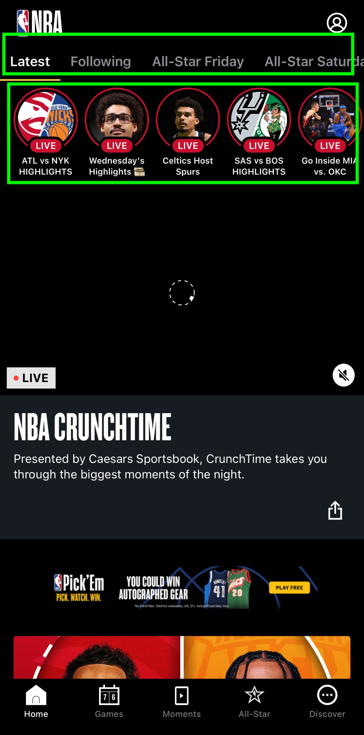
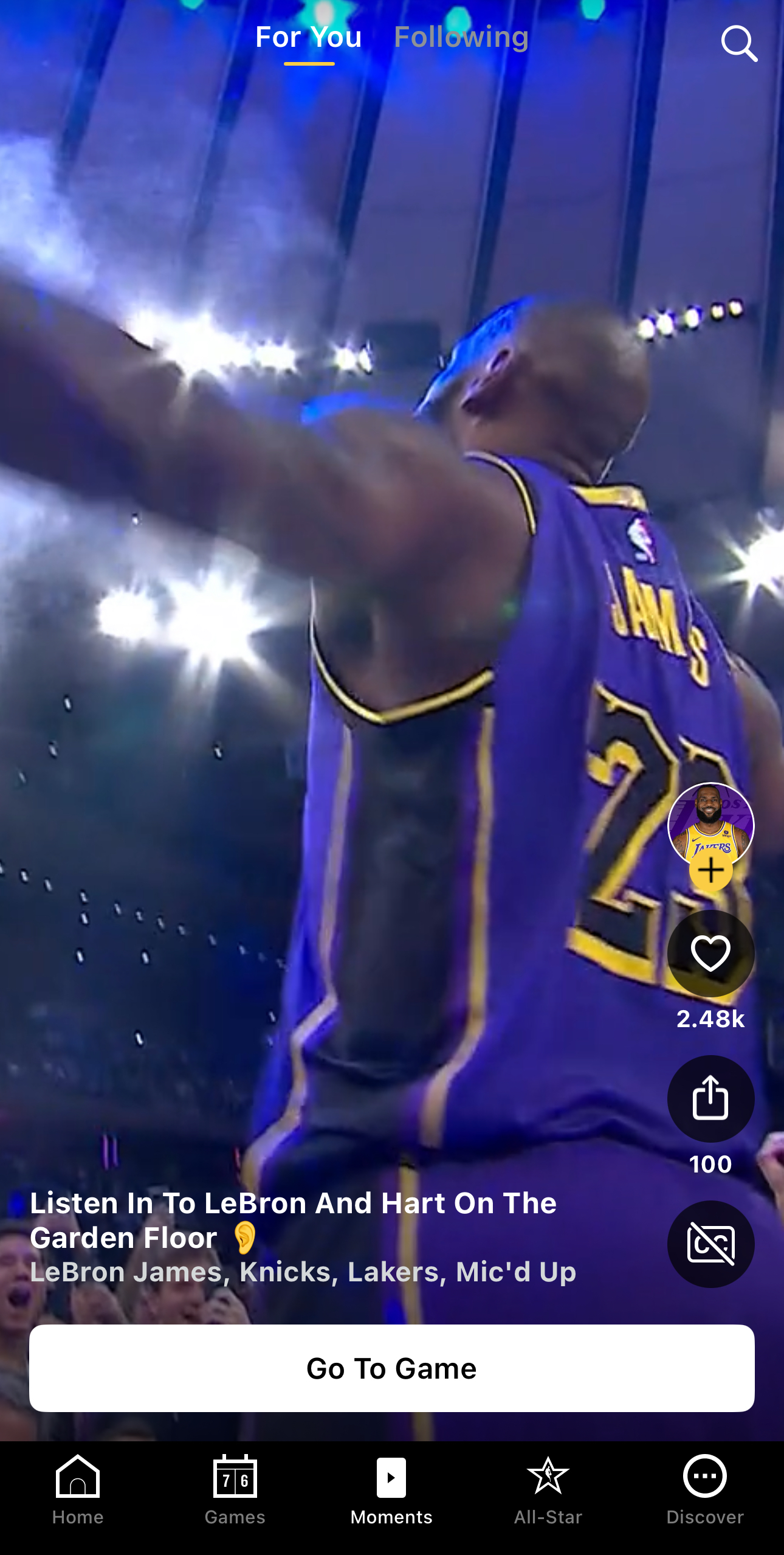
The “Latest” page can reorganize its distinct sections with clear signifiers that emphasize that different content will be accessed through the use of hierarchy, color and shape. One example of this can be shown in another sports app like the NBA homepage with its different signifiers for media content.
Videos Page
Another page from the Formula 1 app that uses discoverability, affordances, mapping, and feedback well is the video page. The Users can easily recognize where to go for videos, relying on the knowledge in the world since the affordances of clickable thumbnails and play icons suggest actions, making the interaction in this page intuitive. Each category is clearly linked to its content, making it a predictable path for the user and one that aligns with the mental model.
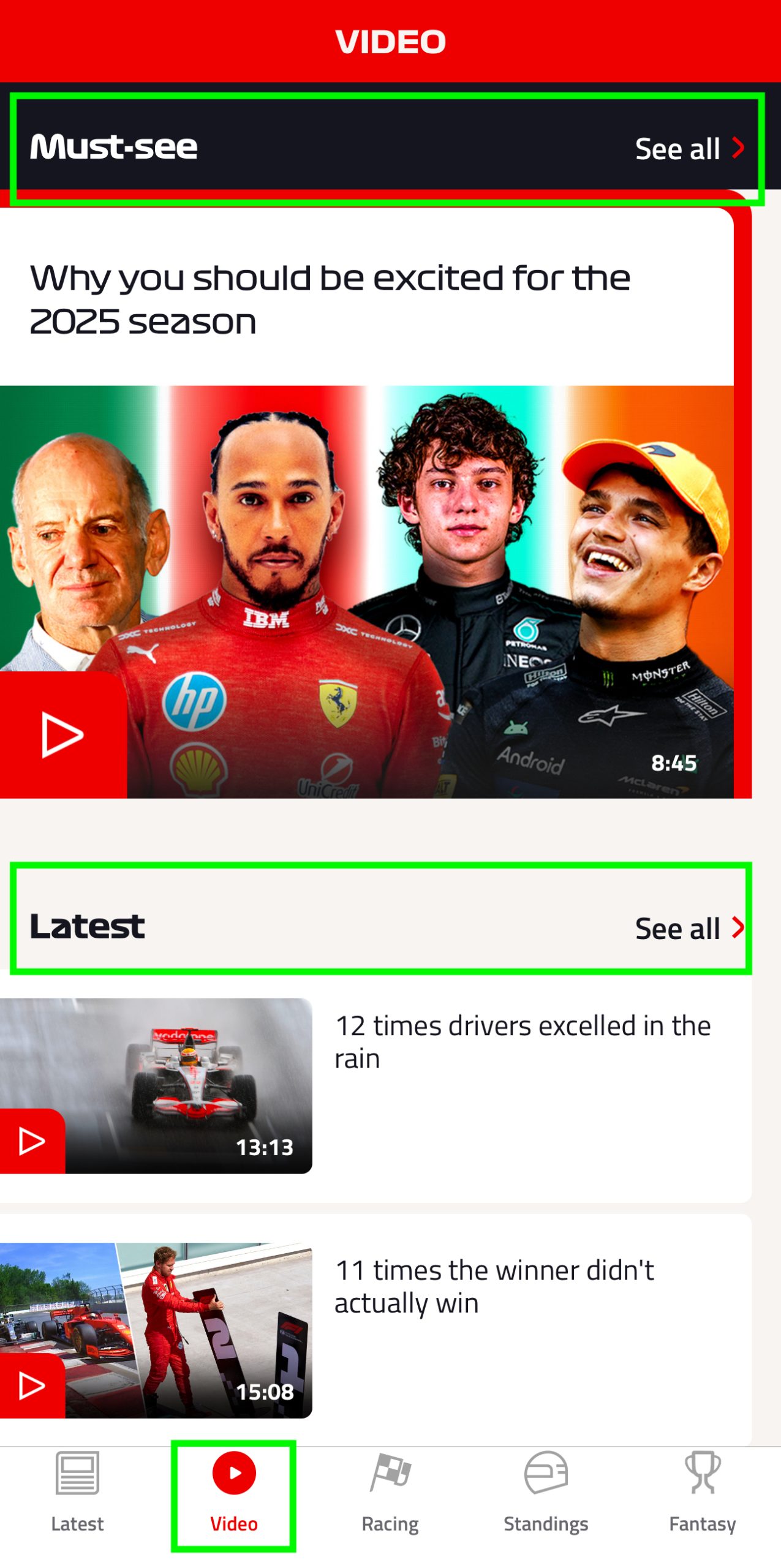
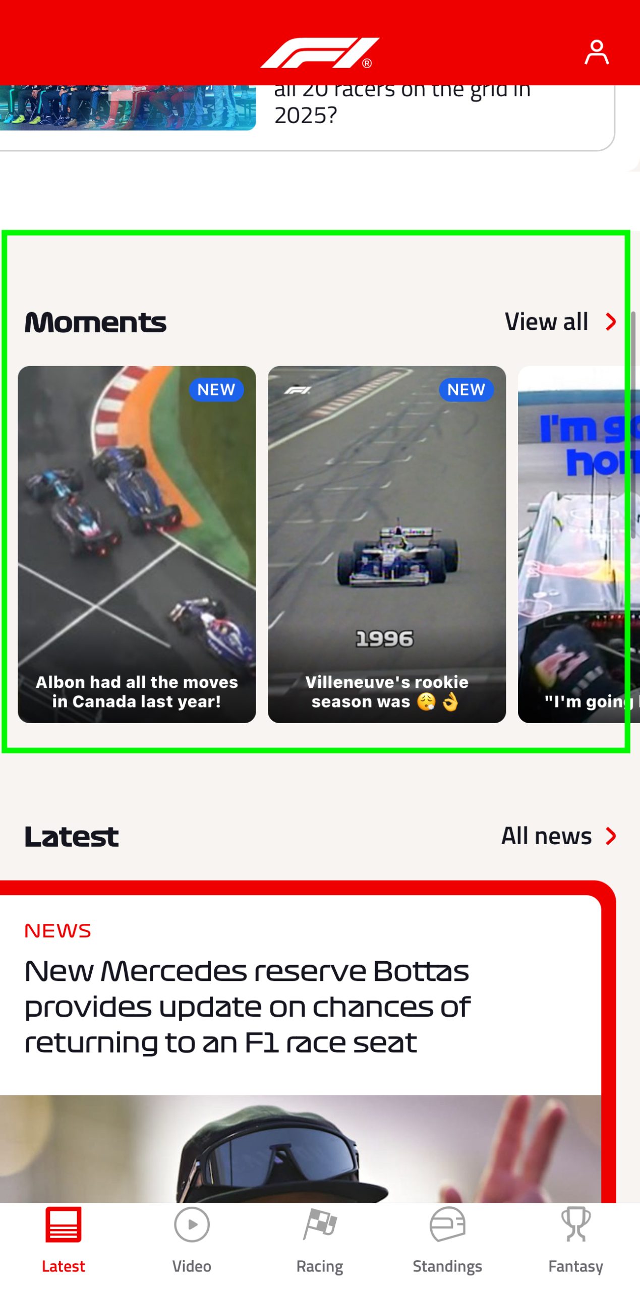
Even though this page is dedicated to videos I found some issues when I tried to look for the moments section. The “Moments” category which contains videos only, can’t be found in the video page, to find it the user has to navigate to the latest page and scroll. This seems out of place when all the other video content is grouped somewhere else. This can cause confusion and make the discoverability for users who only want to consume video content difficult. While also having to rely on knowledge in the mind to remember where to find it since the mapping does not indicate a predictable whereabouts of the section.
To improve this the application can modify the “Videos” page to keep all major video sections in one place and add section labels at the top so there are clear signifiers of which section you’re switching through. This has been implemented similarly in the NBA app using a similar layout to Tiktok for you and following labels.
Standings Page Layout
The Formula 1 app excels in discoverability and clear signifiers that alert users and fans where to find their team. On the “Standings” page this is clearly used through the use of the F1 teams distinctive colors, team name and driver names in one section.
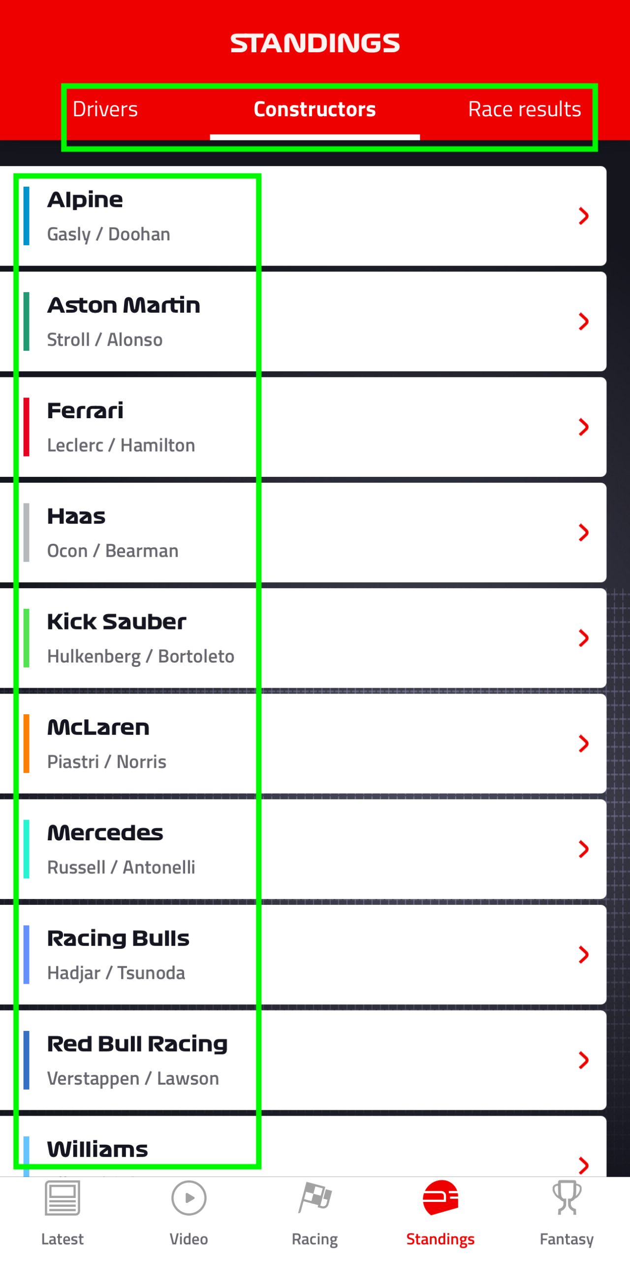
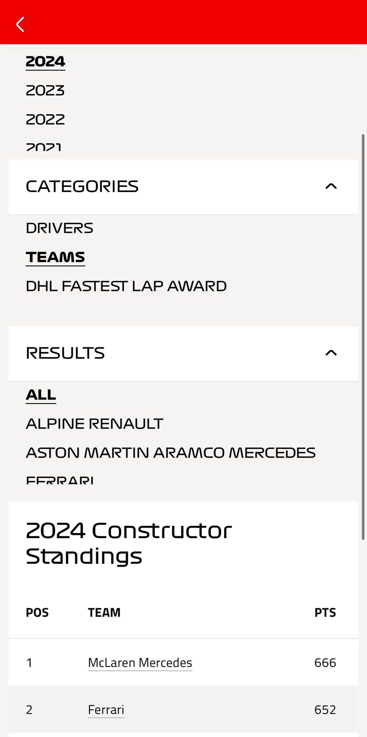
However, the structure for past data is not clearly labeled and color coded as the current season. This shows a lack of consistency that can make it difficult to process as a fan or first time user. The constraints in this case limit the discoverability for users. To improve this, all current and past seasons should follow the same layout.
Conclusion
The Formula 1 application meets users needs of discoverability and provides some clear signifiers that go along with the affordances the different pages provide. Certain features and areas could be improved if the cognitive overload is reduced and the areas that have mappings with race media are more aligned with mental models of users.