The IRCTC website, India’s primary platform for train ticket booking, serves a massive user base daily. However, its complexity often leads to a frustrating user experience. This critique examines the IRCTC desktop website, focusing on usability principles to identify areas of strength and weakness in its design and functionality, ultimately aiming to suggest improvements for a smoother user journey.
Home Page

The IRCTC homepage (Fig 1) presents a chaotic user experience, violating several key usability principles. The sheer density of information and interactive elements creates a significant visibility problem, overwhelming users with choices and obscuring the primary function: booking a ticket. Affordances are unclear; the purpose of numerous links and buttons is not immediately apparent, leading to confusion and hindering efficient navigation. The mapping between user actions and system responses is often unclear, particularly within the booking flow, causing uncertainty and potential errors. Feedback mechanisms are weak, with slow loading times and cryptic error messages frustrating users. The inconsistent layout and visual clutter contribute to a fragmented conceptual model, making it difficult for users to understand the site’s structure and operate it effectively. While some constraints exist, like date restrictions, more could be implemented to streamline the process. The overall design neglects learnability and efficiency, resulting in a frustrating and inefficient user experience.
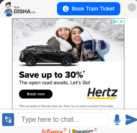
The IRCTC website’s chatbot (Fig 2) implementation suffers from critical usability flaws. A prominent “Save up to 30%” advertisement banner directly overlays and obscures a significant portion of the chatbot window, hindering its visibility and accessibility. Users are unlikely to engage with a feature they cannot readily see, negating the chatbot’s intended purpose of providing quick customer support. Furthermore, the chatbot’s text display exhibits low contrast and potentially small font sizes, impacting readability and making it difficult for users to follow the conversation, especially those with visual impairments. This combination of poor placement and suboptimal text presentation suggests a disregard for user-centered design, prioritizing marketing over functional usability and potentially frustrating users seeking assistance. The chatbot’s effectiveness is severely compromised, undermining its value as a support tool.
Booking Page
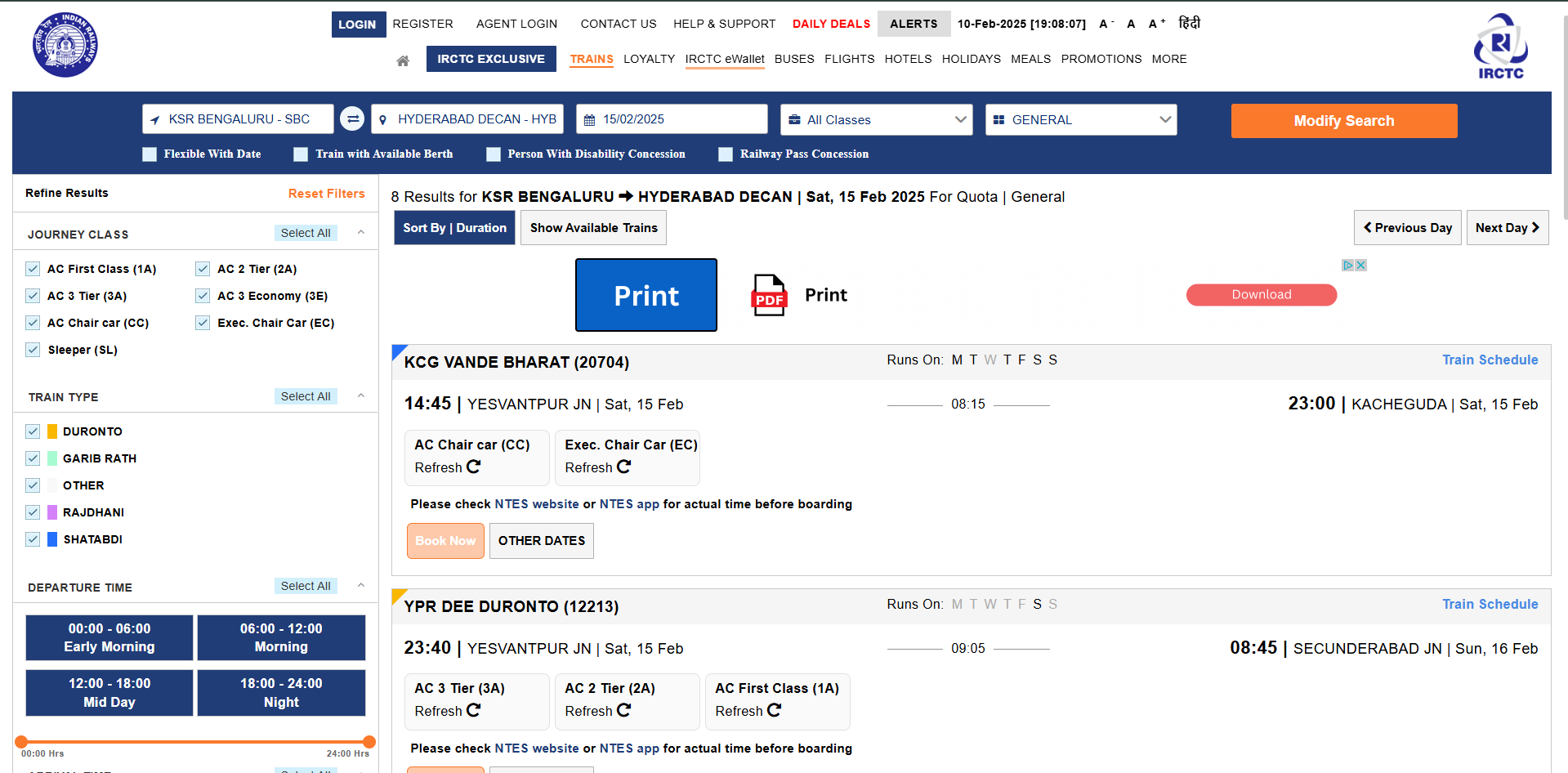
This IRCTC search results page (Fig 3) is a case study in poor usability, violating several of Norman’s design principles. The overwhelming density of information creates a significant visibility problem. Users are bombarded with options, filters, and train details, making it difficult to focus on the core task: selecting a train. Affordances are unclear; the visual design doesn’t effectively communicate which elements are interactive. For example, the buttons under “DEPARTURE TIME” that are present in the bottom left of the page, lack any visual change on mouseover, failing to indicate their clickability and misleading users about available filtering options. The information architecture for each train is also flawed. The key details, such as departure/arrival times and available classes, are interspersed with less critical information like train numbers and intermediate stops, making it challenging to quickly compare options. Mapping between actions and results is inconsistent. While some filters provide immediate feedback, others require users to scroll back and forth, disrupting their flow and increasing cognitive load. The page’s conceptual model is muddled due to the lack of clear visual hierarchy and inconsistent presentation of information. Users must decipher a mix of labels, abbreviations, and color-coded indicators, hindering quick comprehension and efficient decision-making.
The visual clutter further exacerbates these issues. The excessive use of bold text, varied font sizes, and multiple columns of data create a chaotic layout, making it hard for users to visually parse the information. The prominent “Print” and “Download” buttons, while potentially useful, compete for attention with the train listings themselves, distracting users from their primary goal. The lack of effective use of whitespace contributes to the overall feeling of overwhelm. The tight spacing between elements and the proliferation of visual noise make the page feel cramped and difficult to navigate. The absence of clear visual cues to differentiate between trains adds to the confusion. Users are forced to painstakingly scan each row, increasing the time and effort required to find a suitable train. In summary, the page fails to prioritize clarity, efficiency, and user control, resulting in a frustrating and potentially error-prone experience. The design neglects basic principles of visual hierarchy, feedback, and affordances, ultimately hindering the user’s ability to effectively browse and select trains.
Conclusion
In conclusion, the IRCTC website suffers from significant usability issues that hinder its effectiveness and frustrate users. To create a more streamlined and user-friendly experience, several key improvements are recommended. First, simplify the top navigation by reducing the number of options and consolidating less important links. Second, declutter the page by removing non-essential elements and strategically using whitespace. Third, optimize chatbot integration to be accessible yet non-intrusive. Finally, improve visual hierarchy to guide users towards key functions, particularly the “Book Ticket” feature. Addressing these issues will significantly enhance usability and provide a more satisfying experience for IRCTC’s vast user base.