In a world where social media can be overwhelming and impersonal, Letterloop offers a refreshing and authentic way for people to stay connected. As someone who values meaningful human connection with the people around me, I was eager to explore how well this platform fosters engagement.
Letterloop is a private group newsletter service that connects friends, family, and teams. Through answering meaningful questions and uploading life updates, people get to stay in touch, grow closer together, and discover things you never knew with those in your life.
This critique examines Letterloop’s user experience through the lens of Don Norman’s design principles (such as affordances, feedback, and signifiers) and Jenny L. Davis’s affordance mechanisms (including requests, demands, and encouragement). These frameworks help assess how effectively Letterloop guides users through interactions.
Overall, the user interface (UI) is well-designed, with clear signifiers for affordances such as common iconography and layout. In this article, I will focus more on opportunities for enhancement rather than major flaws, suggesting improvements where needed.
Typical User Journey
Before diving into the details, let’s break down the core user journey. Letterloop’s experience begins with an admin initiating a private group newsletter through four simple steps:
- Select and design questions
- Invite people
- Answer questions
- Send off your reply and wait to receive your newsletter!
With Letterloop as a third-party organizer, as long as users can access emails, the website, or an iOS app on any device, the steps for the user are straightforward and less complicated without manual organization.

Initial Setup
Sparking New Conversations
The initial setup screen guides users through a survey-like set of questions and settings. The admin (the person who initiates the newsletter) can customize the newsletter’s settings, including the name, frequency of publication, topic of the first issue, and members list.
While some settings are mandatory (Davis’s “demands”), Letterloop also incorporates soft guidance (what Davis calls “requests”). For example, it recommends setting 3-5 sections and inviting 3-10 participants, yet still allows users to customize these later. These suggestions persuade in one direction (possibly a desired setting for the developer) but leave alternate options open (Davis, p.67), saving time for users when making decisions but still allowing freedom to experiment with unique arrangements.
By incorporating affordances like predefined sections and customizable questions, Letterloop balances structure with flexibility, making it easy for users to engage with minimal cognitive load.
Once the newsletter is set up, a confirmation screen with confetti will appear, and the admin will receive an email announcing the start of the new newsletter. Direct feedback on screen and the confirmation in the email ensure that users know they’re advancing to the next step.


Answering Questions and Uploading Media
Participants will receive a separate email with a clear signifier (the green button) directing them to Letterloop’s website or app. Being redirected to another website in the email inbox is ingrained and intuitive for modern people, even those with lower technology literacy. It easily bridges the small gulf of execution and indicates a clear direction for users to follow.

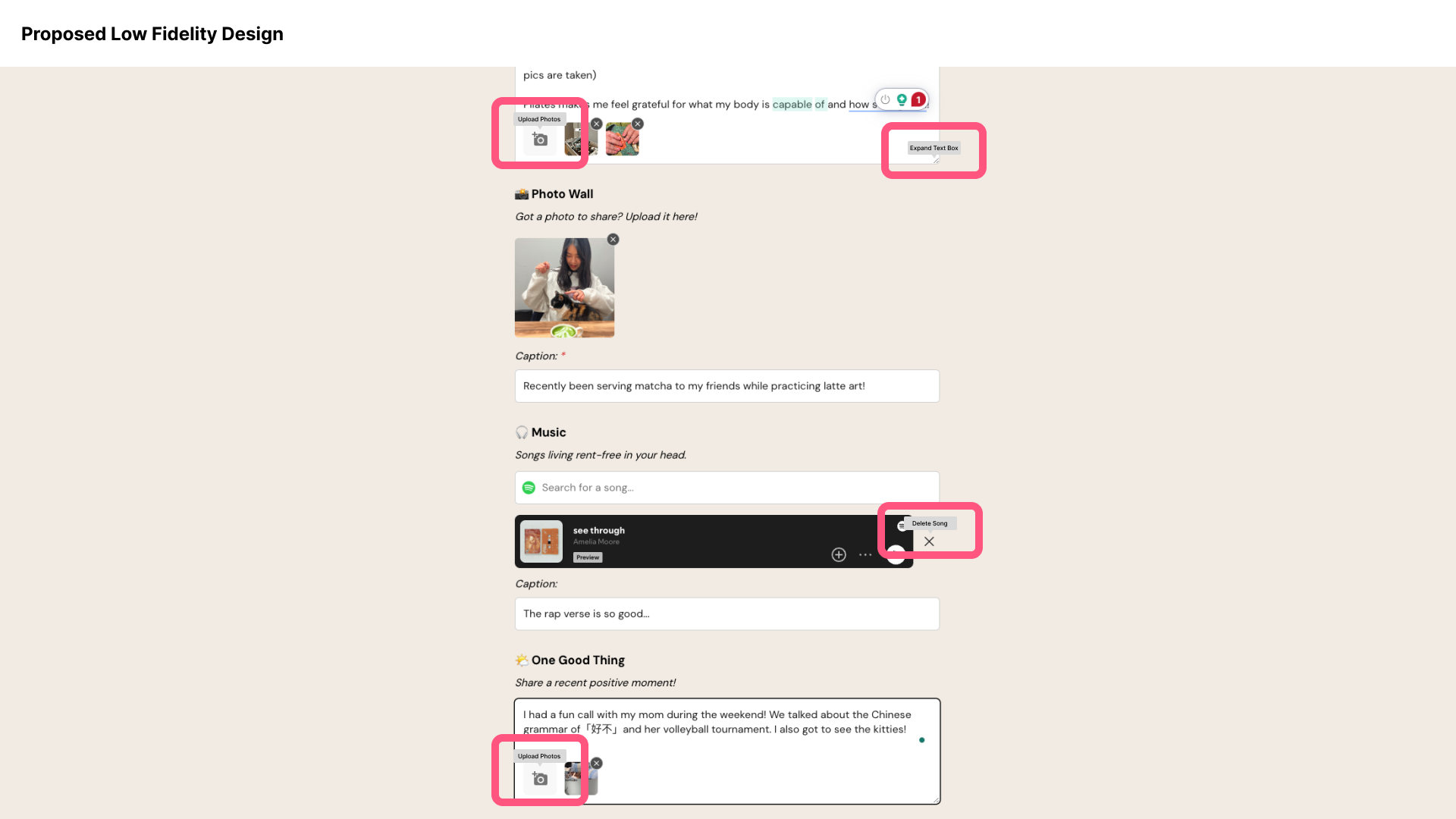
Once they are referred to Letterloop, they can start replying to each section by answering questions, uploading photos, and choosing music to share from Spotify, depending on what sections the participants have selected for the issue.
Icons indicate where it is possible to upload photos, expand text boxes, delete songs, and even preview songs, supporting the affordances this page provides. However, some constraints caused friction in the usability and made the experience less engaging:
- Currently, Letterloop only allows users to upload one photo per question, which can disrupt the storytelling experience. A multi-photo upload option would enhance the narrative flow, allowing users to share more meaningful updates.
- The lack of tooltips when hovering over icons discourages exploration and experimentation. Users may hesitate to explore features without tooltips, as icons lack explanatory text. Adding tooltips would encourage discovery and interaction, improving usability for new users.
Receiving Your Newsletter
Once all participants have replied, the final newsletter is delivered on the preset publication date through email. From personal experience, I found it exciting to read through my friends’ responses, as the questions were more in-depth than those in usual interactions and social media feeds.
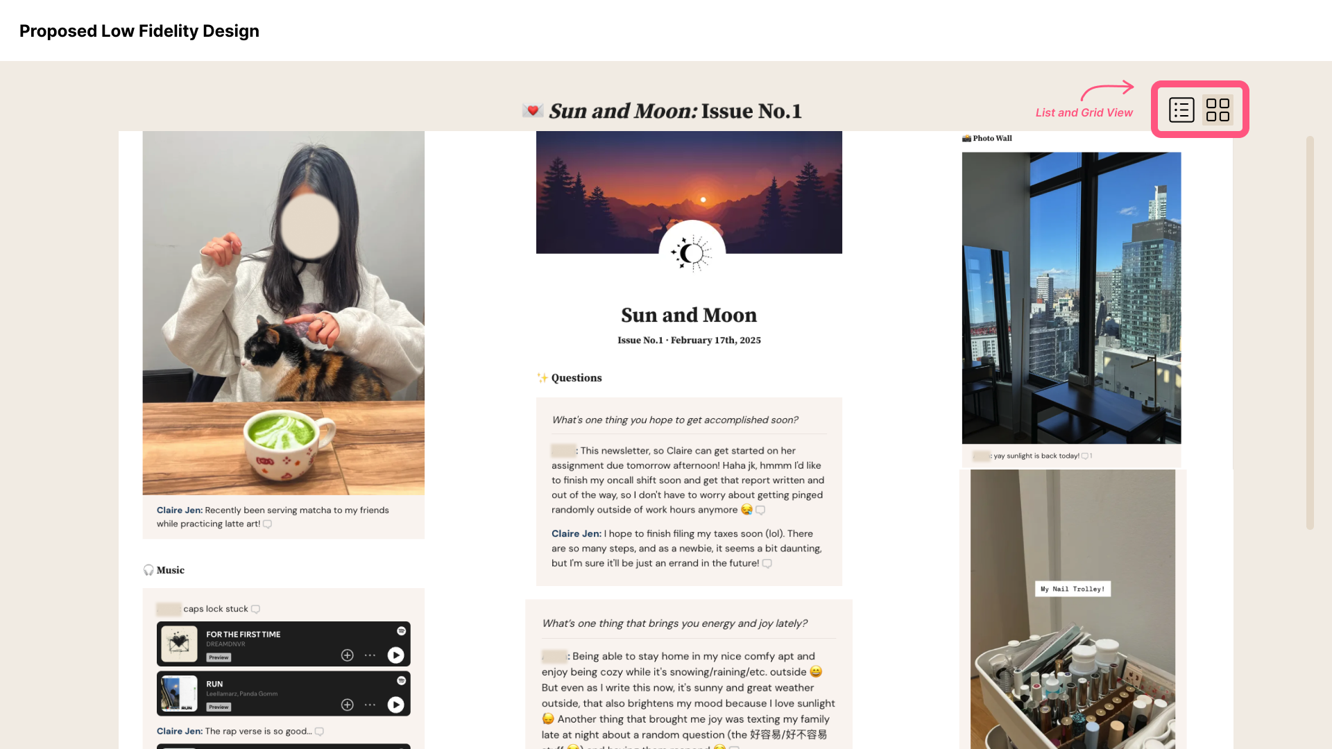
The final newsletter can be read in the email or on Letterloop’s website or application. Its well-designed layout has the participants’ responses organized in hierarchical order. In addition the newsletter on the website/app includes multiple affordances, such as commenting on each response in a sidebar thread, enlarging photos, saving music to Spotify, etc.
However, the readability could be improved by introducing a view mode option, including list view and grid view, offering multiple ways of viewing items on the page. Another suggestion would be to provide a “widescreen” mode to decrease the margin on the page so that users can absorb more information simultaneously.
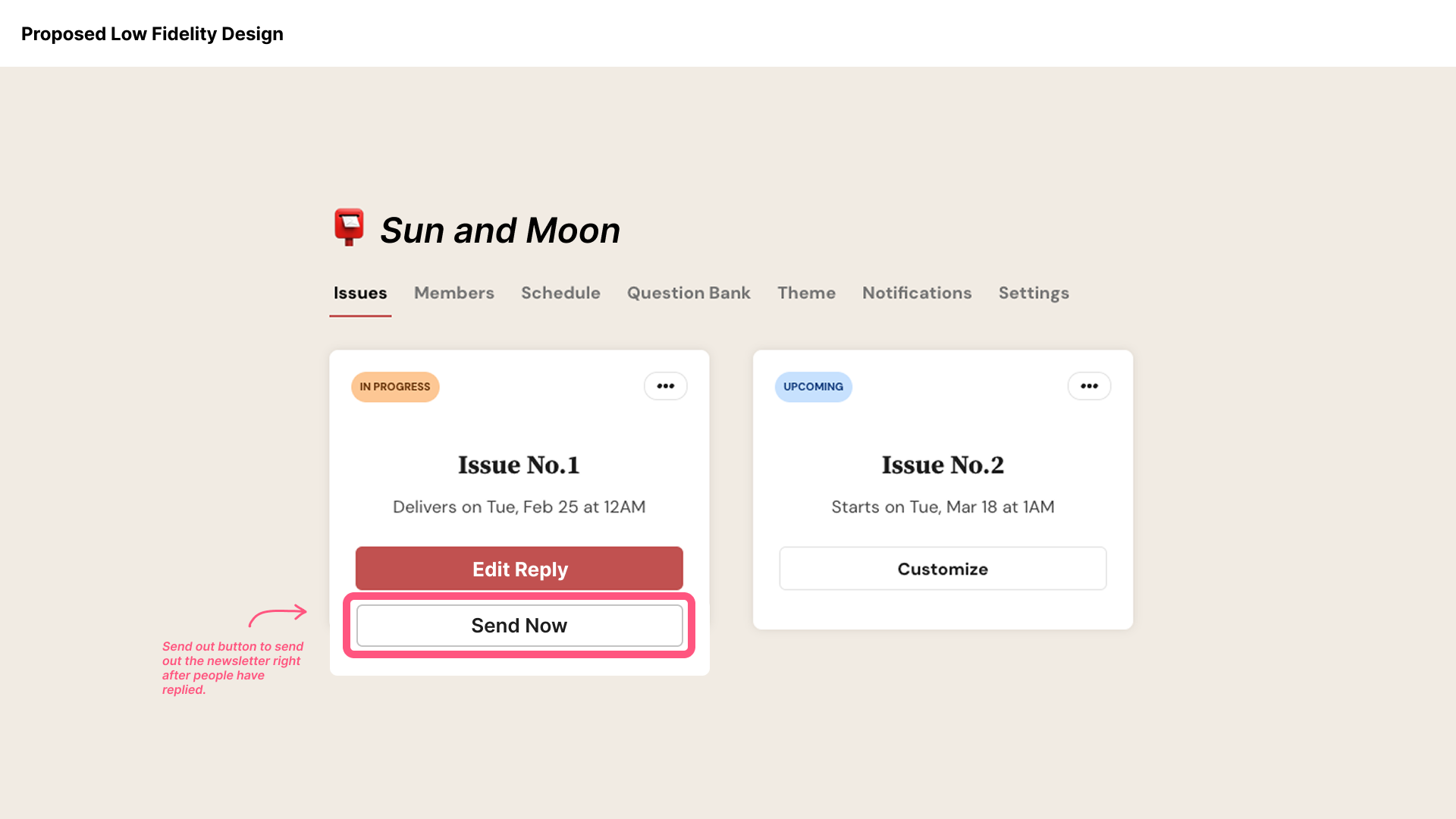
While Letterloop’s default publication date for each issue is one week after the start of replying, it is still possible to send out the newsletter right after people have replied. The ability to send a newsletter immediately after receiving replies is helpful, but it lacks visibility. Since this function is buried in the three-dot menu, users may not realize it exists. To improve discoverability, Letterloop could introduce a “Send Now” button directly on the newsletter page.
Additional Settings and Help Support
Letterloop provides many customizable settings in the horizontal navigation menu of each newsletter, including customizing the theme, managing members, editing the question bank, and schedule-related settings.
Each newsletter displays a progress status (top left) and a three-dot menu (top right) for additional actions. While this design choice reduces clutter, it also hides key functions, making them less discoverable. Though the three-dot menu lacks discoverability, it is a discouragement designed to simplify the process.


In addition to each newsletter’s settings, the hamburger settings menu on the top right includes “What’s New,” Roadmap, Help Center, Contact Us, Subscription, Profile, and Signout. However, when clicking on the first four options, rather than referring to another page, the chat icon on the bottom left expands and guides you through your desired service. Based on Jacob Nielsen’s Heuristic Design principles, this design does not fit the 8th principle: Aesthetic and Minimalist Design, distracting users from a potentially streamlined flow.
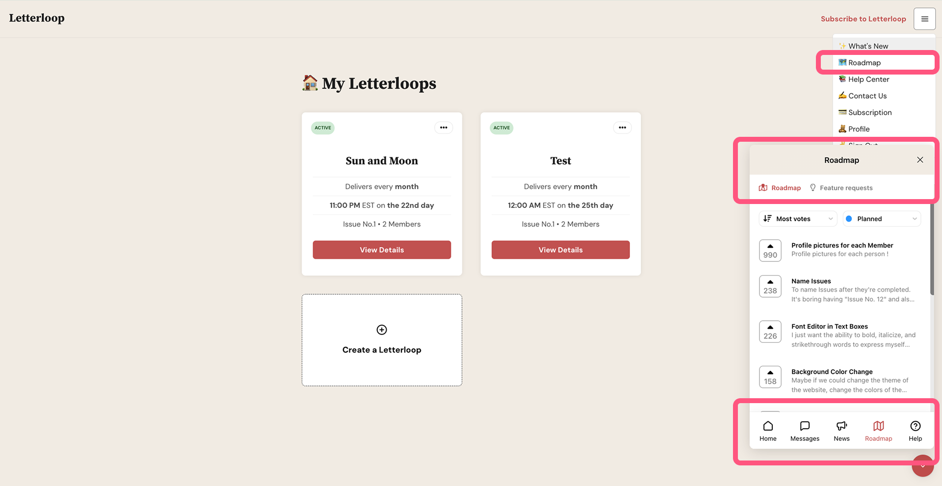
Letterloop’s team provides a section for users to request new features. This encouragement shows the team’s approachable attempt to improve their product with filtering options for progress status and sorting options for relevancy. This design lets users participate in making a better product and experience. However, I would suggest redirecting users to an individual page for this forum rather than cramming everything into the small chat box.
Overall Experience
Overall, Letterloop excels at fostering meaningful conversations that feel personal and engaging. Its email-driven approach keeps the experience simple and intuitive. While the platform is well-designed, minor refinements—such as improved feature discoverability and better support for media uploads—could further enhance usability.
Source
Letterloop https://www.letterloop.co/
Norman, D. A. (2013). The design of everyday things. MIT Press.
Davis, Jenny. (2020). How Artifacts Afford: The Power and Politics of Everyday Things. 10.7551/mitpress/11967.001.0001.
Jacob Nielsen. (1994) 10 Usability Heuristics for User Interface Design https://www.nngroup.com/articles/ten-usability-heuristics