Libby is a free app where you can enjoy ebooks, digital audiobooks, and magazines from your public library. While being immensely popular, there are several design changes that can greatly improve usability.
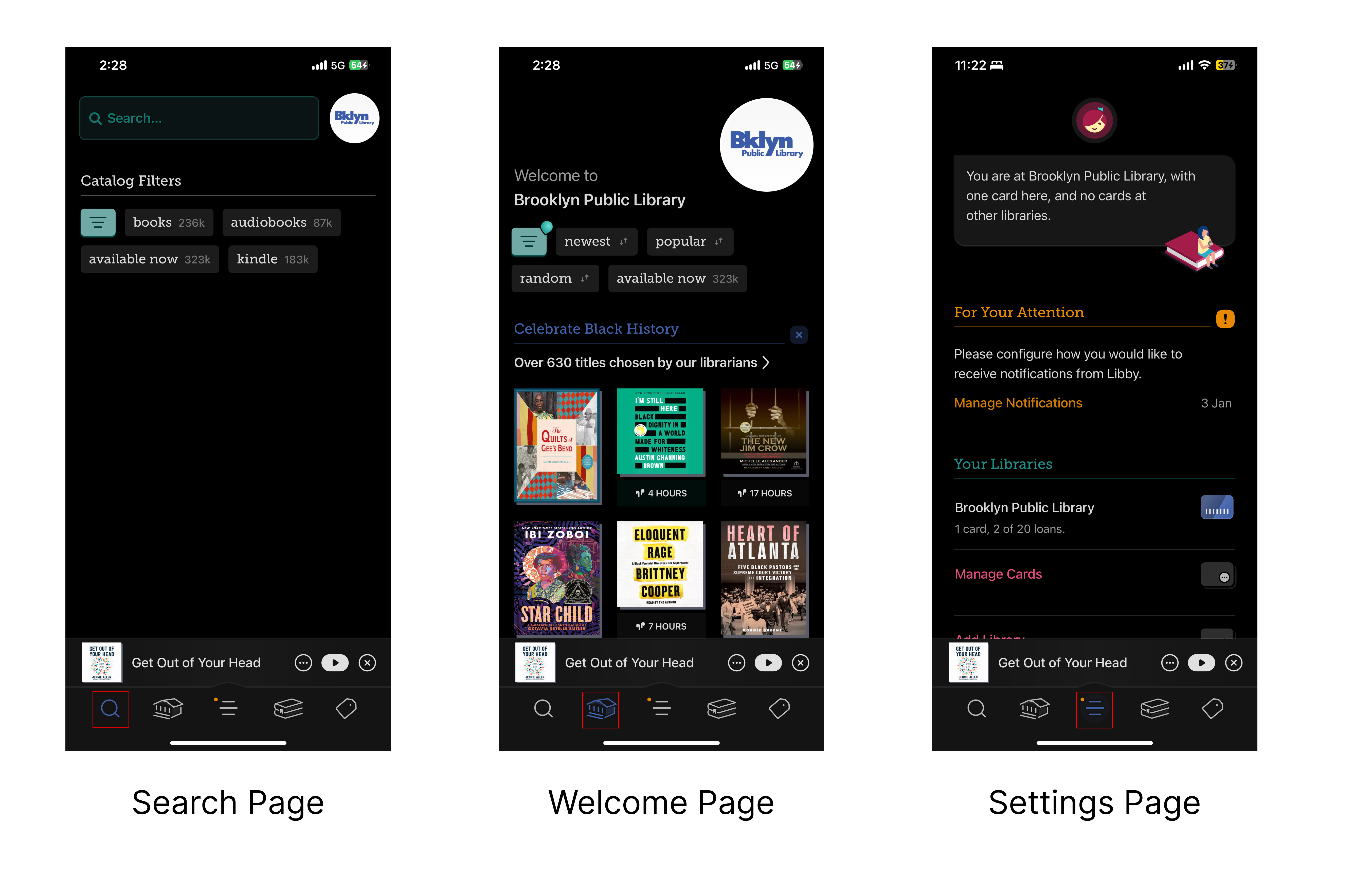
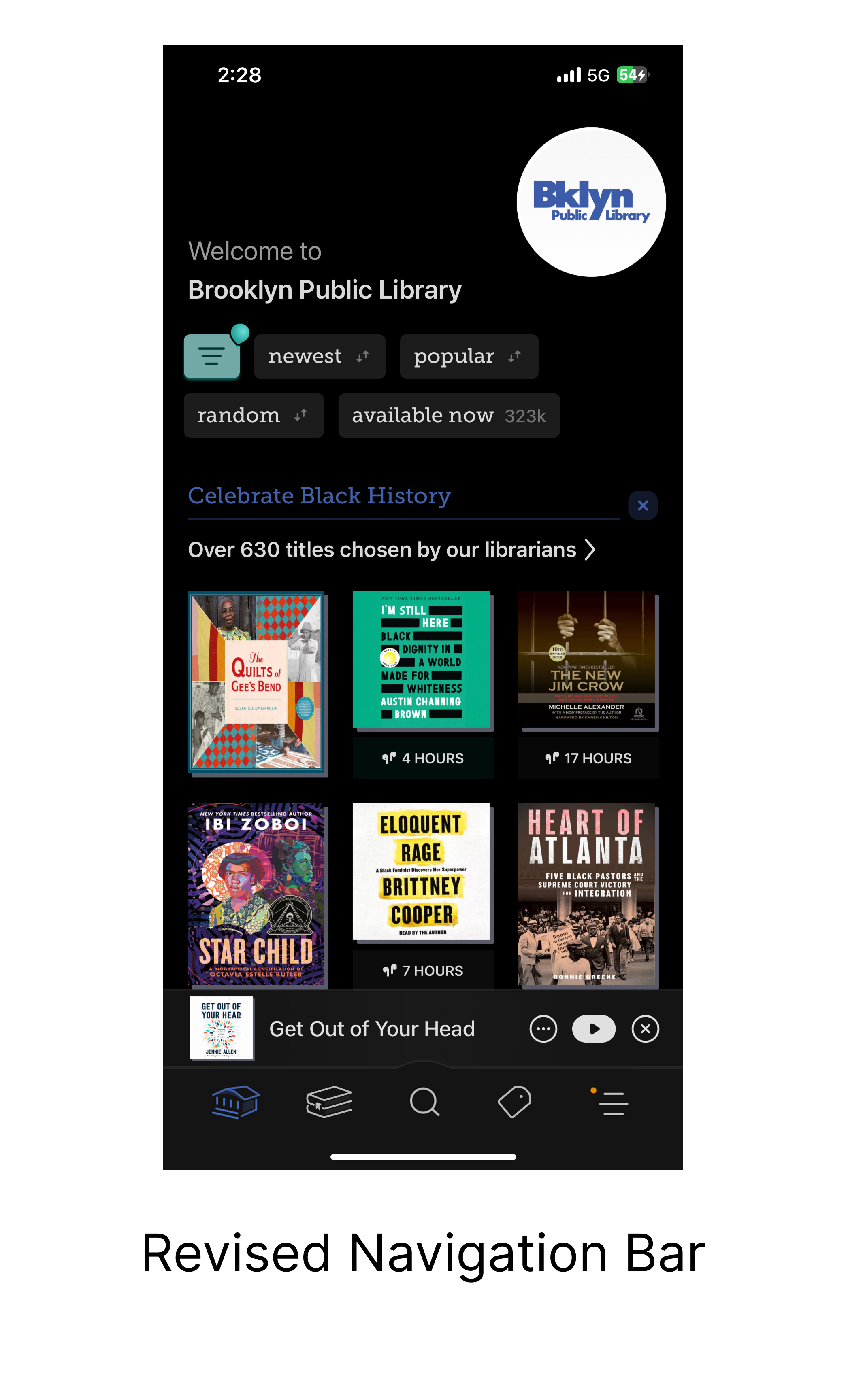
Navigation Bar
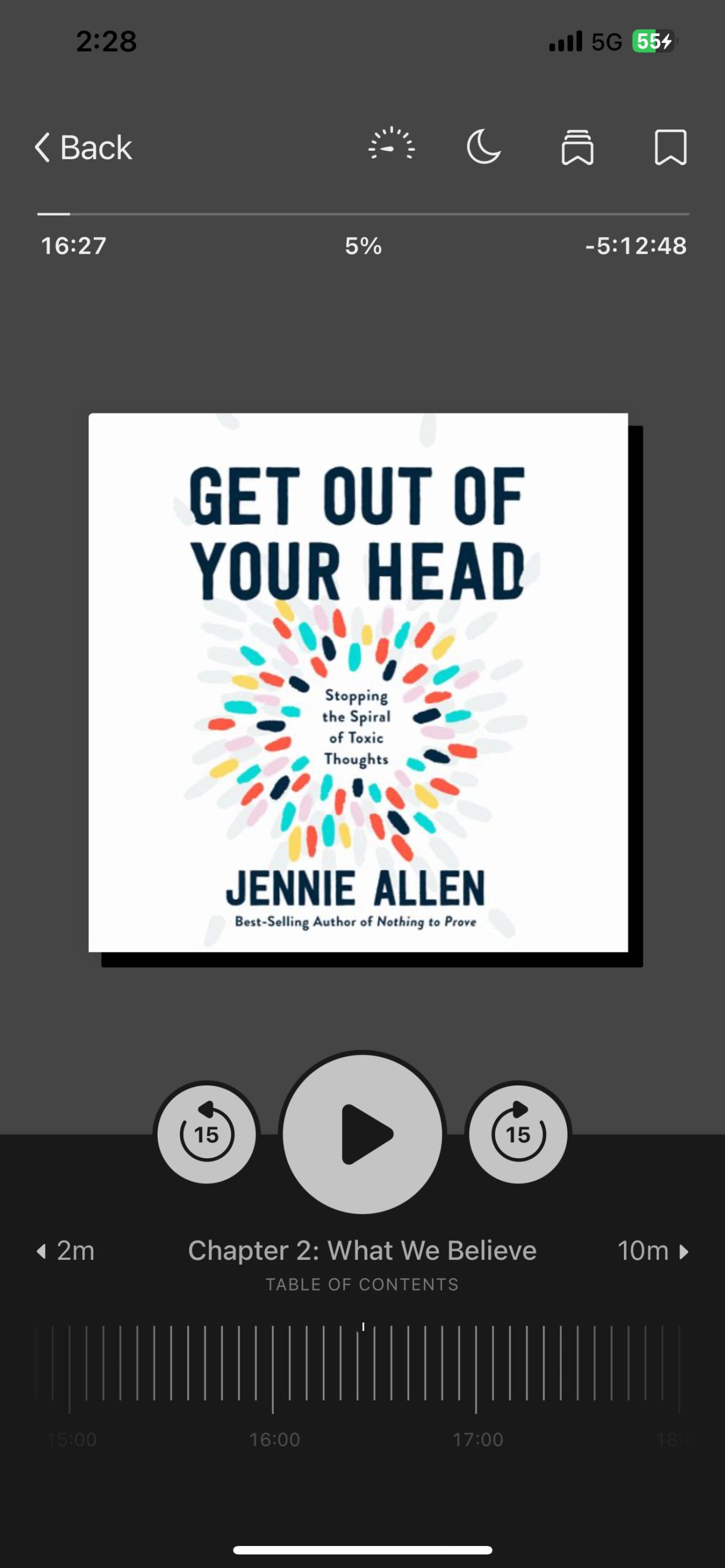
The navigation bar at the bottom of the screen includes four icons representing different pages. While the location of the navigation bar uses a good conceptual model, the mapping and icon choices can cause confusion.
In most mainstream mobile apps, the welcome page is typically the first icon, and settings are positioned last. This conventional layout aligns with users’ learned expectations, forming knowledge in our heads that helps us easily navigate through different apps. However, Libby’s navigation bar does not follow this convention; the welcome page is the second icon, and settings are the third. This deviation creates a disconnect between a users’ knowledge in their heads and knowledge in the world which would in turn cause confusion and frustration for users.
Despite this issue, Libby effectively provides clear feedback when users interact with the navigation bar. When an icon is selected, it lights up blue, ensuring there is no gulf of evaluation—users receive immediate confirmation of their selection.
To improve the navigation experience, rearranging the icons to follow standard conventions would enhance usability. This would mean that the welcome page becomes the first icon and the settings page becomes the last icon.
Now Playing Page
Libby’s slider at the bottom of the page is one that is very good for approximations. When trying to work with time, especially in the context of rewinding or fast forwarding to a specific timestamp, the goal is to get as close to it as possible. Libby does a good job at making the slider more precise by constraining the values able to be selected. If listeners wanted to rewind back a whole chapter, it would be difficult to do that with the slider because of these constraints but Libby was able to solve this with buttons that skip to the end or beginning of the chapter.
All of the controls to the audiobook’s progress are located on the bottom of the page. However, the actual progress bar is located near the top of the page. This is a flaw as it doesn’t follow Gestalt’s Principle of Common Region. One way to fix this is moving that progress bar to the bottom of the screen, where all of the controls are.
Bookmarks
One of the biggest issues is within the bookmarks feature. The act of bookmarking is fairly simple and easy because the button is easily discoverable and the icon choice is conventional. However, the problem is when listeners try to do more with the bookmark. When you open up the menu where it houses the bookmarks, every one of them has a default name of “A bookmark.” This default name doesn’t provide any information as to what the bookmark is and why it was bookmarked. The plan would then be to edit the bookmark and give it a name that can provide more information but, there are no signifiers for an edit button.
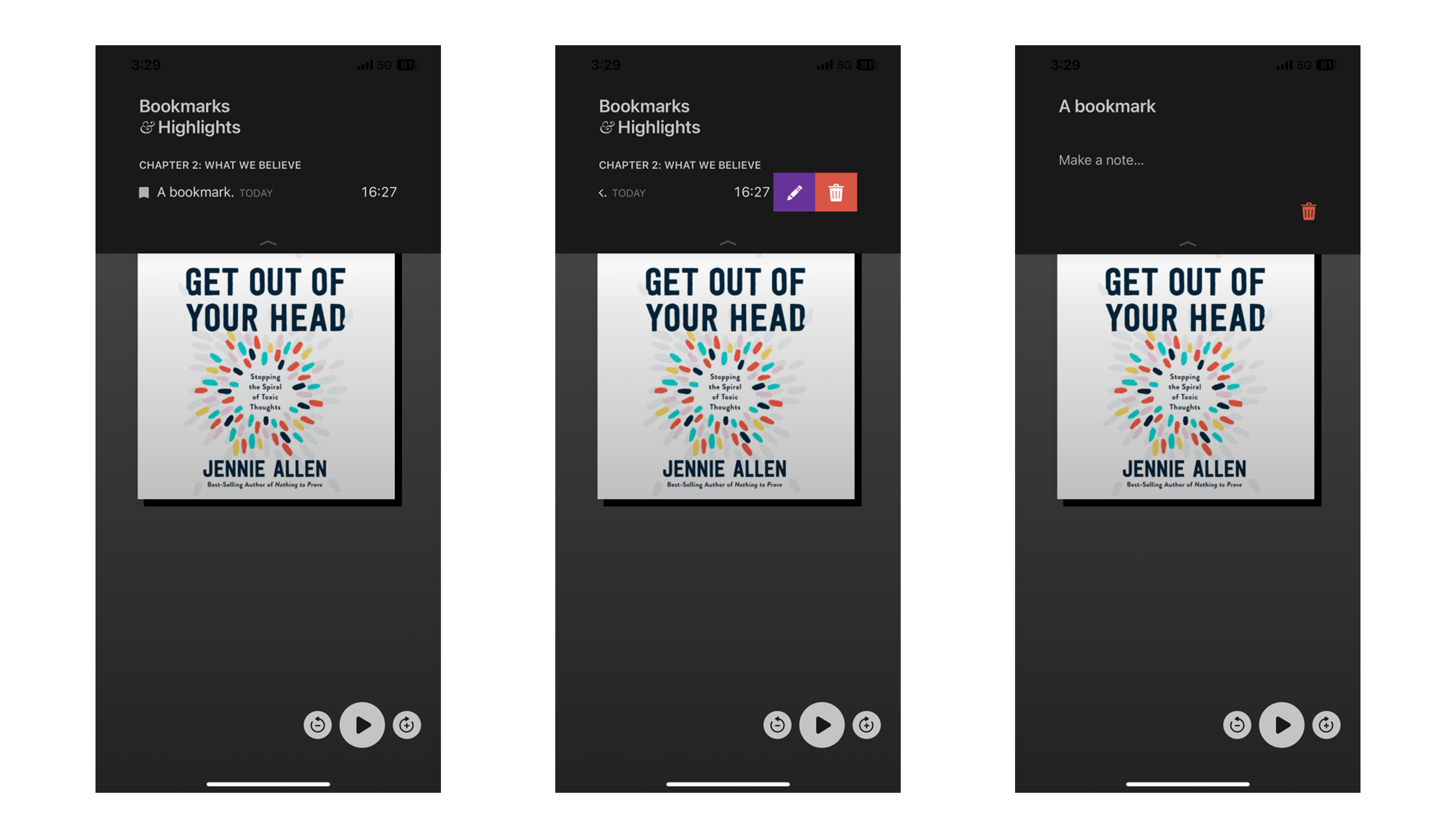
This edit button is actually found when you slide the bookmark to the left. This edit button has poor discoverability due to lack of affordance and signifiers. This leads to a Gulf of Execution and even when in edit mode, the name of the bookmark is unchangeable. When the name of the bookmark is clicked, it highlights and provides feedback as if something is going to happen but nothing actually happens. There are several ways to bridge this Gulf of Evaluation:
- Provide listeners the ability to name their bookmarks when they bookmark it.
- Allow users to change the name of the bookmark in edit mode when pressing on the name.
Conclusion
Overall, Libby has done a great job at creating an experience that is similar to other music streaming or podcast streaming platforms with a few additional features. While these additional features could have a positive effect on the experience, if they aren’t implemented or designed well, it may prove to be more troublesome than beneficial.