What are some artificial intelligence (AI) tools you use for school or everyday use? Google has been stepping up the game in bringing out their Generative AI tools. Apart from Gemini— Google’s version of Large language models(LLM) AI tool competing with ChatGPT— they introduced a product called NotebookLM, a research and note-taking tool assisting users to interact with their sources. Released in 2023, the tool incorporates Gemini to generate summaries, explanations, and answers based on contents uploaded by users. We dive into see what this new tool has to offer competing with the other tools in the market using concepts from Don Norman’s The Design of Everyday Things and Jenny L. Davis’s How Artifacts Afford.
About NotebookLM
First, let’s start by looking at how this product works. With a Google account, anyone can use the free version of NotebookLM. Users are able to upload different sources using file documents such as PDFs, audios, Google Docs, Youtube, websites, and copied texts. For the free version, you have a limit to use up to 50 sources. Upon uploading, the tools quickly analyzes the sources into three different sections, an overview of the “sources”, a “chat” box where users can ask questions and interact with the AI to gain more information, and a more personal section called “studio” where users are able to turn all the material into a podcast or personal notes for documentation.

Onboarding
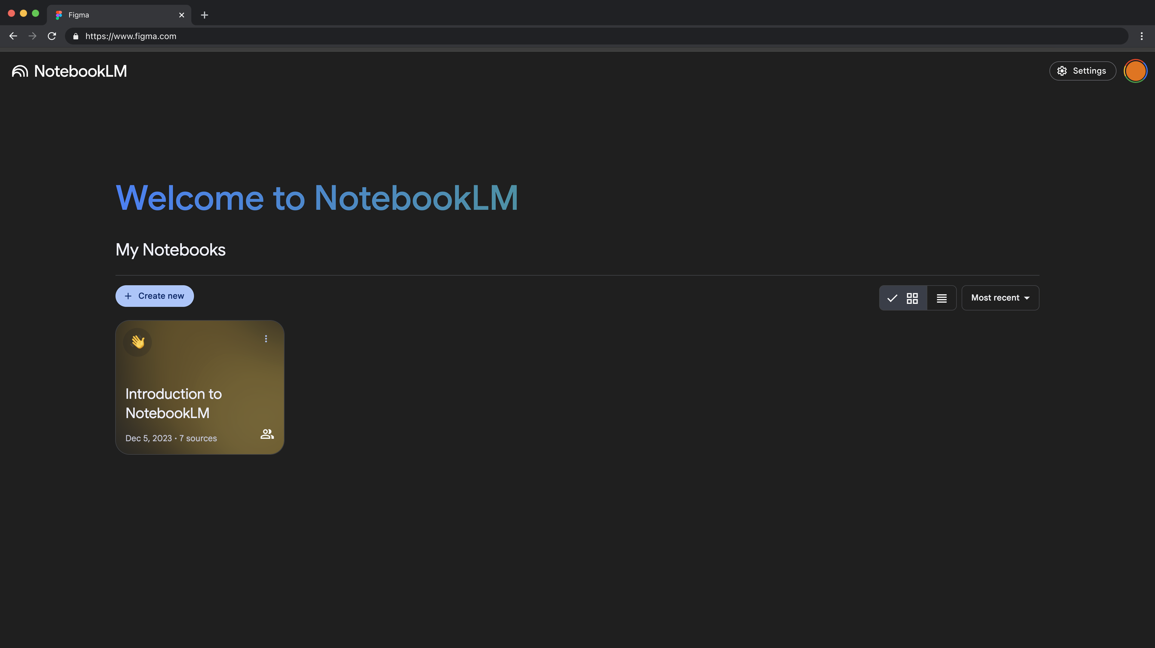
If you are a new user to the tool, onboarding is pretty simple. You can connect your Google account to the tool and then you are signed up for the free version of NotebookLM. Once signed in, the layout of the landing page is very minimal with only a few contents present. You’ll find one pre-existing notebook titled “Introduction to NotebookLM”.
The Problem
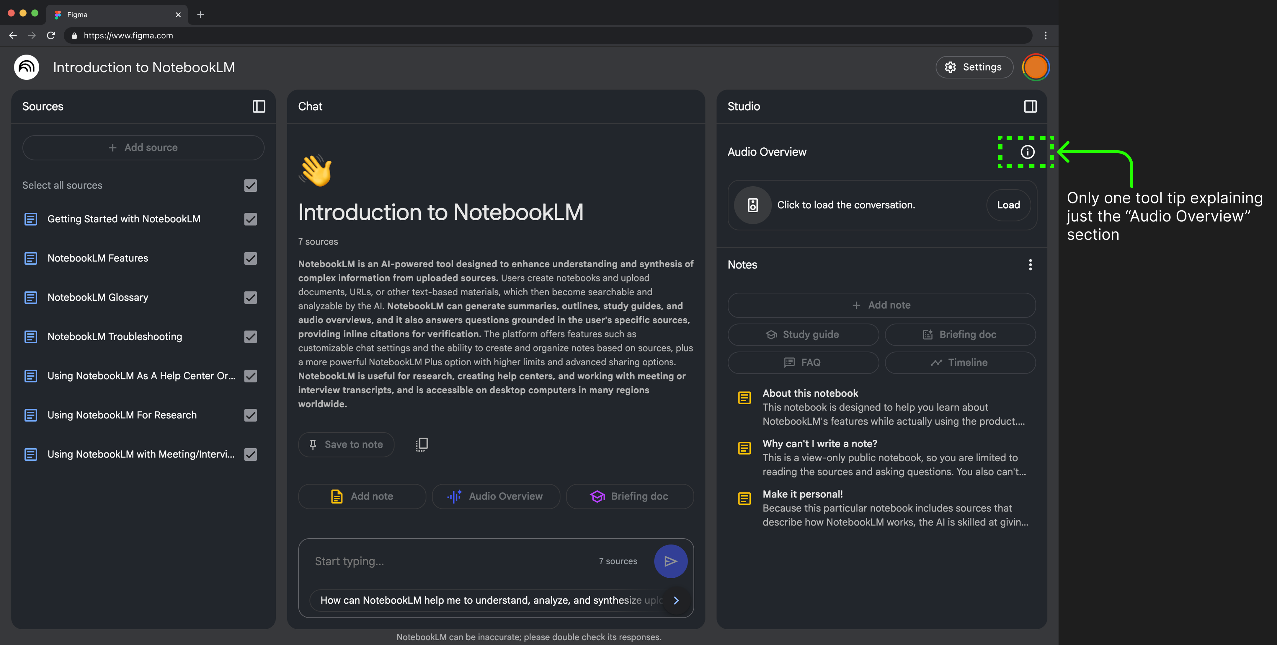
However, I then encountered difficulty after this. I wasn’t sure where to begin or how the product was supposed to work.I felt very overwhelmed with the “Introduction” notebook, as it was very text heavy and did not give clear instructions on how to use it in simple terms. I eventually went searching for how others who were using it on Youtube, and it turned out the tool was actually quite simple to use. The conceptual model of the product was unclear, making it difficult to understand how it should be used. The only available tooltip to depend on was located in the “Audio Overview” section.
On the landing page, there was encouragement and a request for users to start with the “Introduction” notebook, but there was no demand for it. The color difference and the fact that it was the only notebook made it stand out, but it didn’t entice me to click on it. Additionally, the displayed creation date and the indication that it was shared with me were confusing, making me question whether I had used the product back in 2023 —which apparently was the date the product was first released.
MY PROPOSED DESIGN FOR ONBOARDING:
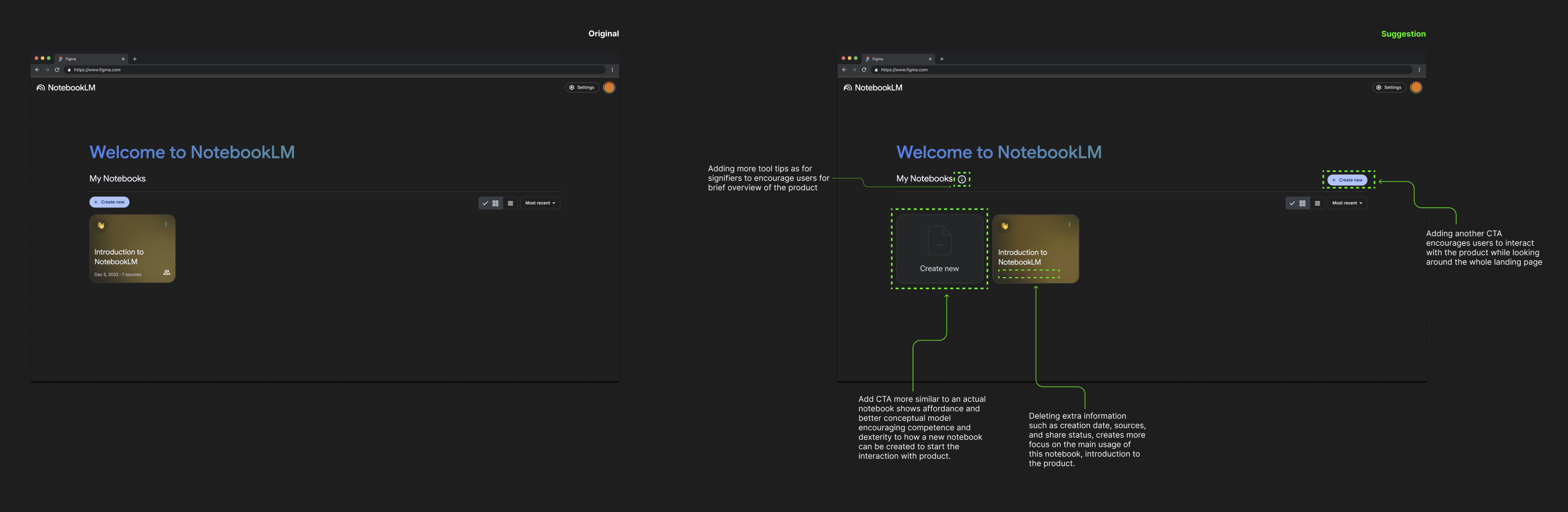
Representing the “Create New” option not just as a button but as a full notebook icon would enhance affordance, making it clearer to users. This change would also help the “Introduction” notebook stand out more, encouraging users to click on it. Also, adding more tooltips might help users to quickly figure out where to start. The landing page layout feels quite different from most websites I’ve encountered, making it unfamiliar to users. While there is a CTA button prompting users to start, it lacks clear explanations on what to do next or how to use the product.
Adding Sources
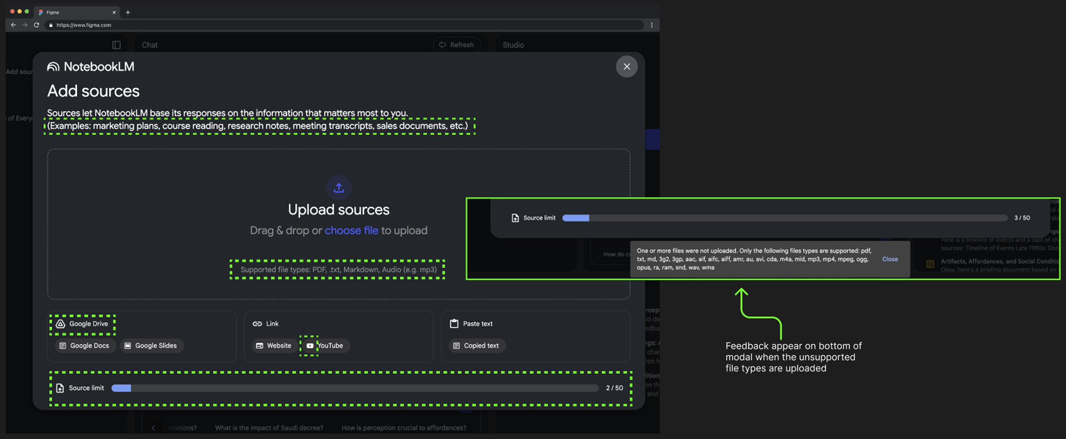
One part of the product I found very easy to use was the “Add sources” modal. This page is divided into four distinct sections. There are very clear signifiers in each section that shows the types of sources that are able to be uploaded and used for analyzing. The top, which is the biggest section, encourages users to upload supported document types and gives examples of what this section is meant for. If the user uploads the wrong document type, there will be feedback that wrong file types have been uploaded, refusing to analyze. The other three sections at the bottom include recognizable Google icons so users are able to understand the kind of sources to be used in each section. At the bottom is a progress bar, which also shows feedback to how many sources were used and how much more sources can be uploaded.
This page was the most clear to me as a first time user, showing a clear visual of what is encouraged to use the product.
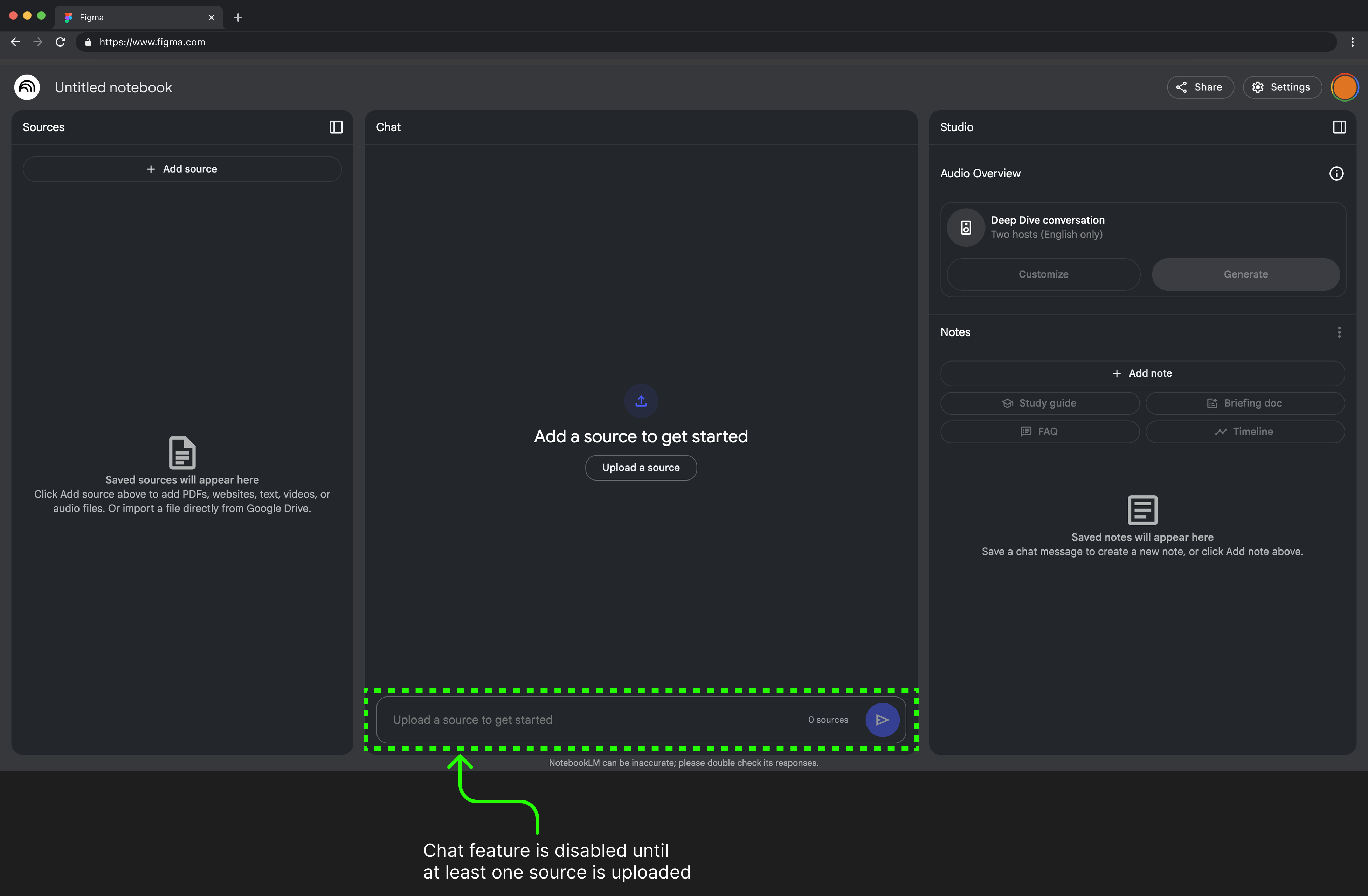
The Constraints
After users click “+ Create new” from the landing page, they are then redirected to the “chat” section of the product. The chat is disabled until the user starts uploading a source. But what if the user doesn’t have any sources yet and wants to start by getting ideas from the chatbot? This was one feature I found frustrating. Although the product is meant to be for generating content from what the user brings in, I felt this constraint wasn’t helpful as a starting point. Enabling the text and giving suggestions in the chat will give more freedom to the users to start generating ideas. Bringing up the message of adding sources later will still give hints and directions to users and a better flow to use the product.
Layout
Being that NotebookLM does not have a true app version yet, it must be accessed from the web version to use its full functionality. The layout of the “source”, “chat” and “studio” are all sectioned off clearly with boundaries. The “source” and “studio” sections on either end are collapsible and expandable depending on which section the user wants to focus on.
What works and doesn’t work
I was only able to see that the layout was very responsive when the screen was and was not in Full Screen mode. As someone who does not use full screen often, I would not have known that the layout expands out into three sections when in Full Screen mode. When the screen was not Full Screen, there was refusal in being able to see all sections expanded out, which then demanded users to only be able to click between the tabs at the top to navigate between each section. This could also be a constraint to how the user is able to view the product, but also a type of Gulf of Evaluation where the system ‘s response and how the user interprets is different. In this case the user would need to explore step further to discover the Full Screen layout and that there are no signifiers stating that the layout will change.
Cutting down on responsiveness and making the layout more static— many websites don’t change much in layout when going fullscreen and usually just adds more white space in the margins or stretch. This will keep the familiarity with users and help with the discoverability of the product, while being able to use the tool fullscreen or not, but also create a more seamless experience of not having to constantly have to navigate between tabs.

Conclusion
We have seen through this design critique of Google’s NotebookLM different concepts derived from The Design of Everyday Things by Don Norman and How Artifacts Afford by Jenny L. Davis. This was my first time using the tool, and it was quite difficult trying to understand how to use it as I could not clearly see how to interact with the product. The product claims that they are still in experimental stages and updates are constantly to come. What sets this apart from other Generative AI tools? Google claims that the tool does not use our data to train the tool—as AI needs constant training to enhance accuracy— trying to ensure users’ privacy of personal data. On the other hand, some have explained, that is what makes the tool less creative compared to other AI tools. As a student, NotebookLM really could help to “Think Smarter Not Harder” to support academic study.