The NY Waterway app is a platform that allows users to purchase ferry tickets and access transportation information for traveling across the New York Harbor. It is mainly used by commuters, tourists, and residents who need a convenient way to buy tickets, check schedules, and find route information. For this critique, I will take the perspective of a new ser who wants to purchase a ferry ticket from Jersey to Manhattan and evaluate the app’s usability through the lens of design principles from The Design of Everyday Things and other UX concepts.
To begin, I will outline key tasks that users typically complete when using NY Waterway. I will then analyze each of these workflows to determine whether they effectively meet user needs and expectations.
Home page: Tickets
When the users opening the NY Waterway app for the first time, they land on the Tickets screen, which immediately informs them that they have no available tickets. This screen follows Norman’s principle of visibility, as it provides clear feedback about the user’s current state.
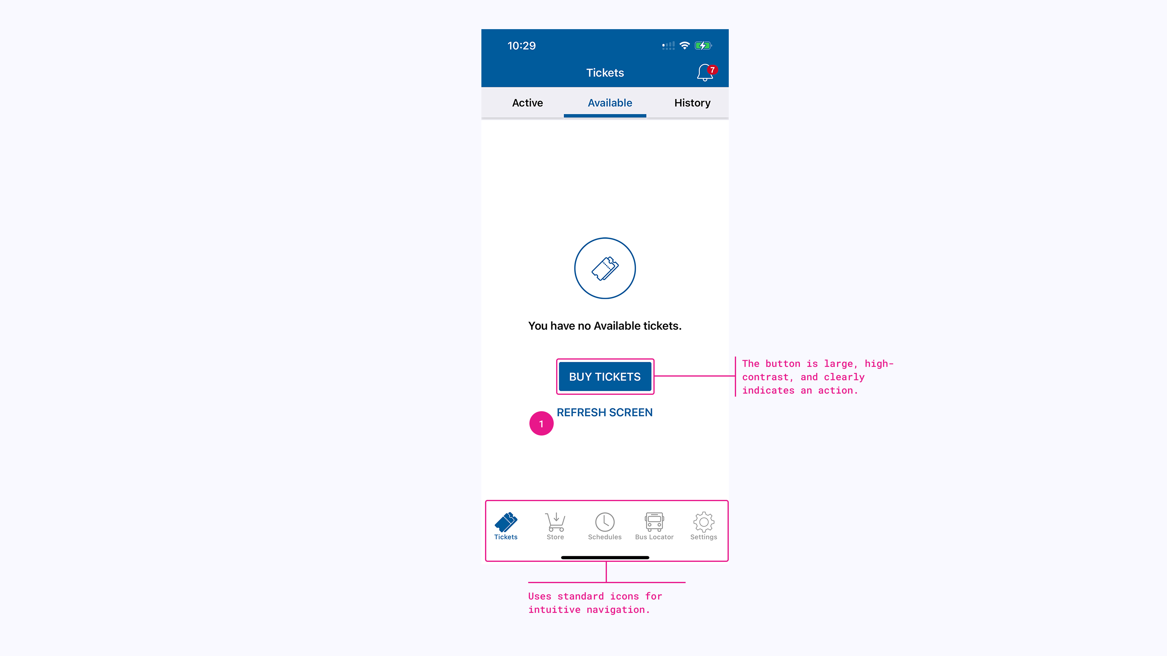
The prominent “BUY TICKETS” button effectively directs users toward the next step, reducing confusion. However, the lack of onboarding or contextual guidance might leave first-time users uncertain about the app’s overall functionality. The bottom navigation bar follows standard conventions, featuring icons for Tickets, Store, Schedules, Bus Locator, and Settings. The icons have clear affordances, signaling their functionality well. The “Refresh Screen” (1) option provides a way for users to manually check for updates, supporting user control. However, there is no indication of whether refreshing is necessary or if the app updates automatically. This violates Norman’s principle of feedback, as users lack clarity about what action (if any) is needed. A simple loading indicator or auto-refresh mechanism could improve the experience by reducing unnecessary interaction.
Store page: route selection
When users navigate to the Store page in the NY Waterway app to purchase a ticket, they are presented with a minimal interface that requires them to manually select their origin and destination from a list of stations.
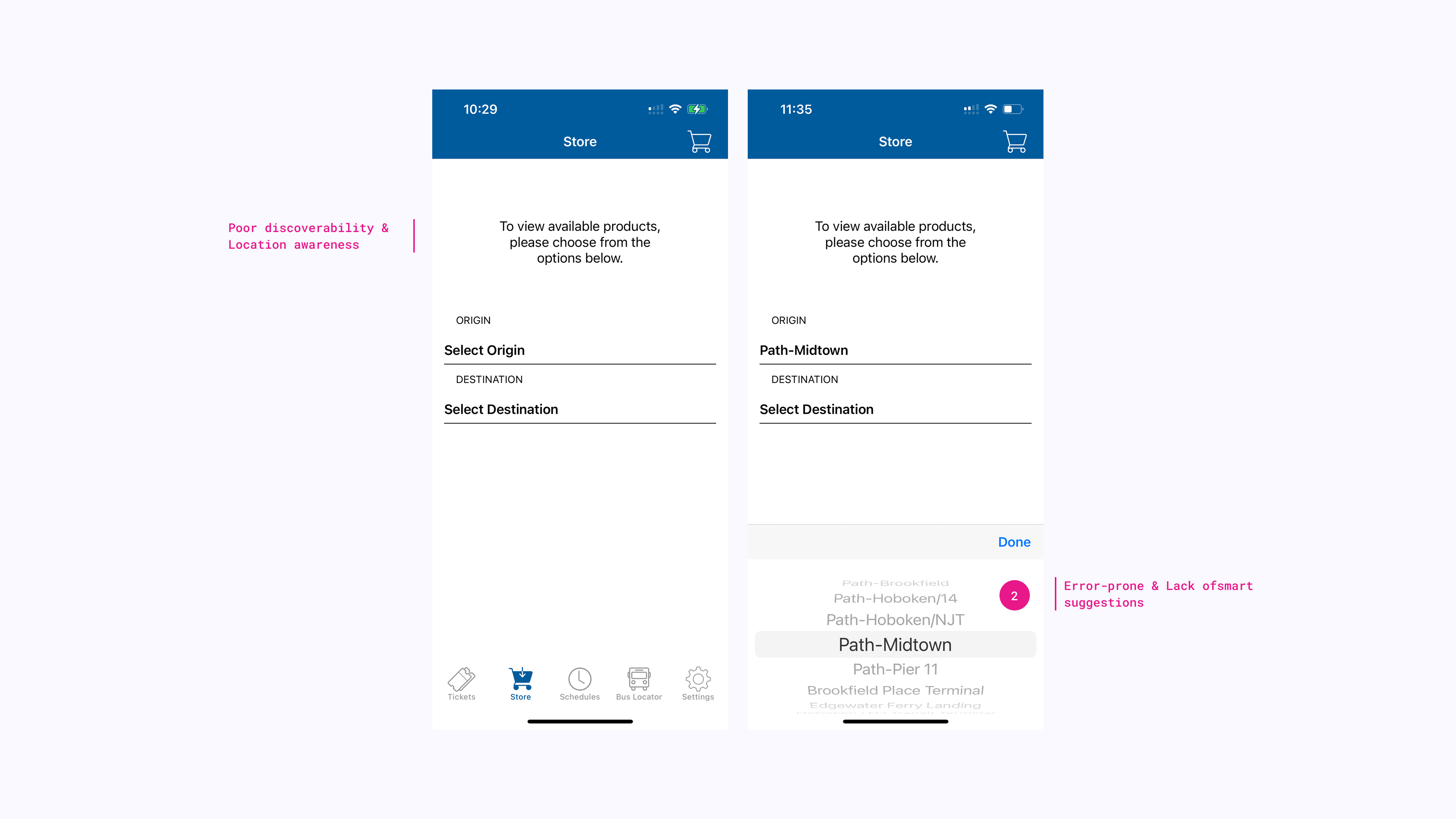
While the design follows a clean and structured layout, it lacks essential guidance for users unfamiliar with the ferry system. A major usability issue is the absence of location awareness—there is no map or GPS integration to help users determine the nearest ferry terminal. This increases the Gulf of Execution, as users must leave the app to search for ferry routes online before making a selection. Another usability challenge arises from the lack of contextual route guidance when selecting a station (2). The station names (e.g., “Path-Midtown” or “Path-Pier 11”) do not provide any indicators of their geographical location or major landmarks nearby. This violates Norman’s principle of feedback, as users have no way of knowing whether they are selecting the correct route. The manual selection process also introduces a high potential for user error. Since users must scroll through a long list of stations, it is easy to accidentally select the wrong one, especially for those unfamiliar with station names.
Store page: ticket selection
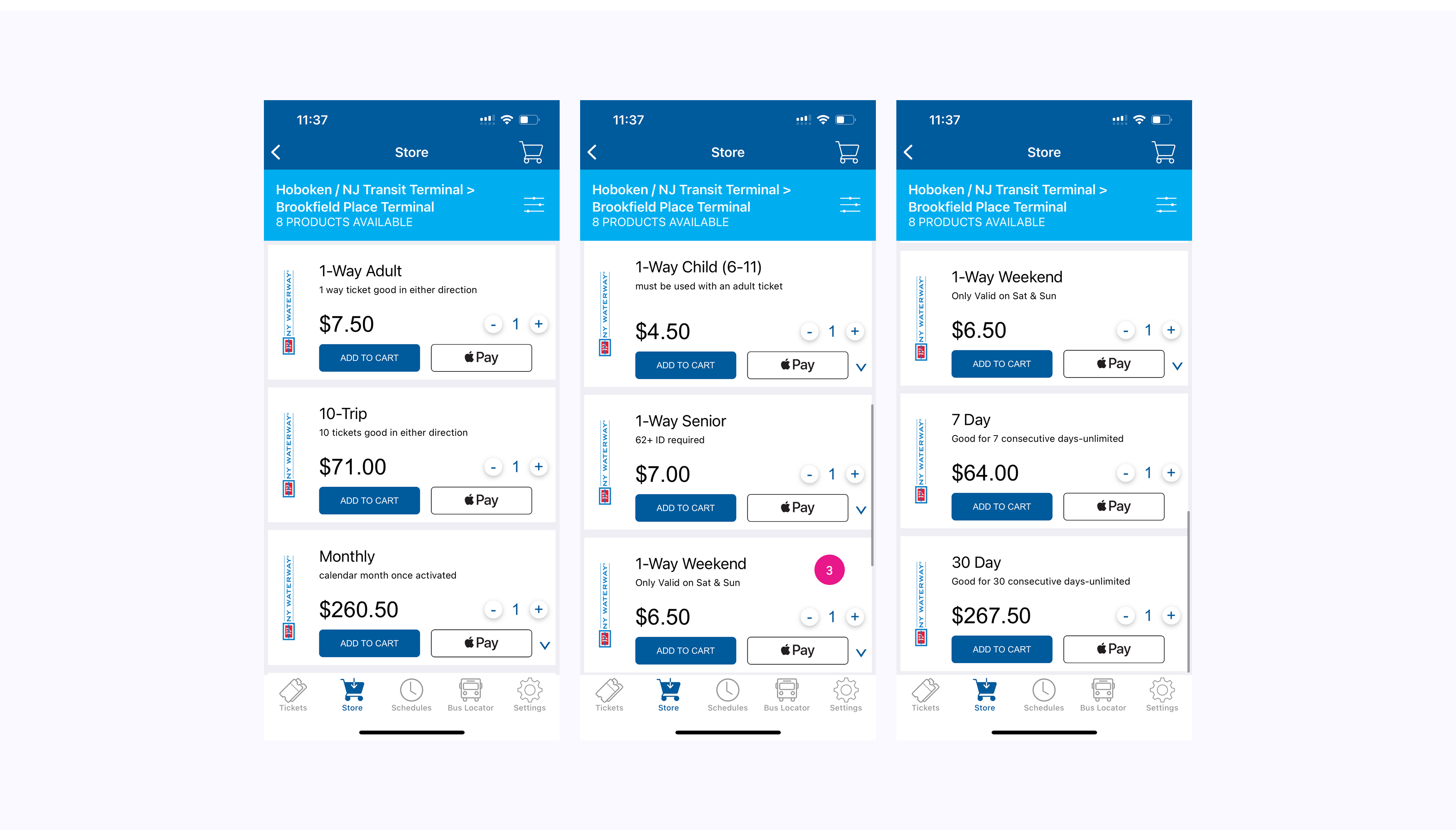
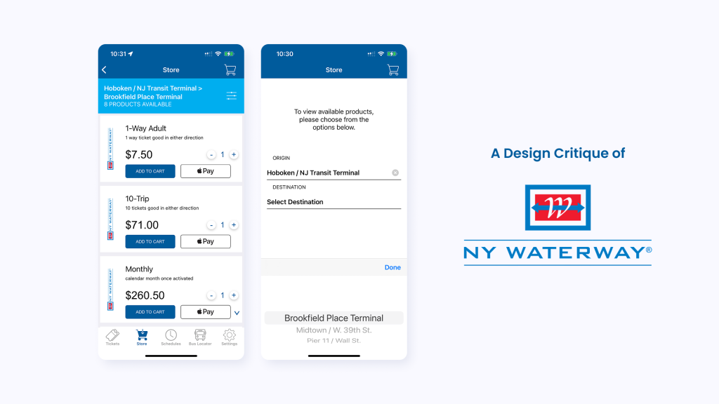
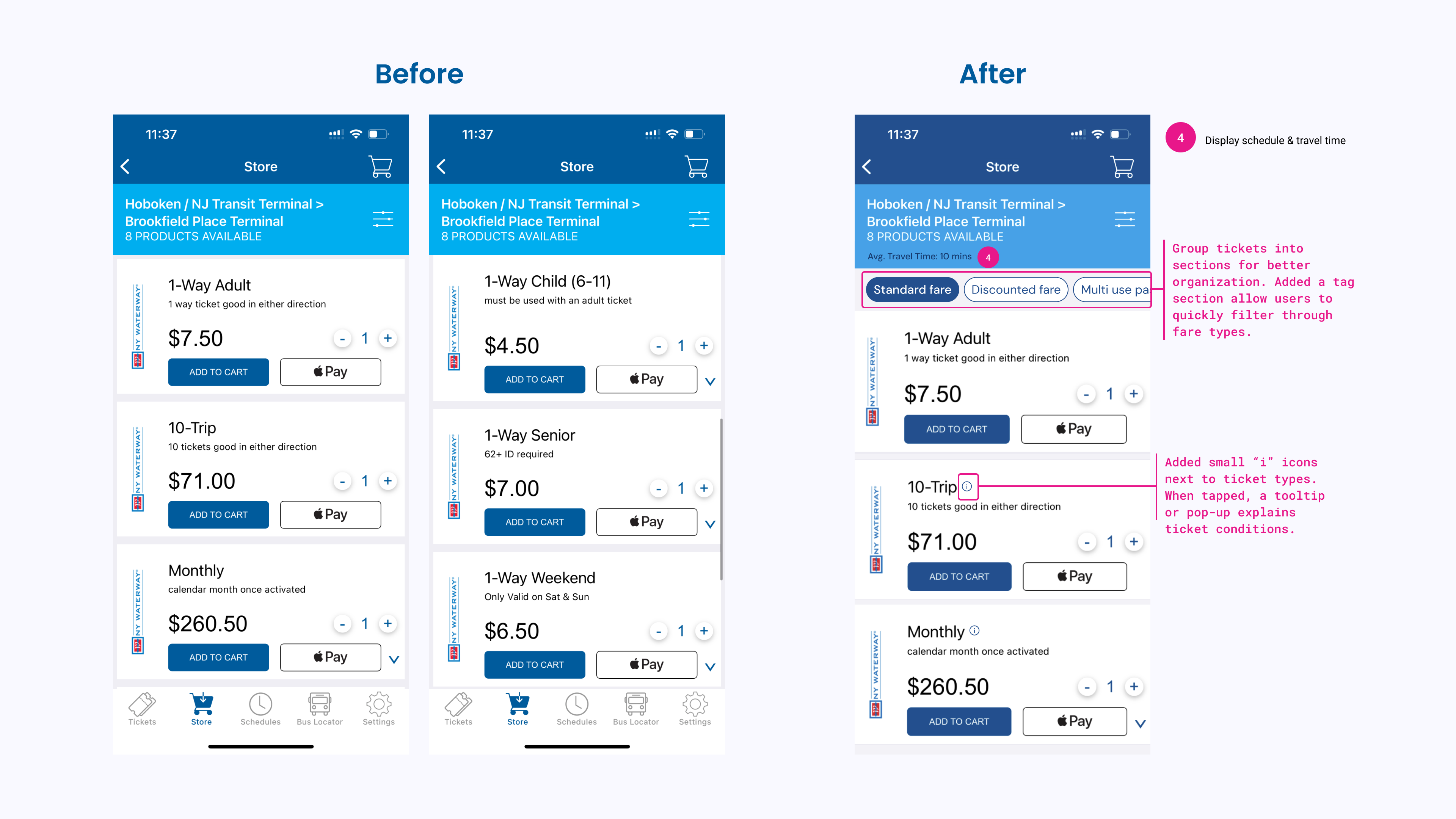
After selecting a route, users are directed to the ticket selection page, where they can choose from various fare options, including one-way, multi-trip, and monthly passes. One major usability issue is the lack of clear categorization or sorting of ticket options. Ticket types appear to be randomly scattered, with “1-Way Adult” at the top, but “1-Way Weekend” buried below “1-Way Child” and “1-Way Senior” (3). This inconsistency forces users to scan the entire page to find their desired ticket instead of quickly locating it in a logical order. This violates Norman’s principle of natural mapping, as the organization does not reflect how users mentally categorize fares. Another key limitation is the lack of schedule or travel time visibility. While users can select tickets, there is no indication of ferry frequency, estimated travel time, or the earliest/last ferry of the day. This forces users to switch between multiple screens or external sources to verify if their ticket aligns with their schedule, introducing unnecessary friction. Additionally, the screen lacks fare breakdowns and explanations. While users can see different ticket types, there is no information on fare rules, such as whether a 10-trip ticket can be shared between passengers or if the monthly pass includes weekends. This violates Norman’s principle of feedback, as users are left with unanswered questions about their purchase. Based on the usability issues I identified, below I mockuped a possible solution that can improve clarity, efficiency and user control.
Conclusion
The NY Waterway app provides a straightforward way to purchase ferry tickets, but the lack of organization, missing fare details, and absence of travel information make the process less intuitive. By improving ticket categorization, adding schedule details, and introducing filters, the experience can be more efficient. The suggested changes aim to make the app easier to use for all travelers.