Introduction
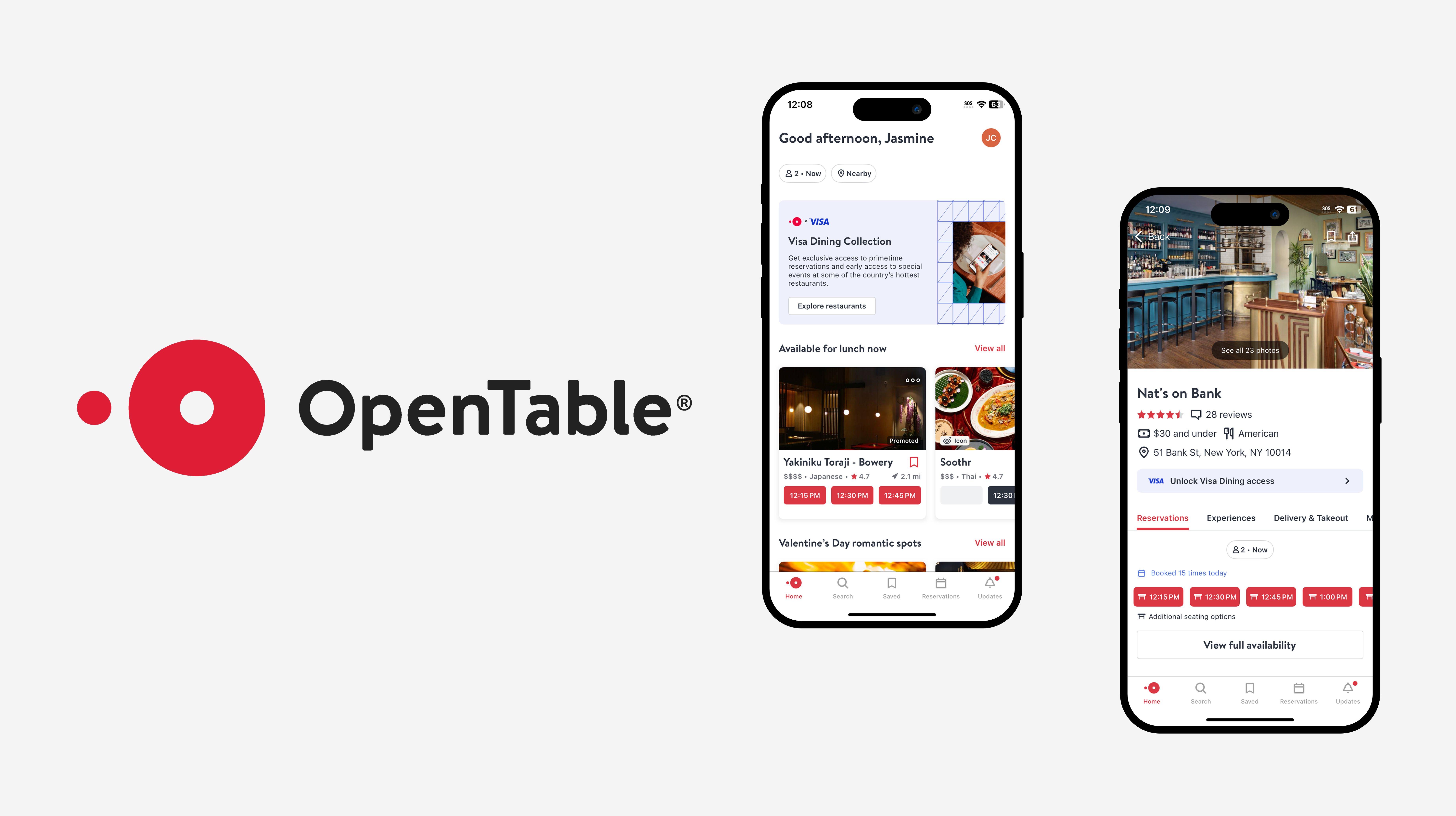
The OpenTable mobile app is designed for managing restaurant reservations, discovering new restaurants , and exploring different cuisines all around the world. OpenTable’s popularity highlights both strong design elements and areas for improvement. We’re going to dive into the design of the OpenTable mobile app based on Don Norman’s principles from “The Design of Everyday Things”.
Browsing The Home Page
What’s Good
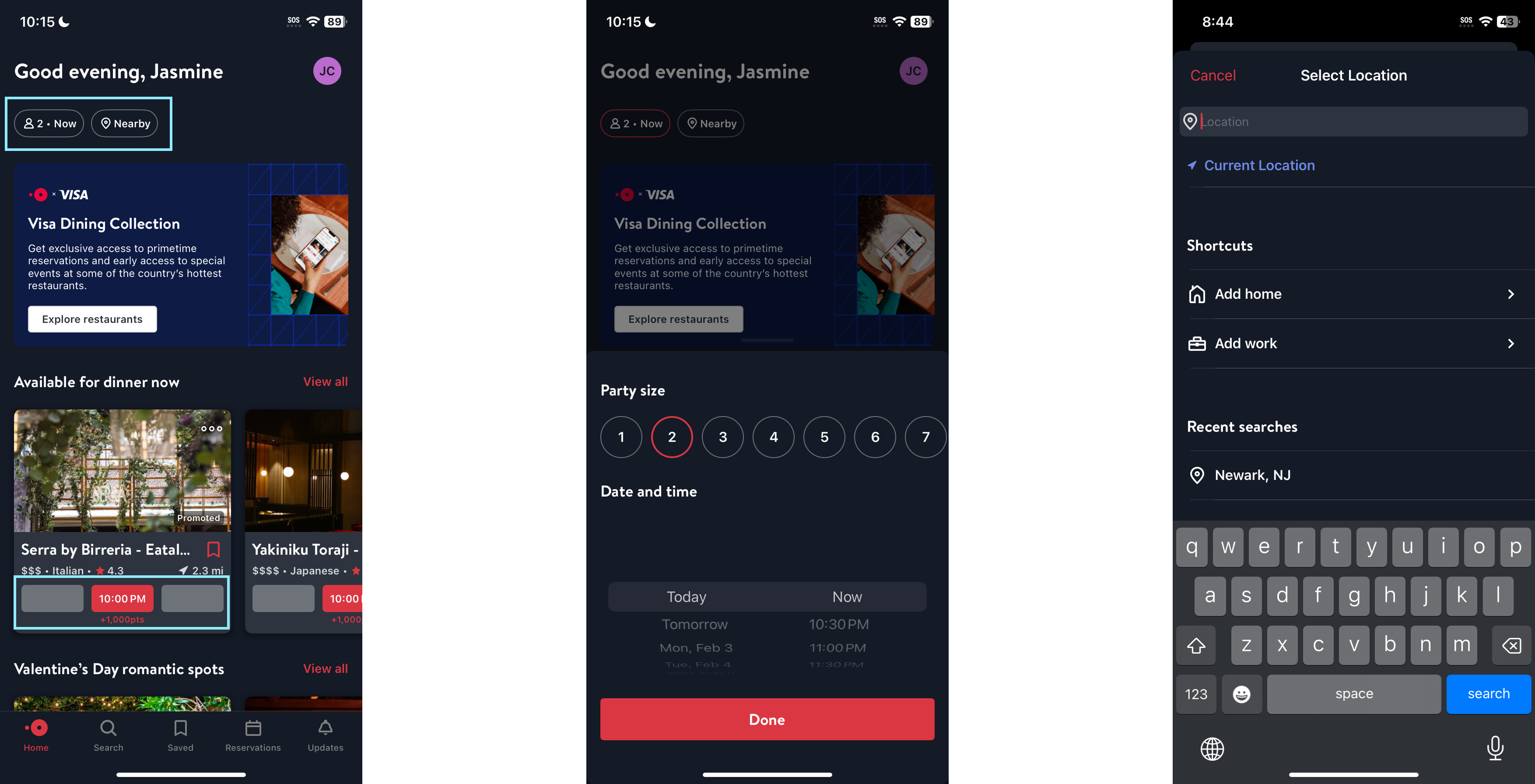
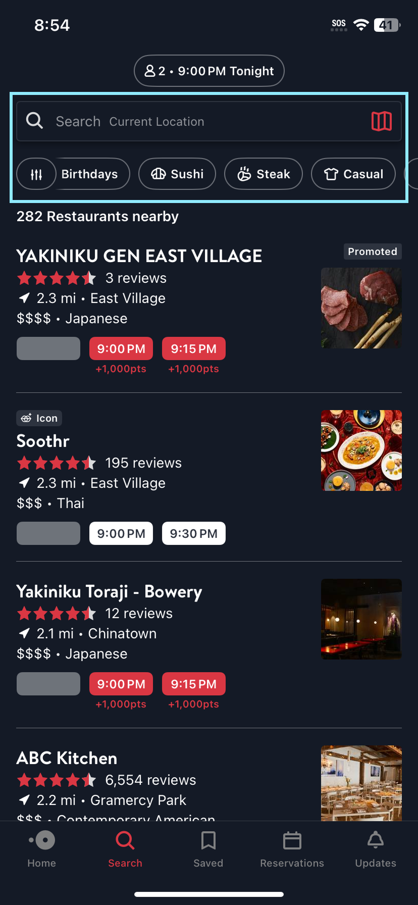
The two buttons (highlighted in blue) features good discoverability as it immediately makes clear through text what actions are possible – users may search for restaurants with available seating by specifying their group size and preferred dining time, or find restaurants that are close to their current location. In addition, the use of signifiers further aids understandability of these features: one button with prefilled group size and time, and the other button features an example of the selected location (“Nearby). Additionally, the two buttons are well designed also because it leverages users’ knowledge in the head of how reservations work, thus helping to reduce users’ cognitive load.
The design of available time slots (also highlighted in blue) leverages both users’ knowledge in the world and knowledge in the head. This is then paired with the use of signifiers: unavailable times are grayed out, immediately signaling to users that no seats are available at those times. Meanwhile, available times are displayed as red-filled, clickable buttons, clearly indicating they can be selected. Additionally, the time selector demonstrates good mapping by revealing later times as users swipe up on their screen.
What Can Be Improved
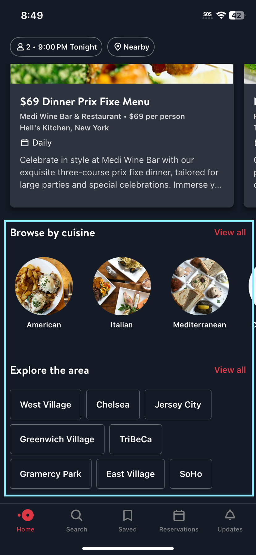
However, the search features for browsing by “cuisine” and “area” are placed at the very bottom of the home page. This indicates a gulf of execution, as first-time users might not immediately recognize that they can search for restaurants using these categories created by OpenTable unless they scroll all the way down. Moreover, since there are no strong visual cues directing users to these options, it contradicts Don Norman’s conceptual model, which suggests that an interface should align with users’ expectations and mental models. A more intuitive placement—such as integrating these filters into the search bar or placing them near the top—could enhance usability and reduce friction in the discovery process.
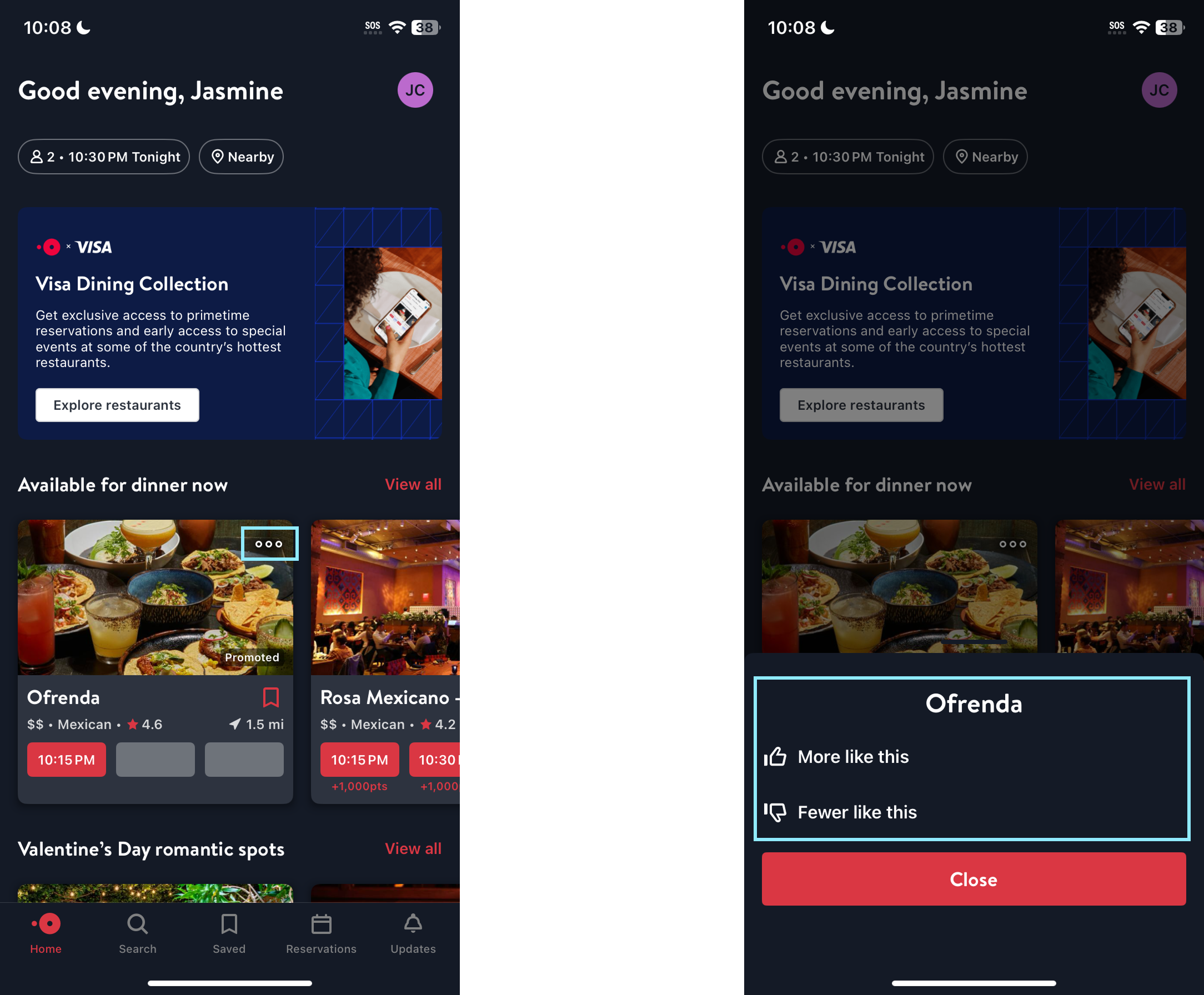
Next, the gulf of evaluation occurs when users click on the “More” icon. Users likely expect the “More” icon to reveal additional restaurant details, but instead, it presents a personalized recommendation feature (“More like this” and “Less like this”). To improve this, I would suggest removing the “more” icon and placing the “thumbs up” and “thumbs down” icons at the bottom of the card (below the time slots section), which would more accurately communicate the purpose of the feature to the user. Also, placing them in an obvious place helps improve the discoverability of the feature.
Searching For Restaurants
What’s Good
On the Search screen, the use of icons helps to bridge the gap between the user’s mental model and the different categories of search results. OpenTable employs signifiers in the form of familiar icons to make these categories easier to understand. For example, the “casual” category used in the restaurant filter may seem out of place to some users. They may wonder why this is included in the search category. However, the T-shirt icon serves as a signifier, visually conveying that the ‘casual’ category implies no strict dress code. Since T-shirts are widely associated with a relaxed atmosphere, which intuitively communicates this meaning to users.
What Can Be Improved
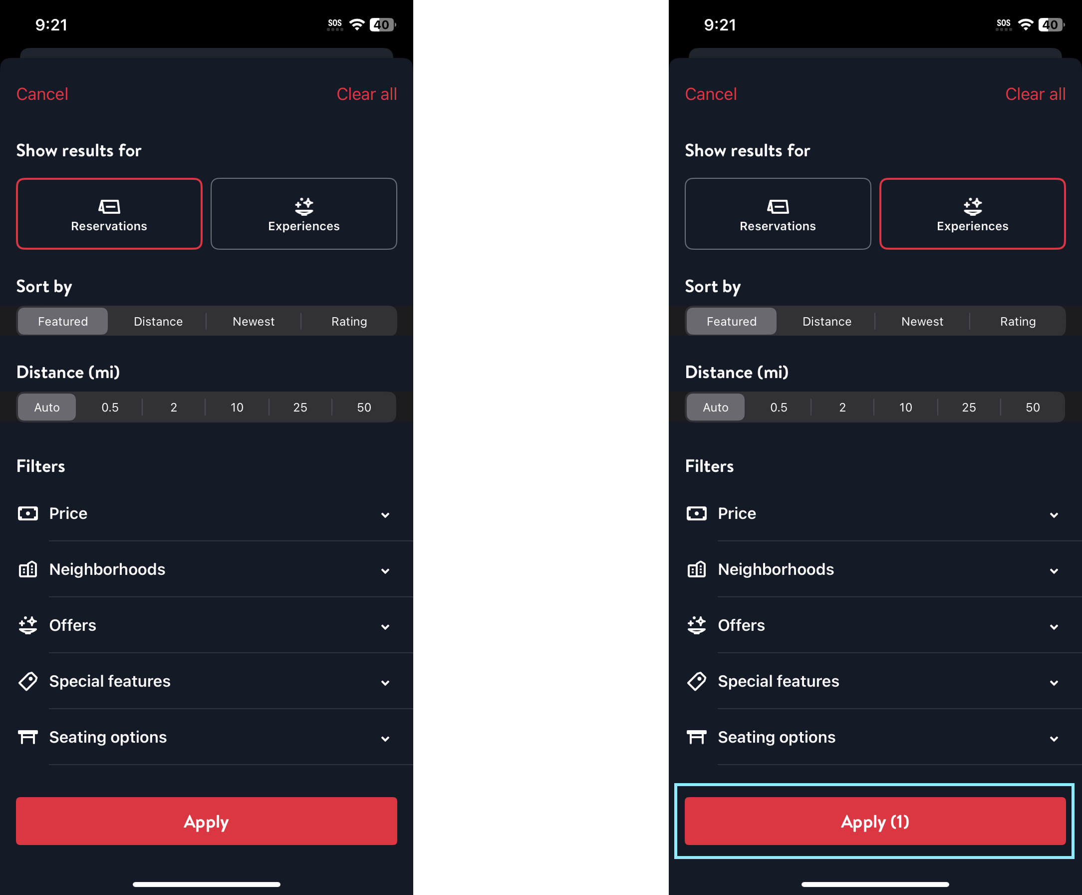
On the main search view, there are two primary categories on the top: Reservations and Experiences. However, these two labels lack understandability, as first-time users may not immediately understand the difference between “Reservations” and “Experiences” when searching for restaurants (on OpenTable, “Experiences” are unique events and activities hosted by restaurants). Understandability can be improved by relabeling the categories from “Reservations” and “Experiences” to “Regular” and “Special Events”, which could act as better signifiers as they clearly differentiate standard restaurant bookings from unique dining experiences. Additionally, this change helps align with the user’s mental model, as the “special event” text intuitively suggests an exclusive or themed experience that meets the user’s expectations.
In addition, the gulf of evaluation might occur when user selects “Experiences” because the page remains largely unchanged, making it unclear whether the selection had any meaningful impact. The only noticeable difference is that “Experiences” is counted as a filter, reflected in the “Apply” button update. However, this does not provide clear feedback to users. To improve this, I would suggest providing users with instant visual feedback when they choose between these two main categories, such as dynamically updating search results as users make their selections.
Conclusion
Overall, OpenTable does a good job of assisting with the restaurant reservation process, but falls short in ensuring a smooth user experience for all types of users. Some areas could be improved, including providing clearer signifiers, ensuring the use of icon matches the label and purpose of the feature. In addition, the design of some features could be modified to better aligned with the user’s conceptual model, rather than assuming that the user will be able to figure out/understand its functionality on their own. This will help reduce errors and increase understandability, especially for first-time users. With these optimizations, OpenTable can provide a smoother restaurant exploration and booking experience for a broader range of users.