
Resy is an application that is commonly used to make reservations at restaurants. It also helps users discover new restaurants, read restaurant guides, and to explore chef driven culinary experiences. The app has many good qualities as well as elements that can be improved which will be discussed in this post.
Landing Page/Search Page:
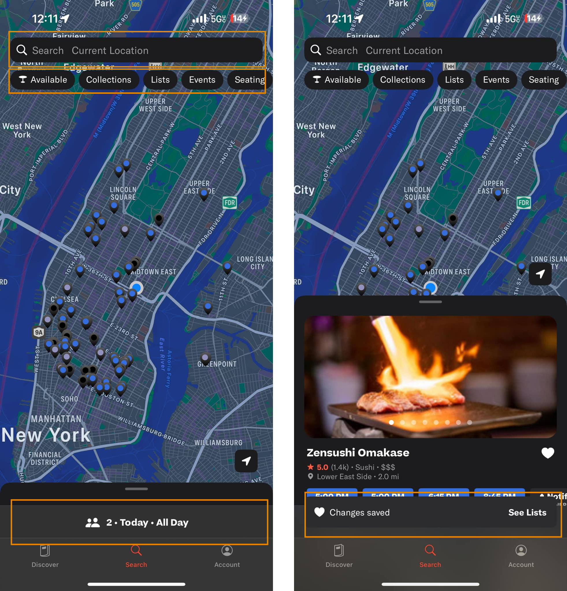
Search
The app opens up directly to the “Search” page which shows users a large and discoverable search bar conveniently positioned at the top of the screen. This matches users’ mental models of typical search bar locations. The text within the search bar says “Search Current Location”. This label is misleading, and doesn’t clarify if the user can search for a restaurant or only for a location. Changing the label to “Search” instead could remove this terminology based confusion.
Filters
The filter buttons beneath the search bar have low discoverability. While their shape affords they can be clicked, they lack clear signifiers to indicate their function. This causes a large Gulf of Execution, as users may rely on trial and error to understand how to interact with them. They could make an error(mistake) by accidently clicking on a filter that they thought was a button. Adding visual cues such as a filter icon or label would help users easily recognize these buttons as interactive filters and understand their purpose without confusion.
Reservation Bar
The bar at the bottom of the screen above the navigation bar shows the number of people in the party in addition to the day and time of the reservation. However, it is defaulted to reserving for 2 people on the current day. To first time users, this may be confusing as they never set these settings on their own. At first glance, this bar also does not look editable/clickable. The qualities of this bar don’t afford clicking. If I could change this design, I would add some sort of visual icon that tells the users that this bar can be expanded and the information can be changed. I would add an “Edit” button, a sliding or expanding icon.
Discover Page
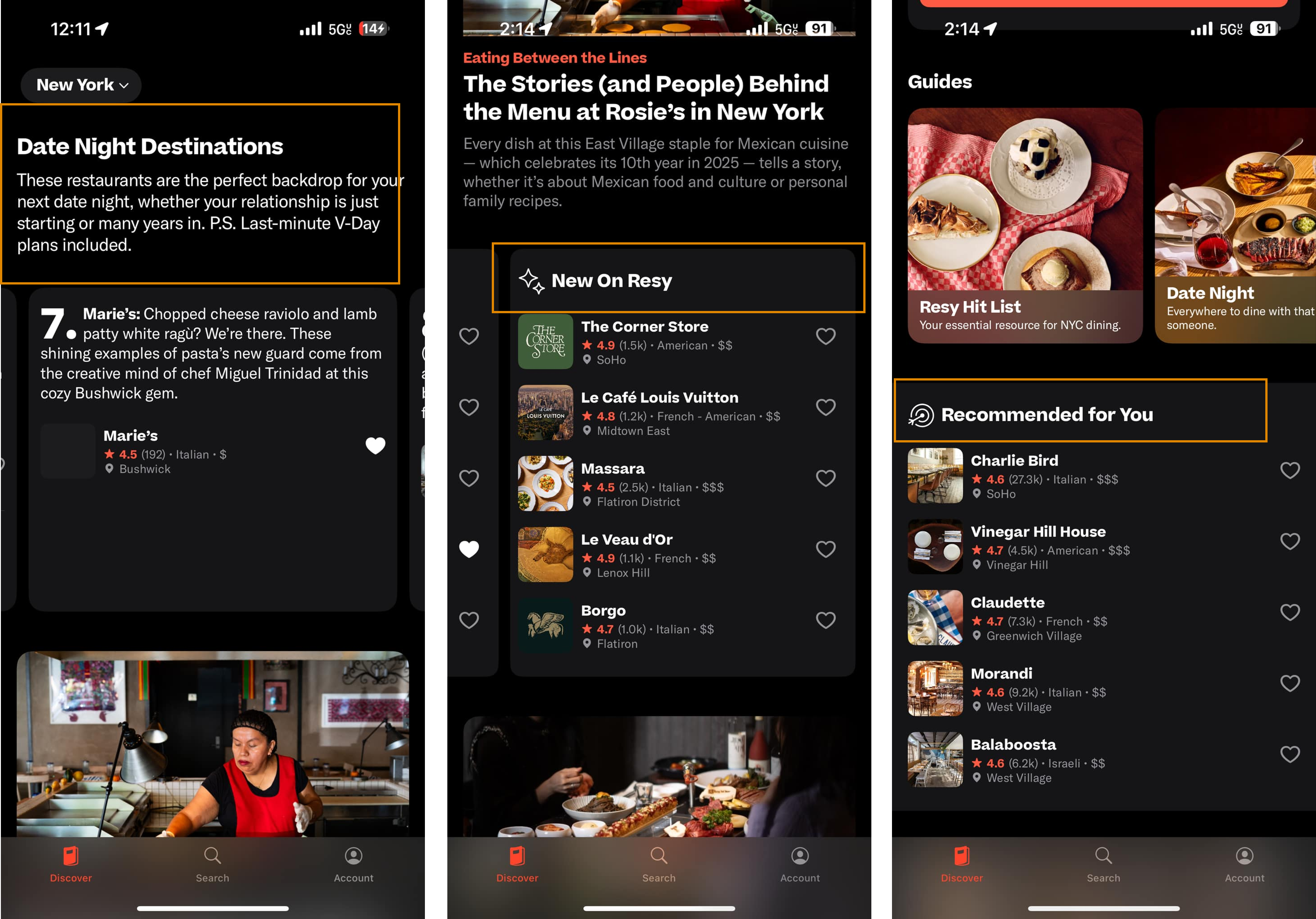
In many mainstream apps, the Discover or Explore page is integrated with the Searching feature. Since the word discover affords exploration, a new user may expect to search and filter within the page. Resy’s Discover Page doesn’t follow this convention – it keeps discover and search separate. This digression from common models creates a sort of disconnect between the knowledge in the head and the knowledge in the world, creating unnecessary confusion. In order to bridge the gap in confusion, I would find a way to integrate the search bar into the discover page or add a filtering system to allow users to tailor their feed.
This page offers a range of content to explore including Date Night Destinations, Culinary Events, Top Rated Restaurants, restaurants climbing the ladder, new restaurants, recommendations, etc. Users would not know the contents of this page unless they scrolled all the way to the bottom of the page. In order to help users get more from this page, I would add a table of contents to help users jump from one section to the next with ease.
Restaurant Page
Main Restaurant Page
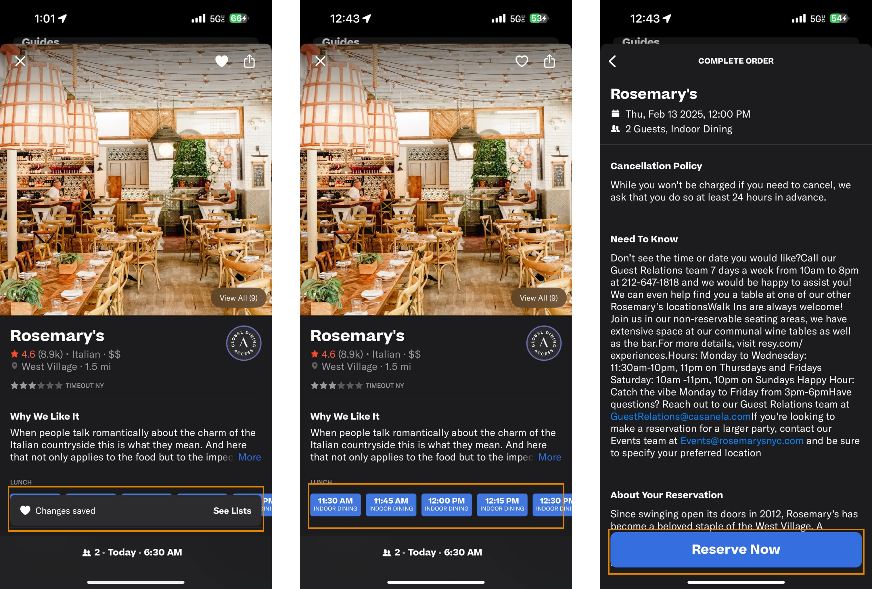
The restaurant page has strong discoverability and is easy for first-time users to navigate through. It mentions only the important aspects of each restaurant without overloading them with information. The open time slots are displayed in bright blue, acting as clear signifiers that they are clickable. This also follows Gestalt psychology principles by grouping the reservation actions and keeping users focused within the reservation workflow. These visual cues make it easy for users to understand the next steps in the process.
Additionally, this page offers feedback to the user. Once the heart icon and the top right of the page is clicked, the interface gives user feedback by notifying them that a change has been saved.
Complete Order Page
The next page has a large and central “Reserve Now” button. This button’s placement reflects mental models of other E-commerce, where users expect the action button to be positioned at the bottom of the screen. This also signifies the end of the process. The scrolling behavior of the page further supports the system image of the app, preventing users from straying from the reservation process. This also shows a constraint in the design to keep the users in the flow. These design choices align with knowledge in the world, creating an intuitive, understandable flow that guides users without overwhelming them.
Conclusion
Overall, Resy maintains a seamless and clean application that follows principles Human-Centered Design. It employs Don Norman’s design principles, though certain features but also demonstrates several avenues to improve. By applying the design suggestions listed above, the Resy app could greatly improve their digital experience!