Robinhood is a trading platform that helps investors track stocks, analyze market trends, and make informed decisions. With real-time data, advanced charting, and a user-friendly interface, it makes trading more accessible and efficient for investors of all levels. Its sleek and intuitive design ensures a smooth experience, even for beginners.
Trading Stocks, Crypto, and More
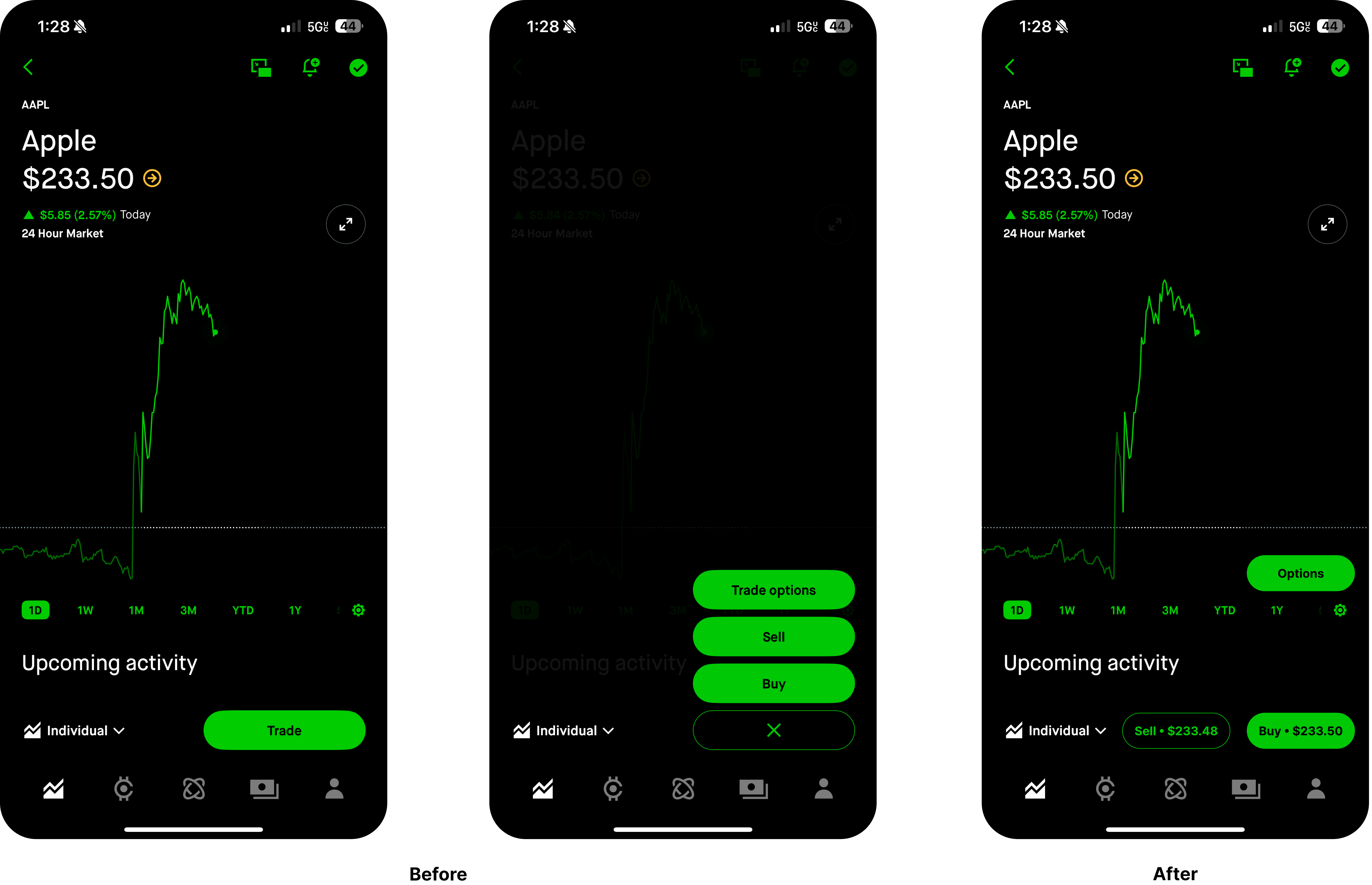
To improve clarity and usability, the redesign replaces the single Trade button with three distinct buttons: Buy, Sell, and Options. This removes ambiguity around the word “trade” and provides natural mapping by directly associating each button with its respective action. Additionally, each button also dynamically displays the bid or ask price, updating in real time with stock movements, reinforcing feedback and discoverability.
Robinhood’s original Trade button effectively utilized perceptual affordances through dynamic color shifts—green when the stock is up, red when it’s down—to provide a quick visual cue about market performance. However, because all trade actions were housed within a single dropdown, users experienced cognitive friction as they were forced to take an extra step to access Buy, Sell, or Options. This disrupted flow and increased the Gulf of Evaluation as users had to confirm they had selected the correct option before proceeding.
The new system applies structured visual hierarchy to maintain clarity and improving signifiers. The Buy button fully adopts the stock’s market performance color, reinforcing perceptual mapping while maintaining clear affordance for action. The Sell button, in contrast, remains outlined, preserving visual distinctiveness without diluting the clarity of the action it represents. By clearly separating status indicators from actionable elements, this redesign enhances system image consistency, reduces cognitive load, and improves error prevention, ensuring a more intuitive and efficient trading experience.

Additionally, the example below demonstrates how Robinhood can leverage micro-interactions—such as an odometer effect—to enhance perceived affordance and reinforce real-time feedback on bid and ask price updates. This subtle yet effective design choice improves situational awareness, ensuring users remain attuned to market fluctuations without disrupting their workflow.
Portfolio
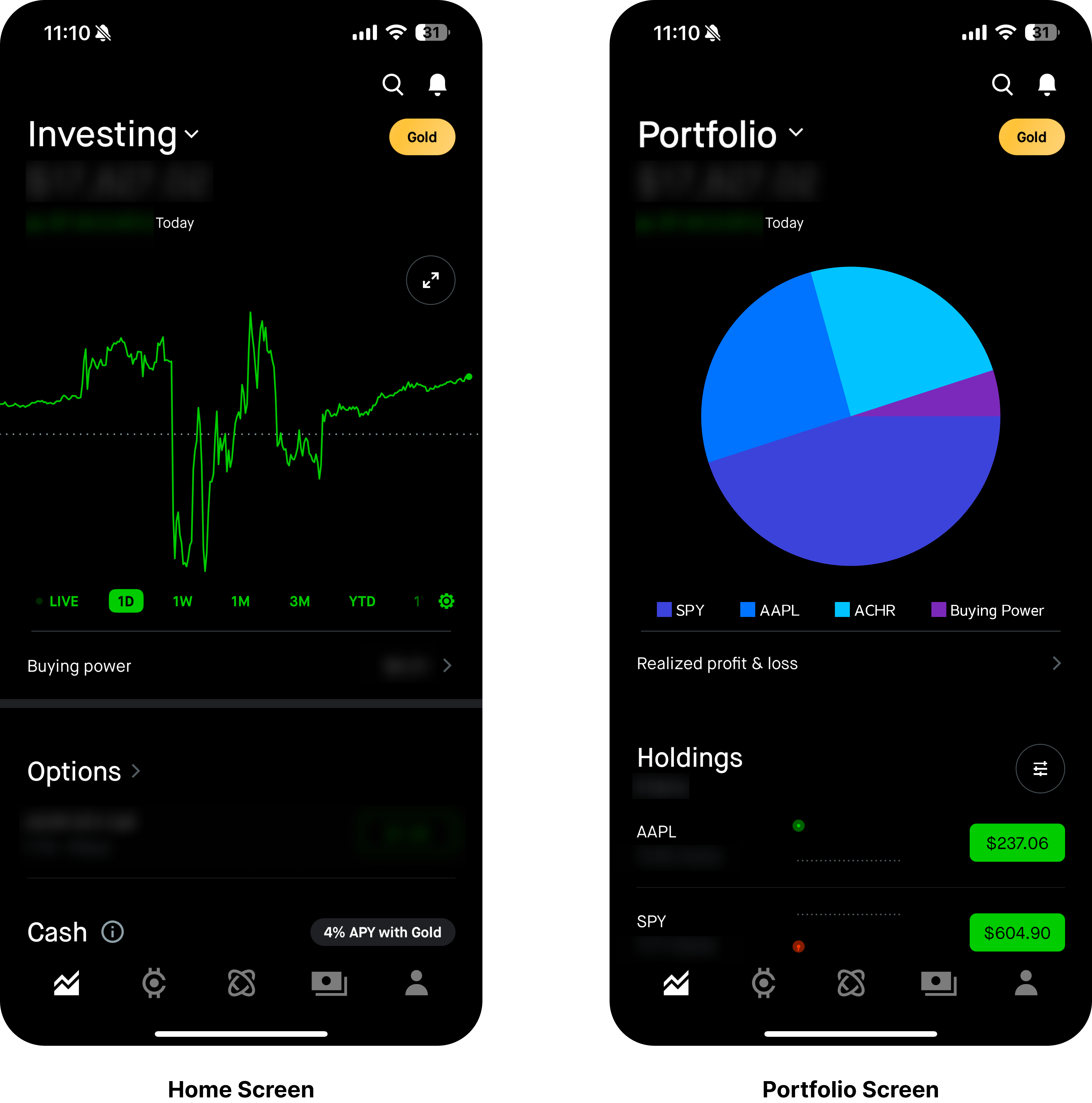
Robinhood’s Portfolio Screen is a key interface for tracking investment performance, offering an intuitive and visually engaging way to view portfolio trends. The interactive graph with micro-interactions and real-time updates, enhances discoverability and provides users with a sense of immediacy and control. By allowing users to switch between different timeframes (e.g., 1 Day, 1 Week, 1 Month), the chart effectively supports quick, high-level decision-making.
However, the Gulf of Execution becomes apparent when users attempt a more in-depth analysis. The absence of a custom time range selector creates a mismatch between the user’s mental model and the system’s constraints, limiting flexibility for those who want to analyze specific timeframes. Additionally, while the chart provides a snapshot of portfolio performance, it lacks a clear signifier for asset allocation, making it difficult for investors to assess their diversification without navigating to other sections of the app or external platforms. This introduces cognitive friction, as users must manually piece together information rather than having it readily available.
To bridge the Gulf of Execution, the design could incorporate a custom date range selector, granting users more control over their historical performance analysis. Furthermore, integrating an expandable portfolio allocation pie chart would provide immediate feedback on diversification, reinforcing natural mapping and reducing the need for external tools. By enhancing information architecture and aligning with users’ perceptual affordances, Robinhood can make its Portfolio Screen not only visually engaging but also more actionable and intuitive for investors of all experience levels.

Conclusion
Robinhood’s commitment to simplicity and accessibility has made it a powerful tool for investors, but more refinements can enhance usability and decision-making. By breaking down trade actions into distinct buttons, improving the Portfolio Screen with deeper insights, and streamlining navigation, Robinhood can continue evolving to meet the needs of both novice and experienced investors. These improvements will reinforce the idea that Robinhood is an intuitive and seamless financial platform.
