A Frustrating First Impression:Why Stomper’s Design is Driving Users Away ? At its core, Stomper has an exciting and creative premise. It transforms walking, an otherwise mundane activity, into something playful and interactive. But the frustrating registration process, unclear interface, and rigid game mechanics create unnecessary friction that discourages users before they can even enjoy .
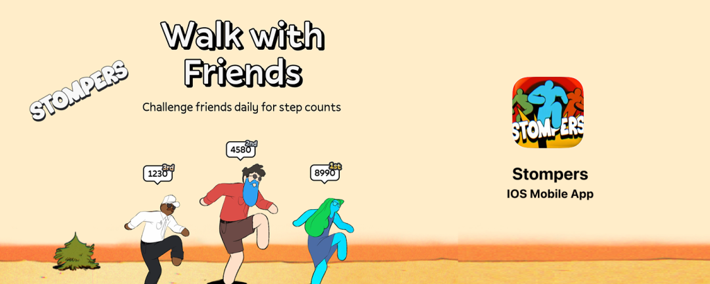
This app is listed under the Health & Fitness category in the Apple Store. Its download page clearly communicates its identity and functionality: tracking steps, walking and interacting with friends in a virtual space, a gamified interface and mechanics, and the thrill of both pranking and being pranked. By adding a playful dimension to walking, the app aims to encourage a more active and healthier lifestyle.
However, I almost quit within the first minute.
I can’t help but wonder—if I had access to their backend data, would I see a pattern of users quitting the very next day? It wouldn’t surprise me in the least. After my experience, I’ve identified three key reasons why this might be happening: the painful registration process, the confusing main interface, and an innovative yet overly rigid game system.
The Painful Registration Process
I was drawn to this app because of its promise of fun interactions and humorous gameplay, as showcased on its promotional page. At first glance, it seemed like a lighthearted, engaging experience designed to make walking more enjoyable. But within moments of opening the app, I hit an unexpected roadblock—the registration process.

Before I could even access the core features, I was required to add three friends. The process wasn’t just a suggestion; it was a mandatory step. Worse, the way to add friends was far from seamless. I had to send a link through private messages or social media, and my friends needed to register and send the link back to me before we could even appear on each other’s interfaces. This process had to be repeated three times before I could proceed.
I sent out five links. My friends were confused. Each of them asked, “What is this? Why do I need to register? How many steps are involved?” And the truth was, I didn’t know the answers myself.

A good user experience should align with user goals and expectations. When people download a new app, they want to explore its features first, then decide if it’s worth investing more time and effort. However, Stomper forces users into an immediate social investment before they’ve even had a chance to understand what makes the app enjoyable. Worse, there’s no option to skip this step, leaving users stuck in an awkward limbo.
This frustrating onboarding process is a textbook example of the Gulf of Execution and Gulf of Evaluation—two critical UX failures that create unnecessary friction for users.
From the perspective of the Gulf of Execution, the app’s design fails to align with the natural goals of a new user. When someone downloads an app like this, their primary intent is to experience the virtual walking, playful interactions, and gamified challenges. Instead, the app forces them to complete an unrelated and complex social task—adding three friends—before they can even explore its features. This not only interrupts the user’s flow but also creates a barrier to entry that feels frustratingly artificial. The friend-invitation process itself is overly complicated: sending links through external platforms, waiting for friends to complete registration, and hoping they remember to send the link back. There is no clear indication of how long this will take or how many steps are involved, leaving users in an awkward state of limbo. The inability to bypass this process only amplifies the frustration.
The Gulf of Evaluation makes things even worse. The app provides almost no feedback on the user’s progress. After sending an invitation link, there is no confirmation on whether a friend has registered, no indication of how many more people need to be added, and no estimate of when the process will be complete. Users are left guessing, unsure whether they should wait, resend links, or give up entirely. Beyond the functional confusion, this design choice also creates an emotional burden. Users are forced into an awkward position, repeatedly explaining the app to friends while not fully understanding it themselves. Instead of fostering excitement, the onboarding experience makes the product feel like a chore—an obligation rather than an invitation to play.
The most obvious solution would be to allow users to skip this step entirely. A simple “Skip” button would let users enter an Individual Mode, where they could explore the app’s features without immediately requiring social interaction. Once users develop a sense of enjoyment and engagement, they would naturally feel more inclined to invite friends, making the social aspect feel organic rather than forced.
At the same time, the app needs to provide clearer guidance and feedback during the friend invitation process. Users should always know exactly where they stand—how many invitations have been accepted, how many more are needed, and what steps are left. Simple indicators like “waiting for confirmation” or a way to provide feedback when a friend is not interested would remove much of the uncertainty. Additionally, small onboarding tooltips or guided tutorials could make the process feel smoother and less overwhelming.

Beyond fixing these immediate issues, the app should also reconsider its reliance on personal contacts for social engagement. One of the fundamental strengths of social media is its ability to connect people beyond their existing circles. Instead of requiring users to bring their own friends, the app could introduce public challenges—community-based events where users can compete or team up with strangers. This would allow new users to engage with the app’s social elements without needing to convince their friends to sign up first. By encouraging spontaneous, low-commitment interactions with other users, the app would create a much more welcoming experience.
The Confusing Main Interface
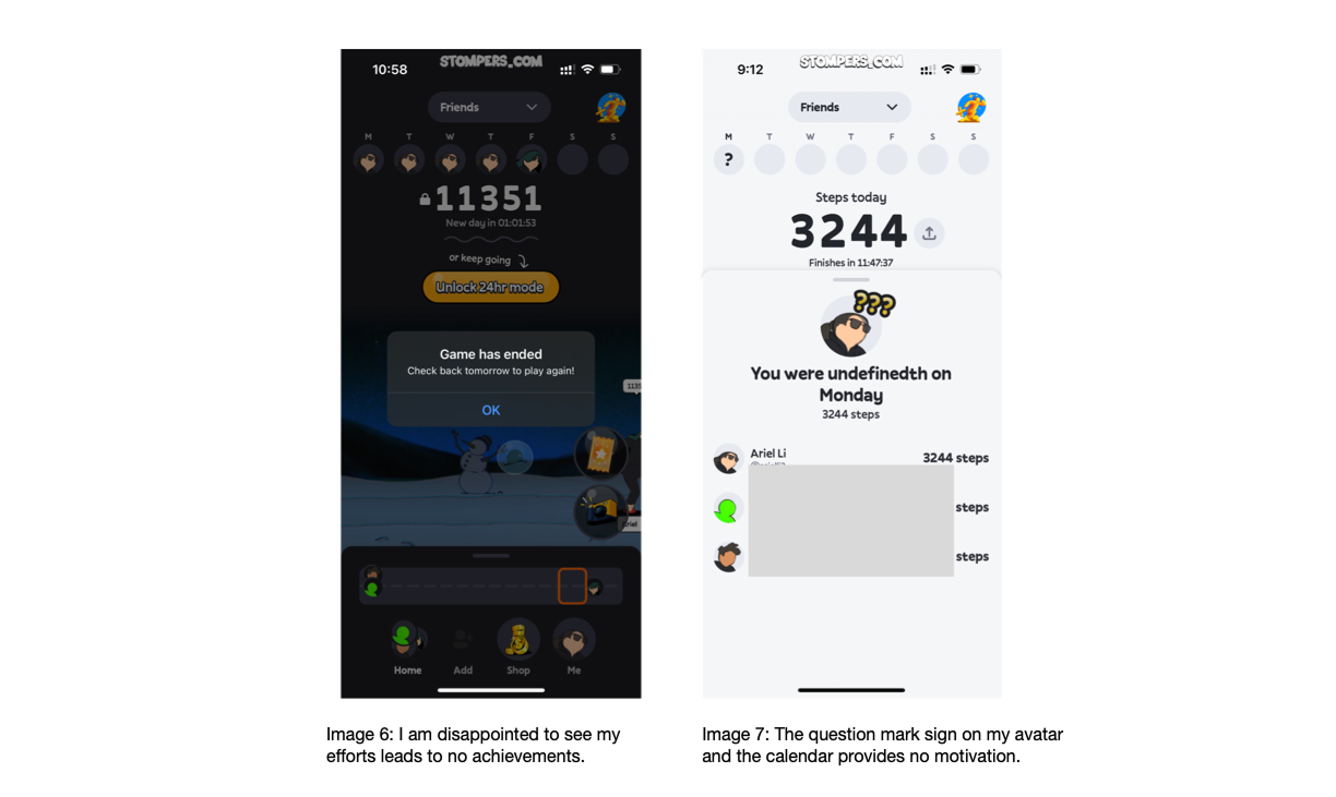
Unless all your friends are avid health enthusiasts, your experience upon entering the app might be just like mine—standing at the starting line, surrounded by equally clueless friends. I found myself staring at the screen, unsure of what to do next. Where are the available tools? How do I use them? Is there anything to do beyond browsing the shop and upgrading my character? The interface doesn’t make it clear.
This is a classic case of poor signifiers, as described by Don Norman in The Design of Everyday Things. Signifiers are meant to guide users by indicating possible actions and interactions within a system. In this app, however, the signifiers are weak or entirely absent, leaving users uncertain about how to engage with the platform’s core features.
For example, when I first entered the interface, I expected some kind of onboarding or visual cues to introduce me to the gameplay mechanics—perhaps glowing icons, highlighted buttons, or a short tutorial. Instead, I was met with a static screen that provided no immediate clues about what I was supposed to do. The presence of a shop and an upgrade page suggests that tools and abilities exist, but there’s no indication of where to find them or how they function. The lack of visibility forces users into a trial-and-error approach, which can be frustrating and discouraging, especially for first-time users.
The usability issue here isn’t just about confusion; it’s about engagement. Without clear signifiers, users don’t know how to interact with the app’s key features, which can lead to them abandoning it altogether. If the goal is to create an enjoyable and social walking experience, the interface should actively encourage exploration and interaction rather than leaving users stranded at the starting line.
A more intuitive approach would be to incorporate stronger visual cues and progressive onboarding. For instance, interactive tooltips could guide users through their first session, briefly explaining how to use power-ups or challenge mechanics. Important interactive elements—such as available tools or ongoing challenges—should be made more visible through distinct icons, animations, or labels that clearly communicate their function. By improving the discoverability of key features, the app would reduce user frustration and create a more seamless and engaging experience.
Right now, the app has an exciting concept, but its design fails to properly introduce users to its unique mechanics. Without clear signifiers, it’s like being handed a game controller without any explanation of what the buttons do. And when that happens, most people won’t spend time guessing—they’ll just put the controller down.
The Strict Game Rules
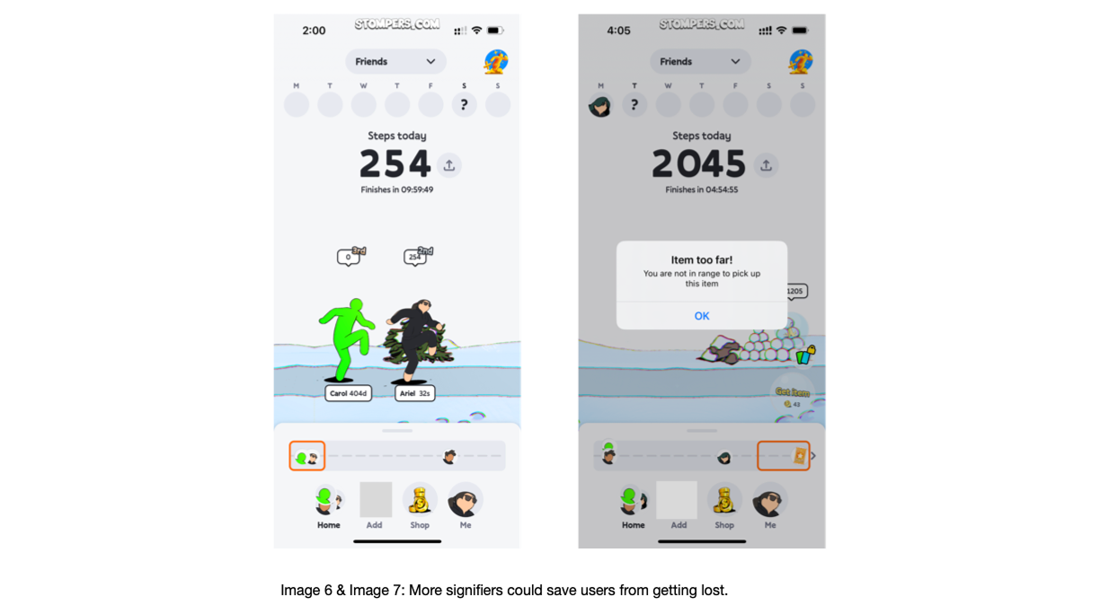
Unless you constantly check the app and monitor whether you’ve reached the range to collect tools, you’ll walk away empty-handed. One evening, as I lay in bed, I opened the app, curious to see what I had earned from a full day of walking. The answer? Nothing. Even though I had passed by various in-game tools, I didn’t have the app open at the exact moment I reached them, so I lost my chance to collect them entirely.
You might suggest a simple fix—just enable notifications! That way, I’d be alerted when I’m near a tool and never miss an opportunity. But here’s the problem: notifications in Stomper don’t serve as gentle nudges; they become overwhelming and repetitive, eventually leading to “learned helplessness.”
Don Norman describes learned helplessness as a state in which people, after repeated failures or frustration, give up on trying to interact with a system. In this case, Stomper’s notifications are so frequent and generic that users quickly stop paying attention to them. Instead of being meaningful reminders, they become white noise—just another ignored message in an already crowded notification tray. When alerts pop up too often, without clear urgency or relevance, they fail to engage users in a meaningful way.
Beyond the notification issue, the core game mechanic itself is flawed. The real-world experience of walking doesn’t align with the app’s interaction design. The expectation that users must keep the app open at all times to collect tools is unrealistic and inconvenient. Walking is a passive, background activity for most people—they listen to music, chat with friends, or simply enjoy their surroundings. Forcing them to constantly check their phone disrupts that experience and adds an unnecessary layer of friction.
A more user-friendly approach would be to introduce retroactive collection mechanics. Instead of requiring users to actively claim tools at the exact moment they pass them, the app could log the tools they encountered throughout the day and allow them to collect them later. This way, users wouldn’t have to stay glued to their screens while walking but could still reap the rewards of their activity when they choose to check in.
The current system punishes users for not interacting with the app in a rigid, predefined way—one that doesn’t align with natural human behavior. If the goal is to encourage movement, engagement, and fun, the experience should be designed to fit seamlessly into users’ lives, not demand constant attention. Otherwise, the frustration of missed opportunities will outweigh any enjoyment, and users will simply stop playing.
Final Thoughts: A Promising Idea Undermined by Poor Execution
At its core, Stomper has an exciting and creative premise. It transforms walking—an otherwise mundane activity—into something playful and interactive. But the frustrating registration process, unclear interface, and rigid game mechanics create unnecessary friction that discourages users before they can even enjoy what makes the app unique.
The good news? These problems are fixable. By allowing users to skip the friend-invite requirement, improving interface signifiers, and making game mechanics more flexible, Stomper could become the engaging, social fitness experience it was meant to be. But until those changes are made, it risks losing users before they even take their first step.