Strava is a fitness tracking app offering seamless activity logging, route mapping, and social engagement, For this critique, I will examine the experience of a first-time user recording and uploading a run and assess it through Don Norman’s design principles from The Design of Everyday Things.
Starting A Run
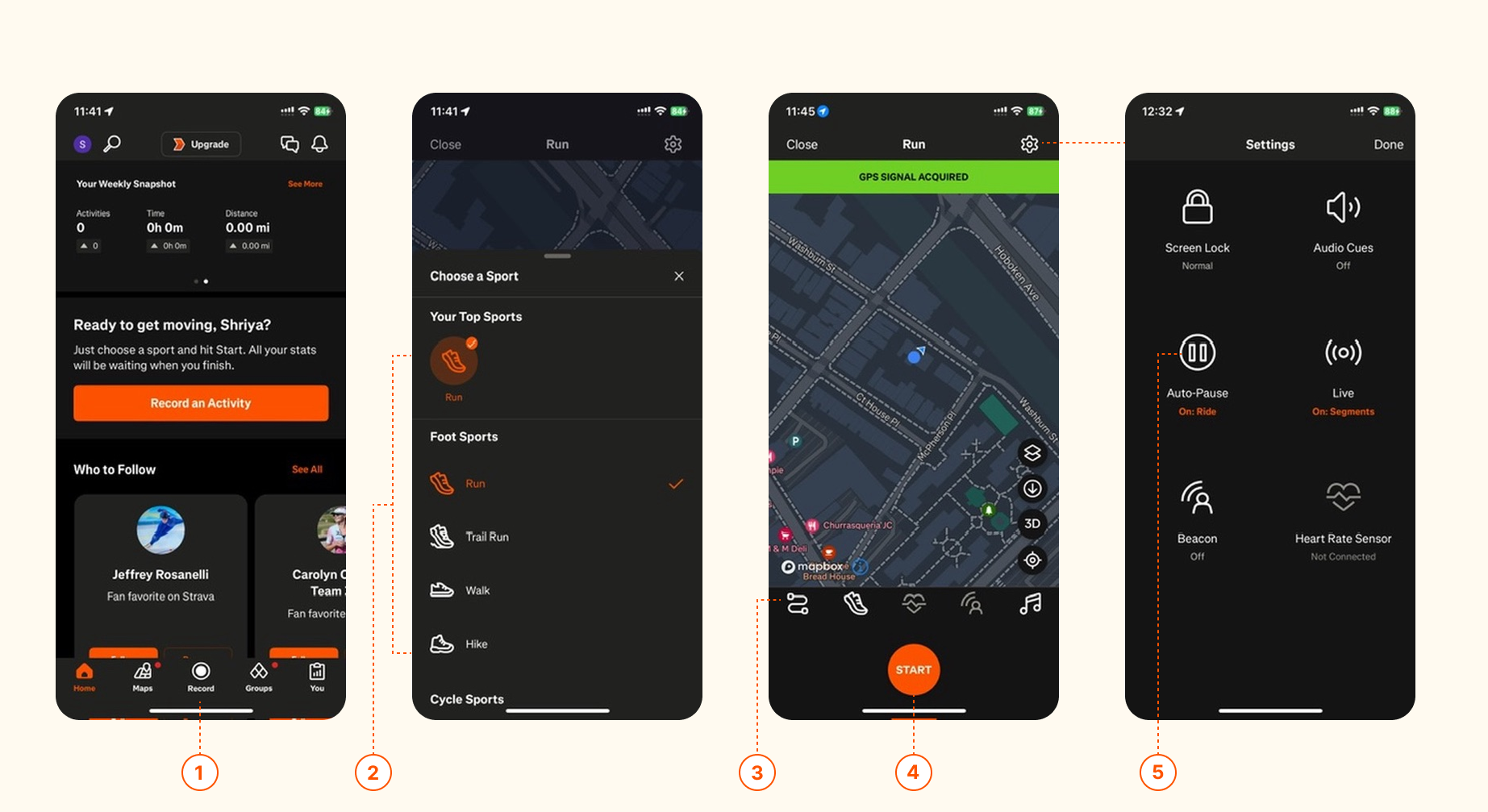
(1)(4)When a first-time user opens Strava, they are immediately presented with a large, central “Record” button, which serves as a clear affordance, signaling that this button is used to start an activity.
(2)Additionally, the Choose a Sport option allows users to select their activity using intuitive icons (e.g., a shoe for running, or a bike for cycling). This aligns with natural mappings, reducing cognitive load and making the process of selecting an activity straightforward and efficient.
(3)However, some icons (e.g., settings, map, shoe) lack labels, making their functions ambiguous. This could confuse first-time users and cause hesitation when interacting with them. Users must experiment with icons to understand their functions, increasing the effort required to start a run. This creates a gulf of execution, the users know what they want to do (start tracking a run), but the interface doesn’t make it obvious how to do it efficiently.
(5)First-time users might not realize that auto-pause is off by default. Important settings (like GPS accuracy, auto-pause, and activity type) are hidden behind icons that don’t clearly indicate their purpose. This leads to poor discoverability and users might not realize they need to configure them before starting a run.
By adding labels or tooltips for icons (e.g., “Map,” “Settings”), users are provided with clearer signifiers, reducing ambiguity and improving discoverability. Using more intuitive signifiers such as replacing the generic shoe icon with text like “Run”, ensures that users immediately understand the selected activity type. This helps bridge the gulfs of execution and evaluation, as users can quickly recognize available actions, anticipate outcomes, and confirm they are on the right track.
Recording A Run

(1)Strava’s swipe gestures for toggling between stats align with natural mappings, making it intuitive. The real-time feedback on pace, distance, and duration keeps users informed.
(2)If the user forgets to manually stop or start the activity, the app may stop recording or continue recording indefinitely, leading to false data. By offering smart auto-stop when prolonged inactivity is detected, Strava can help prevent inaccurate activity logs and reduce user errors.
Uploading A Run
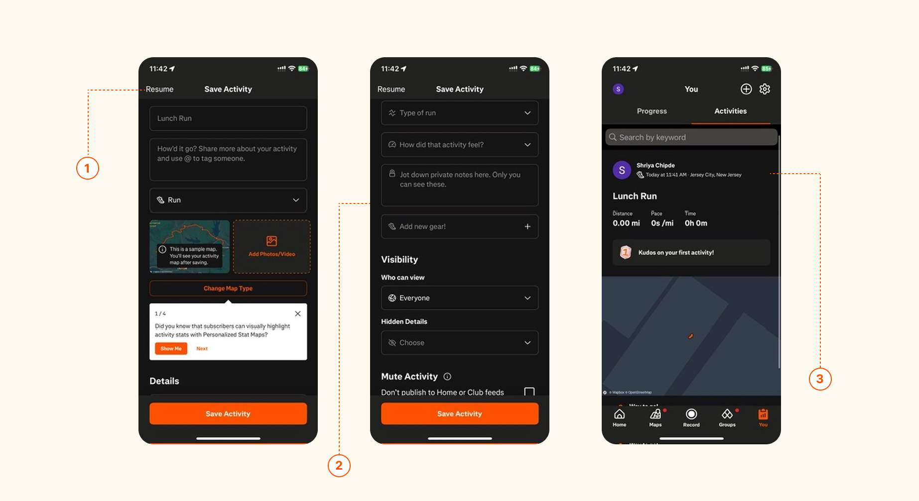
(1)Strava’s interface lacks clear signifiers distinguishing the options for saving or discarding a run, which can lead to users accidentally exiting without saving their progress. By adding clearer signifiers, such as color-coded buttons with explicit labels like “Save” and “Discard,” users will better understand the actions and consequences. This improvement would bridge the gulfs of execution and evaluation, allowing users to recognize what they can do, and what will happen, and confirm they are making the right choice.
(3)The app provides immediate feedback after a run, presenting a summary screen that highlights key stats such as distance, pace, and time. (2)Allowing users to add a title, description, and photos before uploading reinforces Strava’s identity as a social fitness platform, where users can share and interact with their workouts in a community-driven environment. This feature supports affordances by providing cues that users can share and personalize their experience.
Conclusion
In conclusion, Strava offers a solid user experience but could benefit from refining certain design aspects. By improving icon clarity, enhancing the discoverability of settings, and providing clearer feedback during key actions, the app could better align with Don Norman’s principles of intuitive design. These adjustments would reduce cognitive load, prevent errors, and enhance the overall user journey, ensuring a more seamless and enjoyable experience for both new and experienced users.