StubHub is an online secondary ticket marketplace. The platform provides ticket resale and purchases for a wide range of live events, including concerts, music festivals, sports events, etc. Users can conduct transactions through both its official website and mobile application. In this blog post, I will analyze and critique the APP version of StubHub.
Attribute 1: Selling Tickets
As a secondary ticket marketplace, StubHub’s user experience in the selling ticket process is crucial. This analysis focuses on its selling process.
Good Design
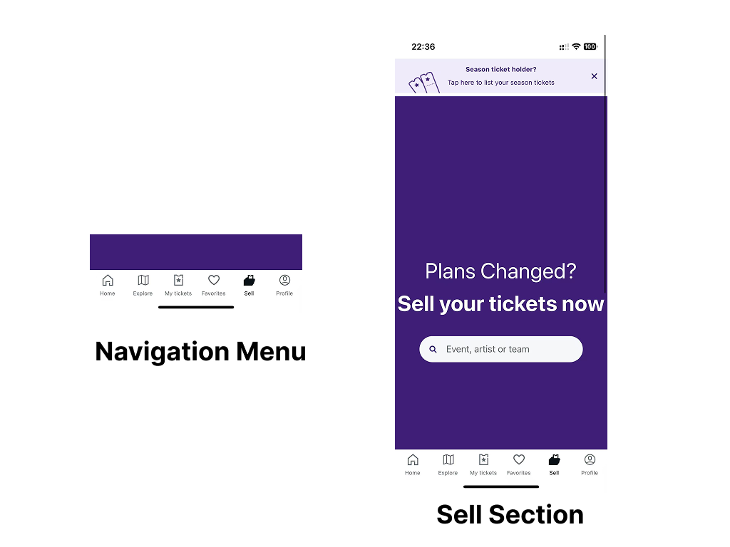
First, users can easily access the “Sell” page from the bottom navigation menu on the homepage, ensuring strong discoverability. Upon entering the page, the interface prominently features an interactive search bar in the center, while the surrounding purple area naturally guides users to input the event name as the next step.
During the ticket information input process, selected buttons change from grey to purple, providing clear visual feedback, helping users confirm their selections and proceed smoothly. Additionally, StubHub pre-selects common options in certain steps, using “Knowledge in the World” to supplement “Knowledge in the Head”, thereby reducing memory load and improving efficiency.

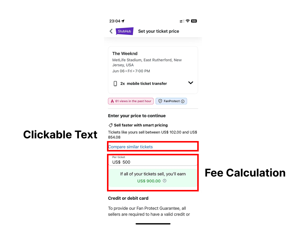
When setting ticket prices, clickable texts are highlighted in blue, serving as signifiers to indicate interactivity. Moreover, after users enter their desired selling price, the system automatically calculates the final amount they will receive after fees, marking this figure in green. This dynamic feedback, combined with effective mapping, reduces the Gulf of Evaluation, allowing users to instantly understand their earnings without extra calculations.
Bad Design
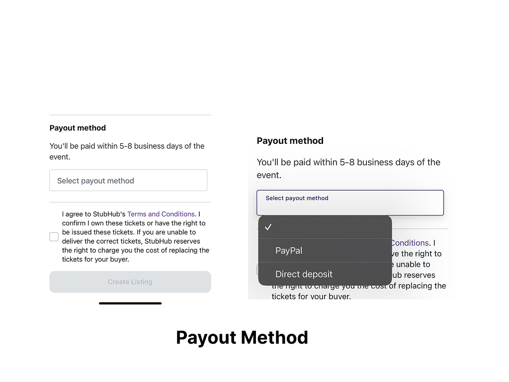
However, in the Payout Method selection, the interface only provides a text box labeled “Select Payout Method,” lacking a clear signifier to indicate that it is a dropdown menu. Some users may mistakenly assume this option is fixed. To improve this, adding a dropdown arrow icon on the right side of the text box would make it visually clear that additional options are available.
Attribute 2: Seating Map
A seat map is often the ultimate test of a ticketing platform’s UX quality. Data visualization in this interface directly influences how users comprehend prices, venue layouts, and seating availability
Good Design
StubHub’s Seating Map demonstrates effective use of Signifiers in its color-coded seat selection. The platform highlights available sections in light purple, allowing users to quickly identify interactive areas without additional explanations. When a section is selected, its color shifts to a more saturated purple, providing clear feedback and reducing the Gulf of Evaluation, ensuring users immediately recognize their chosen section.
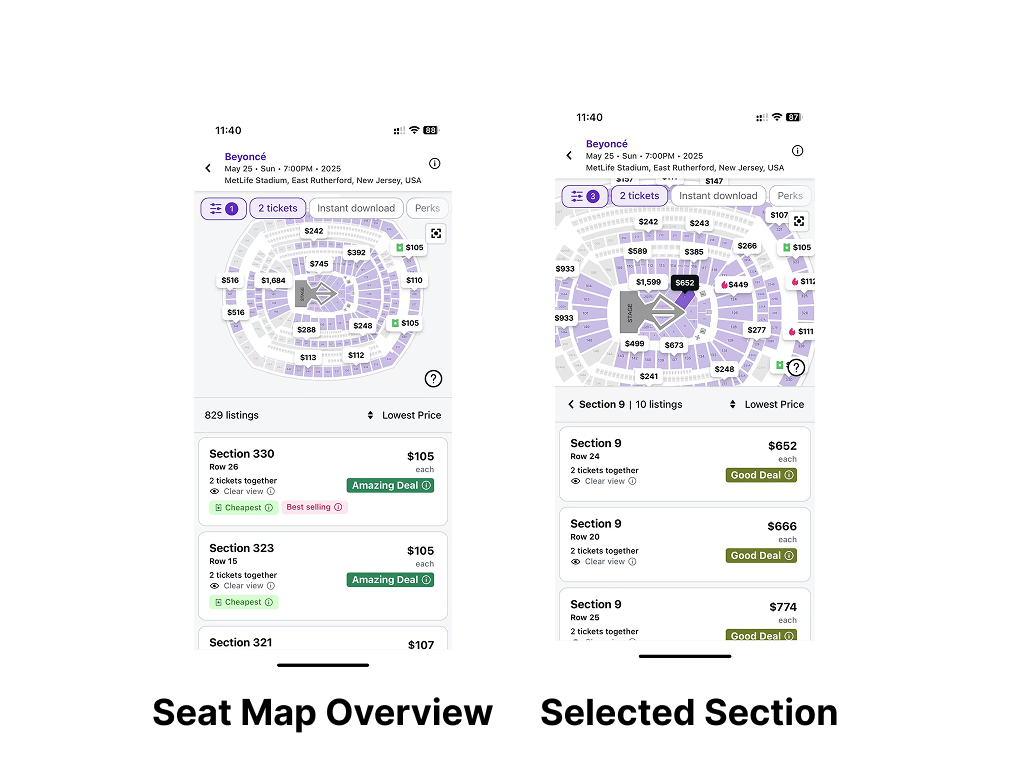
Additionally, StubHub’s Natural Mapping design connects the upper Seating Map with the lower ticket price list, dynamically updating ticket prices when a section is selected. This mapping helps users intuitively understand the relationship between the map and the list, reducing cognitive load and enhancing efficiency.
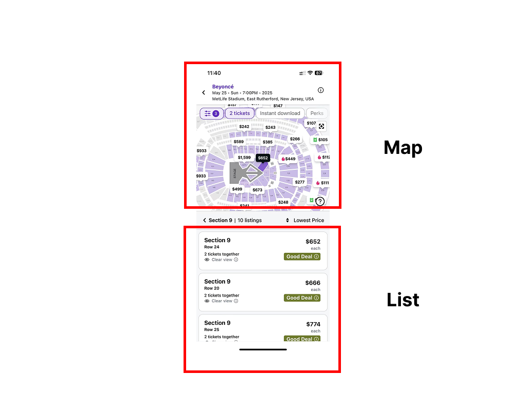
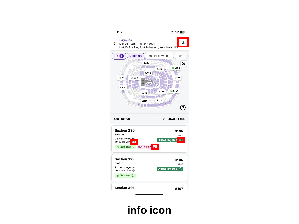
Moreover, StubHub incorporates information icons (Signifiers) within the Seating Map, prompting users to access additional event or seating details. This approach aligns with Norman’s Knowledge in the World principle, allowing users to retrieve necessary information directly instead of relying on memory, thereby reducing cognitive strain and improving the ticket-buying experience.
Bad Design
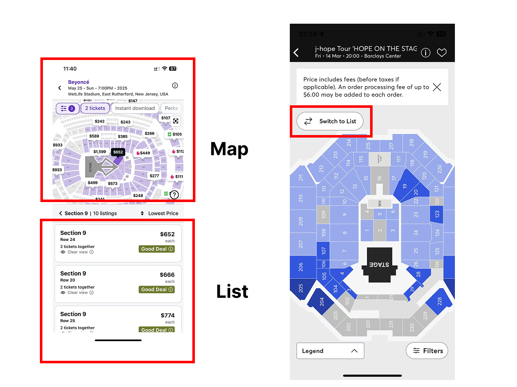
Despite these strengths, StubHub’s Seating Map exhibits UX issues that hinder user interaction and efficiency. Firstly, the lack of a full-screen mode does not align with users’ Mental Models. Many users expect to view seating layouts in full-screen mode for a clearer spatial representation of available seats, but StubHub’s fixed half-screen mode forces frequent scrolling and zooming, increasing the Gulf of Execution and making the selection process cumbersome. To address this, StubHub could adopt a “Switch to Full Screen” button, similar to Ticketmaster’s toggle view option, enabling users to switch seamlessly between map and list views.
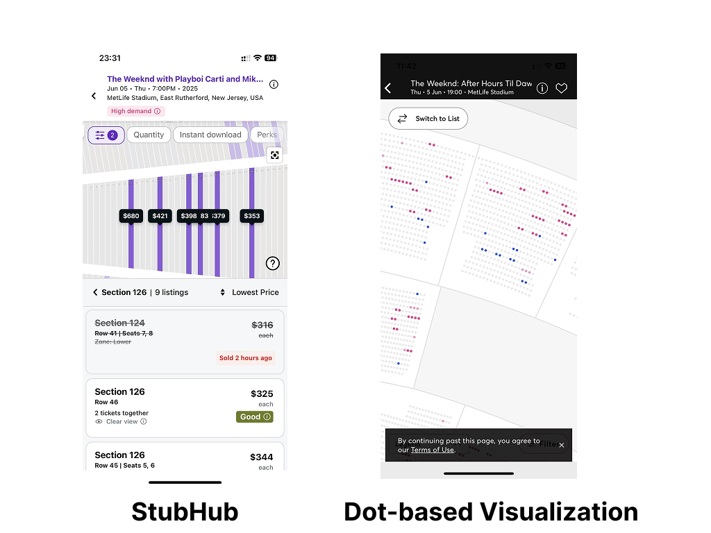
Secondly, the Seating Map does not display specific seat numbers, limiting users to viewing only row numbers when zoomed in. This poor Discoverability prevents users from assessing whether their seat is centrally located or off to the side, making it difficult to ensure adjacent seating for groups. A better approach would be to implement Dot-Based Visualization, as seen in Ticketmaster, where individual seats are represented as dots that users can click on to view detailed seat information, such as seat number, price, and viewing angle.
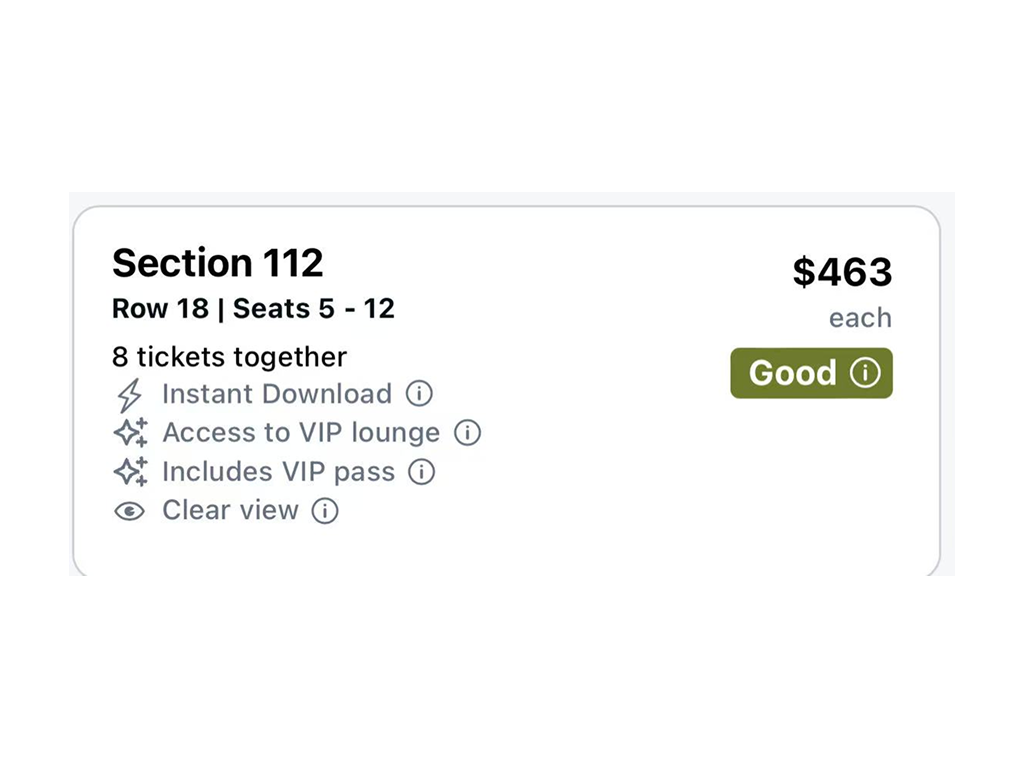
Another usability concern is that the information icons are too small, making them prone to Slips, where users intend to interact with the icon but accidentally tap the wrong element due to poor design. A simple fix would be to increase the icon size by 20-30% or expand the touchable area to improve tap accuracy and reduce mis-clicks.
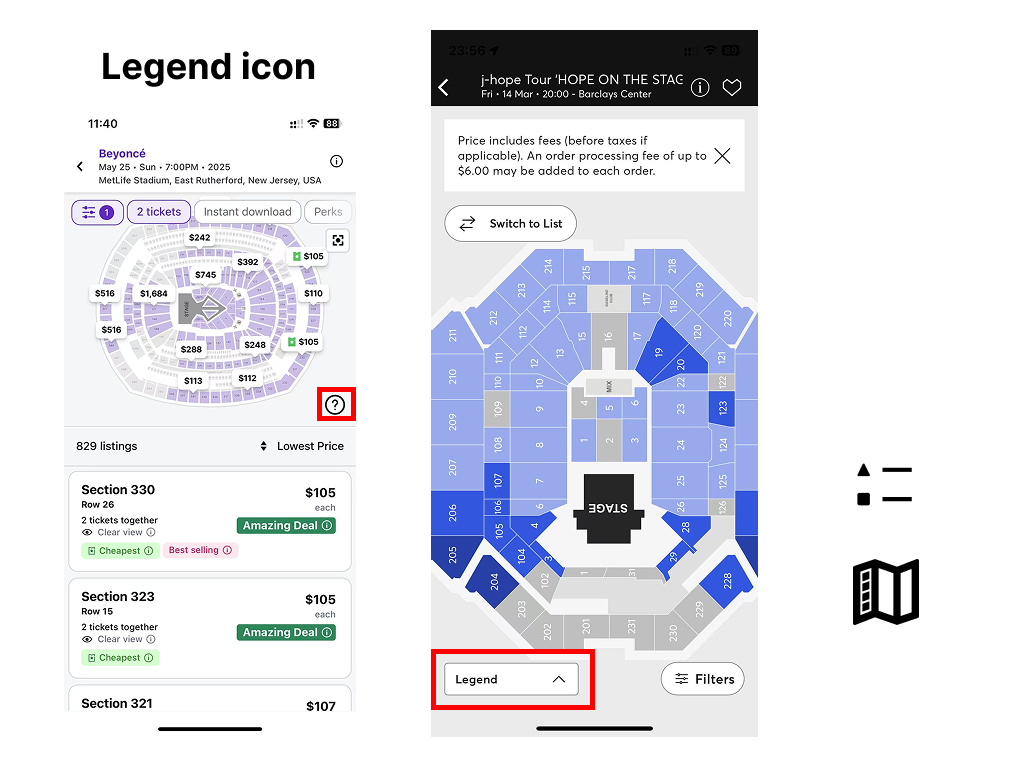
Finally, the Legend icon’s question mark is an ineffective Signifier, as it does not align with users’ Mental Models. Most users associate a question mark with “Help” or “FAQ” rather than a seating legend, leading to Gulf of Execution issues where users must guess its function before clicking. Therefore, this Signifier needs to be optimized. A more intuitive approach would be to replace it with a clearer icon or, as seen in Ticketmaster, use direct text labeling (“Legend”), which would provide better clarity.
Attribute 3: Filtering
Filtering can help users quickly eliminate irrelevant ticket information and narrow down their choices. StubHub’s filtering feature offers several interesting points for critique, both in terms of strengths and areas for improvement.
Good Design
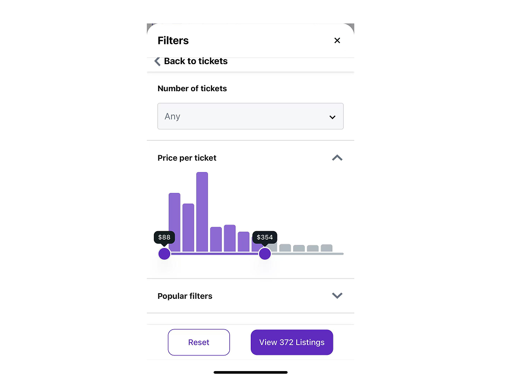
When users drag the price-range sliders, the bar chart above instantly updates to highlight the number of tickets available within the selected range. This immediate visual response demonstrates Natural Mapping: the interface clearly reflects any change in the sliders through a corresponding change in the bar chart.
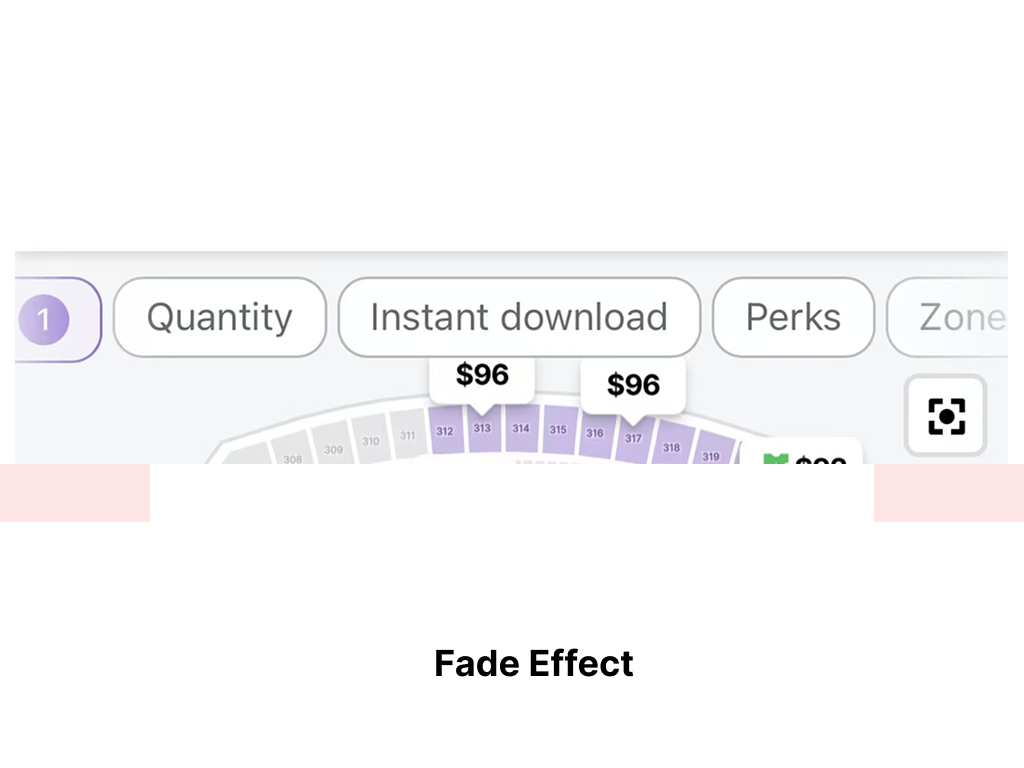
StubHub places a row of filter buttons horizontally on the map interface. To help users realize these buttons can be scrolled left or right, the interface uses a fade effect at the edges. This subtle visual Affordance signals two things: there are more filter options located off-screen, and the row of buttons is scrollable rather than static. Even without explicit arrows or text labels, the fading edges gently prompt users to swipe.
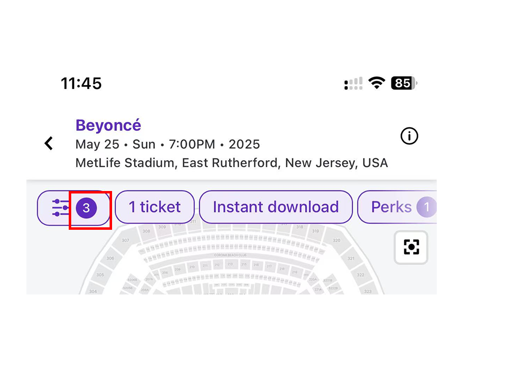
When users apply filters, the selected filter buttons turn purple, and a number on the left side increases to indicate how many filters are active. This provides clear Feedback and maintains Natural Mapping: the interface continuously shows users how many filters have been selected, and which ones are active.
Bad Design
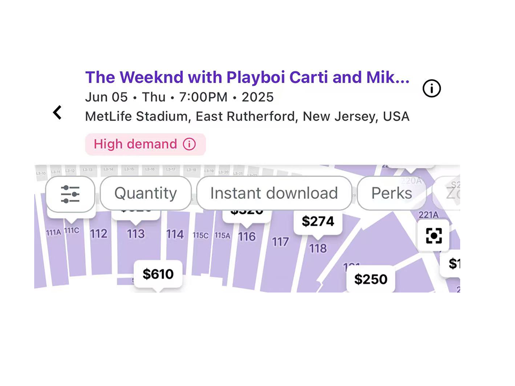
In its current layout, the filter buttons may partially overlap the seating map, obstructing users’ view. This can force multiple scroll or zoom interactions, adding extra steps to the process. It creates a gulf between the user’s goal—examining the seating map—and the system’s provided interaction, as users must work around the obstructive filter panel. My suggest solutions are: Auto-minimize the filter panel when the user scrolls the seating map, reducing visual clutter. Or Provide a “Hide Filters” toggle so users can temporarily collapse the filter section and focus on the map.
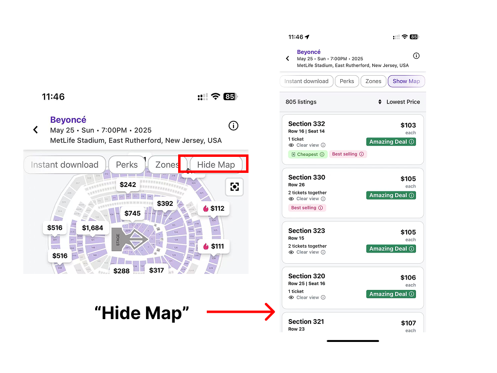
Another issue is the “Hide Map” function grouped with filters. One of the filter features, called “Hide Map,” essentially has the same effect as switching to a list-only view. However, it appears alongside a set of filtering tools, which can be confusing. From a Mental Model perspective, ticket filtering and seat visualization are two distinct functions and should ideally be separated. Combining them in the same menu can lead to user confusion. We could move “Hide Map & Zones” into its own “View Settings” or “View Options” area, for instance in the top-right corner of the screen. This separates it from ticket filtering features, making the interface architecture more logical and intuitive.
Conclusion
Overall, StubHub demonstrates commendable alignment with Norman’s design principles—particularly in its use of clear Signifiers, Feedback, and Natural Mapping—across its selling flow, seat map visualization, and filtering features. However, several areas could benefit from refinements, such as providing a full-screen map view, including more specific seat details, improving icon clarity, and reorganizing filtering tools to better match user Mental Models. Addressing these issues would create a more seamless ticket-buying and selling experience.
