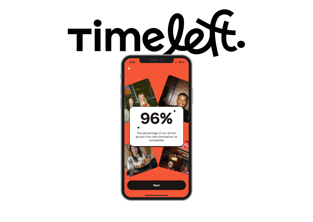
Timeleft is a digital platform where users can book dinners with strangers matched through a personality algorithm. The premise is fascinating: every Wednesday, in cities around the world, curated groups gather over dinner, transforming the awkwardness of first meetings into something potentially meaningful.
As someone who moved to New York City from India, I know the unique challenge of making connections in a fast-paced environment. Timeleft seemed like an intriguing way to meet new people beyond networking events and university circles. But does the app’s design facilitate its ambitious social mission? This critique will take a close look at the app through the lens of Don Norman’s The Design of Everyday Things, where usability, affordances, and feedback shape our interactions with digital experiences.

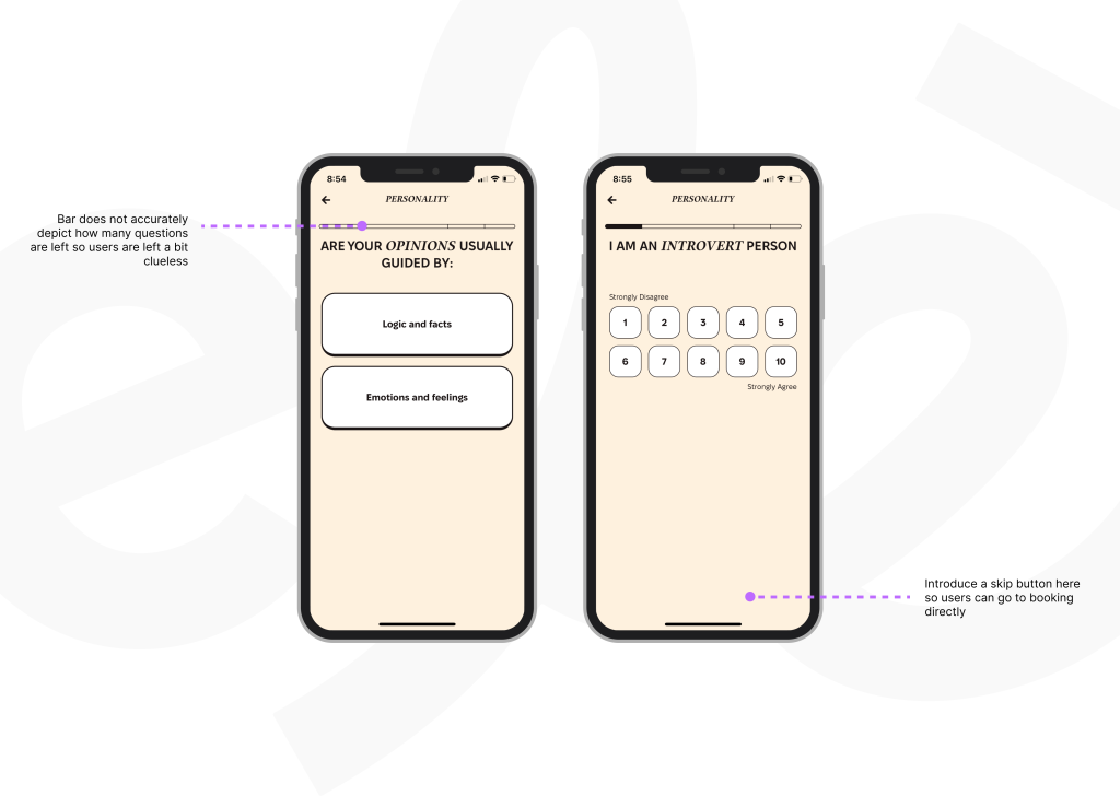
Opening Timeleft for the first time, The sign-up flow is straightforward, guiding users through a personality test that supposedly fine-tunes the matching process. This sounds great in theory but feels unnecessarily drawn out in practice. I found myself stuck in an endless series of questions that seemed to go on forever. There was no option to skip, and it started to feel like a bit of a hurdle before even getting to the fun part.
This friction ties into a key concept called the Gulf of Execution—the gap between what users want to do and how easily they can do it. In Timeleft, the goal is simple: book a dinner and meet new people. However, the lengthy and mandatory personality test increases this gap because it forces users to complete a time-consuming process before they can take the action they came for
Fix? Introducing an option to skip the test or make the test shorter asking only key questions.

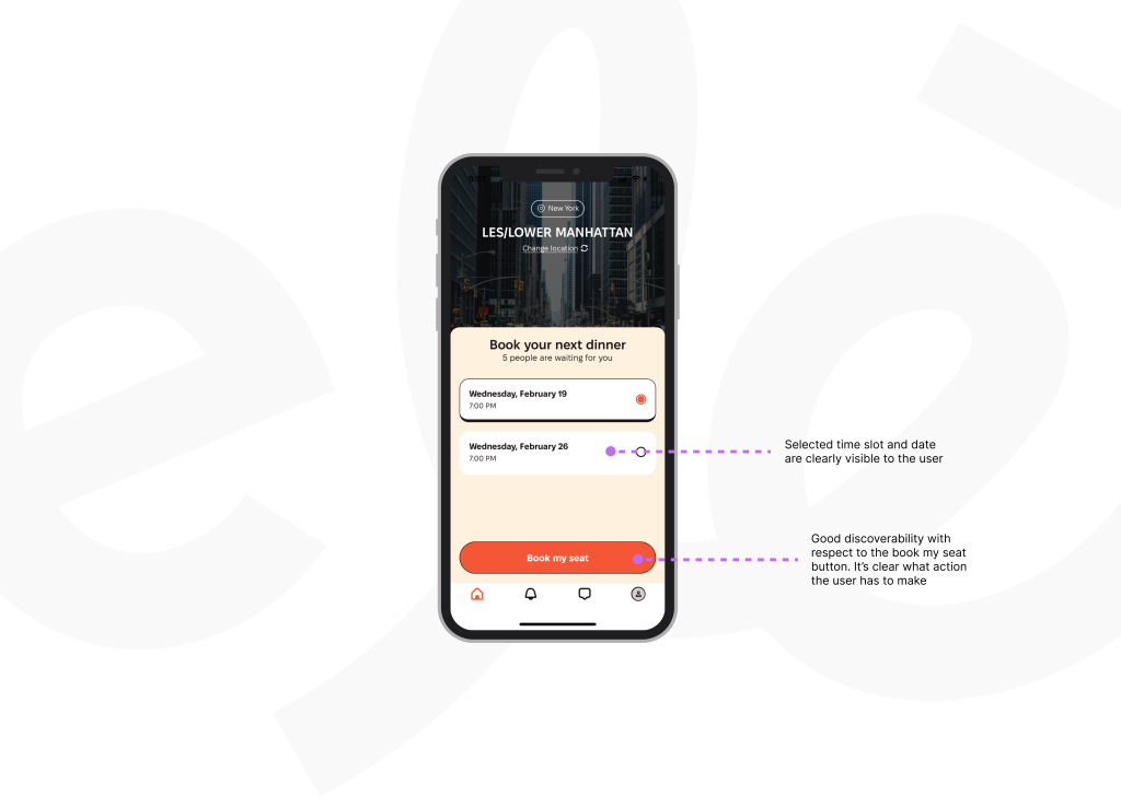
After the onboarding, the user is taken to the home page where discoverability, a key principle Norman discusses, is well executed. The “Book Your Seat” button is prominent, making the primary action unmissable along with the day and date available. However, as I proceeded, I noticed a lack of transparency regarding how the algorithm actually works. Who am I being matched with? What variables are considered? Without clear signifiers, users might feel hesitant, wondering whether they’ll end up at a dinner with like-minded individuals or in an episode of Survivor.
A fix could be introducing a brief explanation of the matching criteria or a “How We Match” section could build user confidence and make the process feel less like a gamble.

Norman emphasizes that a well-designed system should make important information visible and easily accessible, reducing uncertainty and frustration. In the case of Timeleft, one major disconnect lies in trust and reassurance. Meeting strangers for dinner is already an unusual social experience, and new users may feel uncertain about what to expect. Who typically signs up for these events? Have others had positive experiences? What if my group is awkward or unengaging? These are natural concerns, yet Timeleft offers little to ease them. Users are forced to rely on assumptions and guesswork about who typically attends these dinners and whether past participants have had positive experiences. Without visible social proof, such as testimonials, reviews, or event previews, there are no external cues to validate their decision. This lack of information creates unnecessary uncertainty, making the experience feel like a leap of faith rather than a well-supported choice.
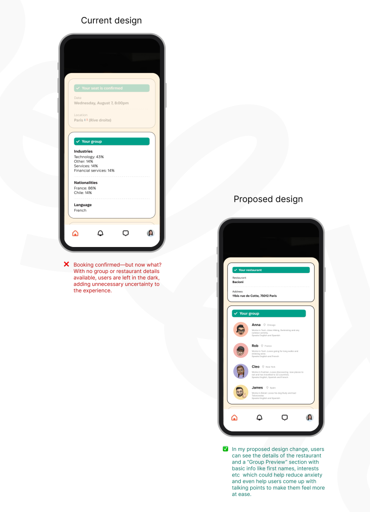
Once the user books the dinner, Timeleft’s design leaves you in suspense until the day before the event when you finally find out who you’ll be dining with. While I understand the element of surprise, it also creates anxiety which is where the importance of feedback comes in—immediate and reassuring cues that let users know where they stand. In Timeleft’s case, feedback is delayed, which could lead to unnecessary apprehension. Users might wonder: What if my group isn’t a good fit? What if I’m stuck in a scary situation.
A fix could be introducing a “Group Preview” feature—revealing basic profiles (first names, interests, a short bio) once your booking is confirmed which could help reduce anxiety and increase the likelihood of users following through with their dinners.

Overall, Timeleft has the potential to make meaningful connections happen through thoughtful design. But, as I experienced, the app’s confusing onboarding process and lack of transparency creates more hurdles than I expected. A few simple improvements, such as giving users the option to skip the personality test and providing clearer feedback throughout the process would go a long way in improving the experience.
Despite its flaws, Timeleft could still serve its social mission well—if users can make it past the initial confusion. But whether or not they do may depend on how much patience they have for an experience that doesn’t always align with expectations.
