The Ulta Beauty app makes shopping enjoyable by enabling users to book salon services, earn and redeem points through the Ultamate Rewards program, and explore and buy beauty products. It has a barcode scanner for in-store discounts, order monitoring, and personalized product recommendations. Beauty shopping is made more convenient and fulfilling by providing users with access to special promos, a store finder, and notifications for sales and discounts.
Barcode Detection
In this application, the barcode scanner feature is not discoverable ( Figure 1 ). The concept of Hidden Affordances is evident here. Although the app lets users scan product barcodes to get reviews and prices, the scanner icon is hidden in a menu, small, and unlabelled. Users become unaware that scanning is a feature when this occurs, which results in poor usability and low demand.
This can be reinforced by having a clear signifier and visibility and mapping. Placing the scanner icon in the account details or main navigation, where users are likely to search for sensitive information, could be one way to address this issue. This makes the function intuitive by improving perceived affordance and matching learnt affordances from other shopping apps.
Banners that seem clickable
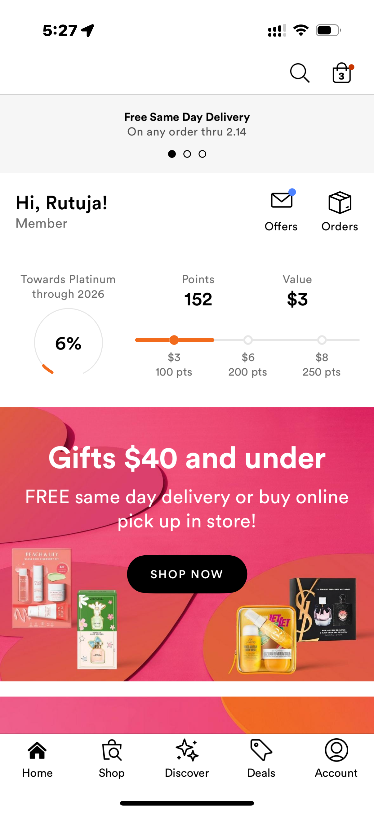
Consumers anticipate that tapping to learn more about a promotion will be possible on big, eye-catching banners. However, it goes against their mental model of interactive user interface elements if a banner is a static image. Here, Norman’s idea of perceived versus actual affordances is applied. This results in false affordance, where users attempt tapping and may believe the app is malfunctioning if they receive no response.
Using clear signifiers to distinguish between interactive and static elements is one way to solve the problem. Proper Signifiers can help with this. To avoid misunderstandings, non-interactive banners should have a clear, flat design without any shadows or hover effects and to make sure that the interactive banners make use of visual clues like the hover effect, which, when clicked, provides a more realistic approach. This will lessen user annoyance by bringing perceived affordance and actual functioning into alignment.
Navigation
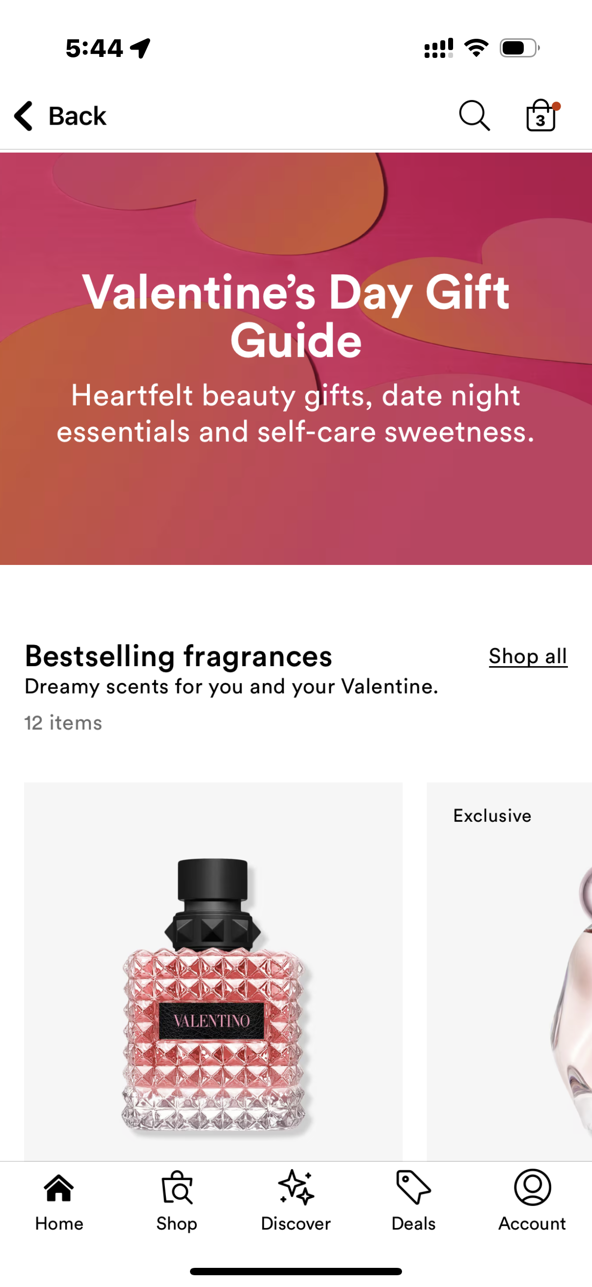
Order tracking is one example of an unintuitive secondary feature placement in the Ulta Beauty app. Some secondary features, like order tracking and past purchases, are hidden under menus rather than being readily available from the home screen or account page. This makes it difficult for users like me to find crucial features, adding to their cognitive load and requiring them to search through several screens. This is one of the concepts of Mapping being poor. ( Figure 3, 4 & 5 )
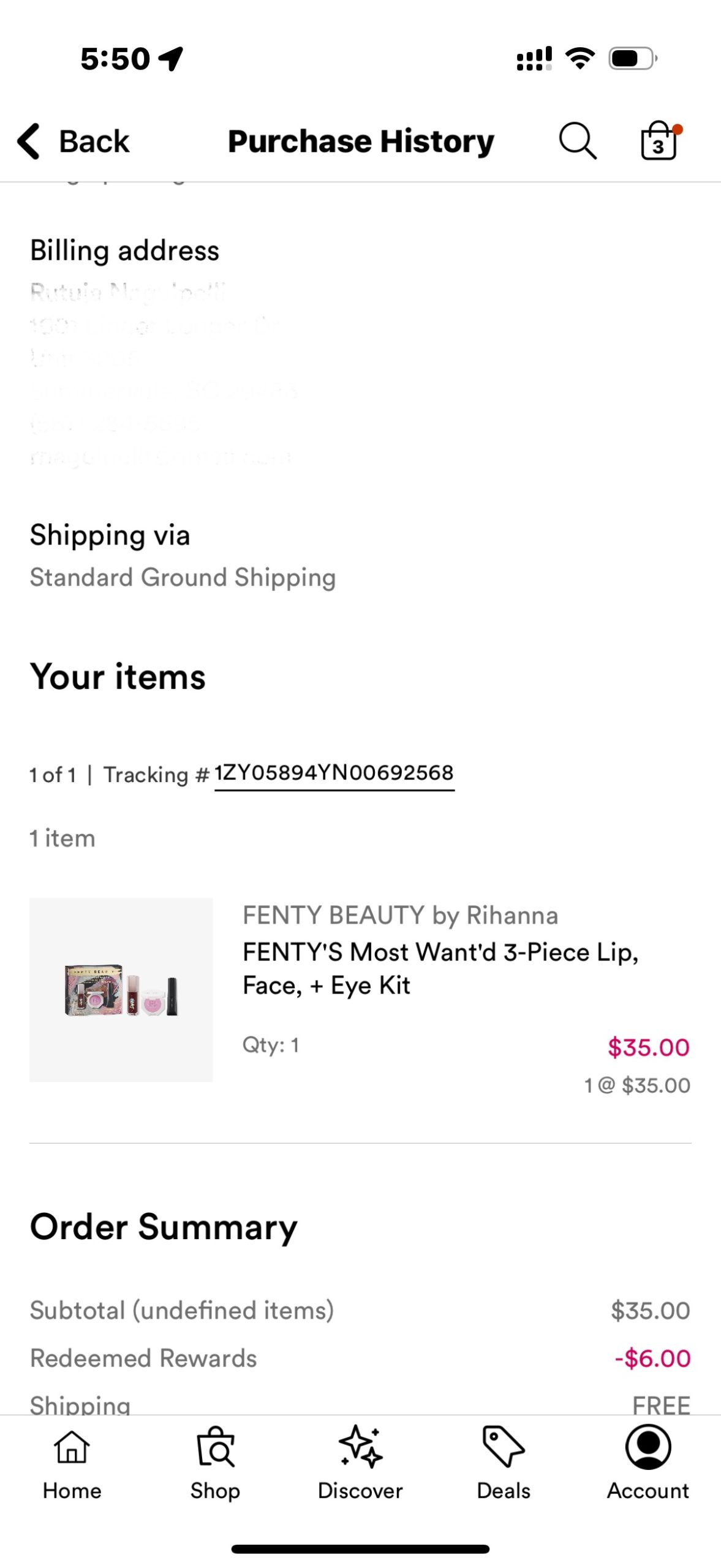
Moving order tracking to the bottom navigation bar under “Account” or providing a clear, labelled button on the home screen, or using progress indicators to inform users that “Your order is arriving in 2 days!” somewhere directly on the homepage for easy access, are some fixes for this problem, which can be resolved by improving conceptual mapping and reducing the Gulf of Execution.
Conclusion
Although the Ulta Beauty app offers a strong online purchasing experience, usability, navigation, and feedback may all be improved by using Donald Norman’s design principles. Usability issues can result in irritation and mistakes due to misleading perceived affordances, hidden features, poor mapping, lack of constraints, and insufficient feedback.
The software can reduce cognitive burden, boost discoverability, and improve mistake prevention by using clear signifiers, better mapping, stronger limits, and immediate feedback. These adjustments will align the app’s design with user expectations, improving the smoothness and intuitiveness of interactions.
In the end, improving the app in accordance with Norman’s ideas will increase user satisfaction and engagement in addition to improving usability, thereby solidifying Ulta Beauty’s status as a top online beauty retailer.