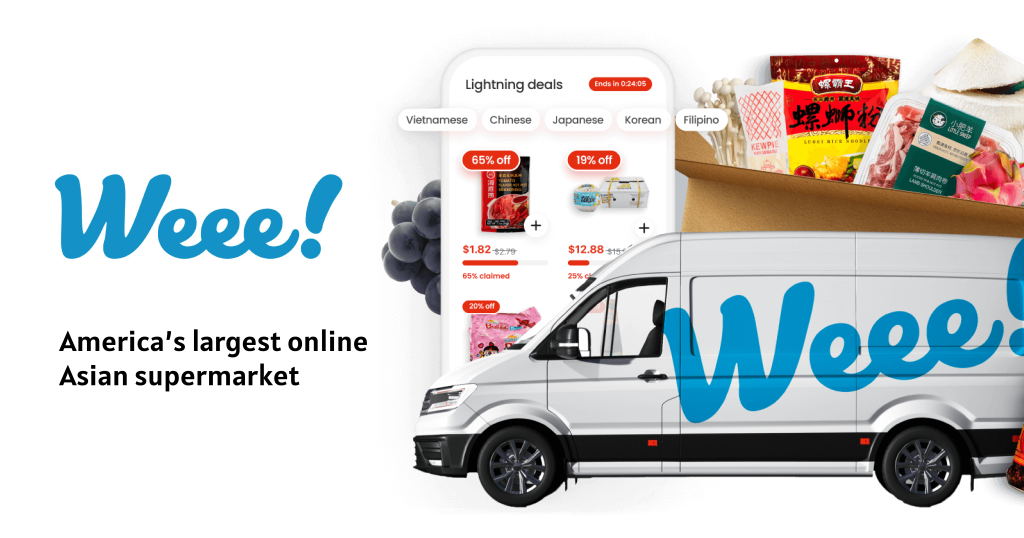
Weee! is an app that sells Asian groceries and products that are unavailable on many American online shopping platforms. Unlike grocery shopping apps such as Amazon Fresh and Instcart, Weee! focuses on providing products for Asian communities within the US and seeks to make Asian food and goods accessible and affordable.
Explore products in various ways
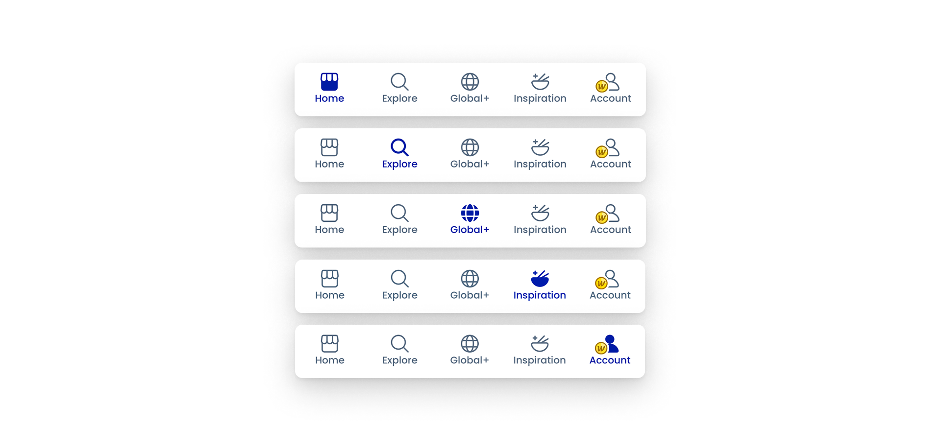
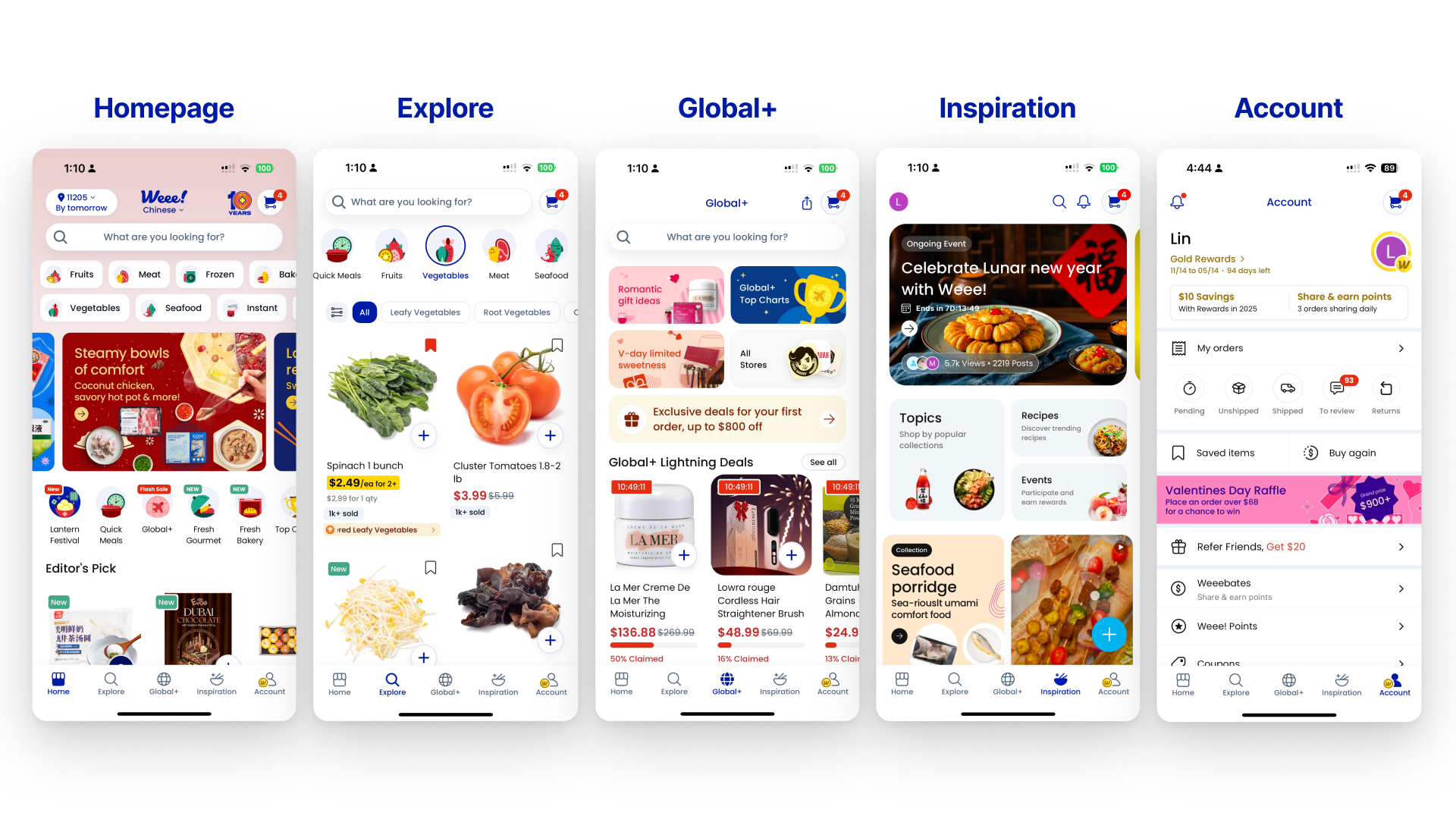
Weee! allows users to explore the products on the mobile app in five different paths. Users can easily switch between the five pages with the bottom navigation bar that uses Natural Mapping. The navigation bar makes the functions match users’ expectations so that users can decide on which is the best browsing method they prefer.
On top of that, providing numerous ways for users to achieve their goals considers different Conceptual Models, which makes this app a Human-Centered Design (HCD).
Add a product to the shopping cart
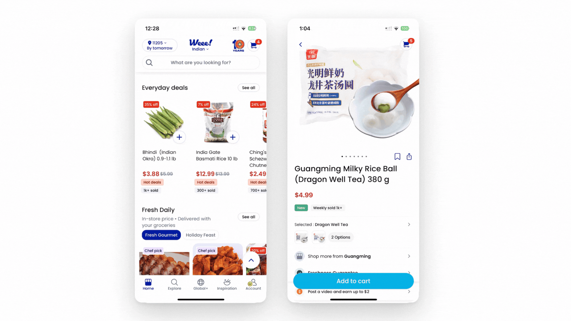
While browsing and searching through various product pages, users can add the goods they want to the shopping cart by four methods:
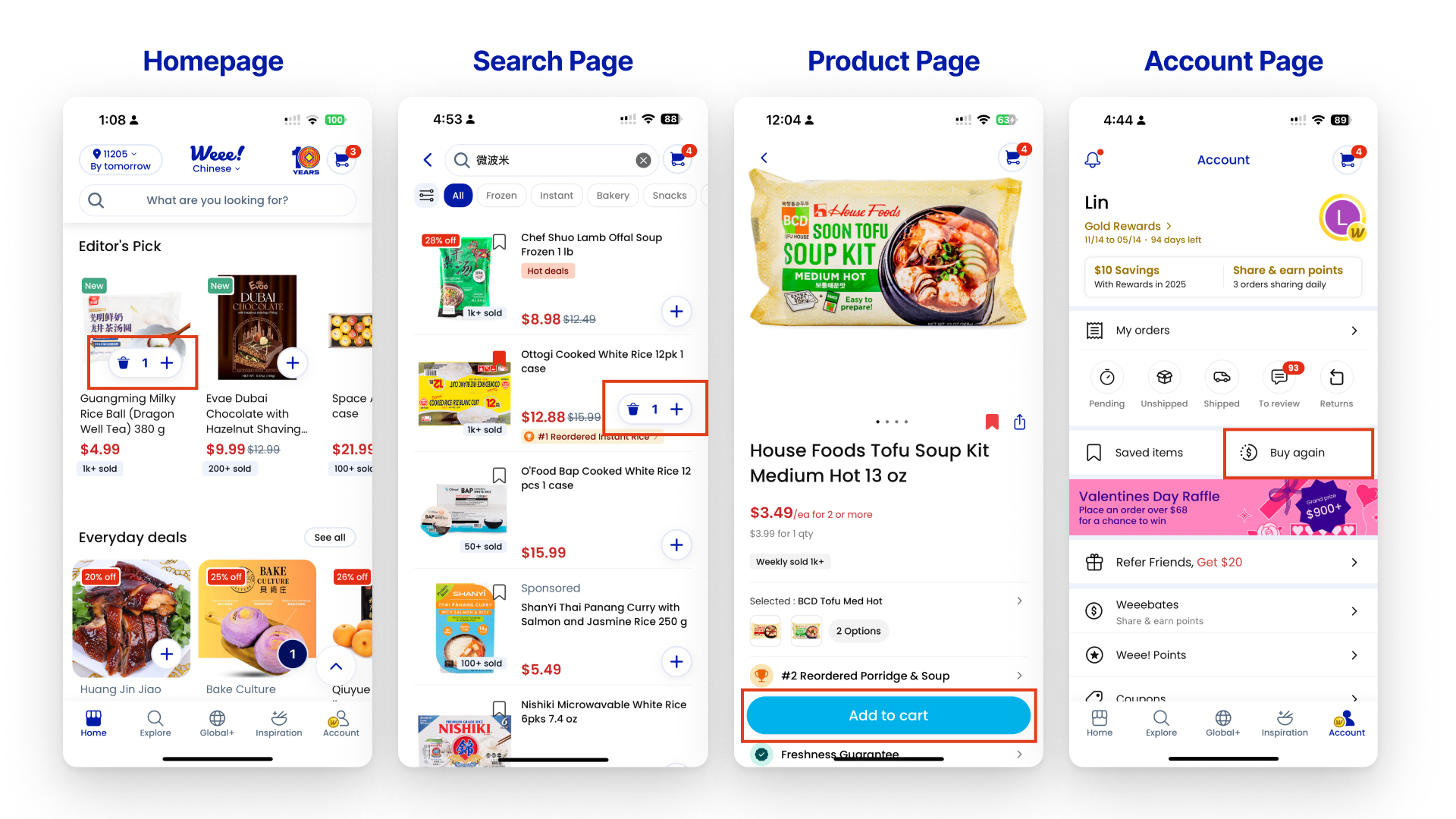
Users can tap the “+” button on the homepage and search result page, tap the “Add to cart” button on the product pages, and tap the “Reorder” button on the “My order” page. By providing multiple paths to complete the task, Weee! minimizes the gulf of execution between users’ intention and their abilities to operate the app, making the app a Human-Centered Design (HCD) again.
(Click or tap the GIF to see the change)
Weee! also showcases intuitive and understandable signifiers and feedback in the adding-to-cart process. Users can quickly tap the “+” button on the featured image on the Homepage or search pages to add items to the shopping cart. The “+” button shows as a signifier to afford actions: adding product. Once the users tap the “+” button, it will transform the button to give users instant feedback. Users can also tap the trash can icon button, which stands for the concept of knowledge in the world, to delete, or tap the “+” button to add more.
Check items in the shopping cart
After adding products to the cart, users would check their shopping cart.
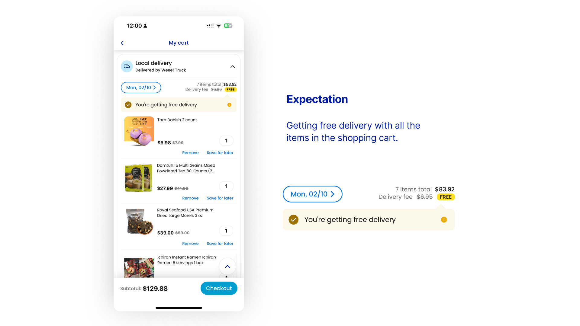
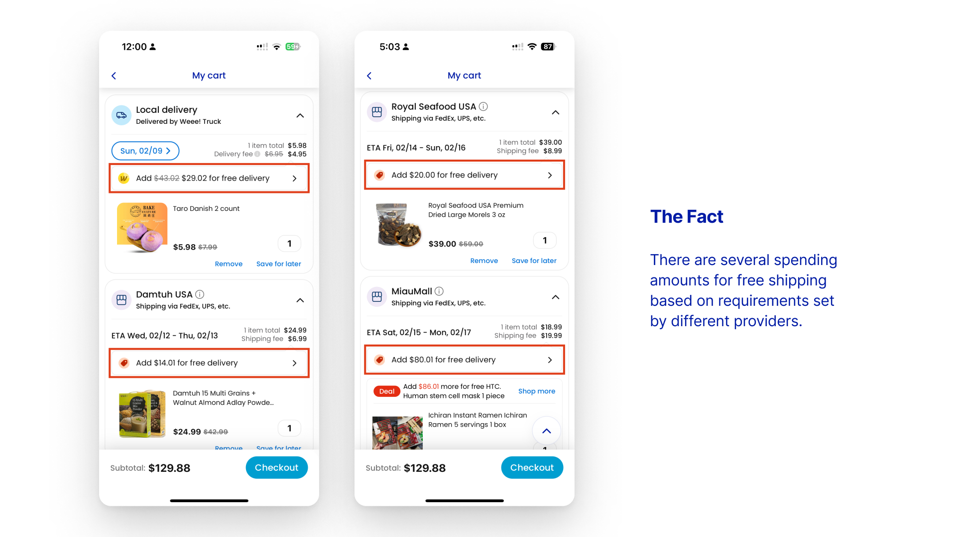
However, when users go to their shopping cart, they might be confused by the different free shipping thresholds offered for each product. There are several spending amounts for free shipping based on requirements set by different providers. Users would need to check the shopping cart page to know which threshold each product belongs to.
When realizing they have not reached the threshold for free shipping, users might blame the wrong things on themselves and think that they did not notice the different threshold carefully. However, there is no obvious mark of the rule and threshold on the product pages and the search pages.
Solution
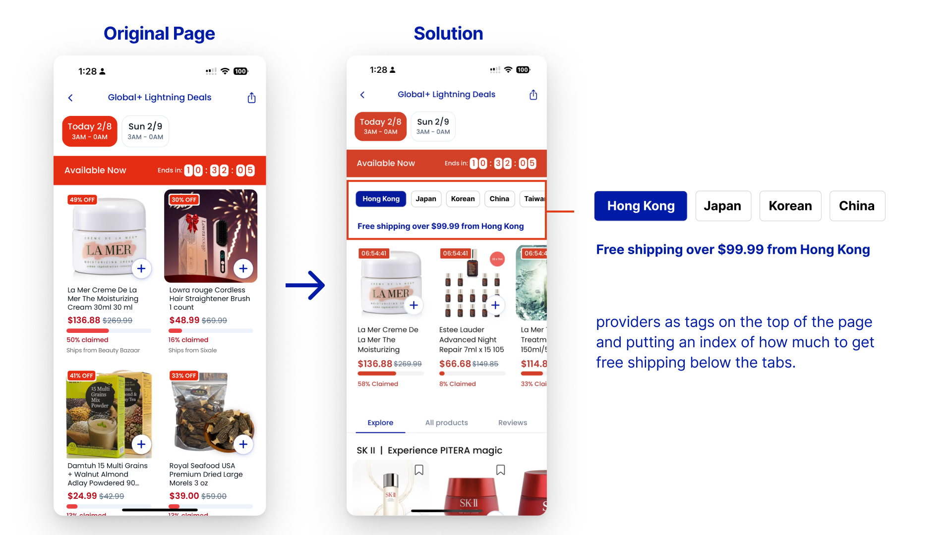
To improve this, I would suggest classifying products by putting the providers as tags on the top of the page and putting an index of how much to get free shipping below the tabs.
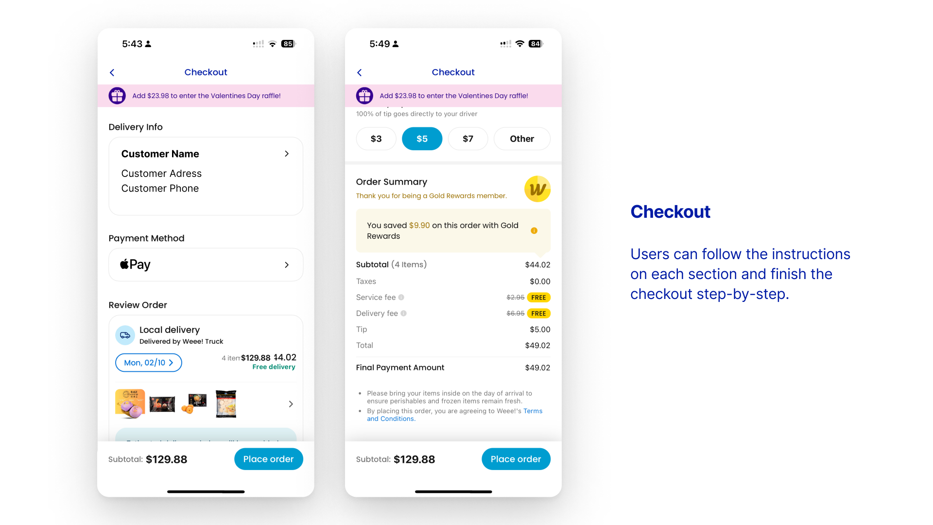
Checkout
The final task of purchasing goods on Weee! is processing to checkout. Weee! divides all steps for checkout into sections in order. Users can follow the instructions on each section and finish the checkout step-by-step, which shows logical constraints to reduce mistakes.
New users will receive a $10 discount on an order over $35. However, when they try applying the coupon, they will receive an error message: “The code can’t be applied (L009C)” with no explanation. Without giving a clear reason, users have no idea why it doesn’t work or how to fix it. After trial and error, they might feel frustrated and experience learned helplessness, then give up on using the coupon.
Solution
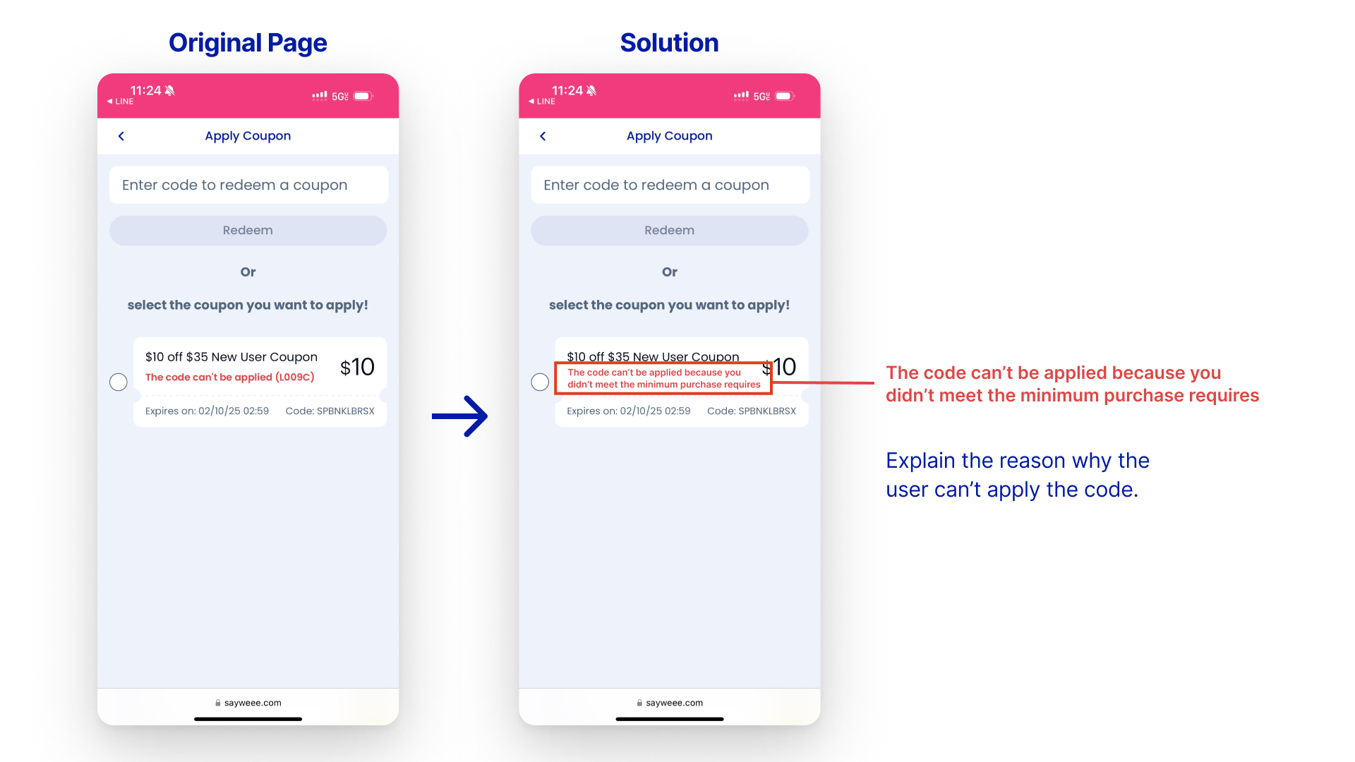
To fix this error, I would suggest translating the error code into an understandable explanation. For example, rephrasing the sentence “The code can’t be applied (L009C)” to “The code can’t be applied because you did not meet the minimum purchase requirement.”
Cover photo source: Weee! (www.sayweee.com)