
Workday is an all-in-one platform used for organizing various aspects of a company’s HR, finance, and IT departments. This design critique focuses on the experience of a job seeker applying for a job listing using the Workday Careers platform.
- Browsing careers page

As a landing page for users that come from a company’s main website, it’s important for the browsing page to provide discoverability on how the user can interact with the content. The page is divided into two columns, the left column has listings with key tags, while the right goes into more detail on selected listings. However, the huge amount of white space makes it necessary for the user to expend effort searching to find relevant job listings. While visibility of the intended action on a job listing (selecting the blue apply button) is high, the visibility of key contextual information that tells the user whether they want to apply for a specific listing is low. This could be addressed by grouping job listings with more relevant tags indicating the department or duties of a role.
2. Filling out an application
In order to submit a job application to a company through Workday, the user is forced to register for an account for that specific account. This barrier does not follow consistency with other popular career sites such as lever.co and Greenhouse don’t have this barrier, making Workday a functional outlier in this area.

When a user starts the job application, they are brought to a page with empty text fields that afford entering personal information. If the user enters their information correctly and clicks the continue button in the bottom left, the progress bar will advance, showing how many more pages the user needs to complete, communicating instant and understandable feedback on the user’s action. While this seems like a good way of keeping the user updated, in practicality, splitting forms into multiple pages can cause frustration for the user because it is difficult to change their information after they leave the page.

As many other career platforms like the aforementioned Lever and Greenhouse also put all the forms on a single page, we can bring consistency to Workday’s platform by making the application one page. We can also move the progress bar to the left side of the screen and add the ability to skip to a section by selecting the title. As the user fills out information and scrolls down, the progress bar will show where in the application they are. Placing the progress bar in closer proximity to the text fields instead of above the section also increases the mapping by making it similar to an interactive table of contents.
- Error messages
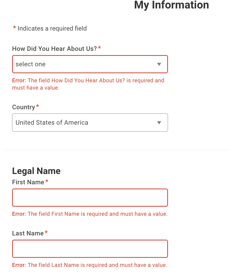
Workday employs a series of strategies to help the user recover from mistakes. If the user makes a memory slip such as forgetting to fill in a required field, the system will give feedback by highlighting areas to be fixed. However, this feedback only occurs after trying to continue on to the next section. Error messages in general are a poor way of fixing mistakes, because they stop the user dead in their tracks and essentially forcing users to redo the entire section. Instead, the system could provide guidance during the process of filling out the fields. If the user selects a required field and then scrolls on without selecting, the system could provide immediate feedback in the form of alert windows so that the user can instantly correct their slip without going through an entire checklist of missed inputs.