The NYC MTA App serves as a critical tool for people located in New York, providing commuters with information to seamlessly commute in one of the largest transit systems in the world. However, the MTA app, while trying to help the user, can sometimes fall into a slight flaw of overwhelming the user.
After reading “The Design of Everyday Things” by Don Norman, I can confidently identify positive aspects in where the MTA app stands out, and some observations on features that could be improved.
First design improvement: Overloaded with Information
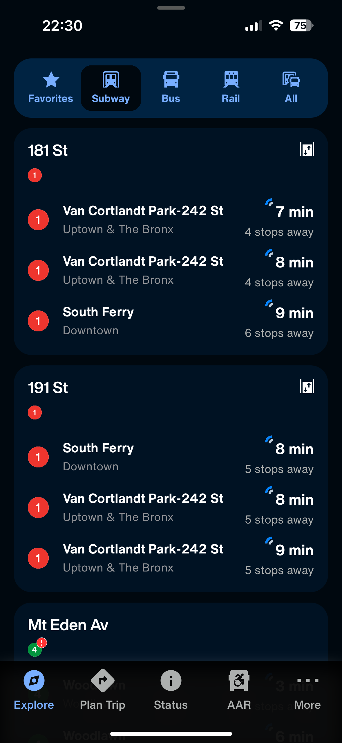
(screenshot: MTA App’s First screen)
Upon opening the app for the first time, the information is divided into the nearest train station, followed by a list of trains and their distance from the station. This action overwhelms users with excessive details, affecting the gulf of execution. When affected, users struggle to figure out what steps to take, which buttons to press, or how to interact with the system to accomplish their intention.
A solution would be a redesign where a simplified version of just one train is available on the homepage, and if you’d like to see more information on other upcoming trains, you would expand, but only when prompted. By hiding nonessential details behind expandable sections, you significantly reduce overload.
Apps like this are meant to guide users by offering strong affordances that signal a possible action. When conducted and designed properly, it helps narrow this gulf, making the product easier to use.
Second Design Improvement: Unclear Navigation Labels (Violates Signifiers & Visibility)
The app has only one indicator that can either mean there is a delay, a planned work, or a service status. This signifier lacks visibility by forcing the user to navigate multiple tabs to understand what the indicator means. Signifiers should indicate their function and should not be limited to only one for all.
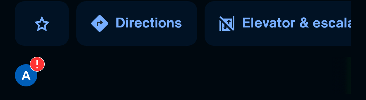
(Screenshot of App’s indicator)
A solution to this would be a redesign that introduces distinct signifiers for each type of service update, paired with a brief onboarding guide or tooltip that builds the user’s “knowledge in the head”. This process is the kind of understanding that allows users to recognize and remember icons without needing to constantly refer back to instructions. By continuing the pattern, the app helps users navigate more efficiently over time.
Third design improvement: Transfer of Training ( Violates Mental Models & Consistency)
Users familiar with other transit apps are used to certain behaviors and consistencies throughout different apps, like tapping a station to see real-time arrivals. However, the MTA app does not always follow these patterns, forcing users to relearn interactions. When using the MTA app, if this is a new experience, Transfer of Training is when users apply knowledge or behaviors from one system or experience to another. If the MTA app works differently from other transportation apps, it can be confusing. If the system doesn’t align with their mental model, confusion arises.
A solution for this could be to maintain familiar structures and design consistency to reduce overwhelming and keep the user satisfied.
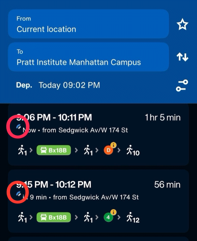
Despite its challenges, the MTA app also demonstrates some positive attributes to its users. One notable strength is its feedback loop.
This is a key principle in which users, for example, plan a route or check a service update, the app provides immediate confirmation that their action has been received by quickly loading up the requested information. It is also accompanied by live information (indicated by a blue signal), reassuring the users that the system is working accordingly
Another strong point is its use of constraints, which helps guide user behavior and reduce errors. A clear example of this is when service lines are unavailable. One common example is when the train/bus leaves your stop, that specific route will go grey, indicating that it already departed. This is a good use of constraints, because it prevents users from becoming confused. This visual constraint prevents wasted effort and directs the user toward working alternatives.
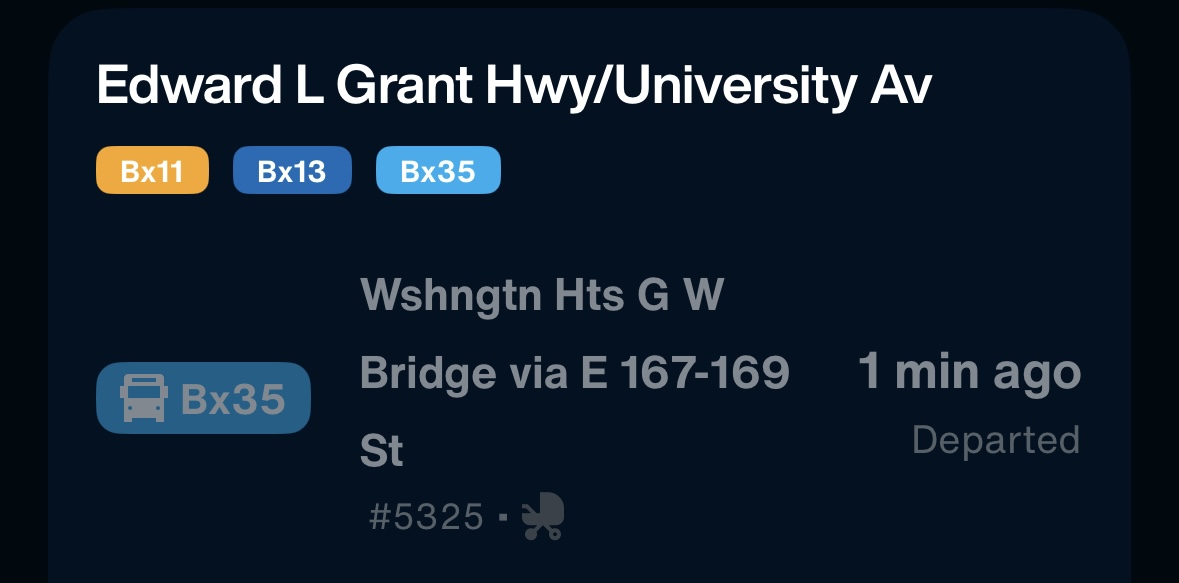
(Snapshot: Grayed-out bus line during a departure change)
Conclusion
The iOS version of the MTA app successfully consolidates New York City’s vast transit system into a single mobile interface, offering real-time updates, route planning, and service information across multiple transportation modes. By leveraging principles like visibility, affordances, and constraints, the app helps users stay up to date to wherever they desire to navigate to, and from. Its use of feedback and real-time updates reinforces users’ mental models, creating a sense of trust and reliability in such a high-stakes, fast-paced environment.
By applying Norman’s usability principles more consistently, such as simplifying the home screen with progressive disclosure, clarifying signifiers, and aligning more closely with common user expectations, the app has more potential to become an intuitive and user-centered experience, helping millions of riders navigate the city with clarity and confidence.