Project Overview
Client: NYC Department of Consumer and Worker Protection (DCWP)
Focus: Home Improvement License Portal
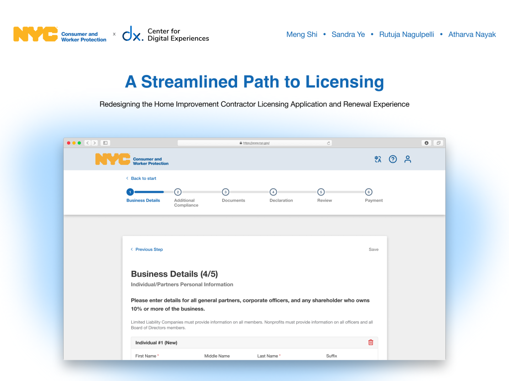
This project aims to enhance the online experience for individuals applying for or renewing a DCWP Home Improvement License. The current process presents usability challenges that can lead to confusion and delays for applicants.
Through user-centered research and design, the project seeks to improve the portal’s usability by streamlining navigation, clarifying application steps, and reducing points of friction. The ultimate goal is to streamline the process and enhance service delivery by developing a digital experience that is user-friendly, effective, and encouraging for all users.
Duration:
12 Weeks
Meet the team
Our Pratt team was made up of four UX designers Meng Shi, Sandra Ye, Atharva Nayak, and Rutuja Nagulpelli each contributing strengths in research, interaction design, accessibility, and product strategy. Under the guidance of Professor Rachel Ginsberg, we divided responsibilities to foster a collaborative, efficient workflow with our client at NYC DCWP.

Design Questions
1. How might we improve the online license application experience to be more welcoming, user-friendly, and more accessible?
2. How might we maximize opportunities to support first-time users with a redesigned business portal?
Project Constraints & Challenges
1. Limited access to actual users
We were informed that the official renewal period for DCWP Home Improvement License ends on February 28. This meant we had less than a month to conduct primary research directly with users to understand the user pain point
2. Cross-departmental considerations
Upon the initial Kickoff meeting, we learned that this project pertains to the daily functions of Licensing, IT, and Marketing departments. This suggested that our design would not only be user-friendly but also staff-friendly, ensuring efficiency for both populations.
3. Expansion of scope
On February 28, DCWP reached out to us to explore the possibility of expanding our scope from the renewal flow to also include the new application flow. As we agreed to this expansion, it greatly impacted our research plan and ultimately our redesign.
Our Final Design Solution
A streamlined path to licensing – redesigning portal & marketing checklist to streamline user journey.
Project Timeline

Research & Synthesis
Our research focused on two research questions.
1. What does the end-to-end user experience look like when applying for or renewing a Home Improvement Contractor License?
Early on in our project, we realized that the user journey actually starts before the portal.
Whether it is the in-person licensing team who would walk users through the online application or the application checklist page that many users refer to, there are many steps and procedures outside of the portal that need to be taken into consideration.
We decided that the first step for us was to determine the mental model of users as they apply for a new license or renew existing licenses.
To do so, we arranged:
2 Onsite Visits
3 User interviews
9 DCWP Staff Interviews
to obtain first hand information and learn about the total experience of applying and renewing home improvement licenses from start to finish.

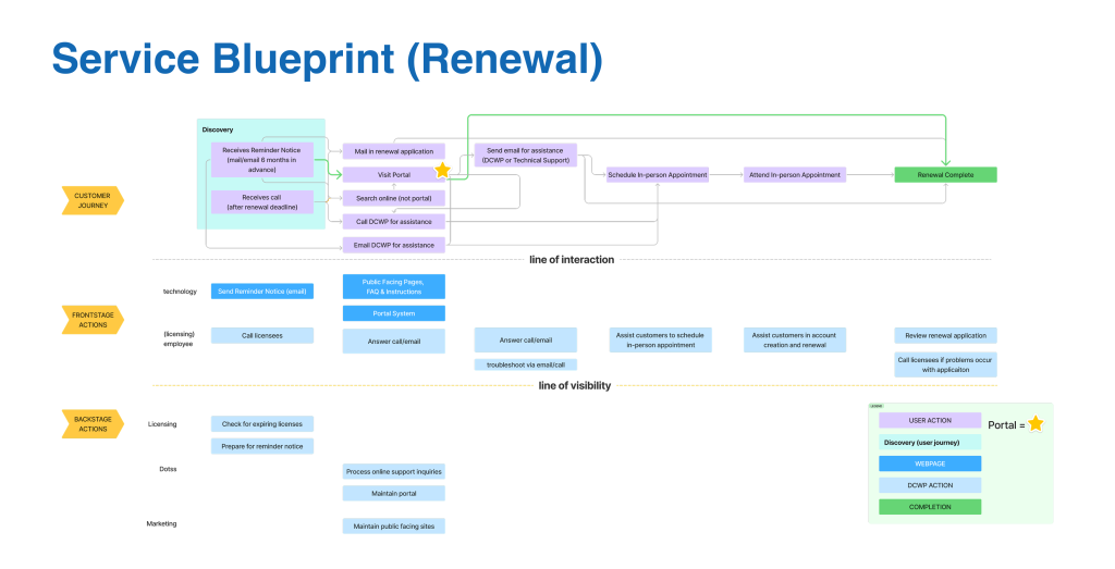
We decided to map out our findings through Service Blueprints.
As an extension to user journey, the Service Blueprints parallel user actions and business processes.
They revealed to us:
- Interactions with the portal can be a SMALL portion of the entire user journey.
This implies that to enhance the user journey, and to allow for an easier and faster renewal or application experience, we have to look beyond the portal and pay heed to all the steps to look for pain points and opportunities for improvement. Our subsequent research and findings supported this idea. - License holders and applicants spend a significant amount of time preparing for their application, PRIOR TO going onto the portal.
It is difficult to quantify the exact amount of time spent in the discovery stage for each person, but from the staff interviews and based on the list of required actions, it does appear to us that applicants spend way more time preparing than actually filling out the application. While this seems intuitive, we were interested in if there are any factors that contribute to or further delay the timespan of preparation for the applicants.
These insights prompted us to conduct user testing to understand how people discover license application requirements, how they navigate to the portal, and their impressions of the overall experience.
We recruited 10 interviewees and provided a scenario in which they themselves are home improvement businesses and need to apply for a license from NYC DCWP.
Their specific paths taken to find relevant information and their real-time feedback are documented and clustered in our Affinity Diagram.

Our findings confirmed our speculation: users are confused and overwhelmed when preparing for application, before coming onto the portal.
- All participants in our user testing were inclined to check DCWP’s pages.
- However, as they read through the License Application Checklist, they found the information hierarchy to be confusing and struggled to navigate the page.
- Many participants expressed their wish for step-by-step guidance.

This connected to our second research question.
2. Where (else) do users encounter challenges in the Home Improvement License application and renewal process?
To identify where users face the most challenges within the portal, we analyzed issues from two primary sources:
- User and staff interviews — including license applicants, license holders, and DCWP licensing staff
- Heuristic evaluation — an independent analysis of the application and renewal processes conducted by our team
To capture and analyze our findings, we documented 55 problems in a comprehensive problem sheet. We then grouped these issues into seven key themes: portal usability, user behavior, insufficient information, IT, logistics, visibility, and user confusion.


To prioritize these issues, we used the RICE scoring model, a framework that evaluates problems based on Reach, Impact, Confidence, and Effort. This approach helped us make data-informed decisions and focus on the problems with the highest impact on licensees.
These insights highlight a core problem:
Users lack clear and actionable information to complete renewal and application processes.

To better understand how to support users at every step, we conducted a competitive analysis of 8+ government licensing and multi-step application platforms. This allowed us to identify UX/UI best practices that directly informed our design strategy and guiding principles.

Translating Insights into Guiding Strategies
Streamlining the application and renewal experience, providing direct and instant support for users.

Informed by user research, our strategy aims to simplify the application and renewal journey by making it easier to navigate, more informative, and less reliant on in-person assistance. The redesign incorporates these elements throughout the licensing experience, making it more accessible, inclusive, and self-guided for licensees.
Guiding Principles
Clarity & Confidence: Make Application Steps Obvious and Actionable
Users often spent excessive time reading through the License Application Checklist and navigating the portal. We decided to streamline the checklist and portal layout using plain language, step-by-step guidance, and clearer hierarchy to give users a better understanding of what’s required and what’s coming next.
Inclusive Accessibility: Design for Every User, Across Devices and Abilities
Users who continue to apply or renew their licenses in person are often older adults or immigrants with limited English proficiency. Staff frequently observed these users struggling with digital interactions and defaulting to in-person support. We decided to prioritize accessibility by implementing desktop-friendly layouts, screen reader compatibility, keyboard navigability, and clear visual cues to better assist them.
Fostering Support: Deliver Real-Time, Contextual Guidance
Recurring issues with PIN requests, linking businesses, document uploads, and understanding key terminologies have highlighted a lack of timely support within the portal. To address this, we decided to embed contextual help through modals, in-line definitions and guidance to reduce user frustration and replicate the assistance they would receive in person.
Final Design Breakdown

Requirements Checklists
Problem
Users frequently complained about excessive scrolling on the checklist page. The old design presented a redundant layout: a quick summary list at the top, followed by the exact same list with additional details further down. This made the page long
Solution
To address this, we consolidated the quick list and detailed list into accordions. Each checklist item appears in a collapsed view by default. Users can expand only the items they need more information on, significantly reducing scroll length
Sticky Side Nav Bar


Impact & Project Takeaway
Over the course of the project, our team redesigned over 20 screens across the Home Improvement Contractor (HIC) licensing application and renewal experience. This included the checklist landing page, detailed requirement sections, the application portal dashboard, and mobile views, all aimed at making the process more intuitive, accessible, and supportive for users.
Throughout the design phase, we encountered several moments where a single right solution wasn’t immediately clear. In those cases, we created and tested multiple design variations to explore different interaction patterns and content structures. This iterative process helped us weigh trade-offs, gather feedback, and ultimately land on solutions that balanced usability, compliance needs, and technical feasibility.
We wrapped the project with a final presentation to the NYC DCWP team, walking them through our research insights, design decisions, and a live prototype demonstration.
To ensure a smooth transition, we also provided a comprehensive design handoff, which included:
- A high-fidelity interactive Figma prototype
- Annotated designs following NYC OTI (Office of Technology and Innovation) compliance patterns
- Recommendations for future usability testing and implementation considerations
This project not only delivered tangible improvements to a public-facing service but, it also reinforced the importance of designing for complexity, collaborating across disciplines, and always advocating for the user.

