Client:
Kerala Museum
Timeline:
16 Weeks
January to May 2025
Design Methods:
- Wireframing
- Iterating
- Prototype
Research Methods:
- User Interviews
- Desk Research (Competitive Analysis)
- Tree Testing
- Benchmarking
- Usability Testing
Our Project
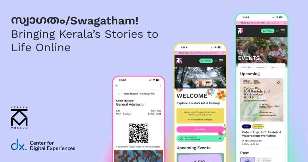
We partnered with Kerala Museum (KM) to evaluate the usability of their current digital presence and design a mobile-first solution prioritizing accessible design that aims to foster community.
What is the Kerala Museum?
Kerala Museum is more than just a museum
Kerala Museum is a vibrant and progressive community center that reflects the diverse culture of Kerala and serves as an inclusive space for lifelong learning. KM fosters a voice for the unvoiced through multi-sensory exhibitions of the rich local history, forward-thinking lectures and talks, and immersive contemporary and performing arts.
Kerala Museum is a progressive community center with a voice for the unvoiced.
– Kerala Museum Community Member
What Were the Problems?
Creating a User Experience for a Physical Space that is Inaccessible to us as a Team
Kerala Museum is located on the other side of the world and none of us have ever stepped foot in the Museum, let alone Kerala.
In order to avoid imposing our own biases and views on digital museum culture, we relied on community voices and real first-hand experiences from patrons of the Museum and members of the local community.
Based on our conversations, we identified 3 key areas of improvement for the KM’s digital presence.
1. Gaps in Digital Engagement
Community members were not using the website as intended and were relying on museum staff and social media for information and updates.
2. Accessibility and Inclusion Barriers
The lack of consistent messaging and easy-to-understand language on the website made it inaccessible to local community groups.
3. Usability & Experience Gaps
The overly complex website structure made it difficult for KM’s audience to find key information required to visit and engage with the museum.
Our Solution
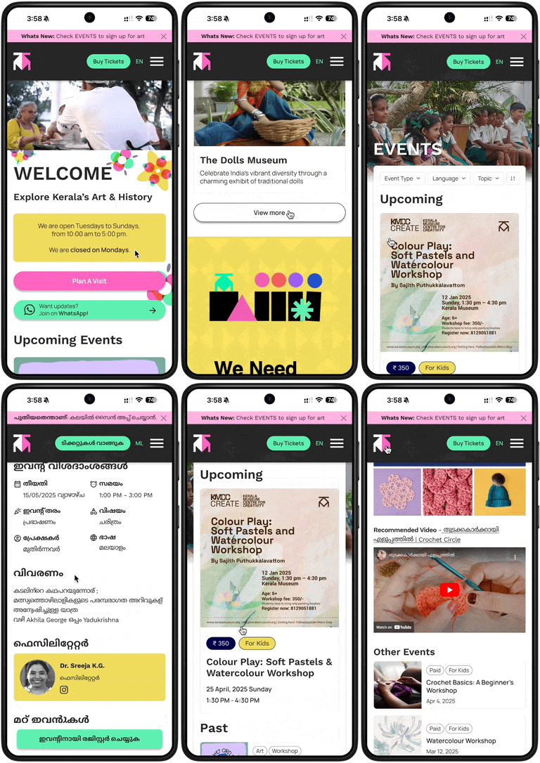
How Did We Solve KM’s Usability Problems?
A Welcoming and Dynamic Digital Space That Encourages Exploration, Connection, and Engagement
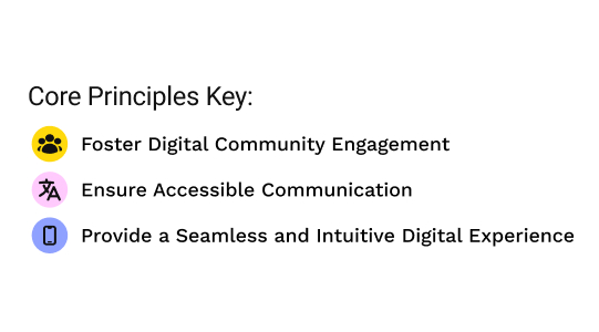
To address the aforementioned key areas of improvement, we reimagined KM’s digital identity through 3 core principles that informed our strategic design designs:
1. Explore: Fostering Digital Community Engagement
A space for students, teachers, and researchers to access resources
2. Connect: Ensuring Accessible Communication
A platform for community events, artist/musician spotlights, and shared interests
3. Engage: Seamless and Intuitive Navigation
Intuitive navigation and functional pages to improve discoverability
What was our research approach?
A Mixed-Methods Approach To Understanding the Museum, Its Members, and the Local Culture
We began our research journey by interviewing 7 users who consisted of community members and museum staff, to uncover pain points and motivations of the museum-going experience. We additionally wanted to understand how users currently engage with the museum (both physically and digitally), barriers to accessing museum information and resources, and the cultural and emotional perceptions of the Kerala Museum
The interviews highlighted a gap between local community members and the museum:
Affinity Mapping of our insights from user interviews
During our interviews, several quotes stood out and reinforced our need to prioritize accessibility, inclusion, and the local culture in the redesign. These insights directly informed our strategic design directions.
Lack of Cultural Accessibility & Inclusion
- “There is a connection between the exclusive use of the English language and perceived classism” – Community Member at KM
- “One thing I find a little uncomfortable in Kerala Museum is that I find the event altogether a little elitist… mostly urban, center, English-speaking people attend these contexts.” – Educator in Kerala’s schooling system
- “There is a class difference in the audience of public programs” – Program Lead at KM
Website Structure & Navigation Issues
- “Website has many sub-categories and subcategories that might make it less accessible” – Program Lead at KM
- “JANAL is designed for common people interested in academics. It is hard to find information on the website and local researchers would also prefer having a Malayalam translation” – Front Desk Personnel at KM
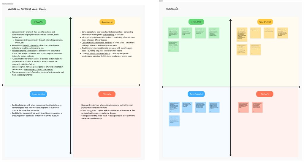
To better understand the landscape of digital museum experience, we conducted competitive research and benchmarking across thirteen cultural institutions, both within India and internationally. We wanted to get a better understanding of how these institutions structure their website and navigation, display events and exhibitions, and engage communities. Institutions included MAP Bengaluru, the National Museum of New Delhi, MoMA, the MET, and MOCA Taipei. We focused on mobile usability, site navigation and information architecture, community engagement, and how events were displayed. We did a deeper dive into the events and did a comprehensive benchmarking with museum sites and event platforms to see the structure and present event information. The insights we gained from competitive analysis helped us identify what was working, what wasn’t, and where Kerala Museum had room to lead. We also mapped our findings in a comparison sheet and ran SWOT analyses to guide design decisions.
For our social proof research, we analyzed the guest feedback on Google Reviews to evaluate guest perceptions of the Kerala Museum’s digital and/or physical experiences. Positive reviews highlighted the strengths of the museum as a place of art, culture, and Kerala History, but negative reviews focused on the inconsistent visitor experiences. This helped us pinpoint areas for improvement in the museum’s digital presence.
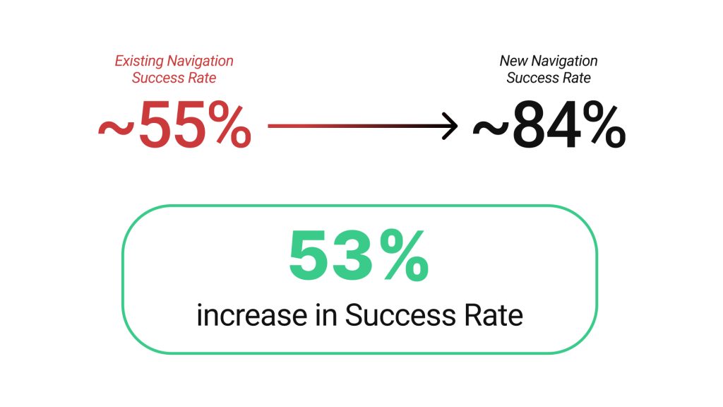
Part of our scope was to revise the IA and navigation structure of the KM site. To evaluate the effectiveness of our revised Information Architecture (IA), we conducted tree testing using Optimal Workshop. Two separate tests were run:
- Tree Test A: Tested the revised navigation and IA.
- Tree Test B: Tested the current/existing navigation and IA of the KM site.
Participants included both local and global users from regions including Kerala, the United States, China, and the Netherlands.
Below is the key finding from the tree testing:
After the tree testing, we asked users to complete a post-test questionnaire. Some key feedback:
- Current IA:
- 69% of users reported that the navigation did not match their expectations.
- Users noted that critical categories like “Contact Us” and “Classes” were missing.
- Revised IA:
- 73% of users felt the navigation categories matched their expectations.
- However, users found it challenging to locate the blog, indicating a need for improved visibility of that section.
We uncovered user needs and deeper cultural expectations around what a museum represents and the opportunity around what a museum should feel like online which helped inform our design decisions
What was our design process?
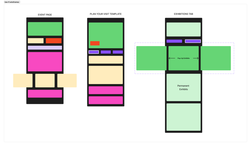
We focused on streamlined navigation supported by IA-derived templates to ensure components were intentional and reusable
Our desk and user research helped us identify the 3 key issues with KM’s website that we wanted to tackle in our project.
1. Gaps in Digital Engagement
- The current site didn’t reflect the museum’s personality as a serene and inclusive space.
- WhatsApp is a key communication tool for the local community, but the website does not fully integrate it.
- Staff members were handling individual requests and queries for information available on the website through WhatsApp and requested a more streamlined way of contacting and registering for events in the website.
- Social media (Instagram, Youtube, Facebook) positively influenced visitor perception and Google Reviews served as social proof that let potential visitors trust the museum, but the website did not leverage these platforms for engagement.
2. Accessibility and Inclusion Barriers
- Museums in India often cater to English-speaking audiences, excluding local language users.
- Jargon-heavy content limited accessibility to website content, especially for younger visitors and casual users looking for general information on KM.
3. Usability and Experience Gaps
- The website’s navigation was overly complex, particularly on mobile devices.
- Key visitor information, such as dates, ticketing, hours, and location, were not easily discoverable.
- The website lacked an intuitive content structure that linked KM’s extensive events, archives, and research materials for users interested in learning more.
- Some content was inconsistent or outdated when compared to KM’s up-to-date social channels.
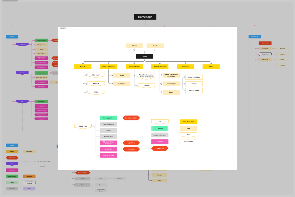
In order to create impactful, relevant, and well-thought-out re-designs, we first spent 2 weeks developing a more intuitive website navigation. Kerala Museum’s original website navigation had nine sections that prioritized showcasing all the website’s offerings at once instead of trying to provide what would be most useful to and understandable by their audience.

We conducted desk research and benchmarked against other museum websites such as The Met, MFA Boston, and The Museum of Art & Photography Bengaluru to understand how to best serve KM’s community while still displaying their offerings at a glance, and settled on a sitemap laying out six categories with simplified names that quickly cued in users to what they could expect.
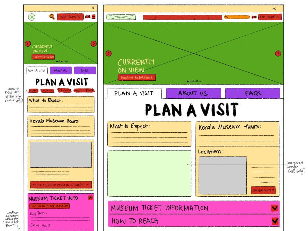
Below is a closer look at the new sitemap. The ‘Plan A Visit’ subcategory has been expanded to show an example of how we accounted for reusable components (Tabs, Image Carousels, Accordions, CTA Buttons, and more) so that KM’s website development team could easily implement this new navigation when updating the website.
We then created quick sketches and low-fidelity wireframes of pages to explore the structure of each page within the updated sitemap.
From there it was easy to plug in pre-existing information from KM’s website in a way that followed users’ mental models, once again based on our user interviews and desk research, to create mid fidelity wireframes.
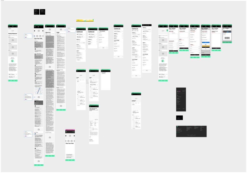
Our mid fidelity wireframes set the foundation for our high fidelity wireframes and prototype, which incorporated KM’s branding, employed consistent hierarchy of information, and created a thoroughly linked ecosystem so users could find information intuitively and from a variety of entry points.

We broke down all our findings into the 3 core principles
Here are some key design decisions we made to improve the KM mobile first site
1. Fostering Digital Community Engagement
Bring together youth, educators, academics, art enthusiasts, and lifelong learners to celebrate Kerala’s vibrant culture and history, encourage open discourse, and spark curiosity.
2. Ensure Accessible Communication
Create an inclusive digital space where KM’s diverse audience feels represented, inspired, and engaged.
3. Provide a Seamless and Intuitive Digital Experience
Serve as a digital extension of Kerala Museum’s serene physical space, offering a sensory-rich experience that connects visitors to both local and global communities.
Now let’s break down some of our key flows
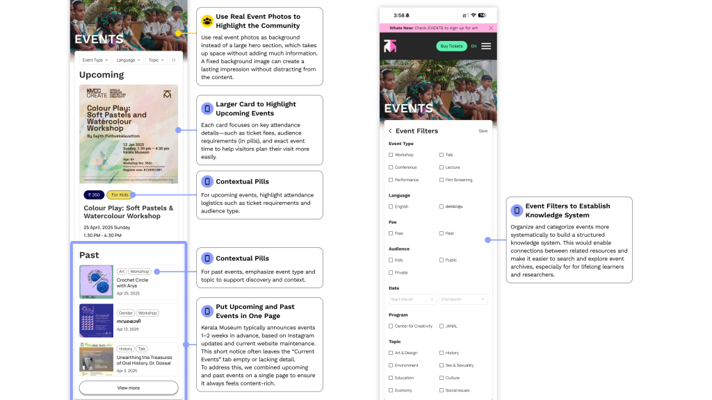
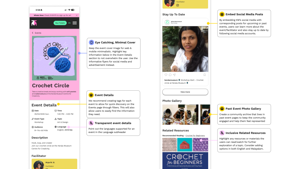
We created annotations for each screen we designed to give our client an insight into each of our design decisions, backed by our desk and user research. Below are 5 key flows with annotations corresponding to our three guiding principles.
1. A landing experience designed to quickly captivate and convert
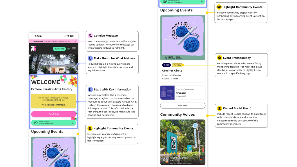
2. Plan a visit with ease through curated messaging and strategic information flow

3. Events as vibrant window into the community, allowing visitors to keep up with what’s happening and experience the richness of KM’s offerings
4. Events as digital archives of memories and resources, enabling continuous learning and deeper connection with the community
5. Buying tickets online in advance not only lightens staff workload, but also creates lasting connection through culturally inspired collectible tickets

The Impact
After completing our redesigns of the Kerala Museum website, we conducted usability testing to evaluate the effectiveness of our new design. We focused on three core flows and gathered feedback from seven participants, three of whom were bilingual.
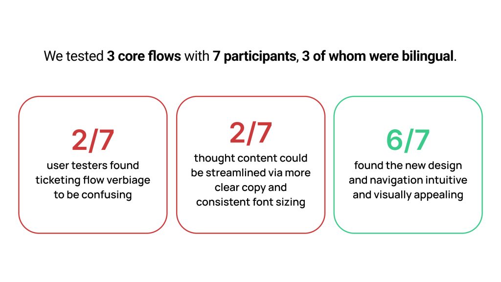
Some key user feedback included:
“Woah, this site is beautiful! I love the use of colors.”
“The questions and answers on the FAQ page seem the same to me. Without the Q&A, I would not be able to tell the difference between the questions and answers.”
Our user feedback helped us iterate on the design, to enhance the usability of our redesigns. Our final designs can be seen in the prototype.
Looking Ahead: Building the Foundation for the Future
The new Kerala Museum website is not a finished product, it’s a framework designed to evolve. Through our research and redesigns, we enabled the museum to:
- regularly update Exhibitions and Event listings
- feature upcoming events for the community to engage with
- integrate social media posts into the website to create social proof
- provide digital-first educational tools by linking resources on events pages
- be a one-stop-shop for all ticketing, registration, and donation needs
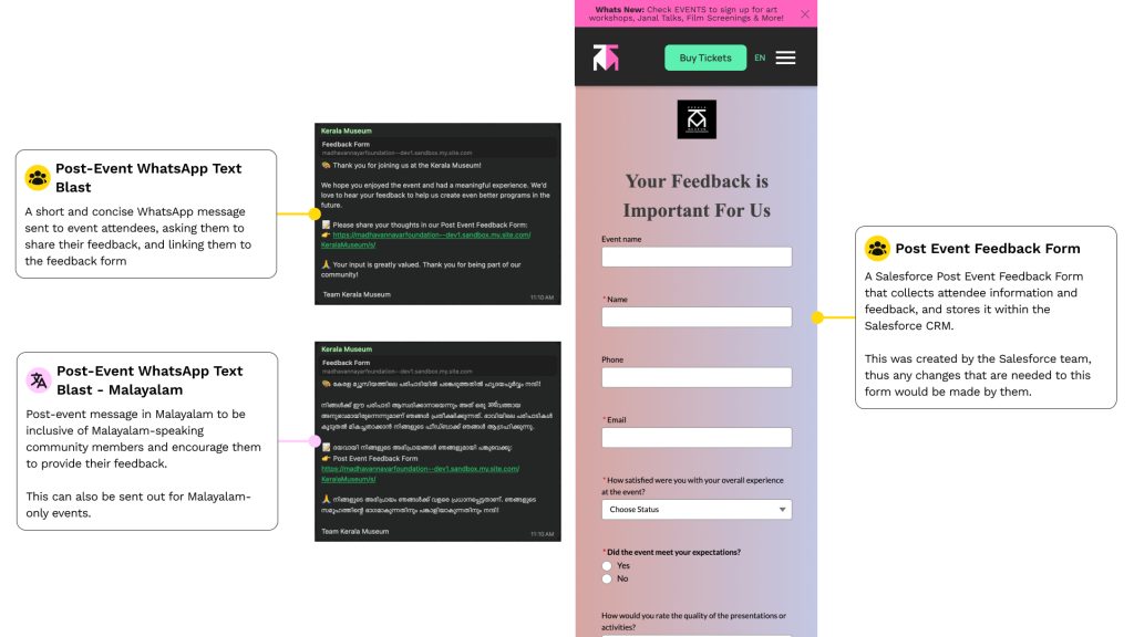
We also met with a Salesforce implementation team from Impaqtive to discuss:
- the creation of a CMS backend for the organization of leads and cataloging of active museum members
- the collection of post-event feedback via an external form integrated through WhatsApp
- a cross-channel data flow that streamlines workflows for KM’s staff
Conclusion
Our collaboration with the Kerala Museum was an opportunity for us to dive deeper into international UX collaboration and client engagement. We were able to empower a non-profit to reach a wider audience online by designing a mobile-first visual interface that highlights the inclusive offerings of the museum. Beyond the visual design of the interface, we were able to experiment with incorporating levels of service design and emotional representation. We really wanted to build a website for KM that reflected the surrounding community through a dynamic community-serving website.
Thank you to Aditi, the staff and community members of KM, and Rachel for all the support!
