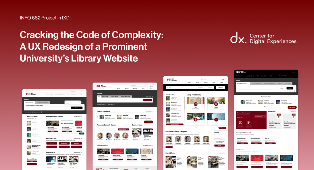
Project Overview
Setting the Stage
Our client, a prominent university library (the Libraries), is one of the knowledge engines behind one of the world’s leading research institutions. With five branches and a powerful digital platform, the library connects students, faculty, and researchers to a vast range of scholarly resources, research tools, and archival collections. More than just a place to borrow books, the Libraries support discovery, learning, and open access to knowledge across disciplines.
In January 2025, our UX team from The Center for Digital Experiences at Pratt Institute partnered with the Libraries to tackle a complex challenge: redesign information architecture (IA) and the homepage of their extensive and research-heavy website. The Libraries internal teams had received consistent feedback that users, students, faculty, researchers, and even staff, were overwhelmed by the website’s navigation and search tools.
Our work here would establish external validation and a stepping stone for our client’s large-scale website redesign, beyond just the homepage and information architecture, in the years to come. Not only will the research that we conduct provide objective support to their own speculations for a need to redesign the website, but a variety of homepage and information architecture redesigns will support their process of leading and informing the greater campus community of the change in the website design.
To support all of the above needs, our goal was to better understand the user experience on the site and reimagine concrete, user-centered designs of the homepage and information architecture.
Timeline
The project was completed in 12 weeks
Jan, 2025 – May, 2025
Our UX Team
Worked collaboratively under the mentorship
of Professor Rachel Ginsberg.
Client
A University Library (further referred to as “the Libraries”)

The Problem
Lost in the Stacks
The library website’s homepage and navigation system were described as overwhelming, cluttered, and unintuitive. Important resources, like research guides, citation tools, and library hours, were hard to locate. Additionally, scholarly information seekers highly rely on search bars to find research topics, known articles, or general website information such as library hours. However, our research found that the currently existing search bar caused confusion, especially around the differences between Bento and Primo search, and given the lack of visibility around a site search function. For context, Bento searches allow users of the website to search from a larger catalog of the library’s services into a “bento-like” search results format. Primo searches pull from a narrower library catalog that, unlike Bento, doesn’t include resources such as Archives and Theses. As a result, users frequently defaulted to the chat function or turned to Google Scholar to find answers, bypassing the site altogether.
Constraints & Considerations
Designing Within Boundaries
- Time: With just 12 weeks, we had to prioritize features with the highest usability impact.
- Design Guidelines: We worked within our client’s existing digital design system.
- User Access: A lack of access to direct users, given our tight timeline, meant we needed to recruit comparable participants.
- Scope: Our redesign focused solely on the navigation and homepage.
Project Goals
Reframing the Challenge
We began with the following design questions:
- What do users want to do on this university library’s website?
- What are they expecting or hoping to accomplish?
- How do they behave as they navigate the site?
- Are they able to use the site effectively, and if not, why?
After establishing goals with the client’s team, our Pratt team aimed to:
- Identify pain points users experienced on the site.
- Analyze how users interact with the homepage and search.
- Develop strategic, research-backed redesigns to improve clarity, usability, and confidence.
Process
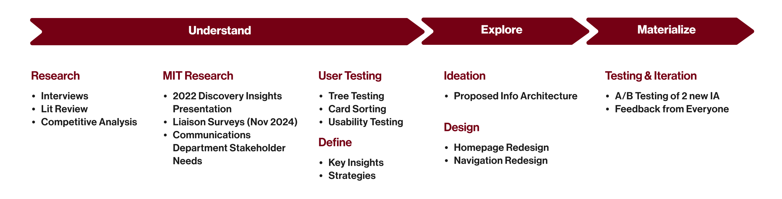
Stage 1: UNDERSTAND — Conducting Research & Synthesizing Insights
Uncovering the Truth
To fully understand how users interact with library websites, we conducted the following:
Literature Review
15+ academic sources helped us frame problems around library literacy, information-seeking behaviors, and UI clarity.
A review of the literature on library websites surfaced three main topics for us to consider in our research: a pattern of information overload, users lacking library literacy, and users in search of greater scholarly support from institutions. These themes were found to overlap extensively with the generative research we conducted.
Full reference list at the end of this page.

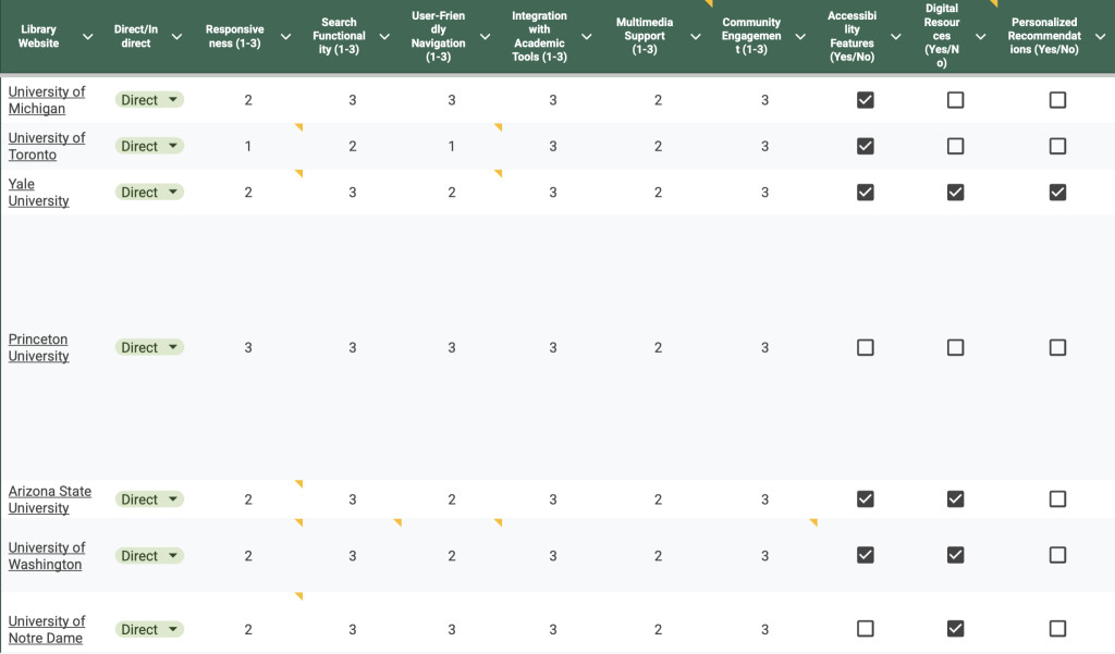
Competitive Analysis
We evaluated 20 other library websites for best practices in navigation, accessibility, and search.
Our findings indicated trends across multiple university library websites that offer intuitive search experiences that differentiate between a site search and catalog search, navigation bars that are clearly labeled and therefore easy to use, offer easy-to-discover library services, and ideally, responsive designs across mobile and desktop experiences.
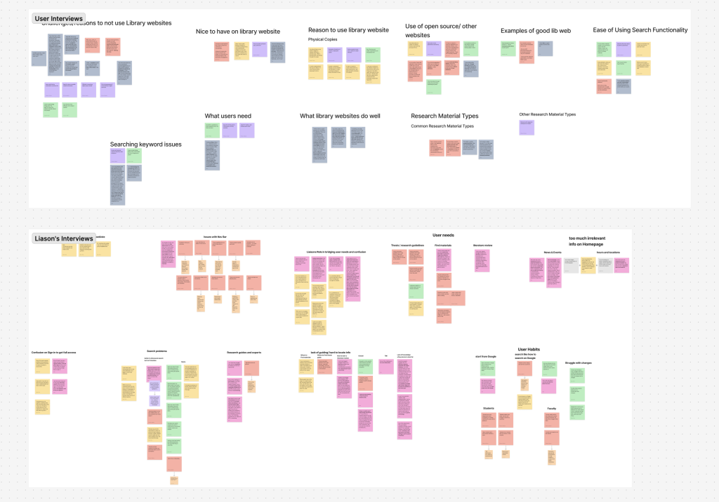
Stakeholder Interviews
Eight information seekers and four library liaisons shared frustrations, strategies, and workarounds.
The research showed two main insights: every day, web search behaviors and expectations negatively impact user experience in the Libraries’ website, and confusing nomenclature makes navigating a challenge. Many users expected the single search function on the existing library website to work like a Google search and were confused to find that to not be the case. Additionally, many users found the labels and tools listed in the navigation bar of the website to be unfamiliar and therefore did not know how to fully navigate or utilize all the tools offered by the website.
Card Sorting + Tree Testing
To reinvision the site’s information architecture, 20+ participants analyzed how users understood and grouped navigation terms.
Our findings indicate that users usually group navigation labels based on familiar tasks and goals, but they struggled to understand labels that used library or research-specific terms or lacked enough context. Additionally, while most participants eventually located the correct information and completed the given tasks in our tree tests, low directness and confidence scores indicated that the navigation experience was not intuitive but involved lots of guesswork.
Usability Testing
We ran eight moderated and unmoderated tests on the current university libraries website and our redesigns.
Here, we found further evidence of users using the existing library website’s catalog search function as a site search. Additionally, users quickly and regularly relied on features allowing them to connect directly with a staff member, suggesting a lack of confidence and understanding of how to navigate the current website and its information architecture.
Key Research Insights
What We Learned
- Terminology was overly academic or vague, confusing many users.
- The Bento search bar (which pulls from multiple library catalogs, including archives and published theses) was often mistaken for a full-site search.
- Overwhelming navigation options led to hesitation and task failure.
- The search bar and staff support became fallbacks when users felt lost.
These insights greatly aligned with the literature and competitive analysis of library websites, where information overload, a lack of library literacy, multiple, clearly labeled search functions, and an intuitive navigation experience were found to be important to consider. As a result, they shaped our priorities and informed every stage of design.
Laying the Foundation
From our research, we developed five core strategies:
- Provide separate, clearly labeled site search and catalog search on the homepage.
- Condense navigation categories to reduce overload and improve scanability.
- Use clear, task-oriented language and improve labeling.
- Make research support, hours, and help tools easier to find.
- Add a floating live chat for immediate assistance.
We also developed two IA models—a task-based and a topical version—and tested both to see which best aligned with user expectations.
Stage 2: EXPLORE — Shaping Our Guiding Strategy
Bringing Ideas to Life
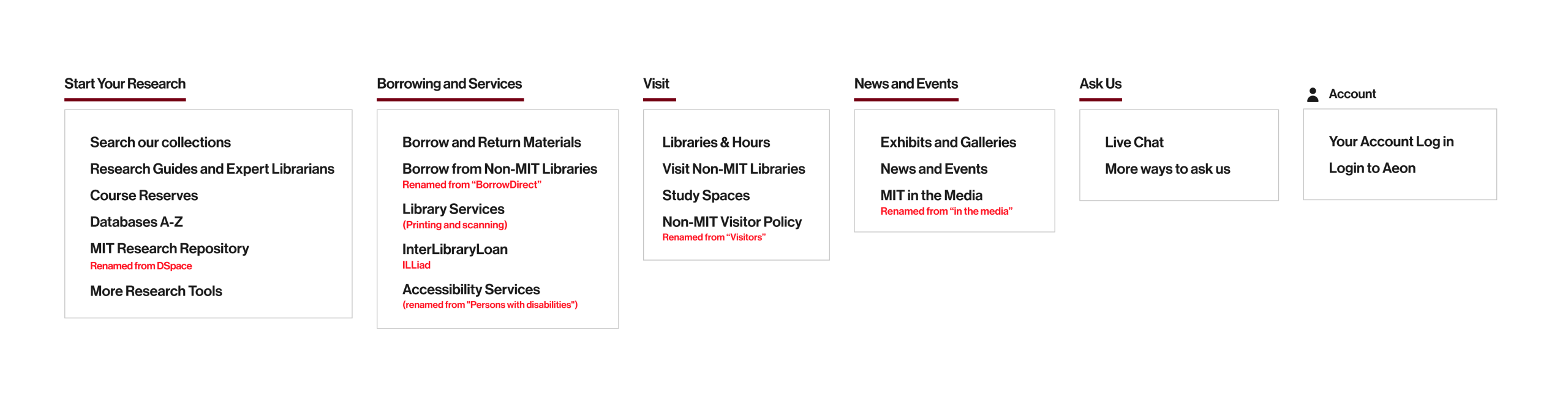
Rethinking the Framework: Information Architecture
Two Information Architecture (IA) models were developed as a result of our research. Given that multiple competition library websites used clear and predictable navigation based on different topics, we redesigned a second IA approach to be “topical.” Topic-based navigation categories included search, services, and research. Additionally, because our card sorting research discovered that users organized labels into categories based on tasks or goals, we developed and named our first IA approach “task-based.” Tasks in this approach could include finding services, conducting research, or visiting the Libraries. Our two IA approaches aim to represent two potentially user mental models that may be interacting with a library website: one that is categorical and the other action-oriented.
To evaluate the impact of our redesigns, we ran tree tests to compare the original IA to two of our new IA models:
- Topical IA: Resulted in a 78% success rate, or a 7% increase from the original IA. These findings suggest an IA approach more aligned with user expectations and mental models.
- Task-Based IA: Resulted in a 68% task success, which was 3% less than the current IA. Findings indicate that this approach was better for direct goals than the current IA, but users were unfamiliar with using a navigation bar based on tasks.
Current Website’s IA
Topical IA
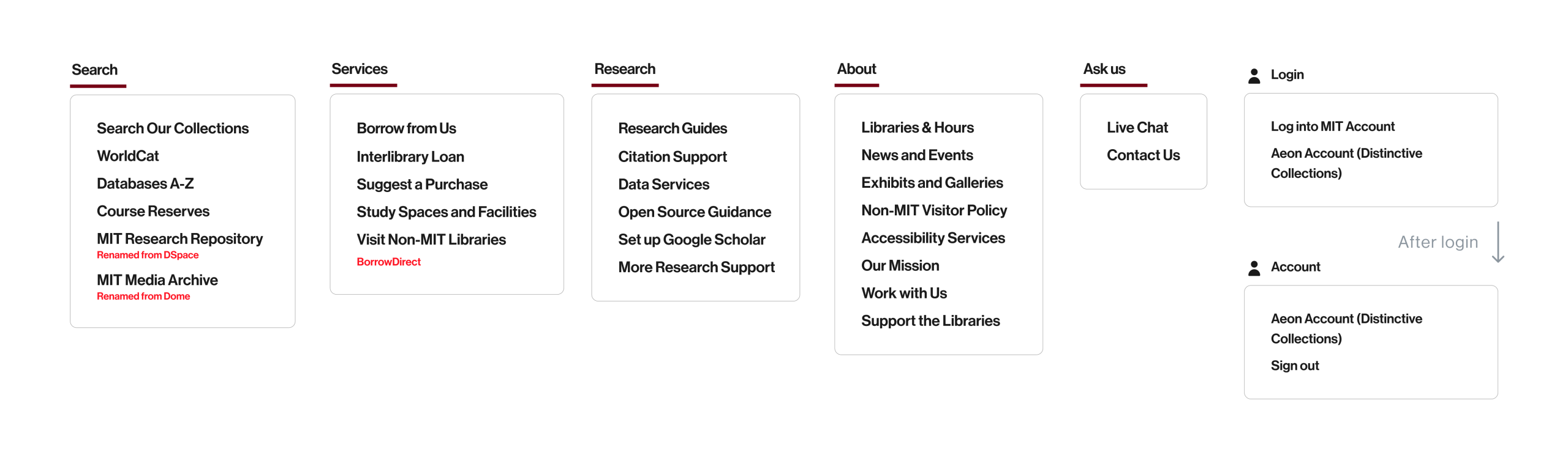
Task-Based IA
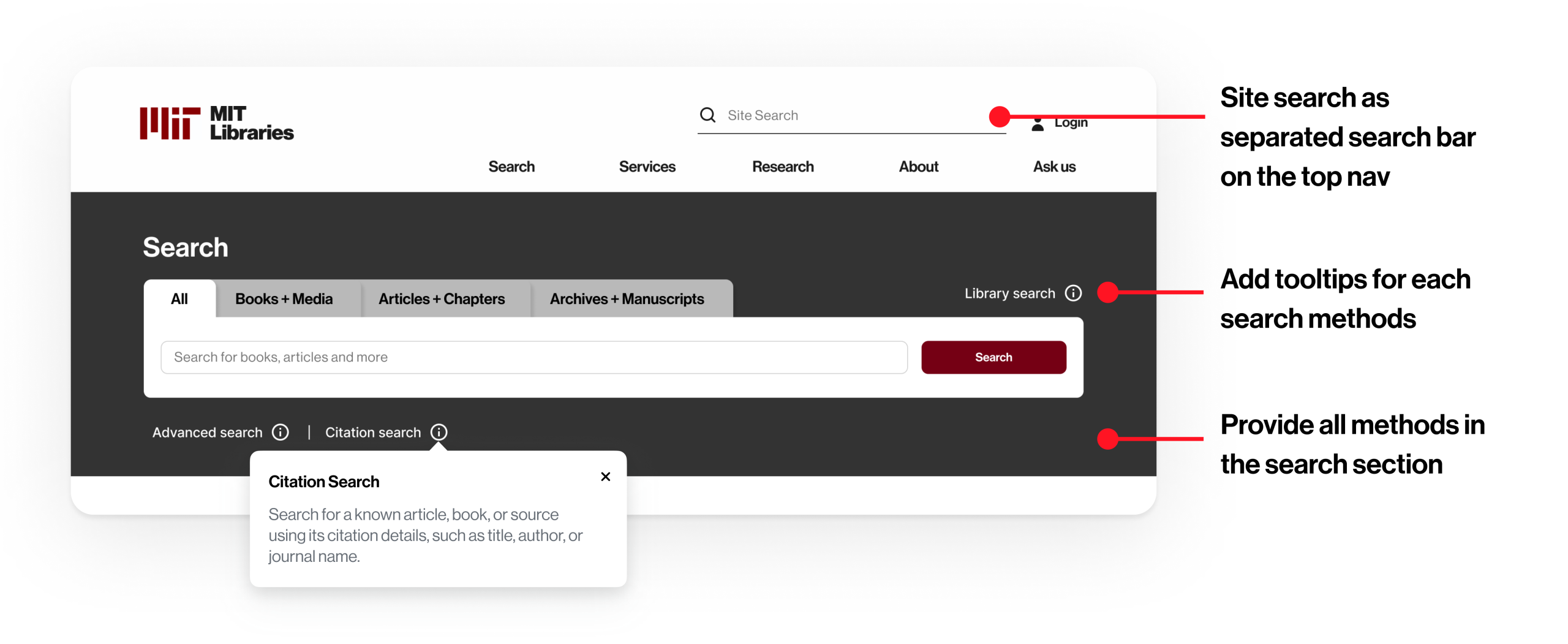
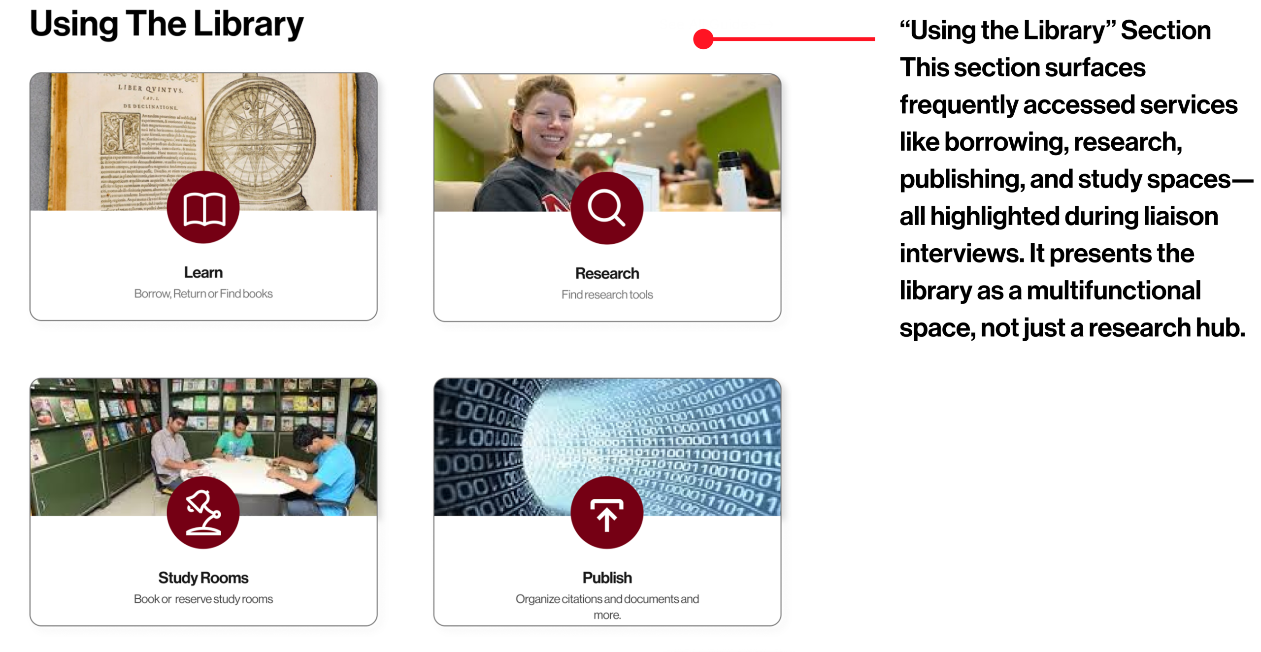
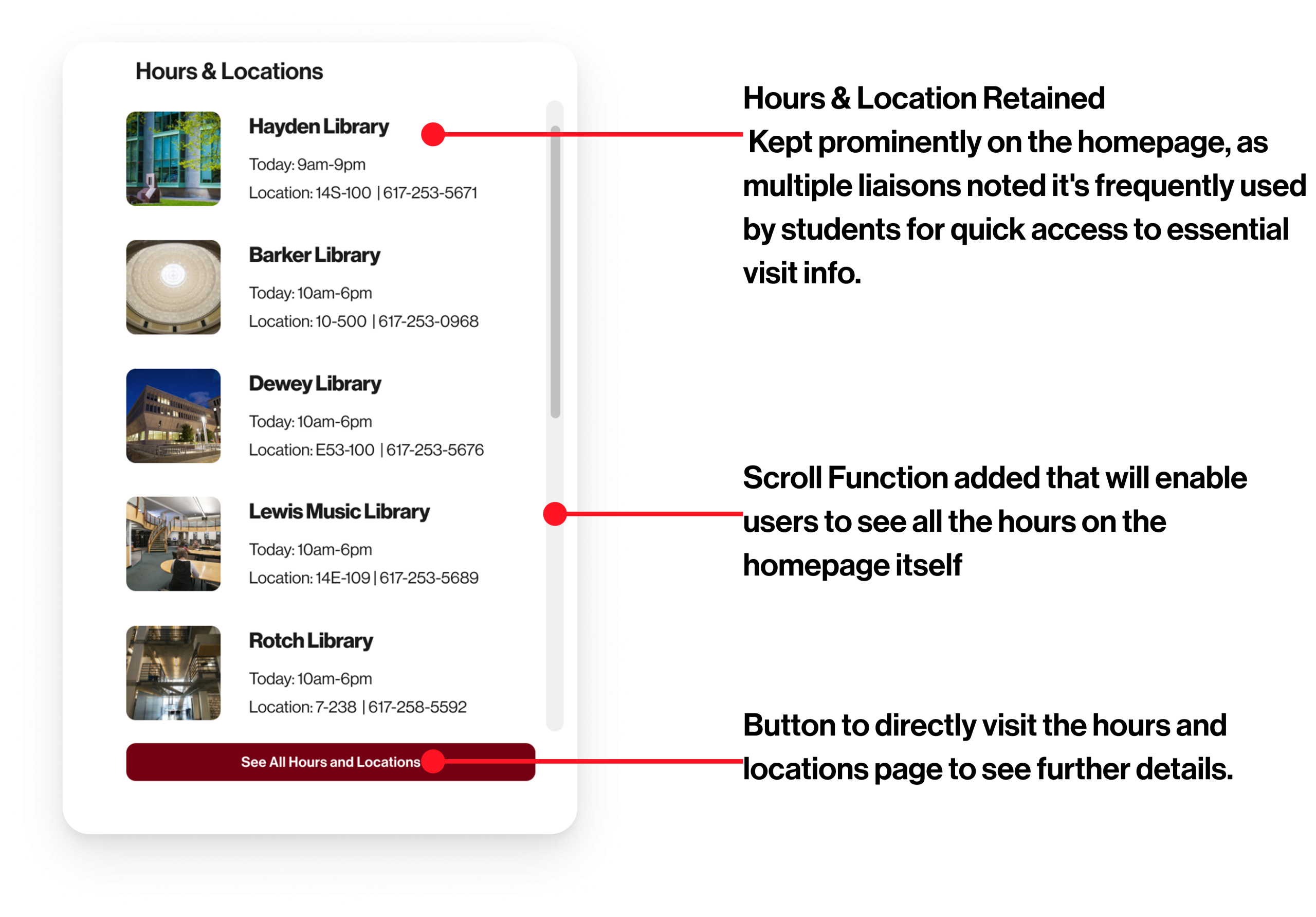
Designing the Gateway: Homepage Redesigns
A variety of homepage designs were presented to the client to offer a range of possibilities for them to consider. Different components from each design version could then be picked and combined in the client’s future website redesign process and relevant stakeholder conversations.
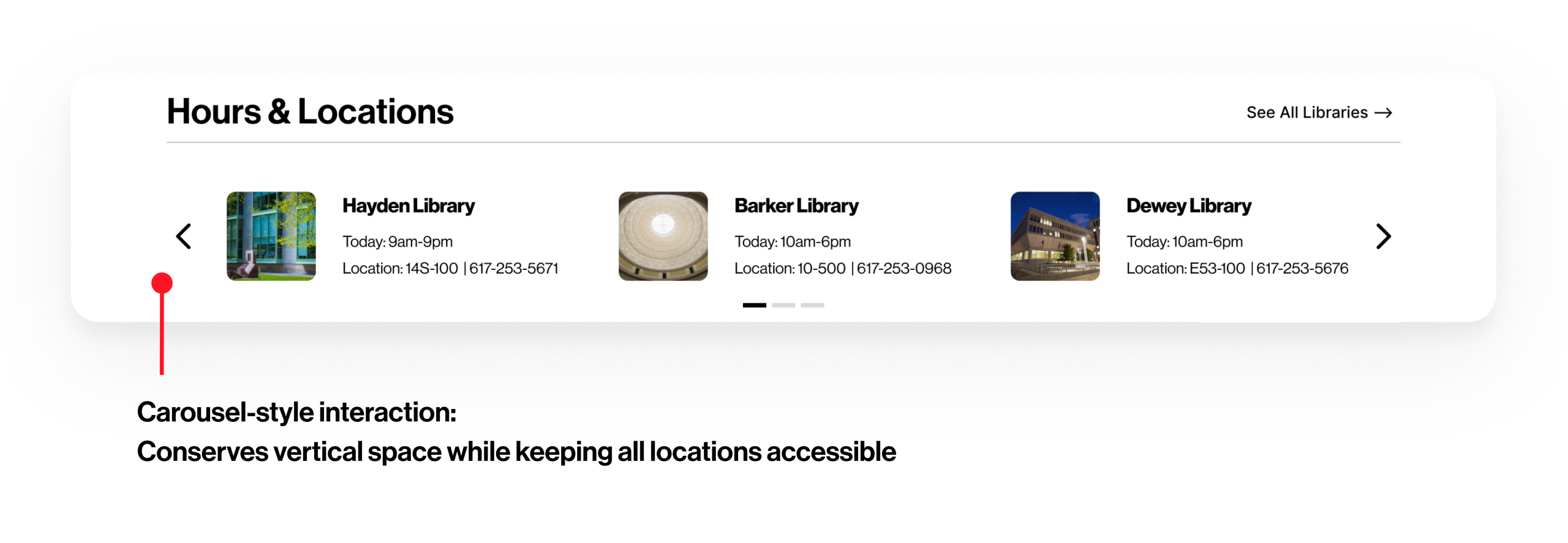
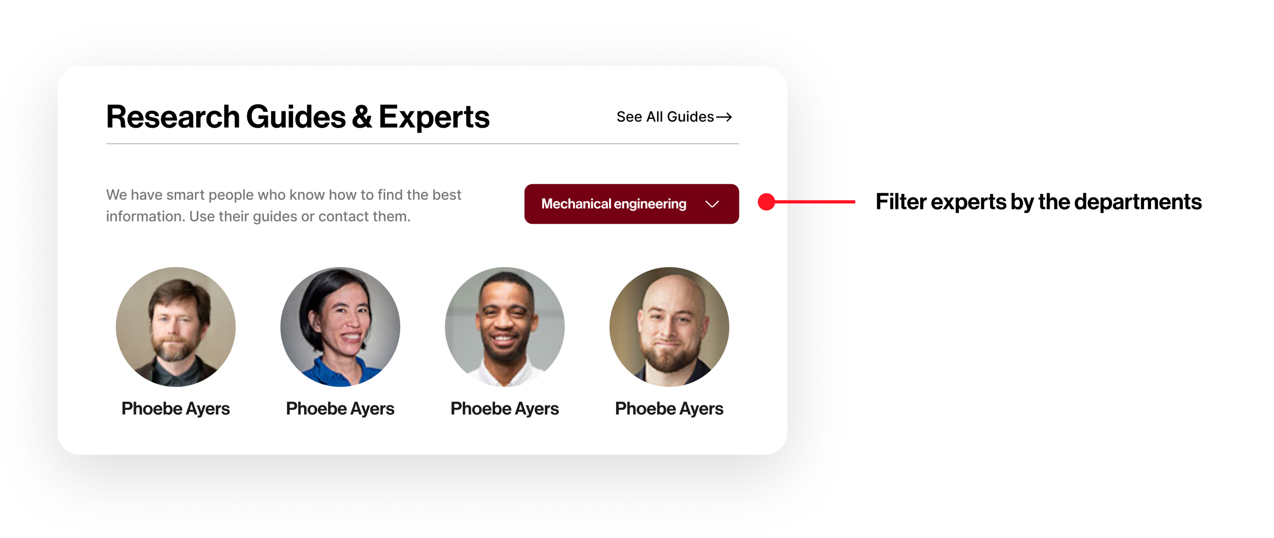
We created 4 homepage prototypes:
- Version 1: Clear dual search, contact options, and research guide visibility.
- Version 2: Centralized services like citation tools and thesis prep.
- Version 3: Interactive carousel, minimal event section, and expert filtering.
- Version 4: Using the library section at the top to use the library as a whole resource.
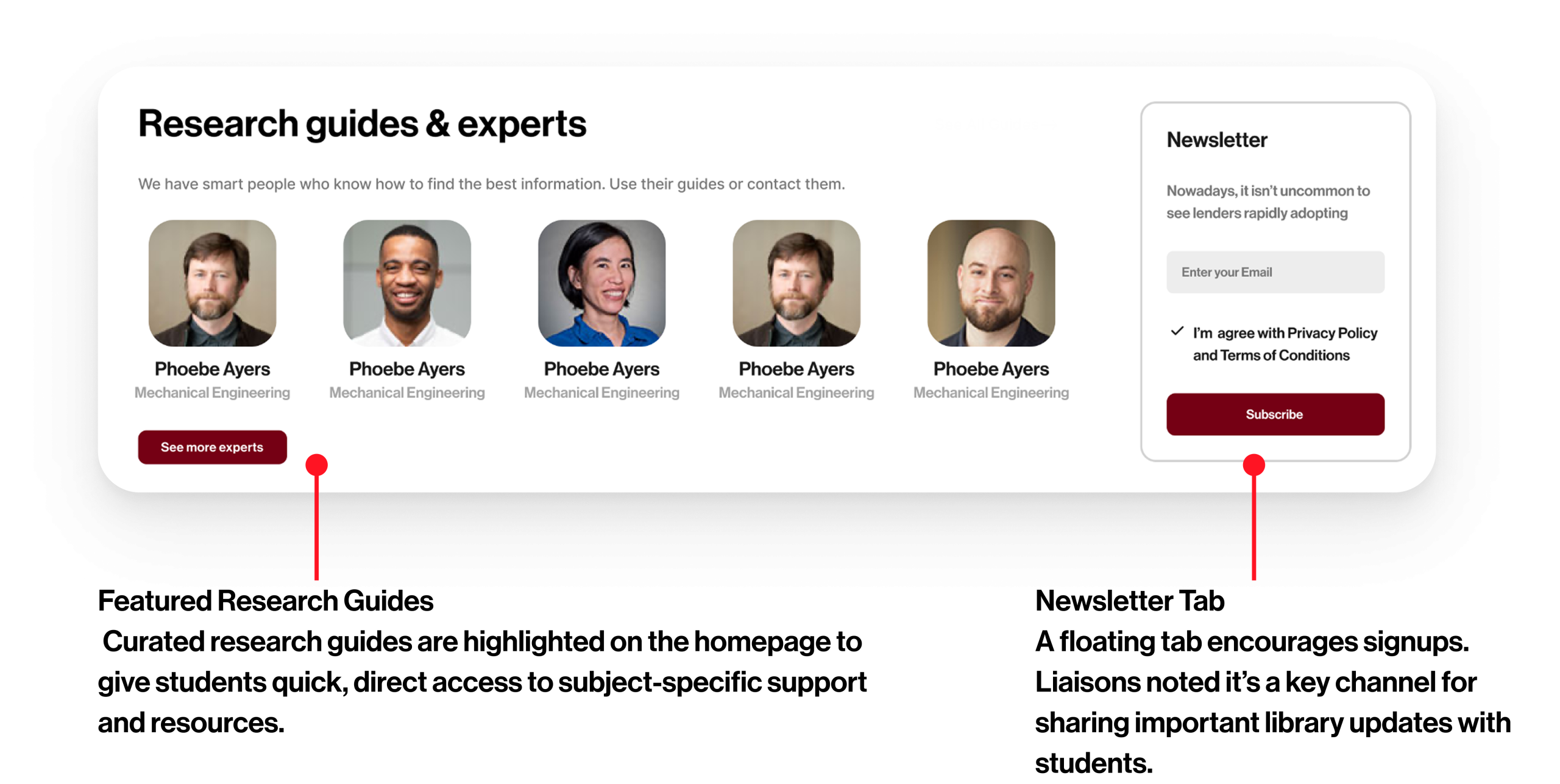
Version 1: Clear dual search, contact options, and research guide visibility.


Version 2: Centralized services like citation tools and thesis prep.


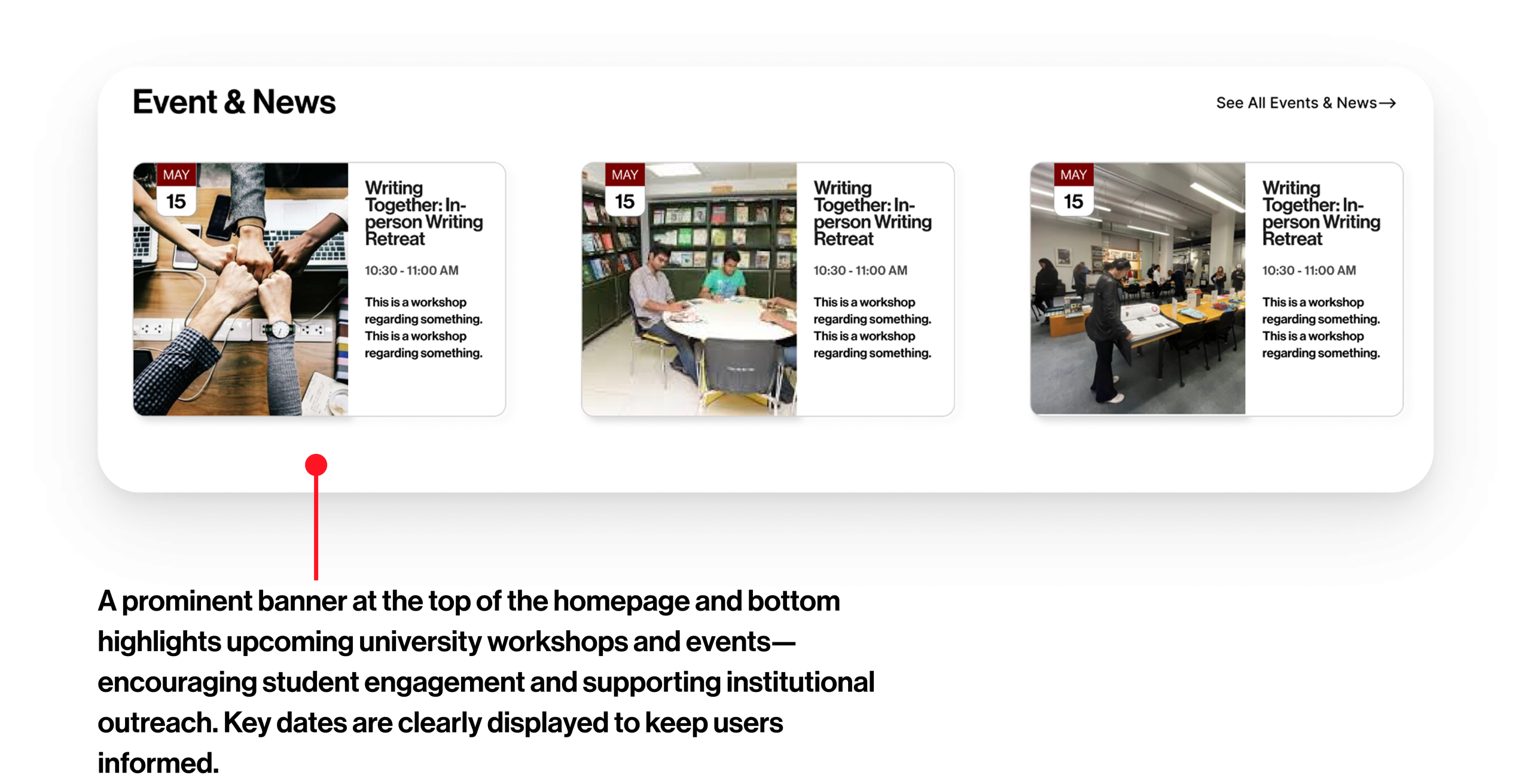
Version 3: Interactive carousel, minimal event section, and expert filtering.
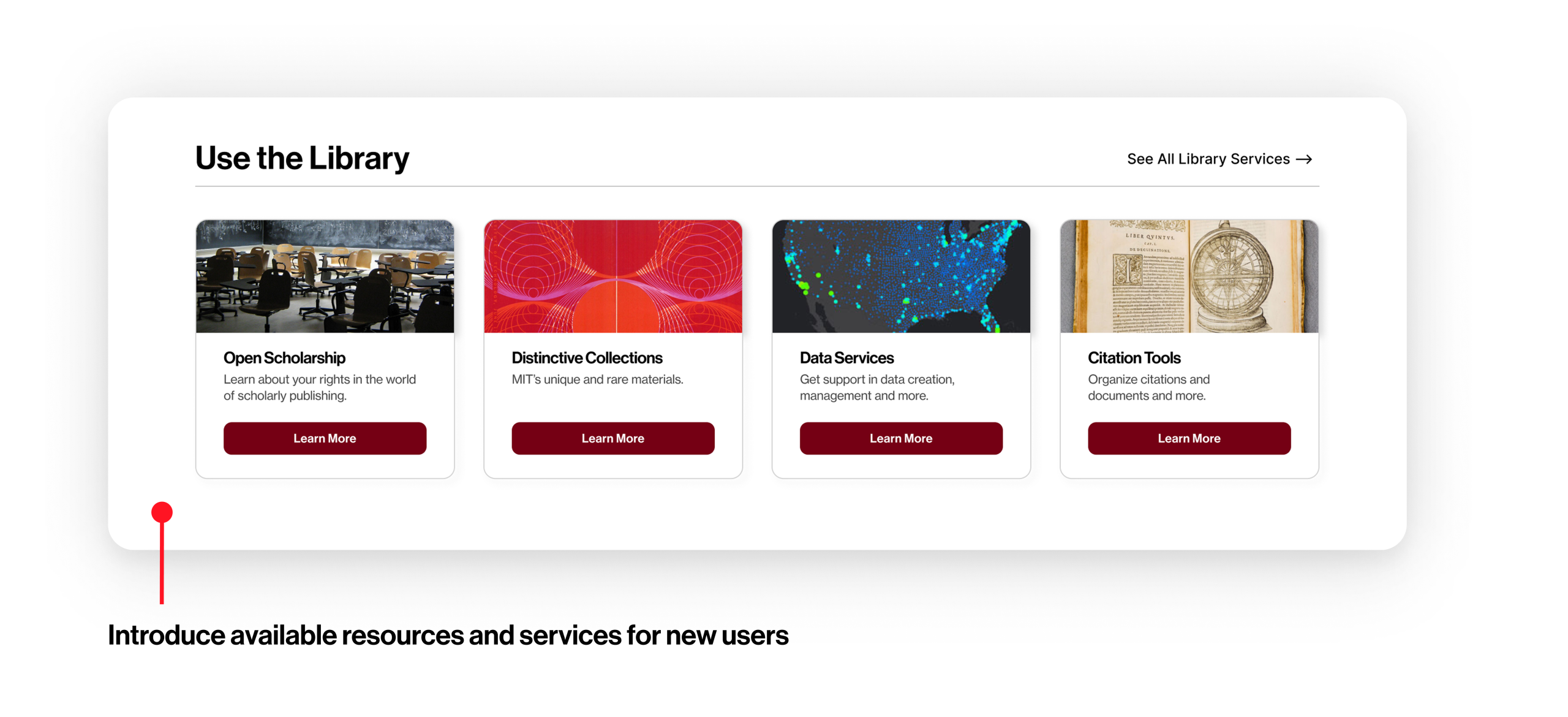
Version 4: Using the library section at the top to use the library as a whole resource.
Version 4 offers a redesigned search bar feature with dual dropdowns, allowing users to choose both the material format and the source. Interviews with library liaisons revealed they often direct users to the footer to decide where to search, this design brings those options up front. Users also emphasized the need for clearer filters, which guided the inclusion of targeted search refinements. Inspired by Bento and Primo models, this interface simplifies decision-making, reduces cognitive load, and supports more focused searches, especially for first-time users.

Stage 3: MATERIALIZE — Iterating on Designs
Client Feedback
Upon initial review of our designs, our client provided thoughts and ideas about areas they particularly liked, areas for improvement, and questions for us to consider. Such comments included an appreciation for the variety of components of different features offered between all four designs. In particular, they liked the different ways of thinking about searching (site search vs how we label different tabs for the catalog search function), and the different ways users can find services and research experts. Other comments we took into our final redesign included rethinking some word choices (such as “Library Services” or “liaisons,” as not everyone may be familiar with such terms). Links to our final IA and designs can be found at the bottom of the page.
The Impact We Made
Final Outcomes & Recommendations
Our redesigns resulted in:
- Higher navigation success and clarity by up to 10%
- Increased confidence using search tools by up to 24%
- Clearer, streamlined homepage layouts
- Deliverables: Annotated wireframes, revised IA, clickable prototypes
Final Design Meeting with the clients.
Our clients were incredibly pleased with the variety of homepage designs and information architecture approaches. They were excited by our new approaches for looking at a library website homepage and information architecture, and look forward to conducting usability testing on the designs for further validation. Lastly, they look forward to showing all four homepage designs, as well as components from each homepage, to stakeholders as they conduct their own future website redesign
Where It Goes From Here
Next Steps
- Conduct further usability testing with the university library’s audiences
- Use this as a foundation for the full-site redesign
- Measure outcomes: bounce rate, search usage, support requests
See It In Action
Task-Based Information Architecture
Topical Information Architecture
References
- Barrett, A. (2005). The Information-Seeking Habits of Graduate Student Researchers in the Humanities1. The Journal of Academic Librarianship, 31(4), 324–331. https://doi.org/10.1016/j.acalib.2005.04.005
- Bingham, K., Colton, O., & Higley, M. (2024). Google Explore App: UX Redesign. Proceedings of the 42nd ACM International Conference on Design of Communication, 277–279. https://doi.org/10.1145/3641237.3691690
- Catalano, A. (2013). Patterns of graduate students’ information seeking behavior: A meta-synthesis of the literature. Journal of Documentation, 69(2), 243–274. https://doi.org/10.1108/00220411311300066
- Connaway, L. S., Dickey, T. J., & Radford, M. L. (2011). “If it is too inconvenient I’m not going after it:” Convenience as a critical factor in information-seeking behaviors. Library & Information Science Research, 33(3), 179–190. https://doi.org/10.1016/j.lisr.2010.12.002
- De Rosa, C., Cantrell, J., Hawk, J., & Wilson, A. (2006). College Students’ Perceptions of Libraries and Information Resources. Retrieved June 30, 2022, from https://www.immagic.com/eLibrary/ARCHIVES/GENERAL/OCLC_US/O060424D.pdf
- Deschenes, A. (2019). Redesigning Harvard Library’s Website with User Research at Every Step. Proceedings of the 2018 Library Assessment Conference: Building Effective, Sustainable, Practical Assessment: December 5–7, 2018, Houston, TX, 773–786. https://doi.org/10.29242/lac.2018.72
- Frederick, D. E. (2018). Information seeking in the age of the data deluge. Library Hi Tech News, 36(2), 6–10. https://doi.org/10.1108/LHTN-10-2018-0065
- Ge, X. (2017). Information-Seeking Behavior in the Digital Age: A Multidisciplinary Study of Academic Researchers | Ge | College & Research Libraries. https://doi.org/10.5860/crl-34r2
- George, C., & Bright, A. (2006). Scholarly use of information: Graduate students’ information seeking behaviour [Text]. Professor T.D. Wilson. http://informationr.net/ir/11-4/paper272.html
- Maughan, P. D. (1999). Library Resources and Services: A Cross-Disciplinary Survey of Faculty and Graduate Student Use and Satisfaction. Journal of Academic Librarianship, 25(5), 354. https://doi.org/10.1016/S0099-1333(99)80054-8
- Miller, A., Johnson, J., Cline, L., Edgar, W., Fischer, S., & Jackson-Brown, G. (2023). Research Services and Spaces as Expressions of the Scholarly Information Seeking Habits and Behavior of University Faculty. Journal of Library Administration, 63(5), 633–651. https://doi.org/10.1080/01930826.2023.2219597
- Research Information Network. (2007, April). Researchers’ use of academic libraries and their services. Research Information Network and the Consortium of Research Libraries. Retrieved July 5, 2022, from https://eprints.soton.ac.uk/263868/1/libraries-report-2007.pdf
- Richardson, B. W. (2023). Design variations and evaluation of loanable technology web pages in academic library websites. The Journal of Academic Librarianship, 49(3), 102670. https://doi.org/10.1016/j.acalib.2023.102670
- Spezi, V. (2016). Is Information-Seeking Behavior of Doctoral Students Changing?: A Review of the Literature (2010–2015). New Review of Academic Librarianship, 22(1), 78–106. https://doi.org/10.1080/13614533.2015.1127831
- Velasquez, D. L., & Campbell-Meier, J. (2022). Is Your Library Website Missing Essential Information?: A Comparison and Evaluation of Public Library Websites in Australia, Canada, and United States. Journal of Web Librarianship, 16(3), 165–183. https://doi.org/10.1080/19322909.2022.2104777
- Velasquez, D., & Campbell-Meier, J. (2024). Library Website Evaluation: How Do Australian States Compare? Journal of the Australian Library and Information Association, 73(3), 310–335. https://doi.org/10.1080/24750158.2024.2362451
- Wu, M., & Chen, S. (2012). How graduate students perceive, use, and manage electronic resources. Aslib Proceedings, 64(6), 641–652. https://doi.org/10.1108/00012531211281779
- Yoon, K., Hulscher, L., & Dols, R. (2016). Accessibility and Diversity in Library and Information Science: Inclusive Information Architecture for Library Websites. Library Quarterly, 86(2), 213–229. https://doi.org/10.1086/685399