Overview
City Harvest’s Employee Portal: a Shared Resource and Responsibility
City Harvest is a New York nonprofit organization that rescues and delivers food for New Yorkers experiencing food insecurity. In 2023, City Harvest created their first organization-wide Microsoft Sharepoint intranet, the City Harvest Portal, to support employees’ access to shared company resources. Our team provided design recommendations to improve navigation, increase engagement, and maintain information accuracy of the portal.
The Business Insights and Informational Technology teams at City Harvest have been led the management of the portal but most content creation and document management is decentralized; each department is responsible for their specific department page and information relating to their department. The distributed responsibility of the portal created challenges with enforcing standardization of the portal and complicated implementation for sections of the portal. All City Harvest employees are content seekers and some are content creators (those who upload and manage documents).
Key Goals
Build Clear Navigation
Refine navigation so employees can locate information and relevant features, regardless of portal familiarity.
Increase Engagement
Improve content design to increase engagement and confidence in portal exploration.
Better Communication
Improve the content management experience
to reduce inaccurate information and streamline internal communication.
Making the Portal Clear and Clutter-free
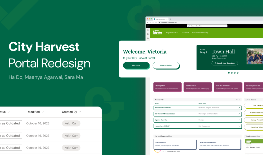
We redesigned the City Harvest
portal home page and top menu bar to improve navigation.

Redesigned Home Page
System to Review Outdated Files
We also created a system for City Harvest employees to review old files to keep files updated and accurate.
Exploratory Research Process
Defining the Overarching Employee Experience of Using the Portal
We learned from our stakeholders that depending on an employee’s department at City Harvest, how they use the portal varies vastly. So our main research goal was to understand what common experiences did employees have across the organization so maximize the impact of our design recommendations.
User interviews
Understand attitudes and journey of using the portal and content contribution.
User Survey
Capture a representative view of frequency of use, motivation to use, and attitude towards the portal.
Desk Research
Created a site map to understand how content is organized and the current state.
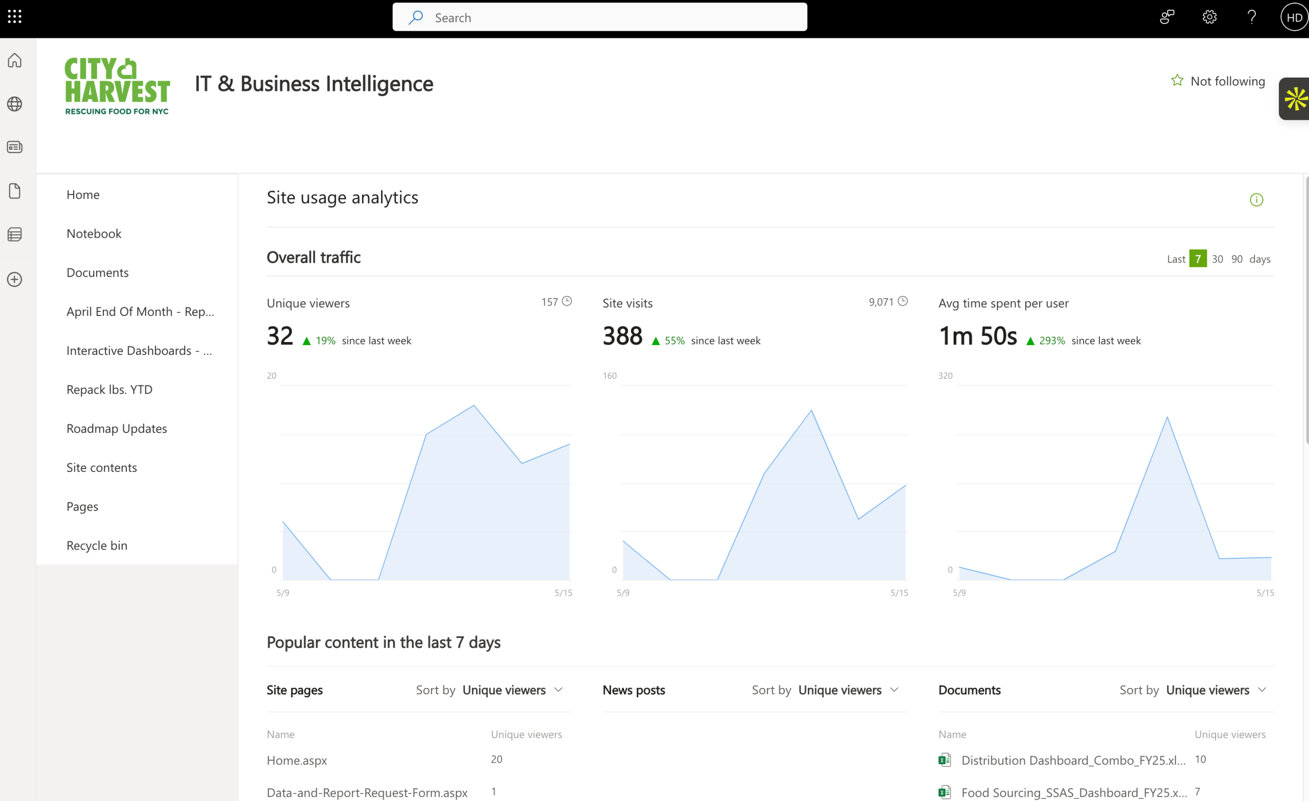
Data Analytics
Define the most commonly used sections of the portal across the organization.
What we learned from each method:
User Interviews: Issues with navigation, labeling, and outdated documents
Users expressed difficulty navigating beyond daily tasks, highlighting a broader struggle with locating essential information on SharePoint. The homepage is information-heavy and lacks intuitive organization. Labels and buttons often fail to meet expectations, and the presence of outdated documents causes confusion, especially for other departments attempting to access shared resources

User Survey: Content creators as the majority, confirming interview insights
72% of respondents identify as content creators, which emphasizes the importance of efficient content management. Outdated documents in key folders hinder productivity, and unclear folder or document names increase the effort required to locate specific files. Despite these issues, users acknowledged the platform’s potential if better organized.

Desk Research: Overall Inconsistencies
We found inconsistency across different department pages, including varied structures, repeated or conflicting terminology, and visual clutter. These inconsistencies made cross-navigation difficult and detracted from the user experience, indicating a need for standardized content formatting and clearer information architecture.
Data Analytics: Search is less useful for unknown items
Search is a frequently used tool for finding documents, but this works when files are updated and users know what they are searching for. In cases where users are unfamiliar with what to search, they rely on the homepage or department pages to locate people or documents. Many existing pages are cluttered and receive little to no traffic, suggesting an opportunity to declutter and prioritize content. There’s also a gap in making exploratory search and discovery more intuitive for users who are unsure of where to begin.
Building A Harvester’s Journey with the Portal
After bringing together all findings from our research process, we began compiling insights, through affinity mapping, to build a user journey map of an employee from new hire to long term employee.
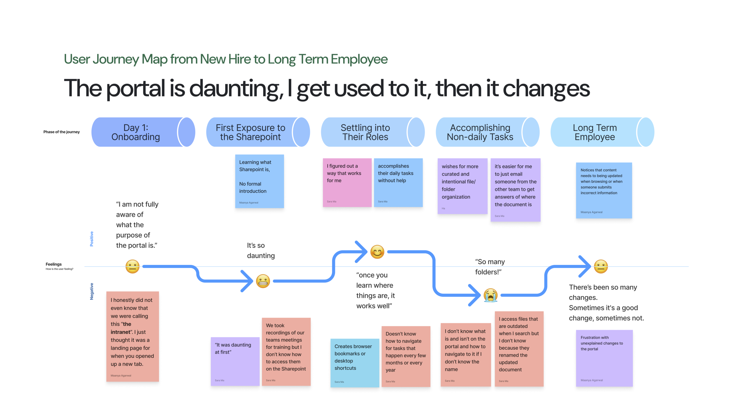
Through our journey map, we were able to pinpoint and prioritise insights with high level impact for as many users as possible.
Key Insights
Insight #1
Inconsistent information architecture frustrates employees for non-regular tasks.
Insight #2
Outdated documents lead to employees completing tasks incorrectly due to access to inaccurate information.
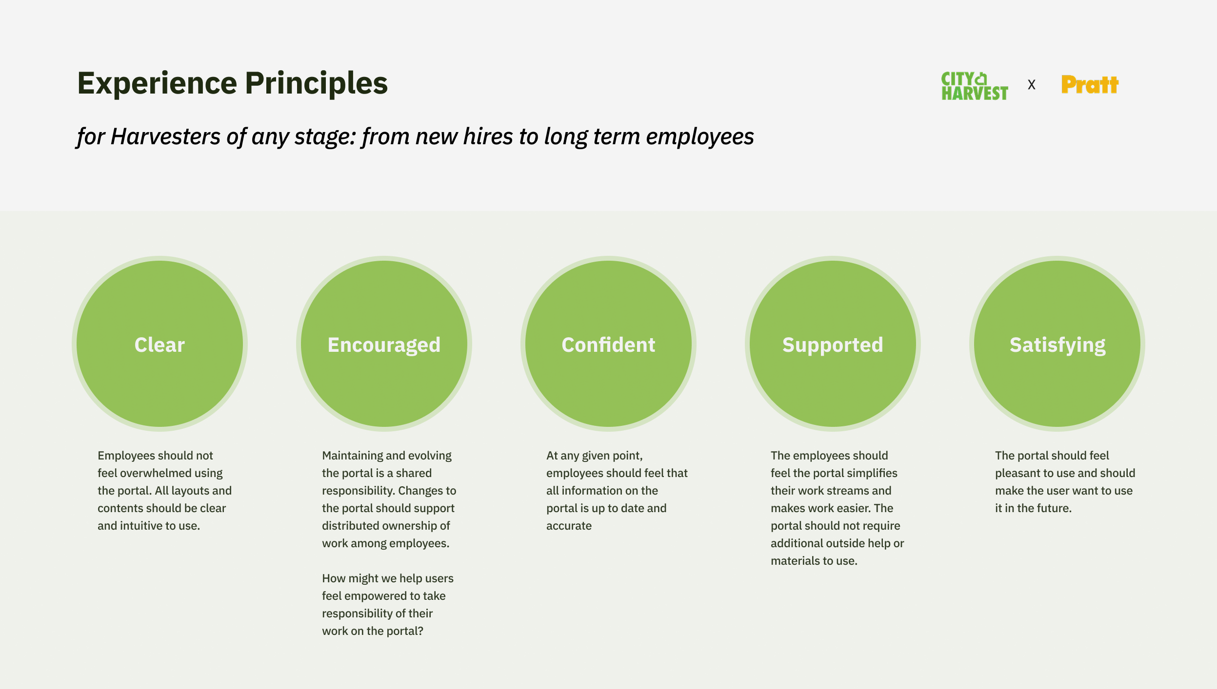
The Design Work
Design Process & Principles
- Concept Sketches
- Wireframes & Mid-fidelity Prototypes
- Usability Testing with Harvesters
- Hi-fidelity Prototypes & Style Guide
In each of these steps, we tried to follow the experience principles that we set out to keep our designs in line with City Harvest’s goals on how the portal should feel to Harvesters.
Design Recommendations
Based on the feasibility of implementation and the size of potential impacts, we focused on the following recommendations:
#1 – Home Page Navigation
Easily Navigate with Clearer Labels and Grouping of Information
#2 – Home Page Announcement
Improve Engagement with a new Dedicated Space for Events & Announcements
#3 – Outdated Files
Create opportunities to review outdated files for ease of content creators identifying files to remove
1. Home Page
Since the home page is the most important page for Harvesters from any department to access City Harvest’s resources, we focused on making the experience on the home page easy to navigate – especially in finding unknown items – as well as engaging to interact with as this page is the first thing Harvesters see when they access their work setup.
Easily Navigate with Clearer Labels and Grouping of Information
We re-organized the information grouping and relabeled certain links and buttons with the goal of making the Home Page easy to understand for different departments and different purposes: whether Harvesters need to find known or unknown items.

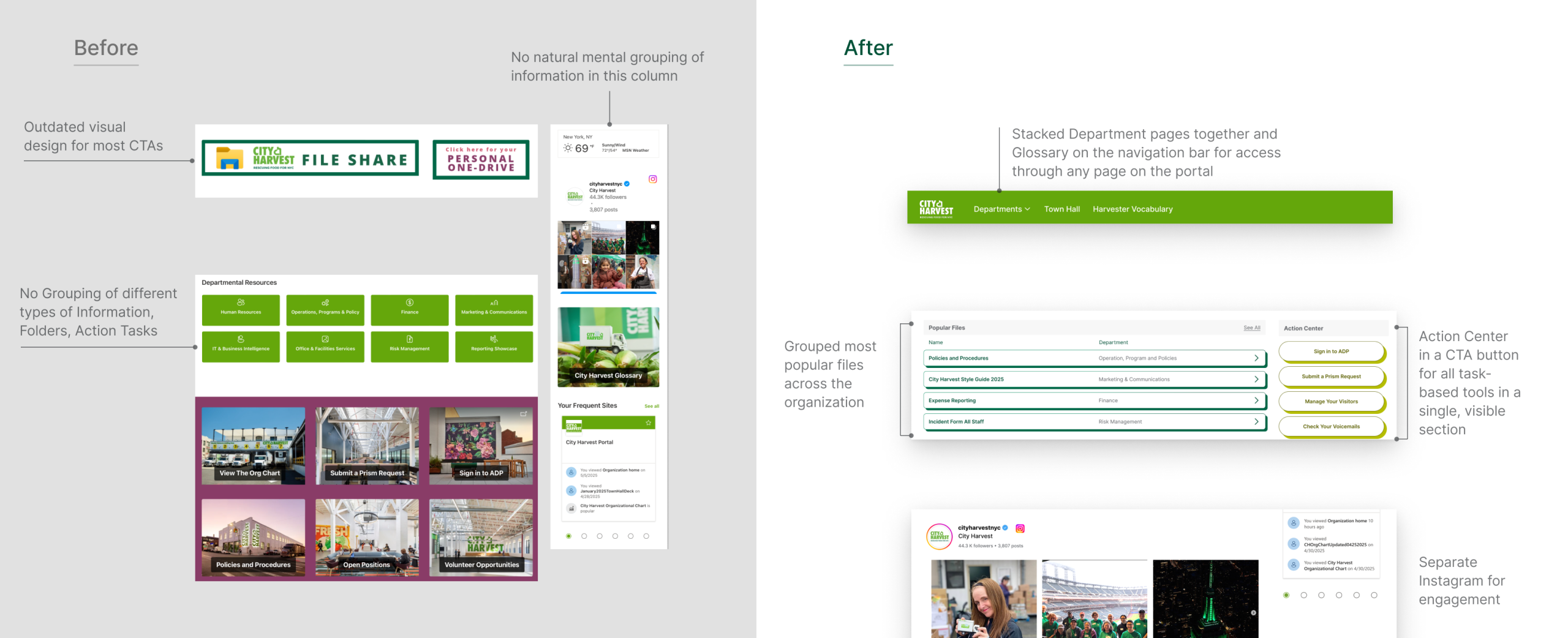

Improve Engagement with a new Dedicated Space for Events & Announcements
One of our goals for the homepage is to have Harvesters feel engaged with the portal and the organization. To do so, we dedicated a carousel on the home page for current events happening in the organization, especially HR training events that Harvest often needs to keep track of.
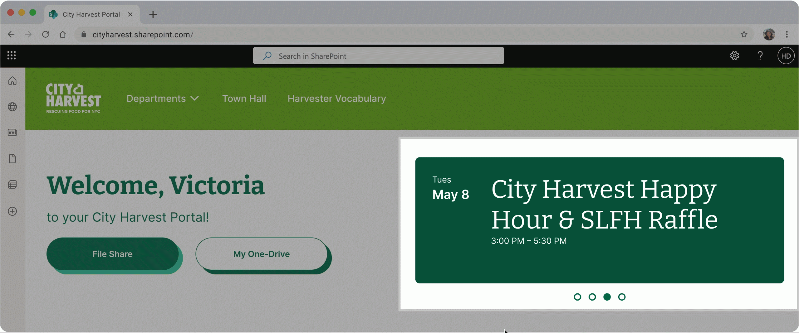
See our Homepage Prototype
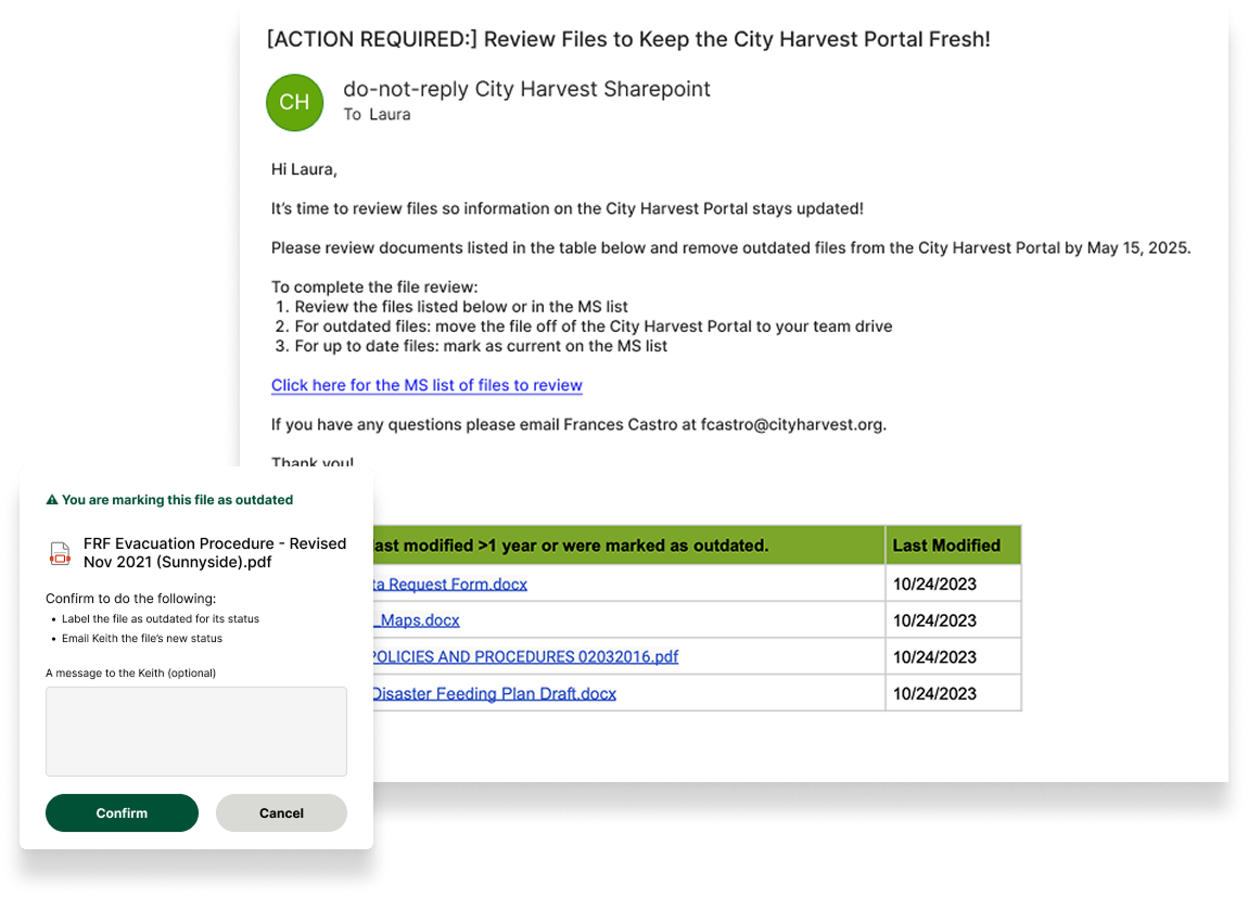
2. Keeping the Portal Documents Up to Date
To address the issues of outdated files that are sprinkled throughout the portal and potentially obstruct City Harvest employees from getting their work done, we suggested a system that builds different moments of review for Harvesters.
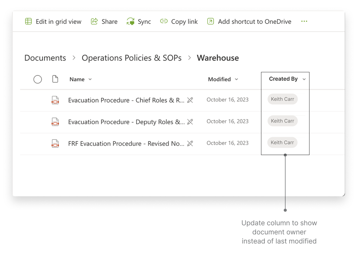
Clear point of contact for documents
Before, the point of contact for documents showed the name of the person who last modified the document. However, this led to many inaccuracies about who true point of contact was. In one department, the point of contact was incorrect for 75% of documents because one person from another department mass migrated the documents from one area to another. In another department, the point of contact for files showed employees who no longer worked at City Harvest.
Our first recommendation is to use Microsoft Power Automate to mass assign the point of contact for department files in the created by field. Then, update Sharepoint to display the created by column. With these changes, content seekers can easily identify the correct document owner to contact.
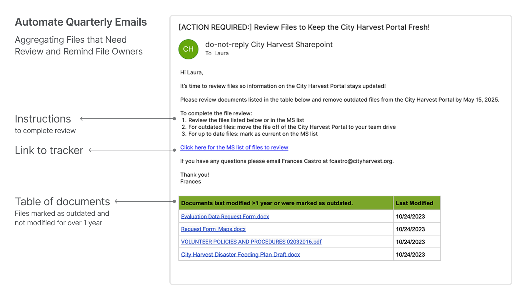
Proactively Review Documents with Automated Emails
To proactively review files, we created a template for an automated email that compiles files in need of review. This encourages content creators to periodically review files, instead of relying on reporting from other employees who may not be confident in knowing a file is outdated. Once again, Microsoft Power Automate can aggregate the files for review and email the correct document owners every quarter.
The Flow: Seamlessly Flagging Outdated Files to Receiving Notice Email
Using the newly integrated button in each file, we thought out an interaction flow that ensures the reporter knows that they have reported with a confirmation window, and the receiver understands the clear actions that they can take to take down the outdated files with automated emails.
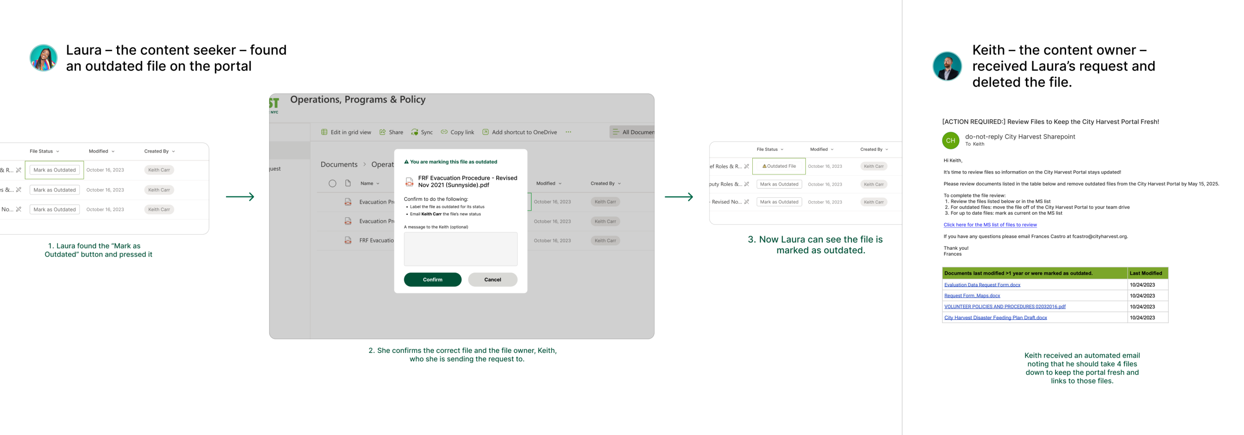
Easily Track Review Status and Distribute Responsibility
Additionally, we mocked up a tracker to build into Microsoft List so content creators can review the status of files that need to be reviewed. While the created by field can hold one name as the document owner, Microsoft Lists can be shared amongst multiple employees to distribute the responsibility of keeping files updated and the portal fresh.
Our Design Journey
Feedback from Mid-fidelity Prototypes

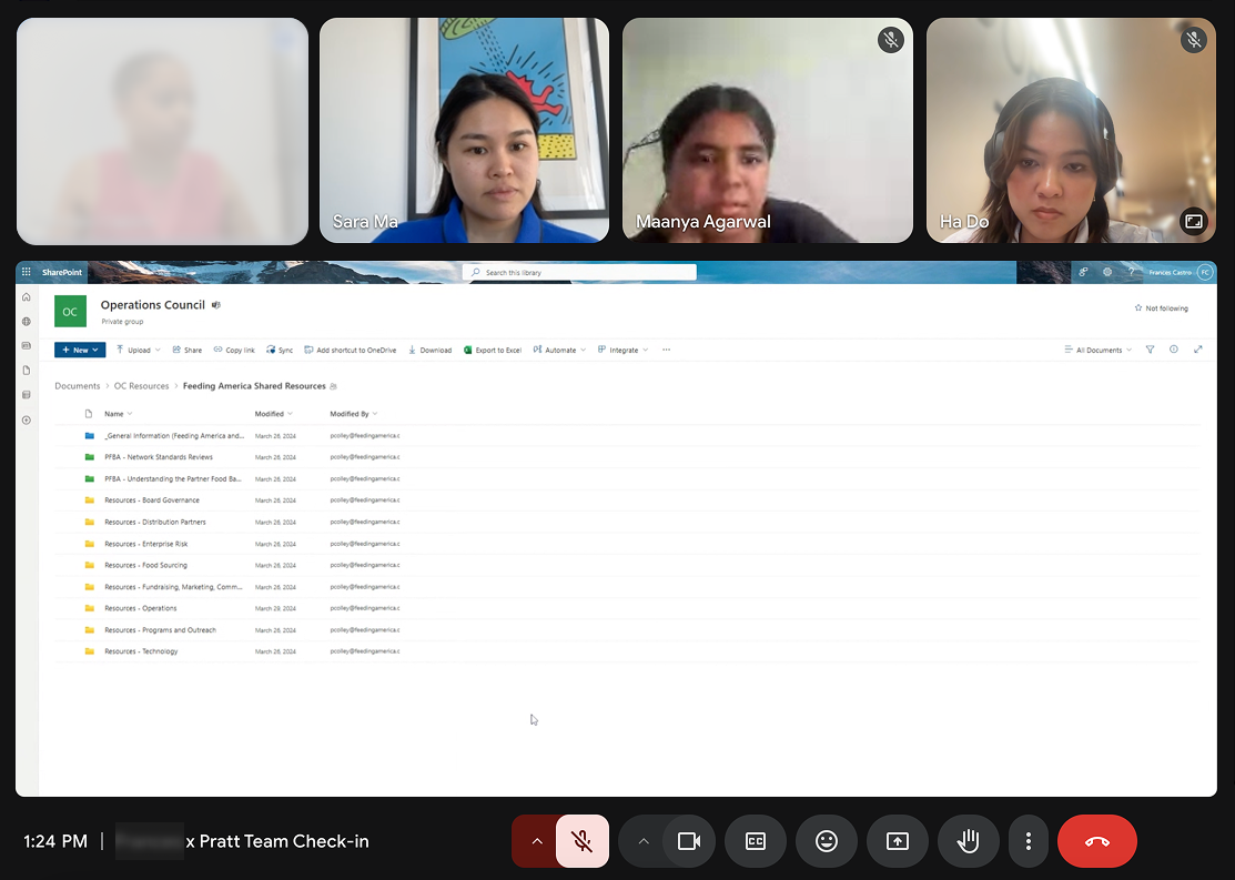
Our final designs were refined based on a series of user tests with 5 Harvesters coming from various departments. We provided testers with a mid-fidelity prototype and a quick view of the final mockup concept to test out both the functionality and the visuals of the portal. Some feedback we received that got reflected in our final designs includes:
“May take some time to get used to from the current Portal but [the new design is a] huge improvement.”
“I like the carousel – it would be nice to see HR trainings on here. ”
“I am unsure on the logistic of how marking outdated files work. Who would be responsible to take the files down?”
Outcomes
Our redesign of the SharePoint homepage and information architecture sparked enthusiastic responses from the City Harvest team. The feedback validated the clarity, accessibility, and intentionality of our design approach.
“I just want to start implementing and adding these ideas in already.”
— Our client representative, Frances
Frances also noted that the new designs were “visually appealing and more accessible”, and even asked to present the updated design in the upcoming Town Hall meeting.
“This feels more intentional.”
— Our client head, Bronwen, reflecting on the improvement of the portal.
Their questions during the final presentation—ranging from search functionality to naming conventions and permissions for labelling changes—showed high engagement and a desire to explore long-term usability improvements.
Conclusion: What We Learned
This project challenged us to think beyond ideal design and engage deeply with practical constraints—technical, organizational, and resource-based.
We learned how to design within the realities of an internal tool, in this case, SharePoint, by aligning our recommendations with what was both impactful for users and feasible for the small IT team to implement. Every design decision was a balance between user needs and backend capabilities, helping us prioritize clarity, scalability, and longevity.
Collaborating closely with the client and IT team, we learned how to communicate design intent effectively, adapt our ideas based on technical feedback, and co-create solutions that would work in their existing infrastructure.
Lastly, we gained insight into the importance of designing for internal teams—whose tools may not always be user-friendly, but whose work is critical. The biggest win wasn’t just improving the interface—it was helping make daily work feel easier, more intentional, and more connected.