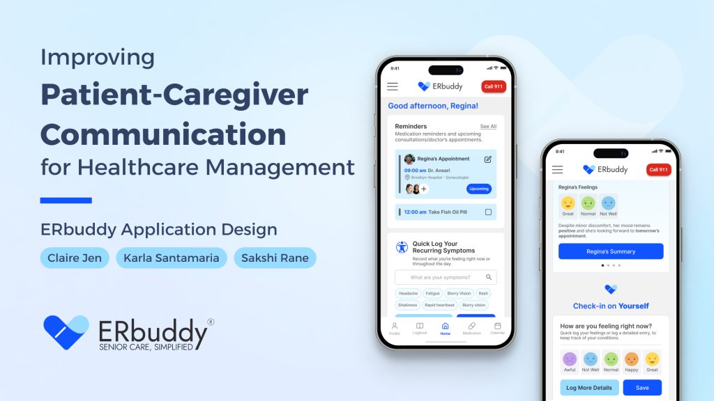
Team:
- Project Manager: Claire Jen
- Insights Lead: Karla Santamaria
- Design Lead: Sakshi Rane
Timeline:
February – May, 2025
Client:
ERbuddy, Inc.
A Shared Vision for Better Care
Project Overview
Born in New York City, ERbuddy set out to transform how patients and caregivers communicate. Recognizing the challenges faced by elderly patients and their families in managing care and staying informed, the app was designed with real people in mind: those who need clarity, connection, and support.
This vision led to a collaboration with Pratt Institute’s Center for Digital Experience, where we worked together to create a tool that makes healthcare communication more seamless and empowering.
Objectives
We wanted to design a healthcare experience that empowers patients to manage their health more independently while reducing the burden on caregivers, ultimately fostering a more supportive and effective care environment for everyone involved.
After making strategic decisions to find opportunity gaps to explore, we chose to concentrate on a core component of the experience:
“Improving communication between
patients and caregivers.”
This would allow us to explore a critical interaction point while still addressing our broader goal of reducing caregiver burden and improving patient autonomy.
Design Goals
With the rescoped direction in mind, we came up with our main design goals for the course of the project.
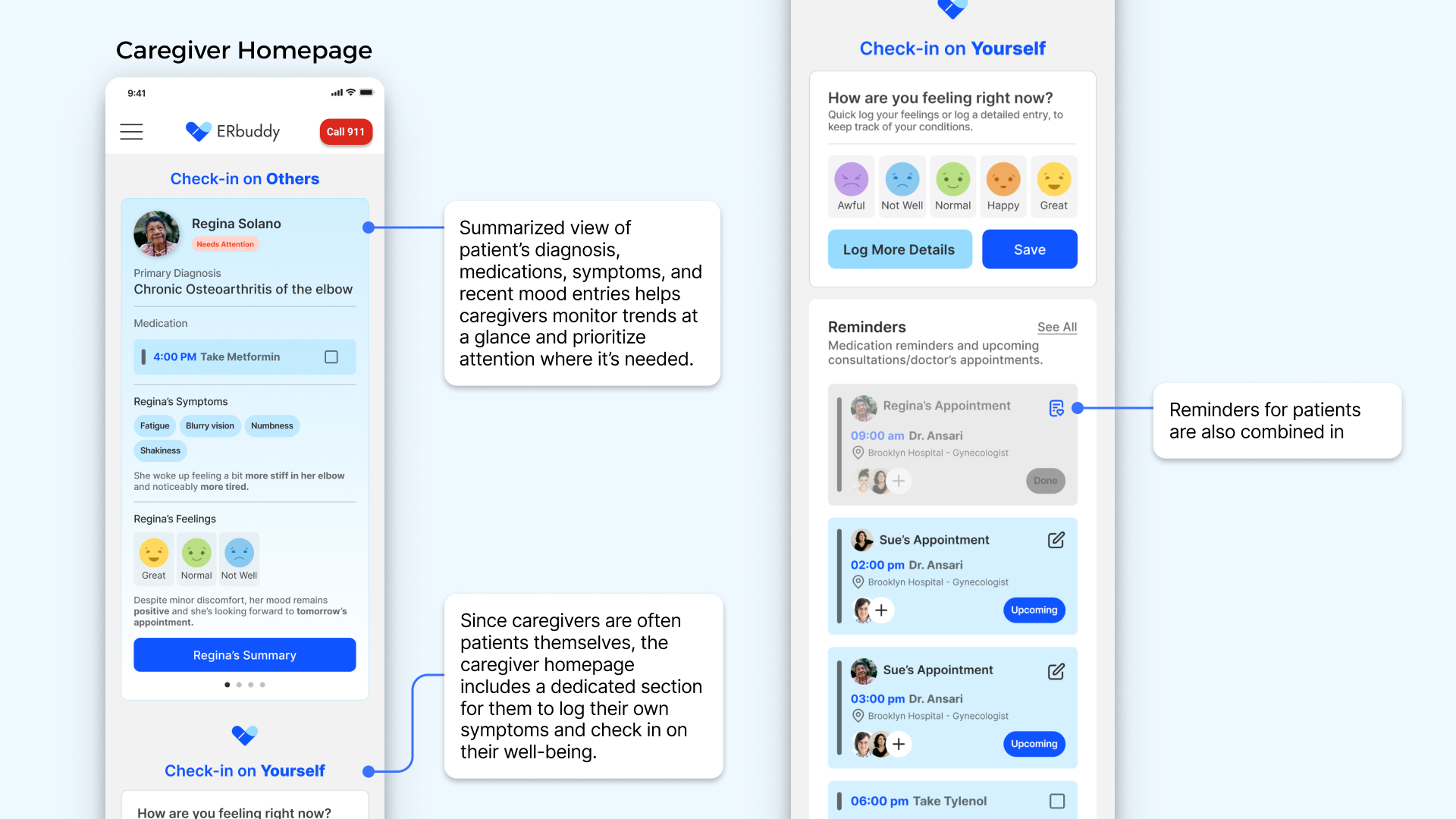
- Centralized Information Access
Create a system that surfaces essential health information at the right time for both patients and caregivers. - Strengthen Two-Way Communication
Facilitate clear and secure communication among patients and caregivers. - Improve Usability and Accessibility
Design an intuitive and accessible interface that minimizes friction for all users.
After three months of in-depth
research, design, and iteration,
we are proud to present the updated ERbuddy app.
From Vision to Screens
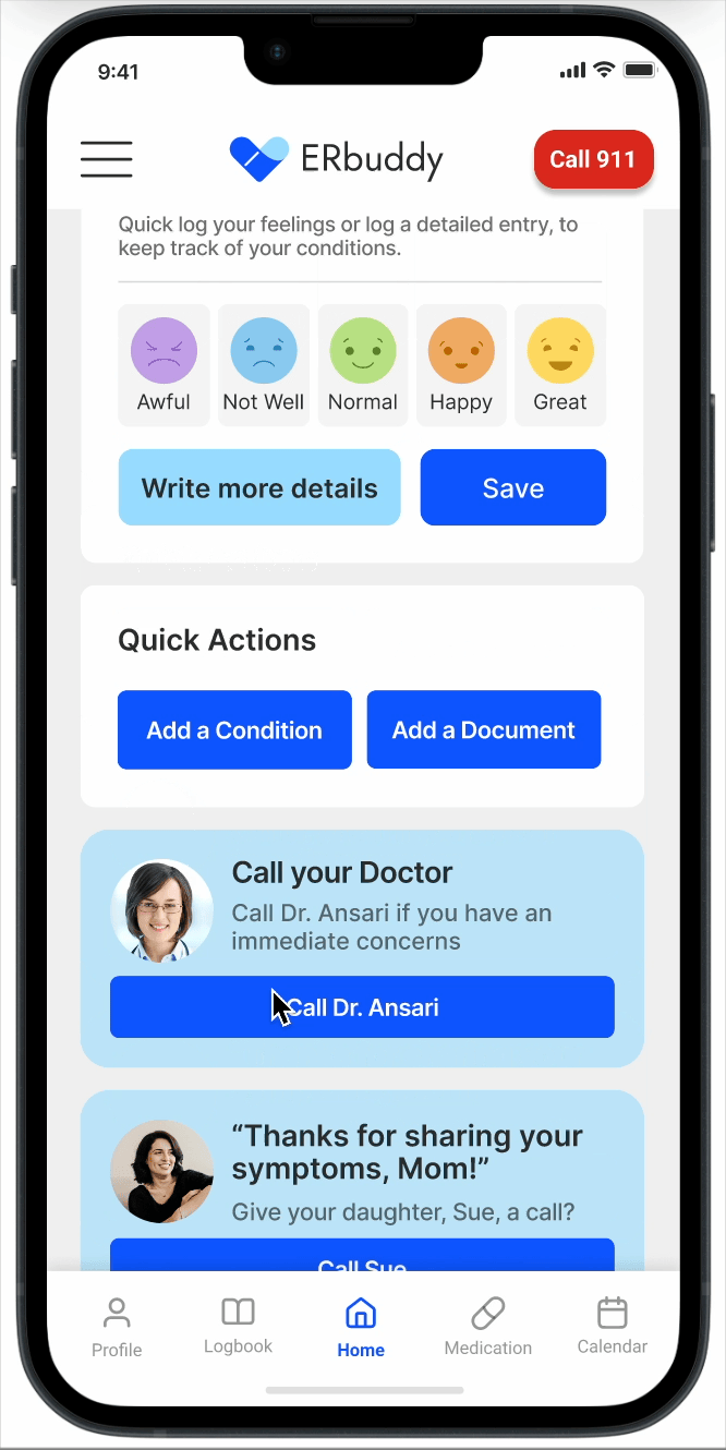
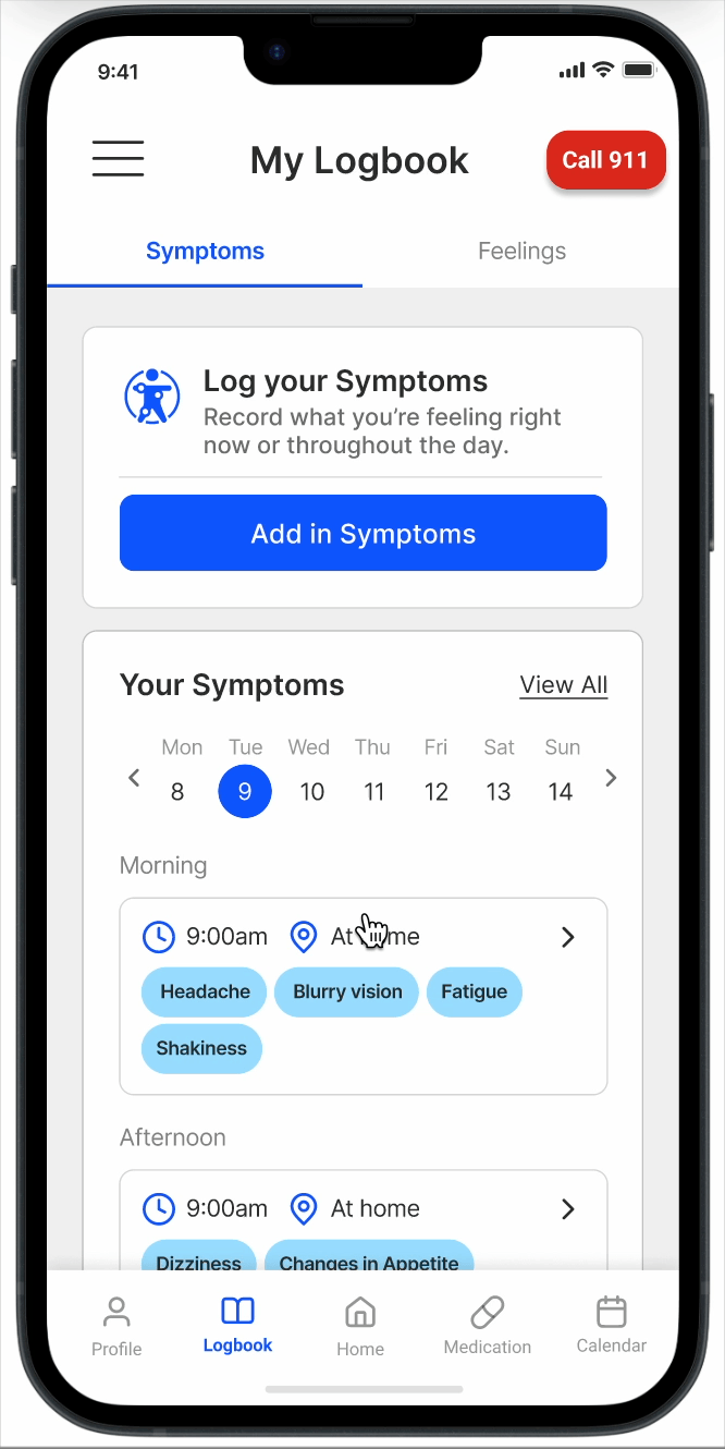
Final Designs
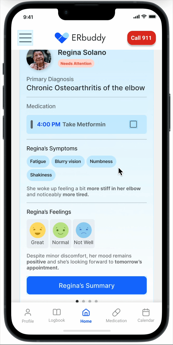
The final designs showcase a powerful application that provides a positive experience for both caregivers and patients. Through seamless navigation and increasing communication for all parties, users can manage their health and decrease stress.
How did we get here exactly?
Listening to the People Who Matter
Research Process
For this project, it was extremely important that we took time to understand the overall healthcare landscape and the patient-caregiver dynamic. Our team conducted desk research and competitive analysis to build our background knowledge and uncover opportunities to expand into the market.
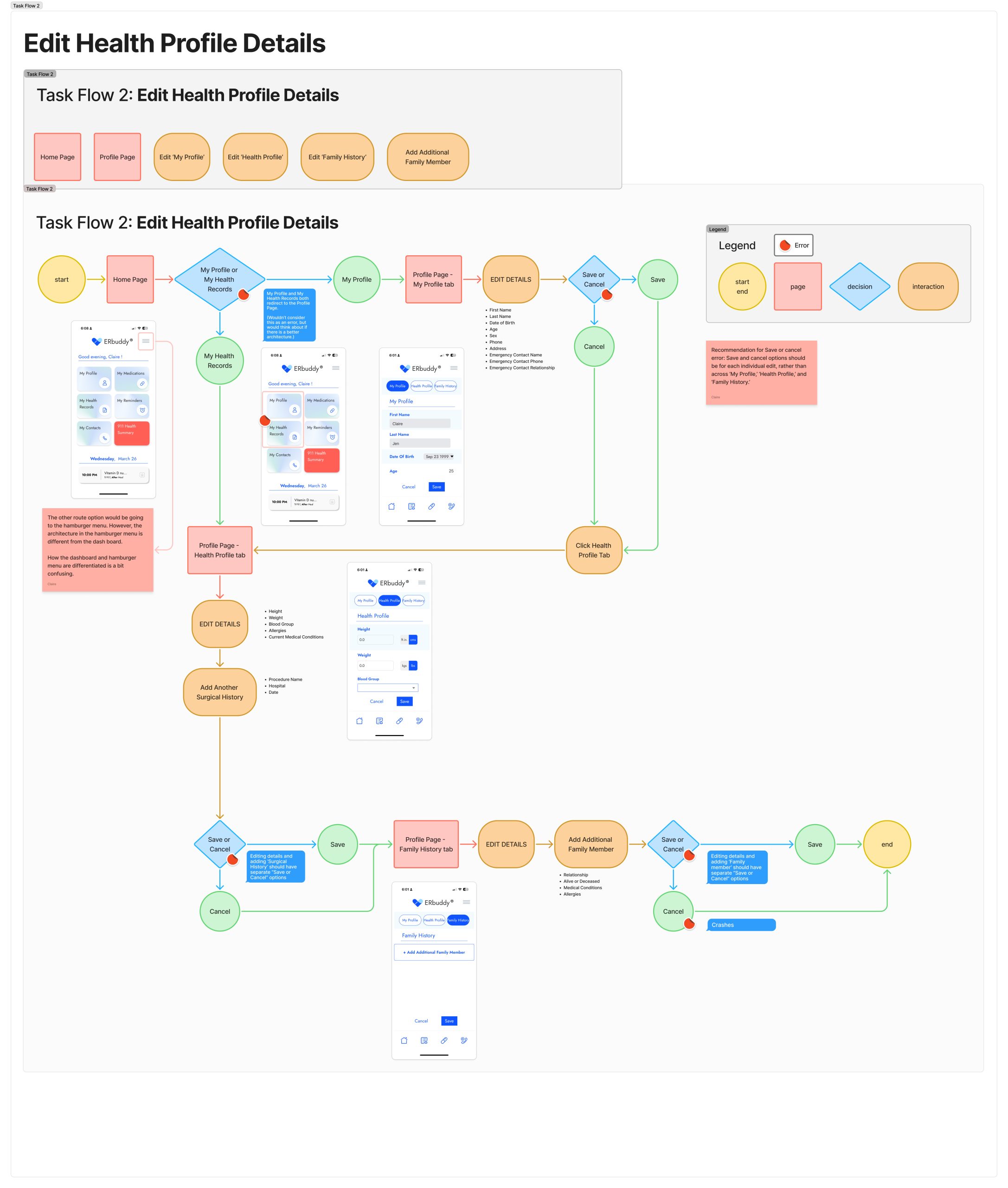
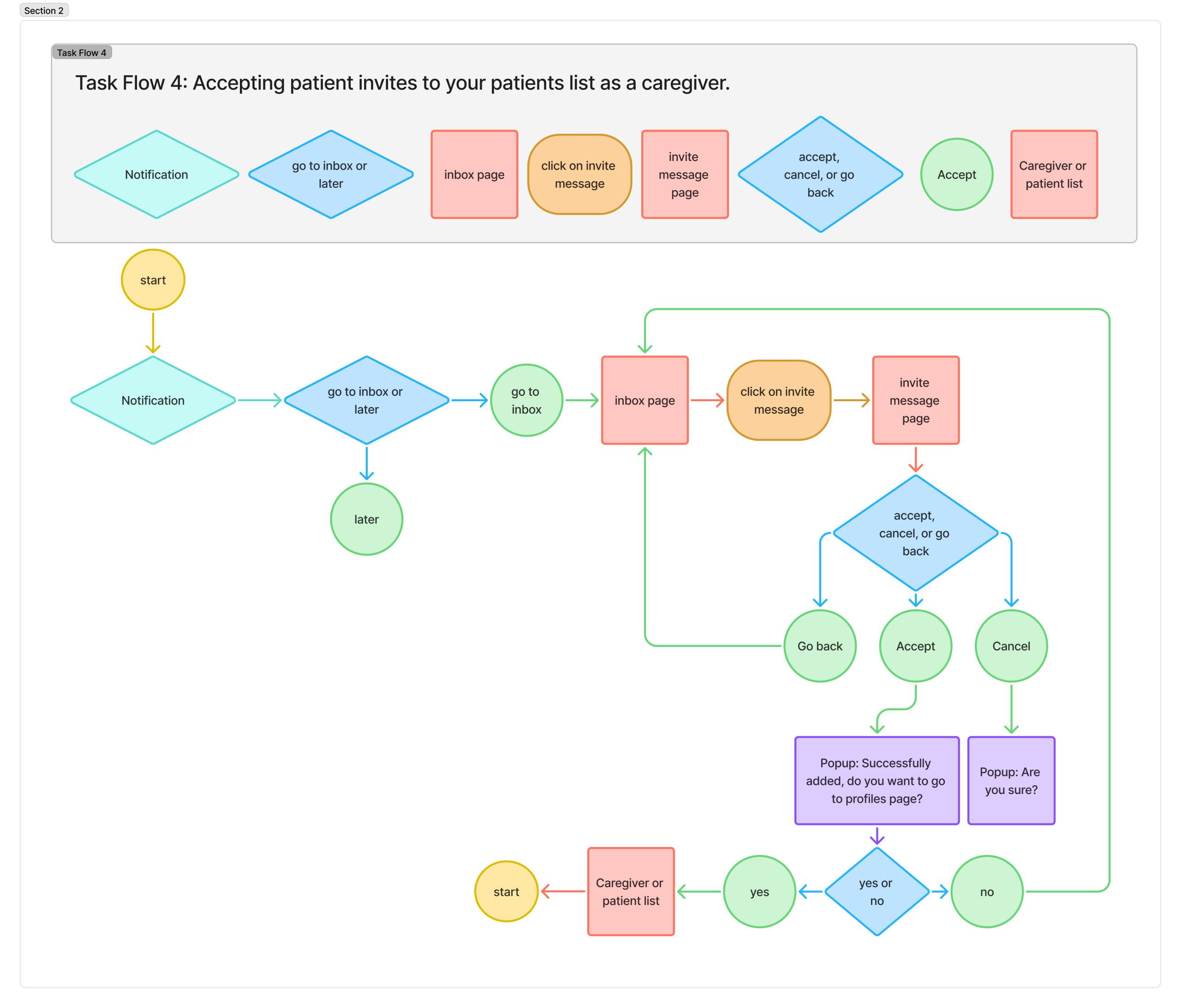
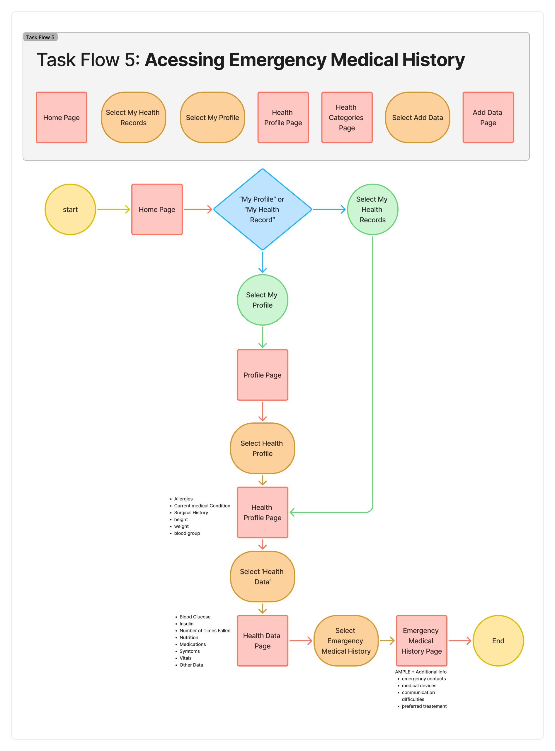
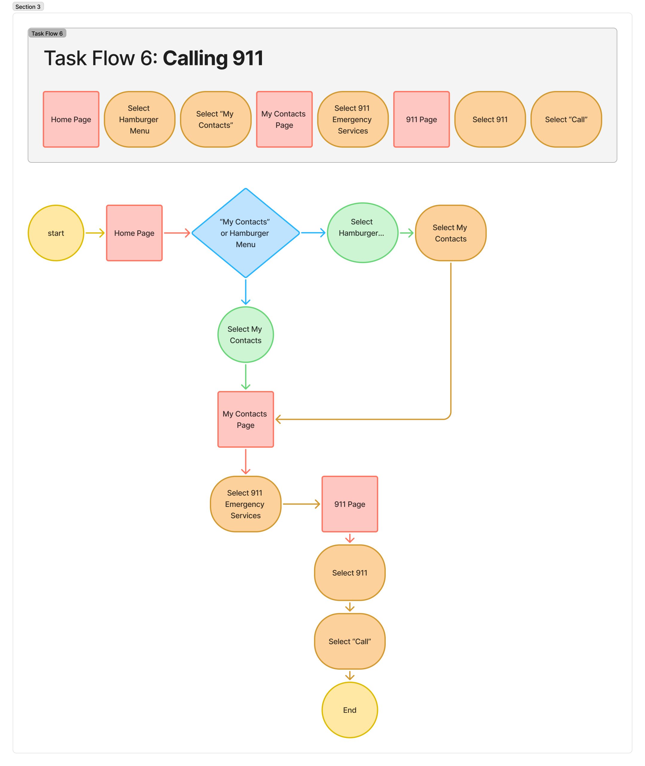
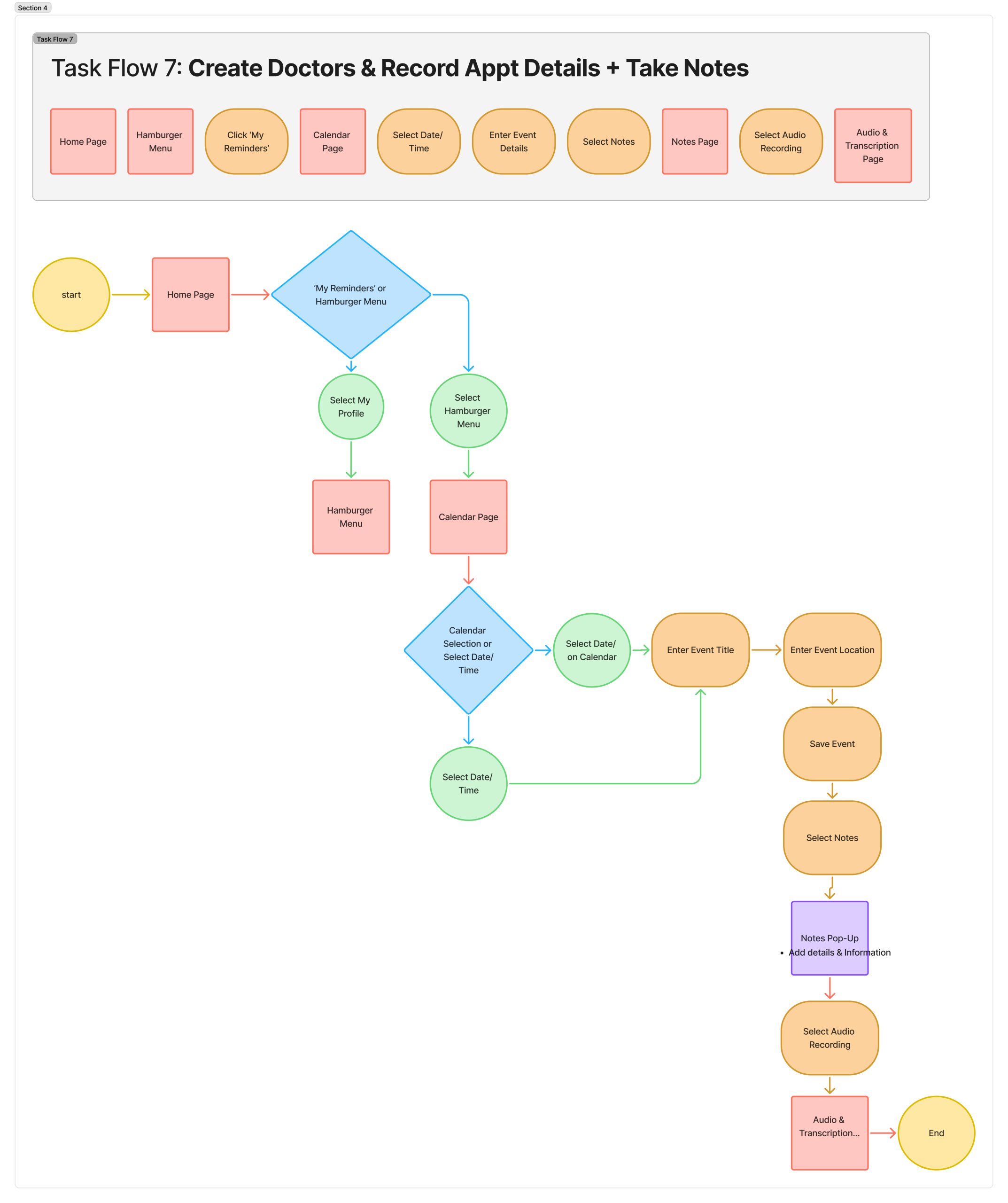
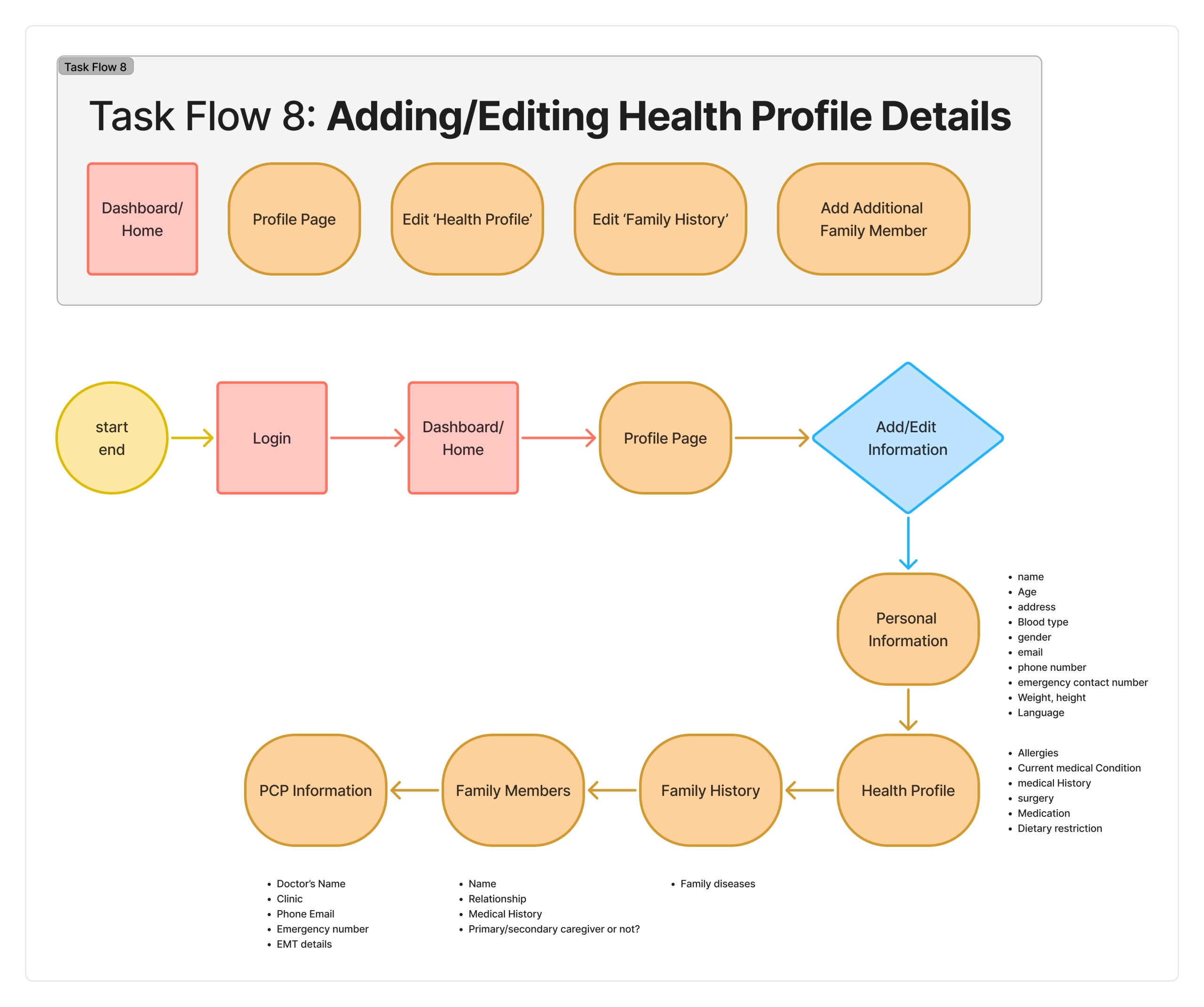
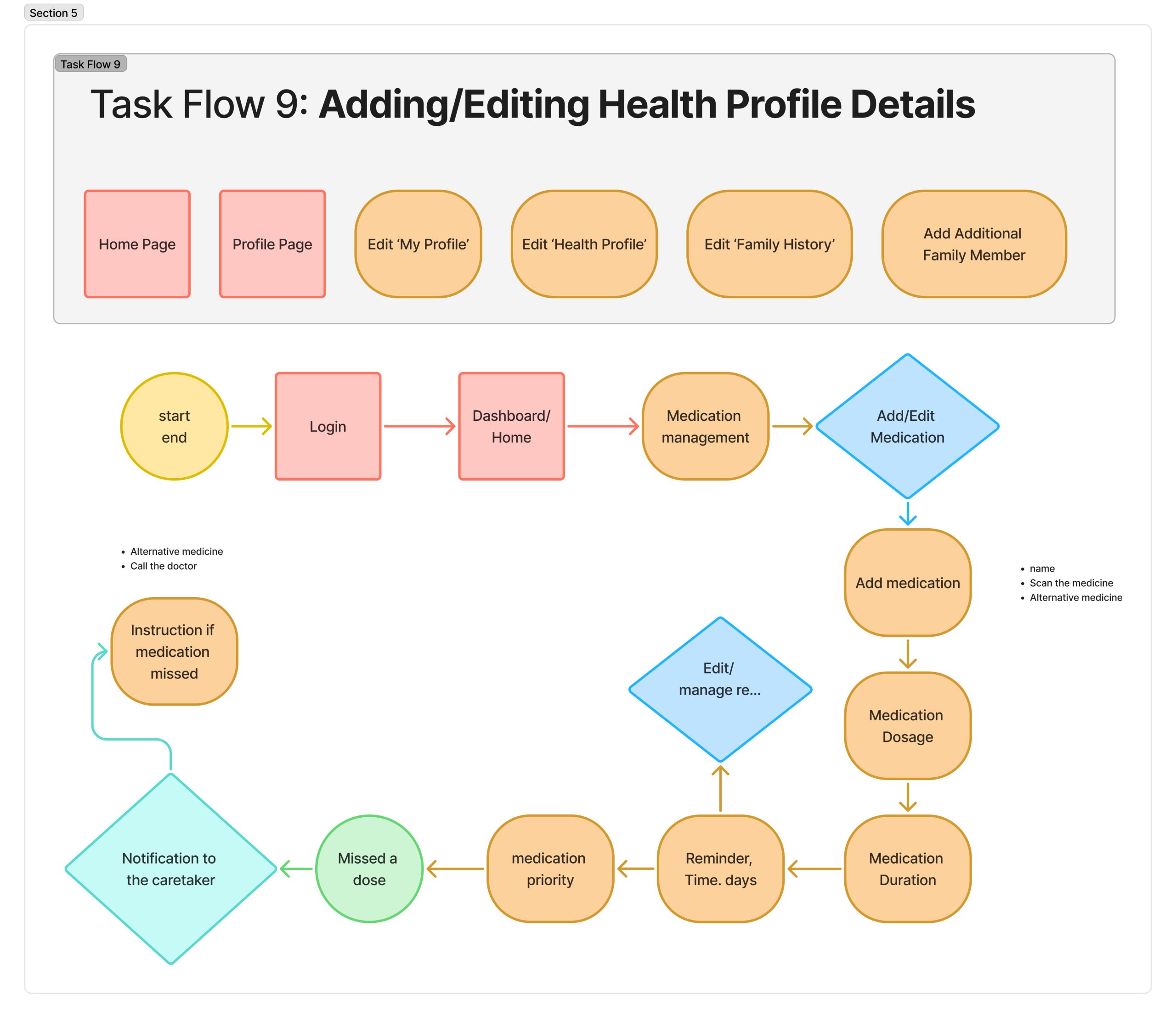
We leveraged what we learned from the competitor analysis to then conduct an app audit for ERbuddy to align with business needs as well. Namely, we reviewed the current information architecture and defined four existing task flows:
- Onboarding Process
- Edit Health Profile Details
- Set New Medication Reminders
- Create Doctor’s Appointment


Talking to Our Users
User Interviews
With a deeper comprehension of the healthcare space and where ERbuddy was in its product development, we conducted user interviews with two goals in mind:
- To explore how patients and caregivers currently communicate with each other
- To identify the difficulties people encounter with caregiving, medication management, and tracking medical records.
This process involved 8 structured interviews with patients. caregivers, and supporters, each lasting roughly 20-30 minutes each. From these interviews, we learned several valuable pieces of insight.
“They tell me certain symptoms they have a couple days after the fact So it’s hard to understand if it’s a serious thing or not.”
– Caregiver Response“There was a time where my grandma was asleep and she was outside in the living room and yelling because she was in pain. We called an ambulance for her to get to the ER. One of the challenges was getting all of the medical information about my grandma.”
– Caregiver Response“Sometimes doctors explain things too quickly, and I don’t have time to process everything before I need to make decisions.”
– Patient Response
Following the interviews, we were able to organize the qualitative data into an affinity map and group our findings based on common themes, revealing larger patterns.
Through this process, we discovered that…
- Managing health alone can be daunting. Gaps in medical history access can make decision-making stressful and difficult.
- Assessing urgency is difficult and stressful
- Patients want a way to keep track of their own health while having caregivers involved for assistance
- Caregivers want a centralized system so that information is not scattered and is shared with all related users
From this foundation, we developed empathy maps and personas that captured not just demographics, but the emotions, frustrations, and goals of our users.
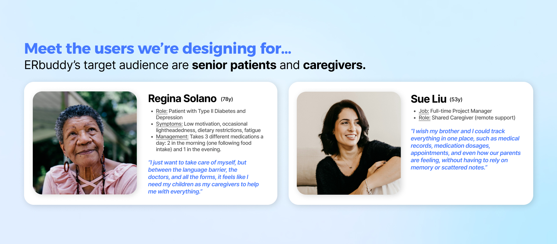
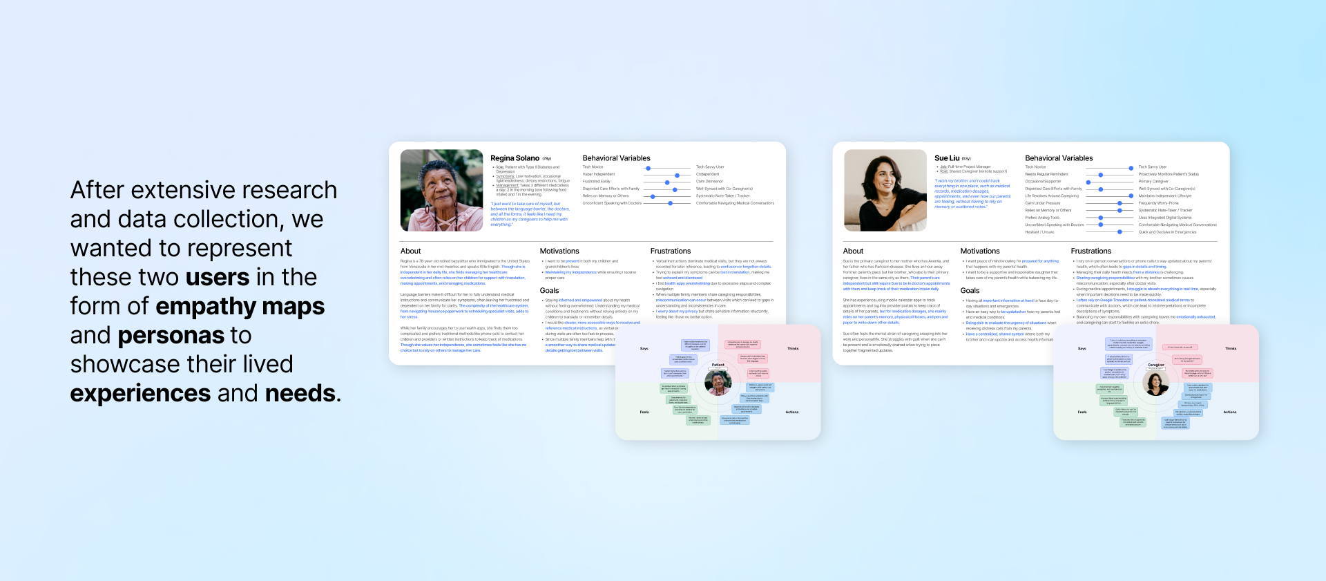
These tools became touchstones throughout our process, guiding us to design with clarity, compassion, and purpose.
Imagining the ERbuddy Experience
Ideating Solutions
The data collected was then synthesized with our personas in mind, illustrating the experiences they may encounter. Our team then began to ideate potential solutions to address certain problems. Specifically, we set out to address the following questions:
How Might We make it easier for caretakers to assess all the medication data and appointments at one place?
How Might We help multiple caregivers sync information they acquire from patients and PCPs so that they are on the same page?
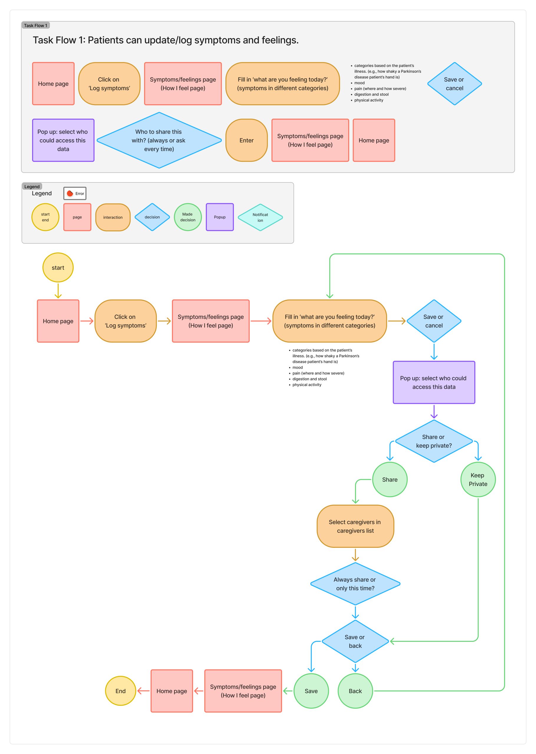
How Might We encourage patients to keep track of and log how they feel mentally and physically so that their caregivers are more aware of their status?
Given these questions, we came up with 3 proposed features to include in the app:
- Switching between roles
- Symptoms and feelings log
- Note-taking during doctor’s visits

Following a meeting with the clients, our team received great feedback, and we decided to move forward with the first two proposed features. Although integrating AI into our third proposed feature was beyond the developers’ scope for this project, it is something the client would like to move forward with in the feature.
Bringing Ideas to Life
Design and Iteration Process
Before starting the design process, we as a team came together to align on how our users would ideally experience the app. The following principles were created as a guide for our design making in the design phase.
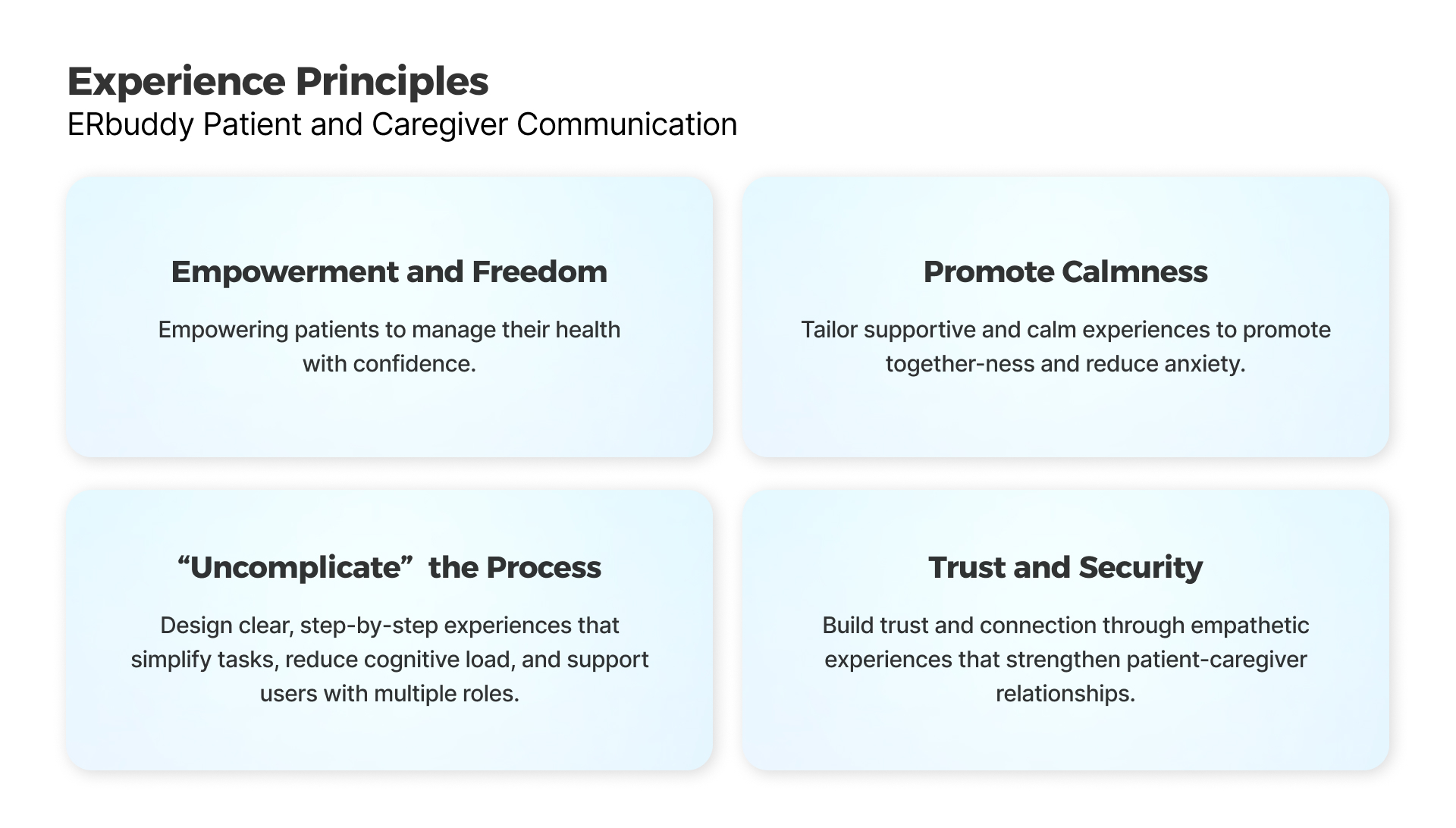
Focusing on the two main features we wanted to incorporate in the app, we began the design process.
- Creating New Architecture and Task Flows
- Designing Wireframes and Prototyping
- Usability Testing
- Implementing Recommendations and High-Fidelity Designs
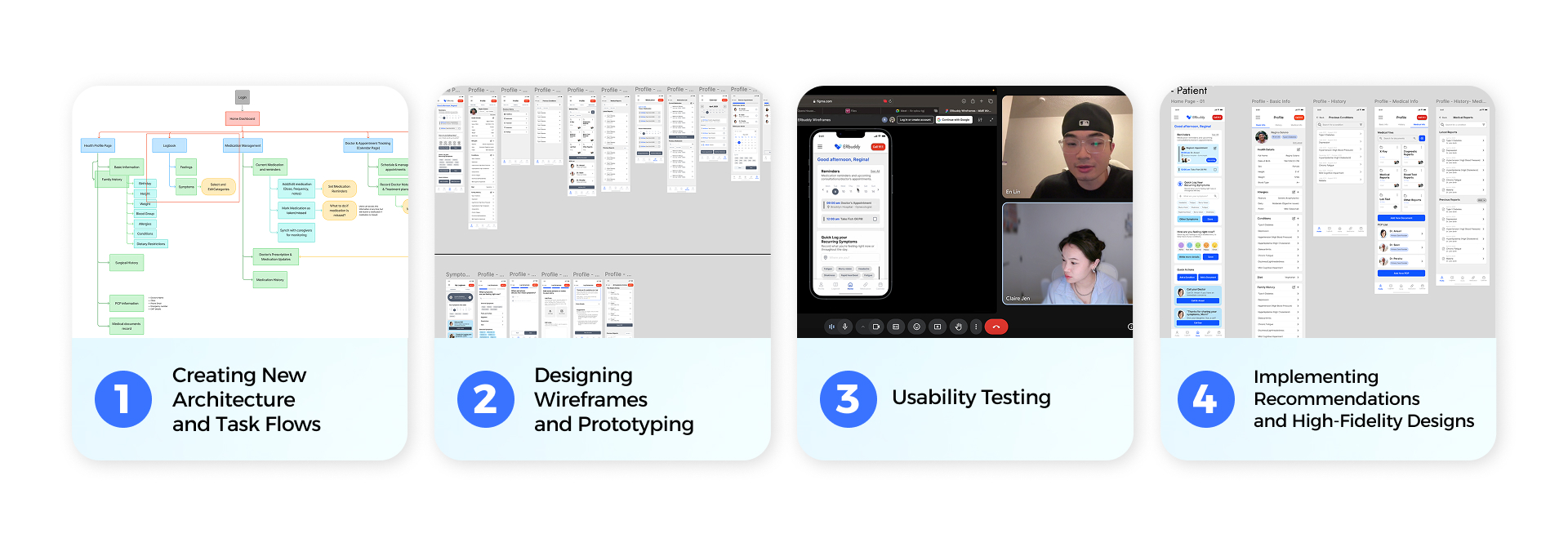
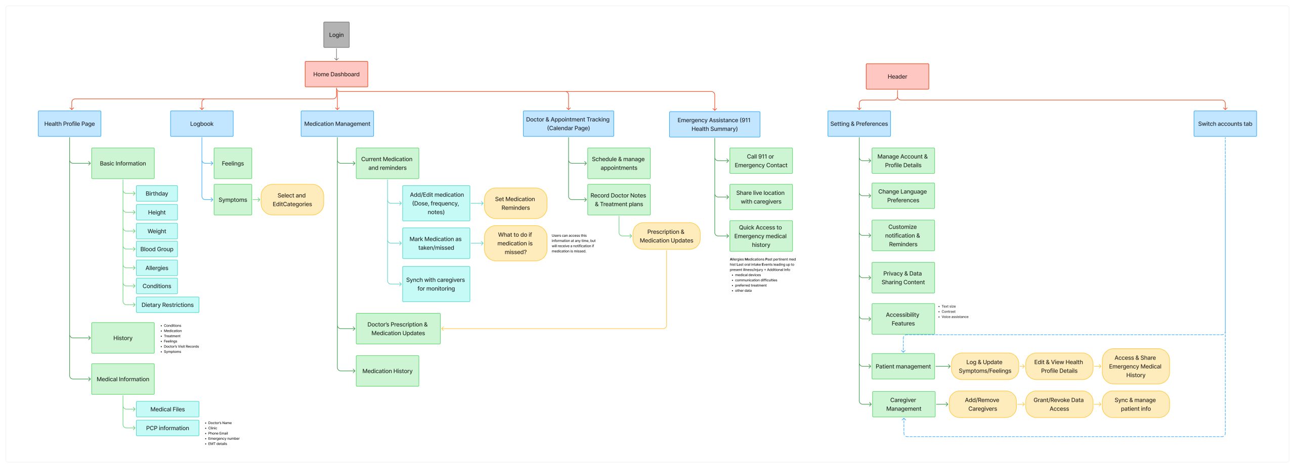
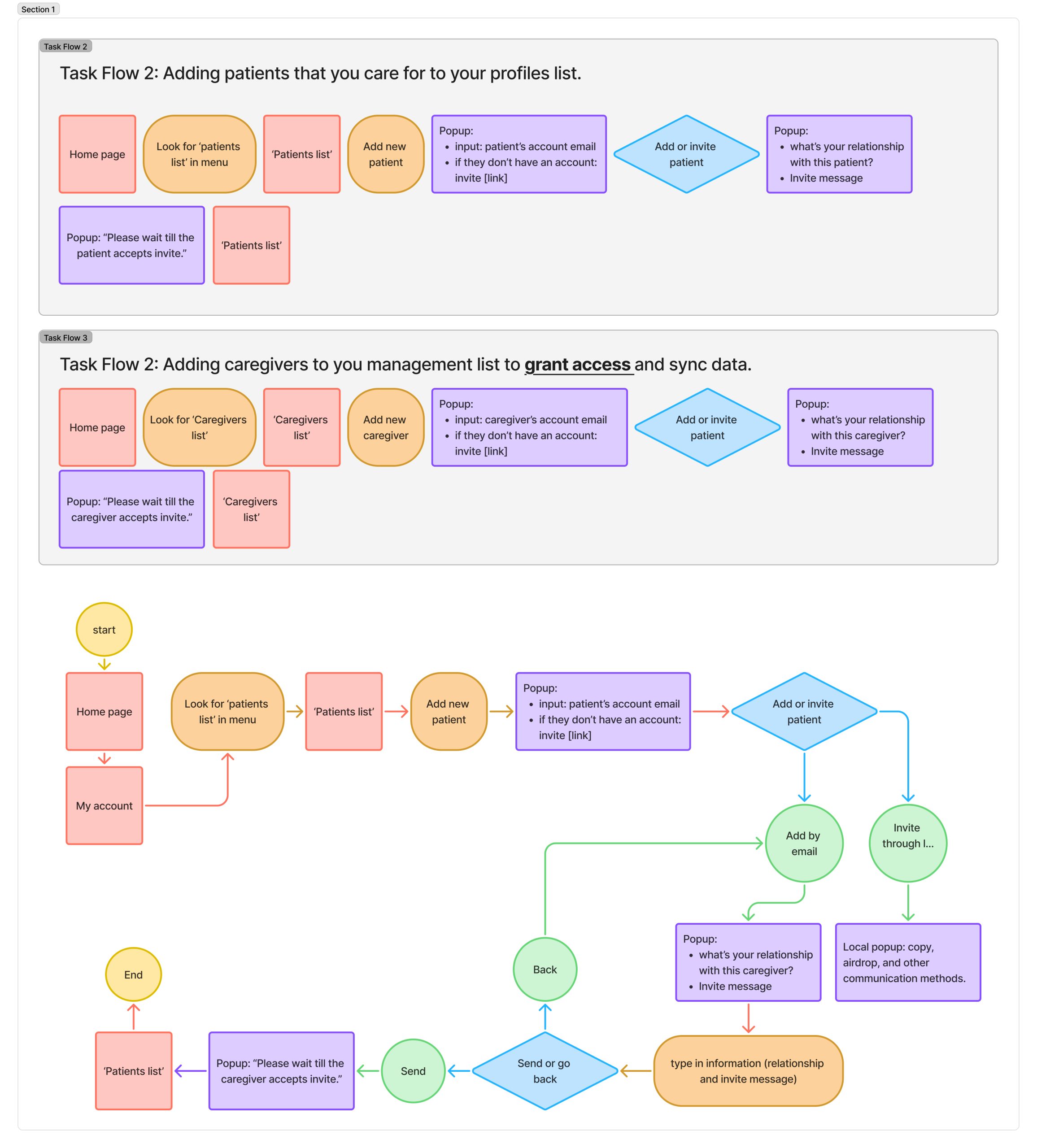
1. Creating New Architecture and Task Flows
By incorporating new features, we also updated the information architecture of the application, while creating detailed task flows to help identify all screens involved.
2. Designing Wireframes and Prototyping
Through collaborative sketching and discussion, we aligned on the screen structure, then designed only the essential screens for each user flow in medium fidelity. By focusing on a minimum viable product—just enough to test key functionality—we could gather feedback early and iterate efficiently.
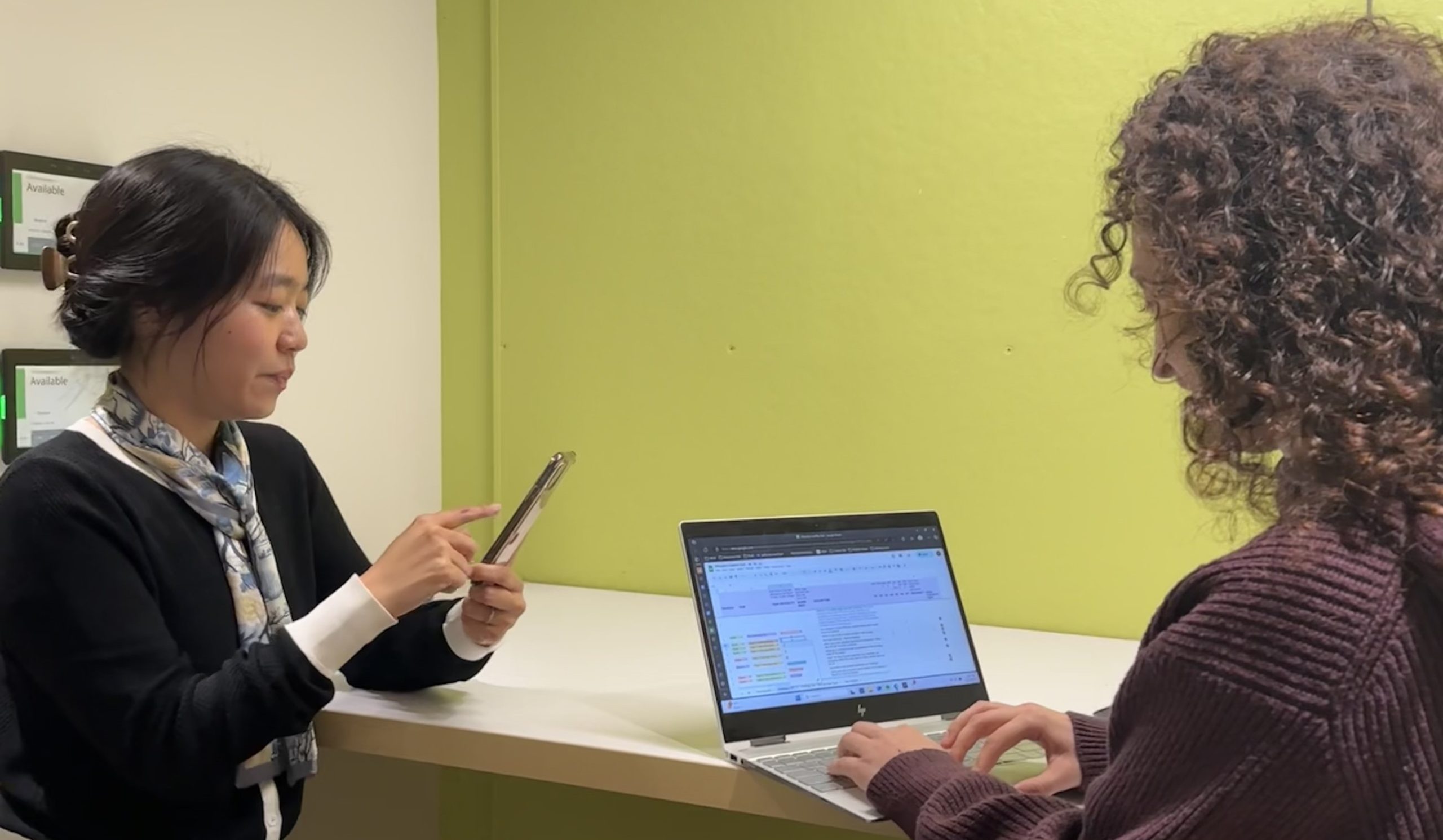
3. Usability Testing
Conducting usability tests at the medium-fidelity stage allowed us to validate our design direction early, ensuring our flows were intuitive without committing to high-fidelity visuals. The moderated sessions included four key tasks aligned with our problem statements, followed by a semi-structured interview. Open-ended questions encouraged users to share pain points and frustrations, uncovering several opportunities for improvement.

Through seven sessions with both patients and caregivers, we identified recurring patterns that led to six key findings and actionable recommendations to guide our next steps:
- Homepage Acts As Navigation Central
- Symptoms And Feelings Logging Experience are Not Parallel
- Caregiver Homepage Lacks Clear Separation Between Patient And Personal Views
- Unclear Section Titles Affect Usability
- Medication Logging Lacks Flexibility
- Limited Account Switching Options Disrupt Workflow
With the foundation solid, we moved into the final design!
4. Implementing Recommendations and High-Fidelity Designs
While the usability test results pointed out areas of improvement, it confirmed that we were on the right track. Minor adjustments were made, and by incorporating a new style guide, we finalized our designs into high-fidelity solutions.
Creating a style guide means implementing ERbuddy’s brand identity in the format of interface elements, representing the brand while ensuring functionality and accessibility through colors, fonts, and component layouts.


Learnings and Takeaways
Conclusion
Throughout our engagement with ERbuddy, our team set out on a mission to aid caregivers and patients with their healthcare management. By utilizing feedback from users and our clients, we leveraged our expertise to create an application that has improved the overall user experience. The response to our efforts was met with overwhelming praise and excitement, and is proof of our outstanding design thinking.
“We will most certainly use your insights and hi-fidelity screens to enhance ERbuddy’s Care Managment Platform this summer and to understand if it’s a serious thing or not.”
– ERbuddy Founder“Your design team really did a wonderful job with your thorough research capturing the needs and gaps.”
– ERbuddy Founder
Our collaboration has marked a significant point in ERbuddy’s product development. We are confident that ERbuddy will continue to thrive as a valuable tool for users to help improve their lives.

Thank you so much for reading!
About Our Team
Get to know the brains behind the whole project! Claire, Karla, and Sakshi collaborated using each of their strengths to create a positive user experience for the ERbuddy application.

Claire Jen
Role: Project Manager
Claire is a Taiwanese-American visual/UX designer working as a design assistant at Nielsen Norman Group.
She is passionate about user-centered design and aims to bridge research and design in her work, focusing on product and service development.

Karla Santamaria
Role: Insights Lead
Karla is a first-generation student with roots from Latin America currently pursuing her master’s at the Pratt Institute School of Information in New York, specializing in Information Experience Design.
Utilizing her research background and design knowledge, she strives to create ethical digital products that positively serve end users.

Sakshi Rane
Role: Design Lead
Sakshi is a Product Designer from India with a background in Computer Engineering.
She combines technical expertise with design insight to create visually compelling interfaces that enhance user interaction. She thrives at the intersection of art and technology, crafting digital experiences that are both functional and engaging.