My Role:
– Audited site UI and rebuilt components
– Helped shape the branding, voice, and structure of the Action! design system
– Contributed to UI design, documentation, and co-presented final deliverables
Tools:
Google Suite, Figma, Zeroheight
Timeline:
6 weeks
Team Members:
Ariel Li, Hridya Nadappattel, Krishna Kishore Lal, Lillian MacGuire
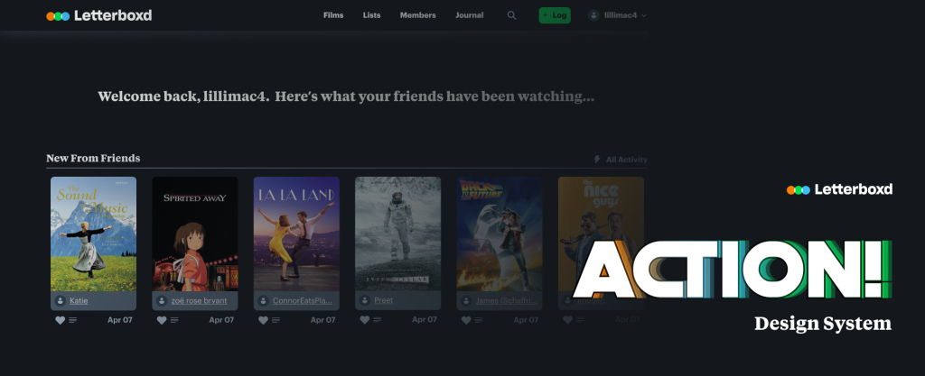
Opening Scene: What is Letterboxd?
Letterboxd is a fun, dynamic platform where film lovers log, rate, and review movies. But as we explored the site, we spotted a huge variety of the same components used inconsistently across different pages. This made it the perfect candidate for a design system! Our goal was to streamline these elements for a more cohesive experience, all while preserving the platform’s distinctive personality. As designers and cinephiles, it was the perfect blend of passion and craft.
The Camera’s Been Rolling Too Long
Too many inconsistencies and a lack of standardisation give users a hard time scanning the site
Letterboxd is a fun, chaotic place, and that chaos is part of its charm. But as we explored its interface, we started noticing the same components showing up in wildly different ways across the site. Buttons, cards, labels, all playing by different rules. That’s when we realised the experience wasn’t just quirky, it was confusing.

Inventory of all the icons we found on Letterboxd

Wide range of colours used in Letterboxd
We each tried to rebuild parts of Letterboxd using different design systems: Polaris, Material, Fluent, and Orbit. That gave us a taste of what clean, standardised systems could do and made it obvious how much Letterboxd needed one.
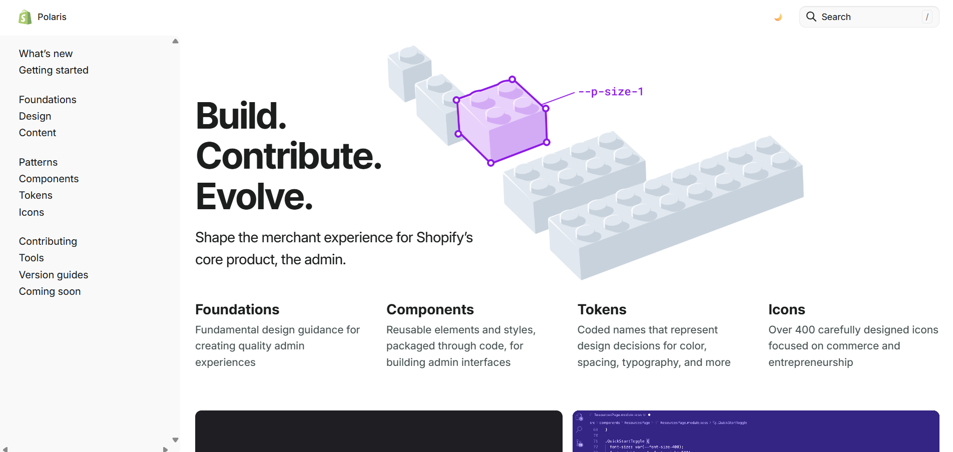
Polaris
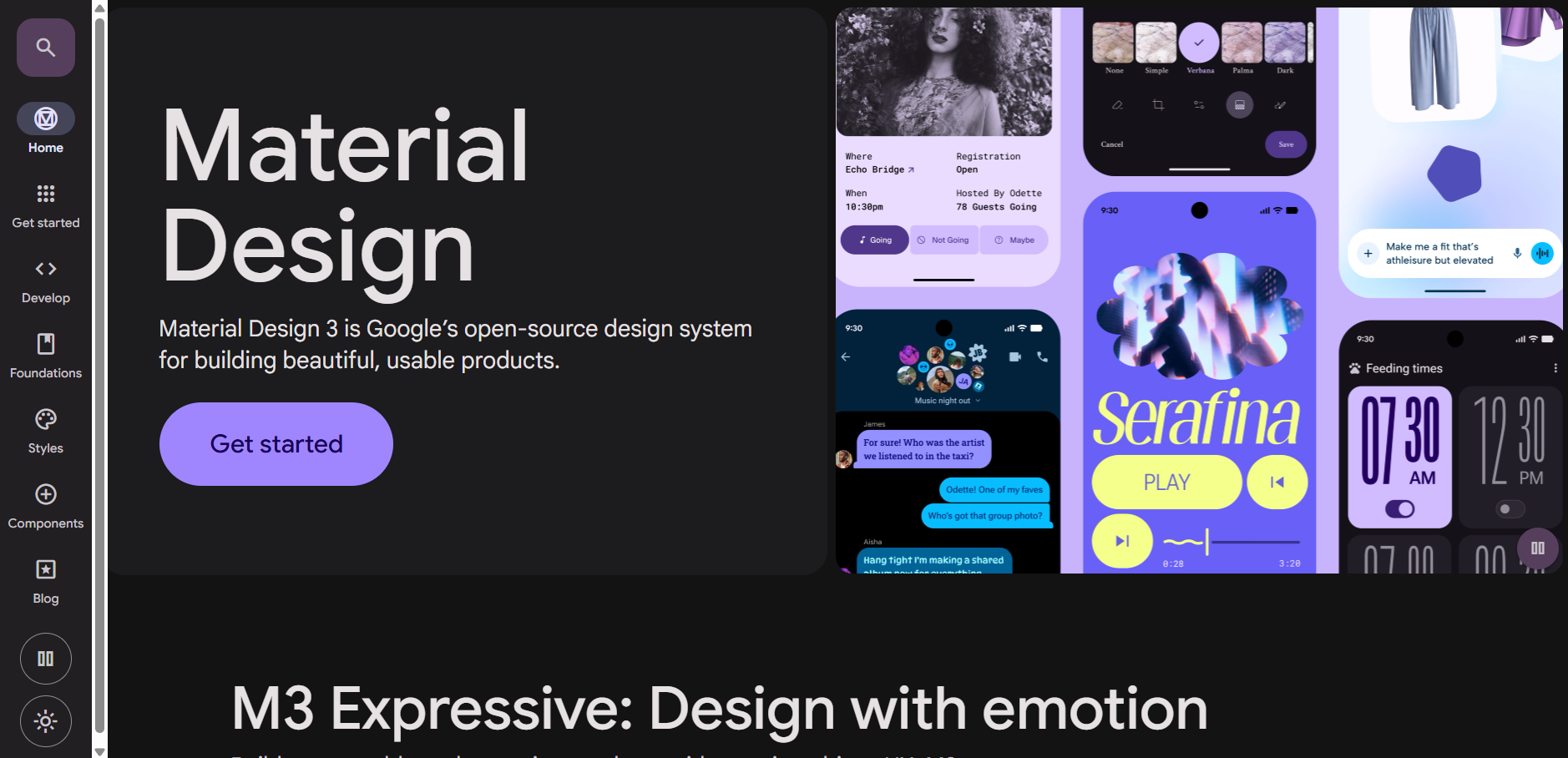
Material Design
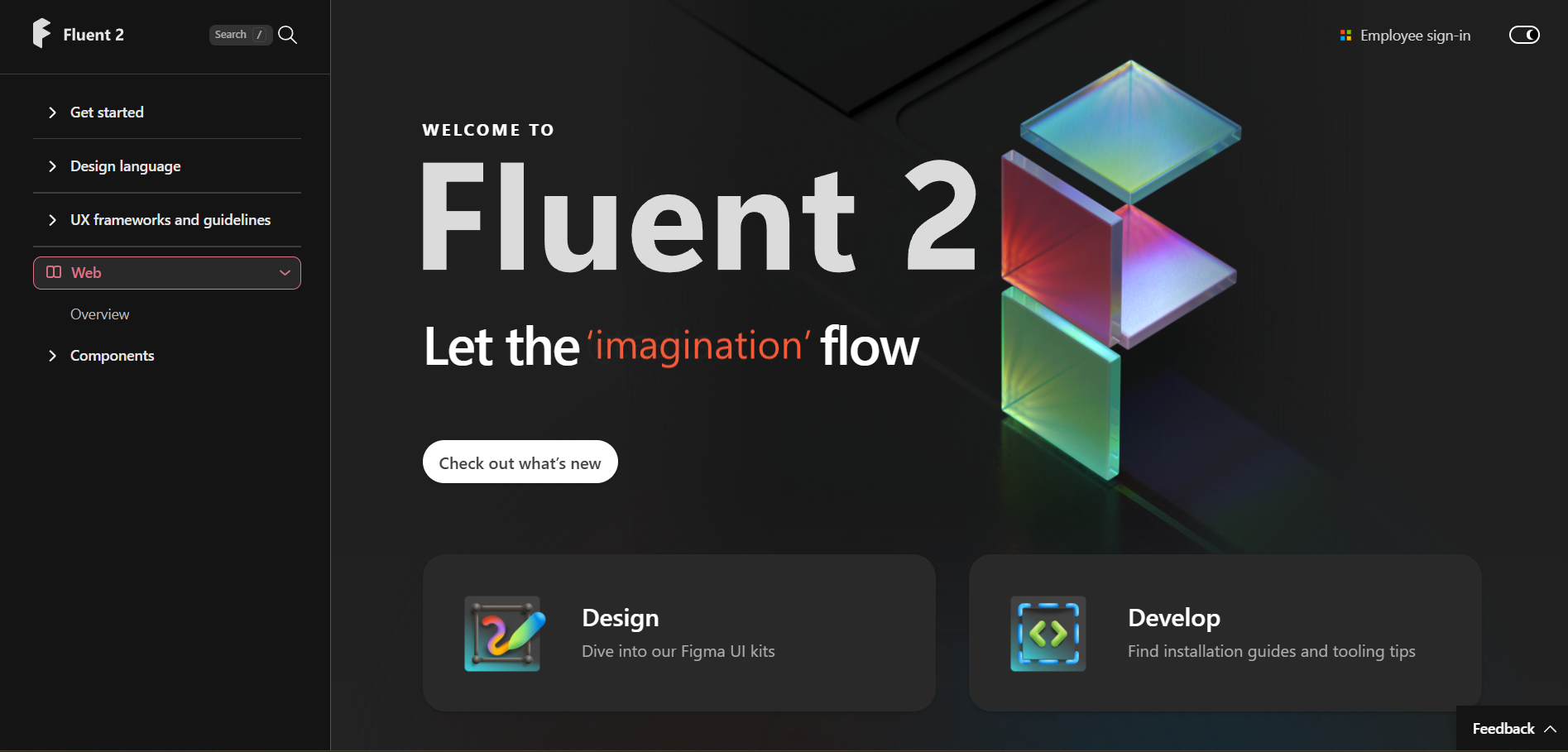
Fluent
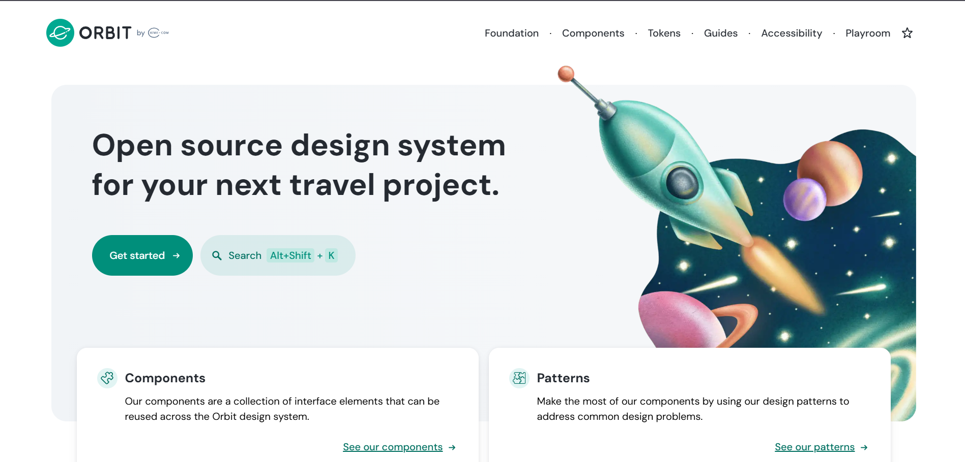
Orbit
So we made one! And we called it:
Lights
Camera
Action!
The design system, built for Letterboxd’s unique tone, visual rhythm, and growing audience.
Why “Action!”?
We brainstormed a ton of names that captured Letterboxd’s tone: cinematic, bold, a little quirky.
After many film references and bad puns, we landed on Action! It felt right: fast, expressive, and true to the spirit of the platform and the team’s core beliefs.

The Character Development Arc
Building a consistent, scalable UI kit backed by usability testing
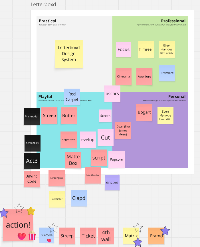
With the foundation set, it was time to bring the cast to life. We started with the basics – tokens, grids, and typography – the stuff that sets the tone behind the scenes.

But naming tokens (especially colour tokens) felt like playing 4D chess with ourselves. Every decision had to work across contexts, make sense to others, and not break everything later. There were moments we just stared at Figma, spiralling.

Then came the show-stealers: buttons, input fields, filters, cards, and navigation.
This was also where we had the most fun. We got on endless calls, became auto layout wizards, figured out variants and instances together, and roasted Figma like it was the fifth team member.
It was chaos. But it was collaborative. And kind of magical.
Each component was designed to feel consistent, reusable, and most importantly, like it belonged in Letterboxd’s world.
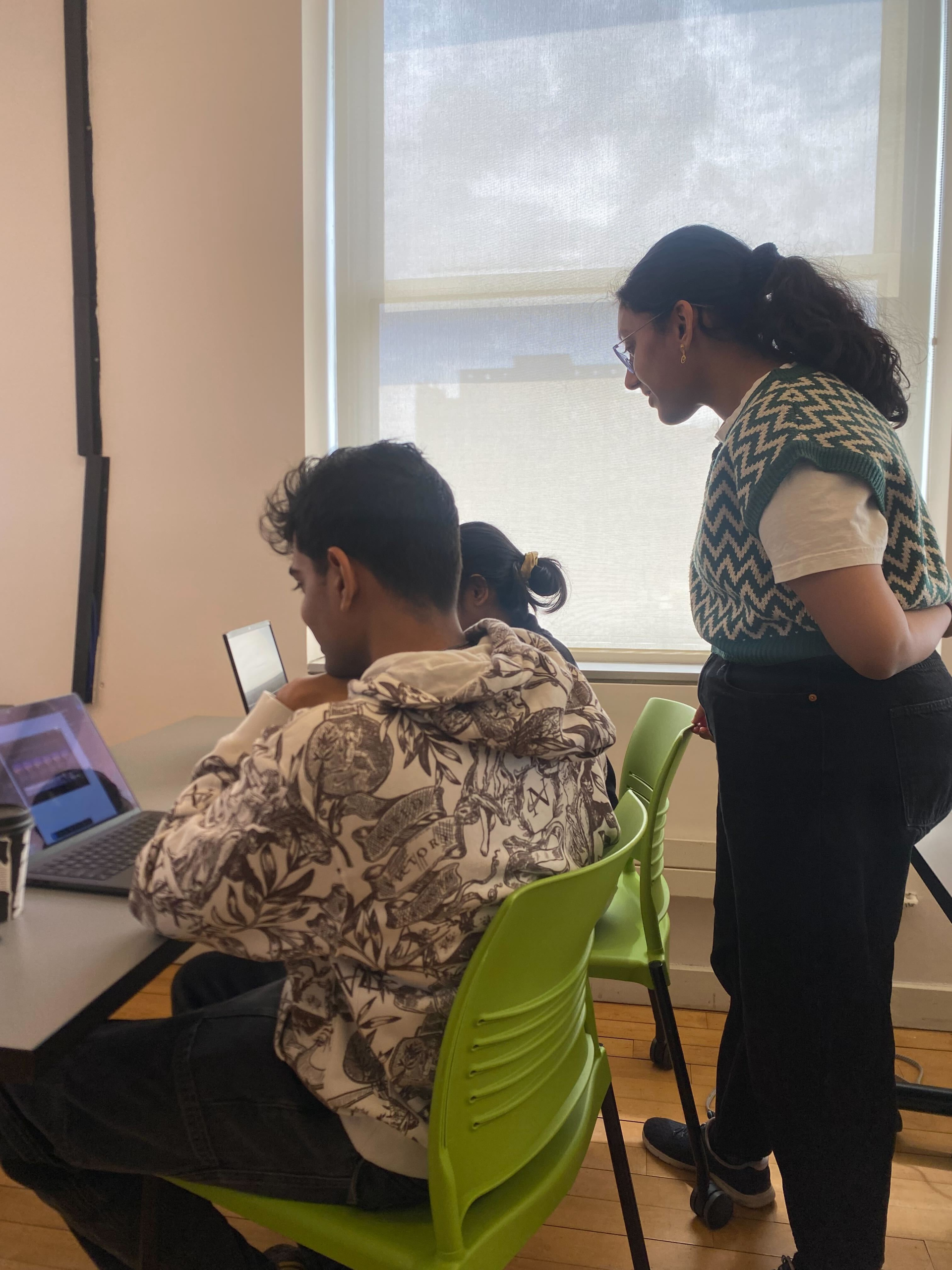
Quick Screen Tests!
We also tested them with classmates and design peers. From confusing token categorisation to not being able to find components, these quick usability checks helped us spot issues early and make confident tweaks before anything got too baked in.
The Script Supervisor’s Notes
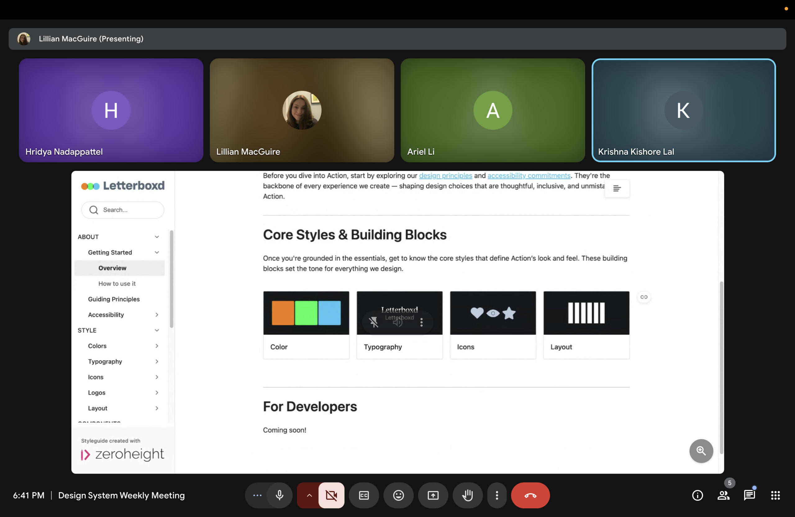
Documenting the system
Because what good is a design system if no one knows how to use it?
We documented everything: from tokens to components to usage guidelines. And we kept clarity and reusability at the centre of everything. Whether it’s a designer dropping in a button or a dev checking spacing rules, Action! is built to be understandable at a glance.
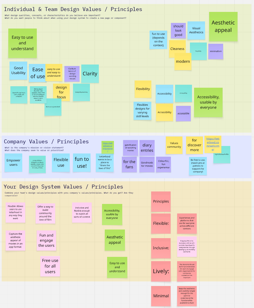
Our documentation lives in Zeroheight. Everything was documented with those same principles in mind: Flexibility, Inclusivity, Liveliness, and Meaningfulness.
Annotating every component, naming every prop, linking usage do’s and don’ts; it was the least glamorous part of the project.
Zeroheight didn’t always make it easy, but we wanted anyone (designer, dev, future us) to drop in and get what they need, fast.
The Final Screening

We wrapped it all up in a final pitch that brought together our process, components, and the Action! story.
It was probably the most chaotic deck we’ve ever built, but also the most fun to present.

Post-Credit Reflections
More than anything, this project taught us what it means to build something together, piece by piece, with care, clarity, and a little bit of courage.
It wasn’t always easy. There were late nights, long calls, and moments where we felt completely stuck; not just on a component, but on how to move forward. But somewhere in that mess, we found rhythm. We found each other’s strengths. We showed up, not just to finish the work, but to keep each other going.
A design system is often described as rigid or systematic. But for us, Action! became something far more human. It was the product of trust, shared language, and mutual respect. Every decision, every token, every layout was a quiet act of collaboration — and by the end, it didn’t feel like four designers working in parallel. It felt like one team, telling one story.
This team reminded us why we love what we do. And we’re not forgetting that anytime soon.
