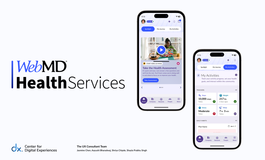
Team: Jasmine Chen, Aayushi Bharadwaj, Shriya Chipde, Shayla Prabhu Singh
Timeline: 7 weeks
Tools: Figma, Panelfox
Role: UX Design, UX Research, Usability Testing
Background
Our client, the WebMD Health Services (WebMDHS), a subsidiary of the WebMD family of companies, has been a leader in designing and delivering well-being programs for over 40 years. Serving large employers, public sector organizations, health systems, and health plans, WebMDHS provides a comprehensive suite of well-being tools through its digital platform. These tools are made available to employees and members to support their health journeys. The platform is designed to help clients improve the overall well-being and health outcomes of their populations while enhancing the impact of their organizational well-being initiatives. Clients can customize tool selection and branding based on their needs, though the full ecosystem is designed to work cohesively.
Utilizing Moderated User Testing, this report presents insights and actionable recommendations based on real user feedback to improve the usability of the well-being tools and enhance the homepage navigation experience within the WebMD mobile app.
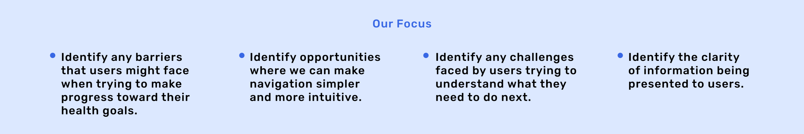
Project Goal
WebMD Health Services is preparing to launch a new mobile platform designed to support users in achieving their well-being goals. Given the breadth of tools and resources offered, the team recognized the need for a more intuitive and cohesive experience. Their objective was to streamline content presentation and simplify navigation, helping users more easily access the tools they need.
To support this effort, we conducted eight moderated usability sessions focused on evaluating the effectiveness of the mobile app’s homepage navigation. Our findings highlighted key areas for improvement, which we synthesized into a focused report with actionable recommendations. These insights aim to enhance the overall user experience, enabling a smoother, more engaging journey toward a positive mindset and meaningful life goals—fully aligned with WebMD Health Services’ mission to deliver a unified, user-centered platform.
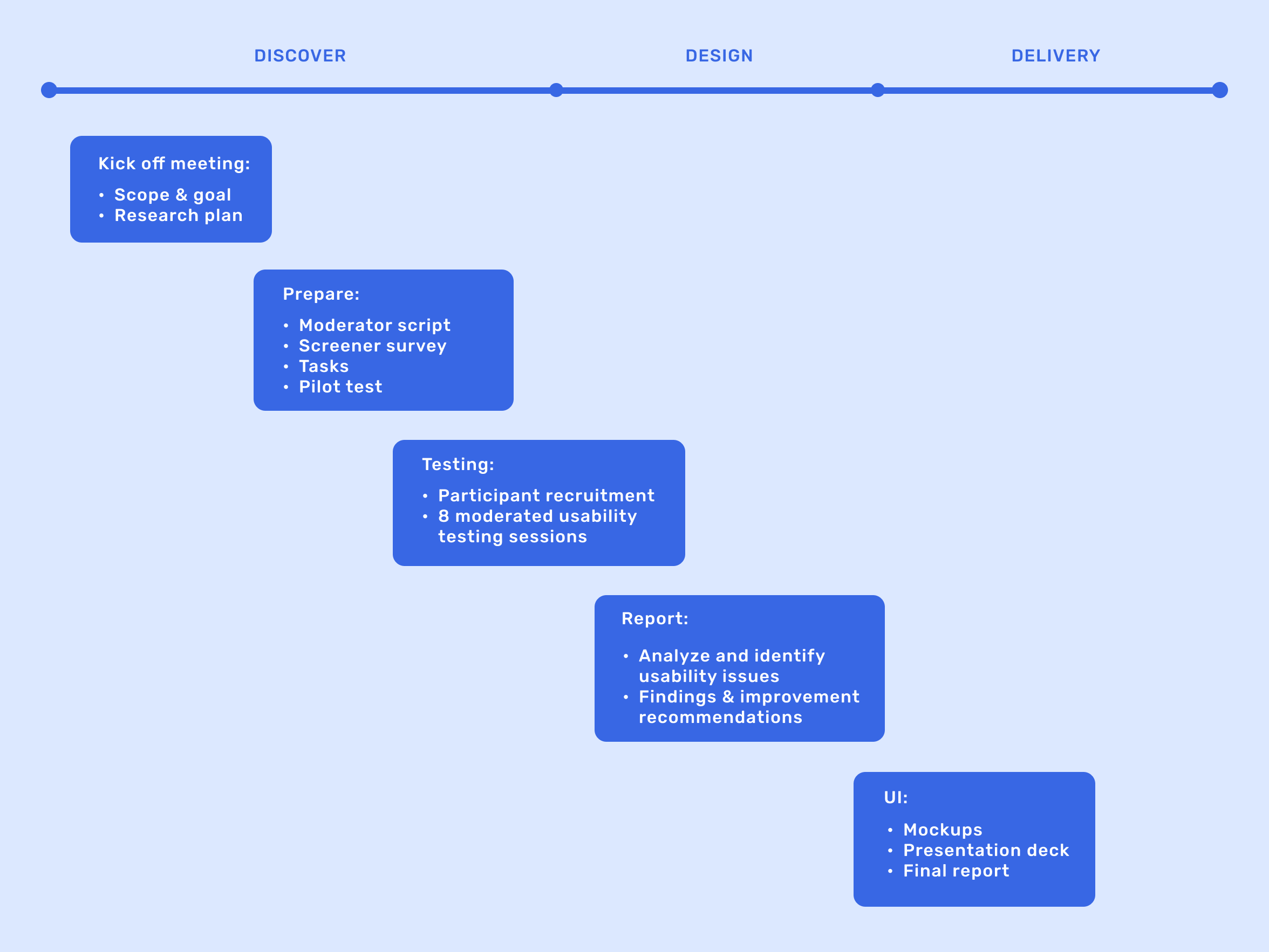
Our Scope of Work and Timeline
Methodology Overview
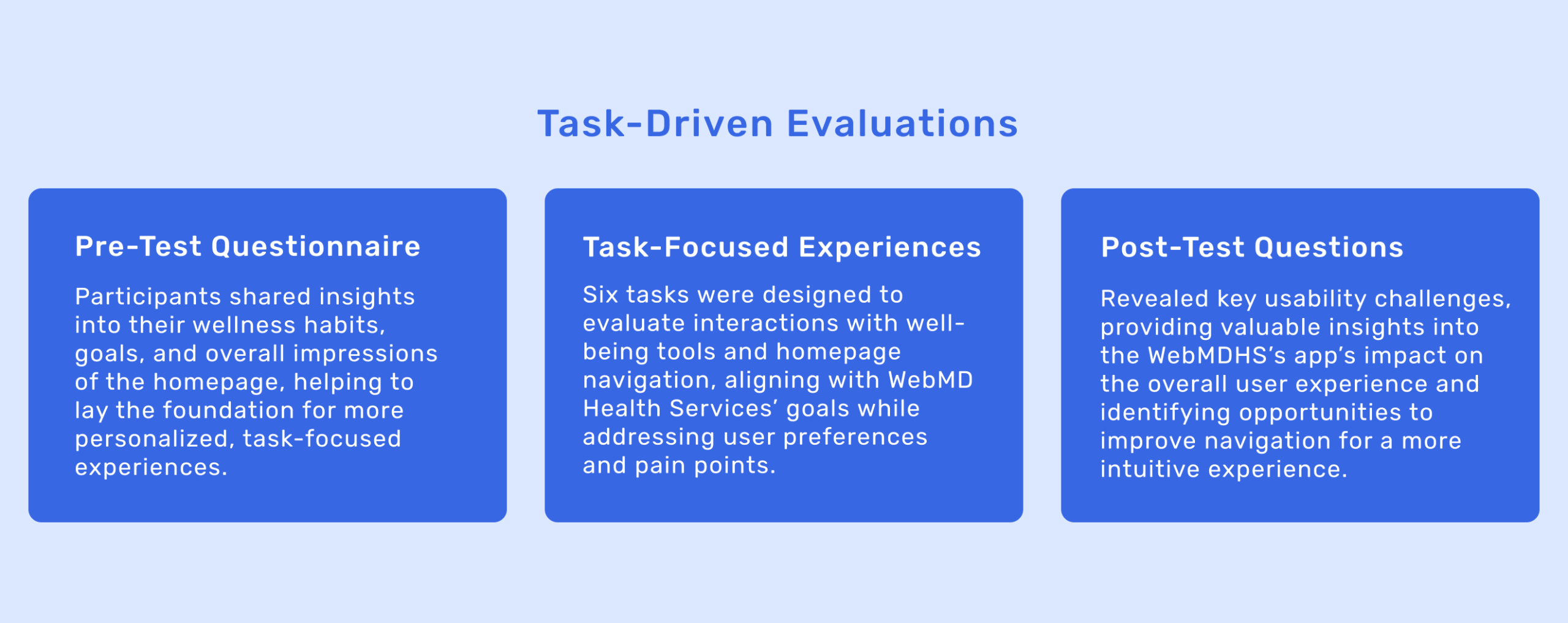
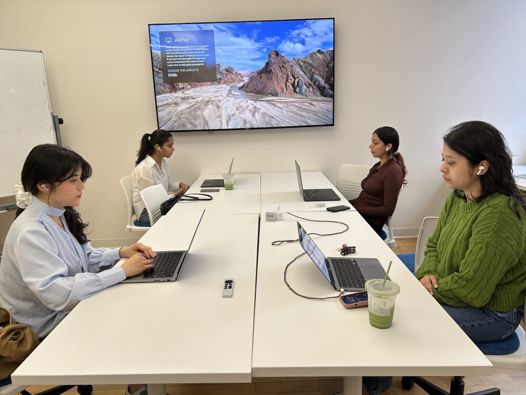
Our usability research utilized moderated user testing to capture real interactions with the WebMDHS app, aiming to uncover user pain points, motivations, and needs. We engaged eight participants in a mix of remote (via Zoom) and in-person sessions at Pratt Institute. Each session lasted between 15-20 minutes, encompassing a pre-test questionnaire, task-driven evaluations, and a post-test questionnaire to delve into users’ experiences and feedback.
About Our 8 Participants-The Target Users
- Age: 25–65
- Location: US-based
- Mix of primary users seeking lifestyle improvement and secondary users motivated by rewards
- Mostly females
- Recruited via Panelfox (a platform for research recruitment)
Key Findings & Recommendations
What Our Users Say
“This app clearly has a lot of great health and well-being features, and it would be really helpful to use once I get familiar with how everything works.” – User
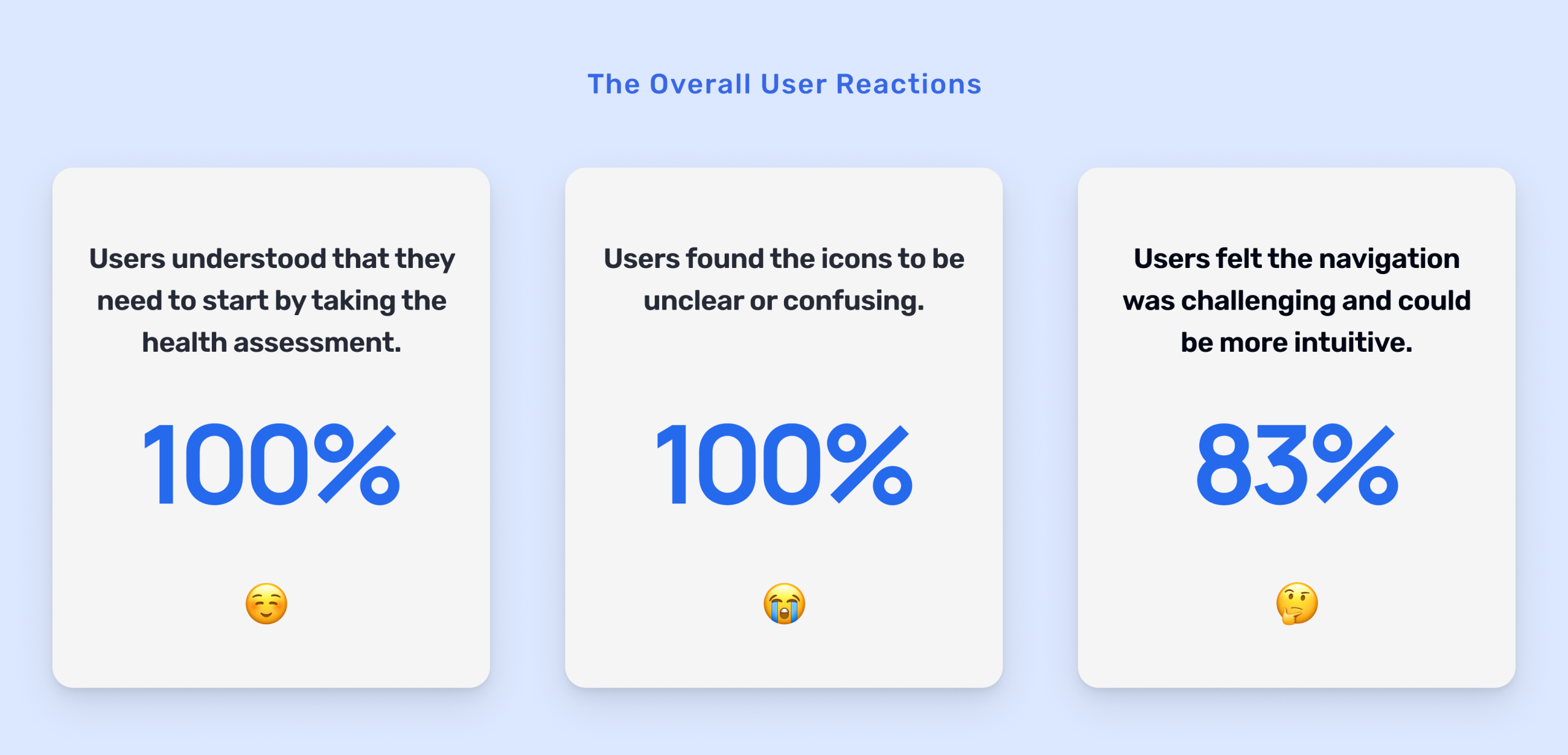
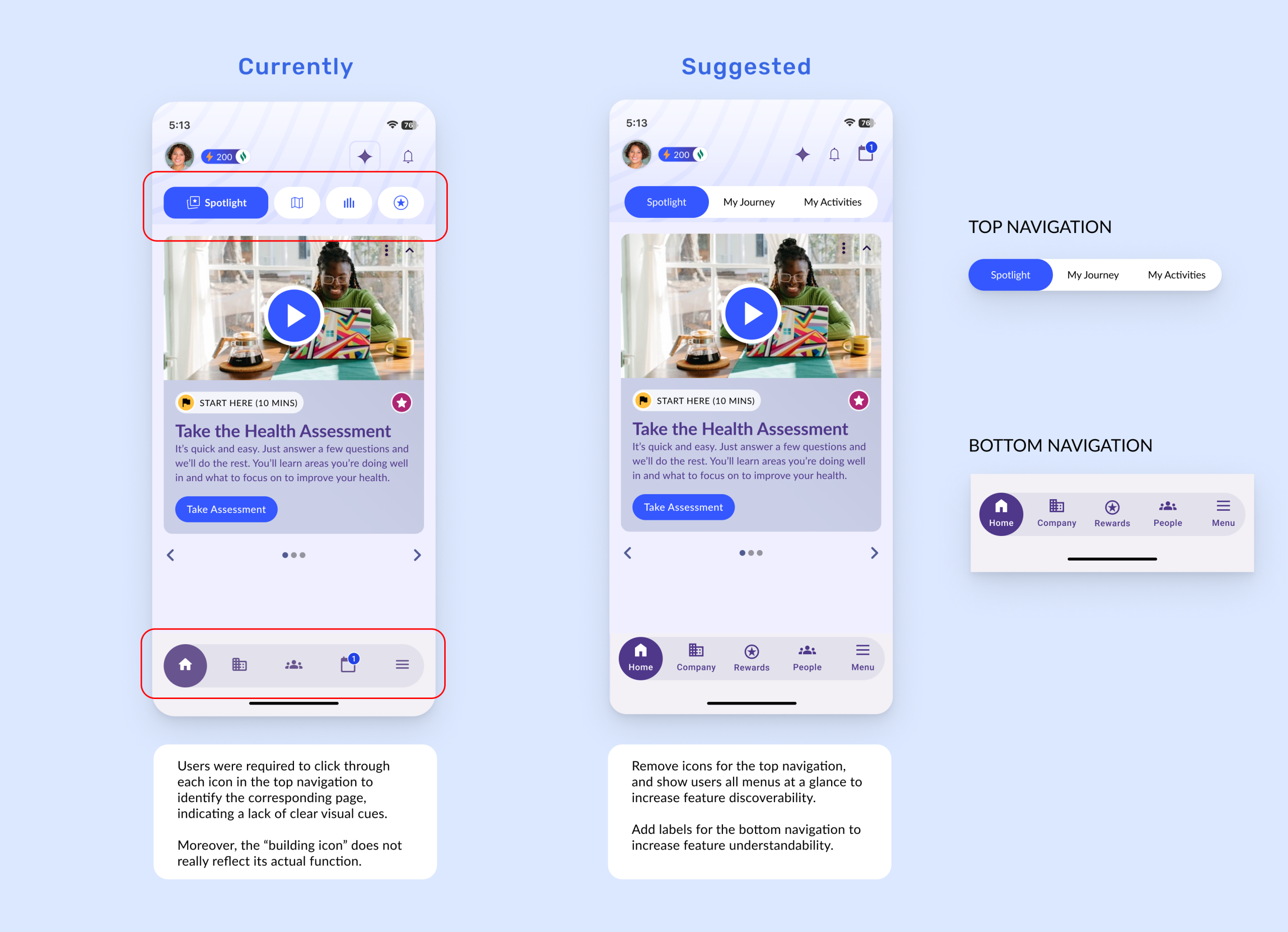
Finding 1
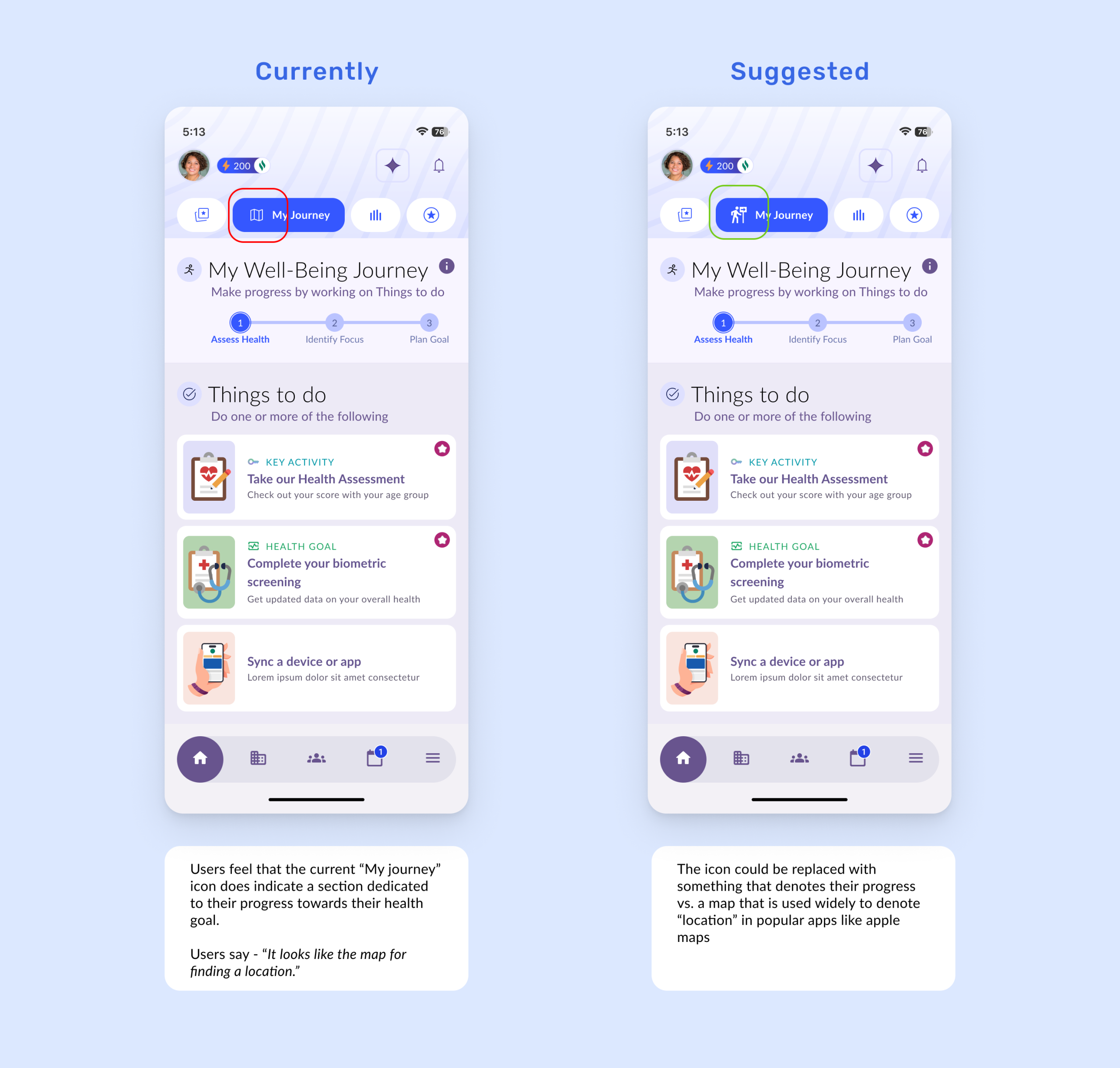
Participants had difficulty navigating the app due to hidden labels in the top navigation and unclear iconography in the bottom navigation.
“The top navigation looks like a call to action button, and it’s kind of competing with everything else.” – User
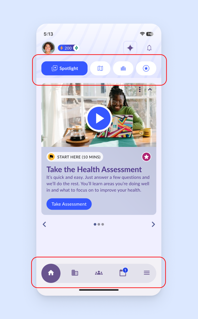
- Participants did not associate the building icon with the intended feature, finding the iconography unclear.
- Participants also struggled to access “My Journey,” “My Activities,” and “My Rewards” due to hidden label visibility in the top navigation bar.
Recommendation 1
Add labels to the bottom navigation to improve clarity, and remove icons from the top navigation to reduce confusion and make features easier to understand and discover.
Finding 2
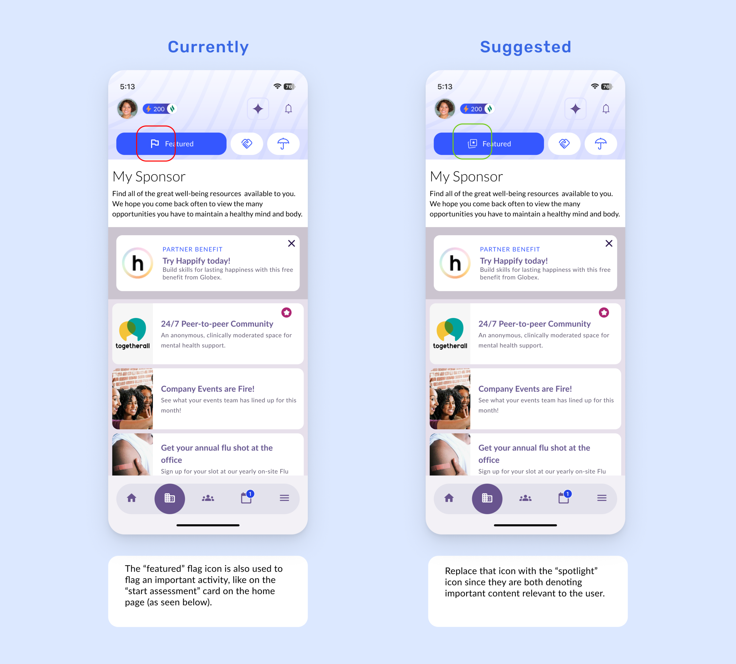
Participants had difficulty interpreting icons due to abstract metaphors and inconsistent usage across the platform.
“Looking at the icon I thought it would show me a map with clinics or hospitals in the area.” – User
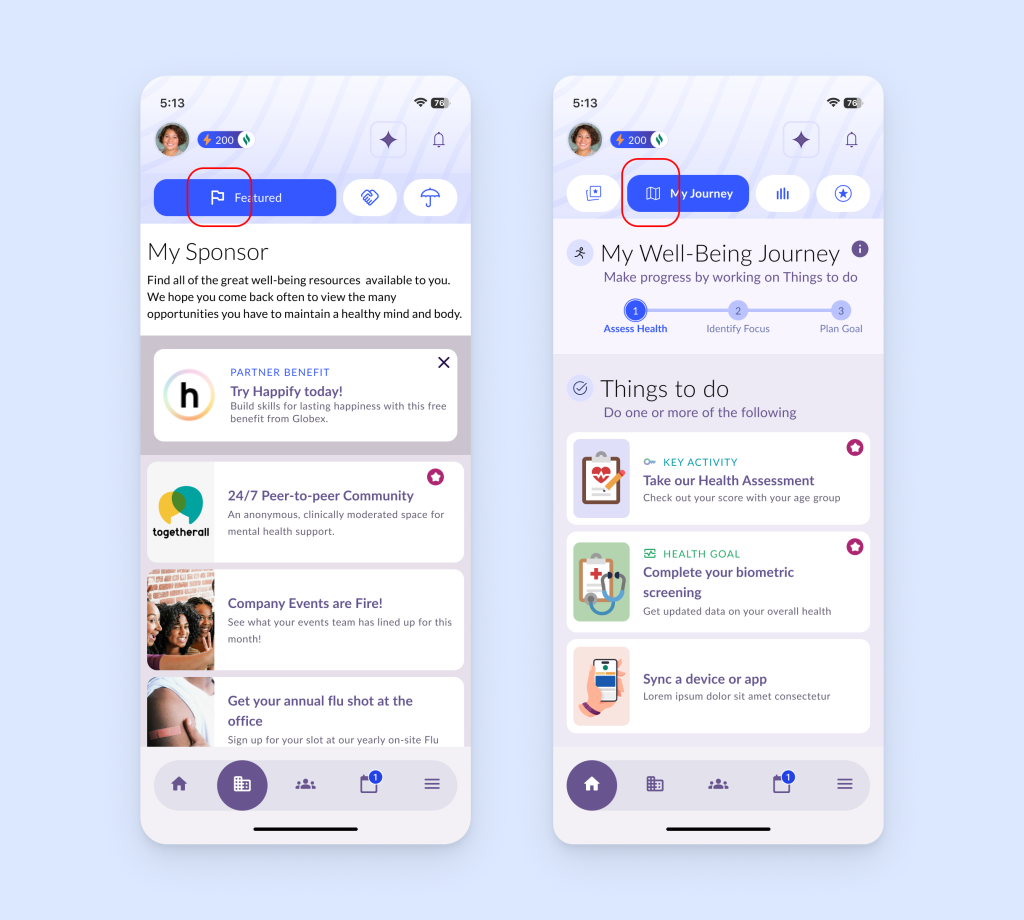
- All participants associated the “My Journey” icon to a map function.
- They also struggled to access “My Journey,” “My Activities,” and “My Rewards” due to hidden visibility in the top navigation bar.
Recommendation 2A
Use alternative icons for “My Journey” to better reflect their corresponding functionalities, which helps to improve understandability and design consistency.
Recommendation 2B
Use alternative icons for “Featured” to better reflect their corresponding functionalities, which helps to improve understandability and design consistency.
Finding 3
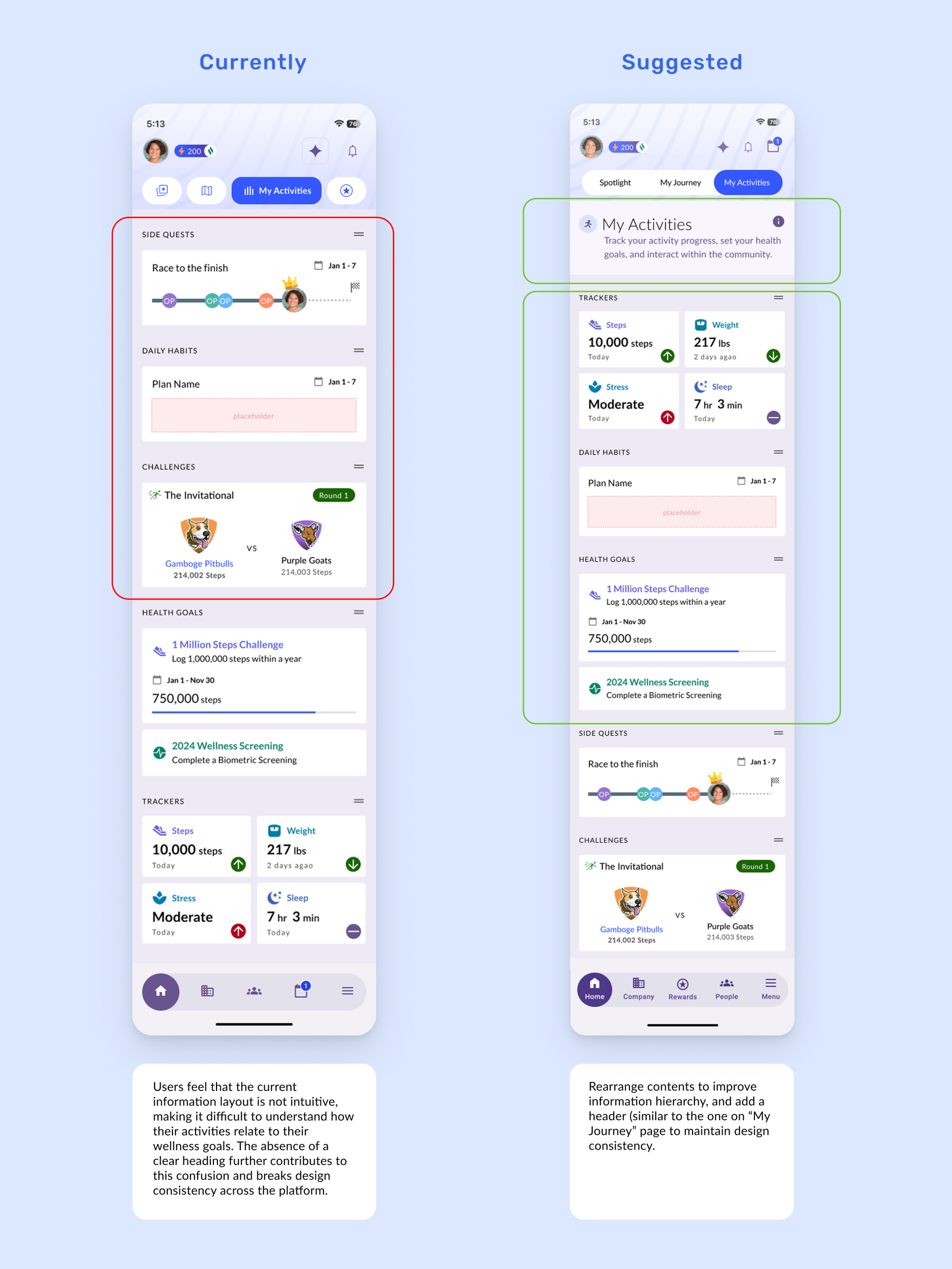
The “My Activities” page lacks clear information hierarchy, making it difficult for users to scan and locate key personal details.
“It felt like, like a very fragmented experience not coherent and consistent and it all just felt very disparate.”- User
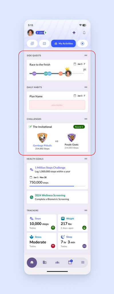
- Participants expected to see their personal health stats—such as steps—immediately, but these were buried under multiple content tiles.
- They would have preferred their own activity data to be prioritized and clearly highlighted at the top of the page.
Recommendation 3
Improve the information hierarchy on the “My Activities” page to facilitate navigation of key personal information first and add a header to improve design consistency.
Finding 4
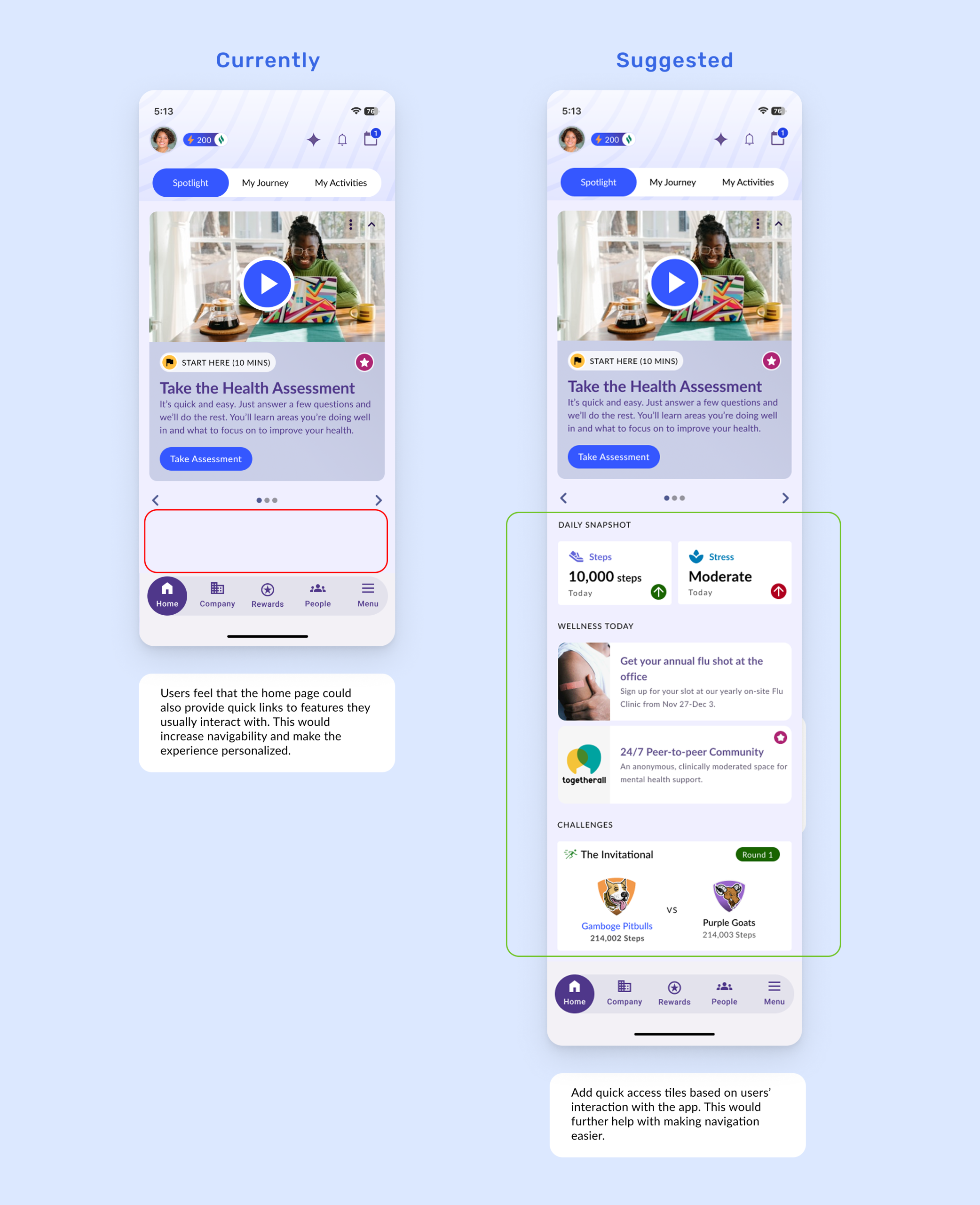
The homepage lacks functional depth and did not support clear next steps beyond the initial health assessment prompt.
“I was scrolling down because I was expecting there to be more things on the homepage – it feels very empty right now. I wish the homepage could be more personalized, having some shortcuts, etc.” – User
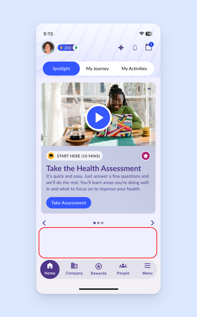
- Without clear entry points beyond the initial assessment, users struggled to discover key features and relied on trial-and-error navigation.
- Users want homepage layouts that are personalized and direct them to what they need to focus on throughout the day.
Recommendation 4
Make the homepage more actionable and personalized with quick access tiles.
Finding 5
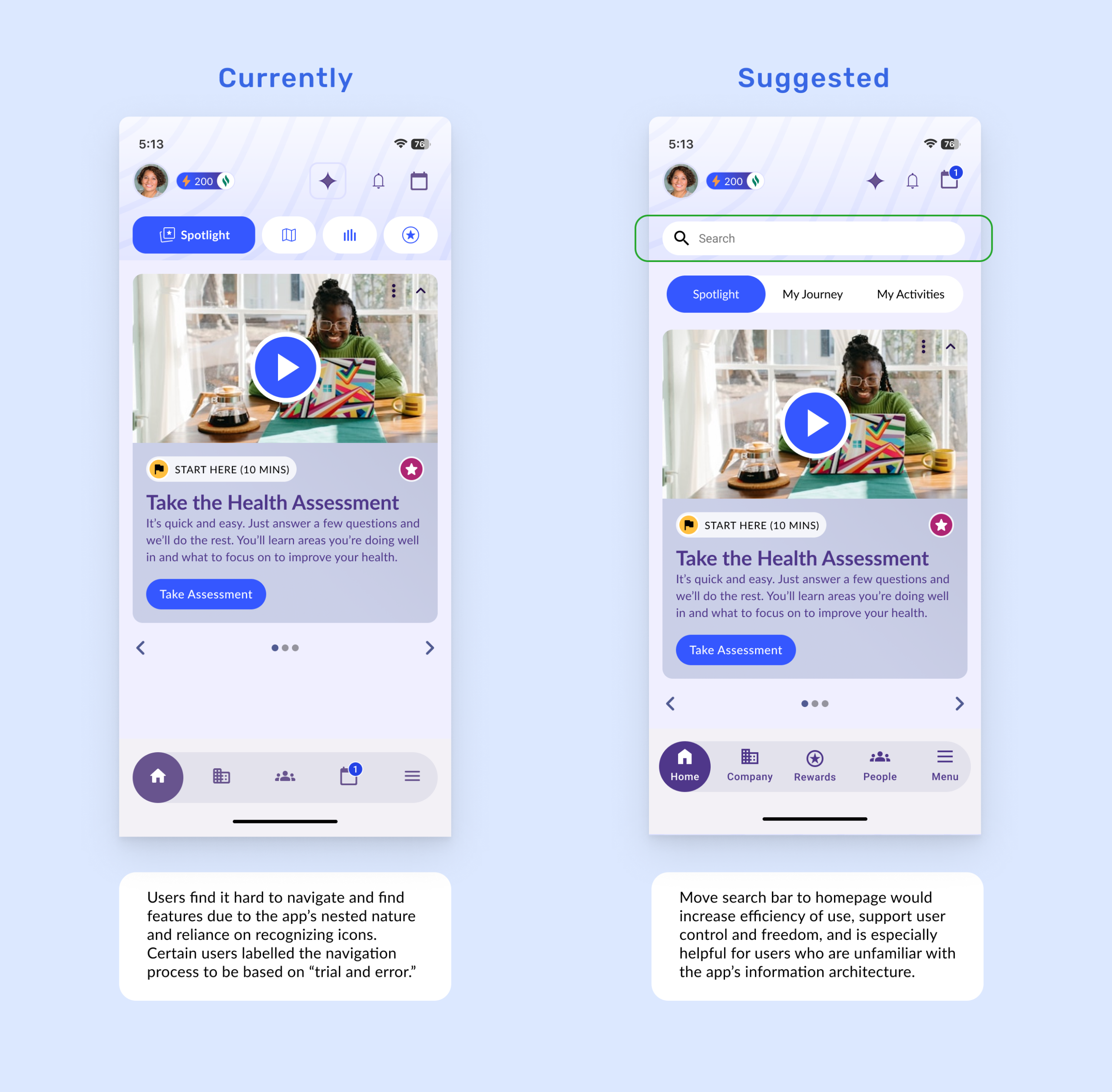
Participants struggled to complete tasks due to complex navigation and hidden features.
“I usually expect to find everything either in the hamburger menu or, if not, through the search bar – like in most apps I use.” – User
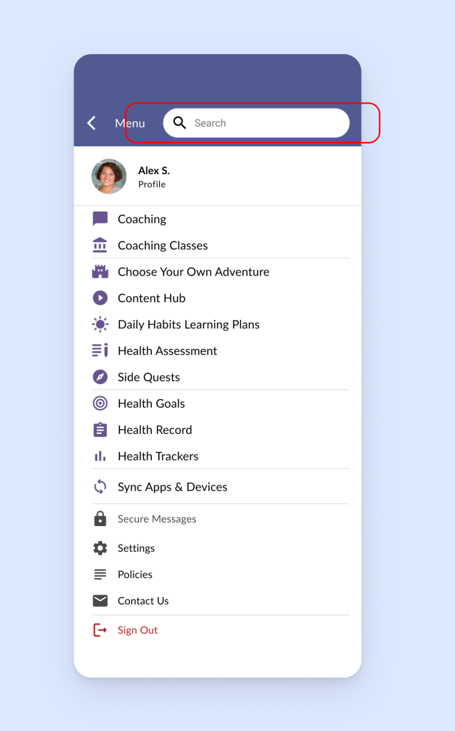
- Key tools like benefits, coaching, and rewards were buried under abstract icons or deep menus.
- The search function, hidden in the hamburger menu, was underutilized.
- Participants expected a more visible, direct path to the content they were looking for.
Recommendation 5
Move the search bar from the hamburger menu to homepage to increase its discoverability.
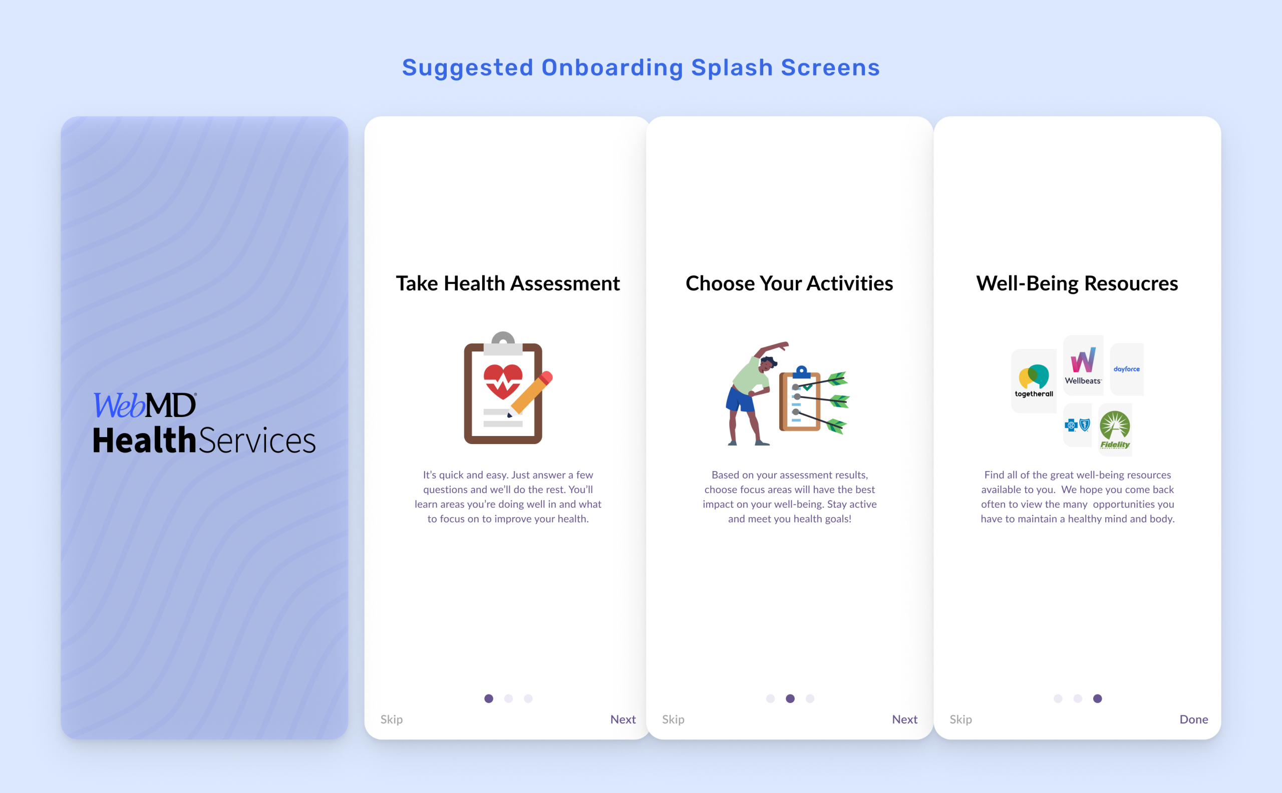
Further Improvements To Provide More Guidance to First-Time Users
Introduce onboarding splash screens and tooltips to highlight core features like My Journey, My Community, Rewards, and Sponsor Benefits.
This will help reduce the learning curve, improve feature awareness, and create a more engaging first-time user experience.
“It would be nice to be told what’s what when I explore so I don’t have to spend a lot of time figuring it out on my own.” – User
Conclusion
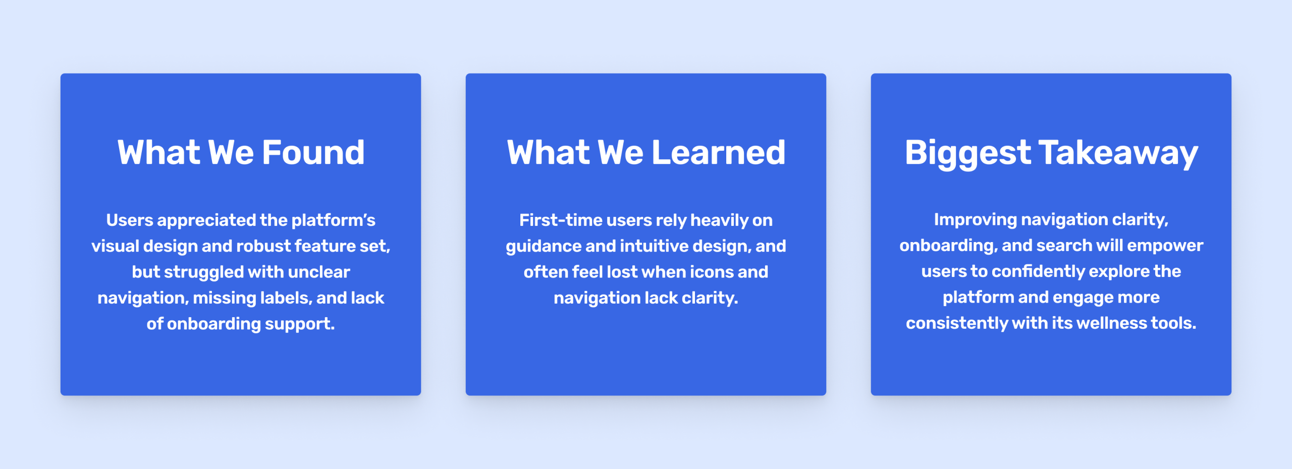
Our testing revealed that users would benefit greatly from clearer navigation labels, more intuitive icons, visible search functionality, and lightweight onboarding to support confident exploration of the platform.
While they found WebMD Health Services’ feature set and visual design appealing, we identified these areas as needing refinement to reduce friction and fully support users on their well-being journey.
What Our Clients Say
You helped us address our number one challenge—our platform includes a wide range of products, and it’s often difficult to find the right icons for each feature. Your suggested solutions felt appropriately representative of our needs and helped guide users more effectively through the experience. – Heidi Roux (UX Manager at WebMDHS
Final Presentation-Deliver the usability testing insights & recommended solutions
Reflection
01-Design for Clarity, Not Just Functionality
One thing I learned from this project is that even a feature-rich platform can fall short if users don’t understand how to navigate it. During our usability sessions, participants responded well to the homepage’s look and purpose, but often got stuck trying to find tools or interpret icons. After analyzing the feedback, it became clear that clarity is just as essential as functionality. This affects how we prioritize features, label elements, and support users through their journey.
02-Effective Communication With Your Clients
Another important thing I learned from this project is the value of ongoing, detailed communication with the client. During our initial kickoff meeting, we discussed the goals of the usability testing and thought we understood what the client wanted. However, as we moved into the preparation phase, we realized there were several gaps, such as some features weren’t fully clarified, and the full functionality of the hamburger menu.
This made it harder for us to deliver more meaningful recommendations. In the future, I’ll remember to ask more specific questions early on and continue checking in throughout the project to ensure we’re aligned. A helpful question to ask might be, “Are there any features or flows you’d like us to focus on more closely during testing?”