Team: Claire Paisley, Lan-Ting Ko, Sisira Mondreti
Role: UX Research, Moderator, UX Design, Usability Testing
Tools: Figma, PanelFox, Figma Slides, Google Sheets
Gutenberg Technology partnered with Pratt DX Center to improve the usability of their newly developed e-reader. This e-reader is meant for undergraduate students who are interested in or required to read their textbooks via a digital platform. To gather valuable information, we conducted remote and in-person moderated usability testing sessions to assess the overall user experience with the target audience by testing key features of the e-reader.
Our Client
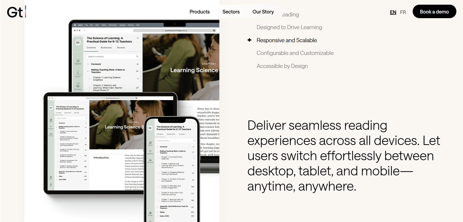
Gutenberg Technology aims to help publishers, educational institutions, and corporate entities enhance collaboration, automate content production, accelerate time to market, and foster innovation at scale. Their solutions support the creation of textbooks, e-books, courseware, and other digital learning materials.
Over time, GT has evolved into an AI-first company, integrating cutting-edge artificial intelligence to enhance its platform and create more immersive and effective learning experiences. They have also expanded their reach into corporate e-learning. Today, they operate with offices in both Boston and Paris.
Our Team

The team comprised of 3 graduate students from Pratt Institute, the Information Experience Design Program.
Our Process
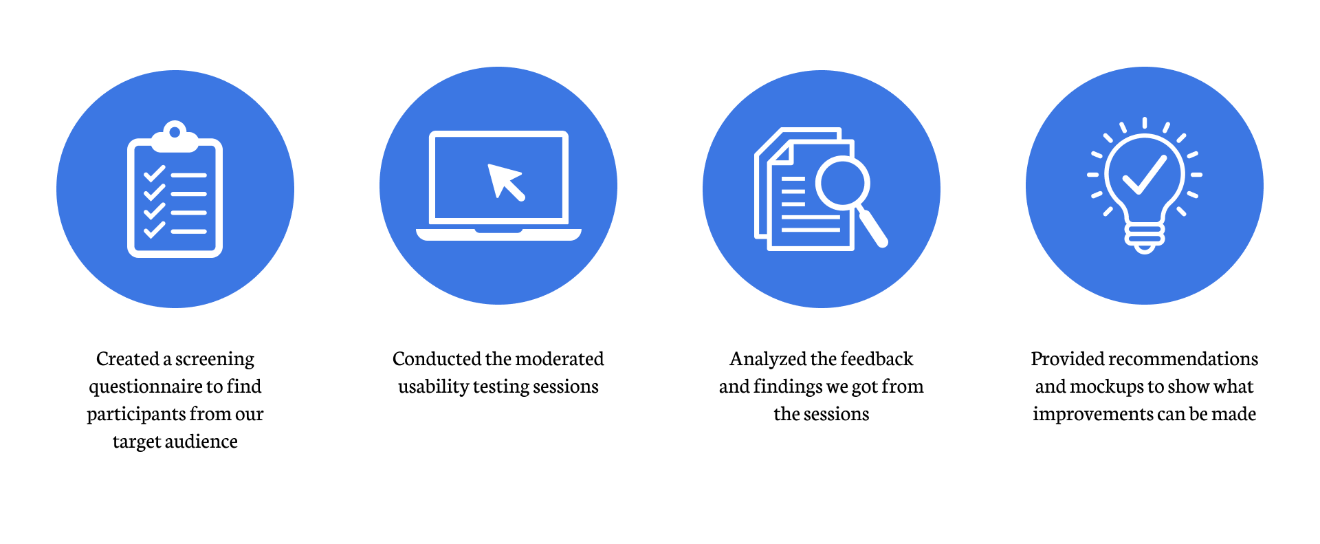
Project Goal
The goal of this usability testing was to test the ease of use of Gutenberg Technology’s e-reader. Through the testing, we hope to locate any pain points, and areas of improvement. During the testing, we asked the participants to think out loud so we can listen to their thought process when interacting with the key features of the e-reader
User Group
Participants Demographic:
- Occupation: Undergraduate students
- Residence: United States.
- Age: 18 ~ 27
- Gender: 5 Female & 1 Male
Key Findings & Recommendations
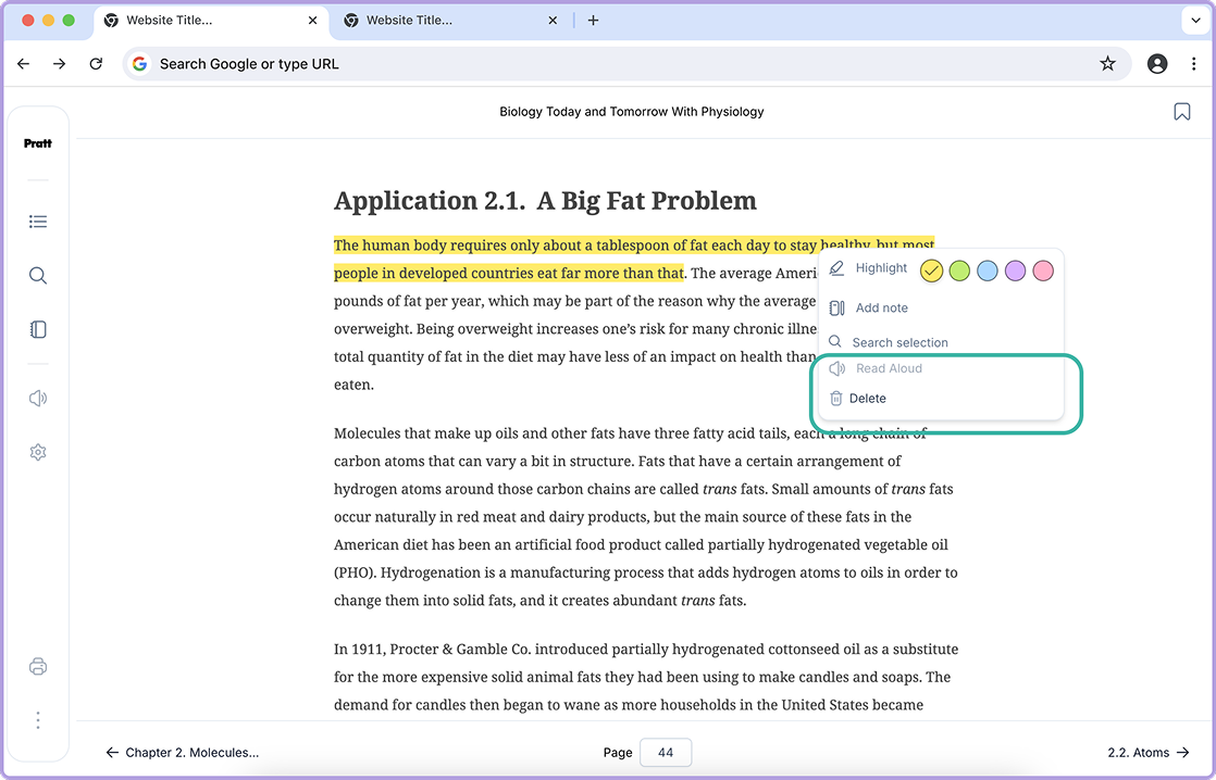
Finding 1 – Participants felt lost when attempting to remove a highlight
When the participants were tasked with deleting a highlight, 4 out of 6 of the participants found it a bit confusing to do so as they were trying to complete the task by navigating to the previously highlighted text to check for highlight options instead of checking the notebook where the saved highlights are found along with the delete option. This indicates a mismatch between user expectations and the current placement of the delete functionality.
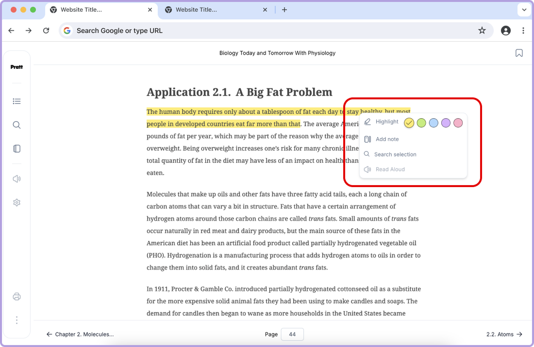
Recommendation 1 – Add a delete button where participants were expecting to remove their highlight
As most of the participants attempted to delete the saved highlight through the highlight dropdown menu, we recommend adding the option to delete in the dropdown, along with the other highlight options. This way, the participants do not need to go through the extra steps just to delete the highlight and can find the option easily.
“…If this textbook were in front of me, I’d like to be able to highlight, whatever I’m studying in the sentence. And then if I were to go back and look at it, I would want more context around it. I feel like taking a sentence out of context doesn’t help me study necessarily. Being able to see [what is highlighted] on the page surrounded by the context is helpful…to look further into it [or remove it].” -Participant 5
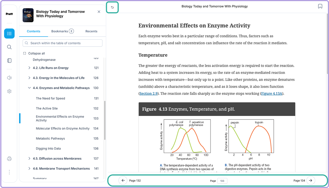
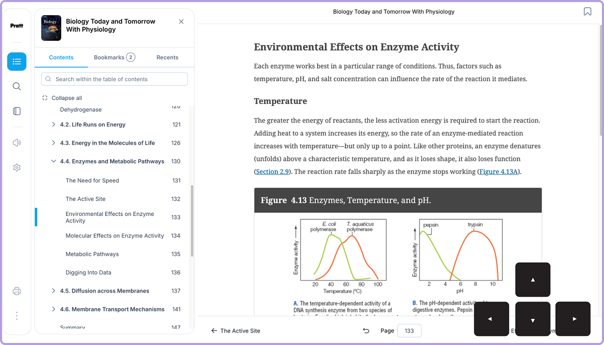
Finding 2 – Participants confused with Page Navigation
For task 2, the participants were asked to navigate through a few pages and chapters. While attempting the task, we soon realised that half the participants confused the undo and redo buttons with the back and next page buttons and instead used the table of contents to navigate between the pages and sections.
“Didn’t understand how to turn page initially. Thought that the bottom arrows (previous/next page button) look like next chapter or a jump ahead.” – Participant 4
“It’s not a ‘back’ page. It just takes me to the last page I visited.” – Participant 3
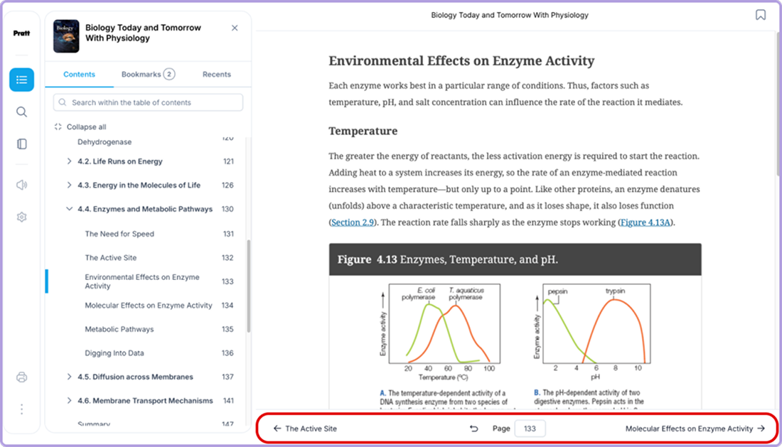
Recommendation 2 – Relocate undo/redo button and add page number
To avoid any confusion, we recommend relocating the undo and redo buttons to the top left of the page, and adding the back and next page buttons at the bottom left and right corner with the page number instead of the page title. This will provide the readers with clear labeling and mapping.
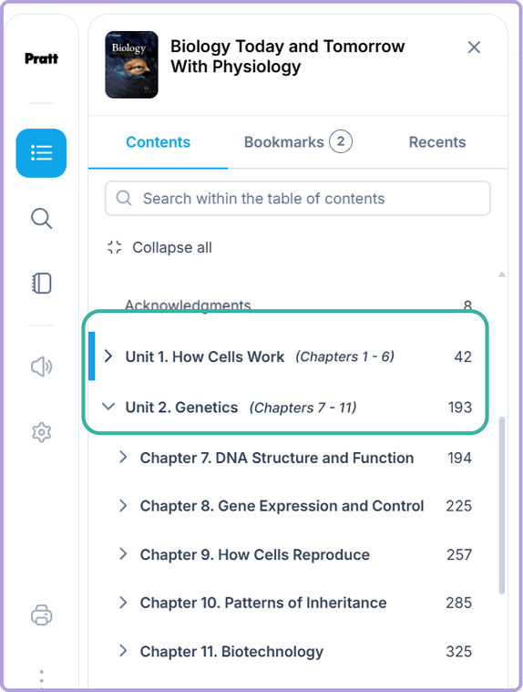
Finding 3 – Unclear structure of units and chapters
During the entire testing session, all participants found the table of contents very confusing to navigate. The labeling and order of the chapters and units made it difficult for the participants to figure out what came next. For this specific textbook, chapter 1 was listed before unit 1, and is then continued with the rest of the units instead of chapters.
“…would like to see the chapters be a little more visible,
the units seemed irrelevant and confusing” – Participant 3
“The way everything is ordered in the table of
contents. Units and chapters are confusing.” – Participant 5
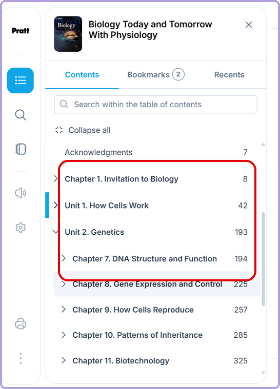
Recommendation 3 – Reorganize chapter and uni structure
To overcome this confusion, we recommend not mixing the chapters and units and instead just list out the units first and then the chapters under each unit accordingly. With this improvement, the readers will not have to guess or constantly check which unit or chapter comes next and can easily find what they are looking for.
Other Suggestions
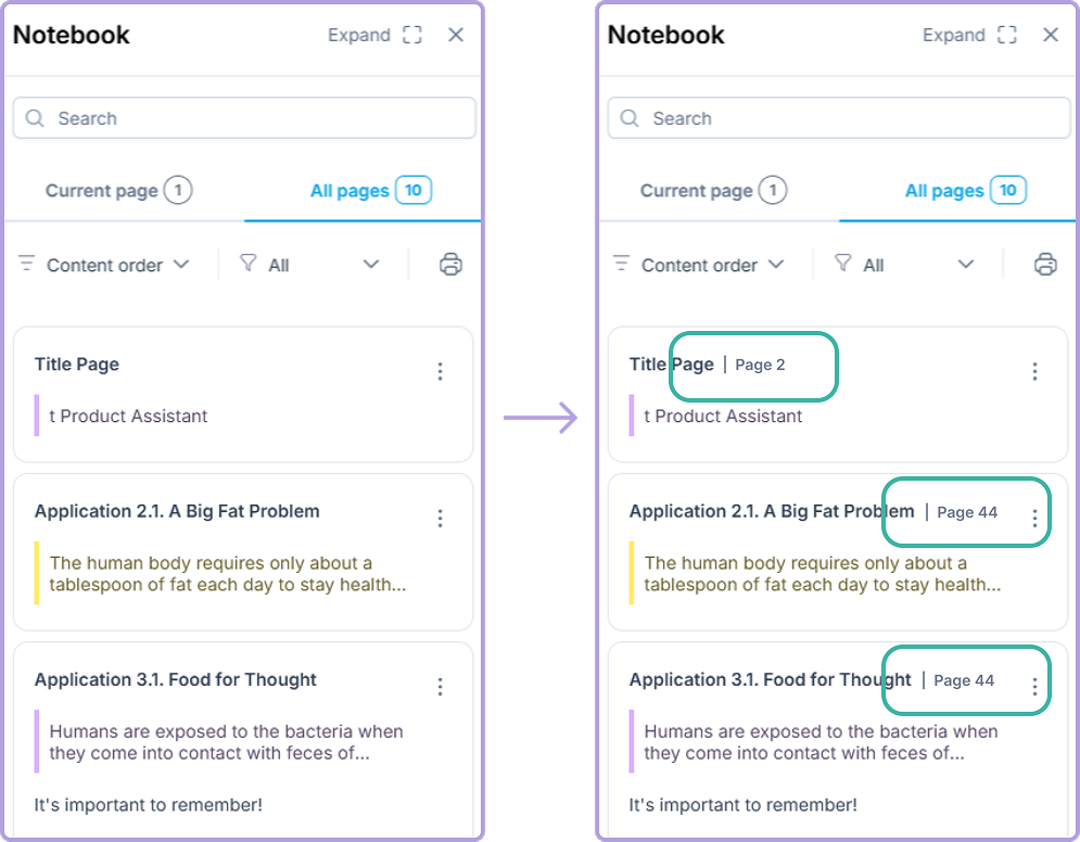
1. The saved notes can maybe have page numbers and section name mentioned next to it as it will be easier for the reader to understand where it was saved from
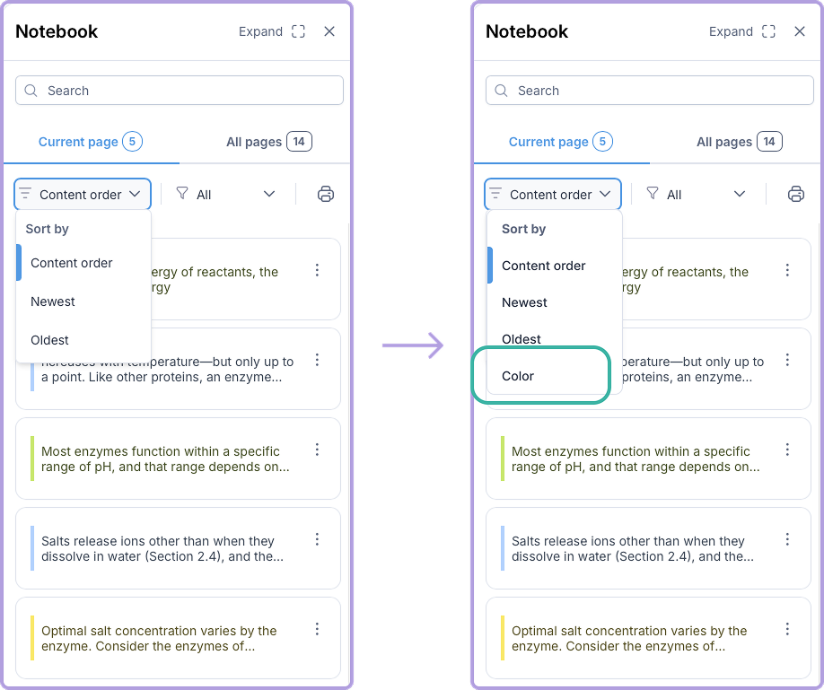
2. The highlights can have an option to be sorted based on color
3. While navigating with a keyboard, the user can have an option of using the up and down keys for chapters, and left and right for the pages.
Conclusion
Gutenberg Technology is currently developing their new digital textbook e-reader for undergraduate students with the goal of giving a better and more enjoyable experience. To achieve this goal, our team of 3 graduate students conducted remote and in-person moderated usability testing sessions with 6 participants from our target audience. During these testing sessions, the 6 participants completed a series of tasks that allowed them to use key features of the e-reader, including navigation, note taking, highlighting, bookmarking, read-aloud, and search function.
Overall, participants had a positive experience with the e-reader and found it very easy and straightforward to use. They also mentioned a few areas that could be improved to elevate the whole experience of the e-reader. The areas of improvement were mainly found in highlight deletion, page navigation, and chapter/unit ordering in the table of contents.
Implementing these suggestions will help to create a more ideal experience when using Gutenberg Technology’s e-reader, making the reading experience more impactful. As a result, students will feel more comfortable and encouraged to read from digital textbook e-readers.
Feedback from our Clients
We got a positive response from Gutenberg Technology after our presentation, they were really interested in what we had to say along with the feedback given from the participants. They were especially quite interested in what the participants had to say about the read aloud feature as it is one of their newest features that is yet to be incorporated into the live website. If we had more time to work on this project, we would’ve definitely explored more of the other suggestions as we believe those improvements would tremendously benefit the experience of the website along with the 3 findings and recommendations given.