by Sisira Mondreti
The Problem at Hand
As an e-commerce platform that prides itself on being “human-centered” and “transparent,” Etsy’s user experience for new customers contains several points of friction and manipulation that contradict its brand values. My role on this academic project was as the sole UX designer and researcher, tasked with identifying these ethical violations and proposing a redesign. Project success was defined by the ability to identify specific deceptive patterns, articulate their negative impact, and propose design solutions that balance business objectives with ethical principles.
The primary user goal was to complete a purchase efficiently and transparently, without users being forced into actions or misled. This case study addresses the problem of deceptive design, or “dark patterns,” in the new user purchase flow on Etsy.
What was my Process?
My approach to solving this problem began with a comprehensive ethical assessment of the new user purchase flow on Etsy. I decided to use the Etsy app as a new user with no saved profile information. As a new user, I followed the journey from browsing for a particular product to the final purchase confirmation, while also paying close attention to moments where I was prompted for information or guided toward a specific action. I went into the project knowing that e-commerce sites often use persuasive design, but the goal was to distinguish between helpful persuasion and harmful manipulation.
After conducting a detailed, step-by-step walkthrough of the new user purchase journey on Etsy, capturing every interaction. Each step was then analyzed against established ethical design frameworks to identify manipulative techniques and their underlying business motivations. Based off of the interactions, the more obvious patterns would come under Dark Patterns, with perhaps a few instances where Anti-Heroes activities are subtly at play.
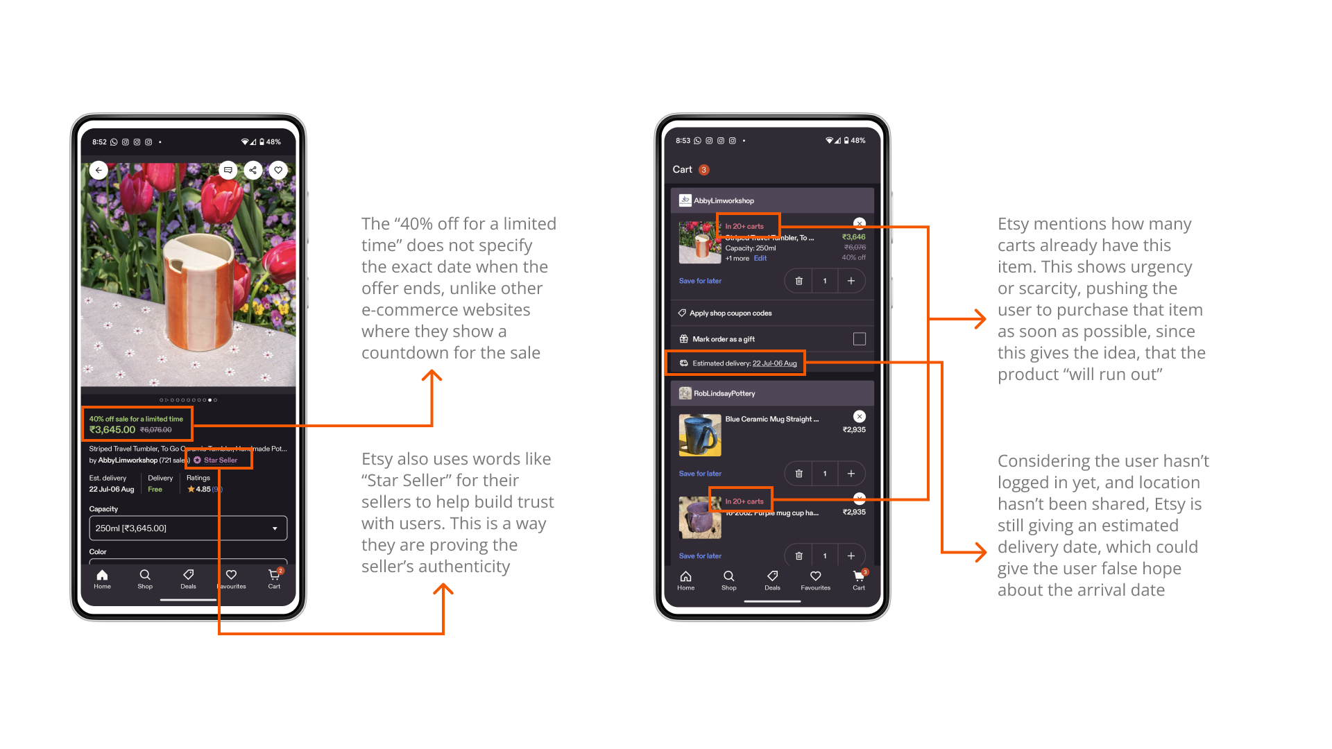
Through my research, I was able to identify three key dark patterns:
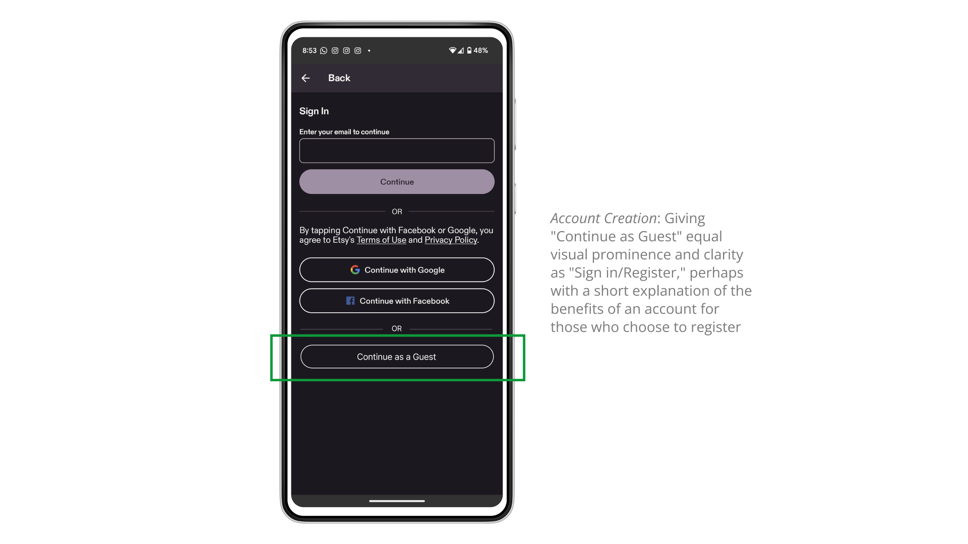
- Forced Action (Obstruction): The purchase flow required a new user to create an account, with no clear “continue as guest” option.
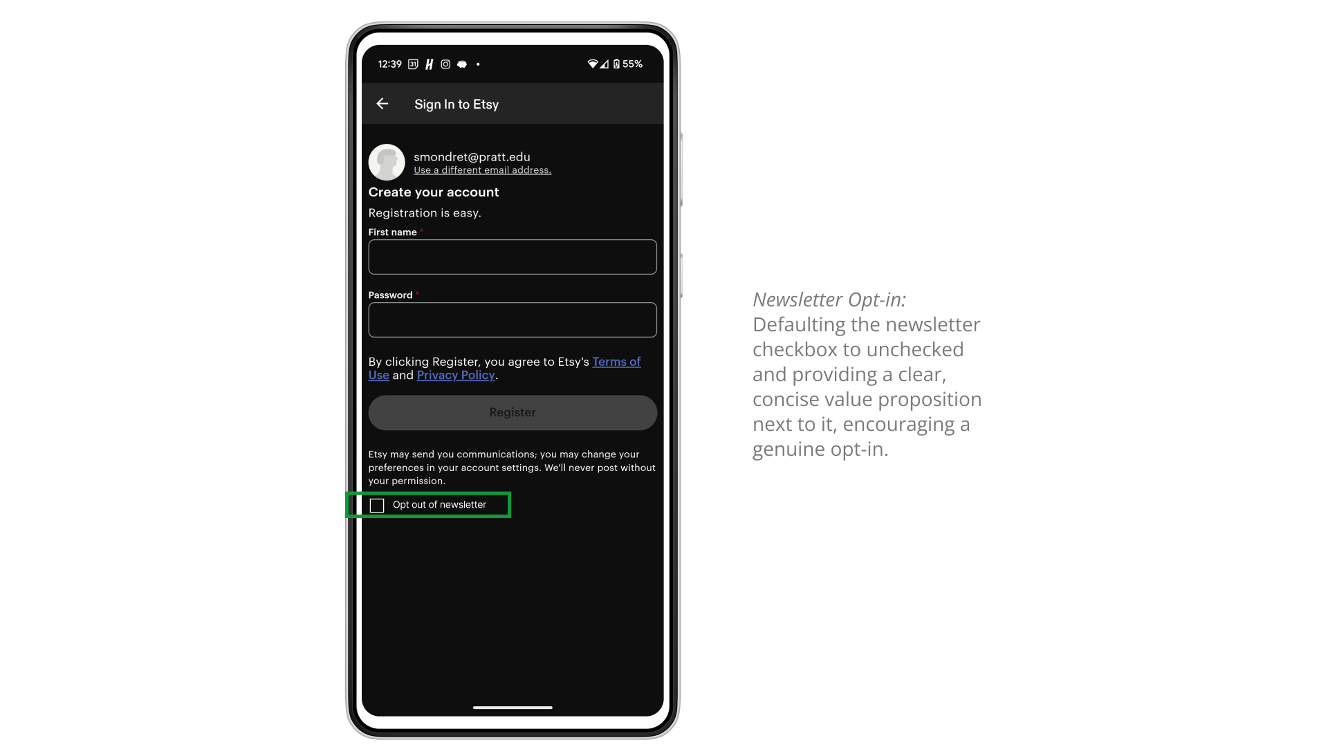
- Sneaking: Users were automatically opted into the newsletter during account creation, requiring a separate, non-obvious, and complex process to opt-out.
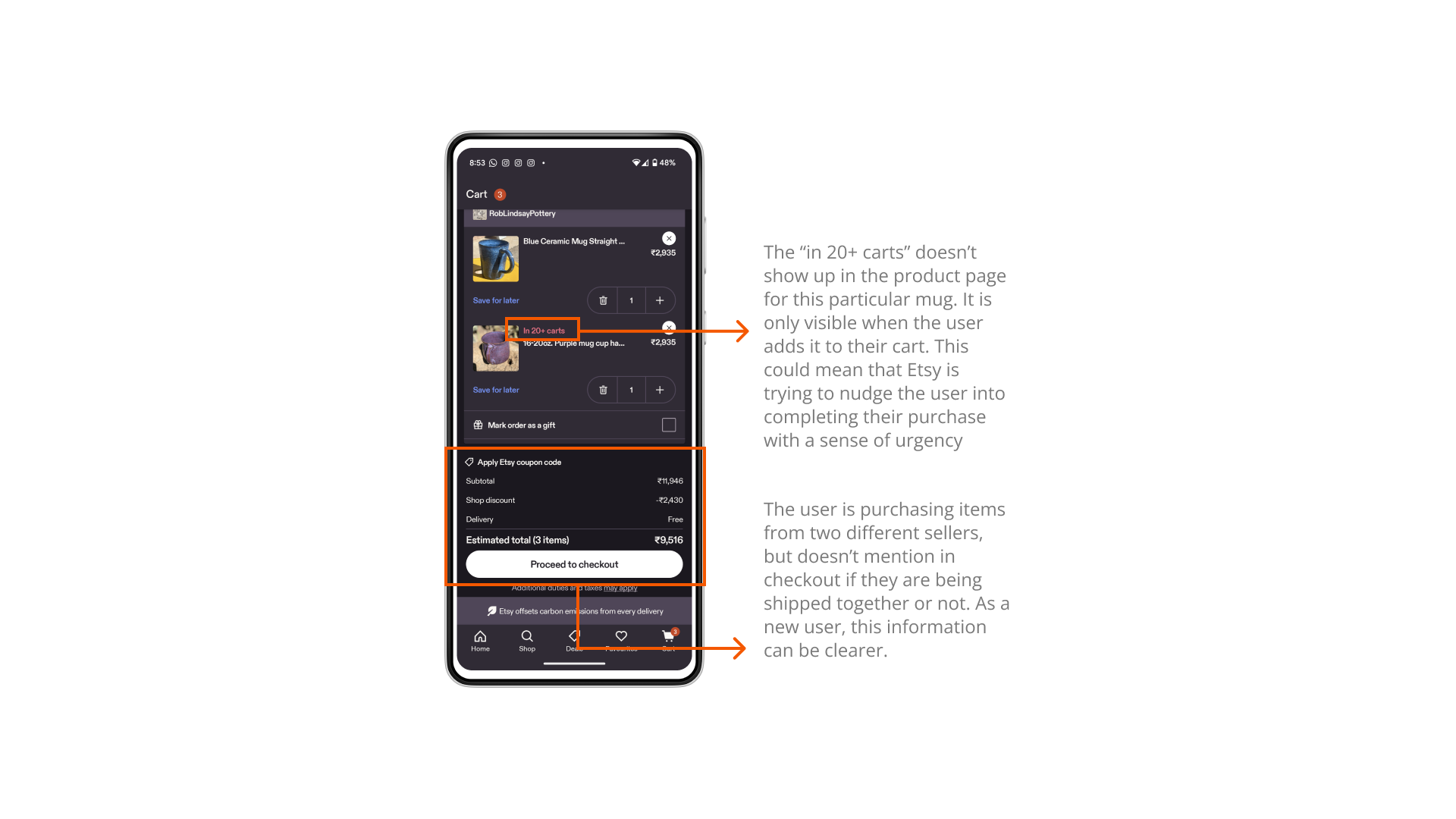
- Fake Urgency: The use of “In X carts” messages created a false sense of scarcity to pressure the user into purchasing items, even though the information doesn’t tell the user anything about whether the item is selling out.
After conducting the walkthrough and analyzing my research against established ethical design frameworks, I decided I would go ahead with redesigning instead of redlining.
My Stance on Redesigning
The core of my solution was to eliminate the identified dark patterns by providing users with transparency and control. The redesign focused on three key areas of the user flow
Account Creation: I proposed giving the “Continue as Guest” option equal visual prominence and clarity as the “Sign In / Register” buttons. This solution directly addresses the forced action and respects user autonomy. While it may slightly decrease immediate account sign-ups, it will continue to build trust and in turn, reduce cart abandonment.
Newsletter Opt-in: I redesigned the newsletter subscription to be a genuine opt-in. The solution involved defaulting the checkbox to “unchecked” and placing a clear, concise value proposition next to it. This respects the user’s choice and moves away from the deceptive “sneaking” pattern.
And finally, Urgency Cues: The solution for fake urgency was to remove misleading cues like “In X carts.” I proposed that any urgency cues used should be genuinely truthful, such as a low stock warning when an item is truly running out, which provides helpful information rather than manipulation.
My Final Presentation
The final deliverable was a presentation and a redesigned user flow concept submitted for a graduate-level course. The project’s success was measured by its thorough analysis of the ethical violations and the strategic, value-centered solutions proposed. I learned that aligning business goals with ethical design is not just a moral imperative, but a business advantage that builds long-term user trust and satisfaction, which I will continue to take along with me in my future projects and roles.
If I were to approach this project again in a real-world context, I would have integrated user interviews to validate the pain points and conducted A/B testing on the redesigned flows to measure the impact on key metrics like conversion rates and user satisfaction.
Questions from my Peers
Although I am still discovering the answers to these questions, I would like to continue finding the answers and further analyzing how I can make my solutions more feasible.
- Esty also has to support creators, can they do that without people actually signing in? you have to support two kinds of users on this platform, how would you balance that?
- How would you present your argument to the PM regarding the FTUE forced flow?
- What are the trade-offs of signing up for an account and letting users know that in order to purchase something they need to sign in/register?